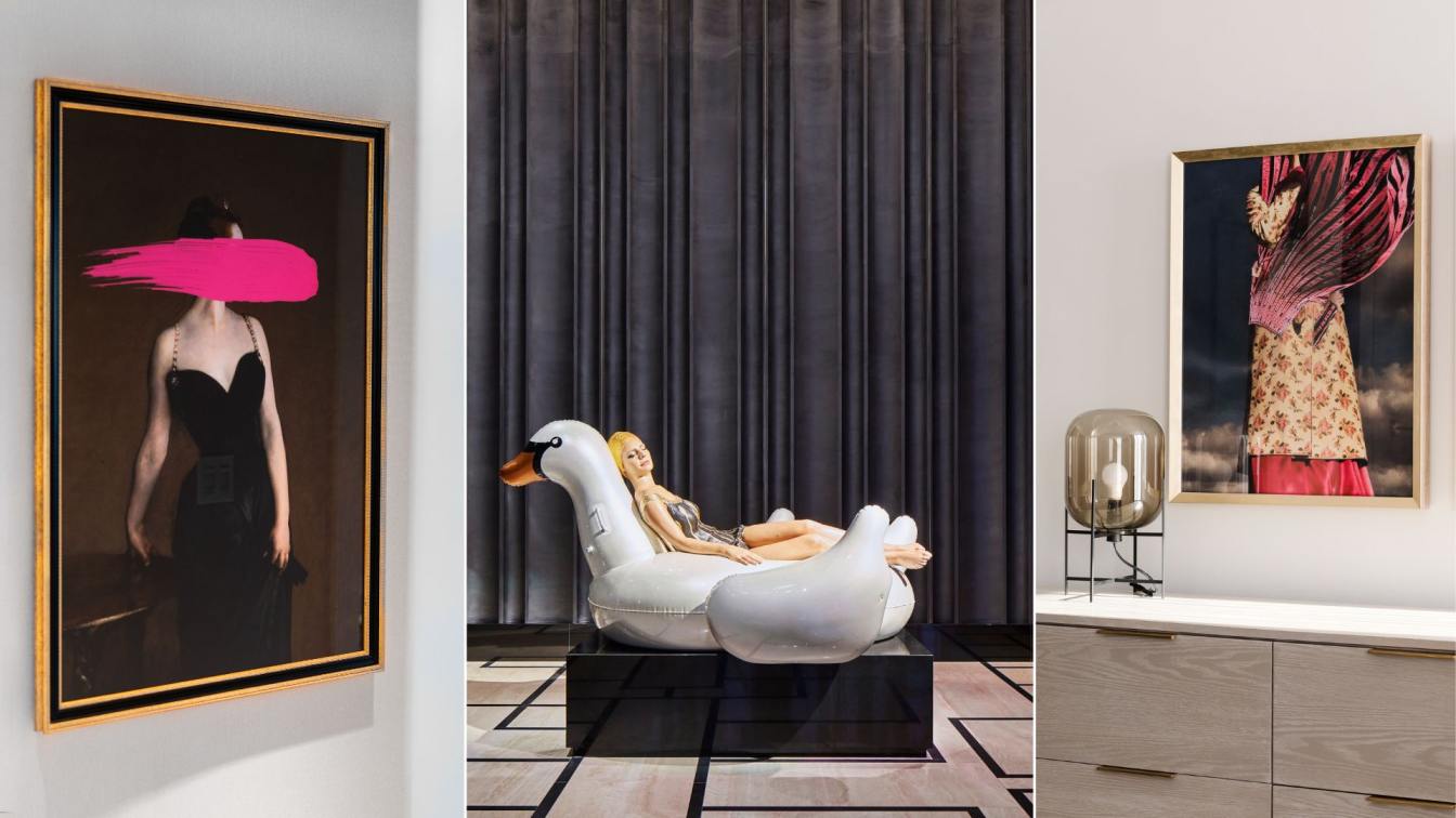
With the rise of women's independence in the new era, words such as “ease and confidence”, “undefined” and “live sparkling” are increasingly emphasized in the process of self-pursuit. Besides, the economy with self-pleasing as its demand has all the more contributed to the rapid rise of the beauty industry. As a renowned beauty brand founded in Shenzhen, HBbeauty strives to give women a beautiful life and a natural, healthy and inner pleasure. It’s third 1,000 sq.m. flagship store is designed by MOSOM DESIGN.
As a leading design firm in the pan-beauty sector, MOSOM DESIGN, with its keen insight, works to unlock the market demands through its “new aesthetic power”. By integrating scene design into the business operation mode, it attempts to dig out the space’s emotional appeal to customers. On the other hand, it supports the sustainable growth of business value via the traffic of scene interaction.
In HBbeauty, a great balance has been achieved between an immersive resonance experience and the sustainable business impact. “The Brand and the space complement each other. Here, the space has radiated its tension and rhythm through architectural deconstruction, light and shadow shaping, spatial materials, display and layout. With these exquisitely crafted details, we aim to create a shared journey and achieve a potential effect from emotional value to sales without advertising”, says MOSOM DESIGN.

1. Creating New Aesthetic Power in the Field
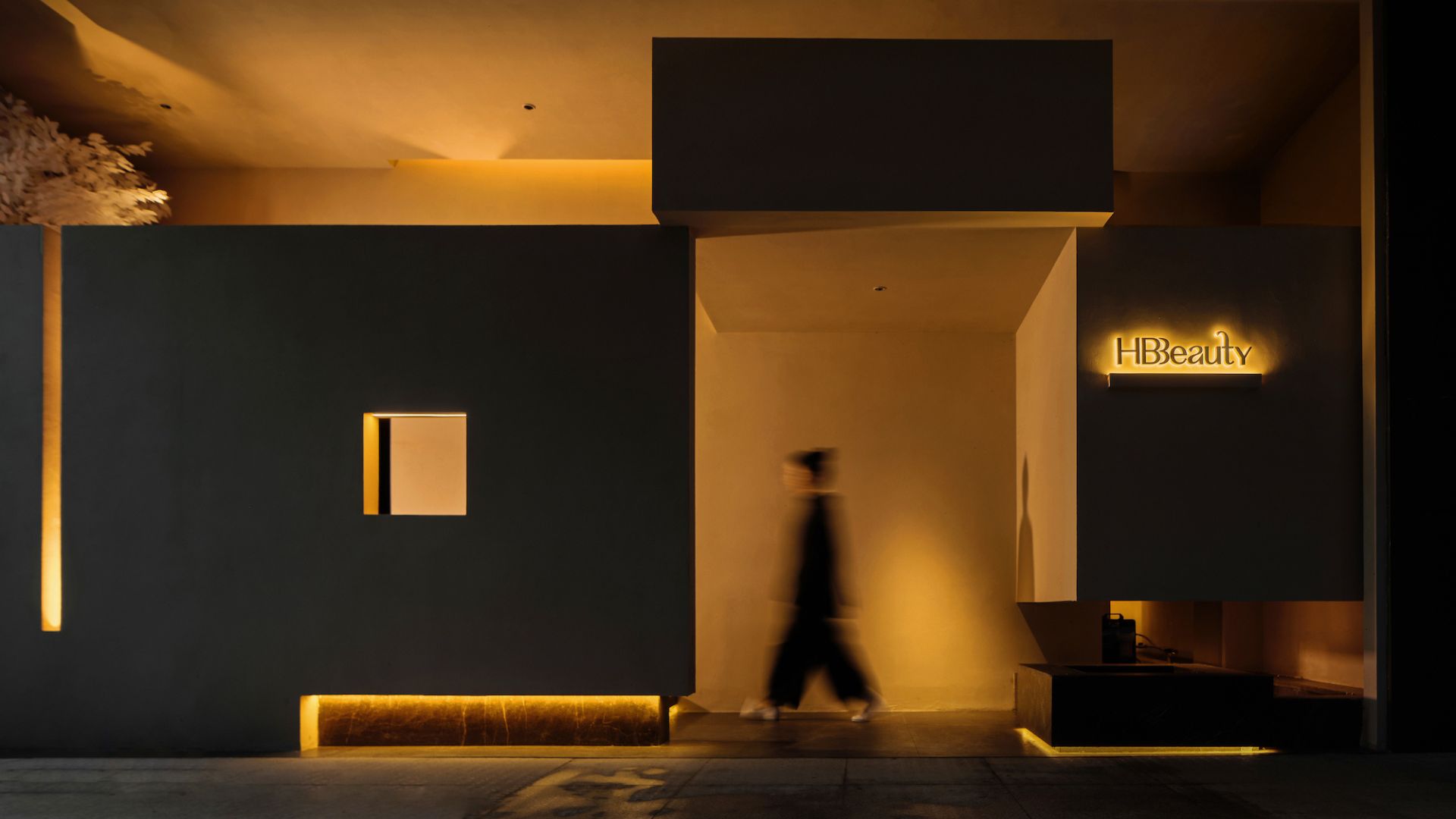
How to evoke the lasting appeal of customers in an immersive experience is the key point MOSOM DESIGN strives to achieve in this case. “Beyond aesthetics, it is the multifaceted elegance and deep emotional memory consumers perceive in the space that create a lasting experience over time.” Therefore, the designers draw inspiration from the La Chapelle de Ronchamp by Le Corbusier to create the field’s ambience. The unique architectural form, with its irregular walls and hole cutting, breaks with the conventional flat and linear blocks, encouraging people to explore the space in depth.
2. Deconstructing Architecture, Art Container
The space is left to the viewer to explore the beauty through the art of architecture. The interior of the structure that resembles a church is gradually mirrored by dispersed light beams that pass through gaps and fall inside. This will give people a sense of silent ritual as they walk through it. Following the spatial motion line, the designers have created a wonderful architectural melody at the corridor of the hall with a progressive space structure. As the viewers enter, the deliberately low ceiling distance wraps them in a sense of novelty, order and privacy. The transition from the the store’s outside to the inside is like a scene change in a play, invisibly drawing the customer's attention. Thus, the expertly constructed "story" starts out subtly.
"The interplay of light and shadow with the building and the combination of blocks and structure is the key design logic." The triangular structure and vertical light exude a sense of solemnity outwards. "Once inside, visitors could initially feel curious, then understood and appreciated. This is the emotional sequence hidden behind the design language."

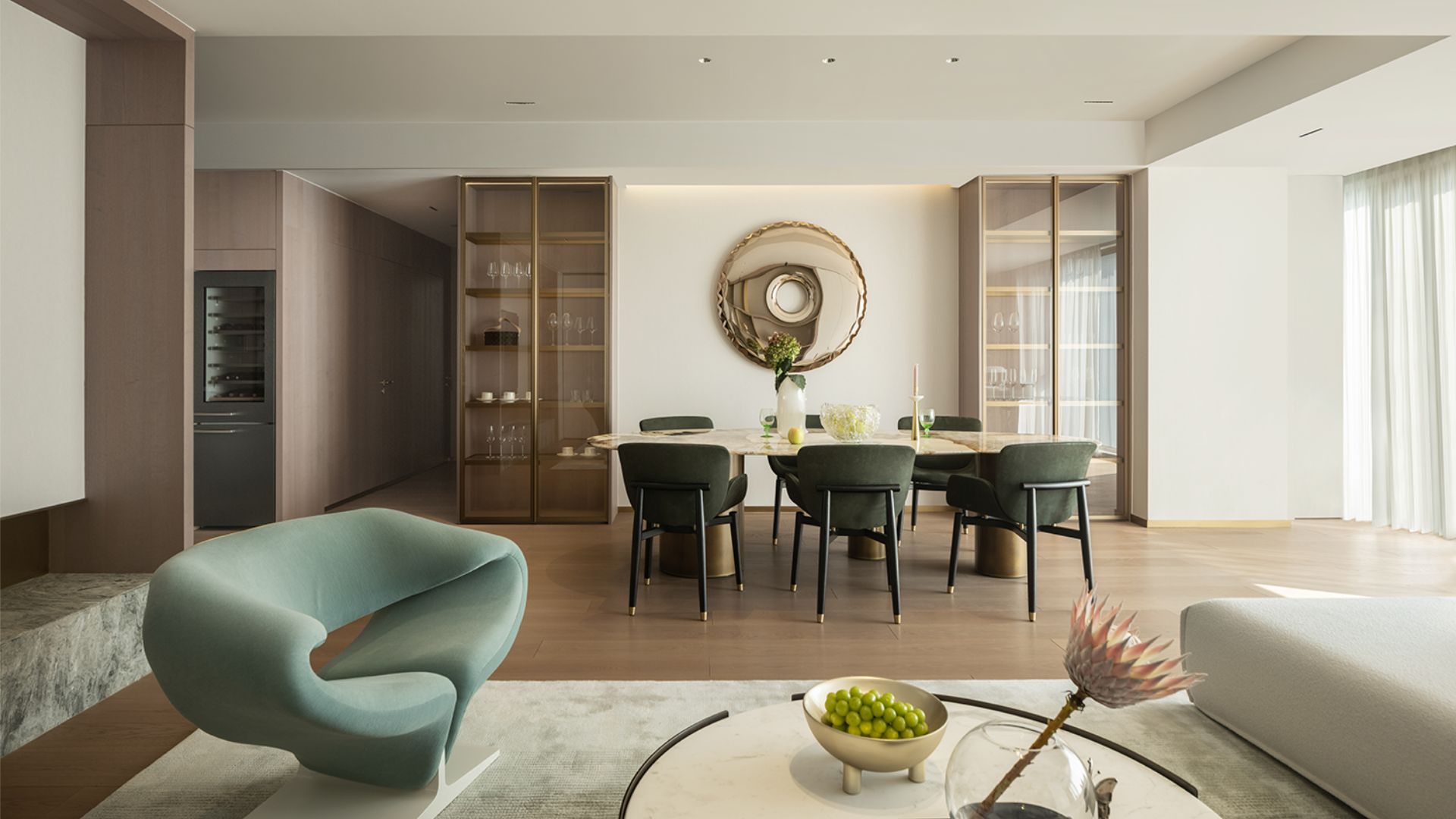
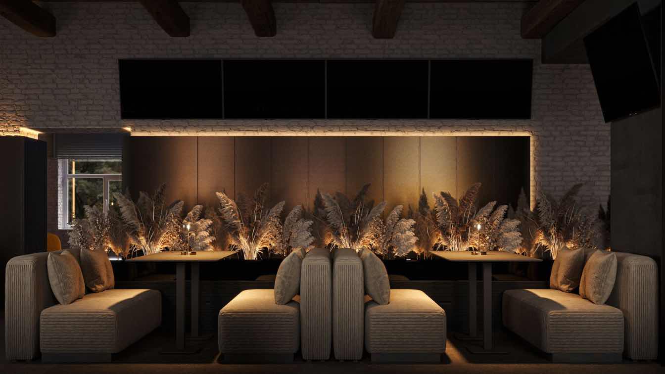
How to precisely express the brand tone that stays in the consumer's mind? "Elegance, purity and implied shock are the character we wanted to give to the space." From the pure fair-faced concrete, the wooden materials, the orderly seating arranged on the partition walls, to the flamed wood installation that dominates the visual centre, multi aspects like scale, colour and image have been taken into account for atmosphere creation. By doing so, each unique element is a key point that strikes a chord.
"Furthermore, there is an implicit sense of rhythm that runs through the design of the architectural spaces. We have deliberately avoided extra decoration in favour of details that stand up to taste. This will be invisibly conveyed to the consumes’ mind and body, evoking a deep sense of empathy among them."
3. To Perceive the Wonders in the Rhythm
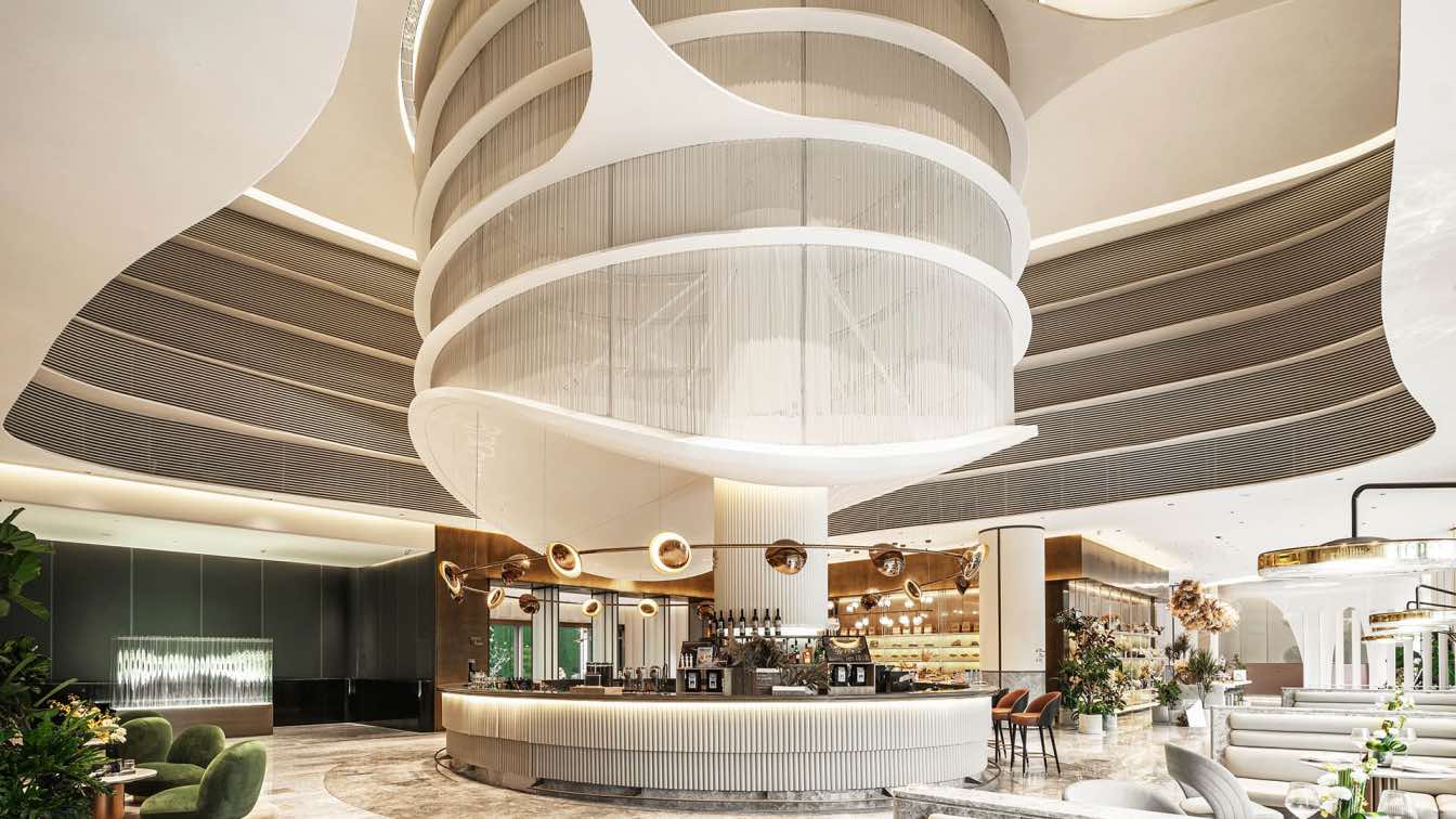
According to MOSOM, the space's design allows access to the objects. Looking around, the arched doors and the curve staircase collide with the original straight lines of the building, thus developing a rhythmic "polyphony". While enriching the layers and the rhythms, it makes the viewers feel the melodious tune of time.

In this way, following the design guidelines, the space is created to open another door for the experiencer beyond everyday life. Based on the "space as brand, scene as marketing" strategy, this feeling of context that transcends time is a key way to activate the added value of the brand.
Behind the winding curved form is a slow coordination and transition technically. But in terms of sensory shaping, behind the curve is change and vitality, conveying a dynamic attitude of mind and body outwardly. This is exactly the experience that the brand wishes to provide to its consumers - to have fun and stay healthy. For offline commercial brands, creating experience spaces is crucial to its brand growth. As MOSOM DESIGN has consistently stated in its pan-beauty space design - as part of the brand identity, the space integrates the traffic and memory behind the scene experience into the long-term operation of the business.
HBbeauty has emerged from the fixed space paradigm and scene concept, transcending deconstructed architectural aesthetics and a physical and mental experience. Instead, it has focused on the spiritual core, which is implied in the commercial transformation of the relationship between people and place, so as to build a deep empathy between consumers and the brand.


About
Founded in Shenzhen by the famous Chinese designer Mr. Zhongchen Jin with a global outlook, MOSOM DESIGN specializes in researching “new aesthetic power”. Engaged in the professional design of beauty clubs, offices and luxury housing, it strives to provide clients with integrated solutions like business consultant in beauty industry, space design, lighting design and soft decoration design.
Over the years, MOSOM DESIGN has put forward the core concept of “diversified change, elegance until eternity”, and given play to the front-end strategy thinking of “space is brand, scene is marketing” with a focus on the high-frequency cognition and efficient realization of business. With these efforts, the value-added beyond design is constantly being created. In the design, we consider the input cost and return cycle of clients horizontally, while analyzing architectural structure, material aesthetics, business logic, commercial economic benefits and brand operation vertically. Efforts are made to turn a strict whole into organic units, integrate upstream and downstream resources and effectively shorten the nod from conceptual design to commercial landing. This is how we maximize return efficiency and business output value, finally presenting a quality complex space that combine function, aesthetics and emotional value with diversified styles and elegant demeanor.

