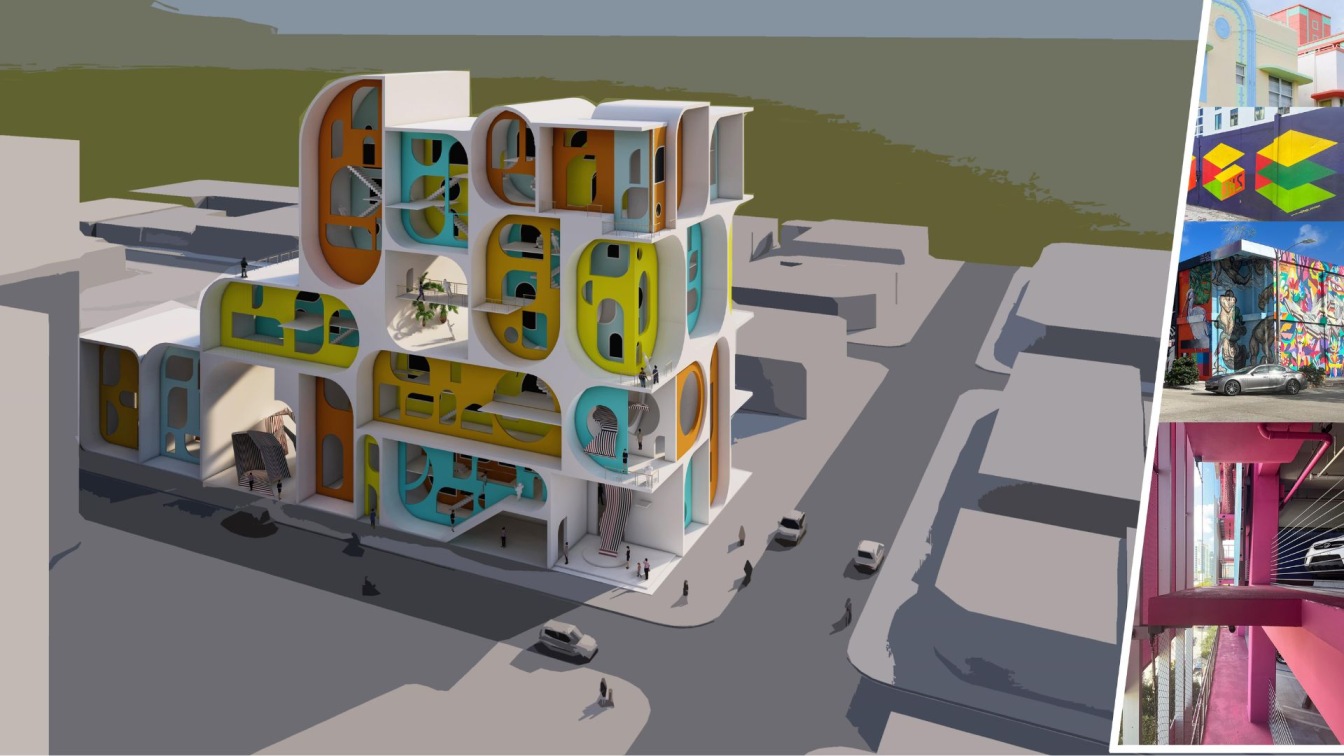
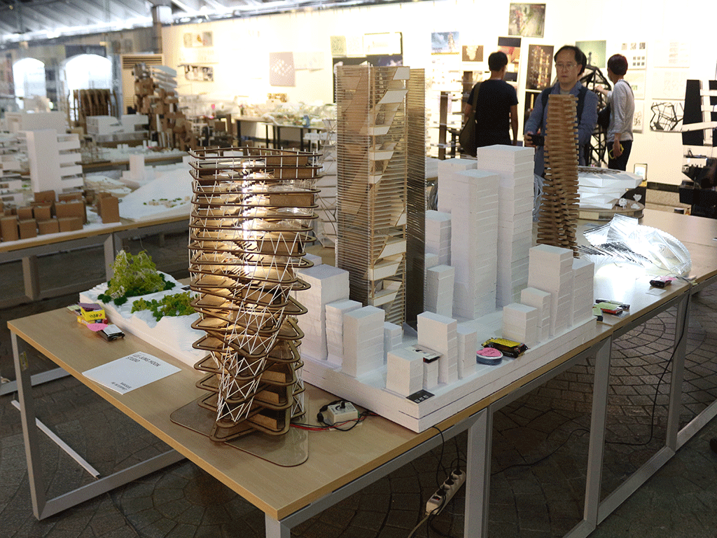
Dipti Trivedi: Our site this semester will be in the Wynwood Arts District, a former industrial neighborhood that has emerged as the creative hub of Miami. Attracting visitors from around the world to explore and photograph its internationally renowned street scene, this edgy part of the city is home to the highest concentration of street art in the U.S. Our building program this semester was an eight-story mixed use proposal with vertical exterior gallery spaces, indoor galleries, and work-live spaces situated adjacent to an existing outdoor mural museum.
The purpose of the building is to provide a public art ‘experience. How might you think of the Wynwood blocks pedestrian meander experience at the street and sidewalk level, to make its way upward into/onto a taller building? Is this via stairs and scaffolds? Artwork cubbyholes and surprising voids? Changing wall panels and display surfaces? Perhaps you conceive of stacked, individually rented artist studios or galleries? Or other types of display spaces that engage/support the overall art environment?
Throughout the semester, we had to use process design iterations – both with drawings and sketch models. The final model was a ½” = 1’-0” partial model of full height of the primary building volume which was a 5 ft
model.
Project title: LIFE IN BETWEEN
Architecture is all about creating space and making people experience spatial quality. The main idea of the project was to give occupants and visitors the unique visual experience of art while focusing on various spatial connections throughout the building with vertical circulation. What if a building doesn’t house the art into only the interior part of the building, but the building facade itself has been used as a canvas, to showcase the art. What if the art is displayed in a layered effect that has spatial depth, and can be occupied?
This project provides the interface-layered facade where the occupants navigate through the gaps between the skin and allies for circulation through stairs, slides, and hangout spaces. My exploration included the study of the layered effect and the blurred boundaries between the inside and outside within the layers. When viewed straight on, they appear flattened (two art walls), from an angle, with a complex fenestration pattern and surface depth.
The cultural site context:
Wynwood Walls, a neighborhood in Miami, where artists might come across the world for their artistic expression and depict stories over every available architectural surface. People have freedom to show and share their wild imaginations. The neighborhood where art can be found on any texture, surface, background, planes, objects. Art is everywhere, no matter what the materiality is. One can feel Wynwood walls are pulsating, happening, chaotic but lively.
A few contextual considerations from site visit during the Studio tenure.
•Garage facades, Work AC interactive artistic garage facade
•Use of architecture/architectural elements (read here wall multilayers) for key facade development.
•Facade became a canvas, to showcase the art.
•Spatial experience void within voids
•Curved profiles of the elevation linked with ART DECO elements of Miami architecture.
Spatial experience:
•The layer facades for art display would act as Interface between public and the building.
•Come, walk, climb, feel the art, have the visual experience, rest in handout space,
and down experience of painting in a dedicated area.
•Make people experience the art, through interface.


