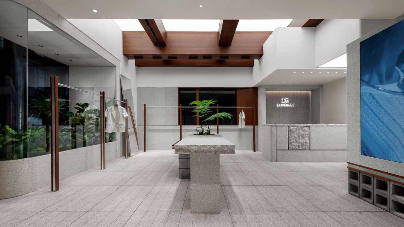
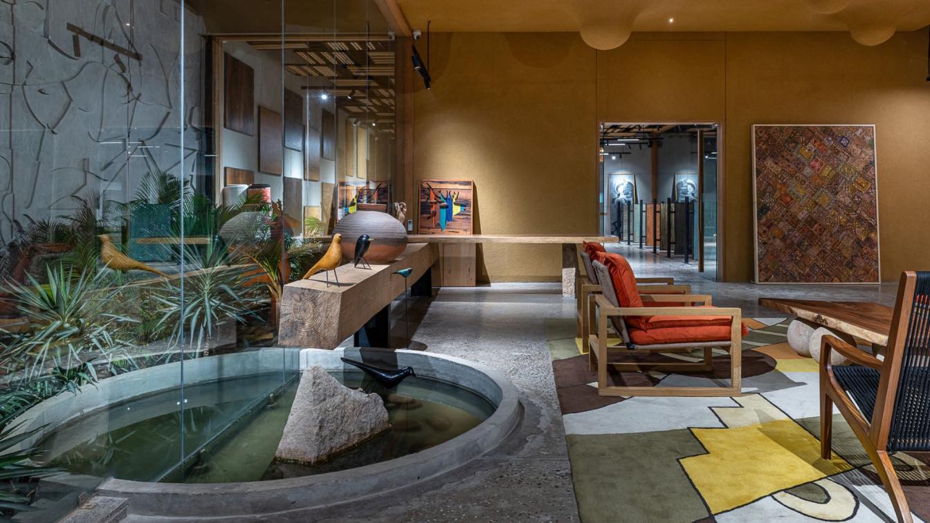
ZHUZHANG, a female fashion brand advocating a design and life philosophy of courage, independence, and authenticity, has opened its first store in MGU Universe Nanshan, Shenzhen. The retail space features a natural, logical, and inclusive design, creating an open and cozy ambiance. It embodies the brand’s essence, offering visitors a serene escape from the hustle and bustle of the outside world, providing a moment of inner peace. Bobo, founder and creative director of LubanEra·Design, created a unique rhythm and mood within the store through architectural language and thinking, focusing on the commercial value of aesthetics rather than a specific design style.
01. Symbiosis
The building stands at one end of a former gourmet street, resulting in a complex internal structure with crisscrossing water and gas pipelines. The large complicated exhaust pipe of the former kitchen occupies significant space and cannot be altered, reducing the spatial height and complicating the design process. To address these challenges, Bobo adopted a design concept emphasizing dynamic forms and symbiosis, integrating architectural structure, spatial form, and varied materials. The rough texture of materials accentuates the delicacy of products, creating a striking contrast and extending spatial perception. This design fosters a borderless dialogue between consumers and the space, constructing an imaginative shopping experience.
02. Order
The well-organized layout creates a feeling of order and appropriateness, while green plants balance the textures, adding a dynamic interplay of softness and hardness. Multi-level relationships between textures and blocks permeate the entire space, while the transitions of details are naturally coherent.
03. Primitive nature
The nature-inspired design blends humanistic and natural art harmoniously. Refined granite shapes the space's personality while retaining its natural characteristics, exploring beauty and wisdom in simplicity and restraint.

04. Soothing ambience
Lighting control and spatial circulation arrangement are crucial to consumer's shopping experience. Wood and granite generate a peaceful atmosphere through their tactile and visual qualities, responding to consumer behavior, mentality, and emotions through natural textures. The space encourages consumers to slow down, returning to the essence of shopping.
05. Tranquility
Balancing freedom with tranquility, the design uses blank surfaces to ignite imagination and enrich the spatial layering, creating a relaxing and comfortable scenography for exploration.
06. Natural metaphor
The design incorporates natural elements and green plants to break spatial constraints. The story-telling architectural space conveys emotions through simple materials and greenery, offering a metaphorical and healing shopping environment.


