Studio Modijefsky creates a home from home for Amsterdam’s hottest young chef’s debut restaurant. Angelo Kremmydas is a chef whose name has been on the lips of the food in-crowd in Amsterdam for the last couple of years. After establishing his reputation across the city, he’s finally opening his first restaurant in West Amsterdam: Gitane. Angelo wanted it to embody his culinary signature: refined food that reflects a mix of cultures and flavours, served without fuss. Studio Modijefsky translated this vision into a casual but elegant spatial design that radiates a welcoming atmosphere from inside to out. At Gitane you become a guest at Angelo’s table, where you’ll enjoy food and wine carefully selected from local producers and small companies. Studio Modijefsky applied the same ethos by working with specialists who can produce the truly extraordinary, like a terrazzo that had never been made before by the company, or anyone else in the world.
The interior of Gitane is divided into three areas: ground floor; mezzanine; bar. The restaurant is hosted on the ground floor and mezzanine, with the bar two steps down from the ground floor. After the kitchen closes, the ground floor gradually turns into a wine and cocktail bar. Each area has a unique atmosphere to suit a different mood, activity and time of day. Together they compose a drinking and dining destination where everyone from food connoisseurs to local residents will feel at home.

Ground Floor
The main entrance is through a wooden vestibule with coloured glass. It brings you into the double-height restaurant space, over which large dark orange neon letters spelling ‘BAR’ spread a warm glow from the top of the vestibule.
The warmth of the light and the wood of the vestibule set the tone for the ground floor. You’re surrounded by classic and custom wooden furniture: vintage café chairs, some with dark orange leather seating; custom barstools with a leather finish; tabletops with refined details; flooring made of repurposed wooden planks; and long custom benches that constitute the main spatial element on the ground floor and mezzanine. These benches have a unique character thanks to integrated terrazzo surfaces and a combination of clear lines and subtle details.
Tall custom lamps hanging from the ceiling enhance the room’s height, while curved lamps in the same style, but with playful light spheres, grow from the wall behind a long custom banquette on the left. This side hosts an abstract tiled landscape where lightly coloured rough stucco meets a pattern of white tiles. Together they form a patchwork of textures and shades that meanders from the front of the restaurant, past the bar, all the way to the kitchen. It has a timeless feel, thanks to the layered finishes and materials that give the impression of revealing how the room has previously been decorated.
On the opposite side of the ground floor small tables offer a more intimate setting next to tall arched windows. The windows are defined by faded soft red outlines and enhanced by conic ceramic wall lamps. The background has been given a weathered appearance, and clouds of different beiges mix and match across the length of the wall.

The Bar
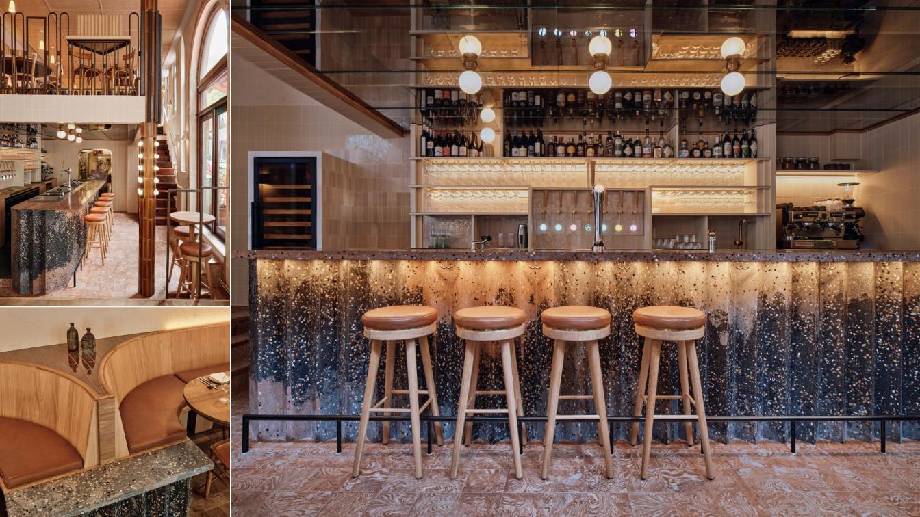
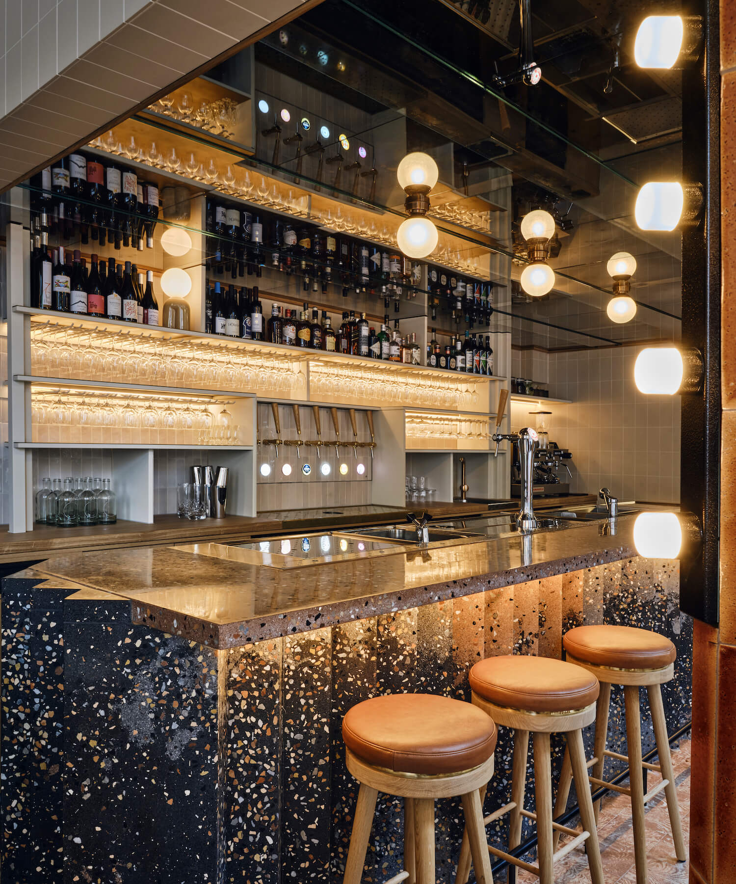
Two steps down from the ground floor you’ll find the bar. It’s a sculptural showstopper in an eye-catching zigzag shape, made with a unique terrazzo mix of greys with pink accents. The zigzag shape echoes the geometry of the exterior brick façade, and returns in the seating elements inside.
A marbled tiled floor contrasts with the neutral colours of the delicate back bar, which stands on a wooden base. The back bar follows the ceiling geometry and develops symmetrically on the back wall. At one end a large fridge invites guests to peruse the carefully curated assortment of natural wines, while at the other they can get a glimpse of what’s cooking in the kitchen.
This intimate space is elevated by a dark brown, aged mirrored ceiling. It reflects the light spheres on the ceiling and the patterns of the sculptural bar beneath, capturing the play between robust, weathered materials and the fresh tiles and terrazzo.
The bar ceiling is supported by a column. By finishing it in rich textured lava tiles and giving it small lights as accents, Studio Modijefsky turned a humble structural piece into a vertical design feature. As the column rises from the souterrain all the way up to the railing of the mezzanine staircase, it visually connects all three areas of Gitane.
Mezzanine
A rattan ceiling with a spectacular geometric pattern of slats unites the ground floor and mezzanine, which you climb up to via an original wooden staircase. Large windows next to the steps define the position of the glass partitions of the mezzanine railing, subtly bringing the facade indoors while extending the visual lines from the street to the interior. A railing of metallic brown vertical elements runs along the mezzanine edge. Once upstairs you’ll find a service area, tables, benches and a banquette, all with zigzag details. The length and shape of the banquette naturally establish smaller seating areas which are complemented by simple shelves exhibiting vases and plates found in obscure French bazaars. A table next to the railing offers the chance to enjoy a view over the whole dining and drinking area.
Terrace
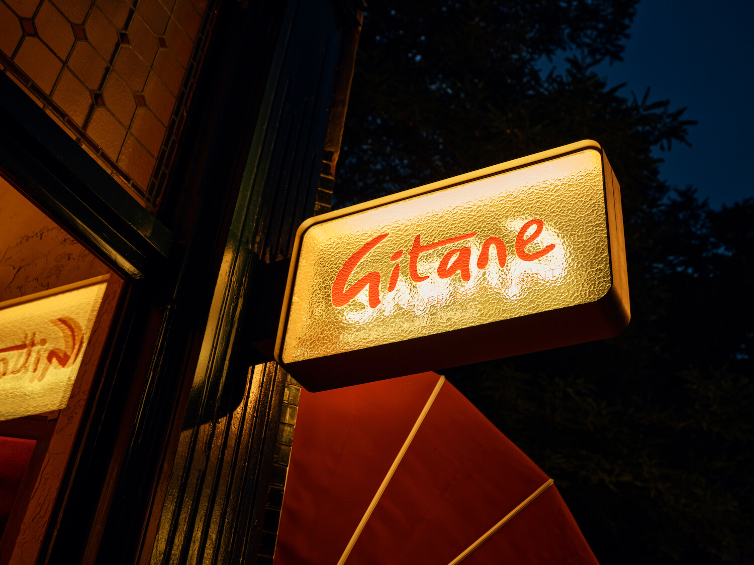
A terrace runs along the façade of Gitane, with custom wooden love seats in a warm red colour sitting underneath striped orange and red awnings. On the other side of the building you can take a seat at a half-round bench to enjoy an aperitivo and watch the world go by, before enjoying a special meal inside.






About
Studio Modijefsky is an interior architecture studio founded by Esther Stam in 2009. Its home in the center of Amsterdam hosts an international team of architects and interior designers who provide a total creative service for spatial interventions for clients that range from hotels to boutiques and bars to spas. The nine women that currently form the studio carefully design everything that is seen, passed and touched by a visitor for the duration of their stay whether it’s five seconds or five hours.
Every Modijefsky project is unique thanks to a rigorous creative process that’s rooted in each location. The site – not just the building but also the local environment - is carefully researched and analyzed to reveal and embellish the location’s story. An equal amount of attention is given to the brand or inhabitant of the new space in determining how their attributes, character and heritage can be translated into a relevant, appealing spatial design and experience.
The next step is to consider how the space could and should be used. Height, width, lines of sight, routing, light and sight are explored and optimized in a spatial design in which everything is related to the location and brand’s unique character. Finally, the entire creative process is presented to the client in a book that tells the history of the location and its future design.
The worlds Studio Modijefsky creates need to make sense until the very last detail. Achieving this level of quality requires a large team of professionals - not just designers but painters, electricians, craftsmen, light makers, shop fitters, and contractors – pushing their limits to perform at their best. This level of collaboration is only possible with regular contact, so Studio Modijefsky regularly visits building sites and workshops where the interior and its contents are made to ensure optimum quality.
It’s part of the studio’s ultimate goal to reinvent the way people interact with an interior. By relating design to the location’s context (whether natural or urban) and playing with the composition of texture and materials, light and routing, height and depth, sight and tactility Studio Modijefsky creates spatial experiences that surpass all expectations and create valuable new memories.

