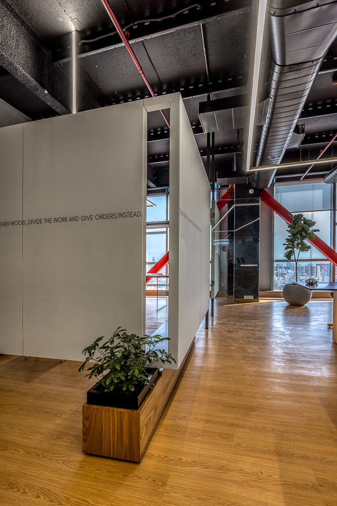
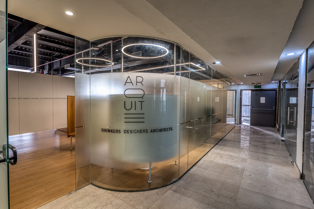
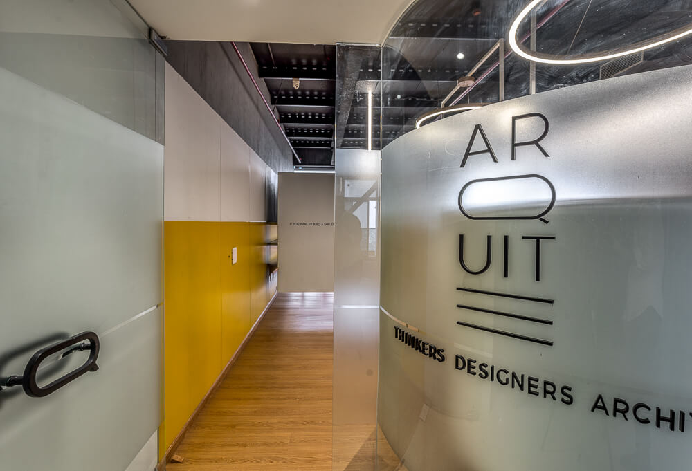
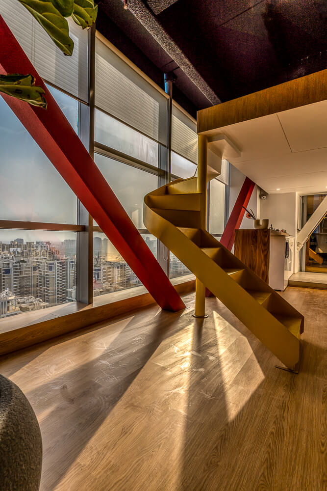
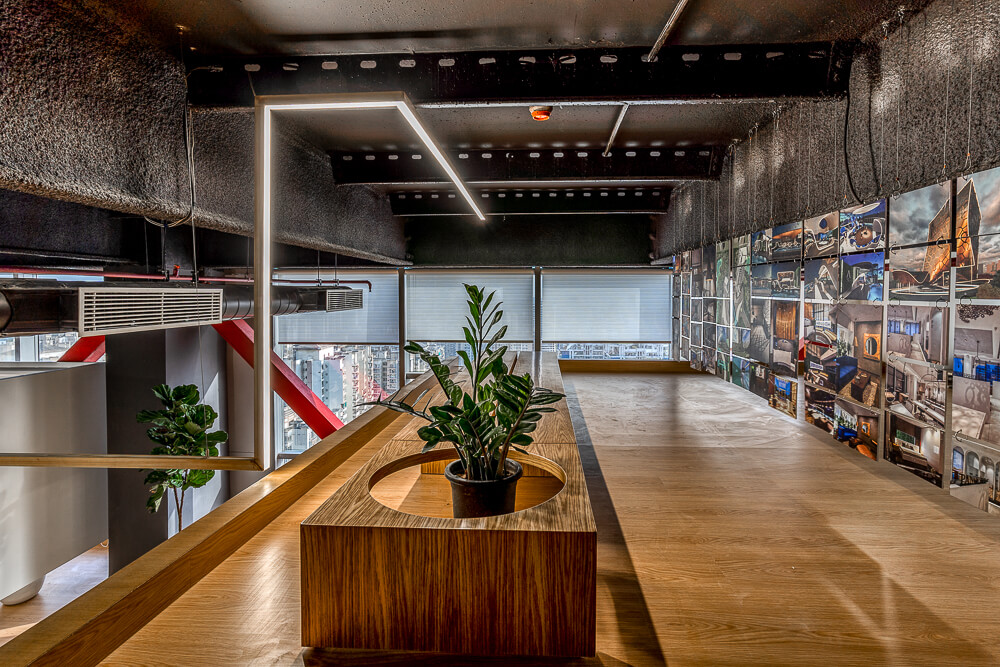
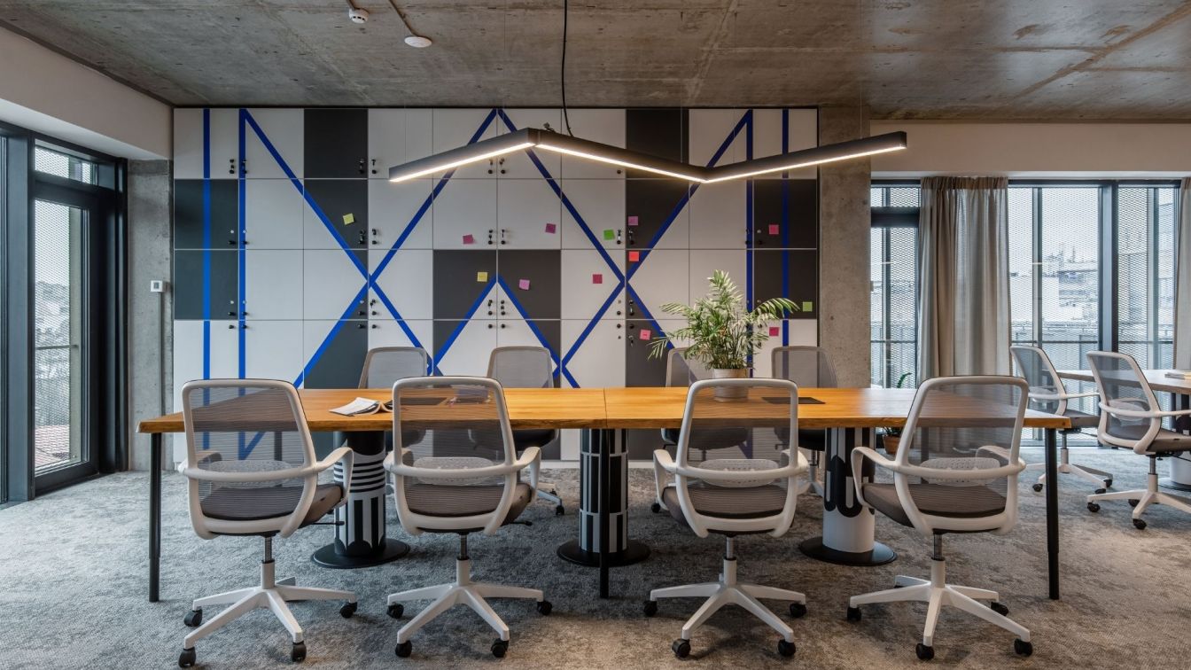
Studio Arquite’s new Noida office corresponds to the next-generation entrepreneurial mindset that does not conform to the rigid rules of traditional monofunctional offices. By keeping it simple and adaptable to the employees’ needs the office corresponds to the four principles – transparency, flexibility, sustainability, and minimalism, thereby decluttering spaces.
The play of proportions both at vertical and horizontal levels, a sincere dialogue between aesthetics of form and the practicality of function along with the simplicity of the material, all contributed to shaping the space.
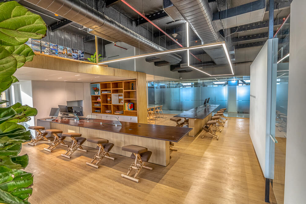
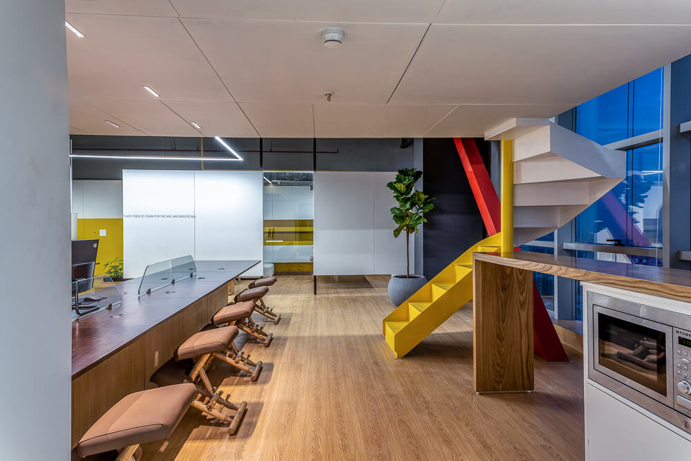
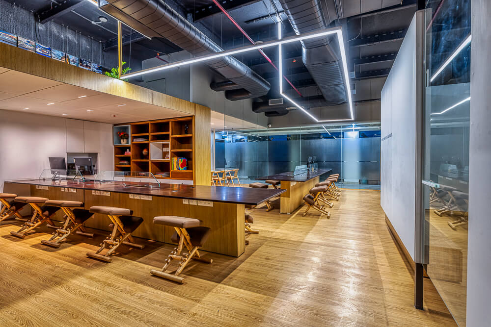
The 1500-square-feet floorplate differs from the typical cabin and cubicle design. It follows an open plan – in terms of layout, communication, and work too. Clean geometric forms become the basic sustainable tool for design development.
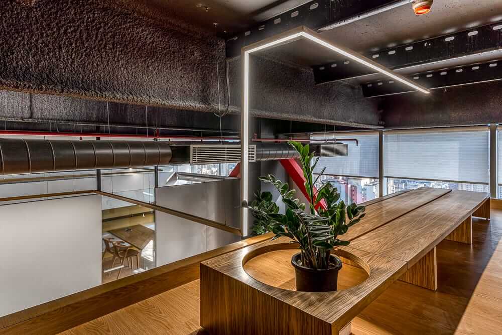
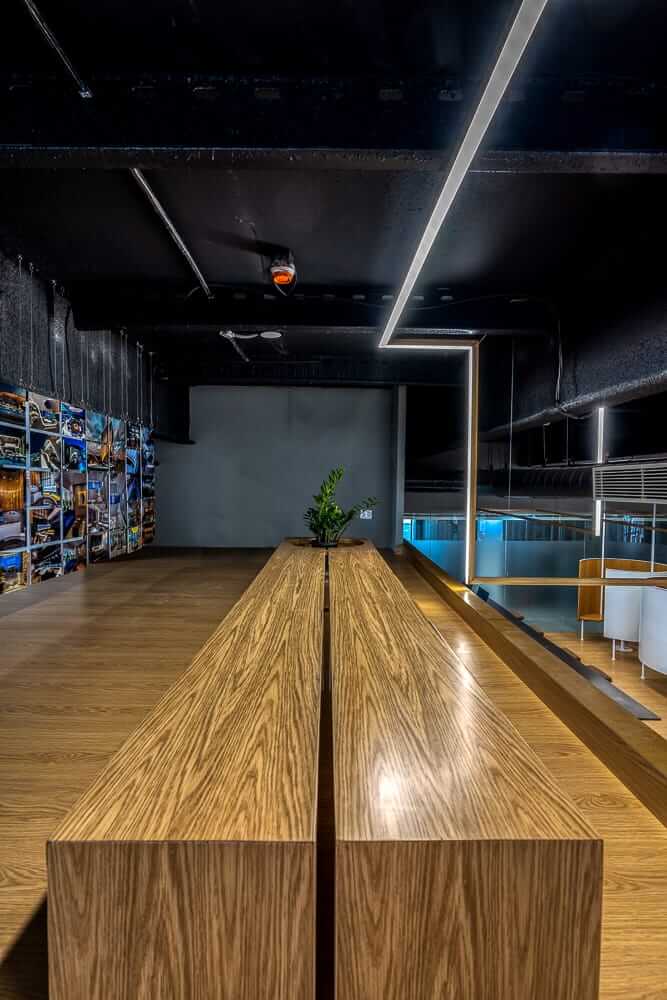
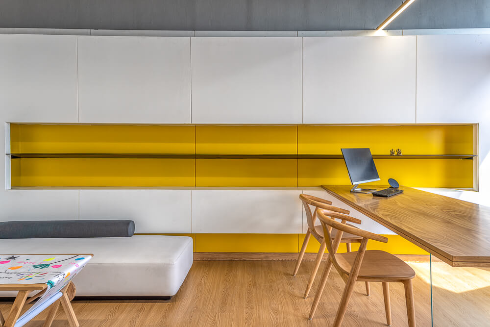
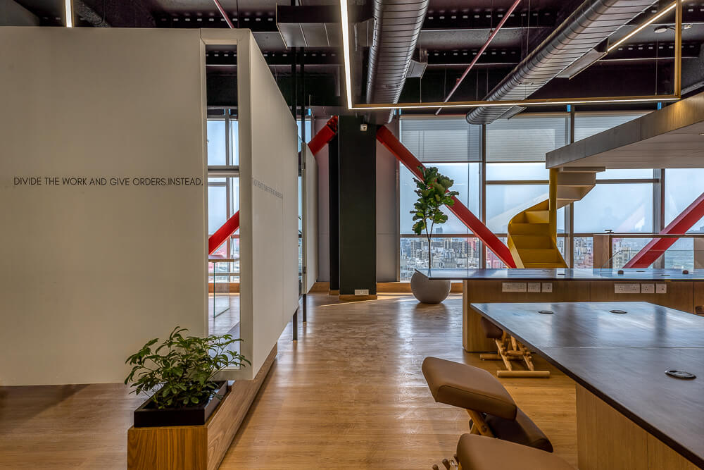
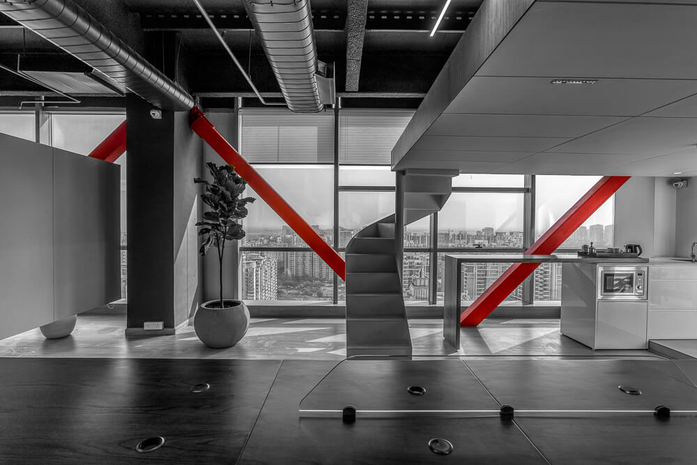
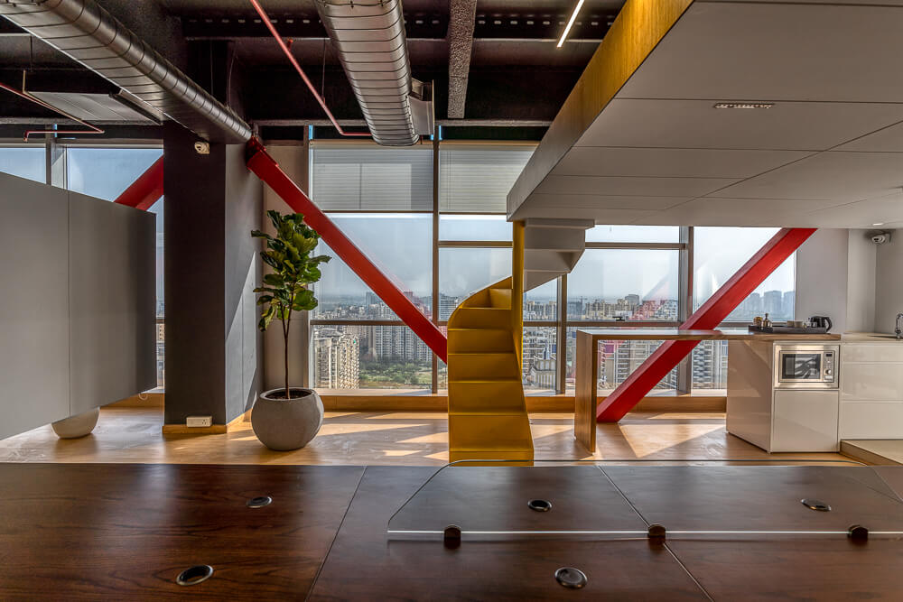
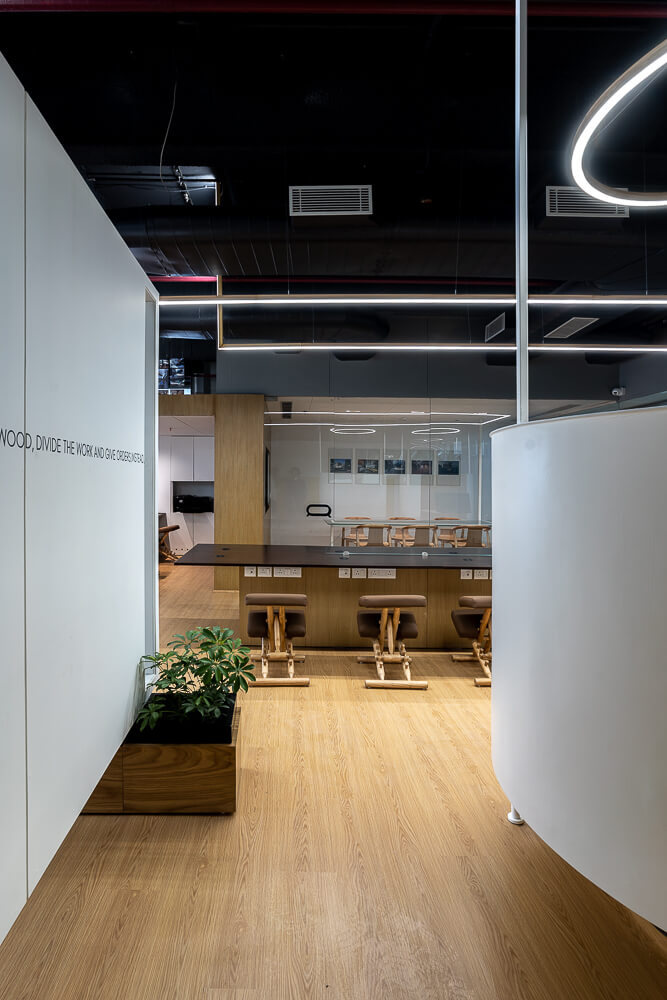
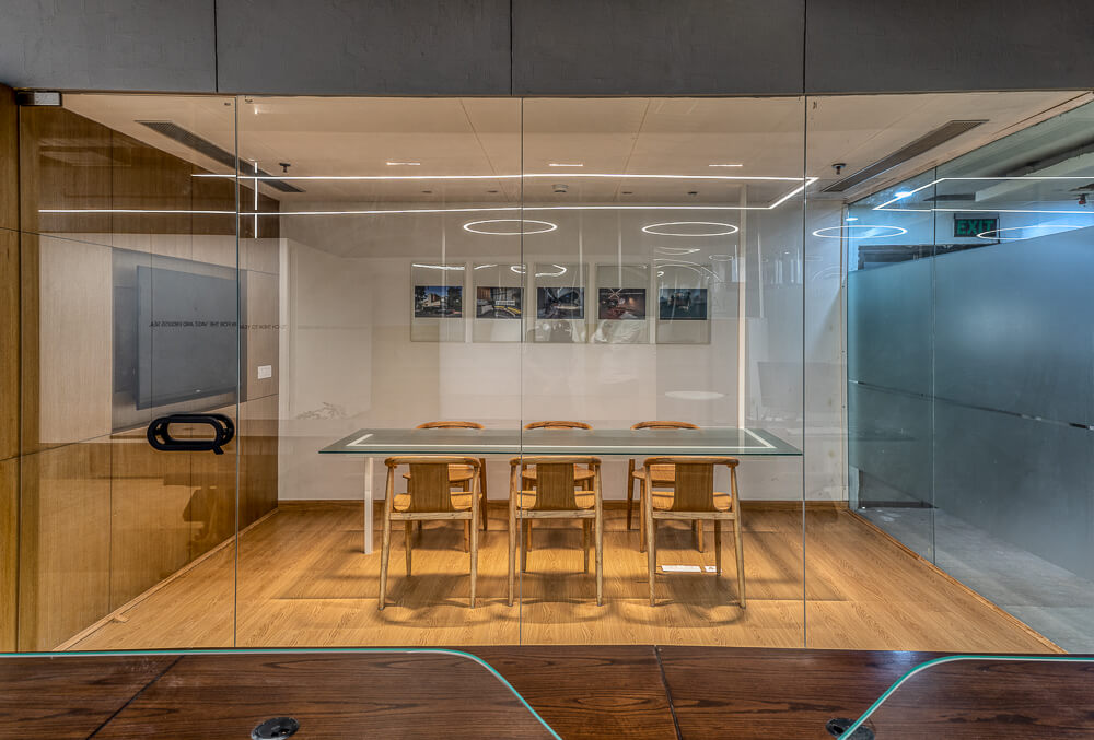
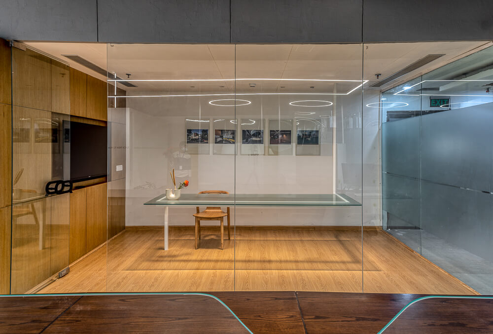
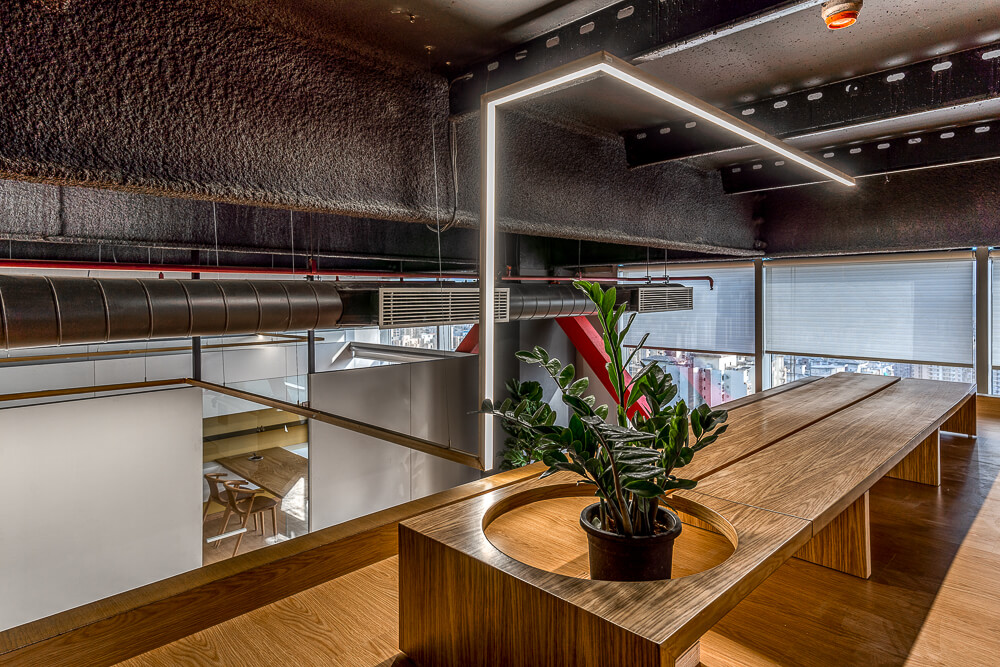
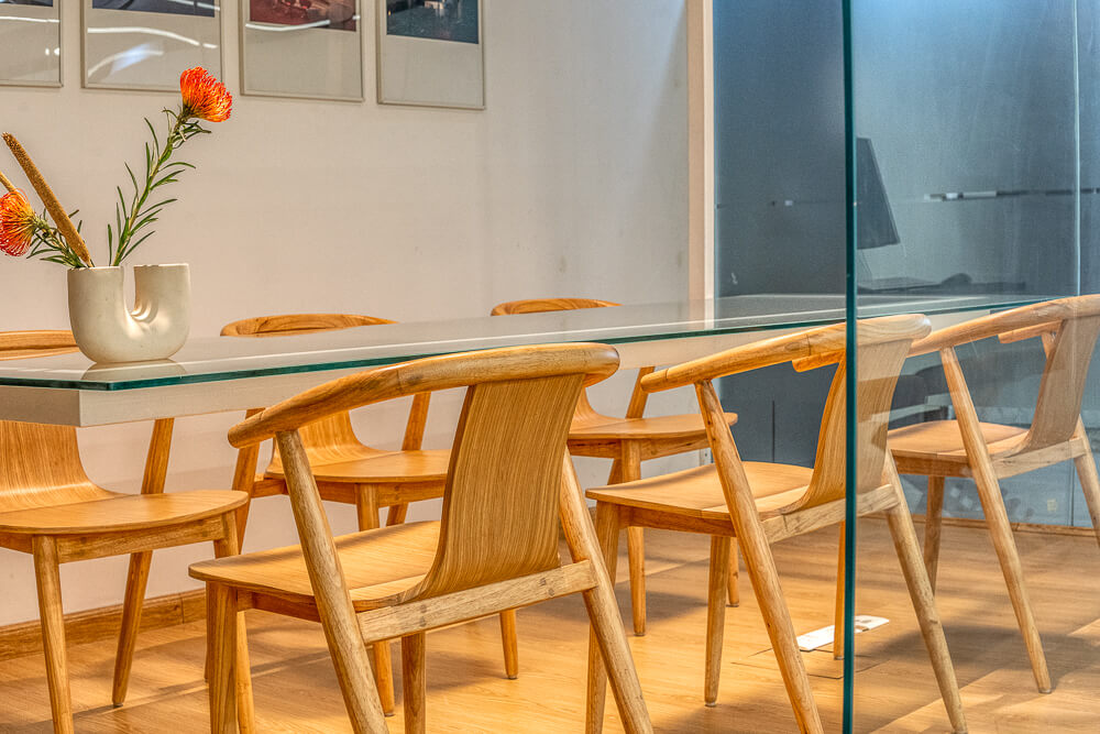
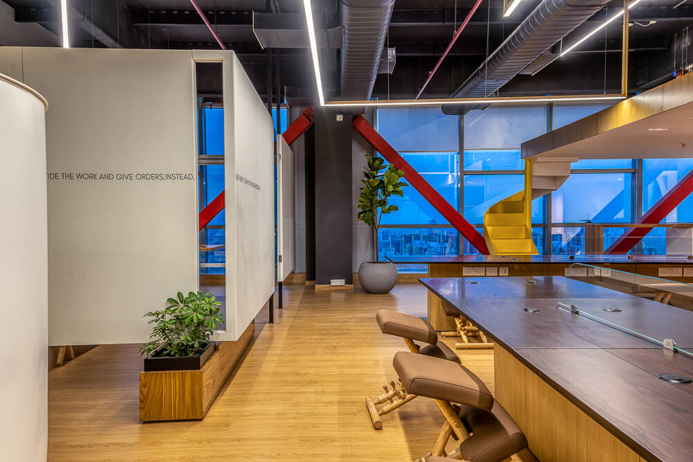
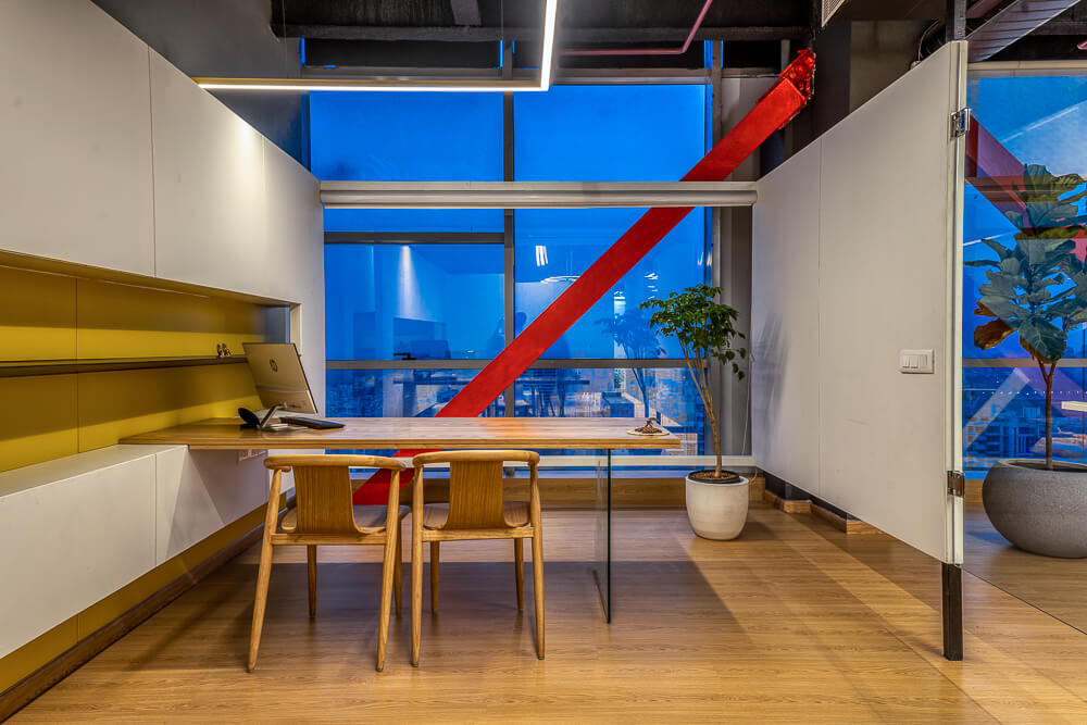
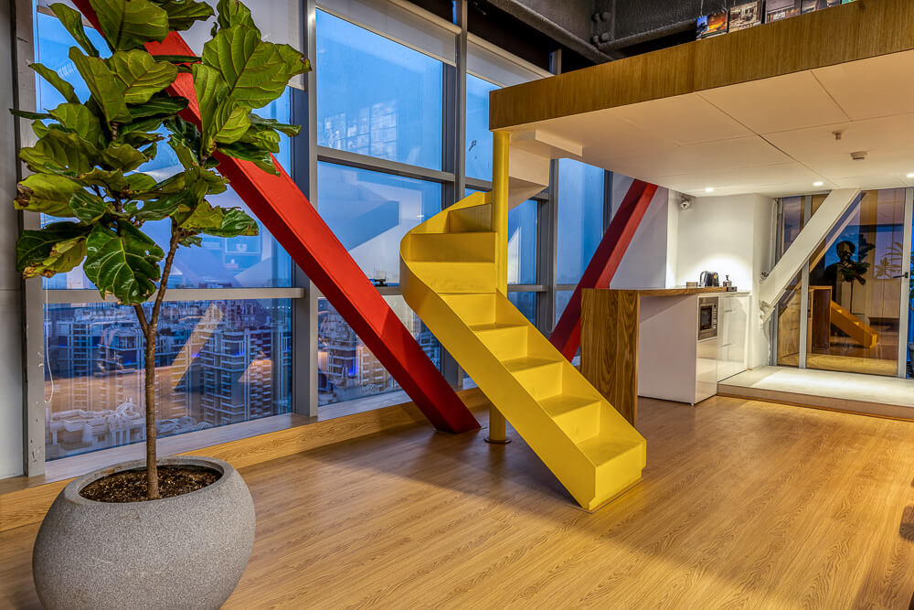
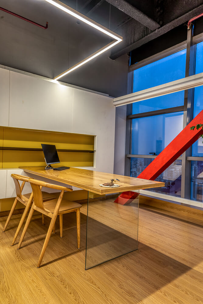
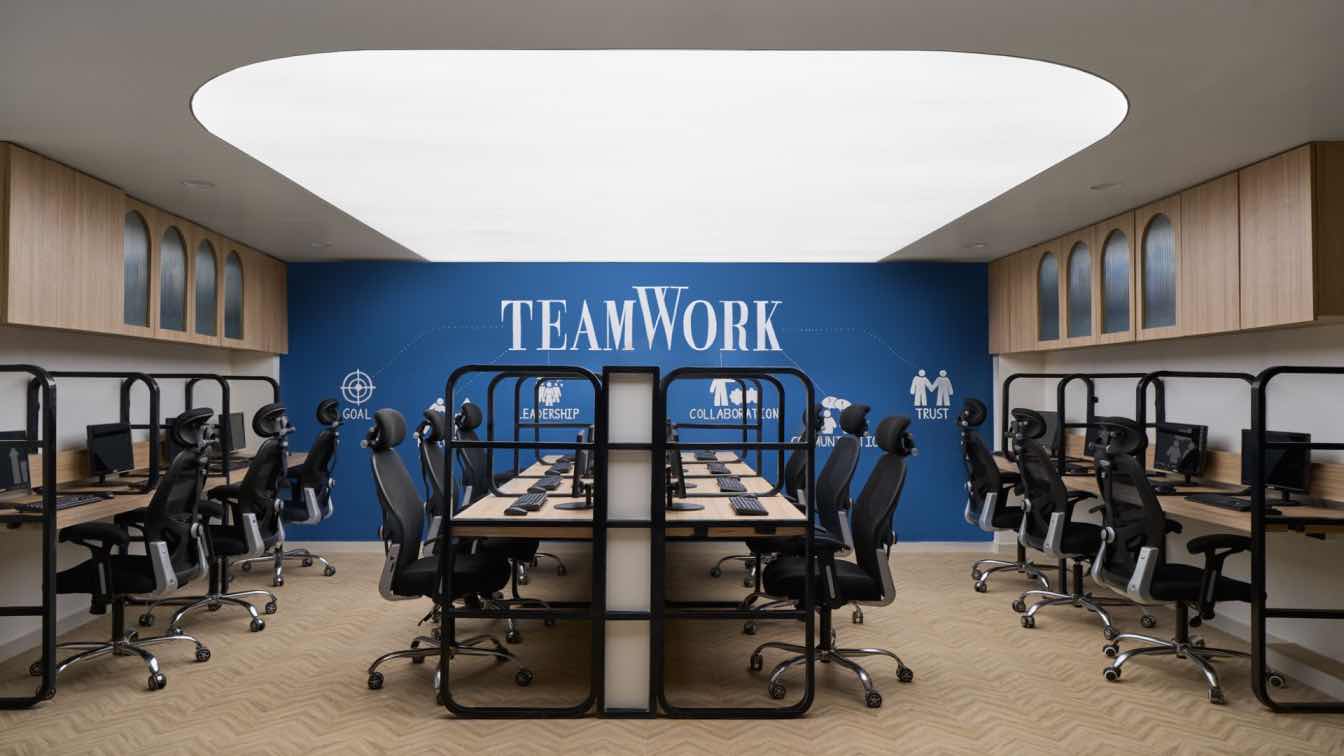
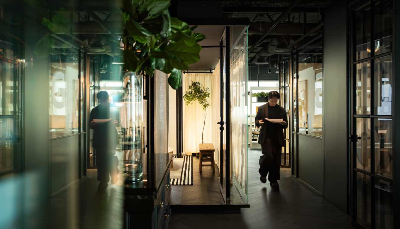
Large islands equipped as workstations anoint the office offering flexible seating, while comfortable cushioned stools substitute work chairs augmenting space. A multi-functional island anoints the mezzanine – a space for informal meetings or dining or an impromptu gathering. Besides, the layout accommodates a glass-encased conference room and a very un-executive executive room.
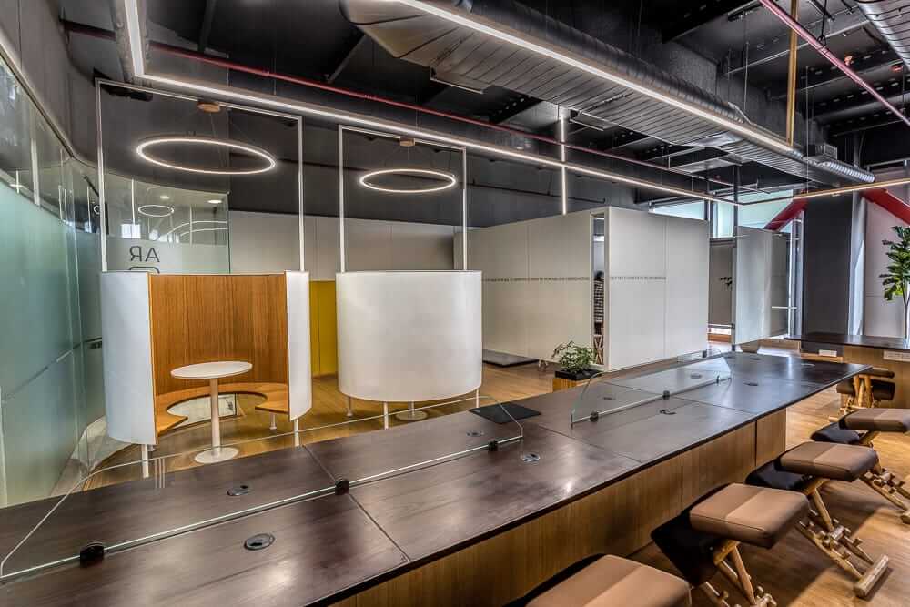
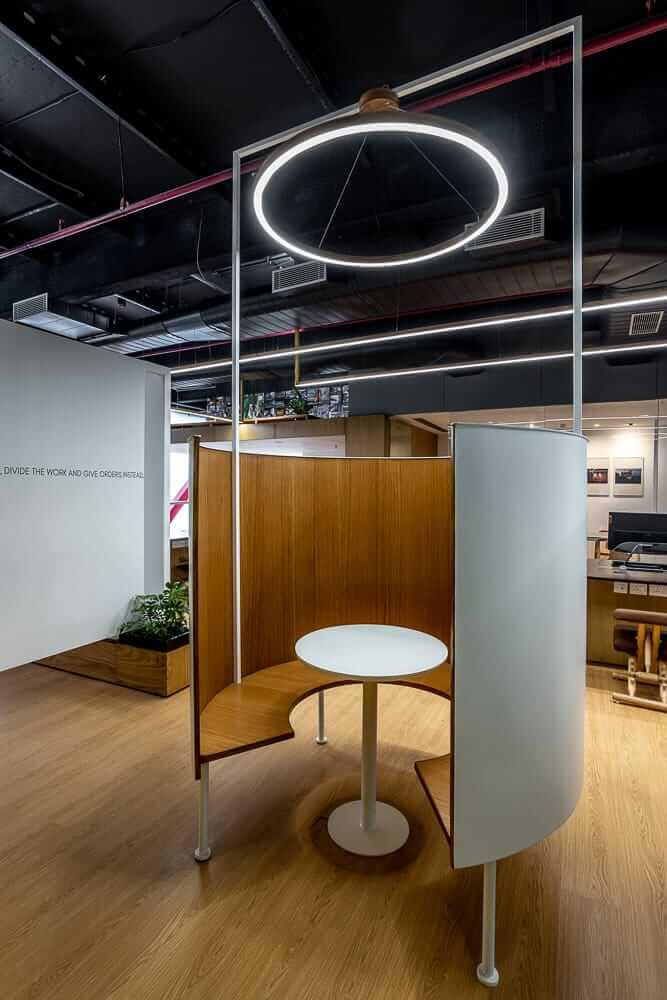
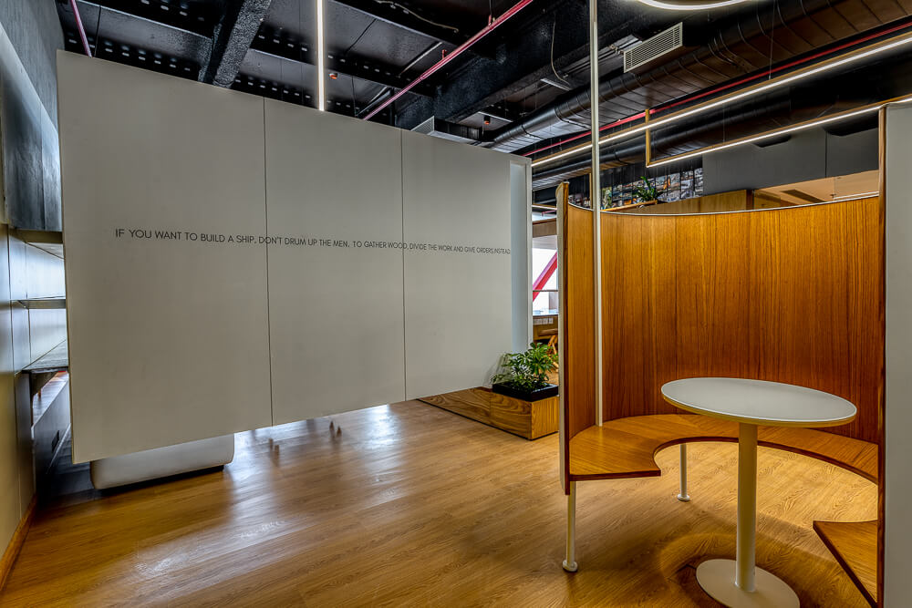
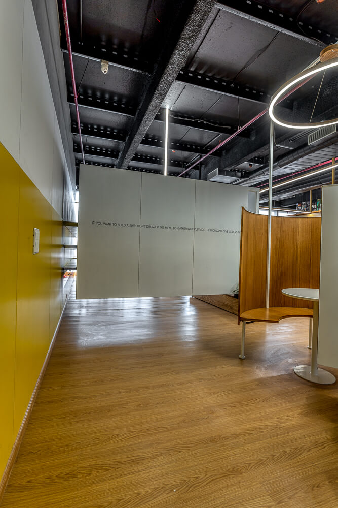
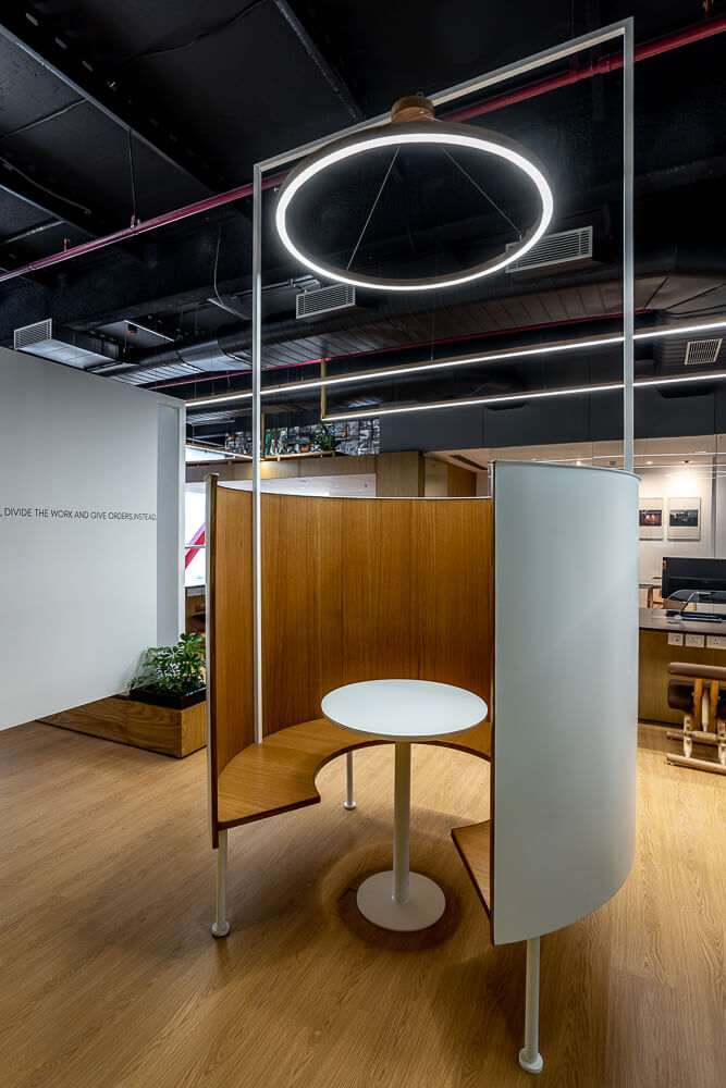
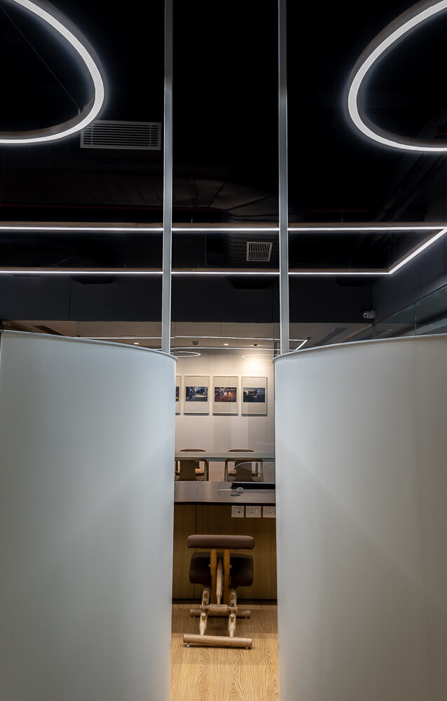
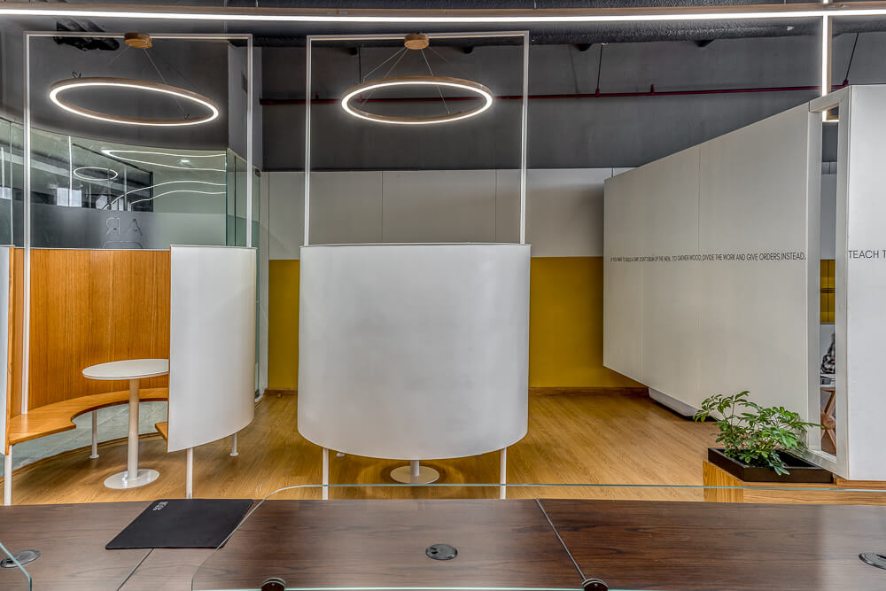
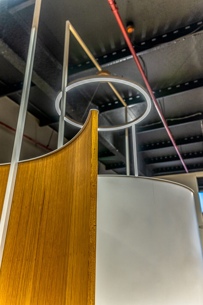
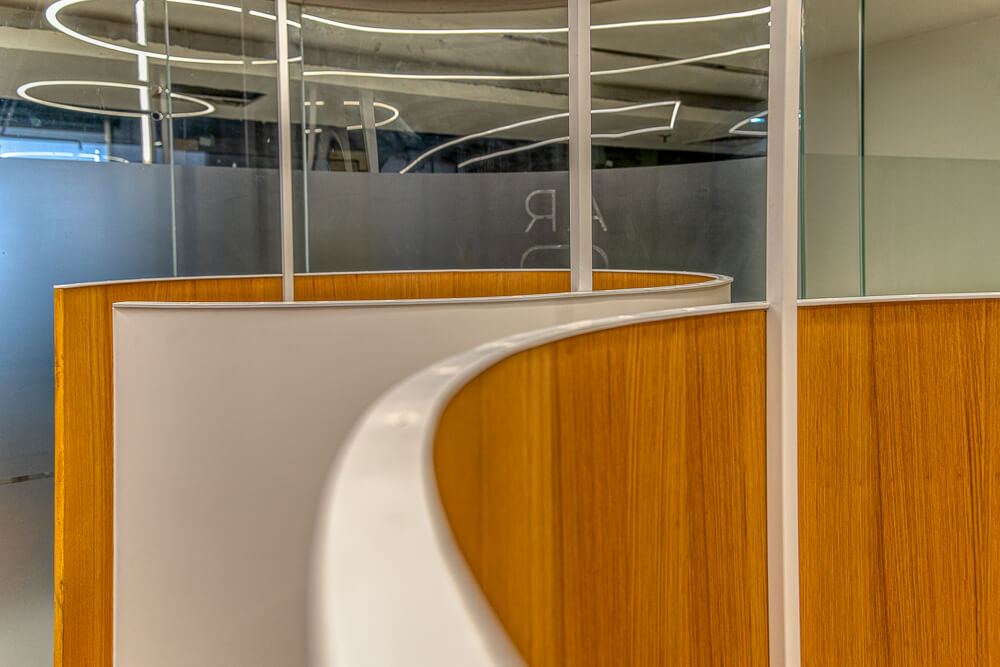
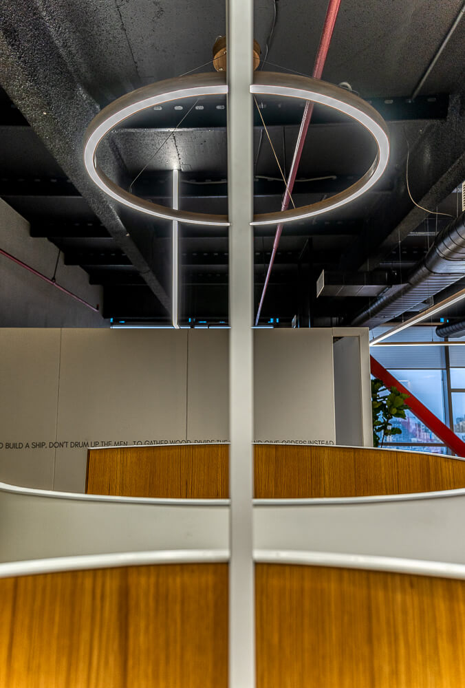
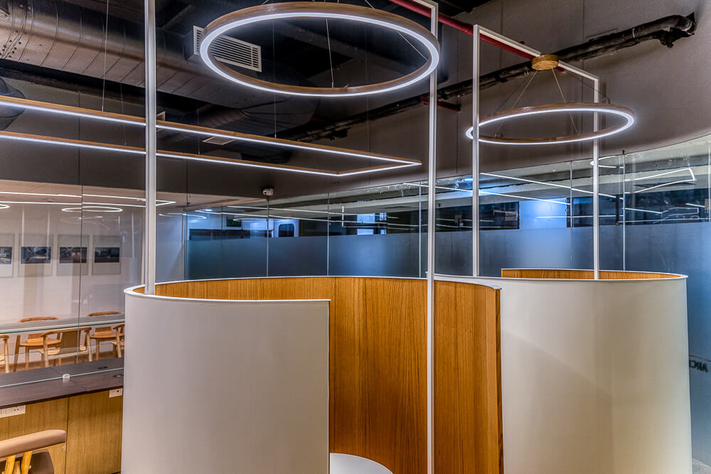
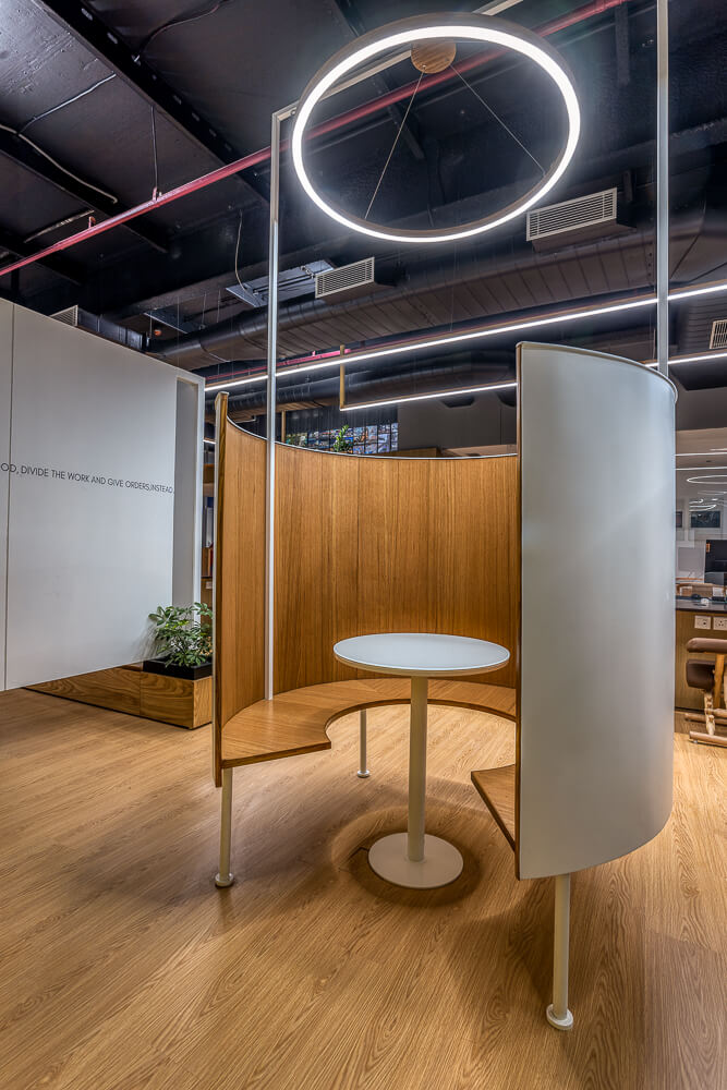
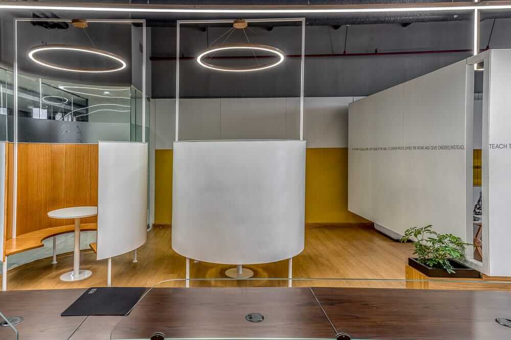
Floating pods, designed as rotund inserts, act as mini private spaces and constitute the highlight of the office. Not only do they break away from a traditional layout and infuse a fun element, but also become the cynosure of all eyes, adding an element of intrigue.
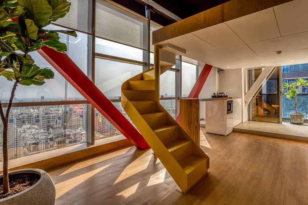
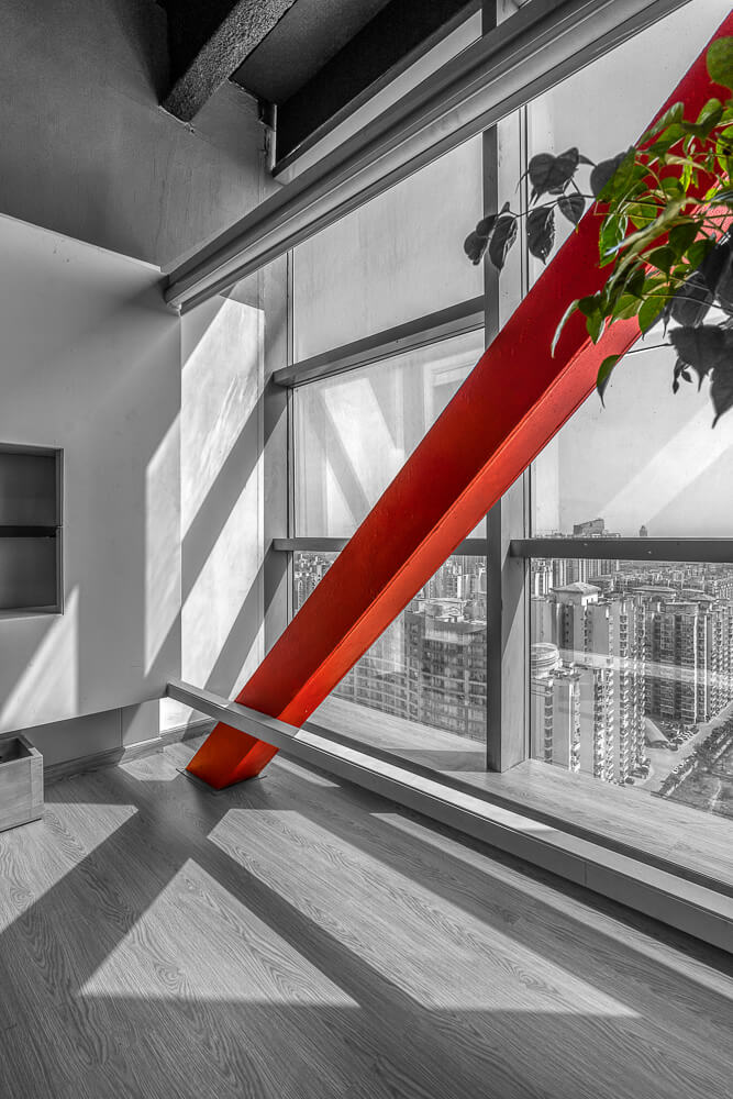
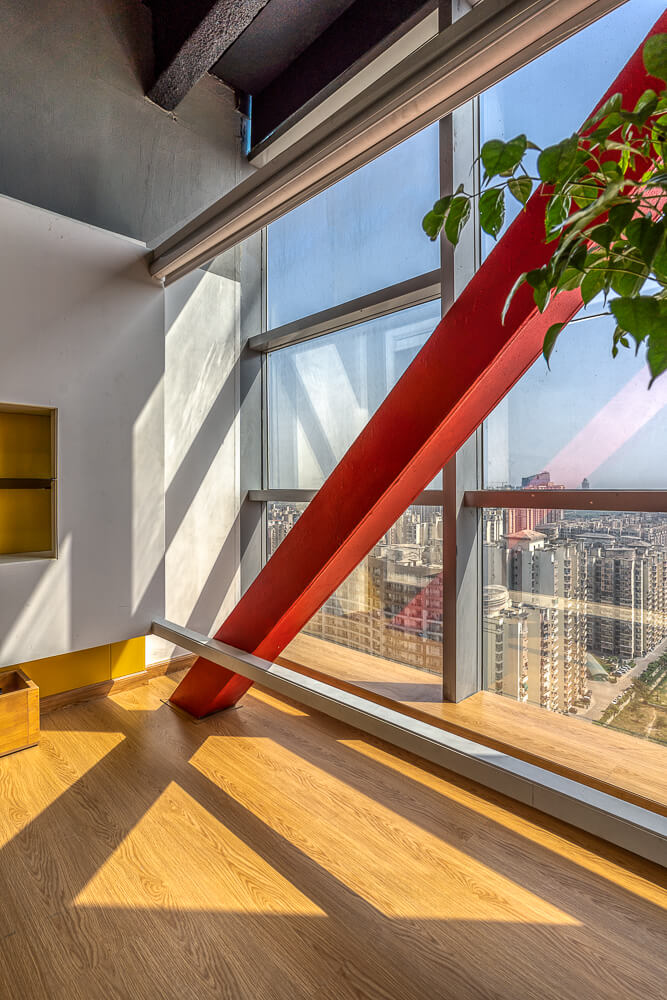
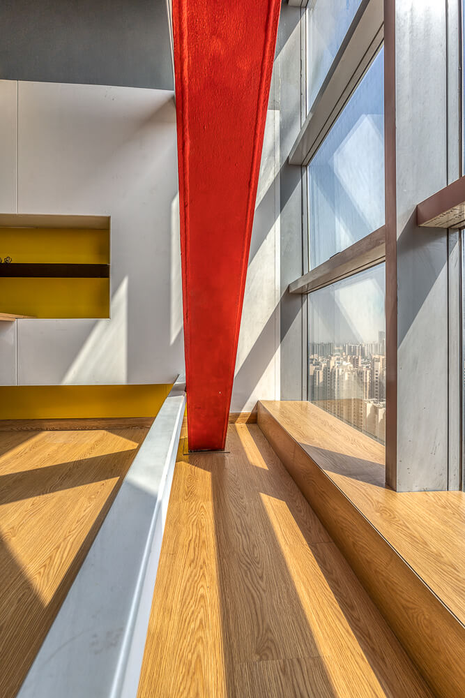
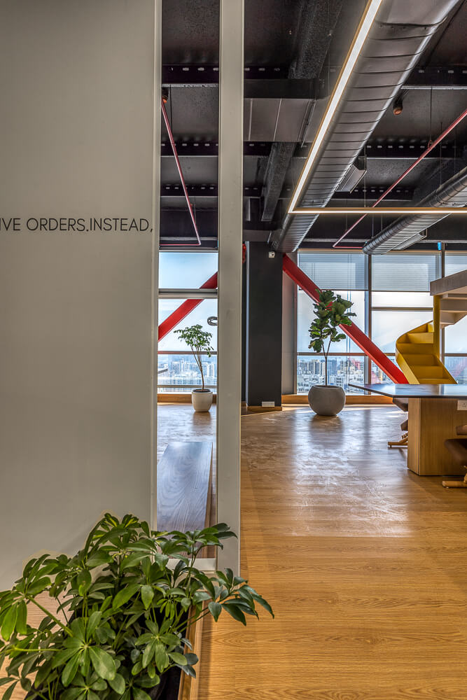
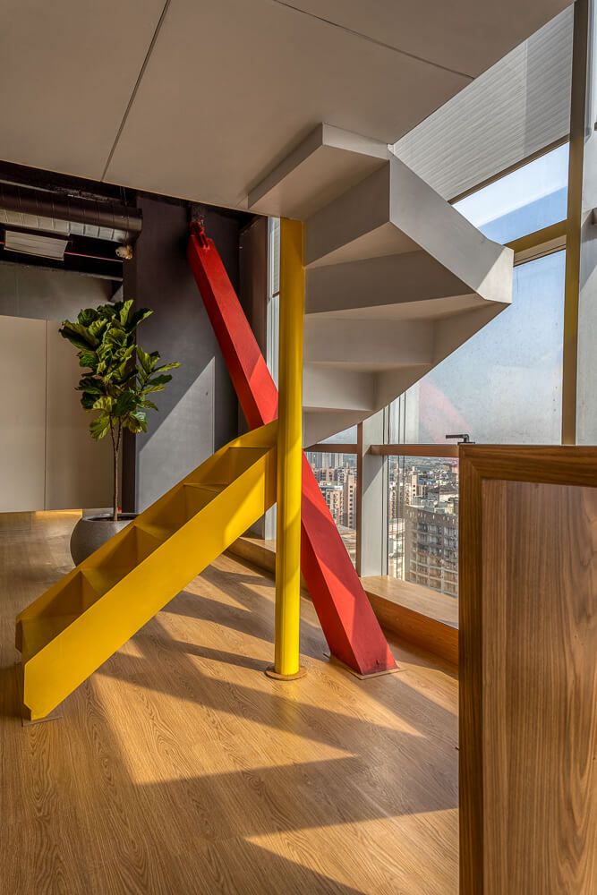
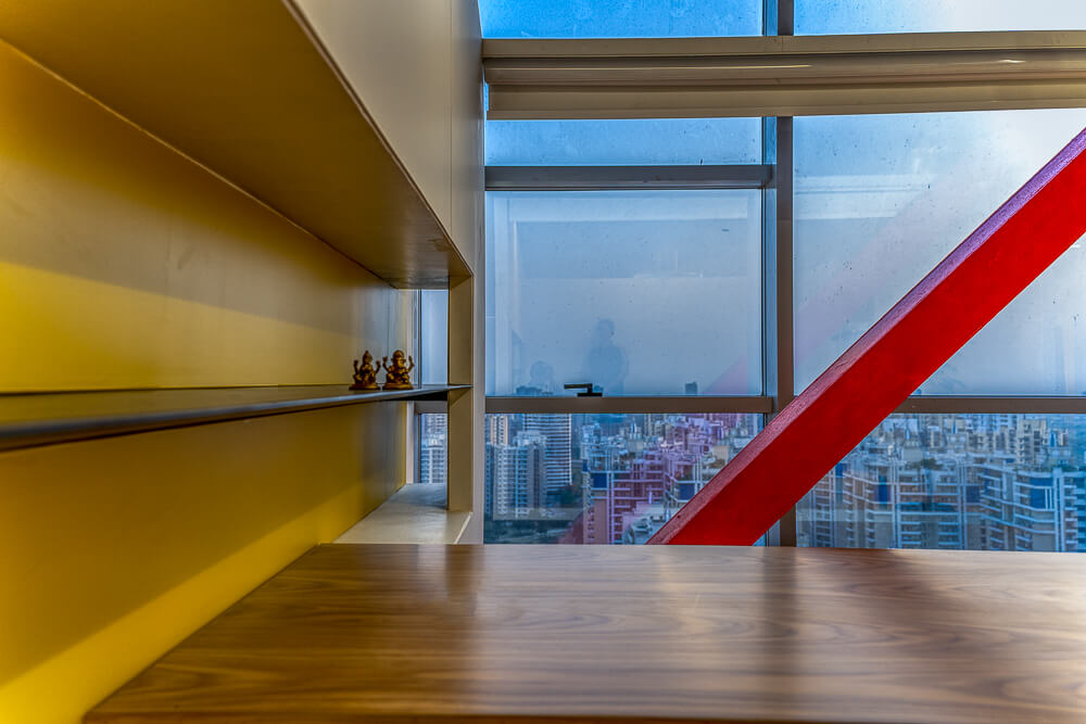
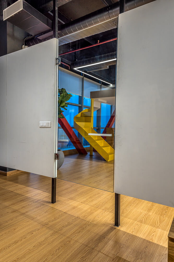
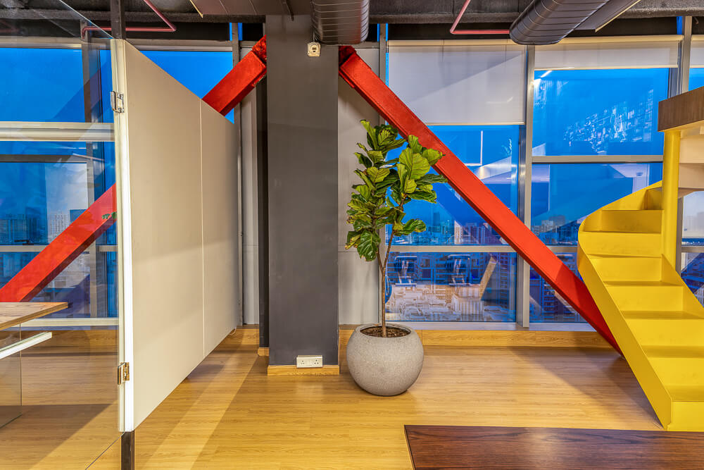
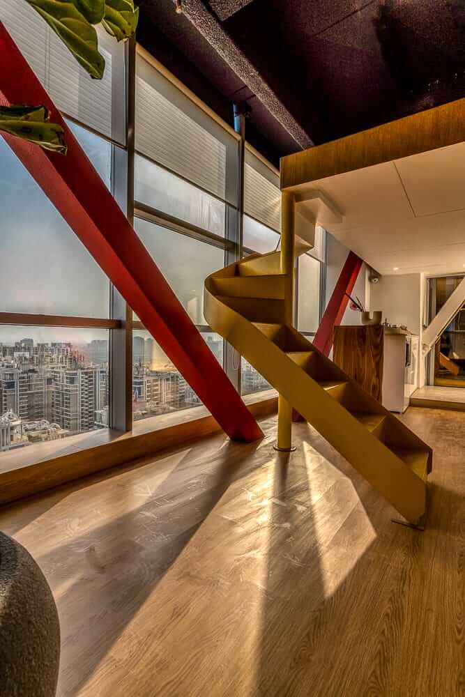
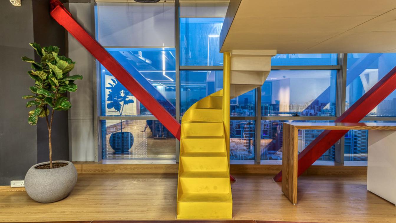
With spaces stylized to surrender to the adjoining city skyline, a beautiful interplay of light and shadow adds to a functional material palette of MDF and metal in the floating partitions, an all-wood flooring ensuring seamlessness, and tinted glazing on the large floor-to-ceiling windows with frosting at the level of the lintel.
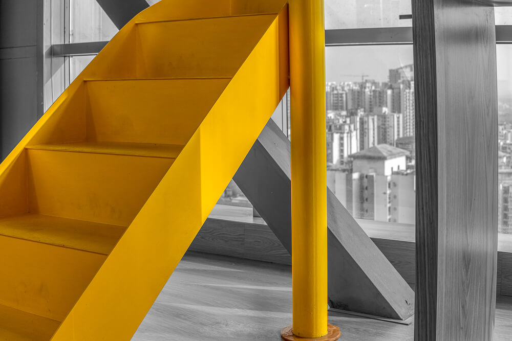
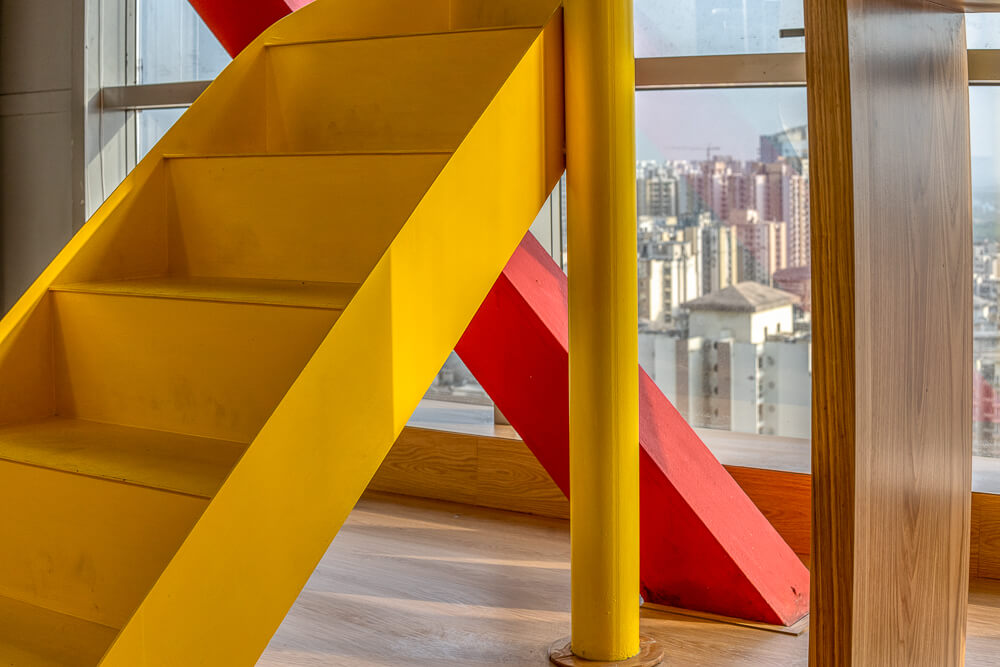
Prioritising the right kind of energy to enhance productivity, primary hues like red and yellow highlight the raw industrial nature of the exposed structural members and add vibrancy to the otherwise neutral palette, whilst an exposed ceiling furthers the idea of transparency. A touch of quirk in the choice of light fittings adds an oomph factor!
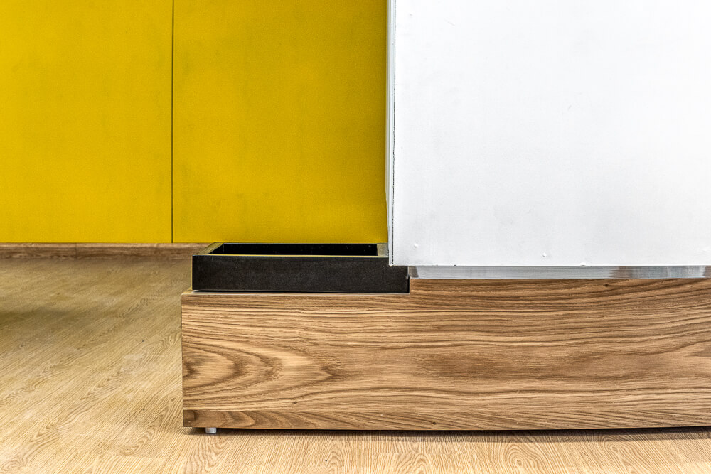
The office stands out for its fluid layout, floating volumes, and keen sense of detail. Combined with minimal use of material, it defines functional aesthetics in the face of a fast-paced scenario where change is dynamic.
Article Authored by:-Ar. Kritika Juneja
