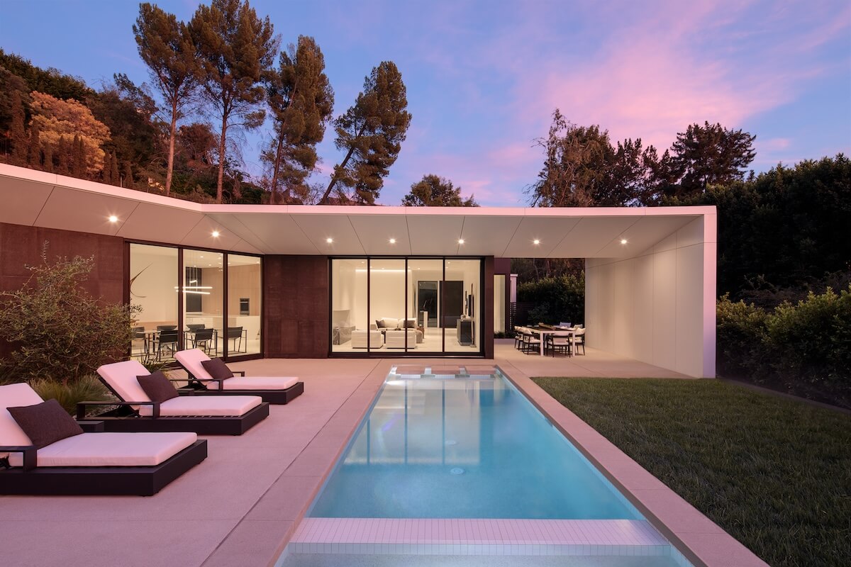
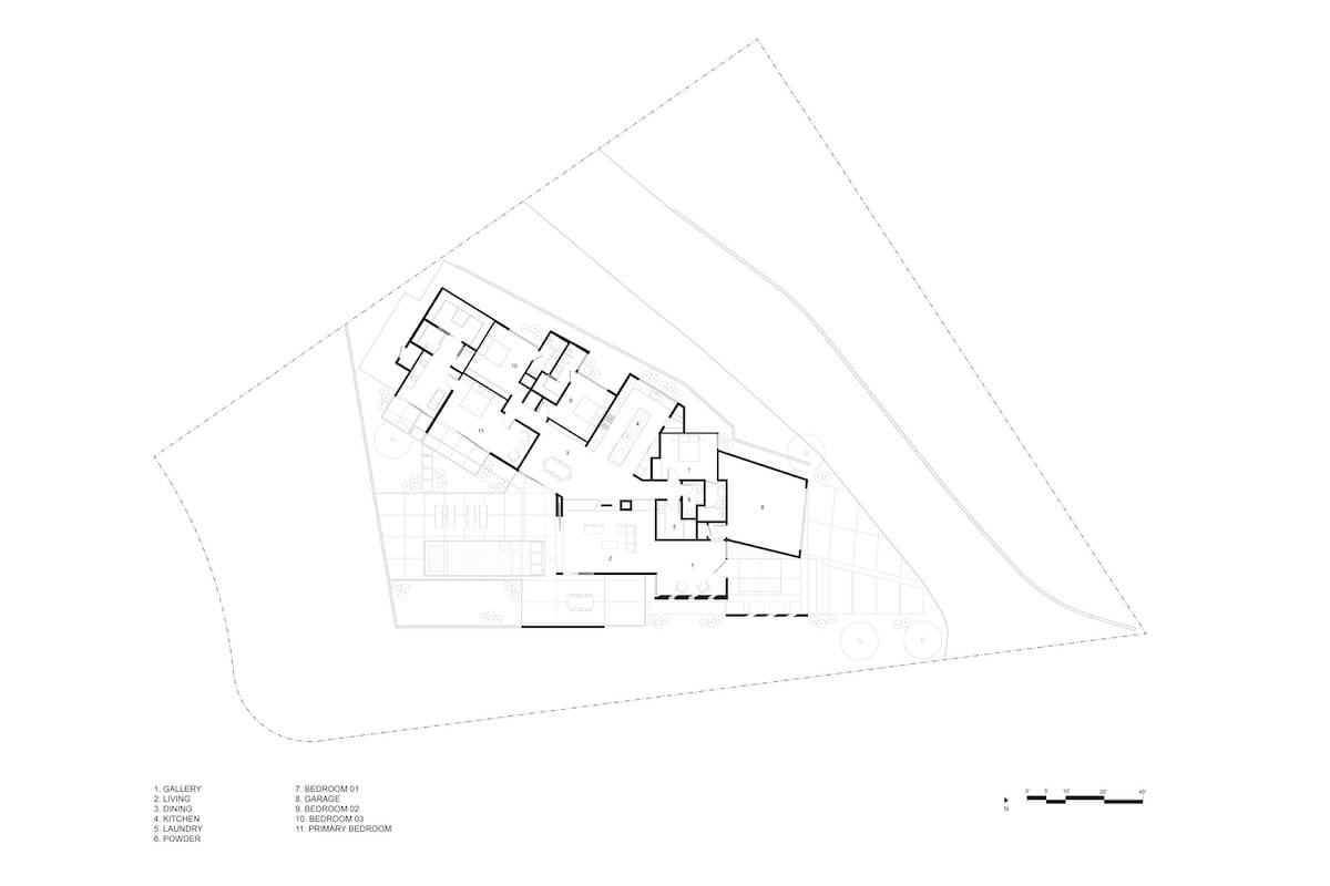
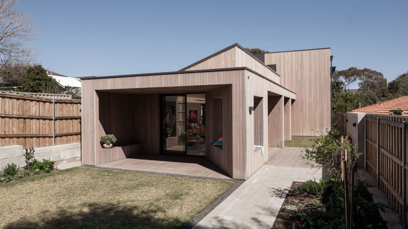
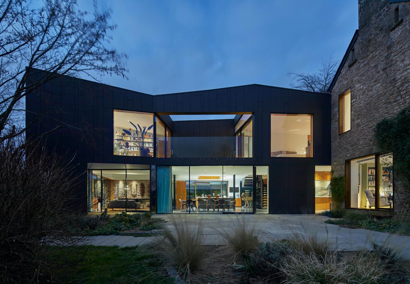
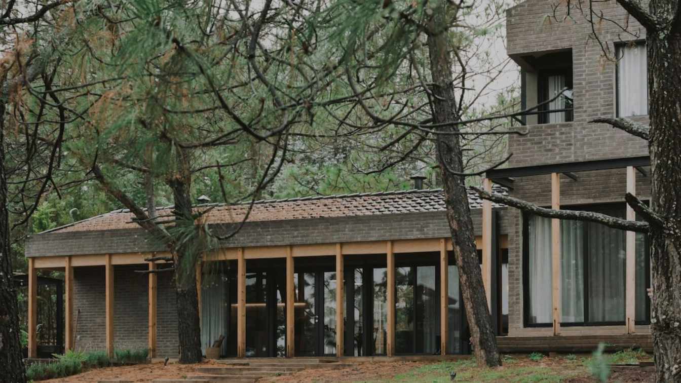
Zyme Studios: This four bedroom, 4,000-square-foot residence was generated from two existing walls with inverse trajectories. The vertex is the starting point to a perpetual line that runs through and generates the building’s form. The attempt was to drive the user into a dynamic pre-entry space where thinness is used as an asset to create an experiential change. A repetition of openings blends the transition of courtyard to entry gallery, while a water feature follows along the entry path with an implied connection to the pool and hillside view. With each step the angular subtractions in the form manipulate transparency. This repetition continues into the residence and is then transitioned into voids in the roof between rooms, subtly separating the spaces and allowing for penetrating light.
The common spaces radiate around a fireplace which conceals existing columns needed to maintain the structure. Each room frames a different portion of the property. The kitchen view faces a private garden to the east to allow for morning light. The living room activates the pool and exterior lounge. A sloped overhang was developed to provide shading, with a tapered profile that runs from the exterior to the interior, penetrating the ceiling and creating a light cove for the living and dining rooms. This roof projection was one of the more challenging aspects of the project due to its size, shape and connection to the existing structure. The dining room benefits from the attributes of both the kitchen and living room. A skylight at the kitchen suggests a separation between adjacent spaces and transforms the atmosphere throughout the day, while a skylight in the hallway provides natural light in a shared entry to the bedrooms. The primary suite hovers over a garden, which provides privacy.
Portions of the exterior facade are panelized in fiber cement integral color panels to create a graphic quality and meet high fire requirements. Contrasting stone accentuates depth of the roof form and detaches horizontal and vertical planes.
