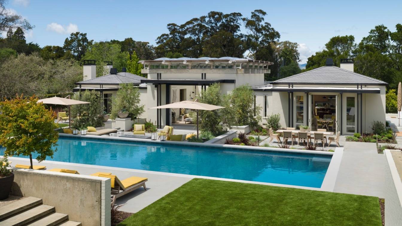
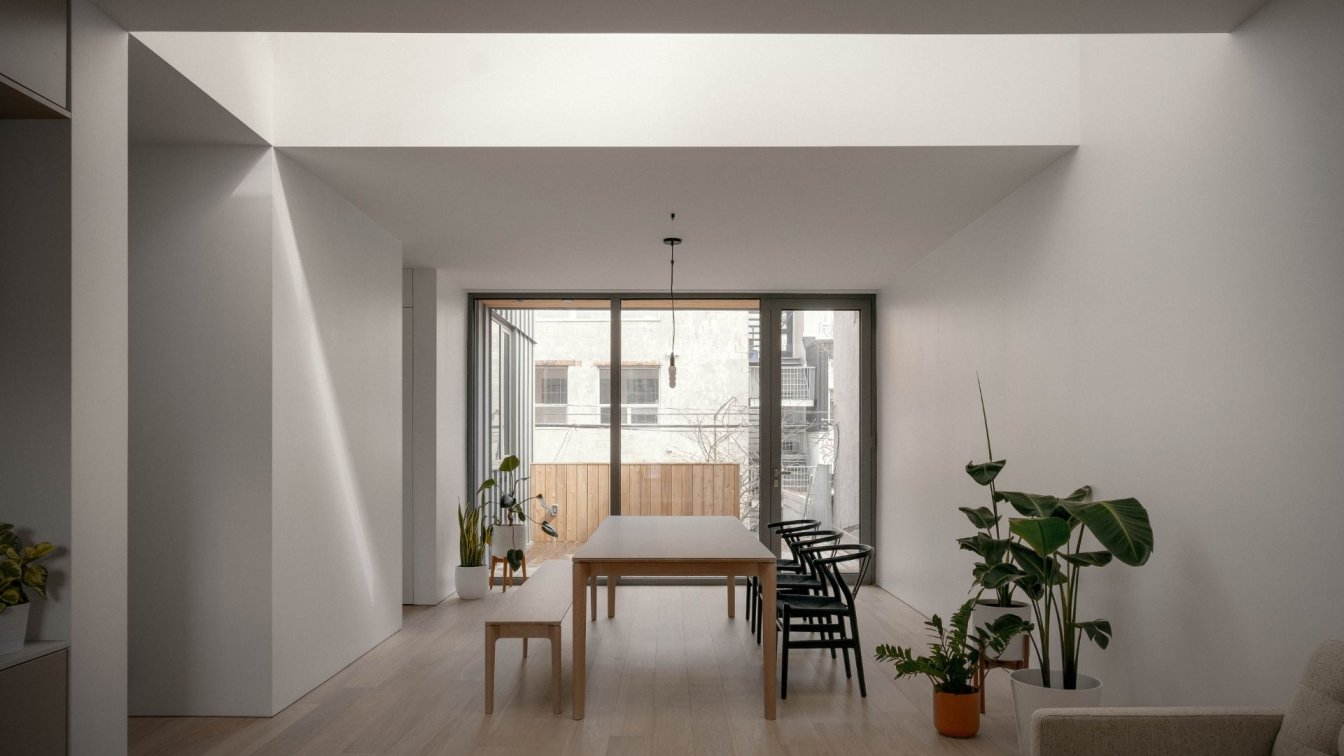
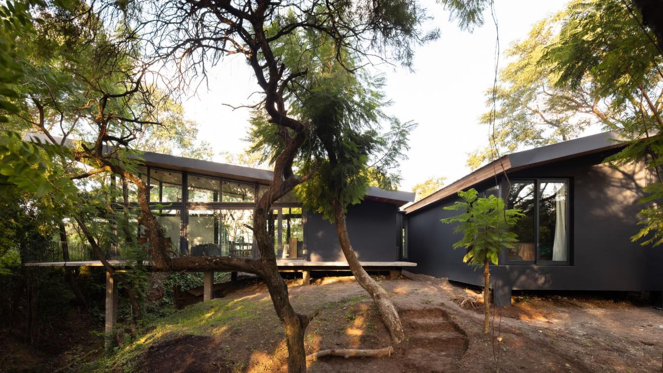
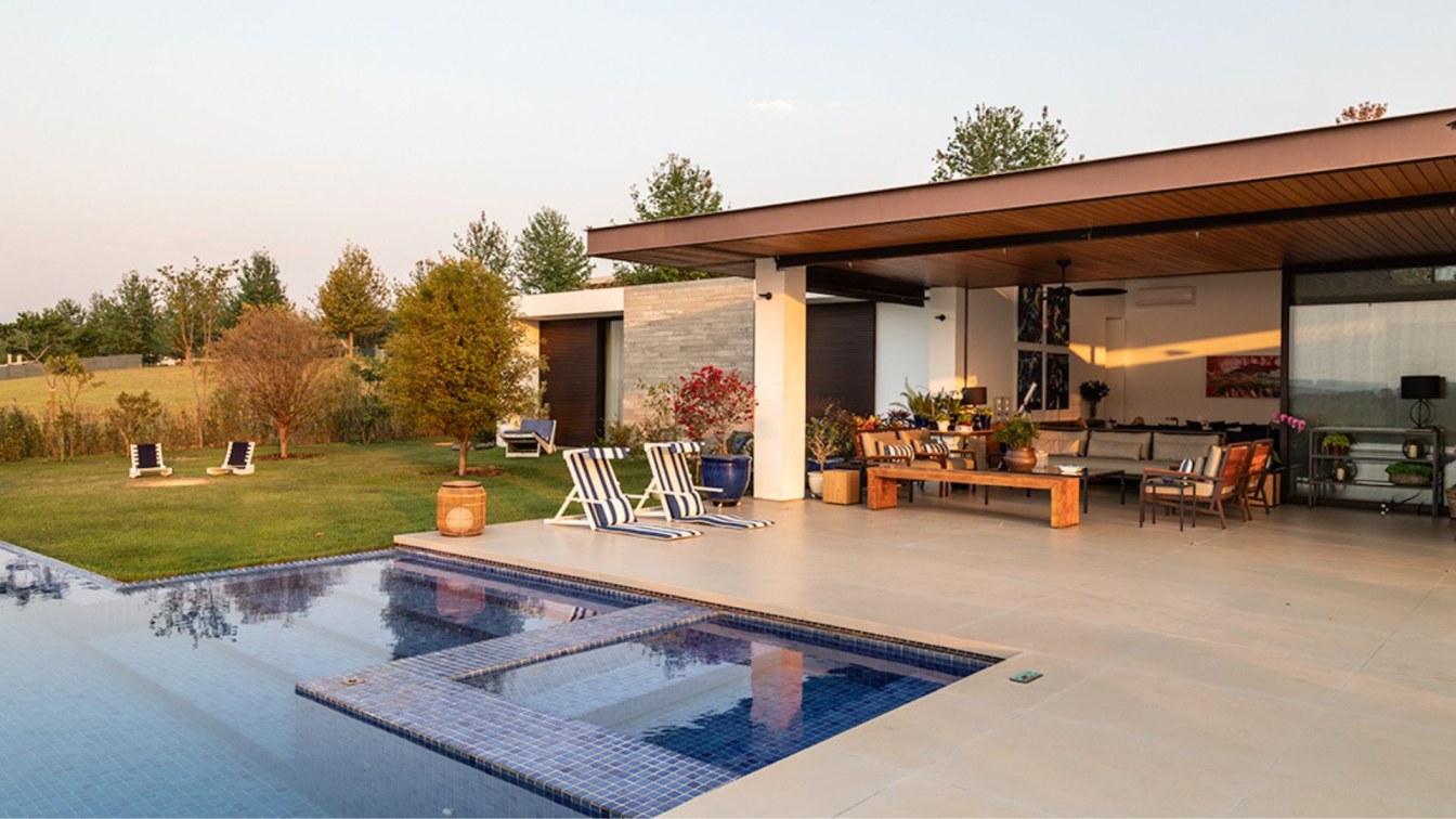
McIntyre House is a distinguished mid-century residence in the San Francisco Bay Area that has been remodeled by Richard Beard Architects and The Wiseman Group.
Originally designed by Joseph Esherick and built in 1961, the conservative interiors of this muscular, concrete-framed house had been a design concession to Esherick's clients who wanted a semi-traditional aesthetic. New owners commissioned Beard's office and The Wiseman Group to rework the house and better capture the spirit of Esherick by opening the floor plan and more directly connecting the interiors to the expansive gardens. The result is a house reborn and more fully aligned with Esherick's typical vision. It's a wonderful transformation and a fantastic project, plus there's art.
Located near San Francisco, this mid-century home needed an update. Nearly fifty years after it was designed by famed Bay Area architect Joseph Esherick and landscape architect Lawrence Halprin, the house had become something of a relic. Modern, muscular architecture concealed a floor plan that was no longer suited for a contemporary lifestyle—the original interiors were surprisingly traditional and divided into a rabbit warren of small-scale spaces. The challenge was to reconfigure the layout and edit the interiors while honoring the large-scale architectural elements that made the house significant. Key to the renovation was reorienting the living spaces to the large central atrium topped by a dramatic concrete-and-glass ceiling and opening the house to the surrounding landscape. A mix of custom-designed furnishings and period pieces, as well as blue chip art now bathe the home in cool sophistication. Outside, the landscape and pool were restructured to better connect with the home’s interiors. The house, its interiors, and grounds, are now a harmonious expression that gives the home new relevance.

Frequent Q/A topics
Richard Beard responses
Were you (the architect) aware of the building before? what did you think when you first saw it?
In spite of being a big fan of Esherick, I didn’t know this particular house before I saw it with our clients. I loved it from the minute I walked in. It must have been so avant-garde at the time it was built. I was very impressed with the light and way the house was oriented to its gardens. Very innovative.
Where does the line sit between changing things and preserving the original character and architectural intention in such a project?
The character of the house is, and was, defined by a number of distinctive details and materials. Those we preserved, and enhanced. It would have been a shame to turn the house into just another lovely suburban home. What was odd was the compartmentalized plan. At a time when open plans were becoming an innovative architectural approach to composition, this house was comparatively segmented. We carefully opened a few things up, to give a more expansive feeling through the home.
How does the interior negotiate the dramatic and more unusual exterior?
The interior architecture (and The Wiseman Group’s décor and furnishing) plays to the era of the original design without being a slavish period set. Contemporary millwork and materials that are sympathetic to the era are used, but clearly of their time. I find it a huge compliment to not be able to tell exactly where original interior intersects new construction; you just know it’s awfully nice!
What materials were used for the interior, what was at the heart of the design concept?
Most of the materials were those used in the original design: concrete, re-sawn (lovely texture) painted wood interior paneling, Heath ceramics, oak cabinets. The limited palette plays up the contrast with the furnishings and artwork; the palette showcases the ever-present landscape.
What was your brief? what particular wishes did the client have? (both in terms of architecture and interiors)
Accommodating a very nice art collection, making a house livable for a family of five, respectful of the heritage but looking to the future. Make the house as relevant today for this family as it was when it was first built for the original owners.

Paul Wiseman responses
Were you (the interior designer) aware of the building before? what did you think when you first saw it?
I had worked with Joseph Esherick on one of his last projects.
Having great clients to collaborate with when doing historical work is imperative to a successful job. In this case, we had amazing clients who dug in and educated themselves.
Where does the line sit between changing things and preserving the original character and architectural intention in such a project?
It was Richard Beard’s inspiration to open up the flow of spaces. We have had a long relationship of trust and working on many projects in the past together, so our team was able to visualize his intent and create an intimacy within that context.
How does the interior negotiate the dramatic and more unusual exterior?
Fortunately, our clients were interested in a mid-20th century aesthetic. The original owner could not distinguish mid-century architecture from mid-18th century English country.
What materials were used for the interior, what was at the heart of the design concept?
The concrete atrium directed all of our material choices. We removed complex floor tiles and re-introduced plain concrete and natural wood where appropriate. Our choice of simple sisal carpets, Heath Ceramics tile and custom architectural furniture all to keep referencing the period and the scale.


