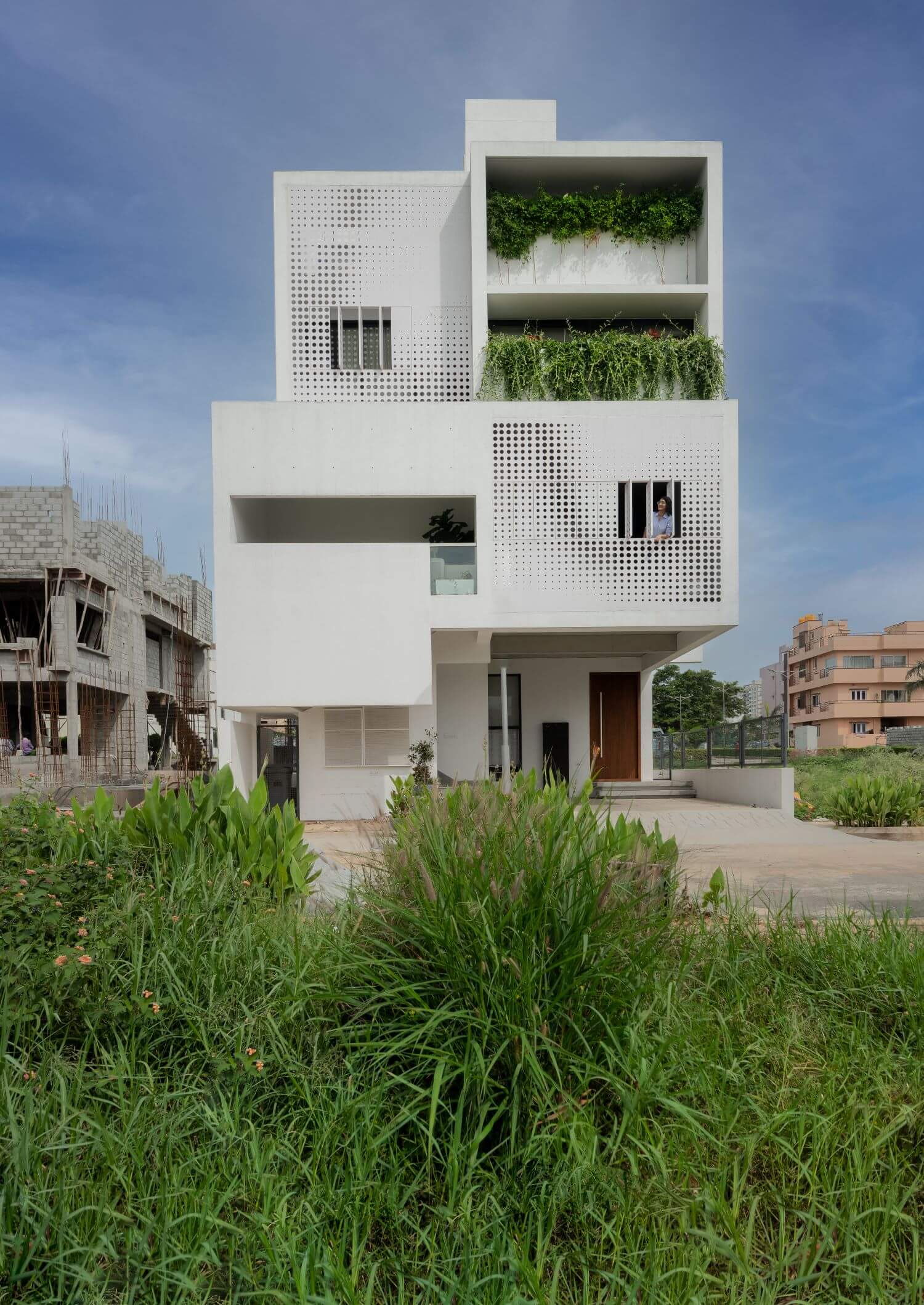
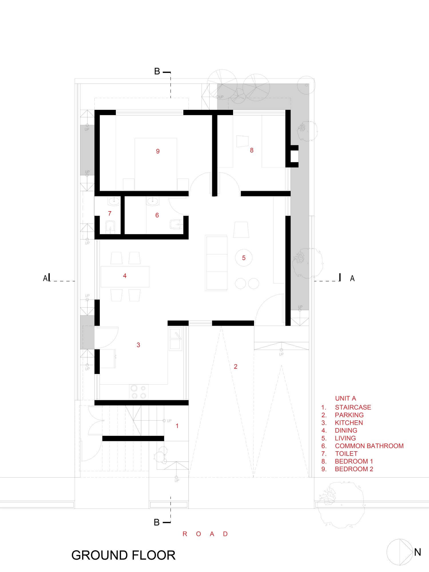
ma+rs: The site is a typical 30’ x 50’ peri-urban parcel of land located in towards the south of Bangalore, Electronic city. Trapped on three sides by plots which eventually will have neighboring houses, only the front opens out to the road allowing for provision of light & ventilation to the house. The idea was to ensure maximum availability of light and ventilation without negotiating the privacy of its inhabitants.
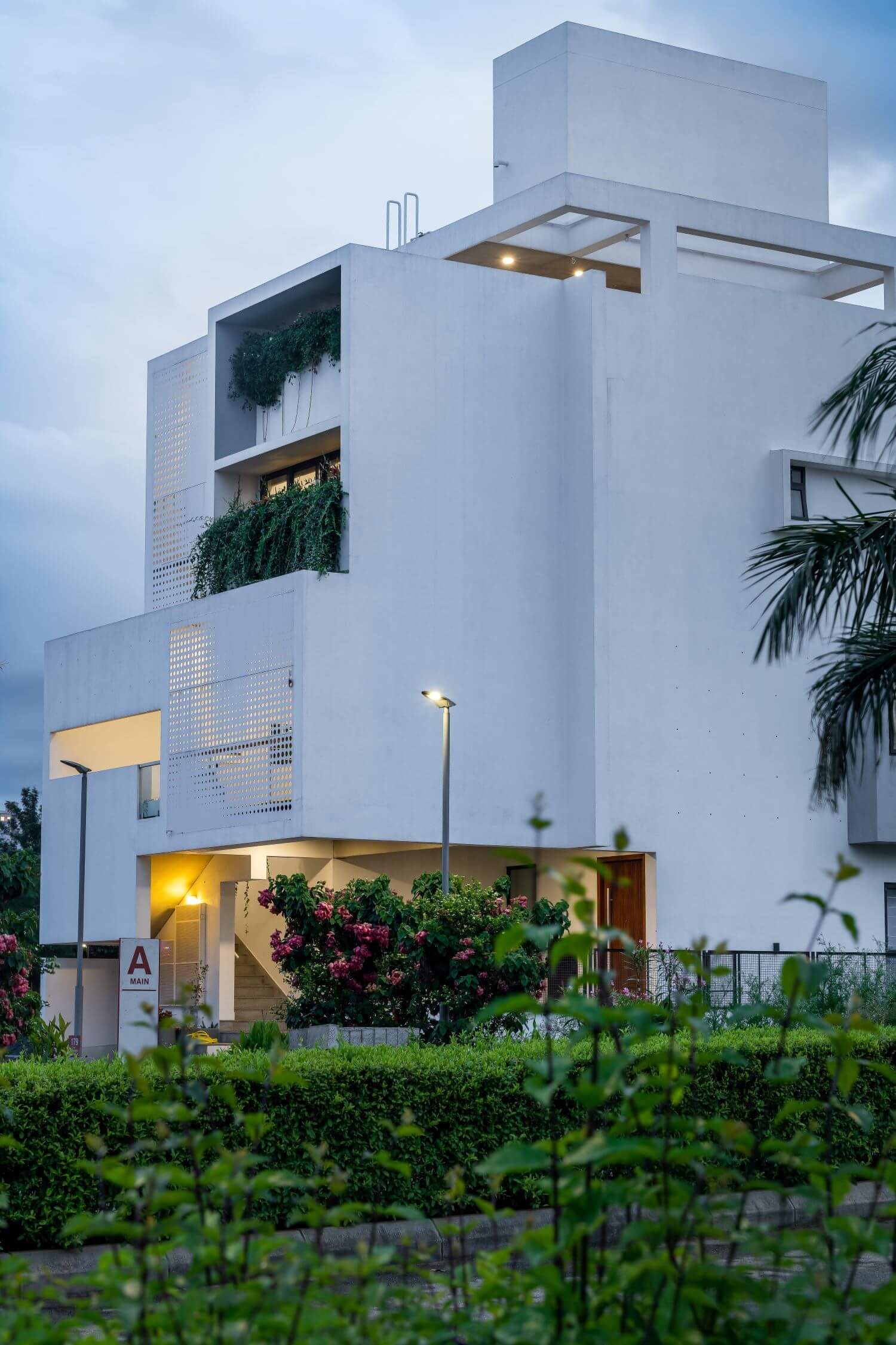
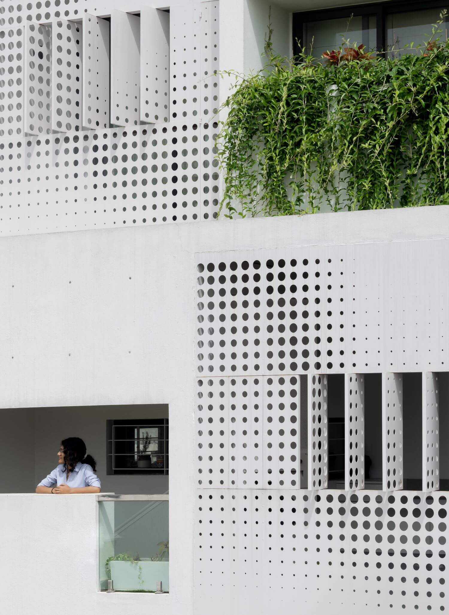
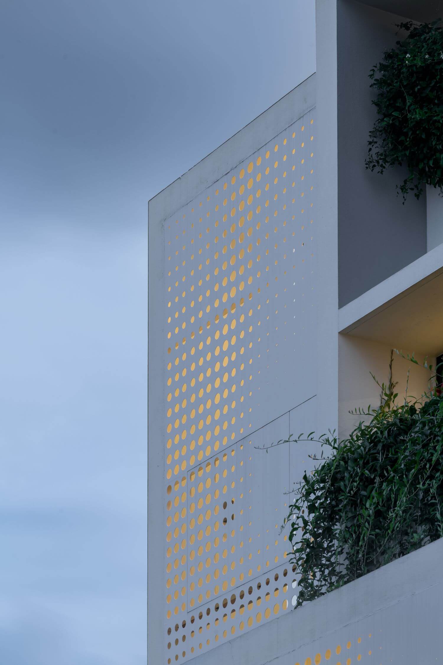
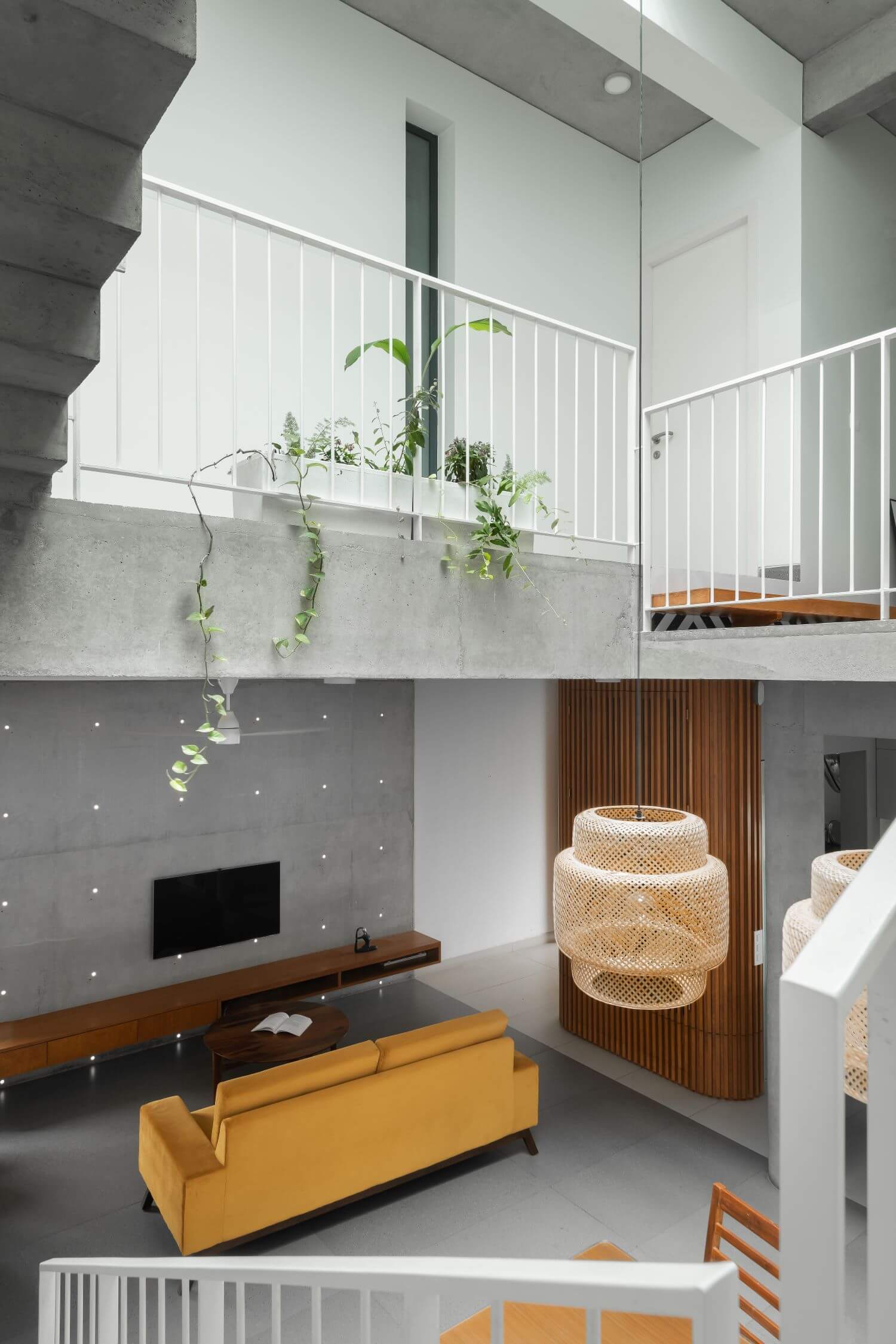
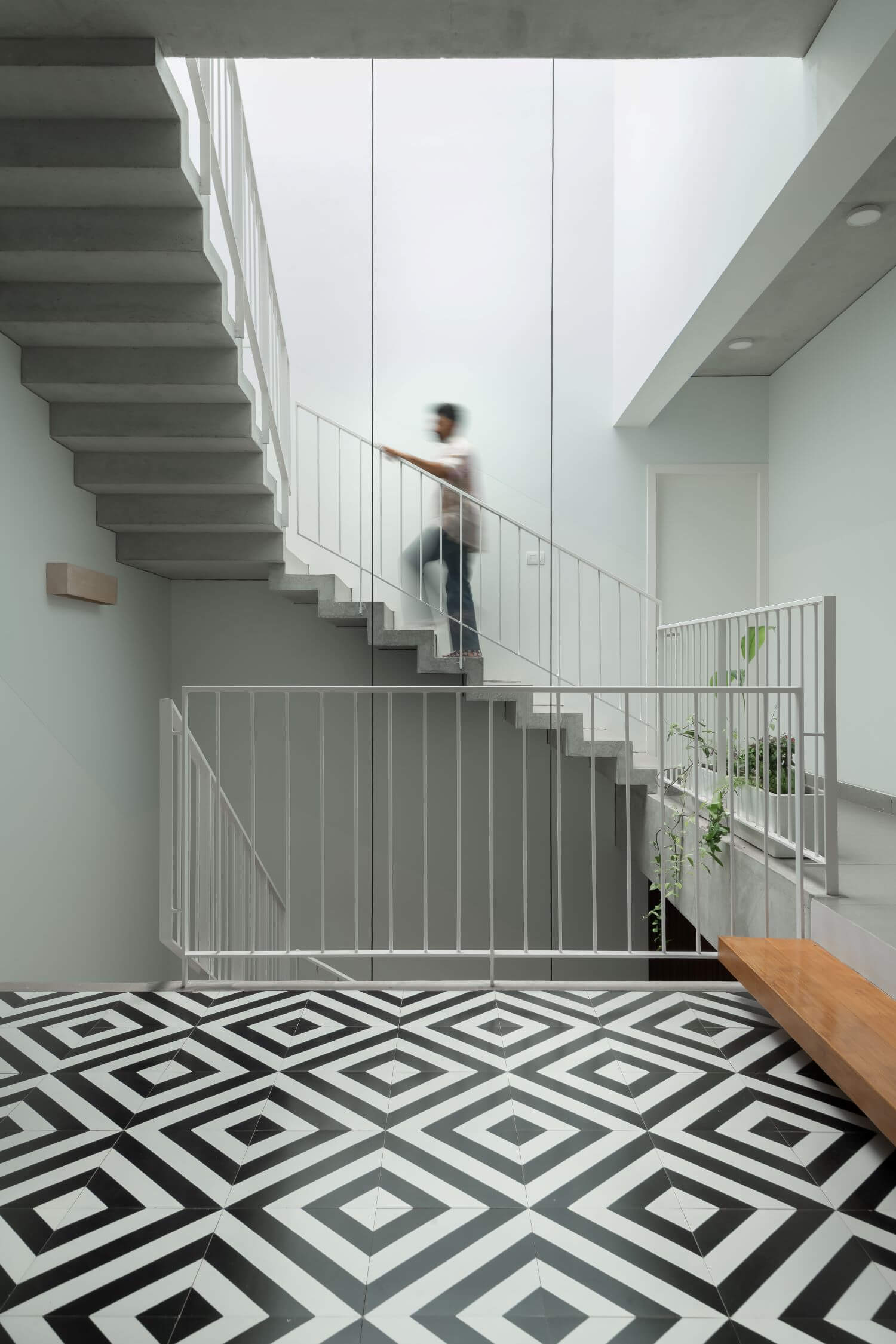
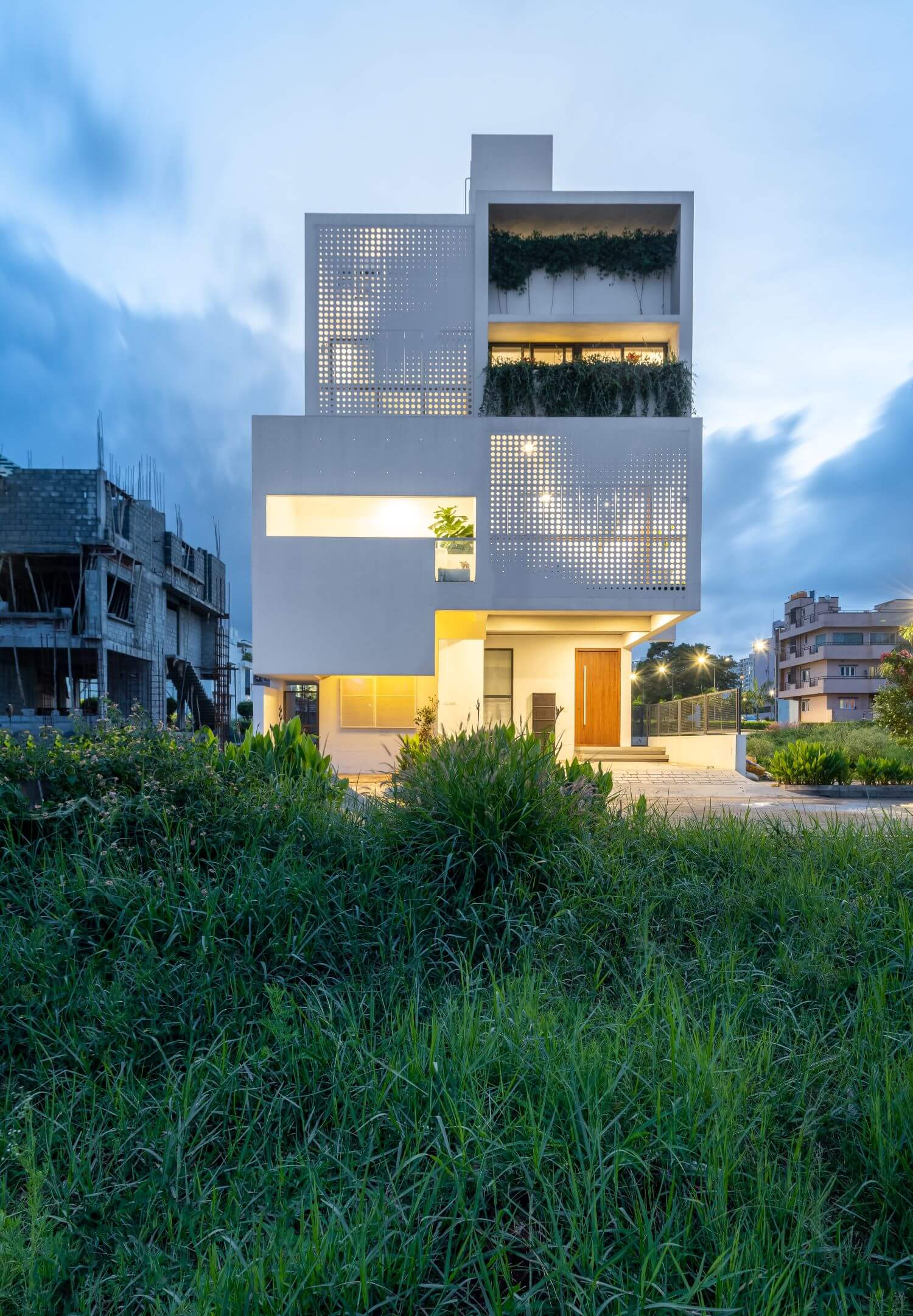
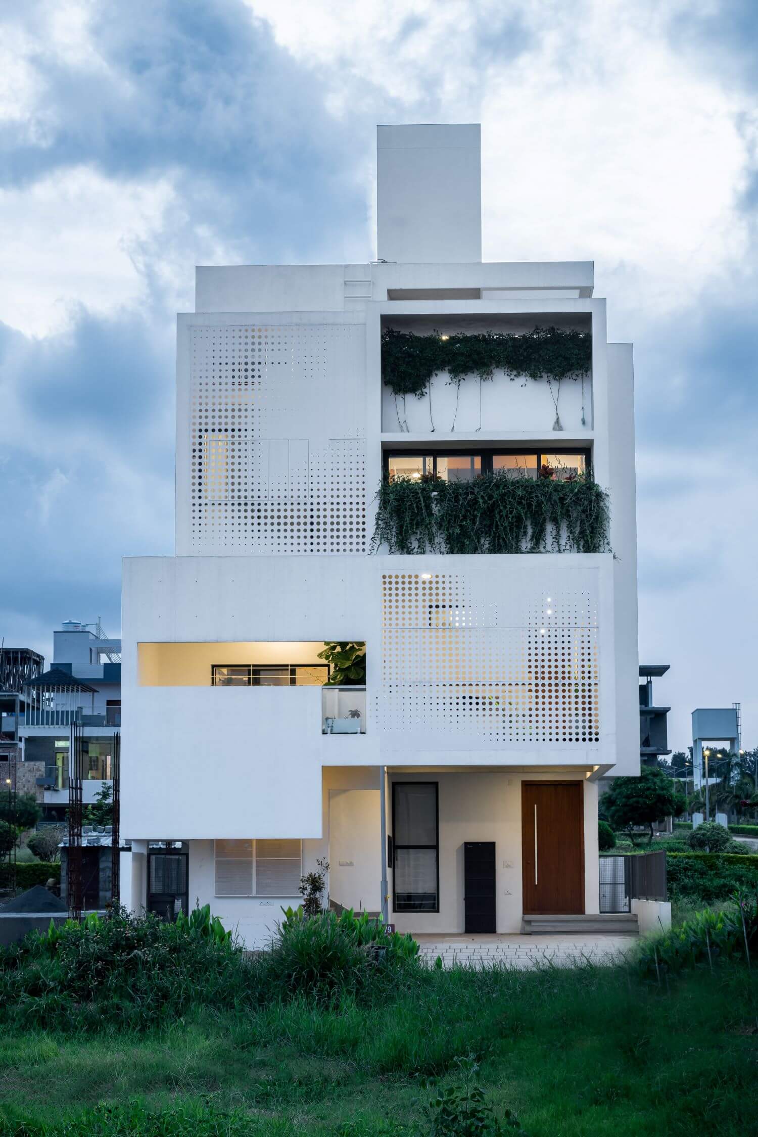
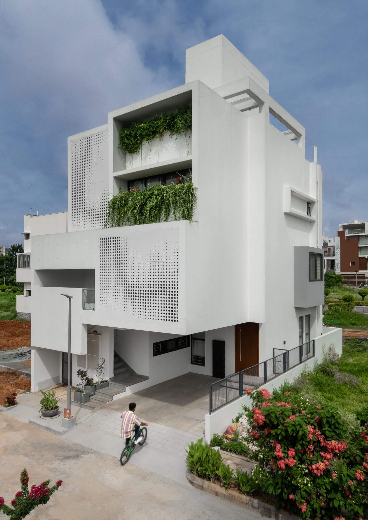
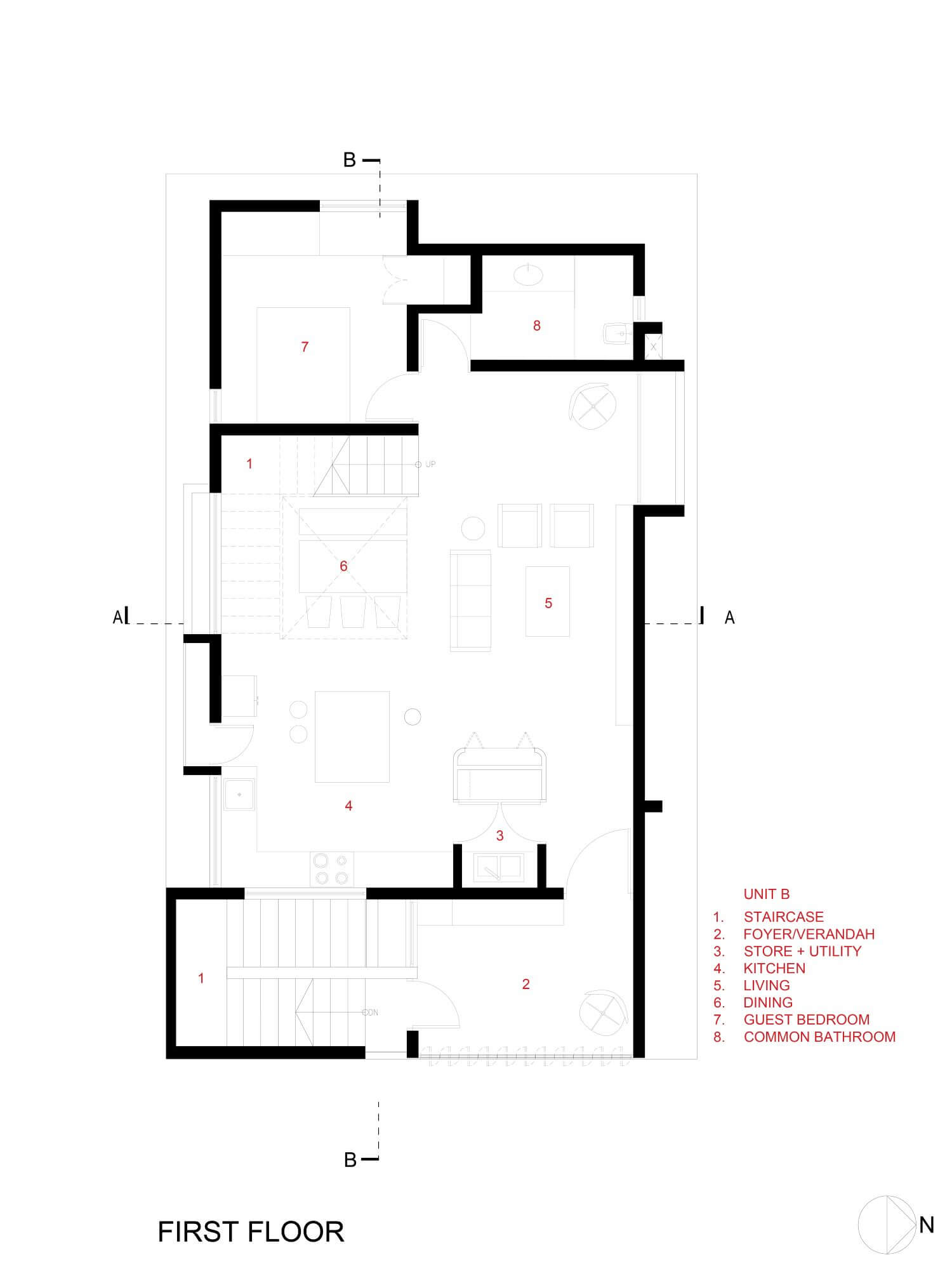
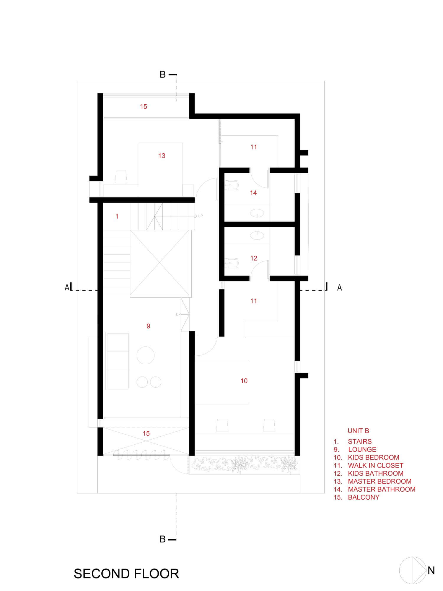
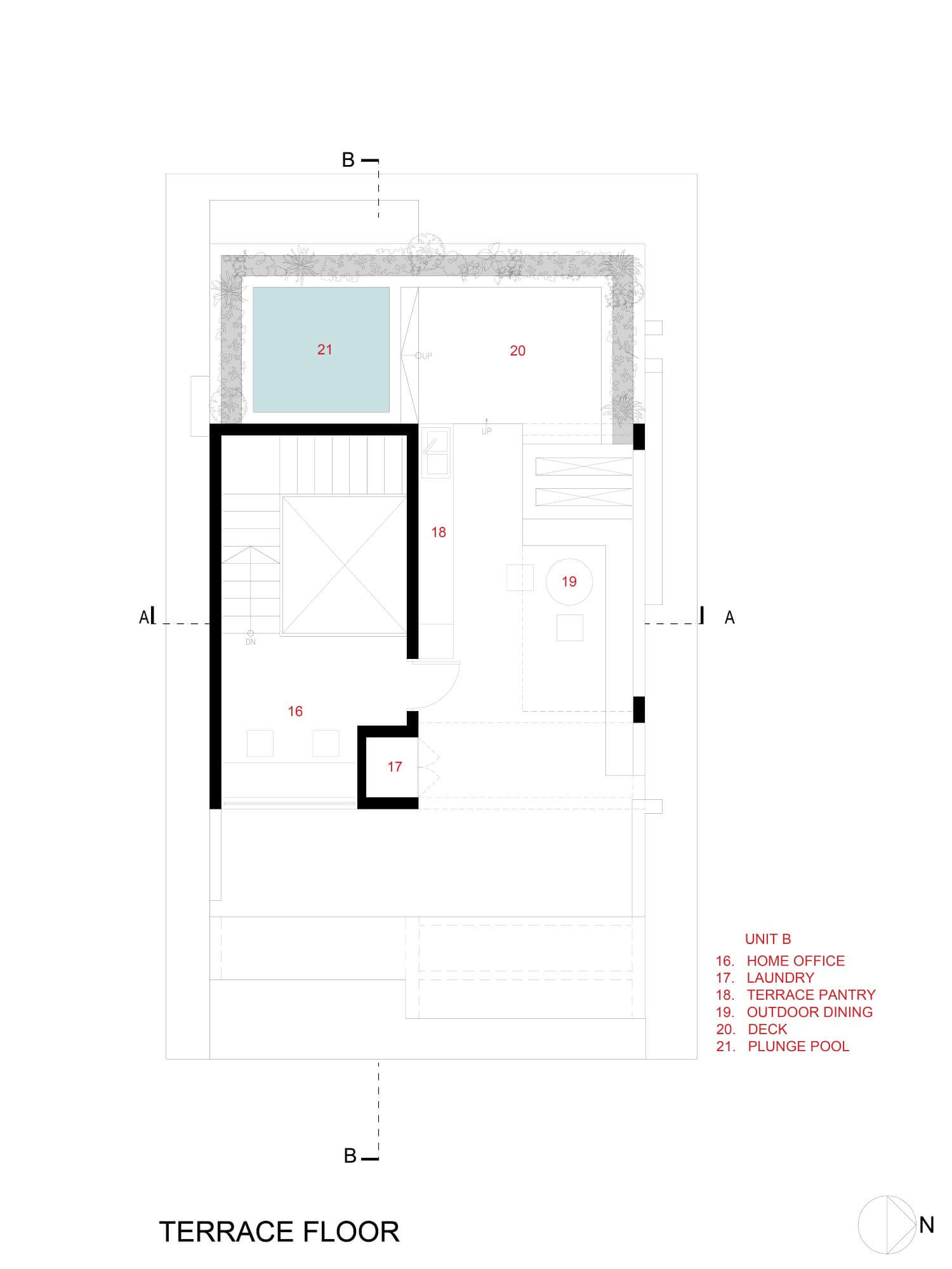
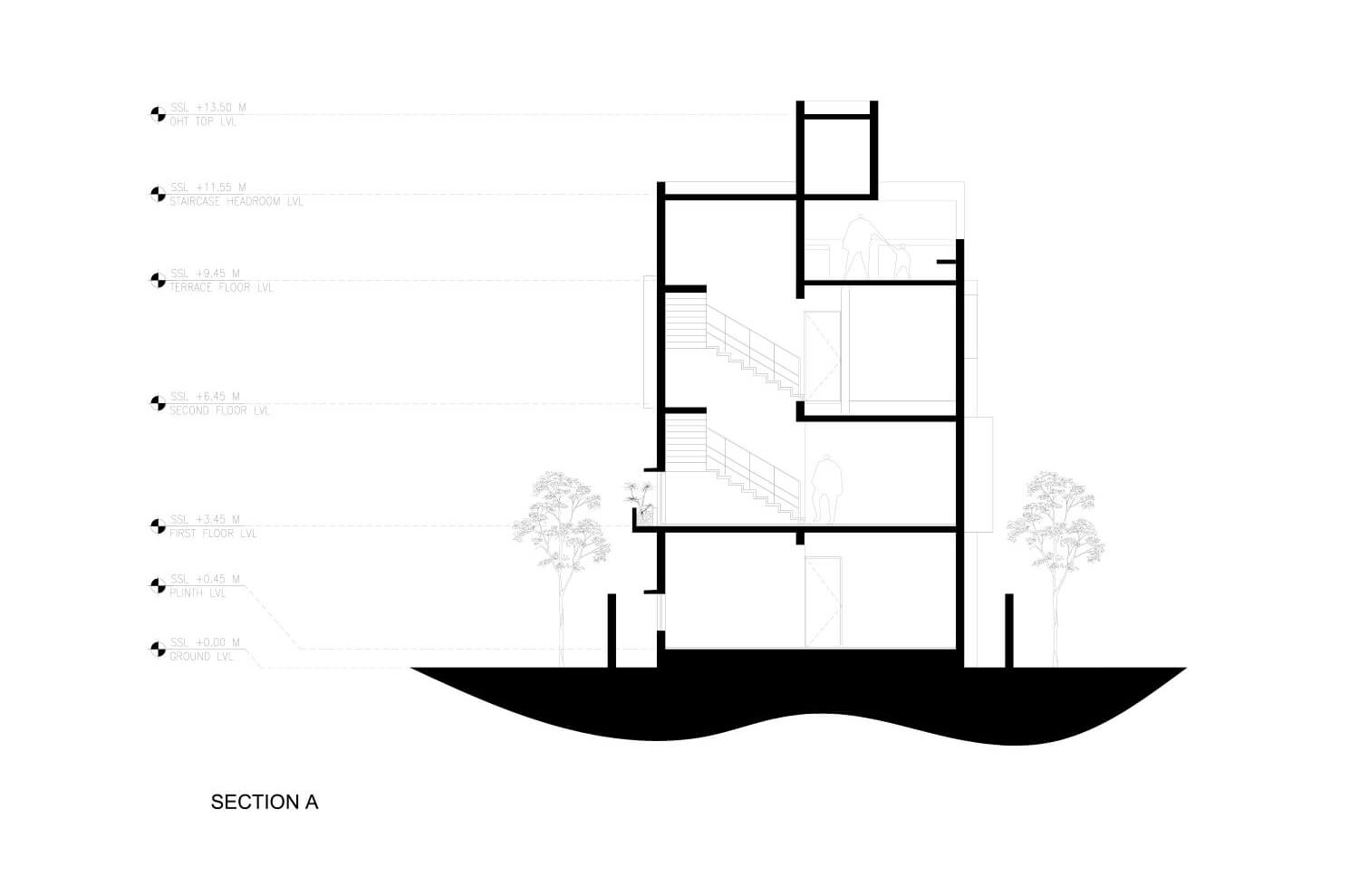
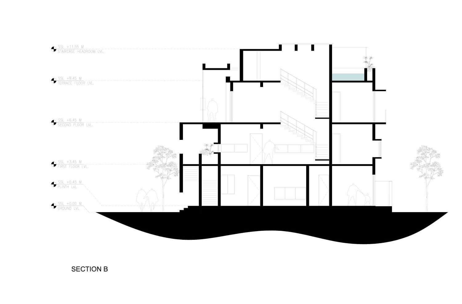
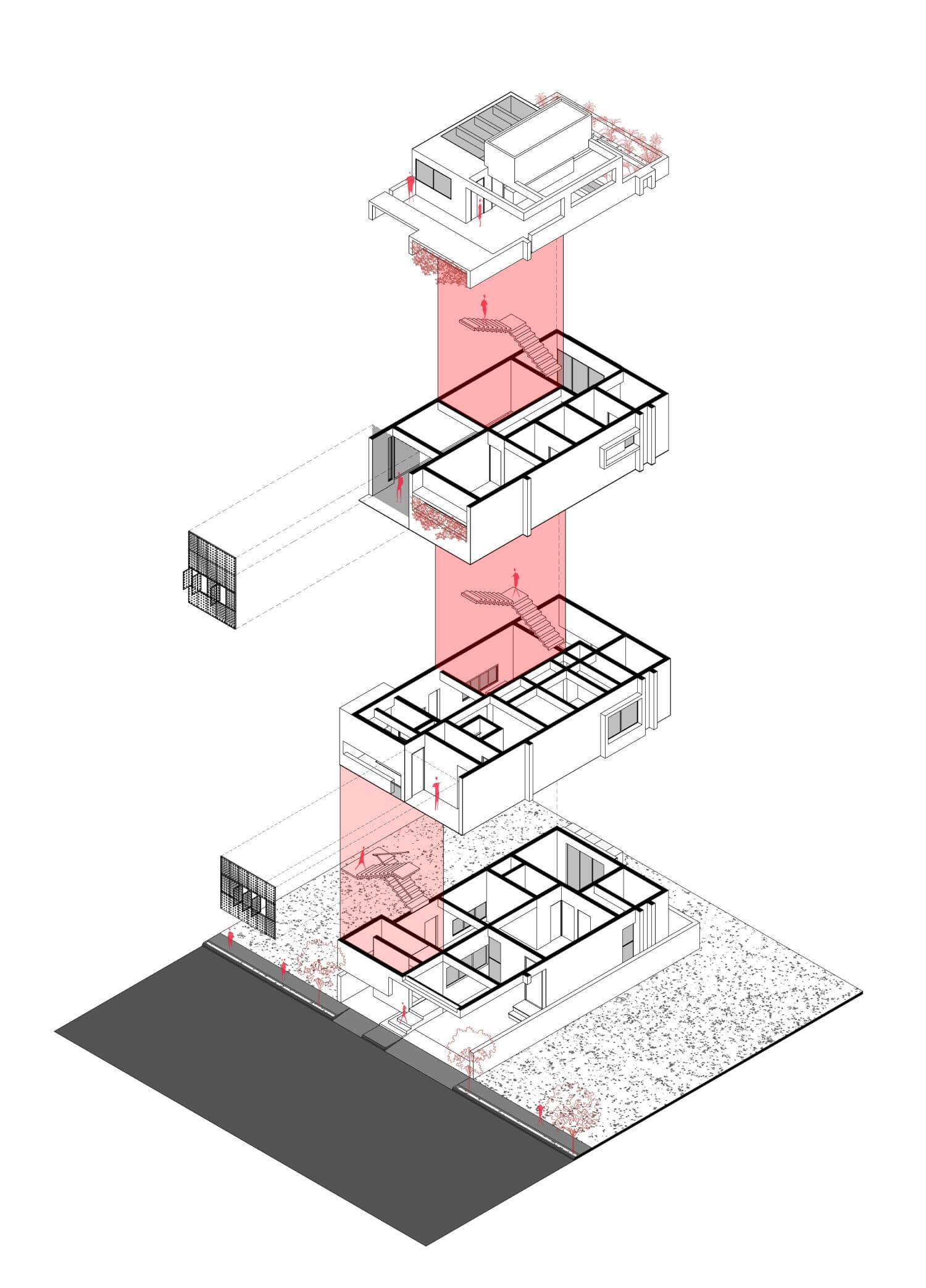
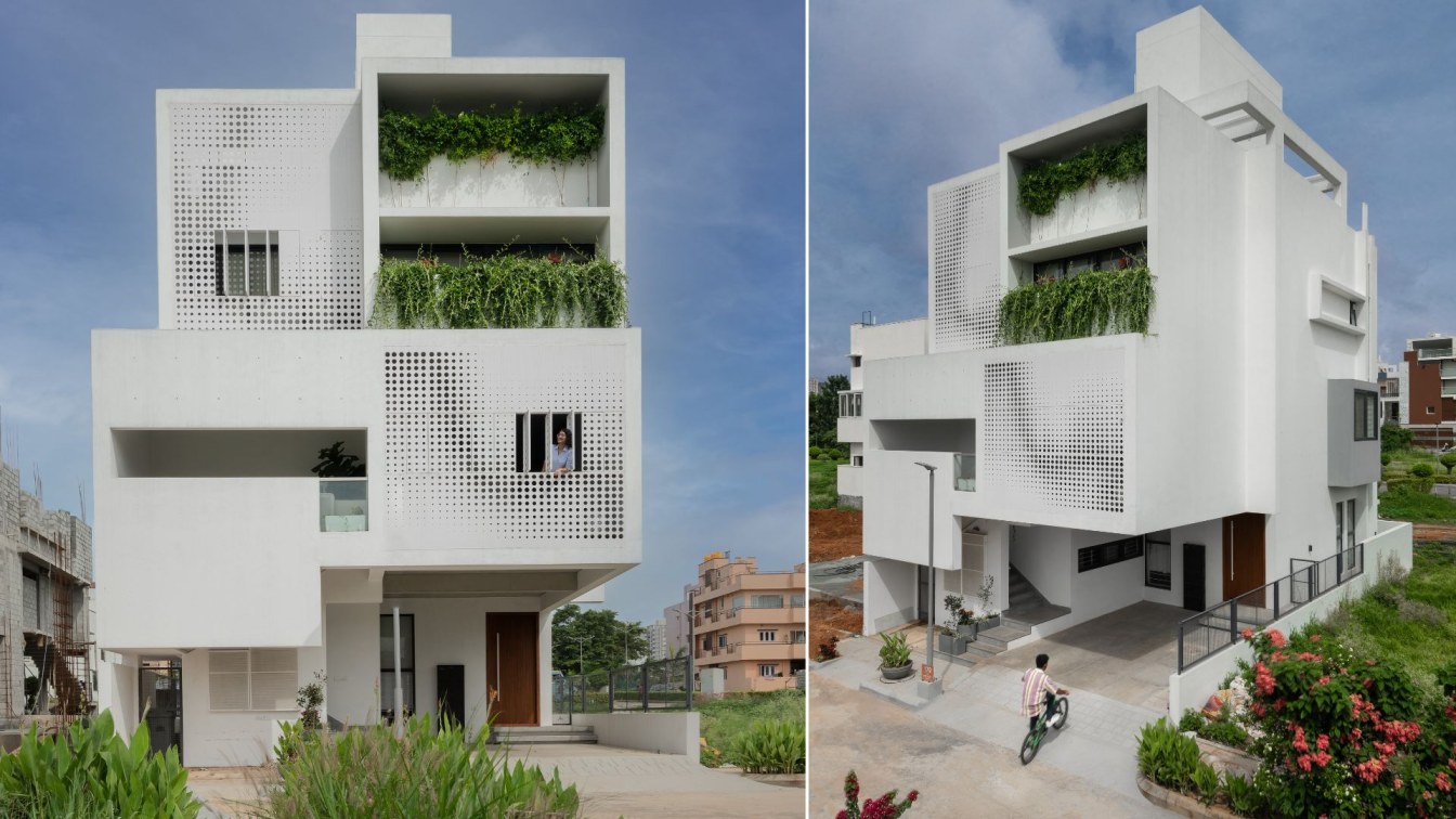
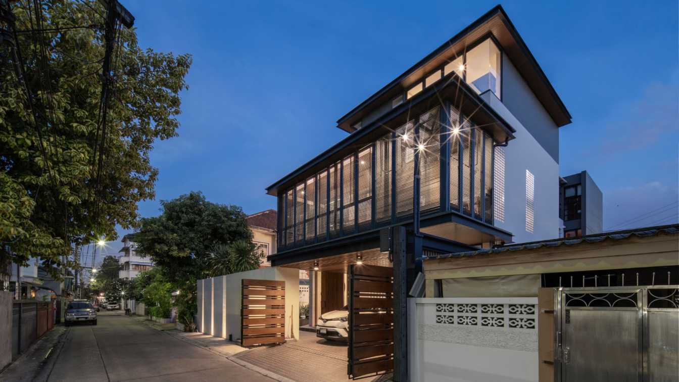
The brief provided by the client was accommodating a one-and-a-half-bedroom rental unit on the ground floor & a three-bedroom single family home on the upper floors. Sticking to the core idea of creating well-lit and ventilated private spaces within the realm of the house, the upper residence is planned around a triple height light well. With the foresight that houses would come up on three sides – the fenestrations on them have been kept nominal, small & functional allowing for cross ventilation. The front façade has a dynamic operable perforated metal screen which creates a dappled effect when light filters through it capitalizing the light coming in while minimizing overlooking.
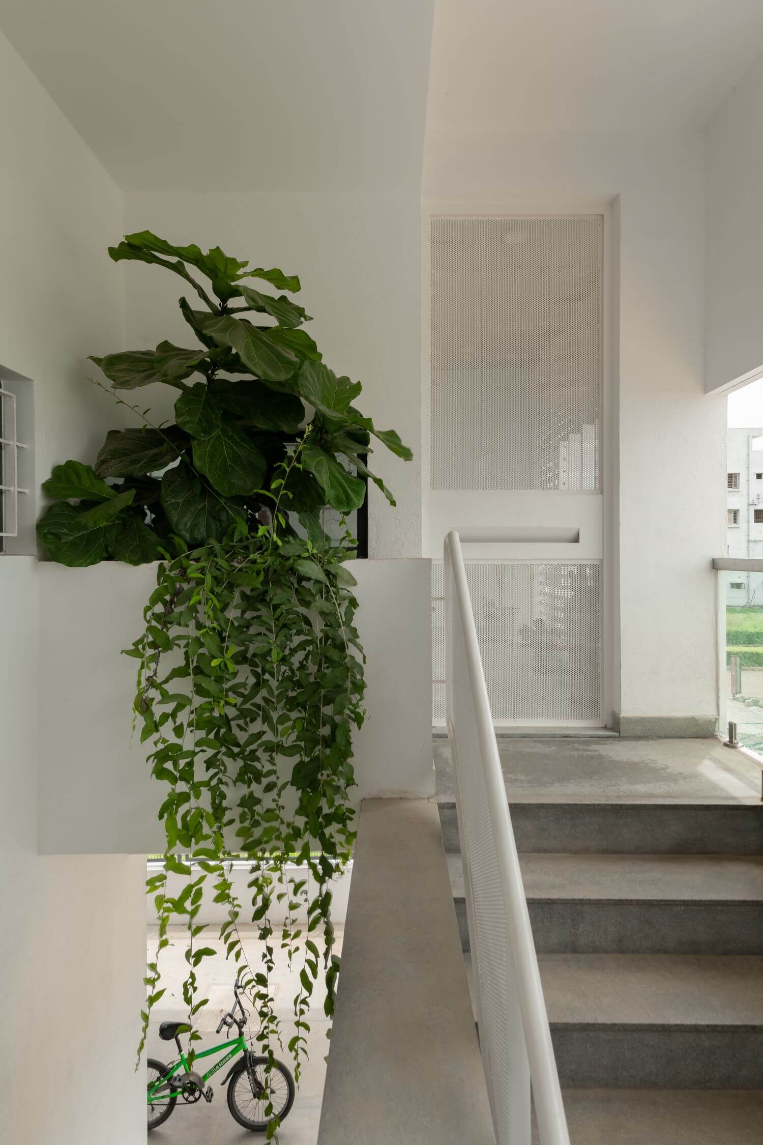
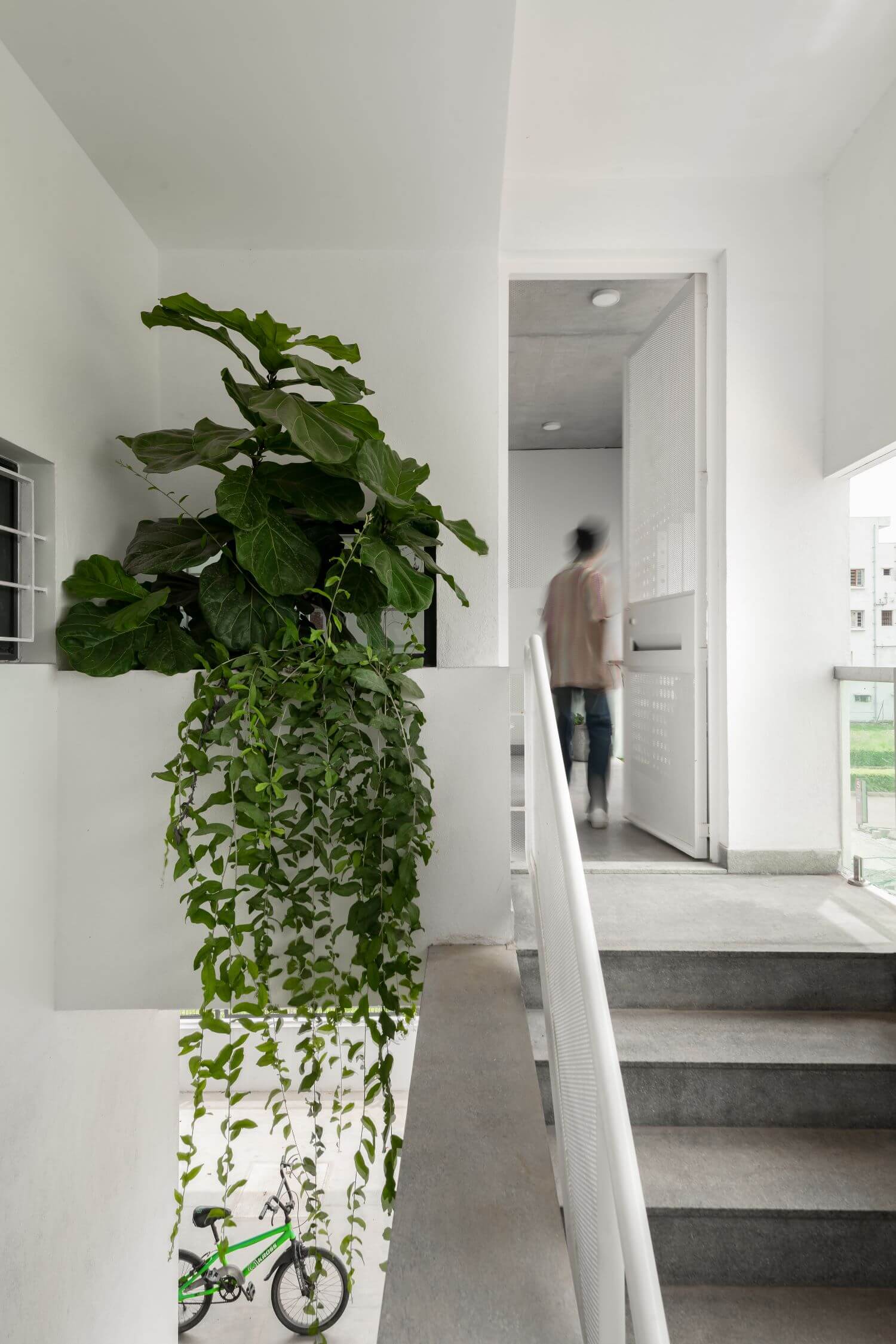
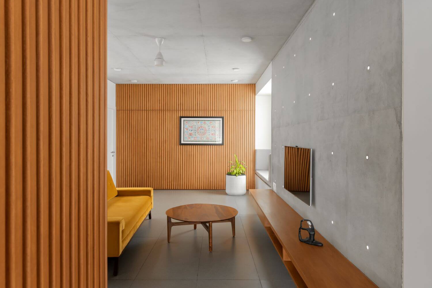
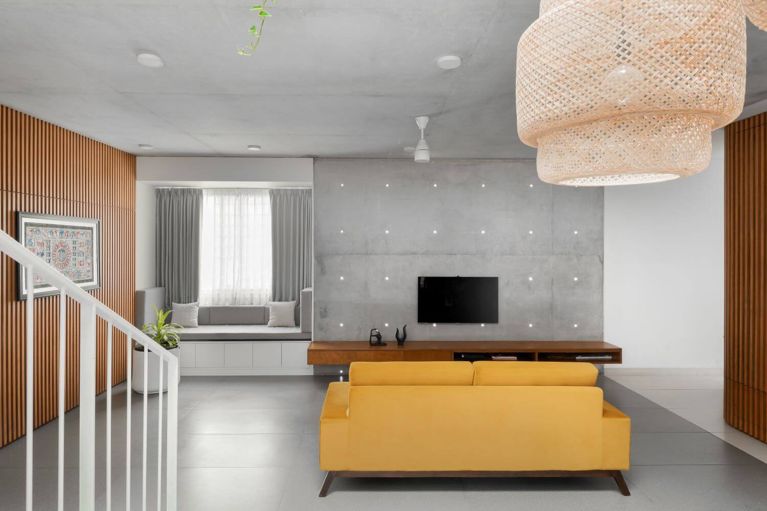
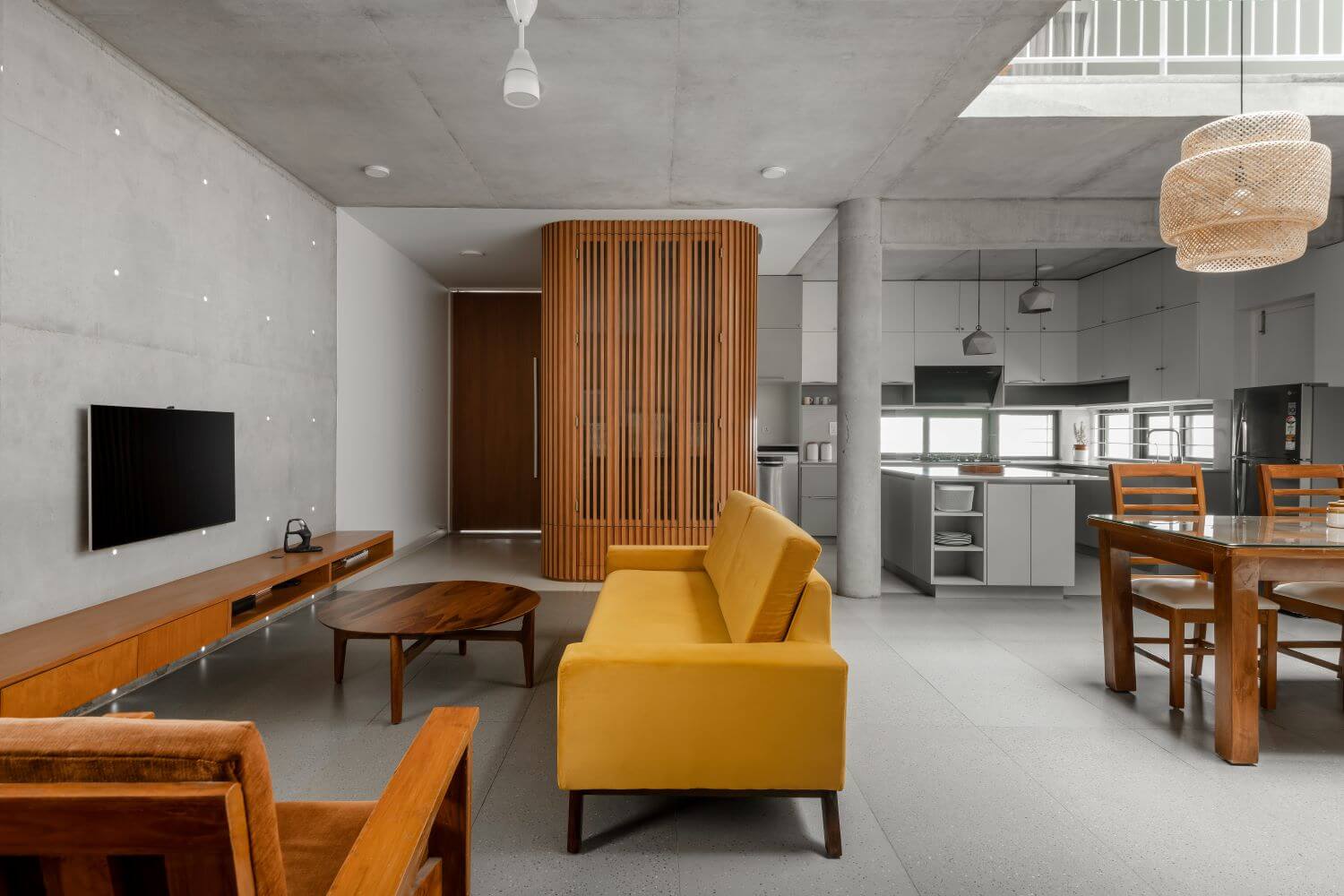
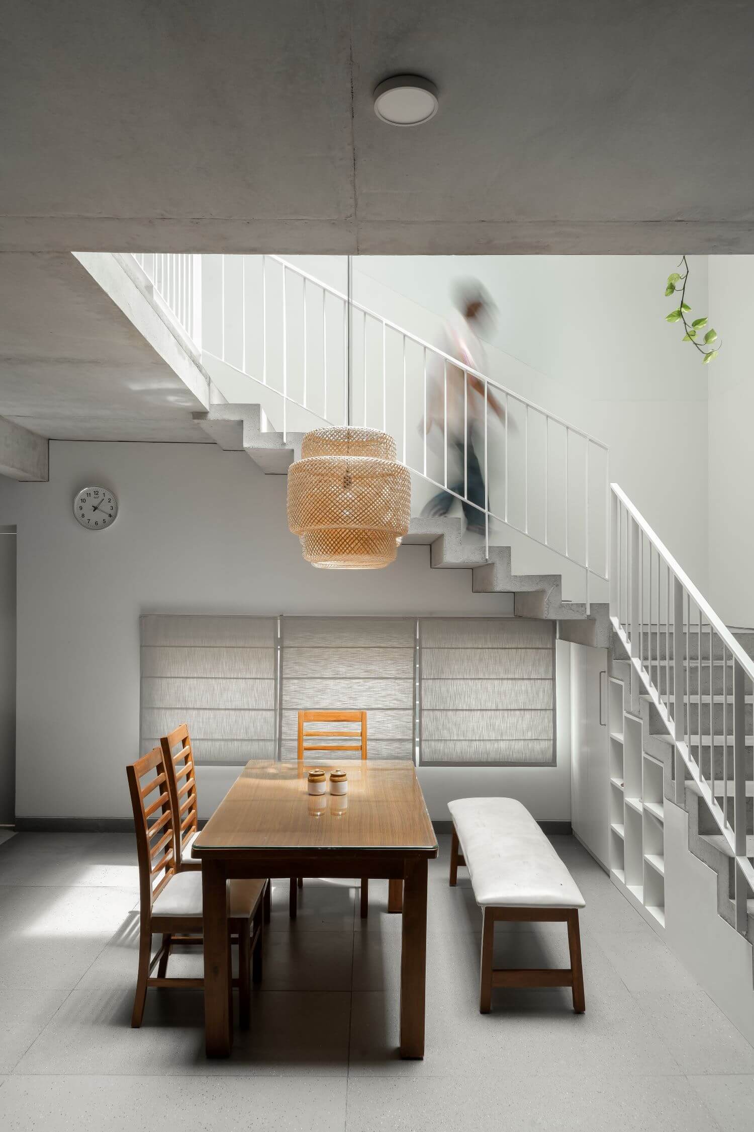
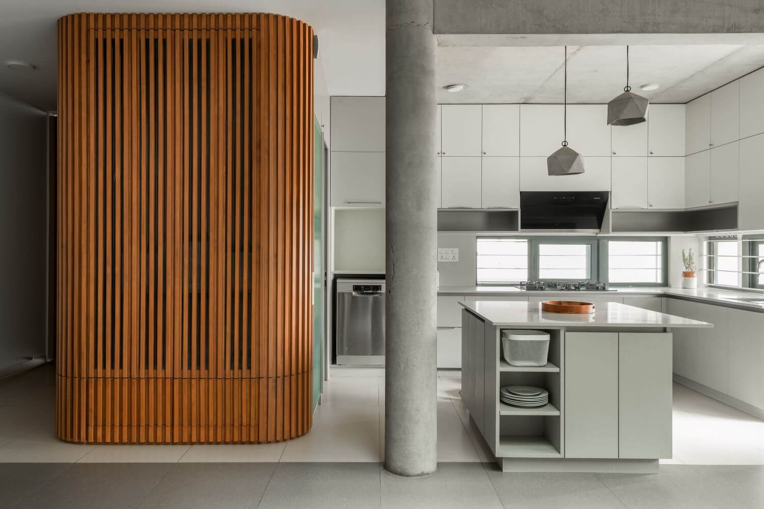
The entrance to the first floor has an outdoor foyer which leads to the public functions of the house – an open plan living, dining & kitchen along with a guest bedroom. The staircase runs along the central light well connecting all the spaces. The upper floor houses the private spaces – the primary bedroom, kid’s bedroom & the family lounge.
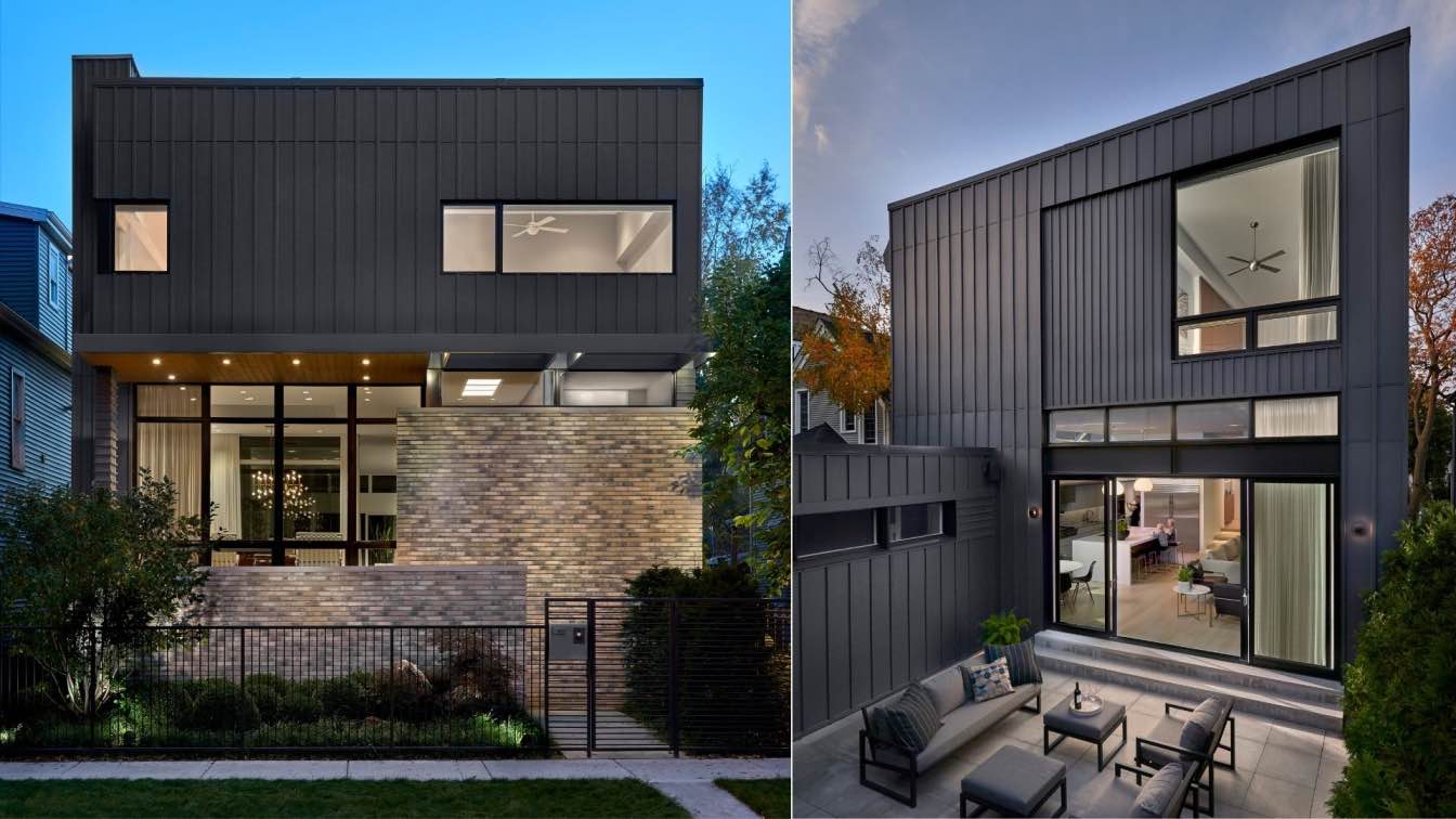
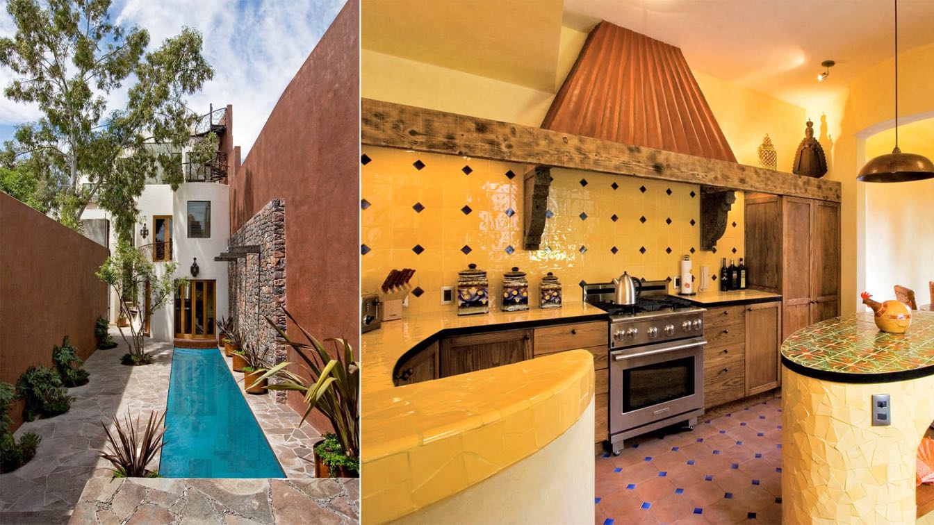
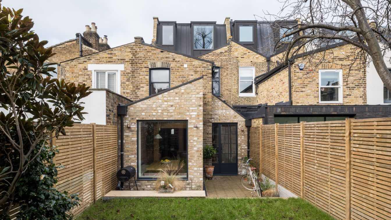
Humble yet long lasting materials have been used throughout the house. Exposed concrete ceilings, white plastered walls, vitrified tiles for the floors, wooden doors and aluminum windows make up the palette. The overall spaces have been kept neutral for the users/residents to add color to it with the furniture, upholstery and the people themselves. The façade with modest openings has planter beds attached to it adding a layer of green to the views of the outside from within the home. The perforated screen creates an ever-changing light effect within the house documenting the passage of time through the day.
