For the owners of the new home, situated in one of Hod Hasharon's quiet neighborhoods, there was one dream: to create for themselves and their three growing children an open, bright, and inviting living space that would centralize the hosting experience and enable interaction between the residents on each floor. Architect Ron Shpigel designed a house that precisely met these requirements - its appearance from the outside and inside reflected this vision. The couple, residents of the city, acquired a corner plot on one of its sought-after streets, bordering one side on a Dutch street and the other on a quiet, spacious road. An old building previously stood on the plot, which was demolished to make way for their new home.
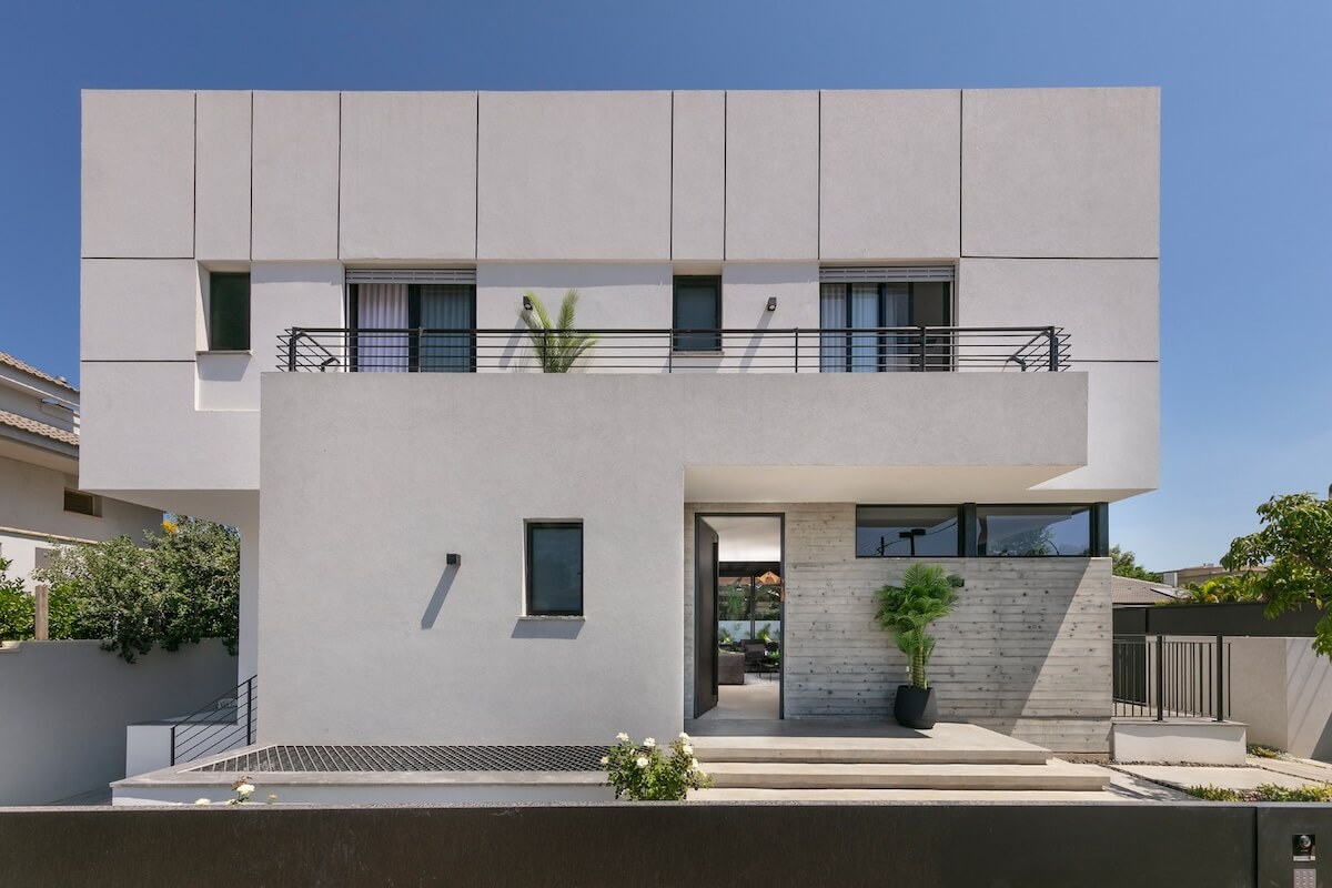
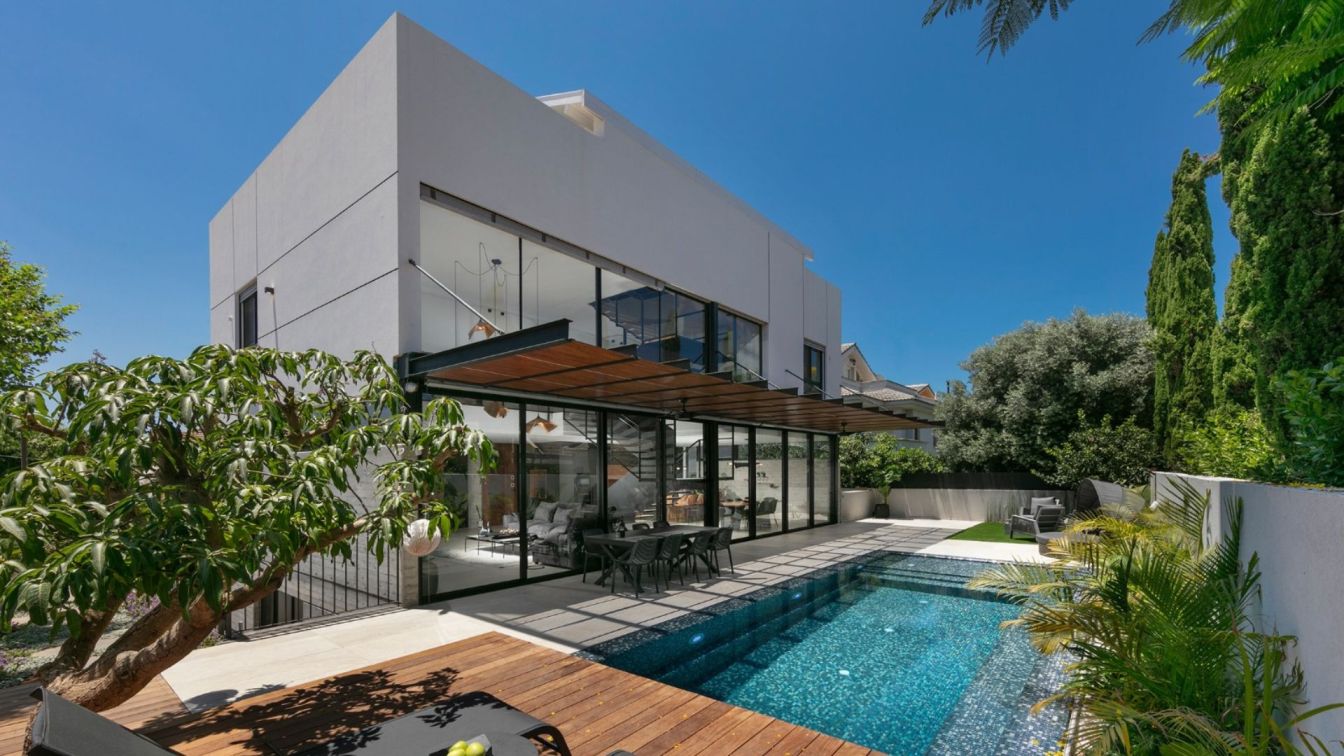
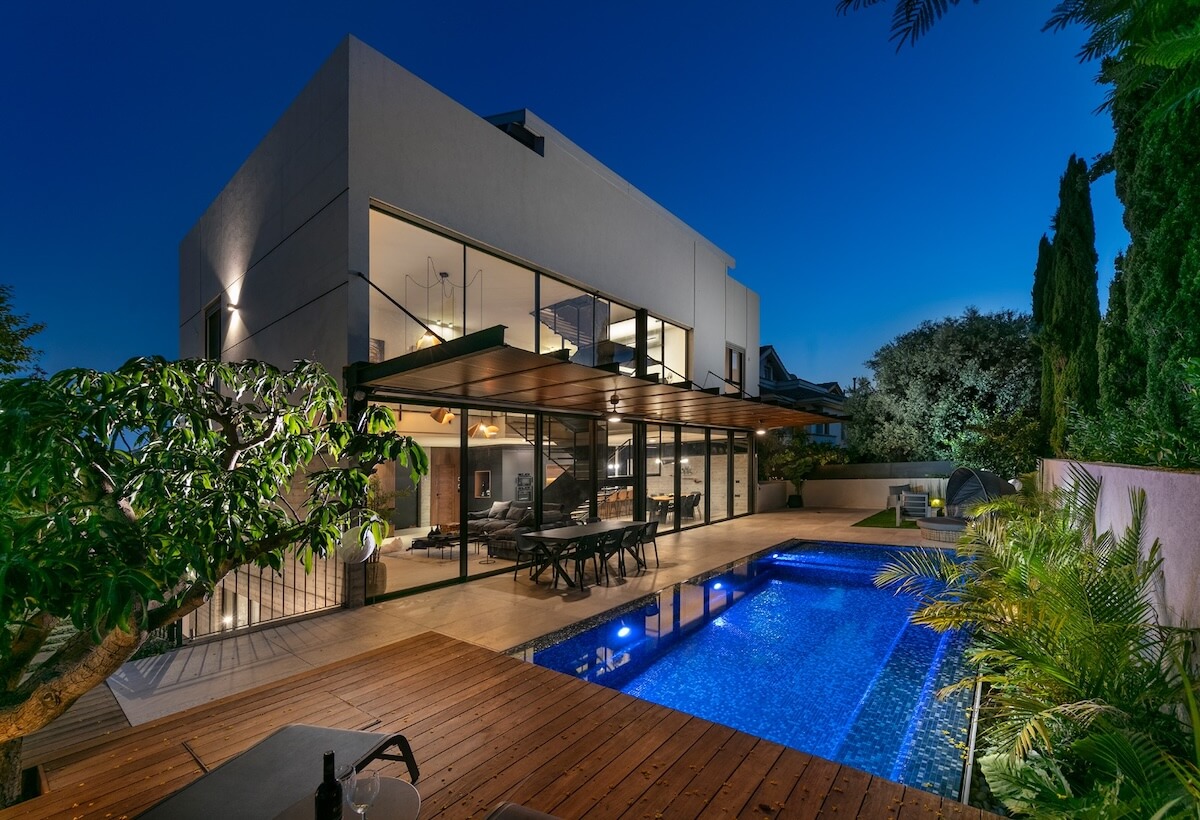
Turning to architect Ron Shpigel, the owners of the 'Shpigel Architects' firm aimed to build an active, dynamic, large, and bright house where they and their growing children could host friends and family across different sections. "The house is positioned in the center of a square plot and built with the concept of an exposed concrete cube housing the floors of the rooms, enveloped in a bright, airy shell. Between these two masses, a series of rectangular windows creates a disconnect between the levels and gives the building a floating appearance. This effect is also enhanced by the large vitrine facing towards the courtyard," says Shpigel.
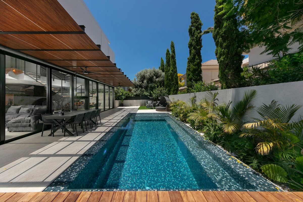
"The optimal connection between the floors continues within the house itself, where, right from the entrance door, a monumental open staircase connects the functions and floors. Inside, the living room, serving as the heart of the house, sits beneath a double-height space and overlooks the upper floor, maintaining interaction among family members almost at any given moment, regardless of which part of the house they are in." The entertainment courtyard and the infinity pool, pouring into a secluded area, are visible from the entrance to the plot. Large concrete steps with embedded lighting were installed between the access path and the entrance gate.

Upon opening the door, the public space is revealed, where one can sense the meticulous separation achieved between the floors - glass windows and steel columns supporting the upper living floors intensify the feeling of height and allow natural light to penetrate and suffuse the inner part of the building. Another element evident right at the entrance is the staircase made of 12mm metal plates, combined with glass partitions and solid wood steps. "Much like the living room, the staircase serves as a focal point in this house. It is present from every angle and serves as a visual connection between the various functions, especially those on the entrance floor.
To give it a precise and refined appearance, we installed the heavy metal all the way from the ground floor to the upper floor during construction, and from this impressive structure, the cantilevered floating stairs emerge." Another built element was designed adjacent to the entrance, leading to the basement: "With a house spanning four levels and while we wanted to highlight the lively areas where the family lives and spends time, we specifically aimed to modestly design the concrete staircase leading to the basement. A fireplace wall separates it from the living room, adorned with oak wood strips," explains the architect.
"Since the entire concept is based on family orientation, the staircases on the bedroom floor serve as an open balcony towards the living room, which constitutes the center of the house and is surrounded by a double space where one can also see the kitchen and the courtyard - thus creating direct connections between the floors: one horizontal, thanks to the open space, and the other vertical, thanks to the staircase." "Above the living room, three Studio Kozi light fixtures made of folded wood are suspended. Some are painted black, while others retain their original hue.
This colorful and material combination recurs in various parts of the house, especially in the communal space, like the kitchen fronts, shelves, and more. The seating system we chose for the living room is intentionally informal - it's 'plapit,' exceptionally comfortable, inviting you to curl up in it and aligns perfectly with the family concept." The kitchen is positioned beyond the second side of the staircase and adjacent to the entrance. "In the black cube adjoining the entrance door, functions we wanted to conceal were planned: guest services and a utility room accessed from the parking area," explains Shpigel.
"The kitchen itself hides plenty of storage space within but maintains a minimalist appearance. Almost its entire front is covered in durable Nano-graphite panels, except for the niche on the high facade and the base of the island, where we chose walnut wood to warm the monotone color scheme, especially the floor, which we adorned with travertine stone-like porcelain tiles."
The dining area is located between the kitchen and the large vitrine and serves the family and their guests for more formal meals. Like many elements in the house, it is made of a combination of natural wood paneling and black metal construction. The entertainment garden area is fully paved, and at its center, the sliding pool merges with the courtyard level. Sun loungers are arranged around it. The exit from the indoor kitchen and dining area leads to a cozy lounge area, while the exit from the indoor living room leads to the domestic lounge and kitchen area.

On the intermediate level, three children's bedroom suites were designed, each with its own bathroom, and two of the rooms also share a common balcony. "Adjacent to the staircase podium, the father's workspace was designed, as he works long hours from home and wanted to enjoy both privacy and remain an active participant in the ongoing activities, so we designed for him a glass cubicle overlooking the entrance and the bedroom floors, allowing him to conduct Zoom calls quietly while staying connected with the family."
On the top floor, the master suite is located, specifically sought by the parents for a refuge. The fact that their sleeping suite is practically situated in the attic allowed us to create for them in this area a richly crafted wooden ceiling that produces a luxurious resort-like feeling. "The bedroom is located to the right of the entrance to the master suite, and to create a serene suite-like feeling, we emphasized the wooden beams painted in white, thus reinforcing the sense of height," says Shpigel.
"Overall, we used light colors in this area alongside wooden elements that bring warmth. We designed a mini-bar corner for them, allowing them to pour themselves a good glass of wine, step out to their private balcony, and enjoy the peace and the view. Adjacent to the other side of the suite is a closet room with concealed fronts, one of which is essentially a hidden door leading to their elegantly designed bathroom."


