This townhouse in Shenzhen used to be a completely different look. The colonial-style and complicated decoration that was popular in a certain era in China, is no longer fit for current life. The owner of the house, a rational and logical lawyer, after experiencing the ‘past tense’ living experience for a short time, decided to invite KiKi ARCHi to do a renovation, and create a relaxed and free-living environment for his family. The 'complex' home needs to return to the 'lightness' to accommodate the daily life of three generations, but the original house is not ideal. The building that gets light from only one side has a basement, three floors above, and an attic. As a result, most of the interior is dark except for the top attic with skylights, and the internal loft structure adds uneven visual sensation. In addition, due to climate and mosquito problems, several small balconies attached to the building were once wasted, which is a great pity for the owner's family, who enjoy the outdoors.
After discussing, KiKi ARCHi proposed the concept of a breathing house and focused on three keywords of light, air, and flow, for integrating the indoor and outdoor spaces continuously. First, to solve the lighting problem, the designer added two sets of skylights on the roof above the staircase hall. In this way, the skylight can pass through the structural gaps in the split level, providing natural light for each floor and brightening the staircase hall.
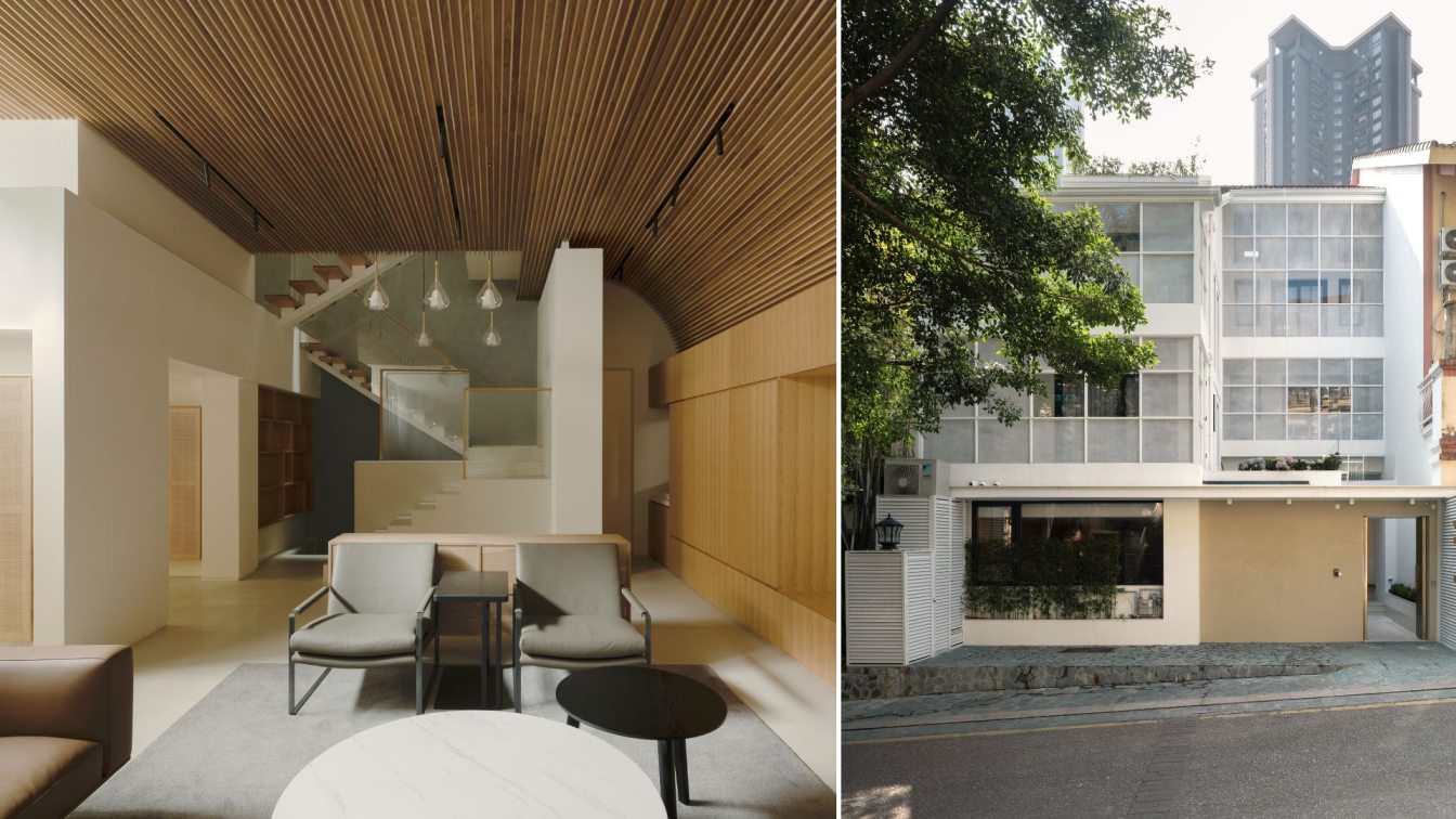
At the same time, the exterior of the house changed dramatically. With the existing balcony structure, a special white mesh window wraps the entire facade, while turning the balcony into a semi-outdoor space. The mesh windows are treated with anti-corrosion and anti-rust, both ventilated and anti-mosquito, which is very suitable for use in southern Chinese cities. To provide a good viewing effect, some mesh windows are replaced with glass according to the height of the angle of view. This new façade is modern and airy, allowing for privacy but also breathable.

The interior layout is adjusted according to optimal principles, especially the living space on the ground floor, where families spend the most time together, which is connected to the courtyard. Therefore, the designer moved the original entry door to the wall position and divided part of the courtyard into the semi-indoor area, which became the tea hall. Most of the non-load-bearing walls were removed and replaced with an open kitchen area. Although the area of the courtyard is reduced, the outdoor space is virtually doubled, thanks to the fully open folding doors, sliding doors, and screens. Now staying in the teahouse, and dining room, the family can face the courtyard directly and feel the gentle breeze.
The living room in the innermost part is relatively quiet. The steps provide a natural sense of boundary, and the flexible double lines allow the living room to connect with all functional areas, which is convenient for family members to move at the same time. To provide better lighting in the living room, The designer adds a long glass on the porch wall, which makes the height of the two areas equal, and creates a more complete sense of space. The interior materials and decoration are chosen with a focus on a sense of breathing, such as by using the micro cement floor, customized rattan cabinet, diatom mud wall, curved wood grid ceiling, etc., bringing a comfortable living experience.
The new house brings many changes to their life. Besides satisfying basic living and rest, it has been repurposing the basement and attic as a video room, multi-purpose lounge, and reading room, providing more suitable places for the family to relax. Now, by opening the folding door or standing on the balcony, the family can enjoy the four seasons of light and wind even if they do not go out. Between nature and life, there is more freedom and less constraint.


