Blending Dots: How to adapt an abandoned office building with just 7 floors for a hotel in an area of high-ranking contemporary buildings without detracting from it presence and without being absorbed by the comparison that surrounds it?
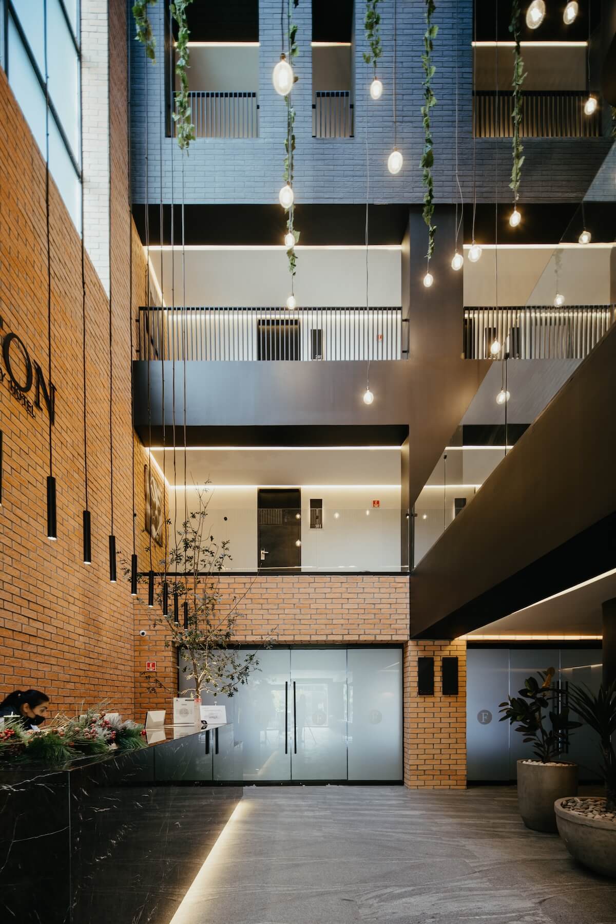
This was one of the most important challenges to be addressed in this project. What if in You have to follow the stereotypes marked around the site (tempered glass walls and clean and neat finishes, perforated steel facades and aluminum lattices) we opted for designing "that quaint and cozy little hotel in the corner"? That was our stance to be able to tackle this problem. In this sense, we seek to respect 100% the structure and focus on designing inversely to what is proposed to our surroundings, proposing a sequence of openings and frames randomly distributed solids on the façade, heaviness in its proposal of materials, in contrast to the lightness of our neighbors, which is repeated in the free height of reception inside, warmth instead of coldness.
The core of vertical circulations serves as an extremely important element since that it was rehabilitated taking the original staircase as a starting point, dressing it elegantly with a dark skin and taking over the headroom that houses it. Cables with vines that run down from the highest part to the area of lobby give life to the circulation spaces and at the same time end in spotlights that they light up the space.
The design of the bathrooms contrasts with clean and fine finishes, you could say the leather lining the bathrooms is interpreted as the immediate negative to the dark brick of the exterior and this responds to the use of space. In short, it could be said that the Fulton Hotel is designed with uniqueness since it invariably contrasts with the surrounding proposals and is rebellious to continue with these stereotypes, which makes it unique in its immediate environment and characterizes it for the antagonistic way of responding to their context.

