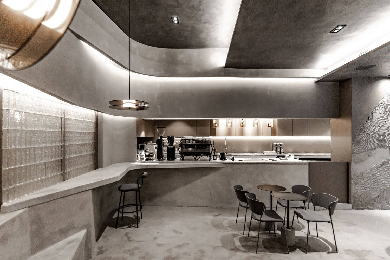
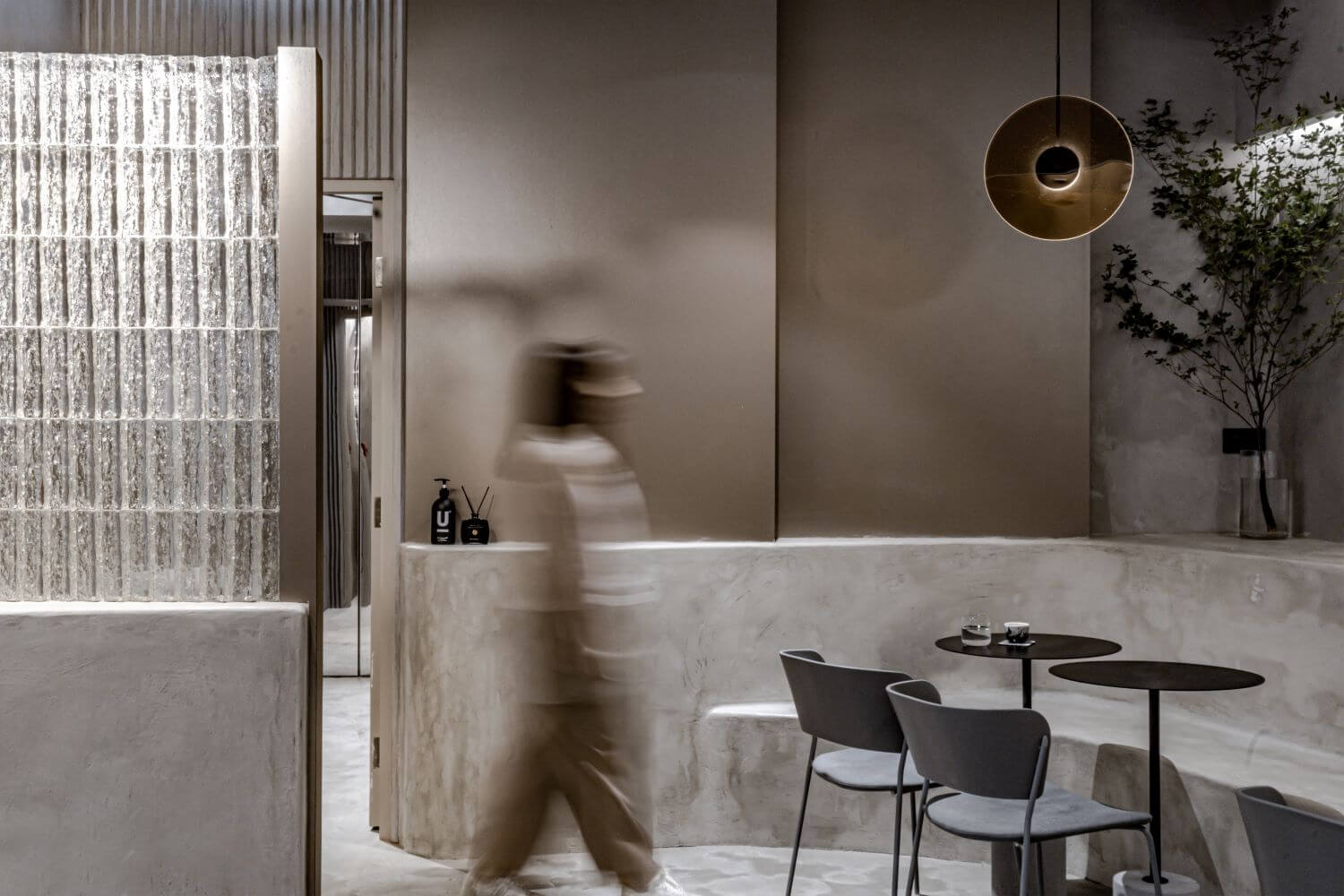
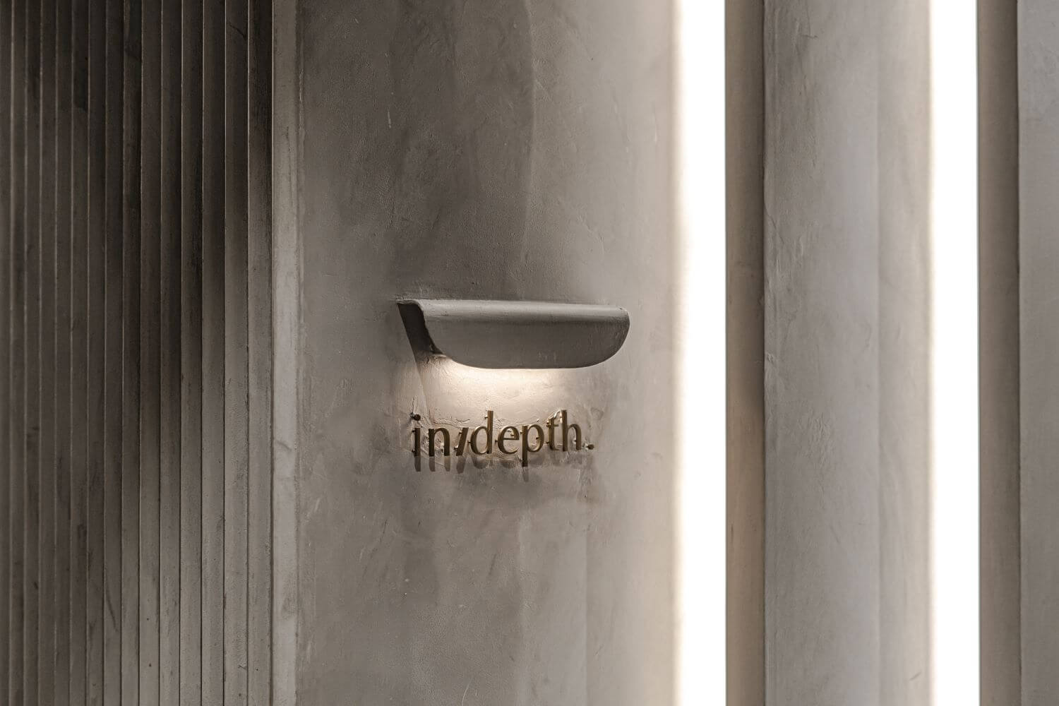
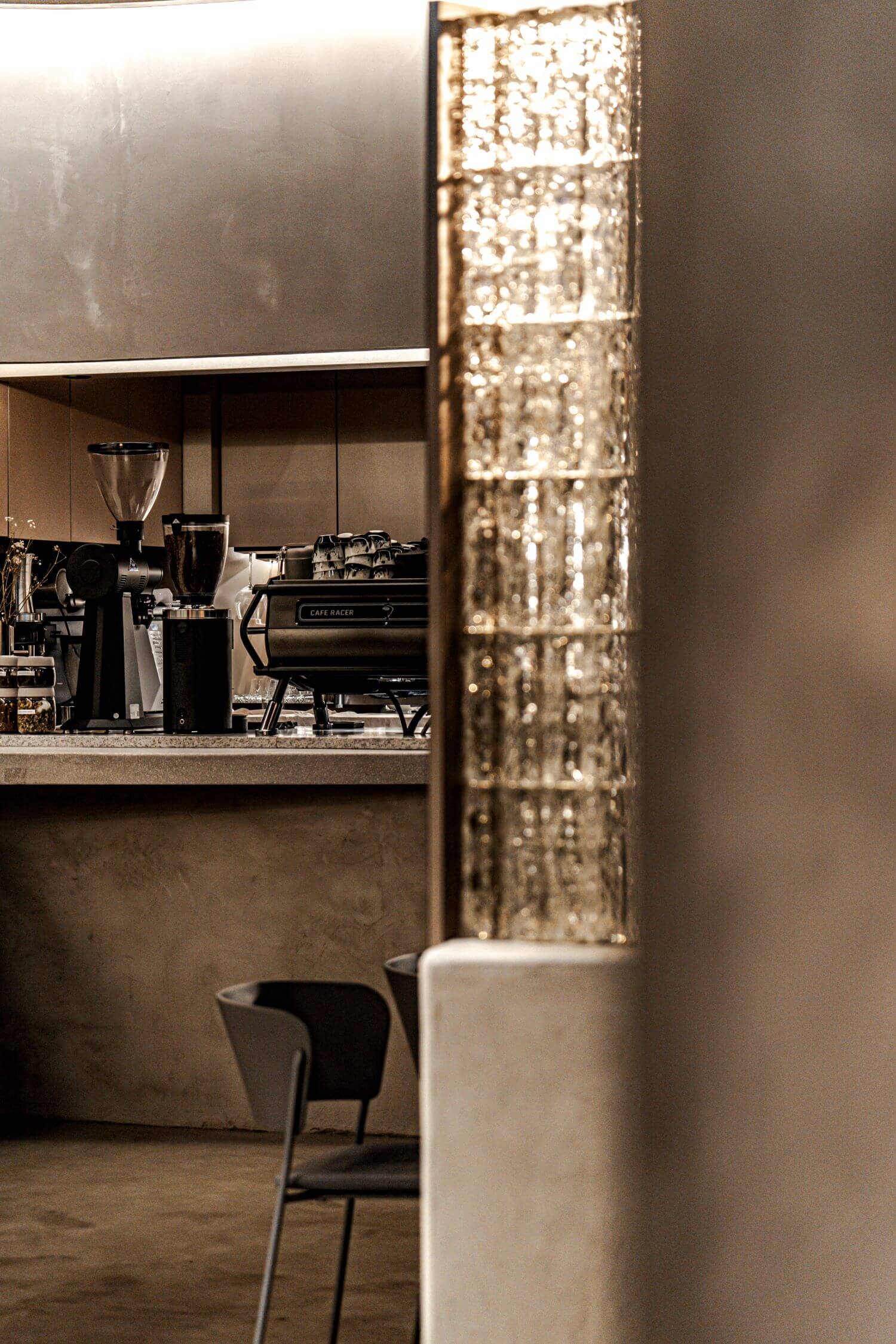
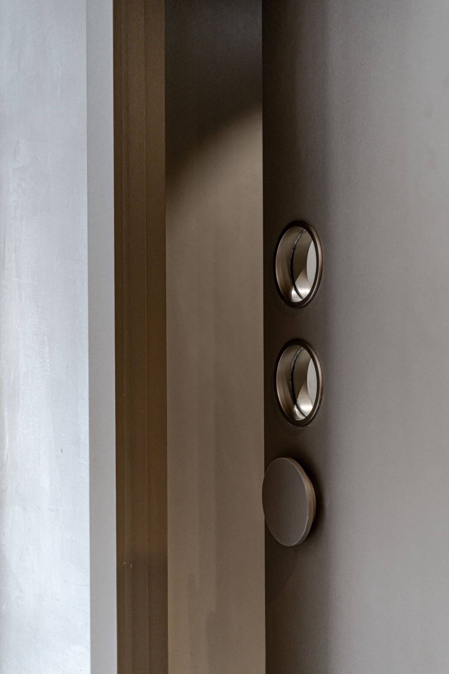
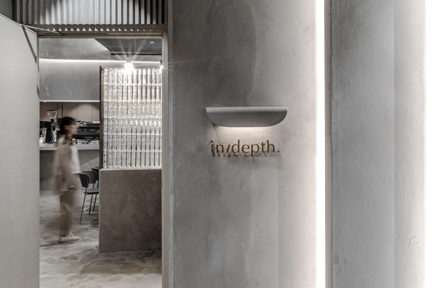
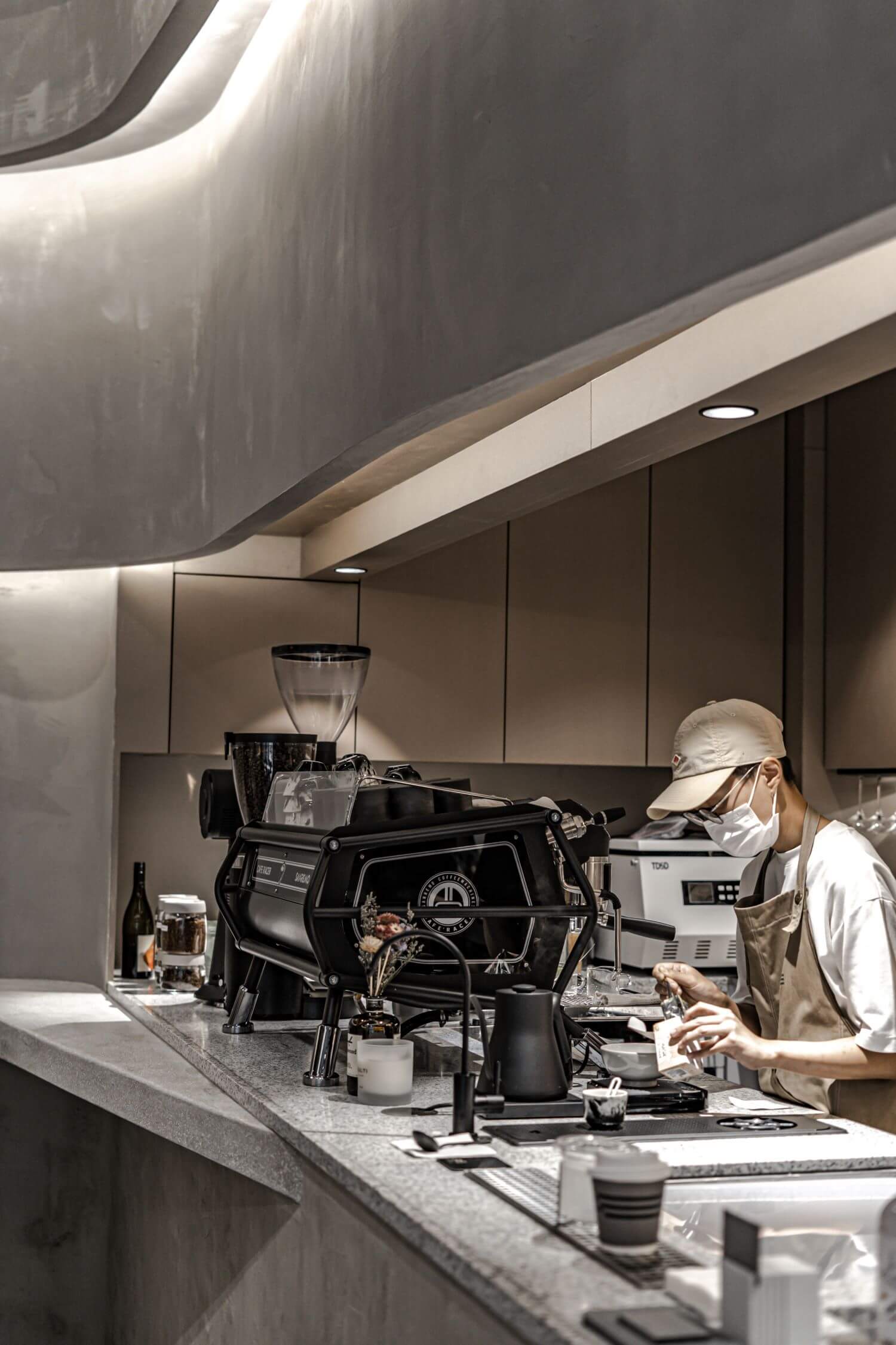
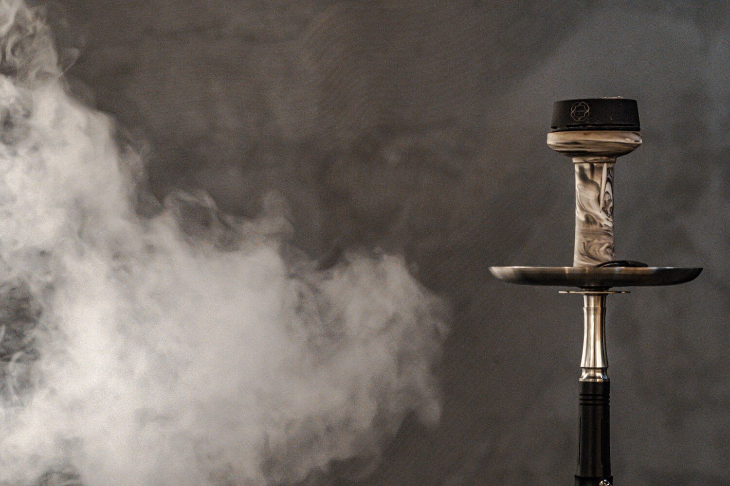
ABT Design Studio: In-Depth is a cafe where quality coffee, shisha and bar services are offered. By creating gradients of colour, light and shadow in waves, we are presenting every visitor a visual appetiser as a welcoming gesture.
How is the project unique?
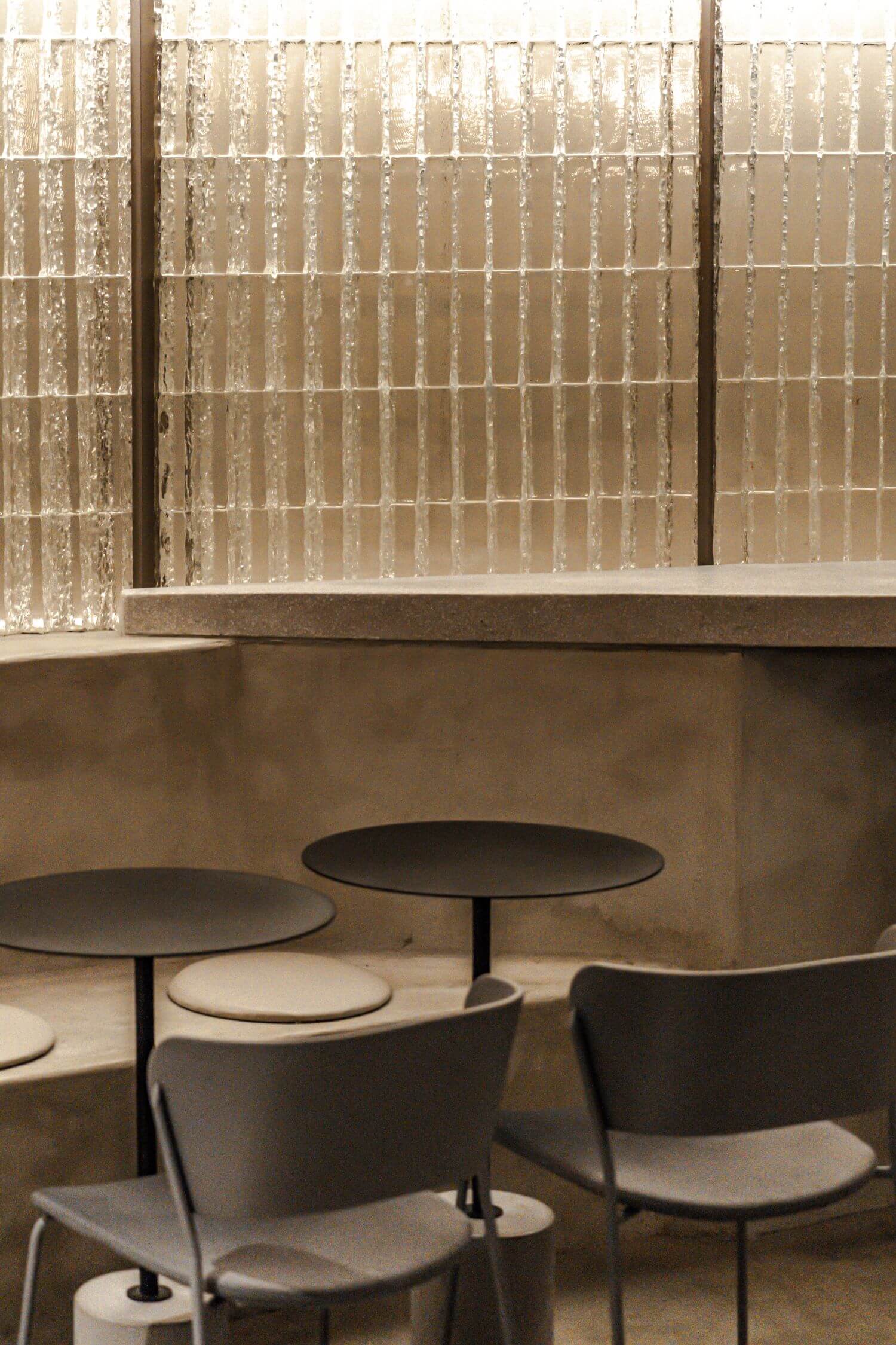
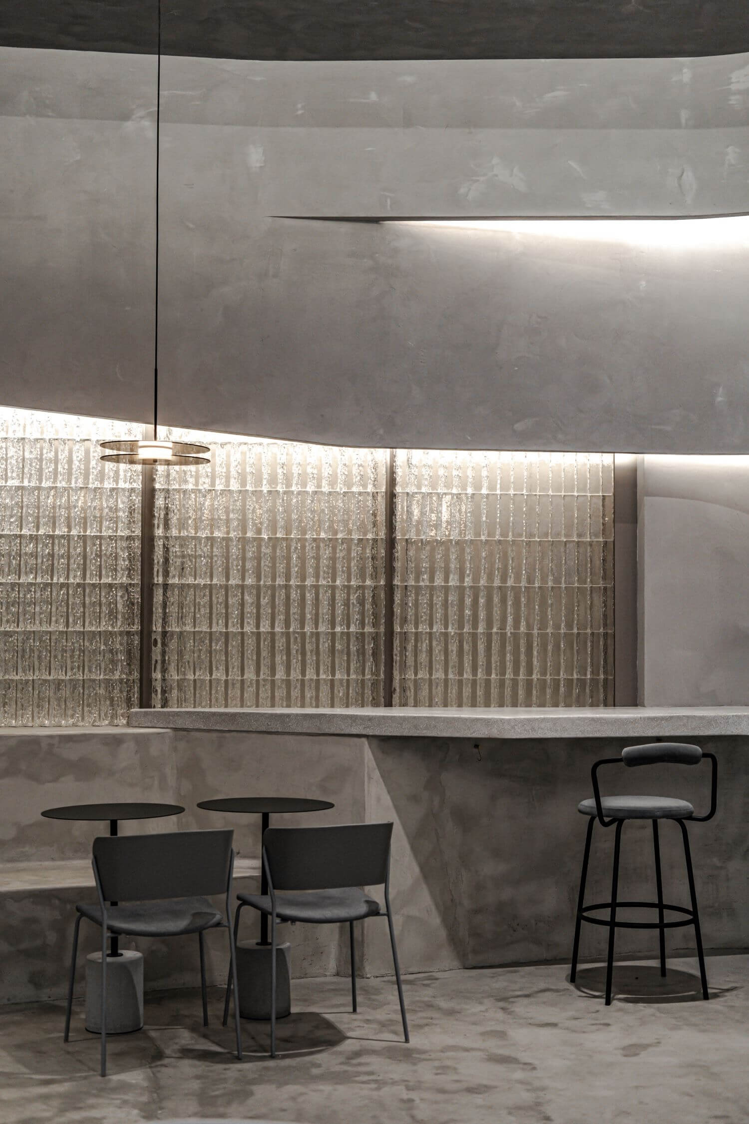
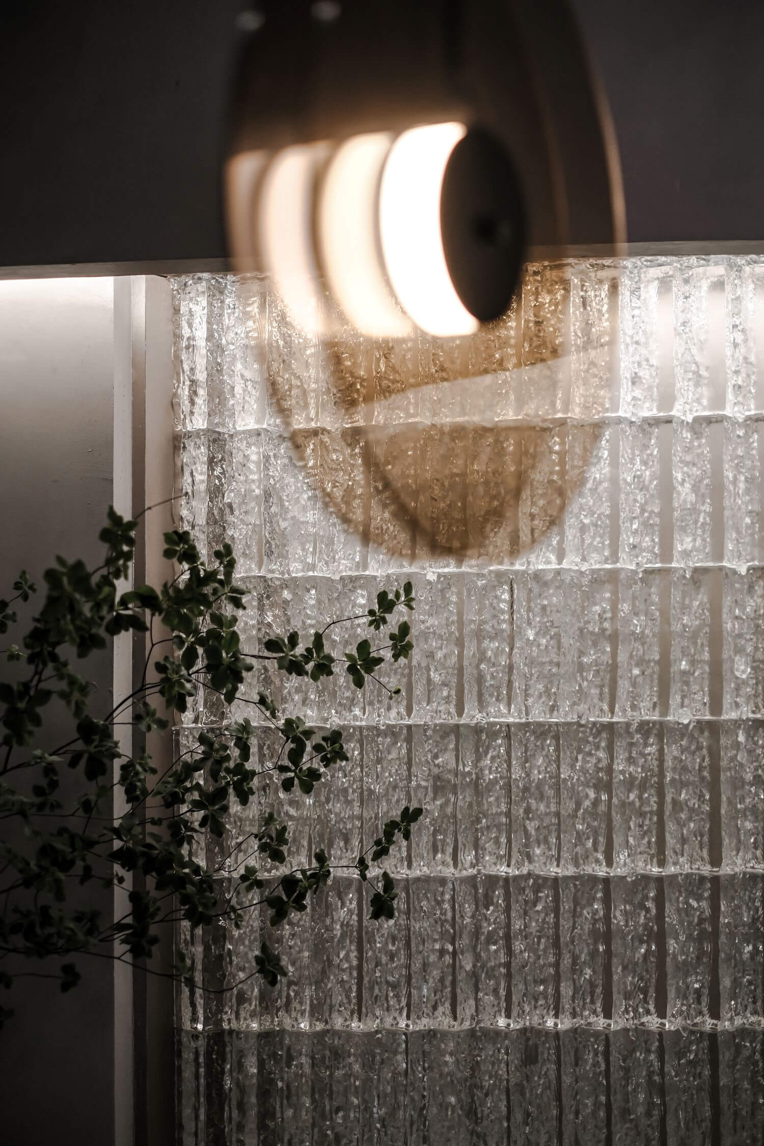
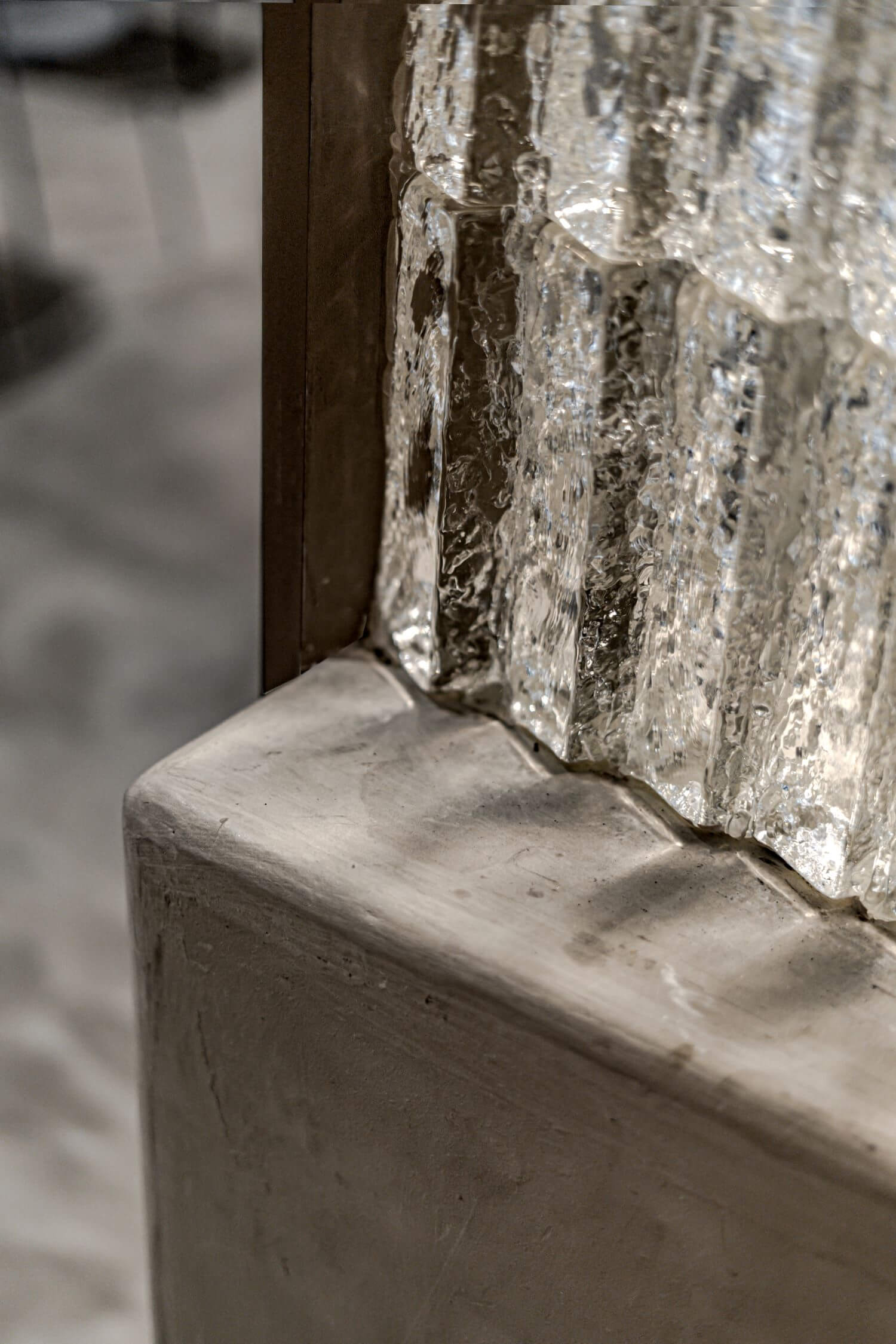
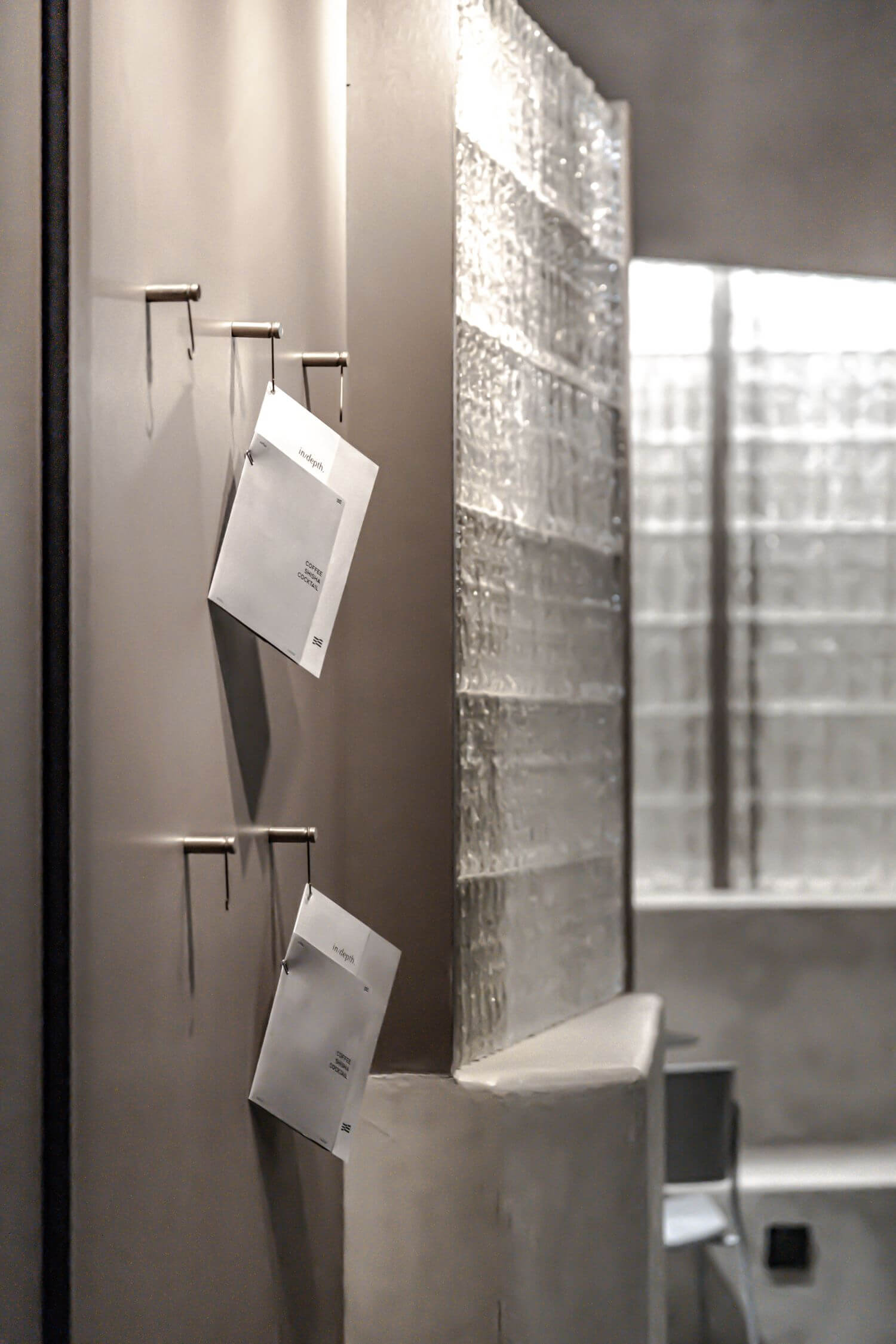
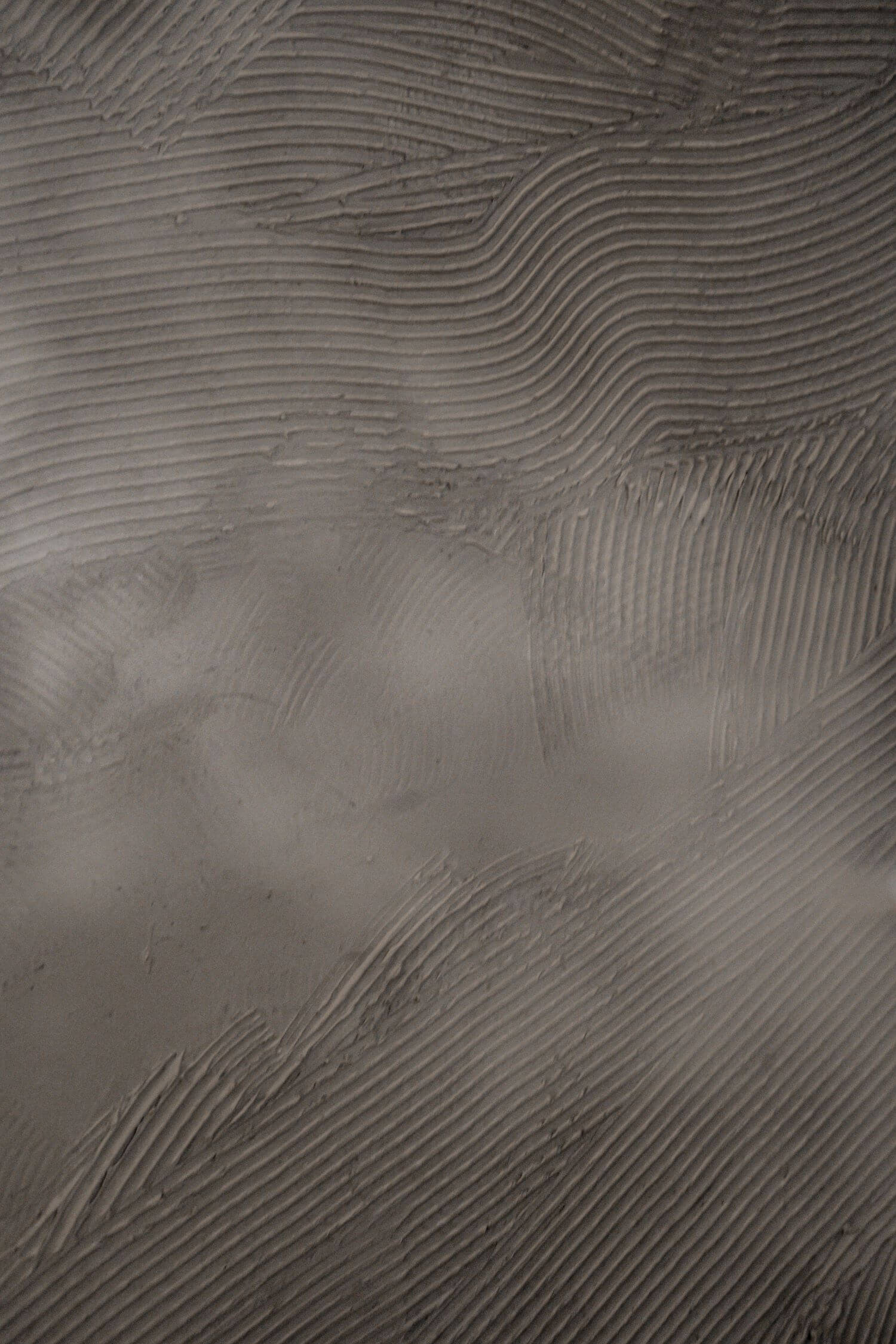
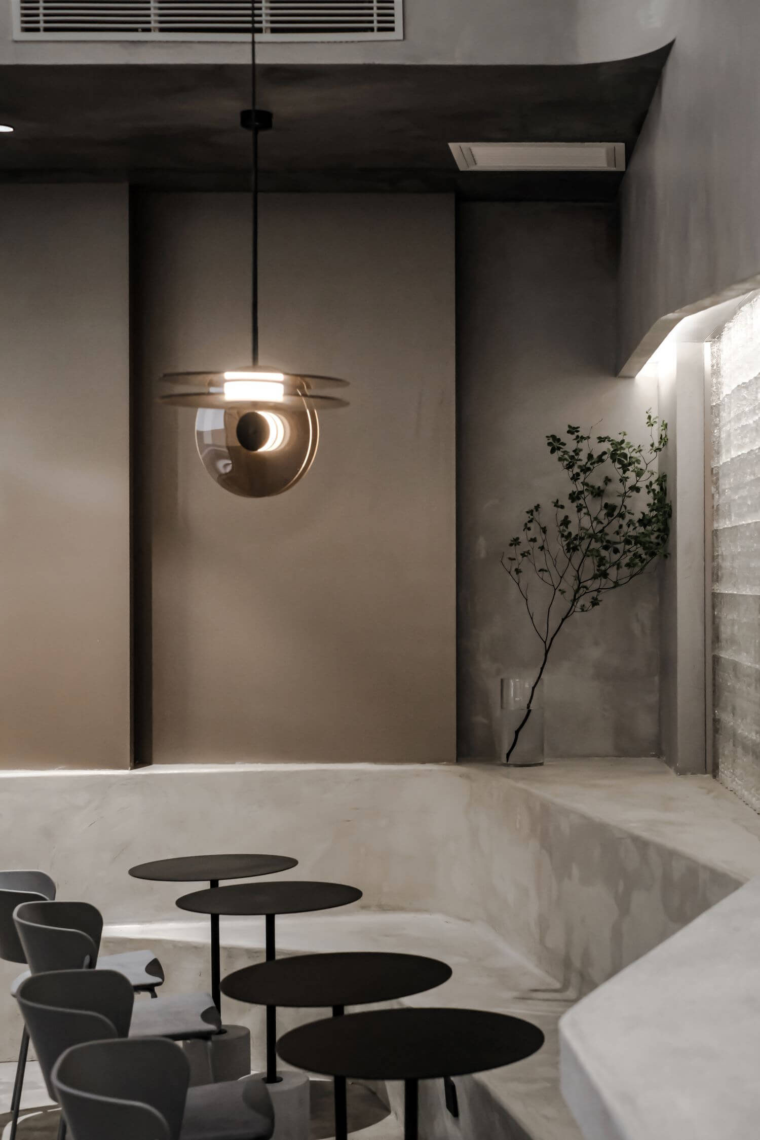
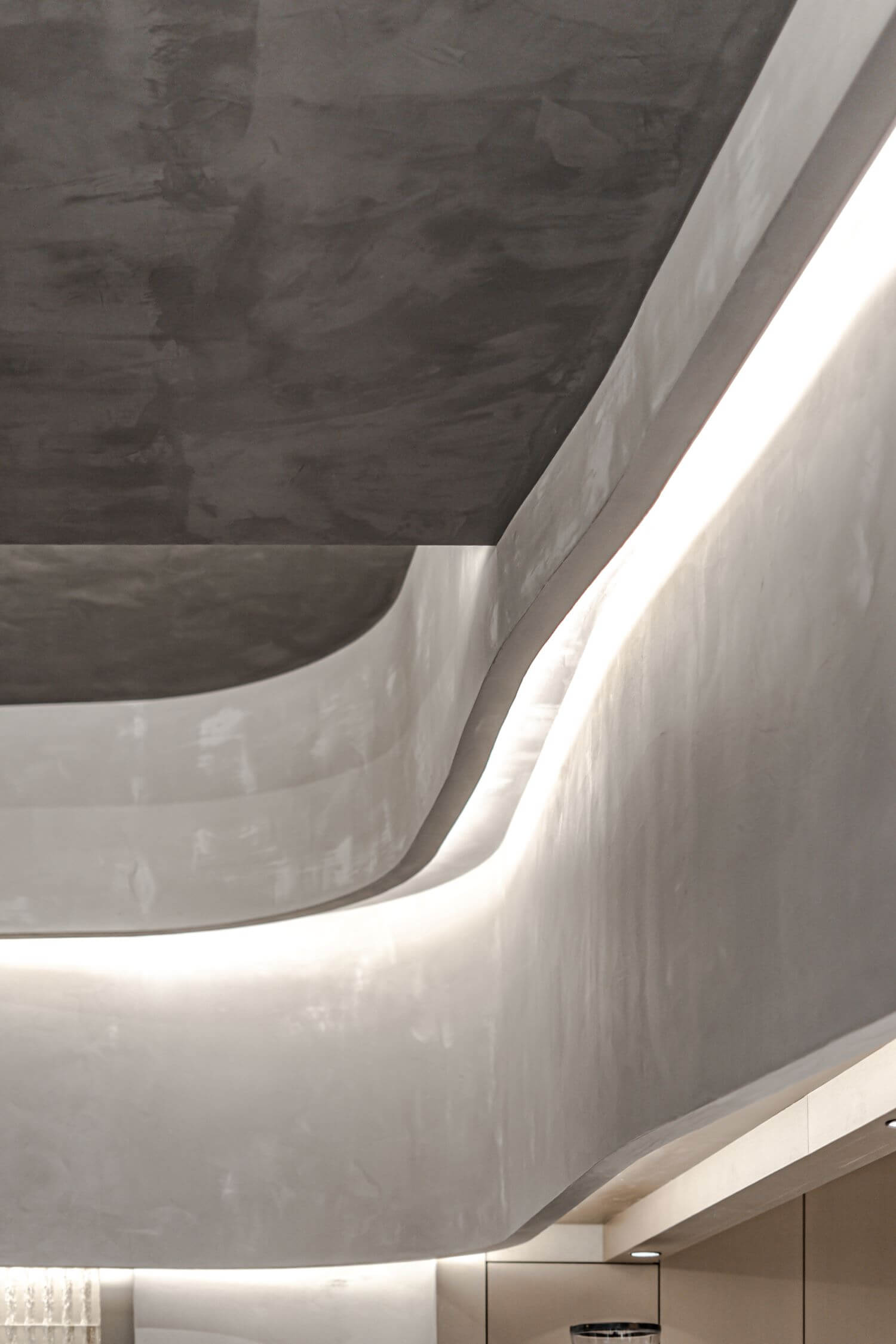
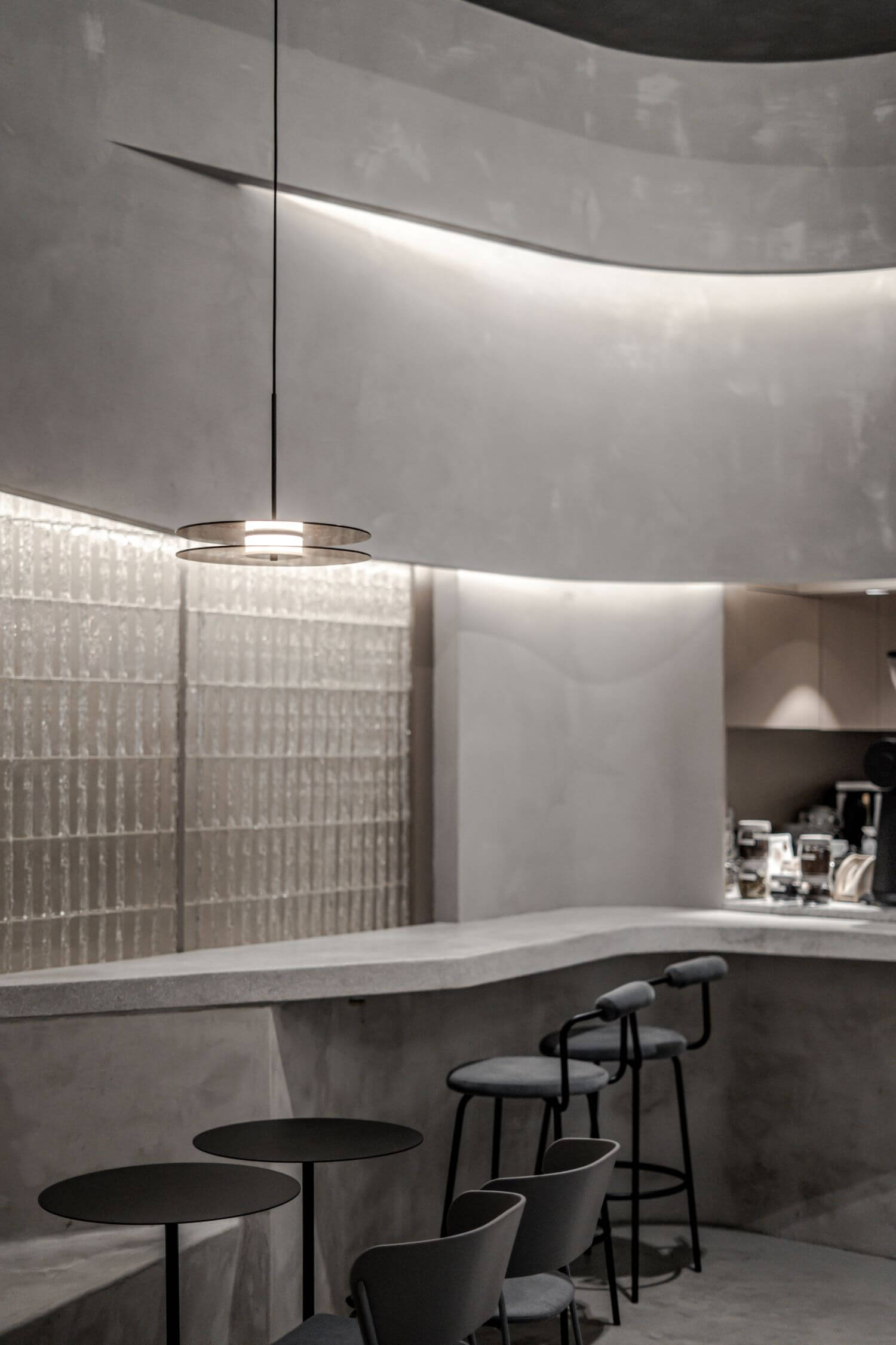
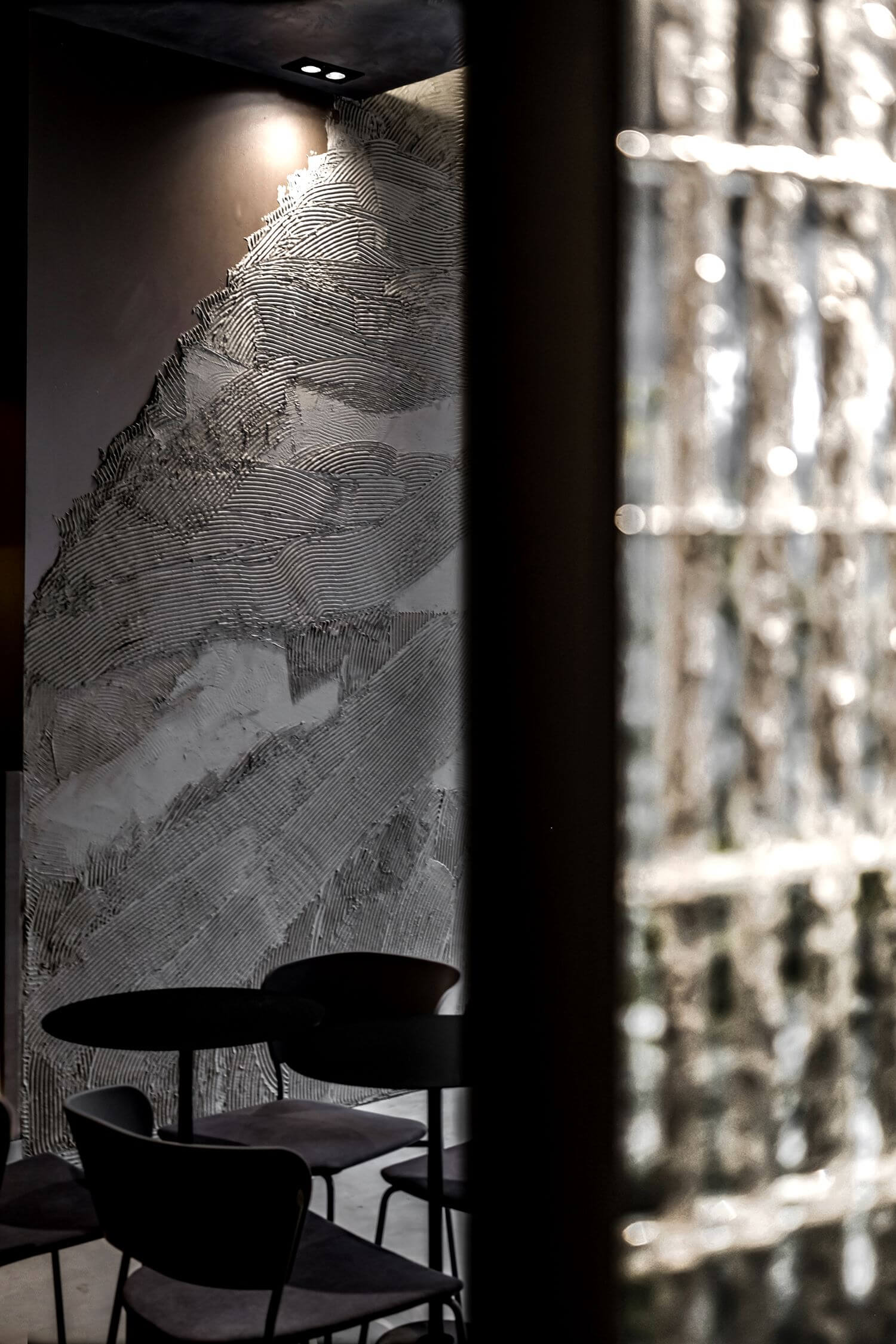
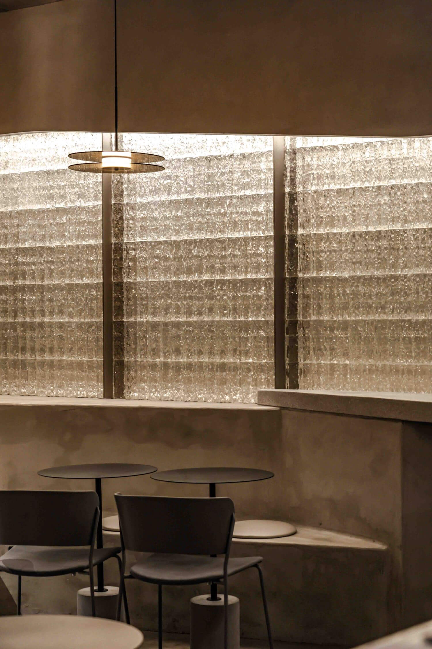
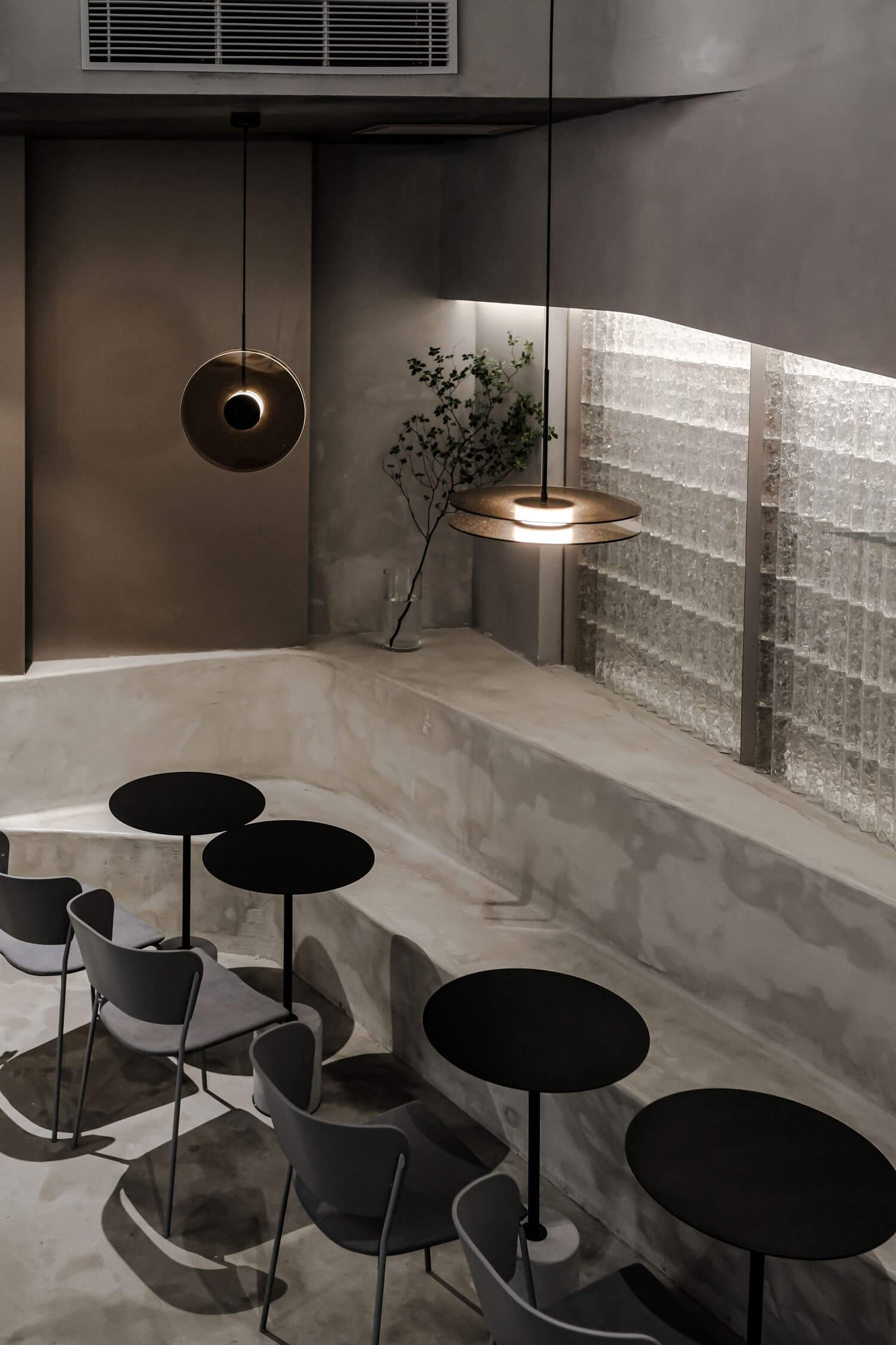
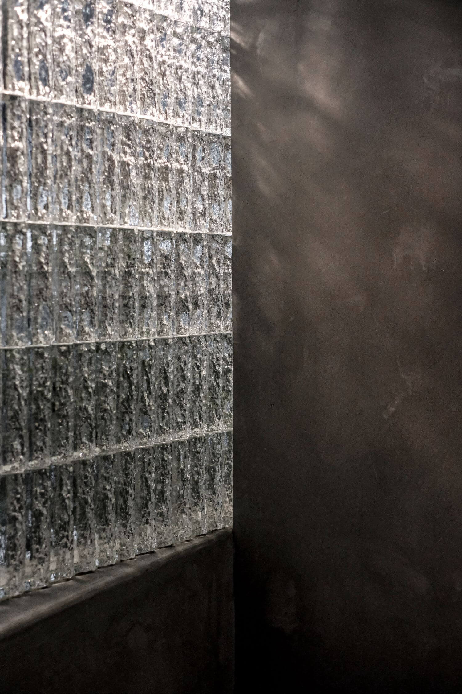
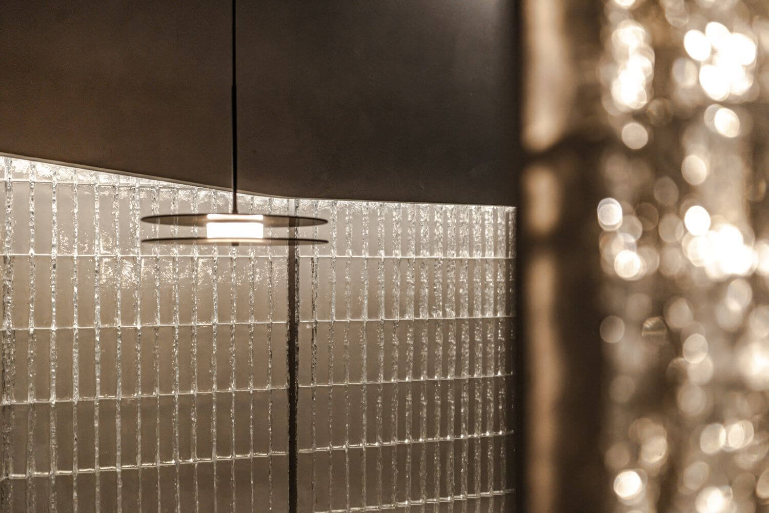
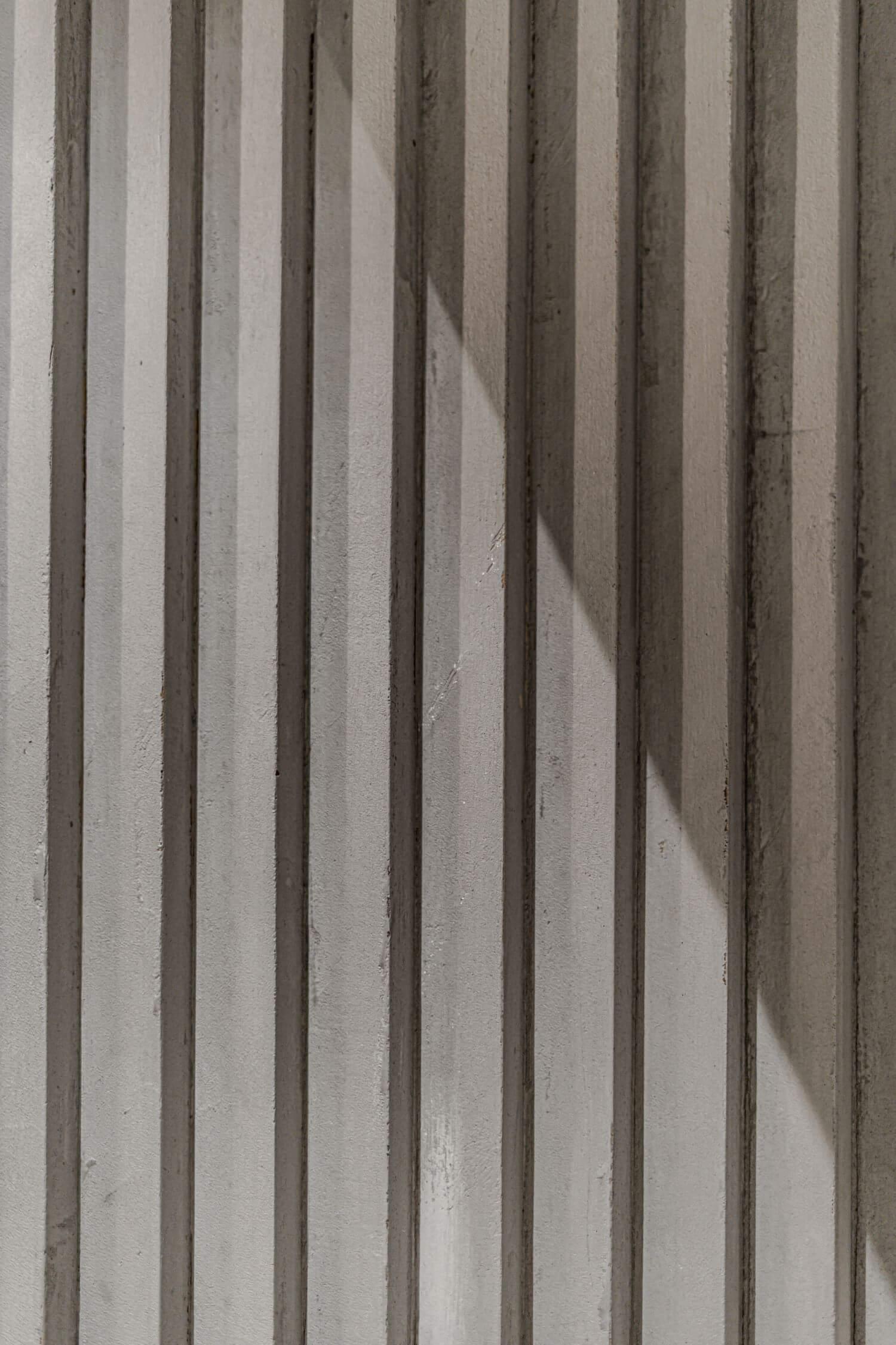
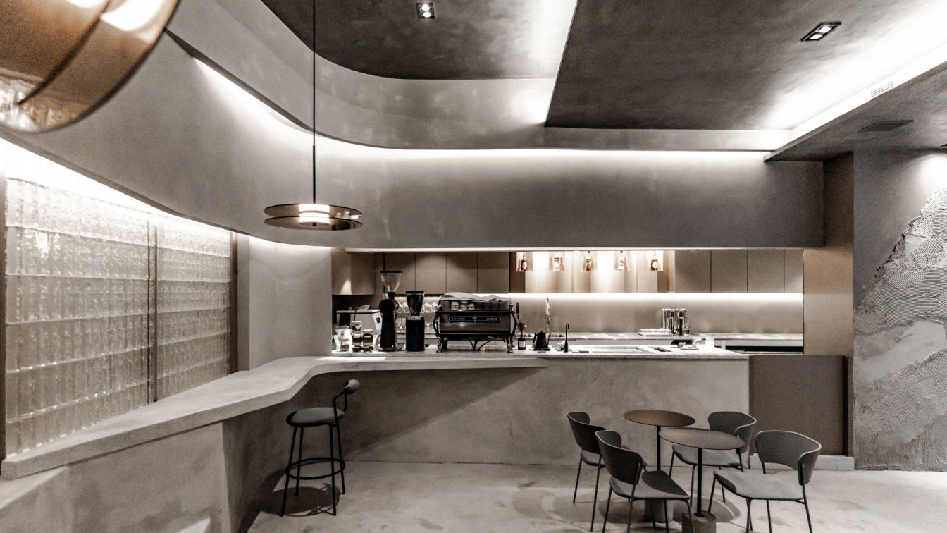
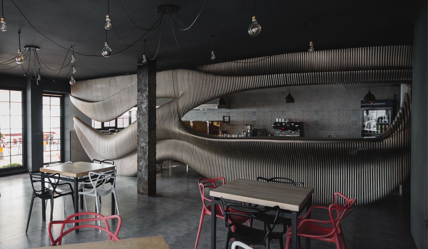
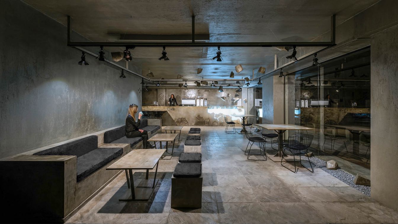
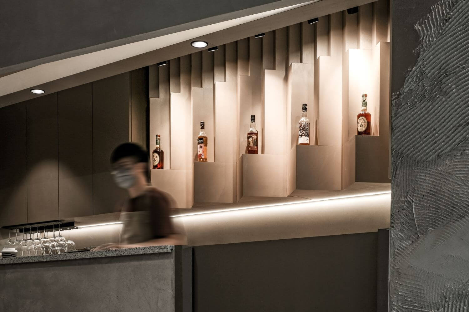
The cafe is designed with curves and layers to echo the theme, “depth”. Both rigid and feathery waves are presented to capture the motion of liquid. Layers of curves can be found through concrete seats in wavy form along with the soft reflection that the glass brick wall brings when the light is on.
Who are the clients and what's interesting about them?
The clients of this project are the stakeholders from different fields. They are all professional in their own aspect as this cafe is formed by baristas, shisha providers and also bar tenders.
What were the key challenges?
It is a cafe built in a small space where three different types of service are provided, plus the requirement from the owners that they would like to have different vibes for day and night to suit their operating needs.
What were the solutions?
We provided downlights and light troughs with different lighting temperature to offer various lighting combinations. Downlights could be used at daytime to have a brighter environment while light troughs on walls could be dimmed for groovy nights. Beams and ventilation pipes on the ceiling need to be covered for better visual presentation so we also created layers for it to fit in the theme "depth".
