jones | haydu: Located in downtown Oakland, The Caffè reflects the second generation of Bay Area icon Mr. Espresso, serving as an example of how our diverse cultural landscape is nourished by those eager to share their heritage with the community. The design is heavily inspired by Italian culture, using minimalism and contrast.
The Italians call the ritual of stepping into a caffè and enjoying espresso a “pausa” or a pause — a moment that allows for reflection and community. In Italy, the pausa is typically taken while standing at the bar. The goal of the design was to honor this most basic daily ritual and experience as meaningful, as art. In Italy, the espresso experience is more like getting a drink at a bar. All the ordering, waiting (and often the drinking) is done standing at the bar. The experience, then, is essentially having coffee at a communal table.
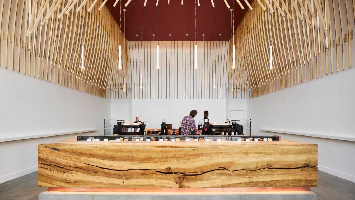
The design centers around this communal ritual. To accommodate a good volume of people, the bar is not simply linear, but sits as an island in the space. Great care was taken in the design to provide a multitude of experience around the bar, while remaining democratic and non-hierarchical. This concept led to a custom designed pastry display that is kept long and low, reminiscent of a jewelry shop.

Informed heavily by Italian cuisine, which is masterful at creating great complexity with minimal ingredients, we chose to minimize the number of materials used, and to celebrate their innate richness. Crafted from slabs of a single Valley Oak tree that fell in 2008 at a farm south of Chico, the primary bar frames nature as the focus. The perimeter of the caffè hosts a Calacatta marble ledge, a nod to Italy’s most ubiquitous, yet luscious, materials.
The Italian notion of contrast, “chiaroscuro,” provides further inspiration. Behind the bar, hand polished copper contrasts with the organic nature of wood and stone. Overhead, a wooden sculptural form is used in a diaphanous manner in contrast to the heavy stable oak bar. Highlighting the verticality of the space, the sculpture is a gestural move to provide both monumentality and intimacy; to form both an object (from outside the bar) to a space (once underneath). From some angles it is airy (chiaro); from others it is quite solid (oscuro). Though the shapes and fabrication process are modern, it is a nod to the domes and arcades of the Renaissance and Baroque periods.
The sculpture is composed of 272 slats formed from a total of 528 pieces, all made of birch plywood, CNC’d, designed and laid out to minimize waste. Each slat is roughly 12’ in length, 2” wide tapering to ¾”, and weighing roughly two pounds. Prototypes were made and tested at the architect’s office. Final slats were assembled, glued, and stained by the architects at the client’s warehouse. Many different staining processes were tested. The final stain was achieved with Ethiopian Shantawene coffee, brewed quite strong, and wet applied. Once dry, the slats were hand rubbed with beeswax.


