Babayants Architects: How an interior is born? At what moment an image appears? We don’t have a certain script.
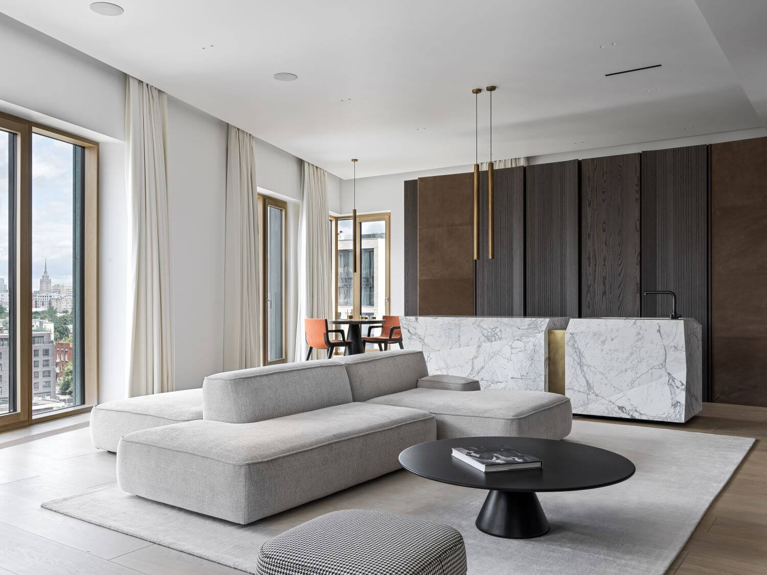
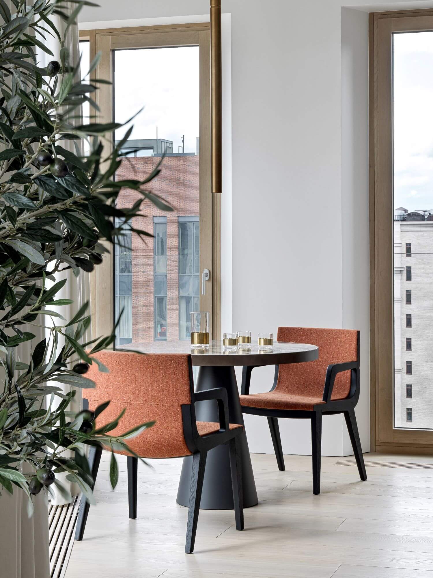
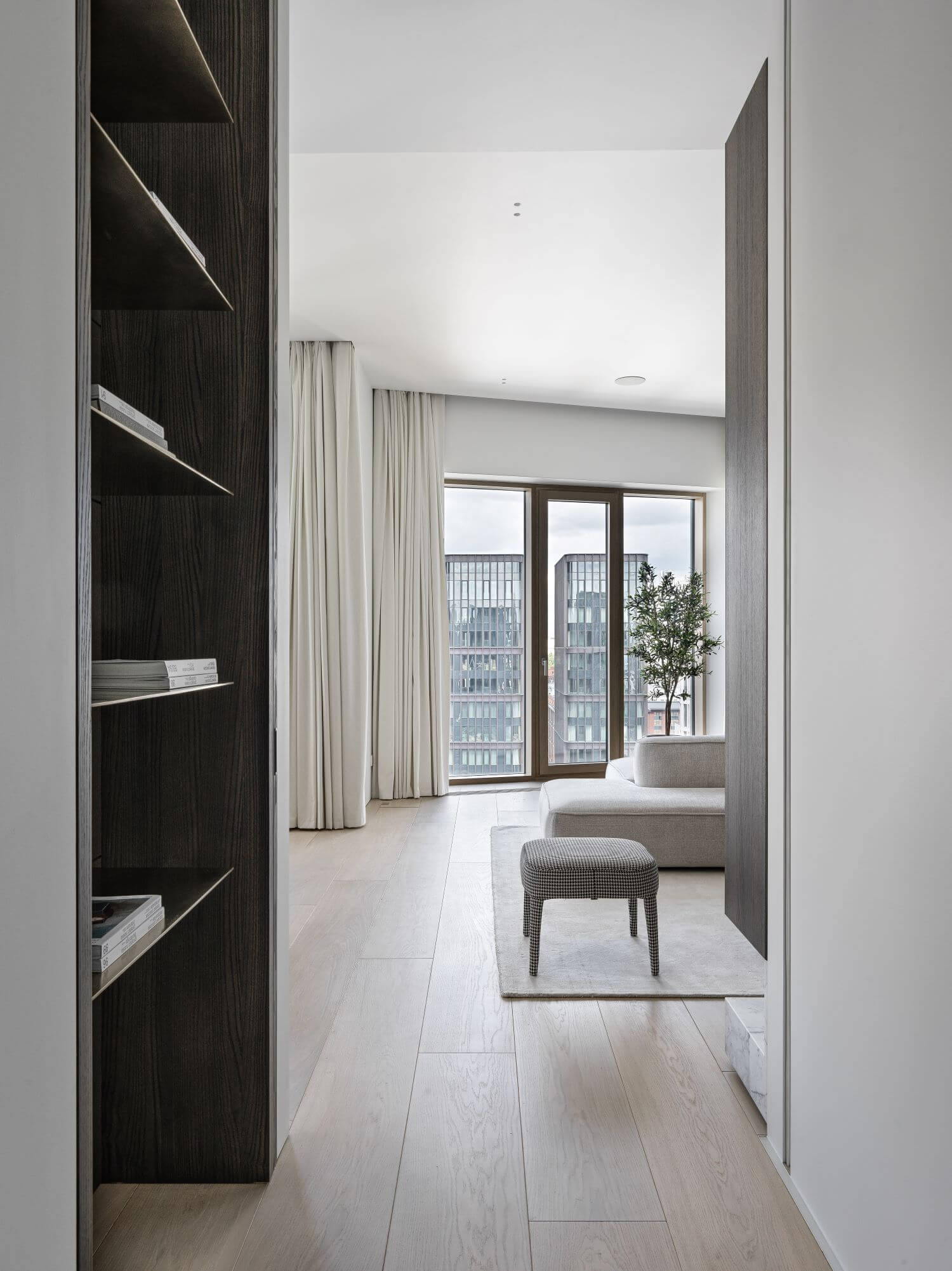
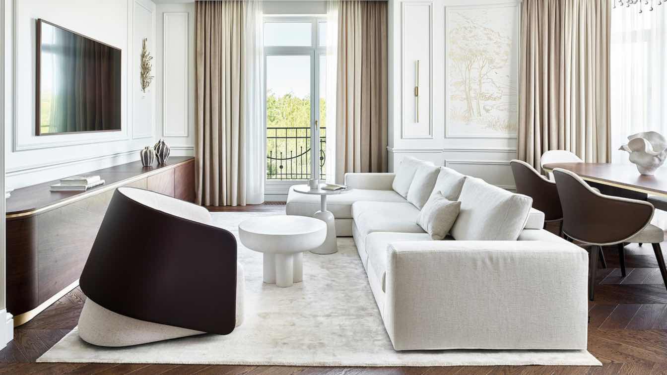
Many of the ideas for this project came to our minds when we first visited the apartment. So, we had a wonderful space with high ceilings, lots of daylight and a splendid view.
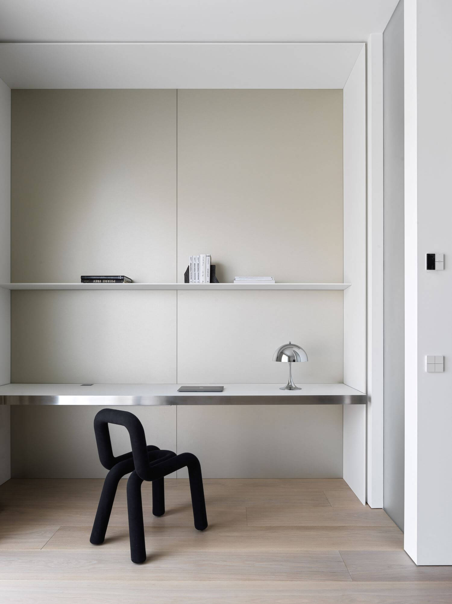
Our task was to show and highlight all the advantages. Designing in such a case should be very empathetic and nuanced. We had to implement a lot of functional solutions and not to make the space top-heavy, not to cut it into small parts. And the main thing - not to pull the focus.
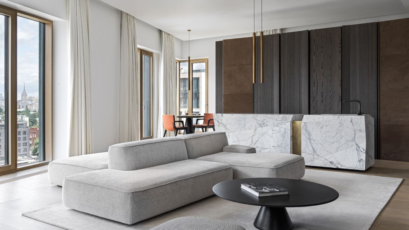
Sky, lake, changing weather are the main actors in this project. And the interior is a decent and appropriate frame for it. ⠀
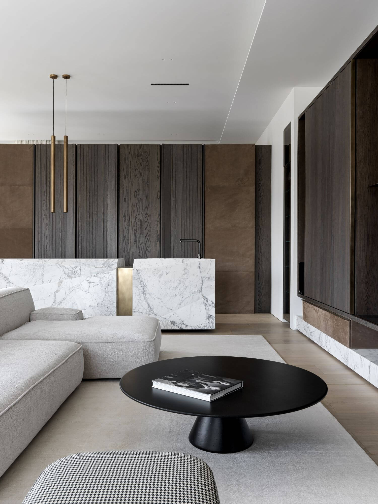
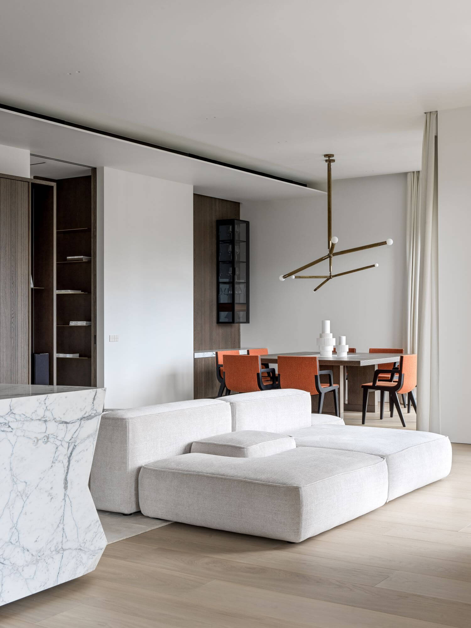
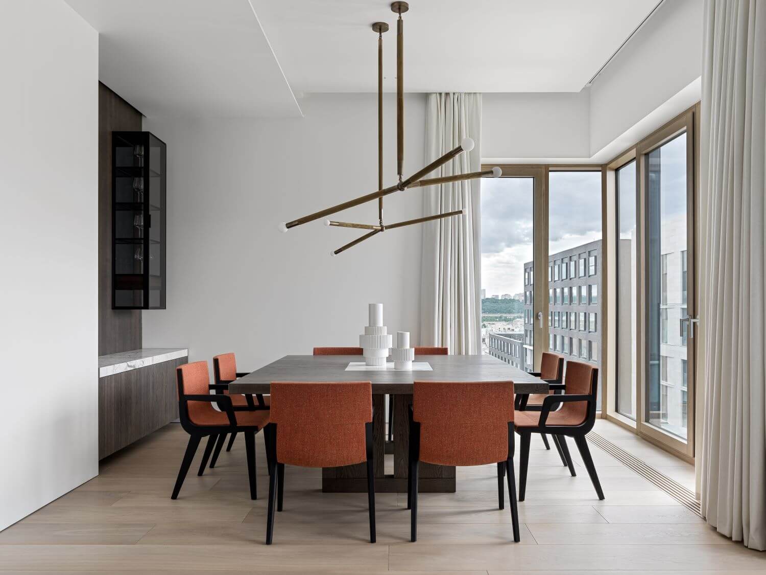
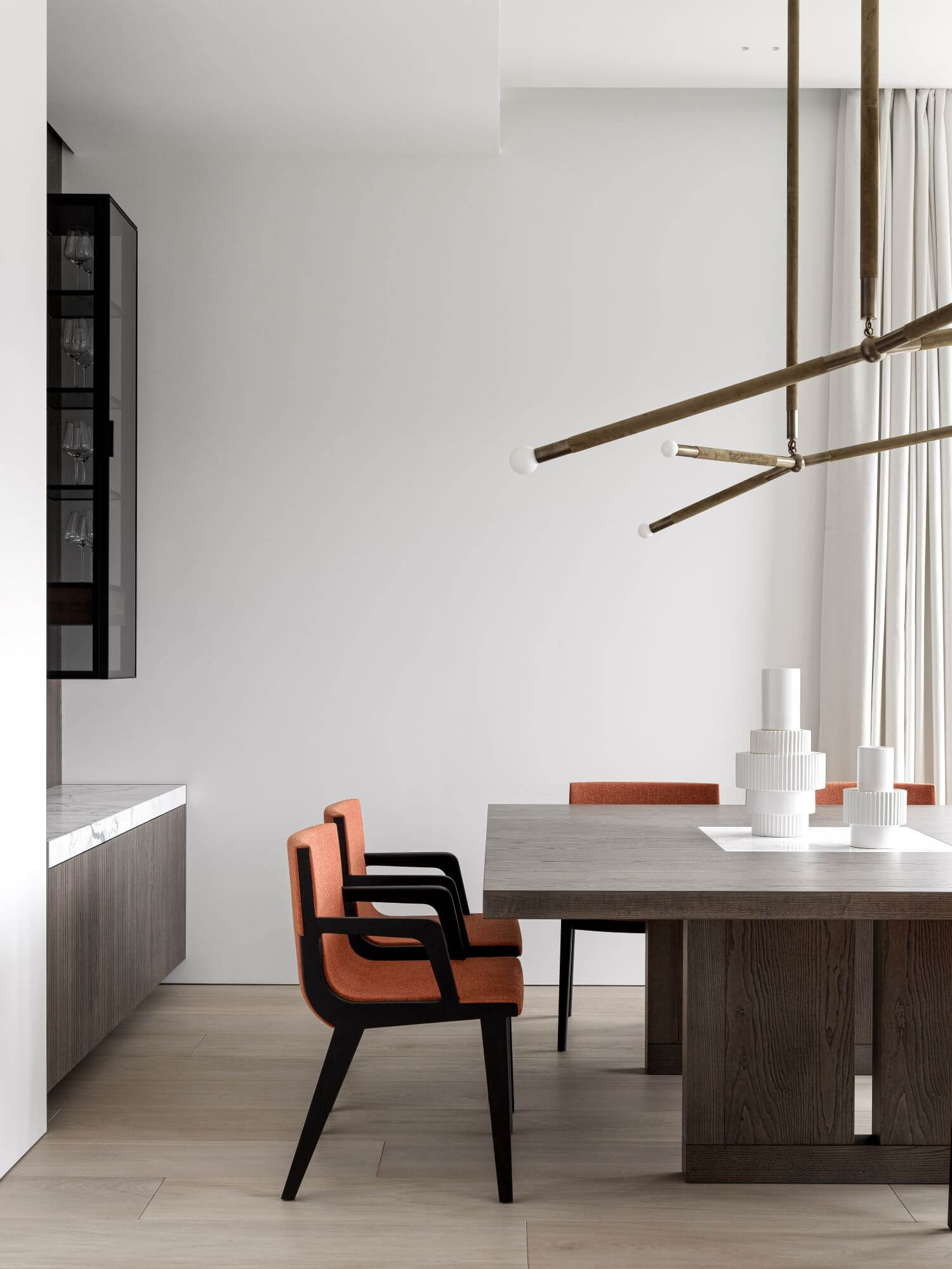
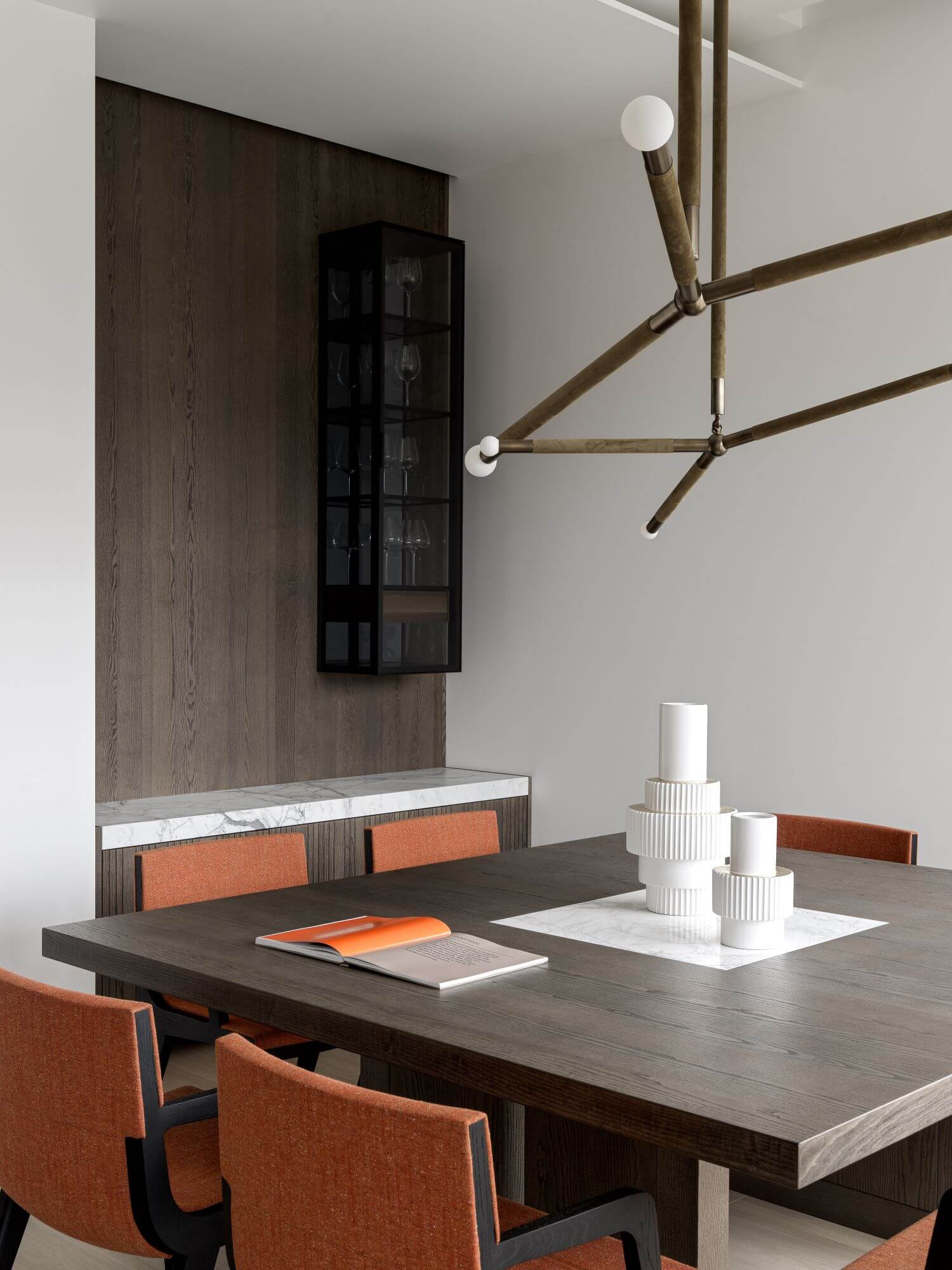
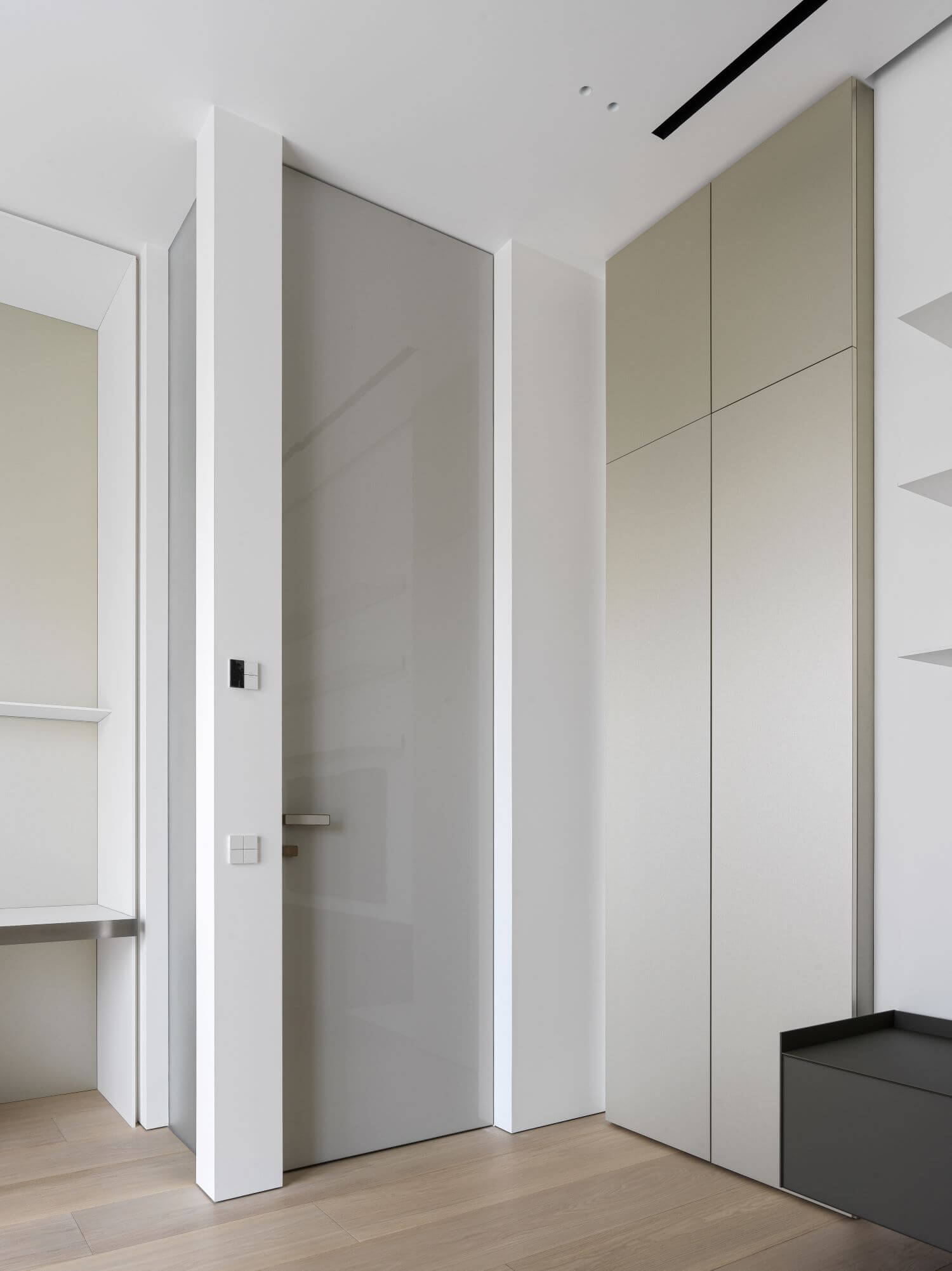
Working with high ceilings might also be tough. When you have a 3.4 m ceiling you can’t make things too small and placing furniture accidentally would be too obvious. We controlled all the proportions on the plan and built clear compositions to avoid the risk of things looking unscaled. Simple geometry gives a feeling of right and harmonic composition.
So, the priority points were:
1) Multifunctionality, integrity. Visual ease and spaciousness, usage of every centimeter.
2) A subtle but restrained style.
3) Individuality of our clients.
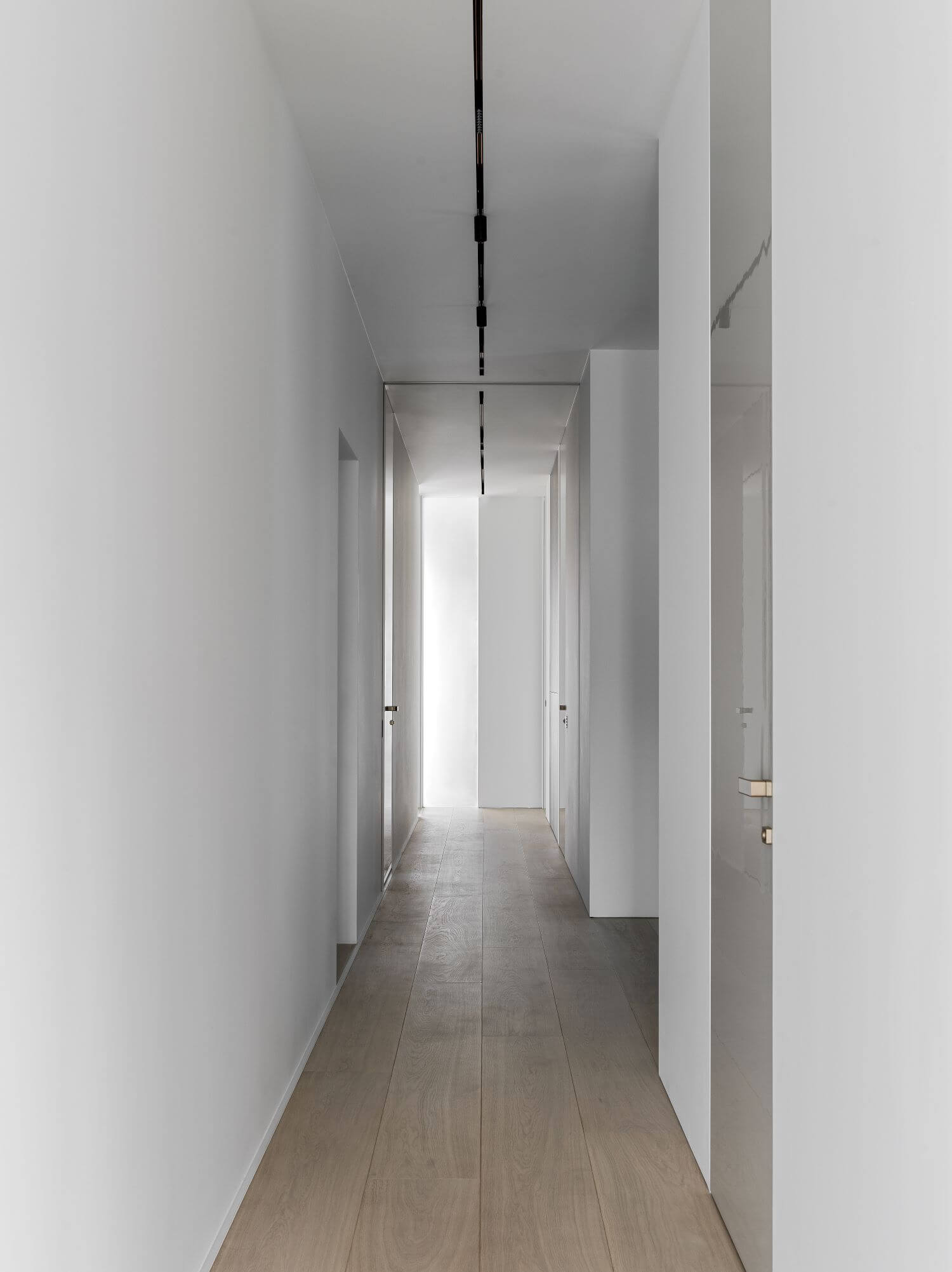
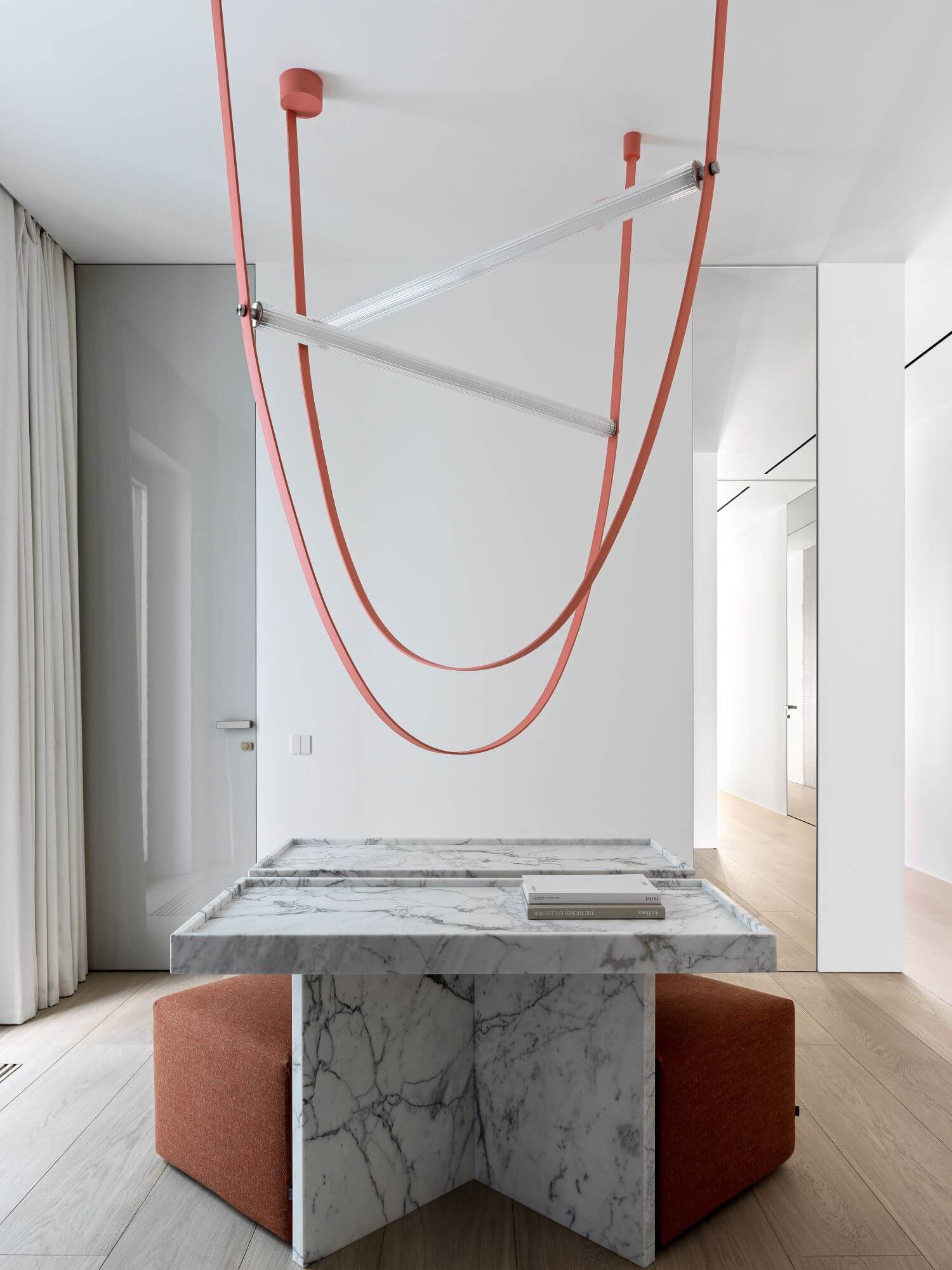
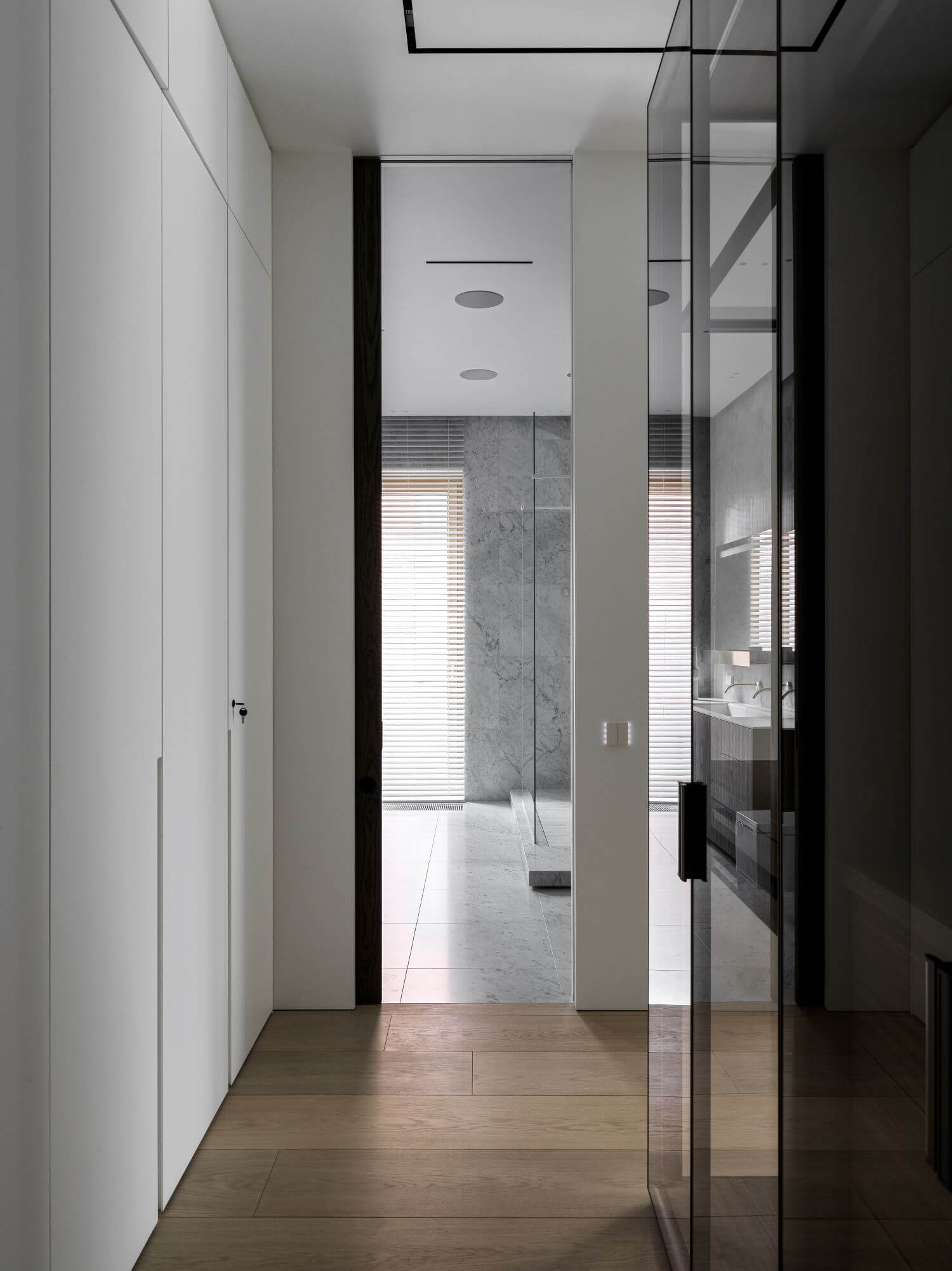
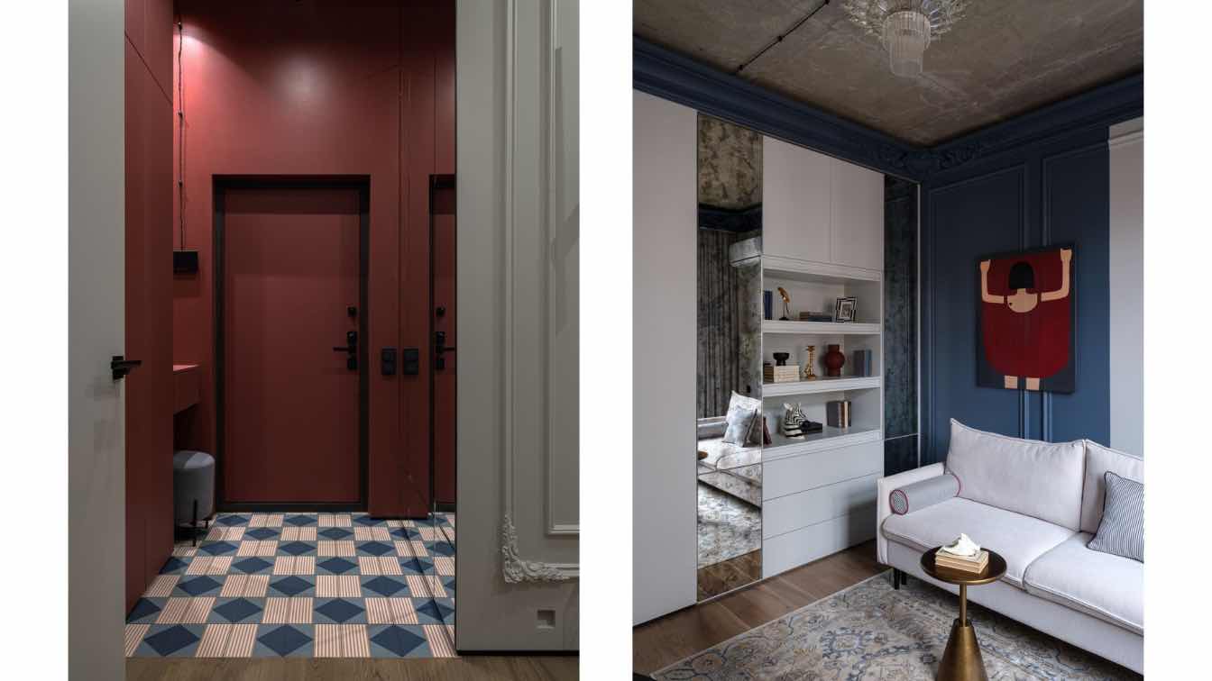
Hallway always creates the first impression about space you enter - here you see the proportions, feel the atmosphere, mood and style.
It must tell the story of the place. That is important not only for living, but also for public spaces and commercial interiors.
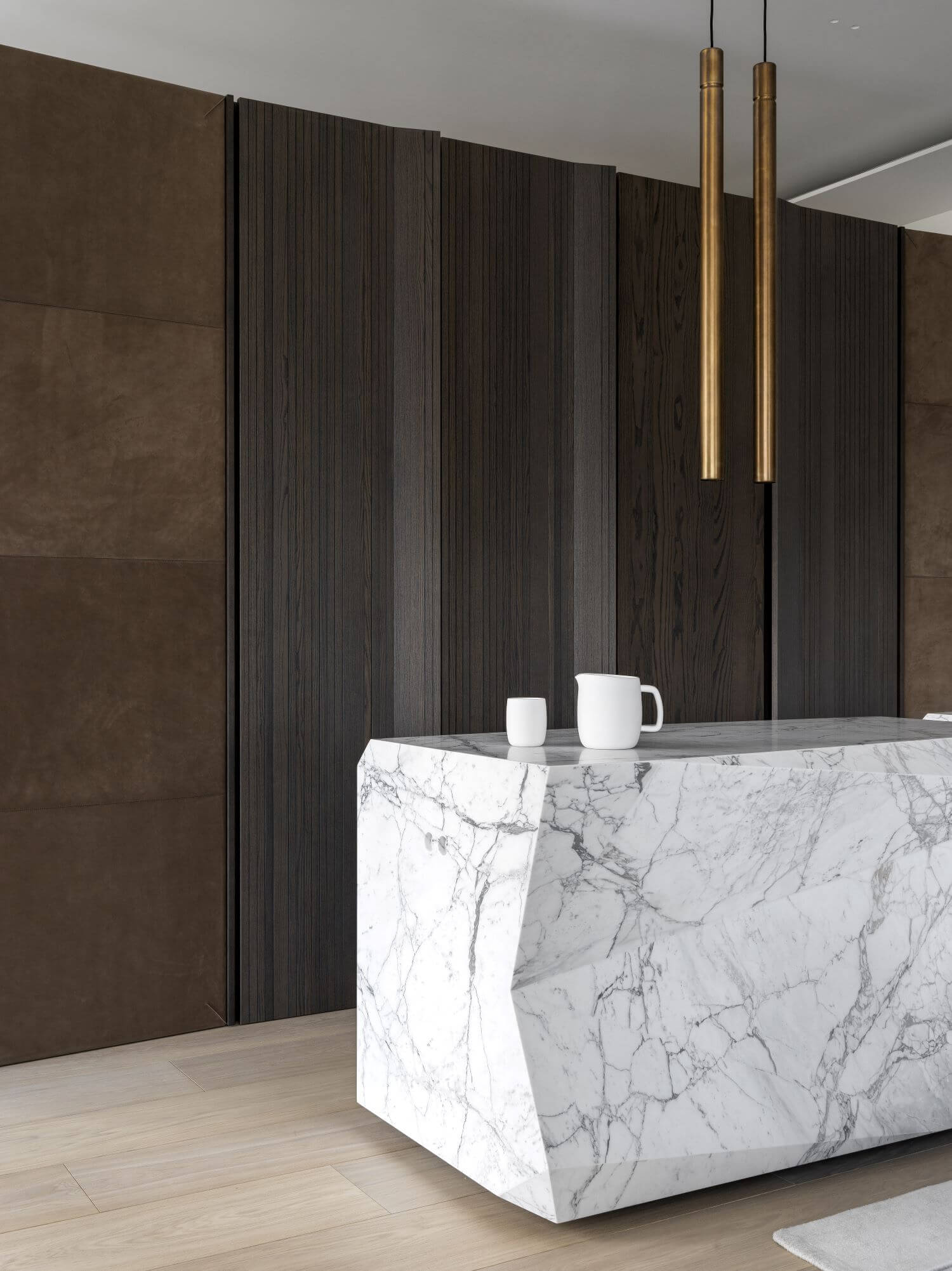
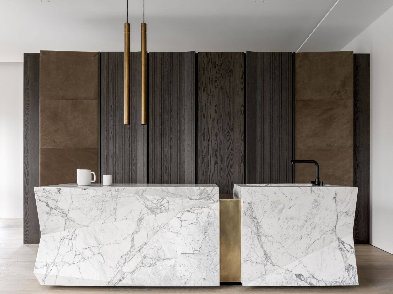
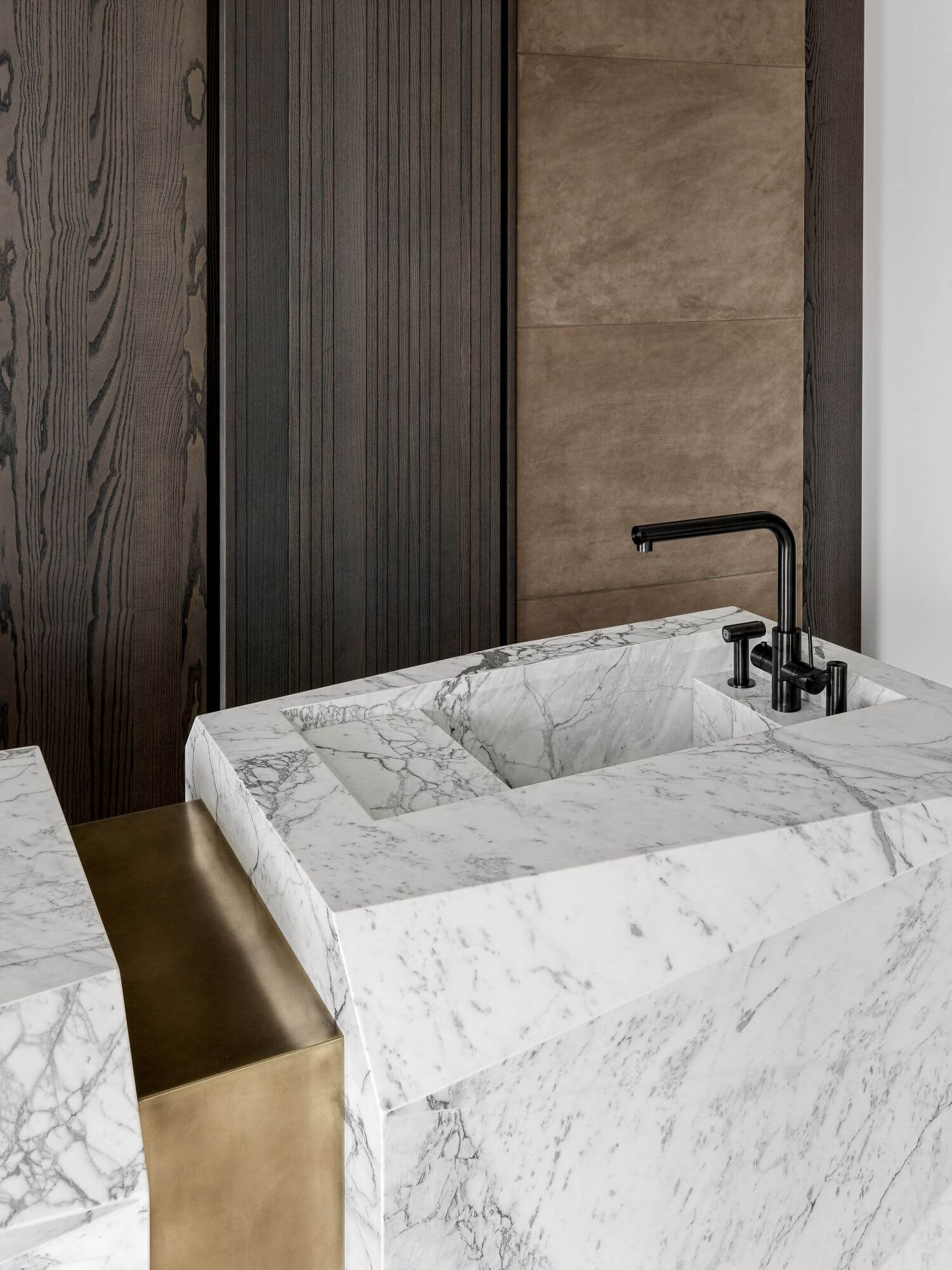
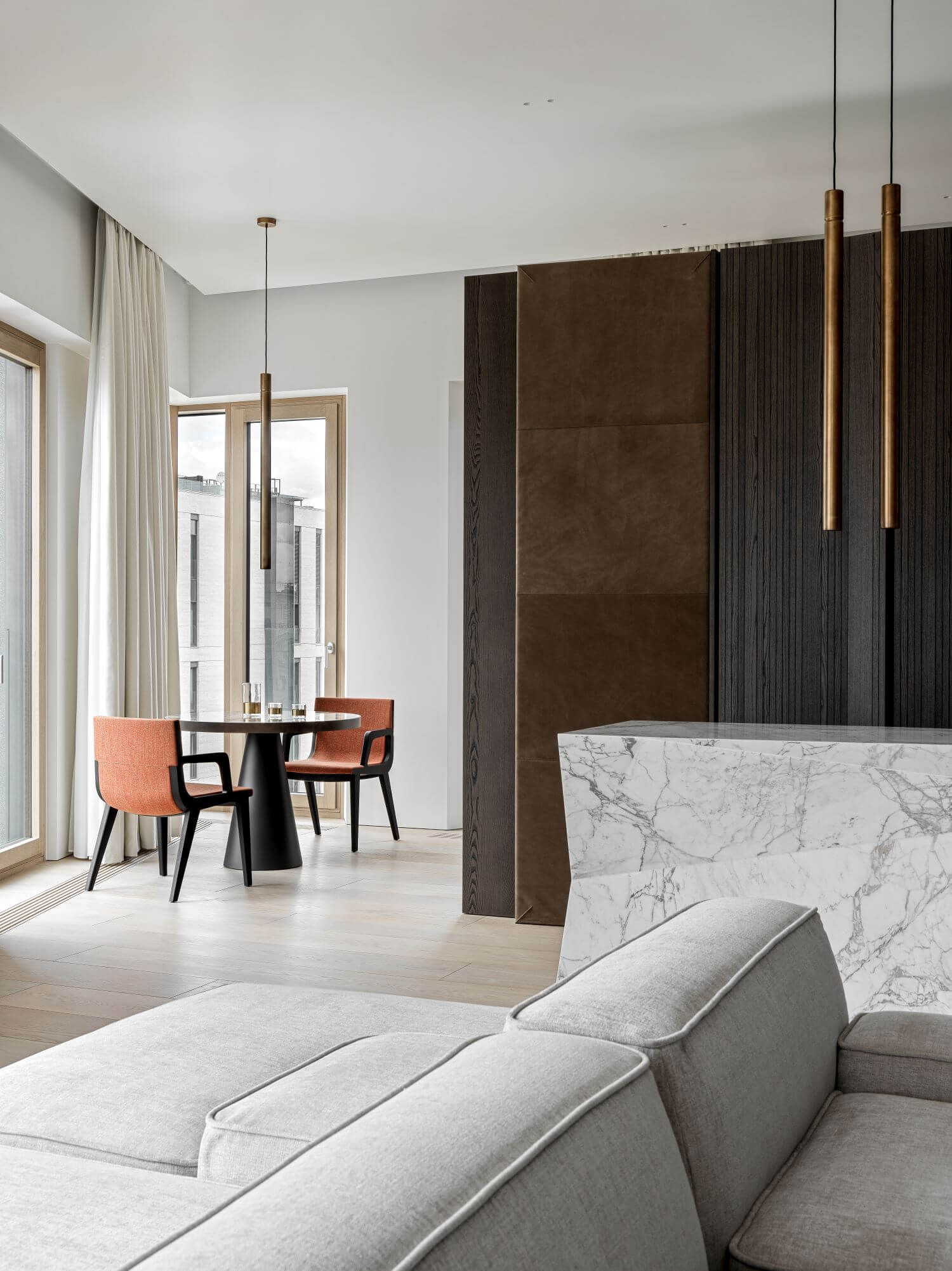
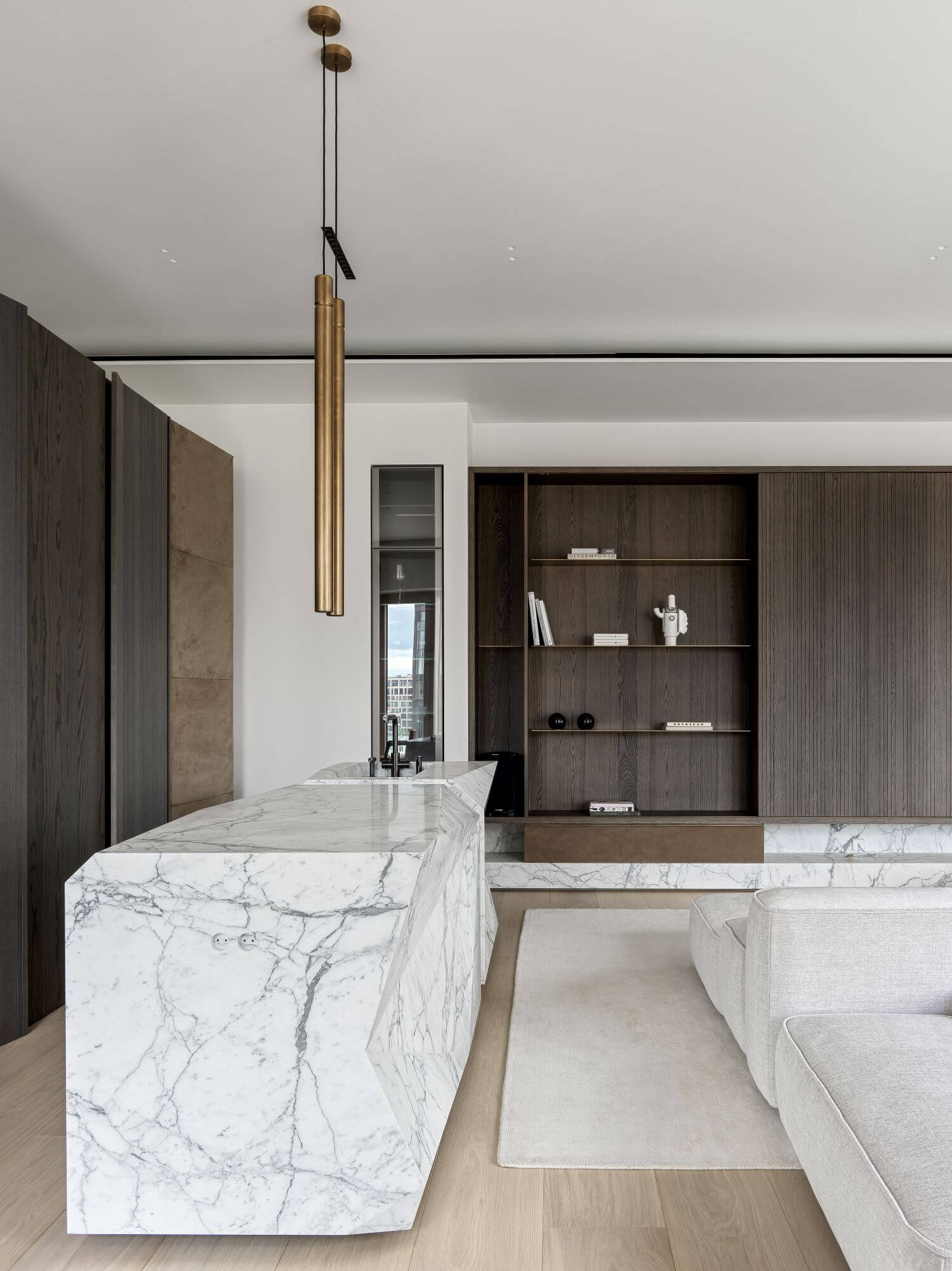
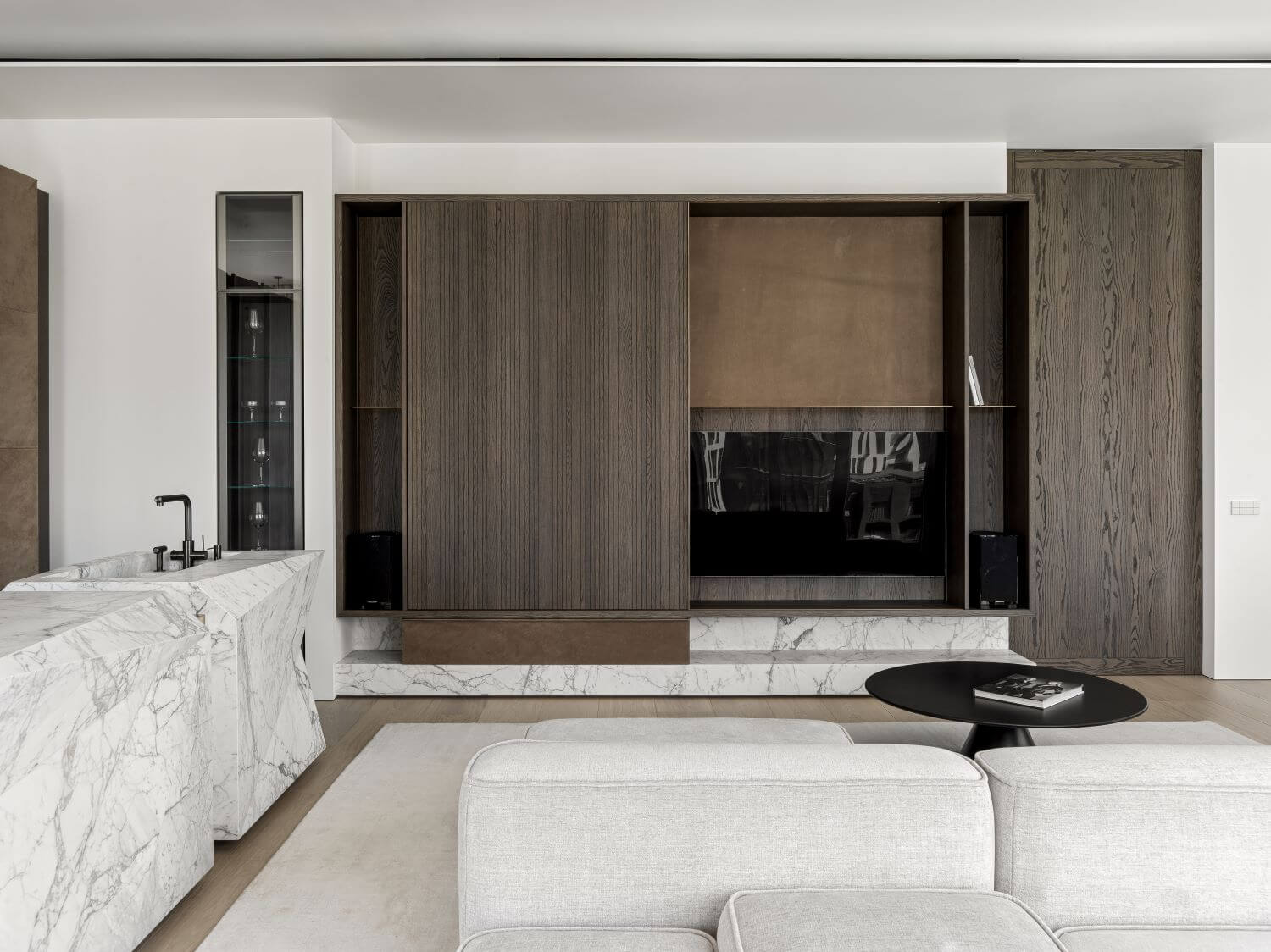
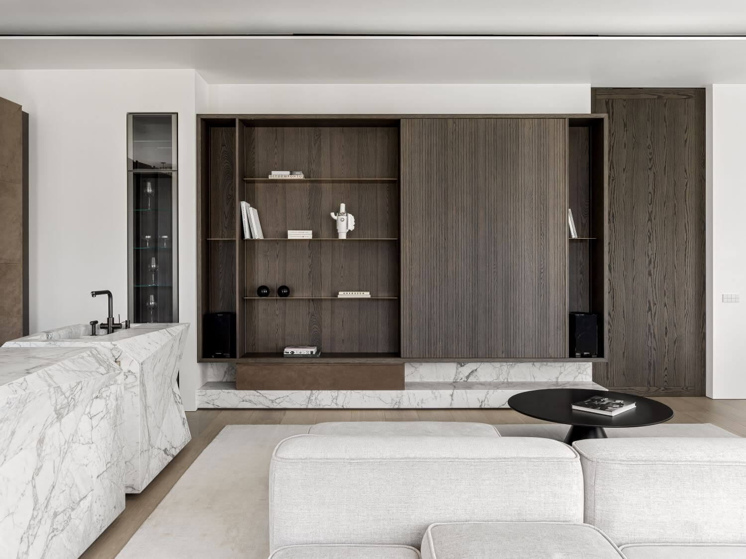
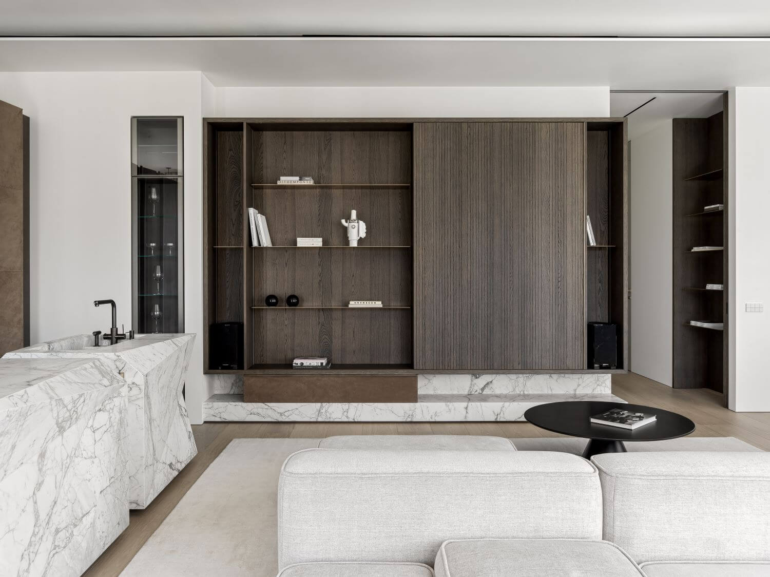
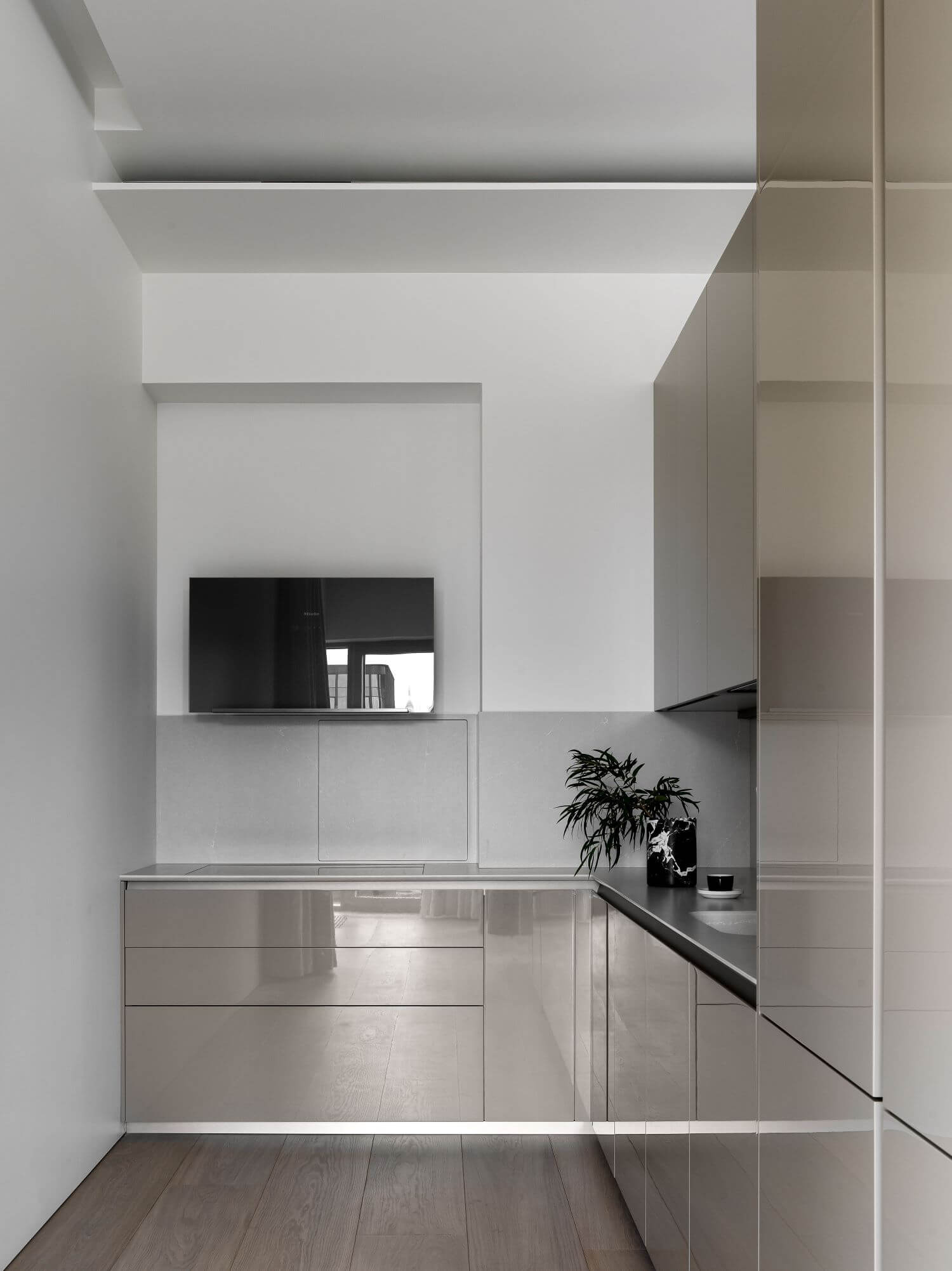
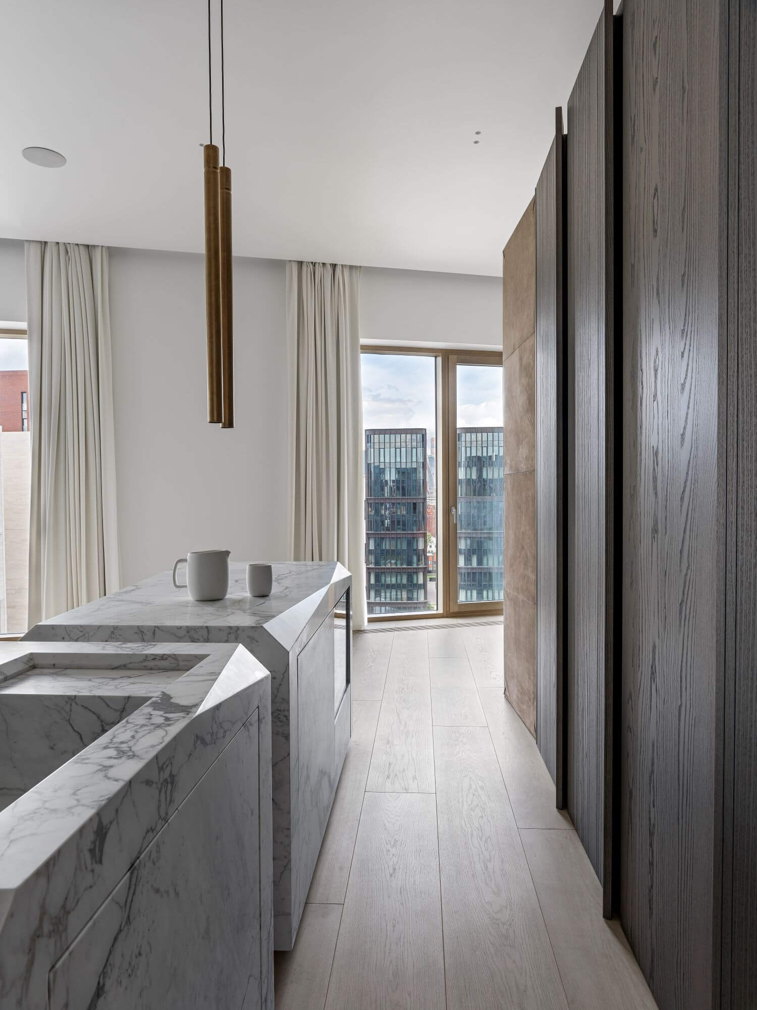
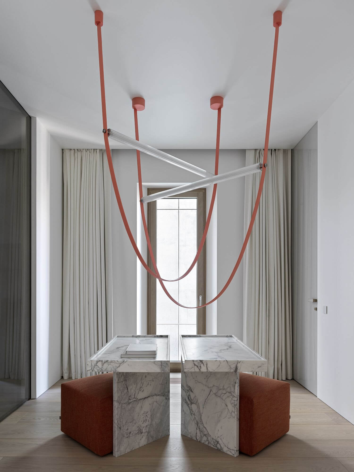
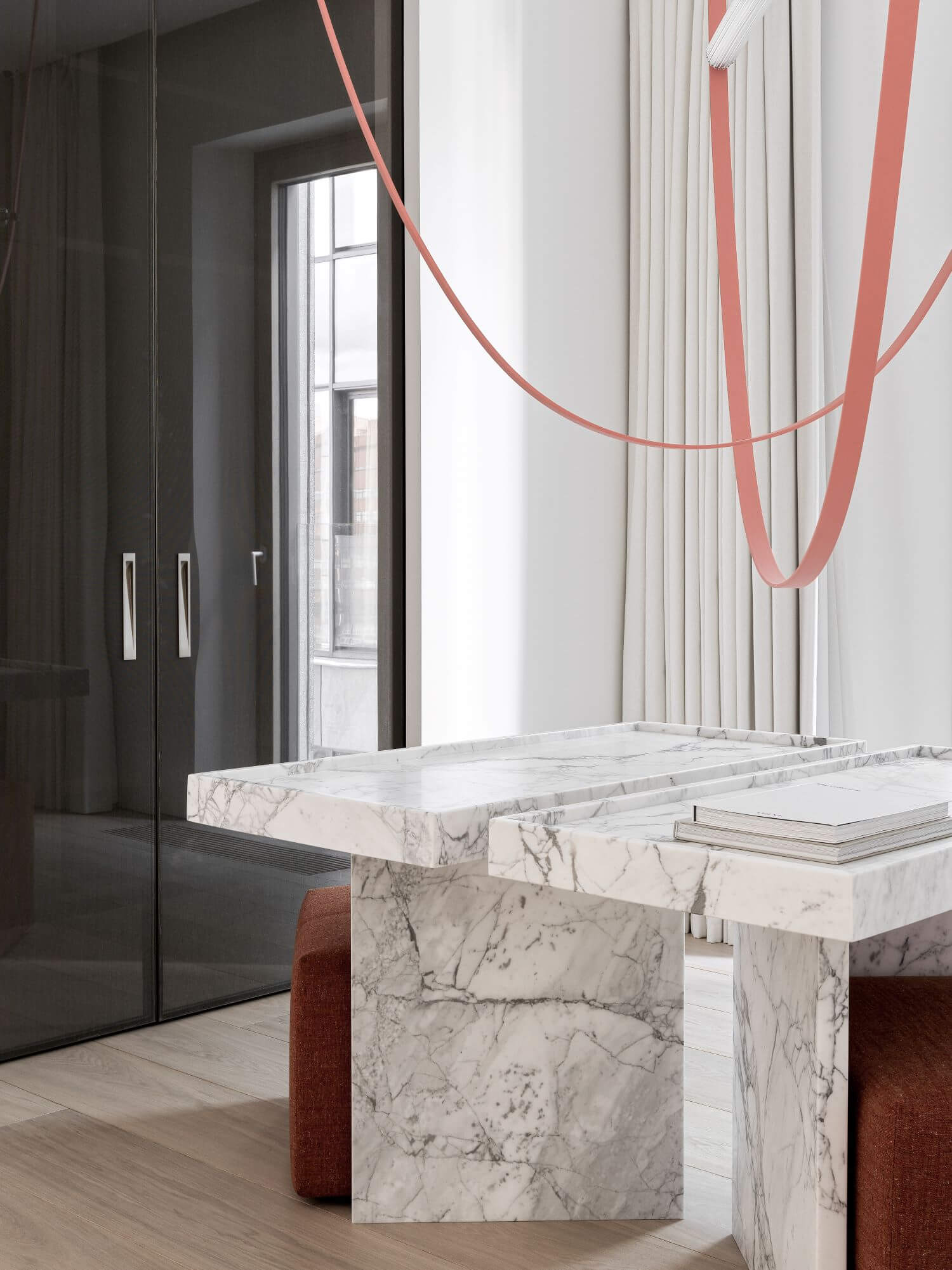
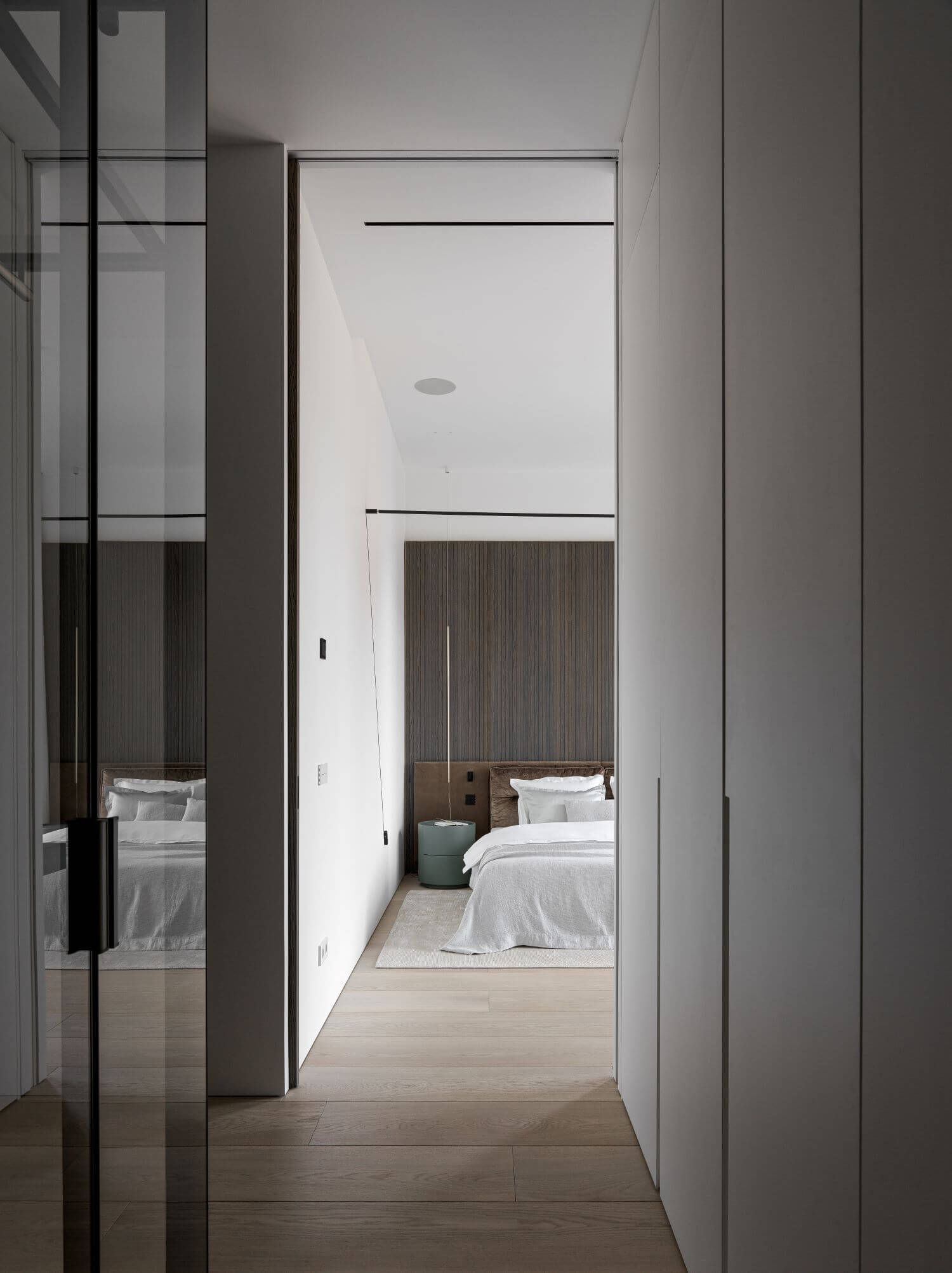
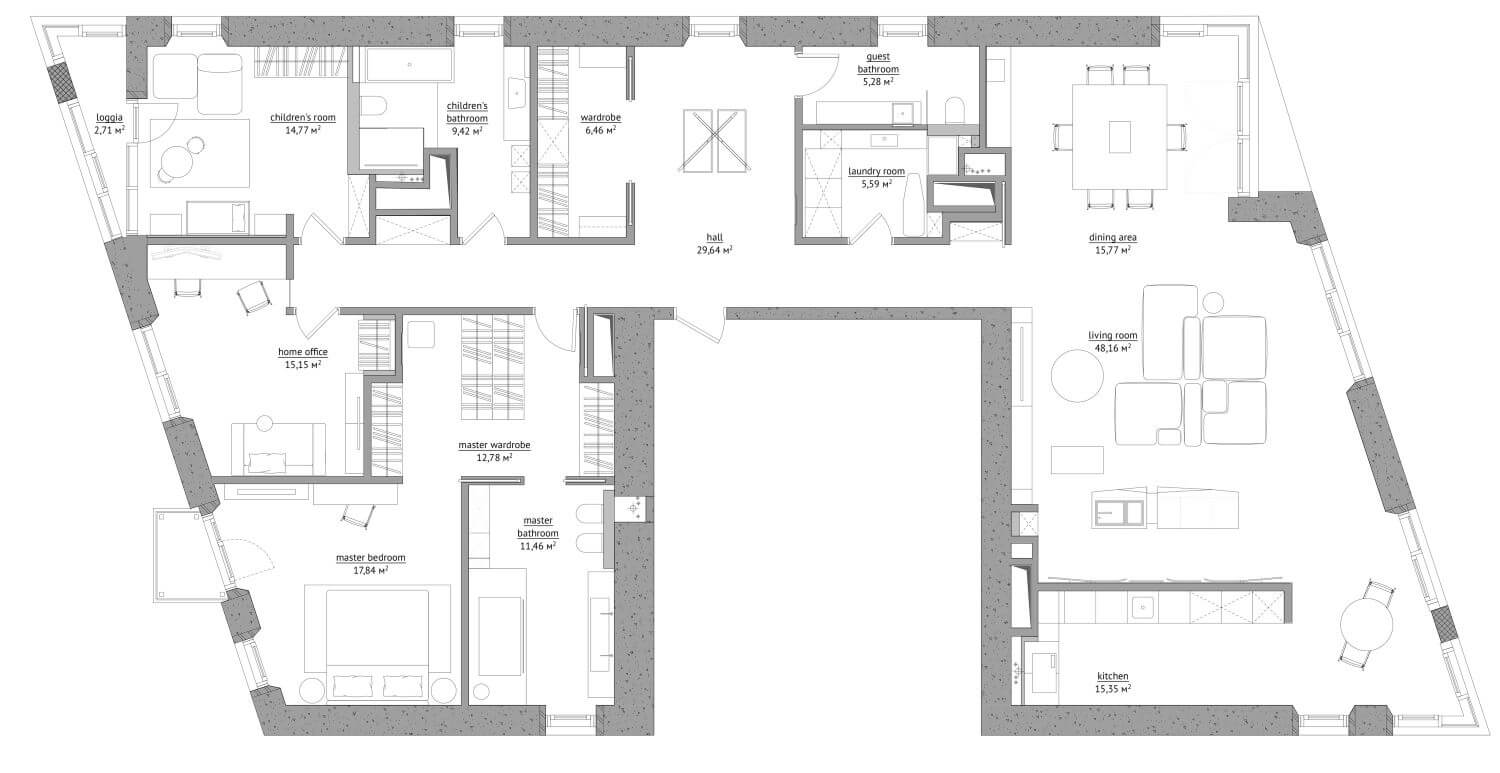
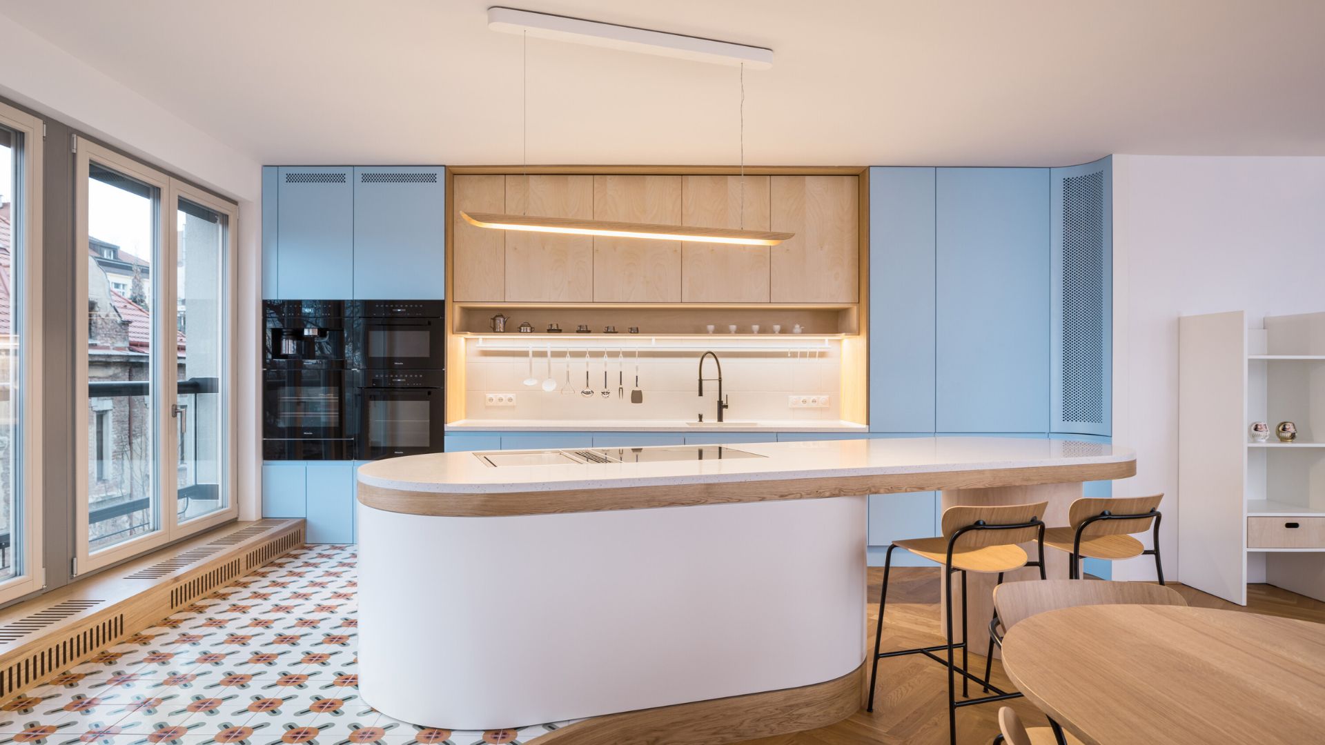
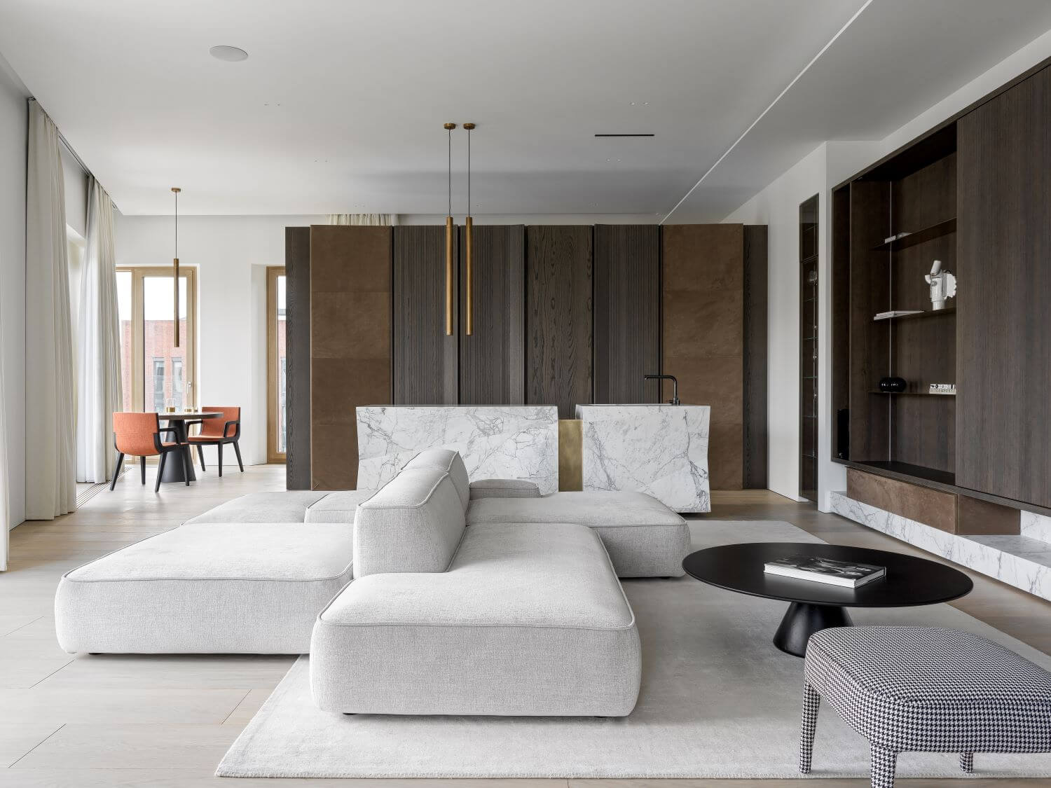
Central composition coordinates space around it. It divides apartments into shared and private areas. Movement around the center is also fraught with surprises: each new angle will not look like the previous one.We located kitchen behind the partition wall (covered with wooden panels), in the niche. Working kitchen zone is hidden. This idea came to us when we first visited the apartments. Seems like this space gave us the idea. We discussed it with clients and made it possible.
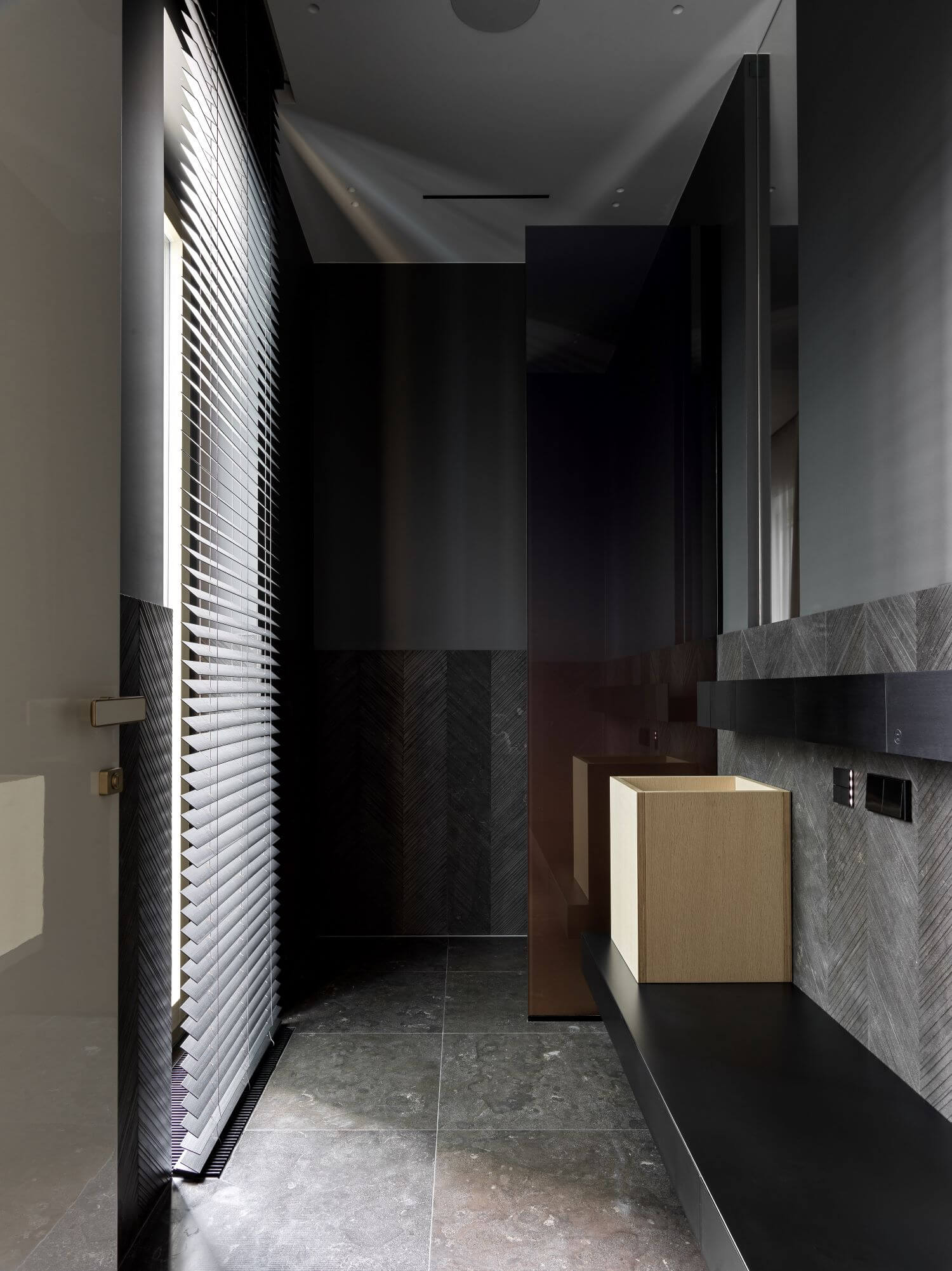
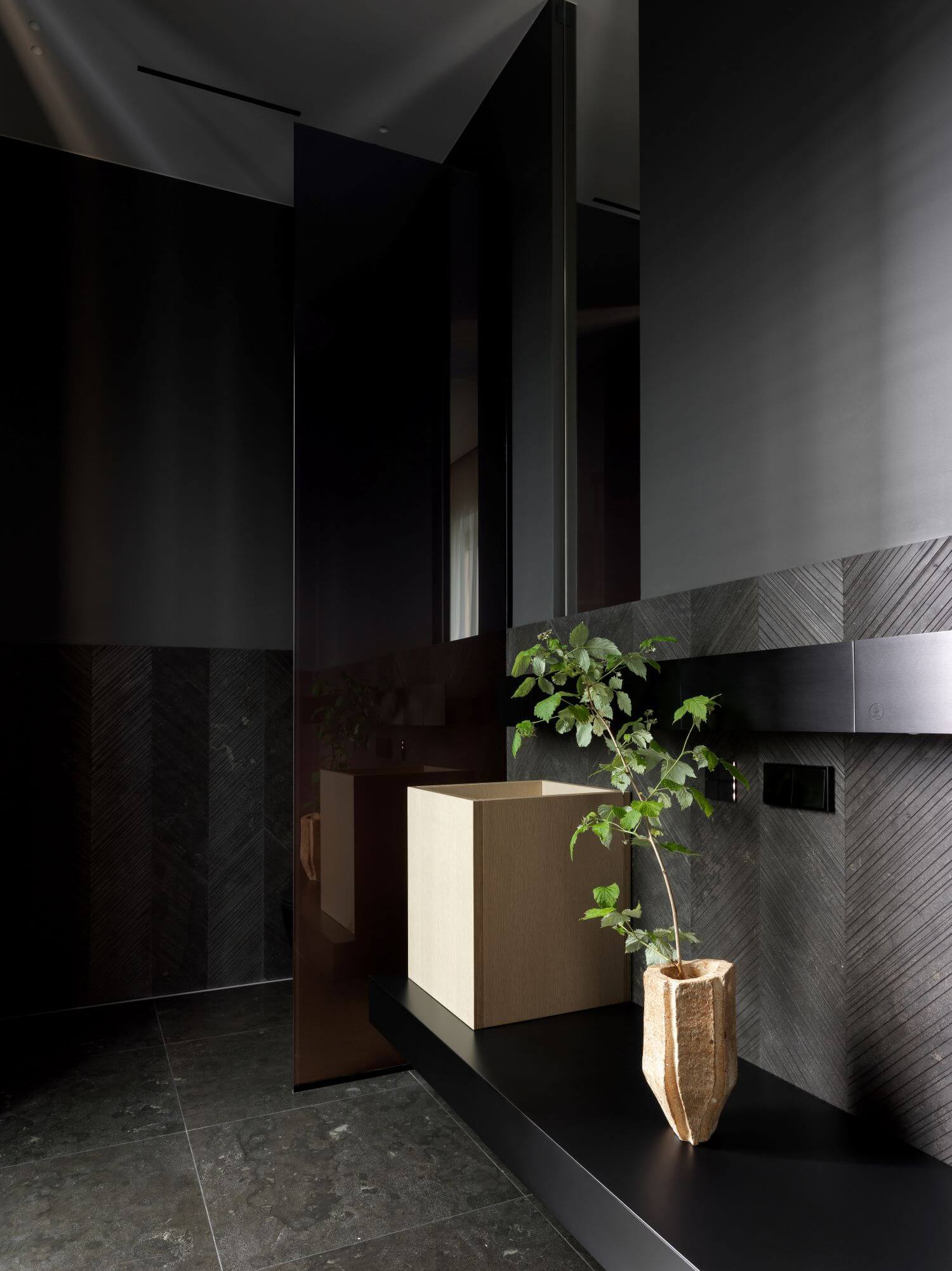
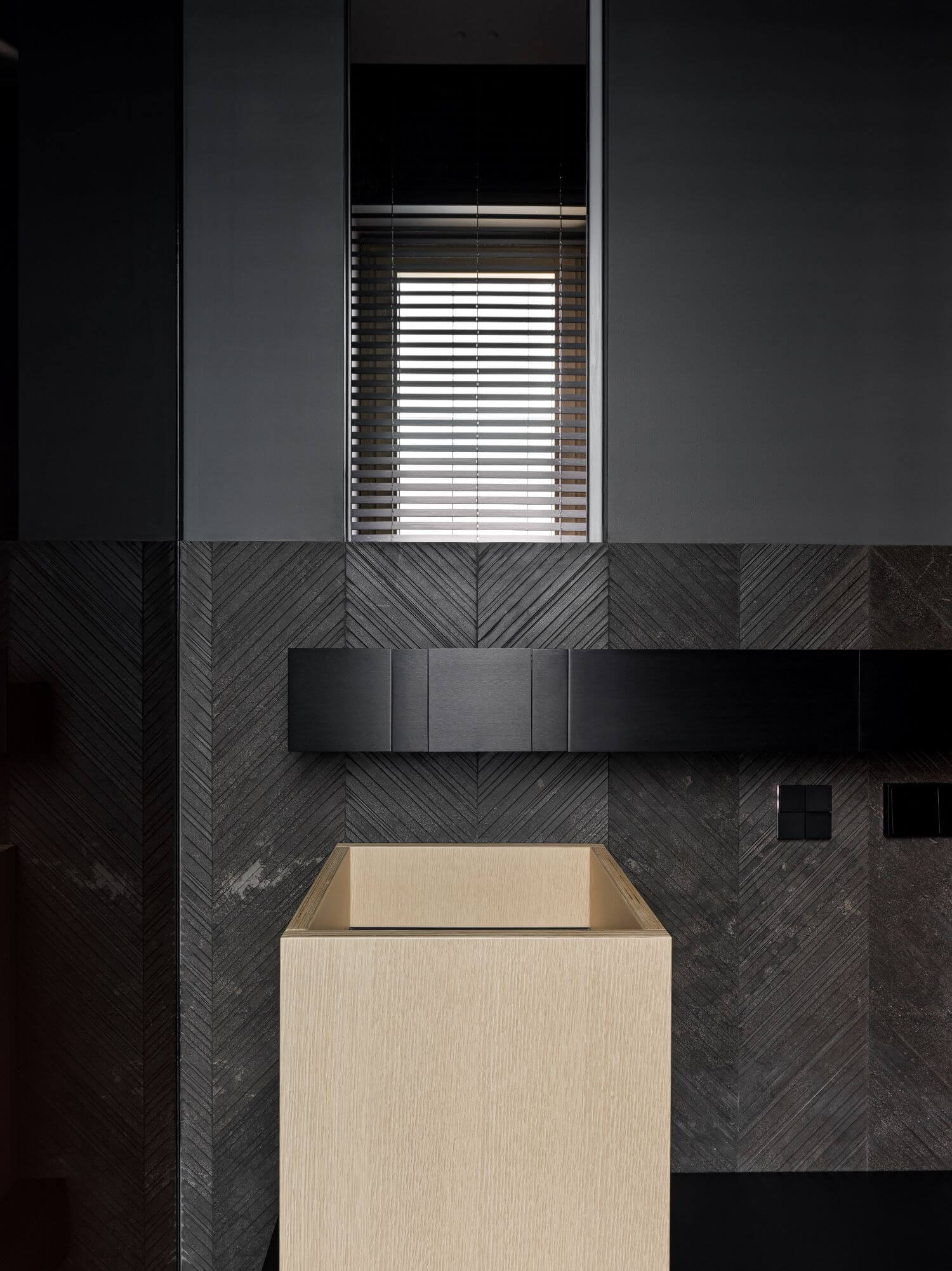
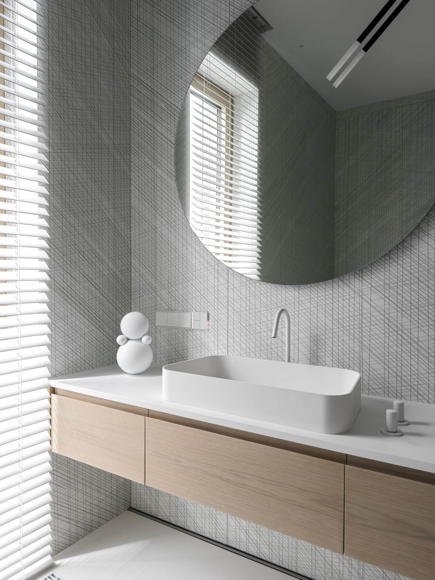
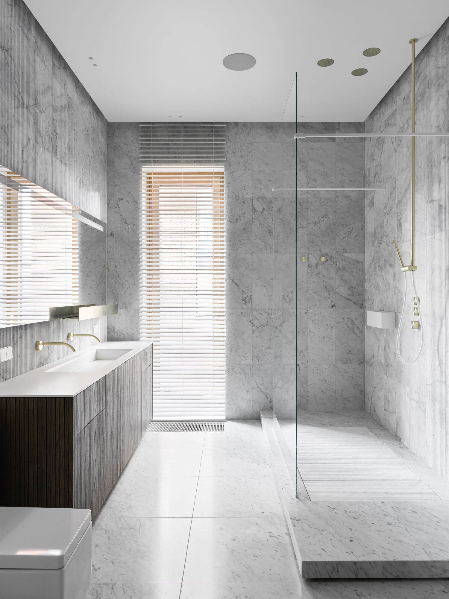
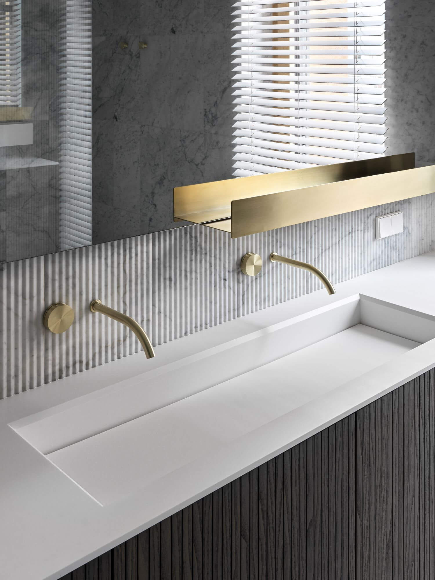
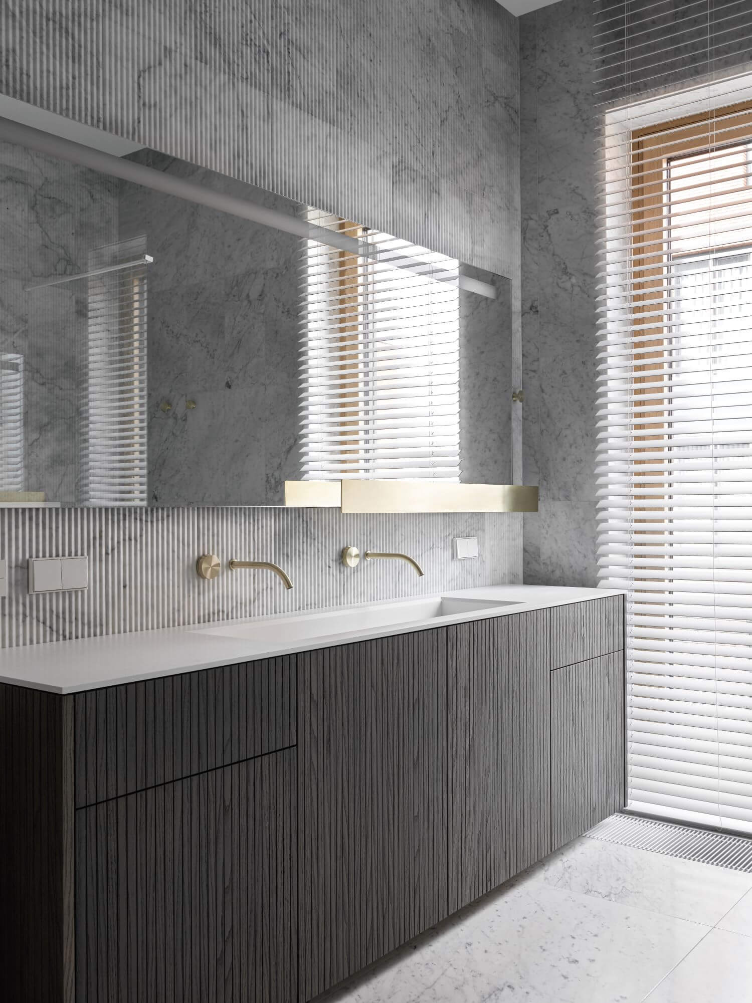
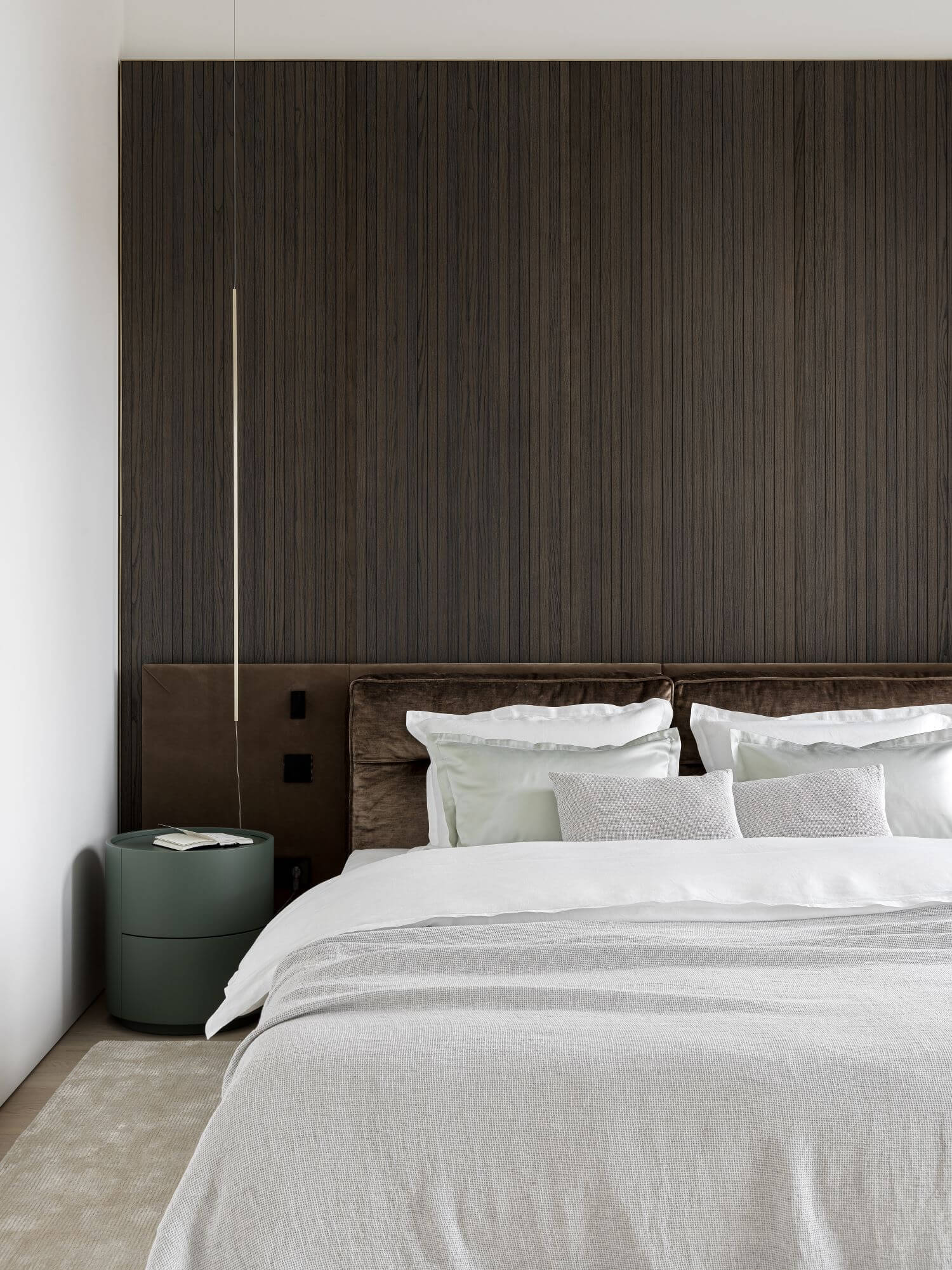
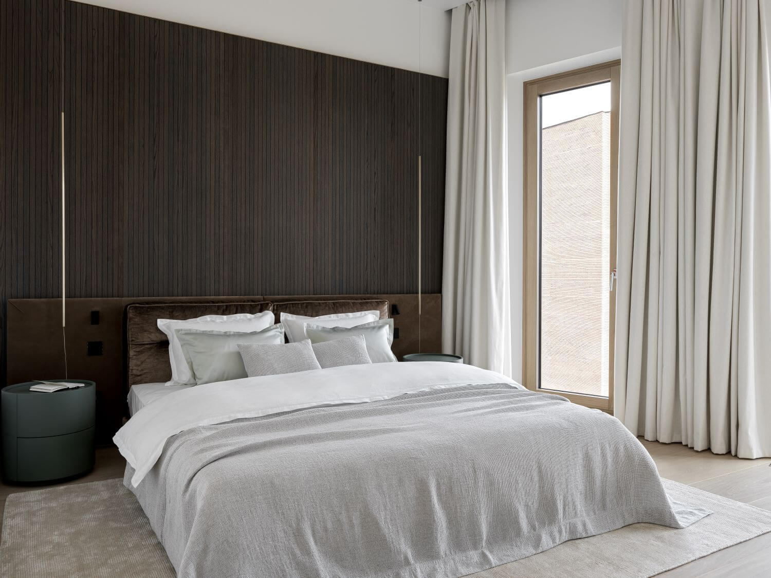
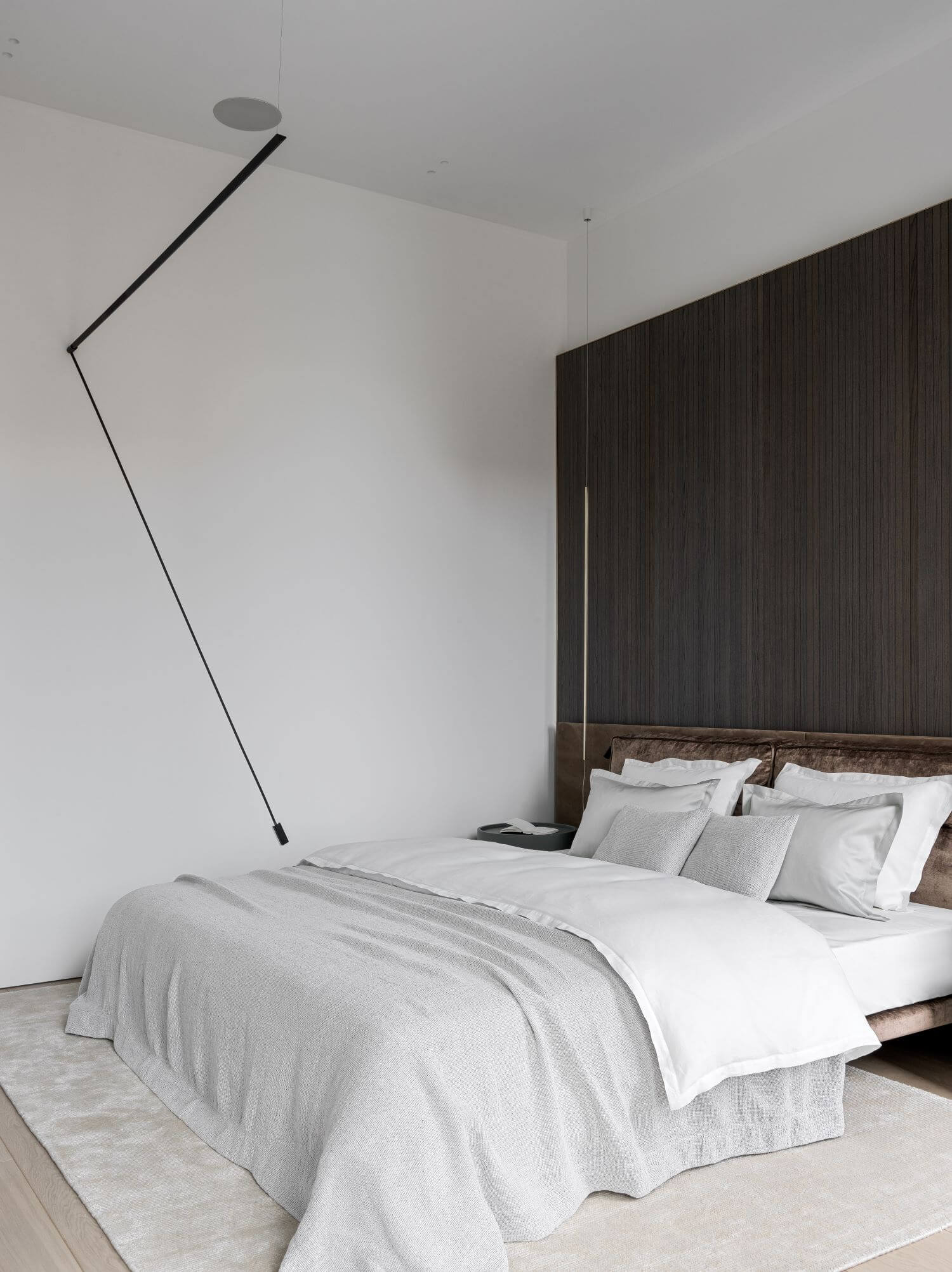
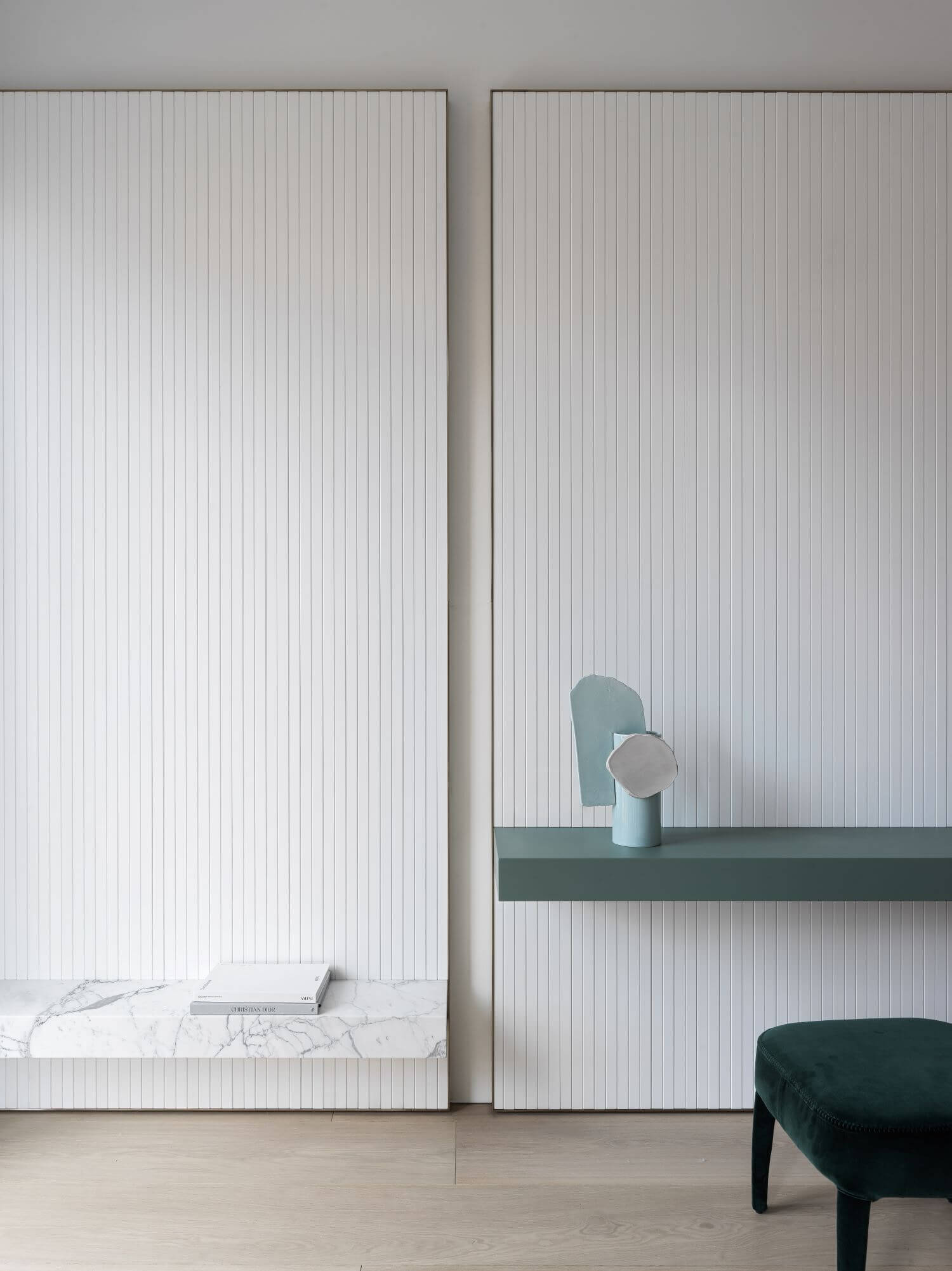
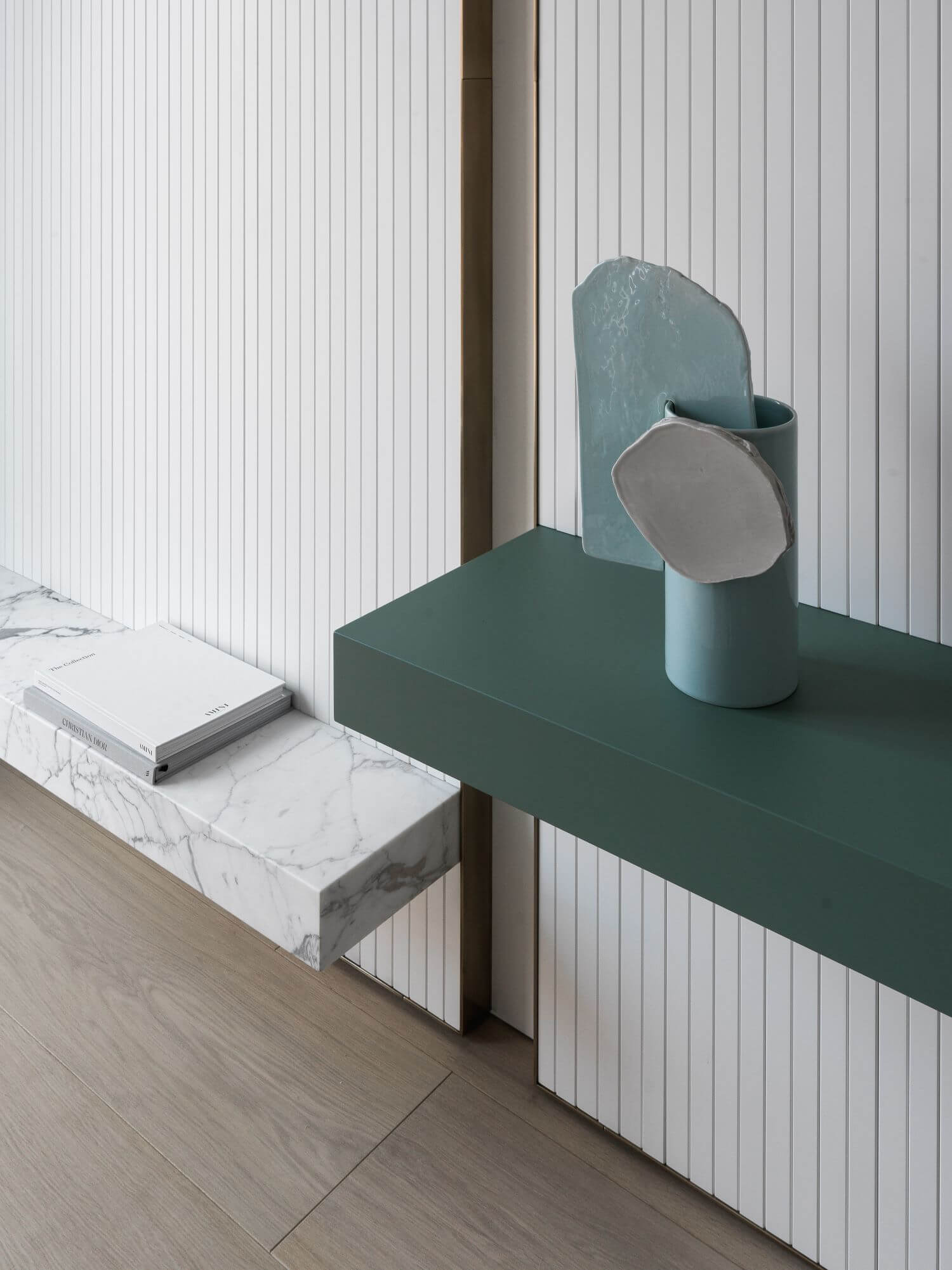
In the guest bathroom of this project, we decided to mischief a little bit. When you open the door of warm wood that leads from the light hallway, suddenly you see four strict lines that cut the space and then gather it in one again. Bright verticals - mirrors and colored glass - soften two graphic metal horizontal lines. Upper one is a mixer tap, a shelf and a towel rail. Another trick we did here was a wooden sink. We spiced it all with absolutely stunning stone. Its texture helped to make this total black design richer. Female part of the bedroom is designed without any obvious boudoir details. Instead, here we have a light tone, almost strict lines and perfect proportions. Dressing table is hardly recognized but imagine Her silhouette and you will understand everything. Thin and high lines frame natural women's beauty.
