This 120 sqm apartment for a young couple is situated in a residential complex on the shores of the Moscow reservoir, just a minute's walk from the beach. Acquiring a home here is quite challenging, so when this property became available for sale, the clients immediately purchased it.
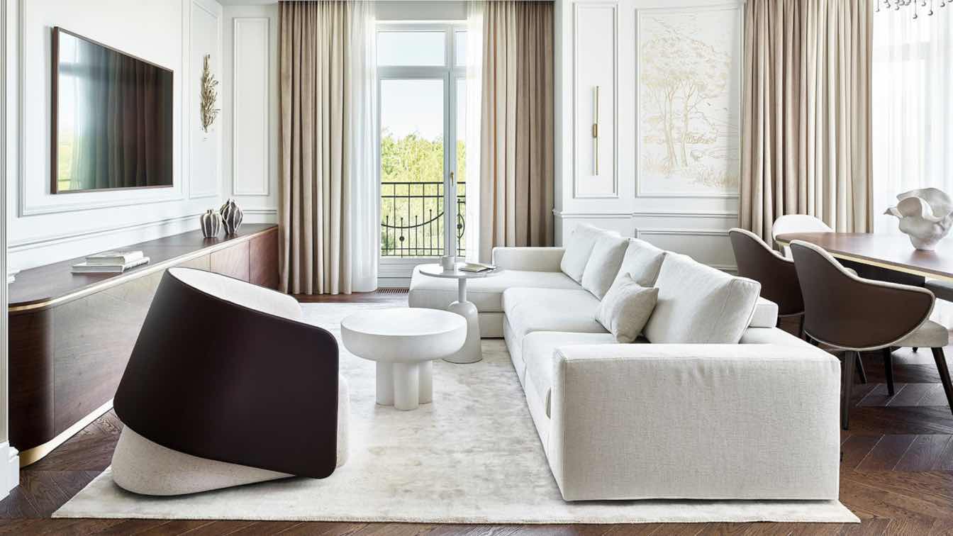
The apartment owners approached interior designer Alisa Shabelnikova, requesting a bright, airy space with a classic foundation and modern furniture and art. "The original layout was completely illogical, with many angled corners, a living room divided by doors into two separate parts, and bulky ventilation boxes on the ceilings. Therefore, we unanimously decided to completely redo the layout," shares Alisa.
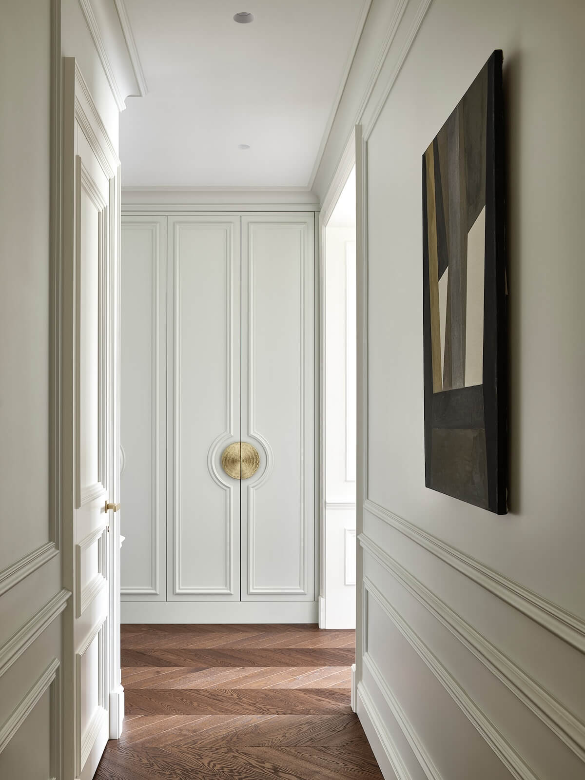
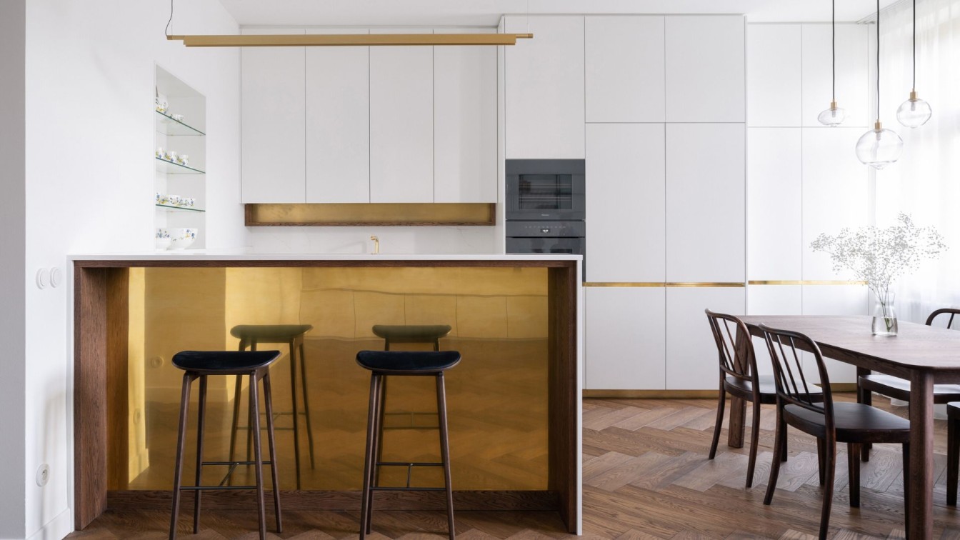
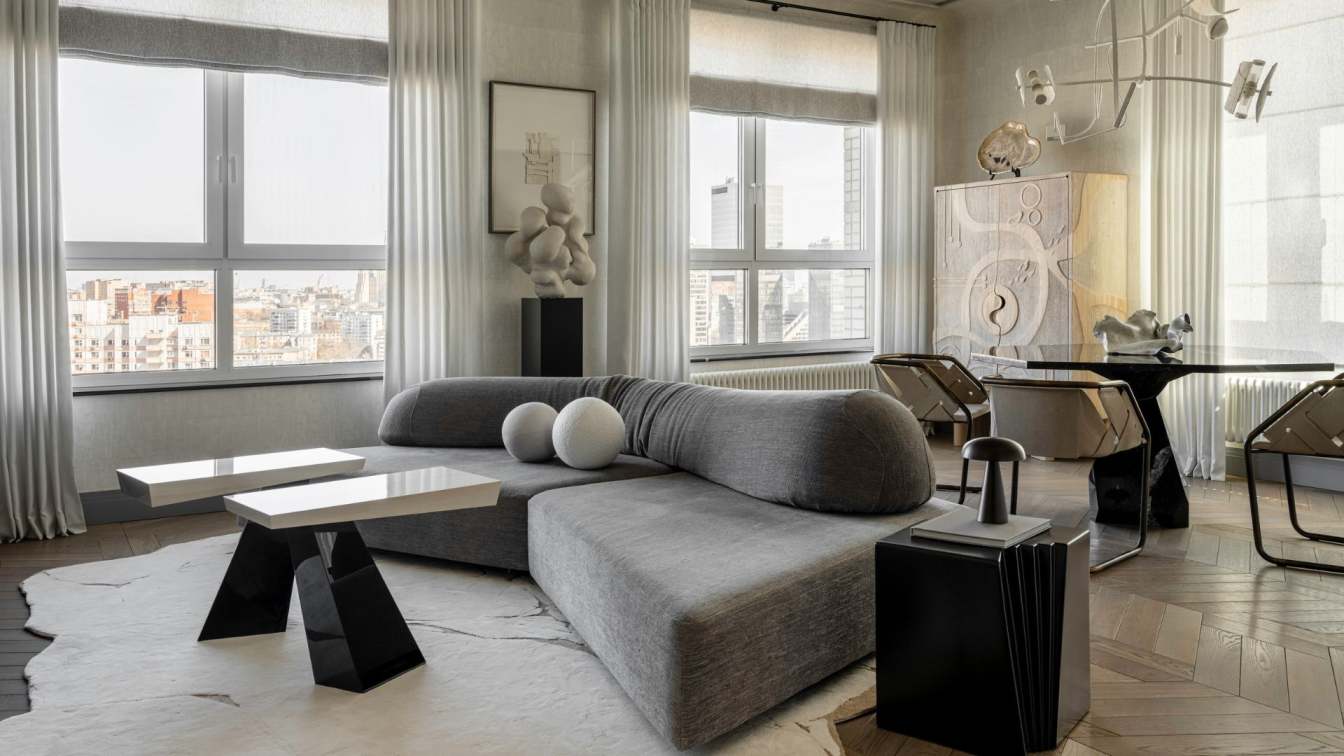
The new layout follows the principle of enfilade, where one room smoothly transitions into another. From the spacious, well-proportioned entrance hall, the panoramic living room window, offering stunning views of the surrounding landscape, is clearly visible. "First impressions of the apartment are always very important, and I strive to create the most impactful composition," the interior designer emphasizes. The apartment's communal area consists of a large living room with a dining area and a kitchen tucked away in a niche.
"One of the apartment's flaws was the awkwardly placed and bulky ventilation and plumbing boxes in the kitchen area. We concealed them behind panels, lowered the ceiling in this area to create a niche for the kitchen furniture. Some panels, for visual symmetry, are clad in the same walnut veneer as the kitchen cabinet fronts, making everything look like a cohesive organic ensemble," says Alisa.

The apartment's private section includes the main bedroom with an en suite bathroom and a personal dressing room. Built-in wardrobes with façades matching the wall color are planned by the window. Another dressing room and laundry room are conveniently located separately from the master suite. There's also a guest room, which can easily be converted into a nursery in the future.
"In this space, there's only one warm white shade, very comfortable to the eye, contrasted with dark walnut veneer for contrast. The exception is the guest bathroom, dominated by a bitter chocolate color," notes the project author.
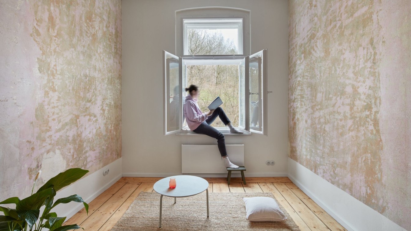
All walls and built-in furniture in the apartment are painted in one color, while the kitchen, living room, and master bathroom are finished in veneer of the same shade. This uniformity in finishing and monochromatic spaces fill the apartment with air and light, making it appear visually larger.
"Working on this project was a real pleasure. The clients quickly approved all stages, and in the end, everything, down to the smallest details, turned out exactly as we had planned," concludes interior designer Alisa Shabelnikova.


