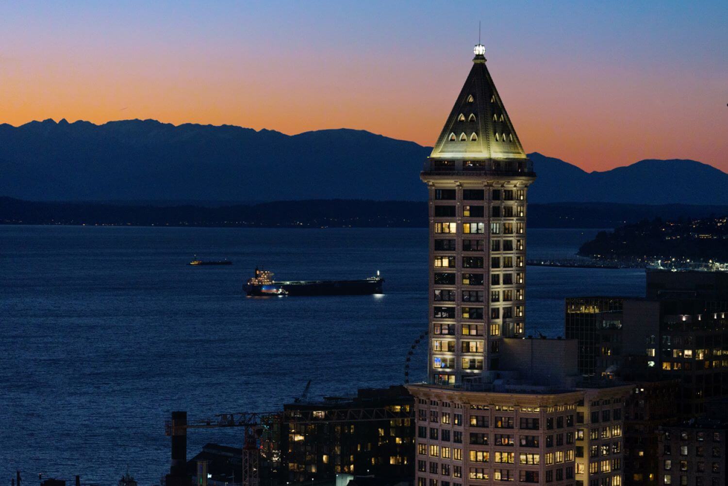
Graham Baba Architects: Built in 1914, Smith Tower was the tallest structure west of the Mississippi upon its completion. No expense was spared in the construction of this ambitious 462-foot-tall building, with interiors finished in rich materials and ornate detailing. Today, this iconic figure in the Seattle skyline houses offices and commercial spaces topped by an observation deck on the 35th floor. The pyramid-shaped peak of the tower is the site of a one-of-a-kind two-story penthouse apartment recently reimagined by Graham Baba Architects.
Despite its enviable position above the city skyline, the base of the pyramid was originally used for a building maintenance office, and the very top of the tower housed a large water cistern for the building’s fire suppression system, which remained into the 1940s. The lower portion of the pyramid, now the main level of the penthouse, went through a variety of uses including serving as office space and a radio broadcasting studio run by infamous Prohibition-era bootlegger Roy Olmstead and his wife Vivian, who was rumored to broadcast coded information for her husband’s rum-running operation during her children’s radio story program. In the late 1990s, the neglected and underutilized space was converted into an eccentric apartment through a 20-year lease. The latest renovation, completed earlier this year, builds upon the unique opportunity of living atop one of Seattle’s most iconic structures, updating the apartment into a fresh and contemporary space that celebrates the character of the building and the particularities of its history and form.
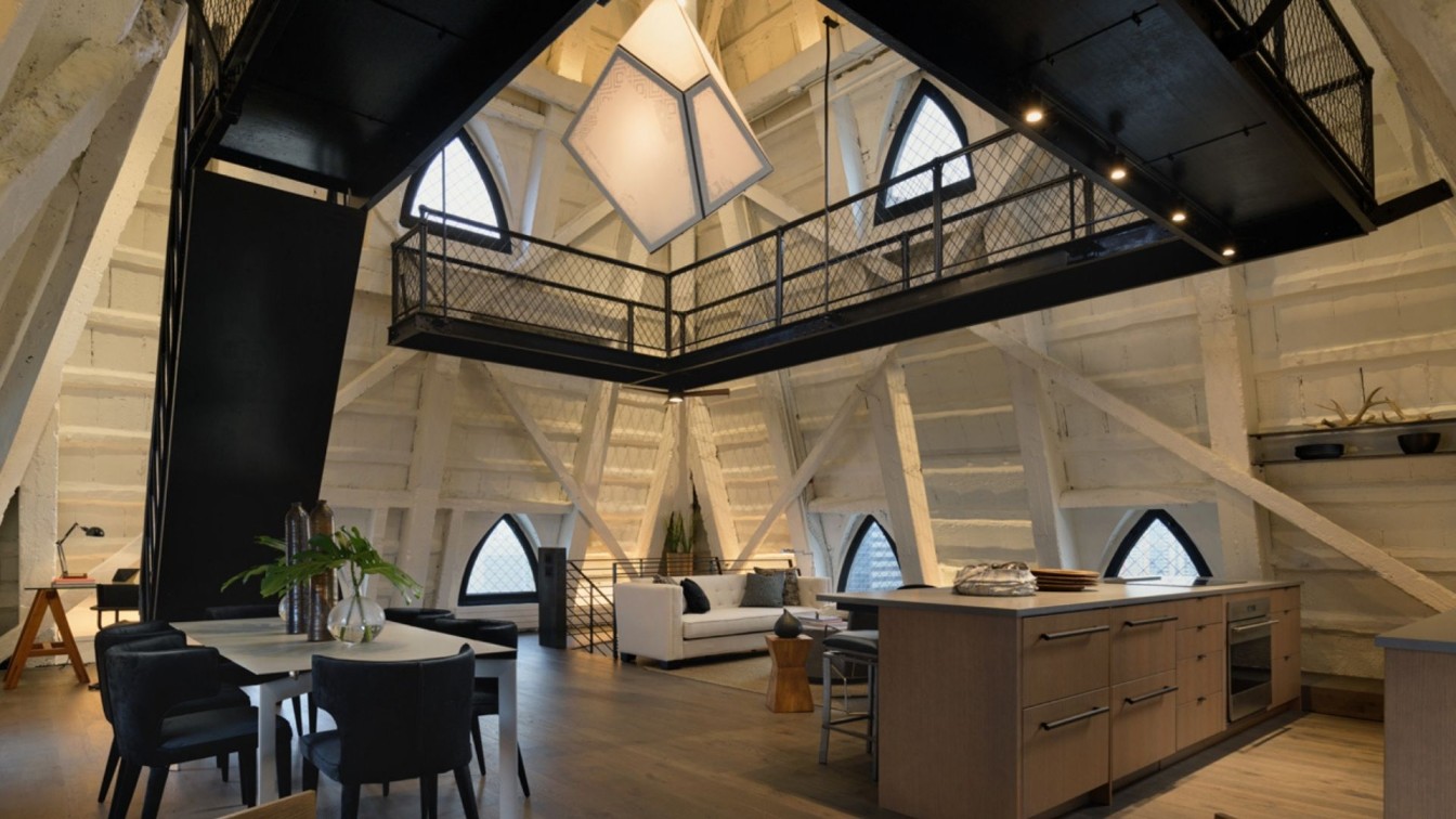
The new 2-level layout was carefully considered to maximize space within the modestly scaled, uniquely shaped volume, and to emphasize the experience that is particular to living in a pyramid above the city. The top level, where the materiality and form of the pyramid are most directly experienced, is programmed as the primary living space with kitchen, living and dining flowing together in a single, open plan. The space below contains a den, bathroom and primary suite which can be closed off for privacy while aligning with the views down to the city in more intimate settings. Throughout the apartment, the design team found clever opportunities to interact with the unique conditions of the space, including the angled walls, low windows, and unavoidable disruption of the existing historic mechanical elevator.

The design effort began by stripping back many of the added partitions within the pyramid, opening the floor plan so all spaces within the uniquely shaped volume flow together. The large mass of the mechanical elevator was encased with a central core of white oak casework, housing closet space and an upgraded bathroom, including a water closet with frosted glass doors, a white oak vanity, and a walk-in shower. All of these elements are aligned so that they form one continuous volume, keeping the space efficient and preserving the clean, monolithic massing of the core. The bedroom suite occupies the L-shaped perimeter around the core, allowing uninterrupted views and circulation along the south and east walls. The only enclosed volume, a powder room at the east wall, creates a separation between the entry stair and the bedroom. With space at a premium, the powder room efficiently takes advantage of every inch of the space it occupies, tucking casework into the lower height portions of the pyramid and incorporating a unique door with an inside corner, which provides additional space at the entry landing and tucks back against the shower when opened. Between these two volumes, a large pivot door can be closed to provide privacy to the bedroom suite or left open so the full space can be experienced. A vertical array of stained oak boards screens off the stair from a small sitting room on this main level with a window tucking back behind the central core.

The pyramidal second floor houses the primary living functions, including a fully open combination kitchen-dining-living area. The team replaced the entire kitchen with two low counters that include undercounter refrigerator and freezer drawers, upgraded appliances, and bar seating for social gathering. The low profile and bright finishes complement the space without distracting from the overall volume. Climbing up from this space, an original steel stair leads to a catwalk with an additional band of windows, and a final flight up a hanging spiral stair brings you to the lantern room, which features a glass-and-steel ball at the very top of the building which can be tightly occupied for panoramic views of Seattle. A custom-designed and -fabricated luminary by the Seattle studio House of Sorcery is suspended through the catwalk in the center of the space.

The rich yet simple material palette of the apartment consists of stained white oak wall panels, blackened steel guardrails and warm grey quartz counters and tile. On both levels, the flooring was upgraded to stained oak planks. On the upper level, where the existing structure is left expressed, a moat of polished black river rock fills in the irregular space between the new floor and the undulating perimeter of the exposed, angled supports. LED strip lighting along the perimeter of the space provide a wash of soft light along the canted walls. Track lighting is integrated into catwalk and run along the exposed structure to provide further illumination to the room while not distracting from the featured luminary. The exterior concrete walls and ceilings, which are exposed to the living space at the second level, are painted white to reflect light and stand in contrast to the rich finishes of the new interior walls and casework. The white interior volume reflects the light tone of the building’s presence on the Seattle skyline.

Small, triangular-shaped windows punctuate the perimeter walls of both floors, granting 360-degree views of the Olympics, Elliott Bay, and the city of Seattle. Window seats, set within the deep openings afforded by the canted walls, were upgraded and fitted with access to additional storage and mechanical systems. Because the space was not originally envisioned as an observation deck or residence when designed, the windows sit below a typical standing height, which adds the unique experience of optimizing light and views while seated in the space. The scale of the windows, along with their low positioning along the perimeter and the geometry of the pyramid, makes the views a much more intimate experience that works beautifully in a home setting. Rather than sweeping panoramic views, each window frames a contained view, directing one’s sight as much downward onto a swatch of the city as outward to the mountains and bay beyond.
For Graham Baba, who had previously worked on the refresh of the entry level which included a visitor center and gift shop as well as the historic observatory and bar, the project was an incredible opportunity to continue writing the next chapter in the history of an iconic Seattle building.


