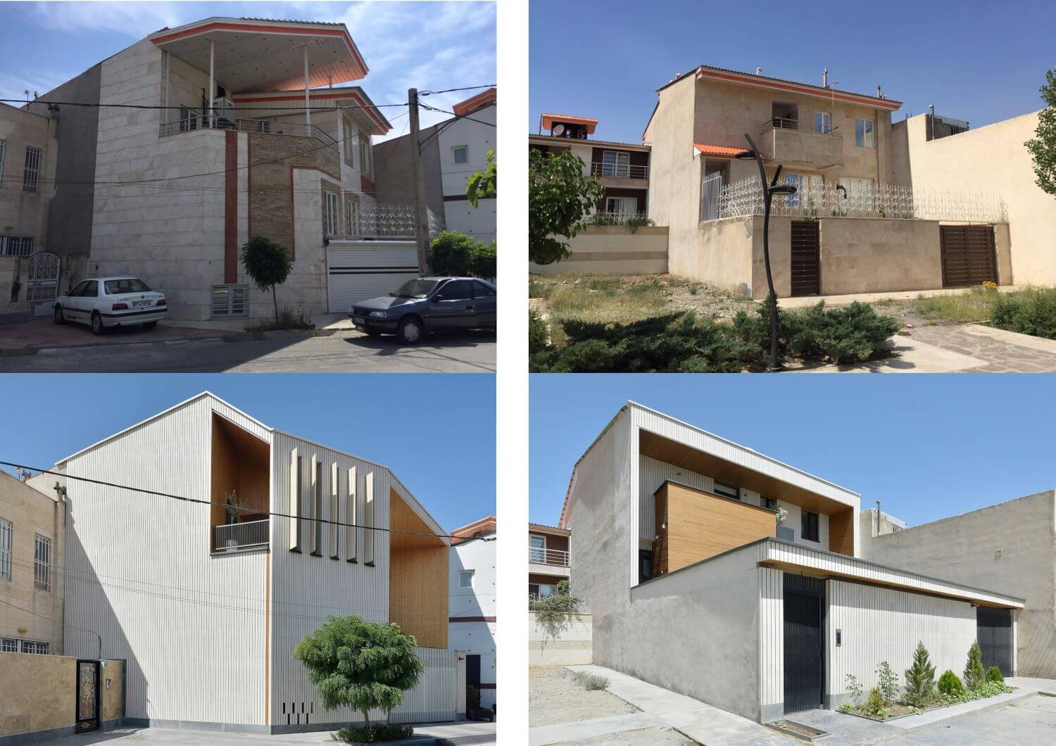
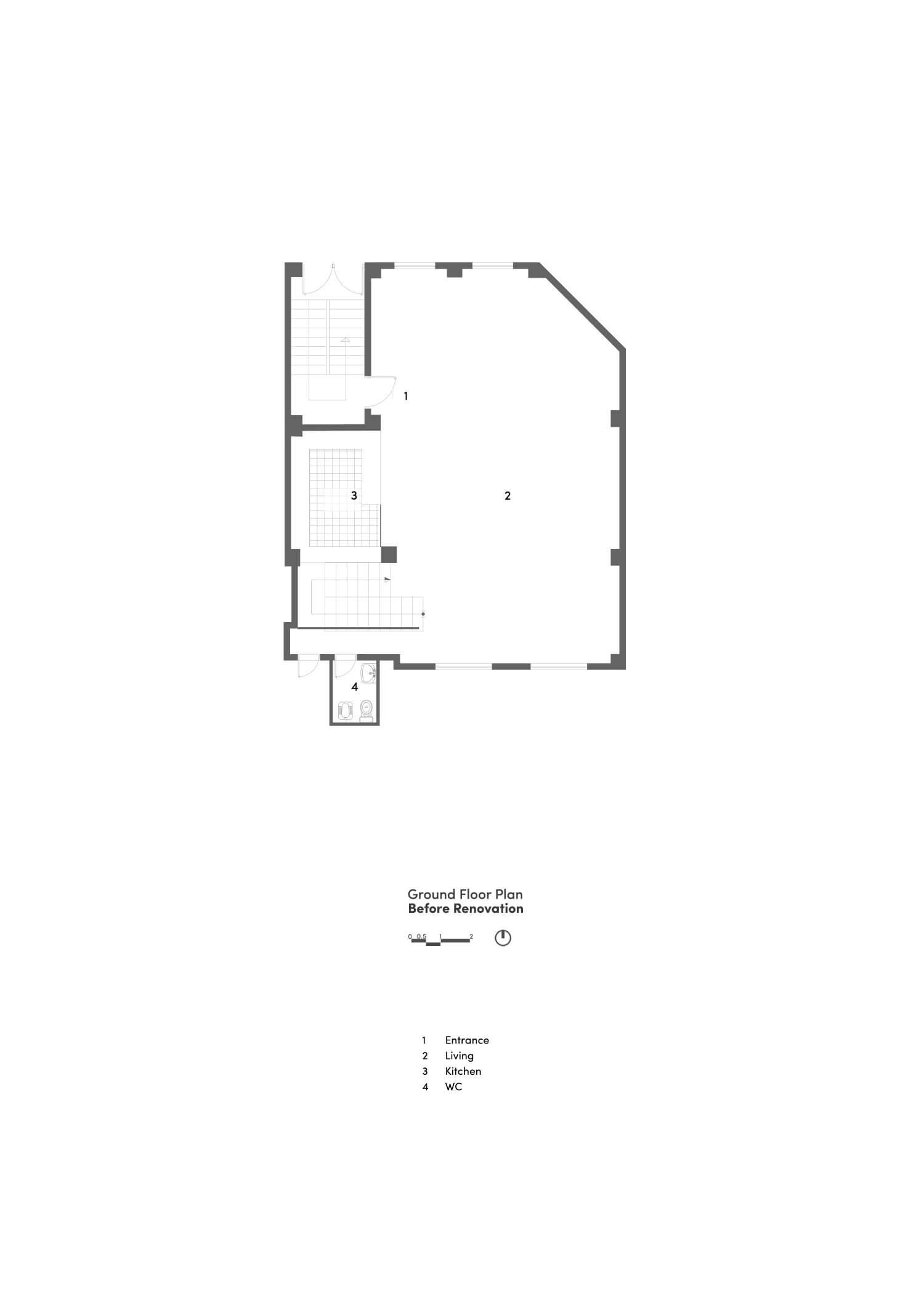
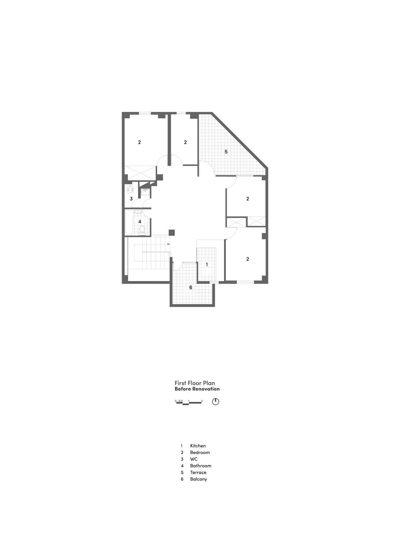
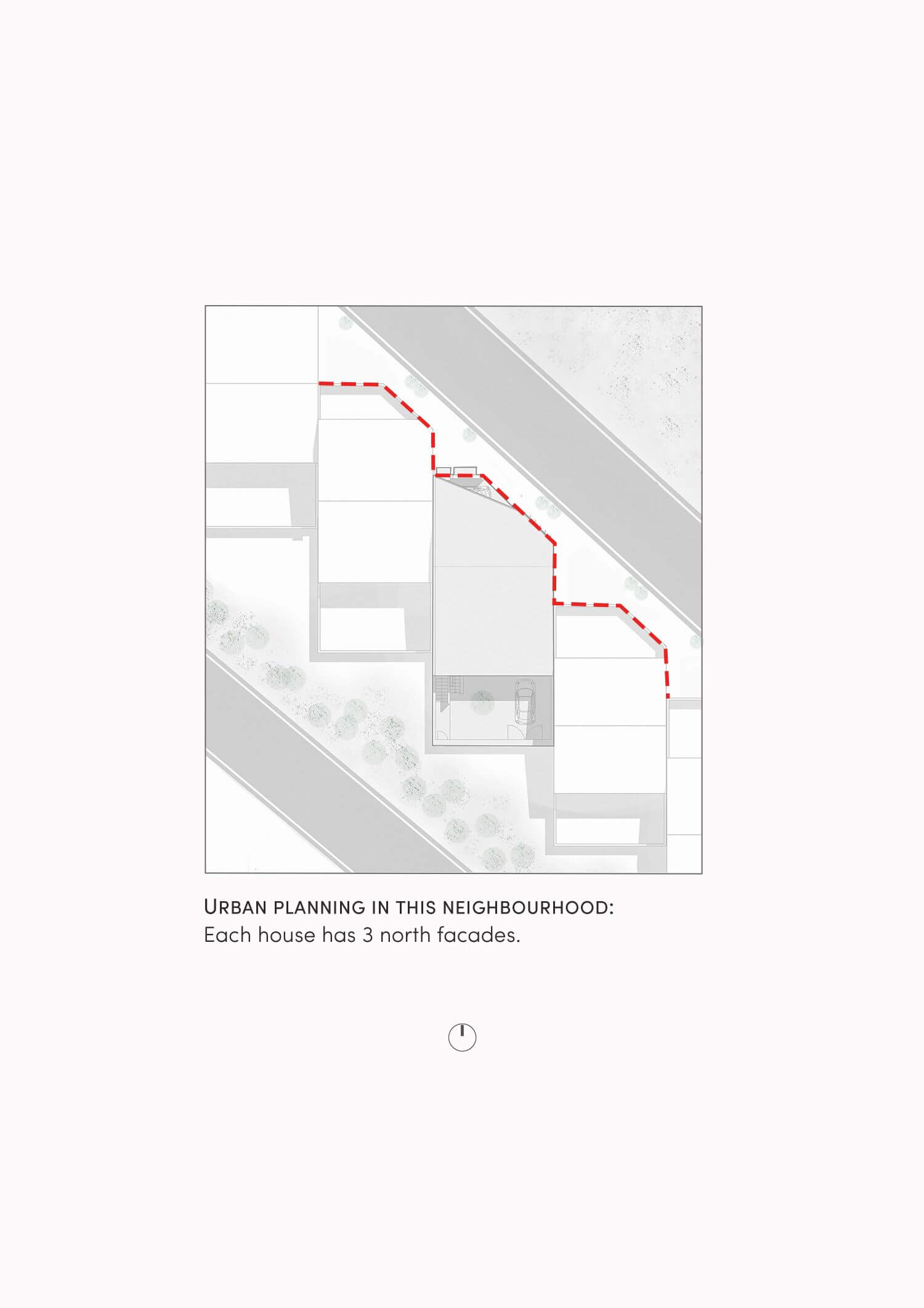
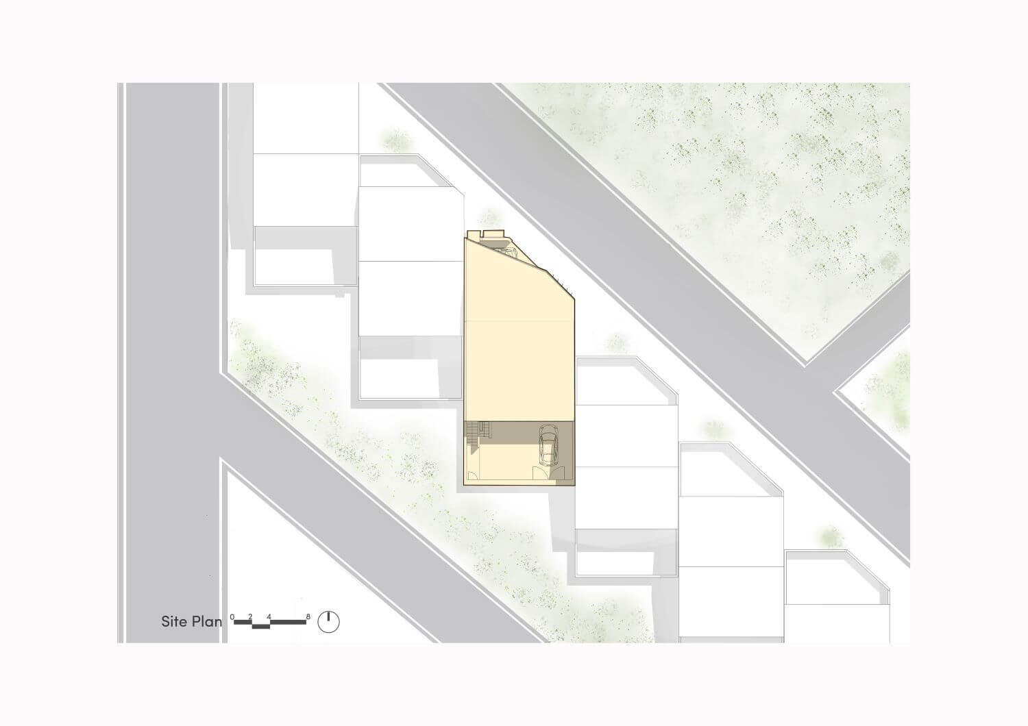
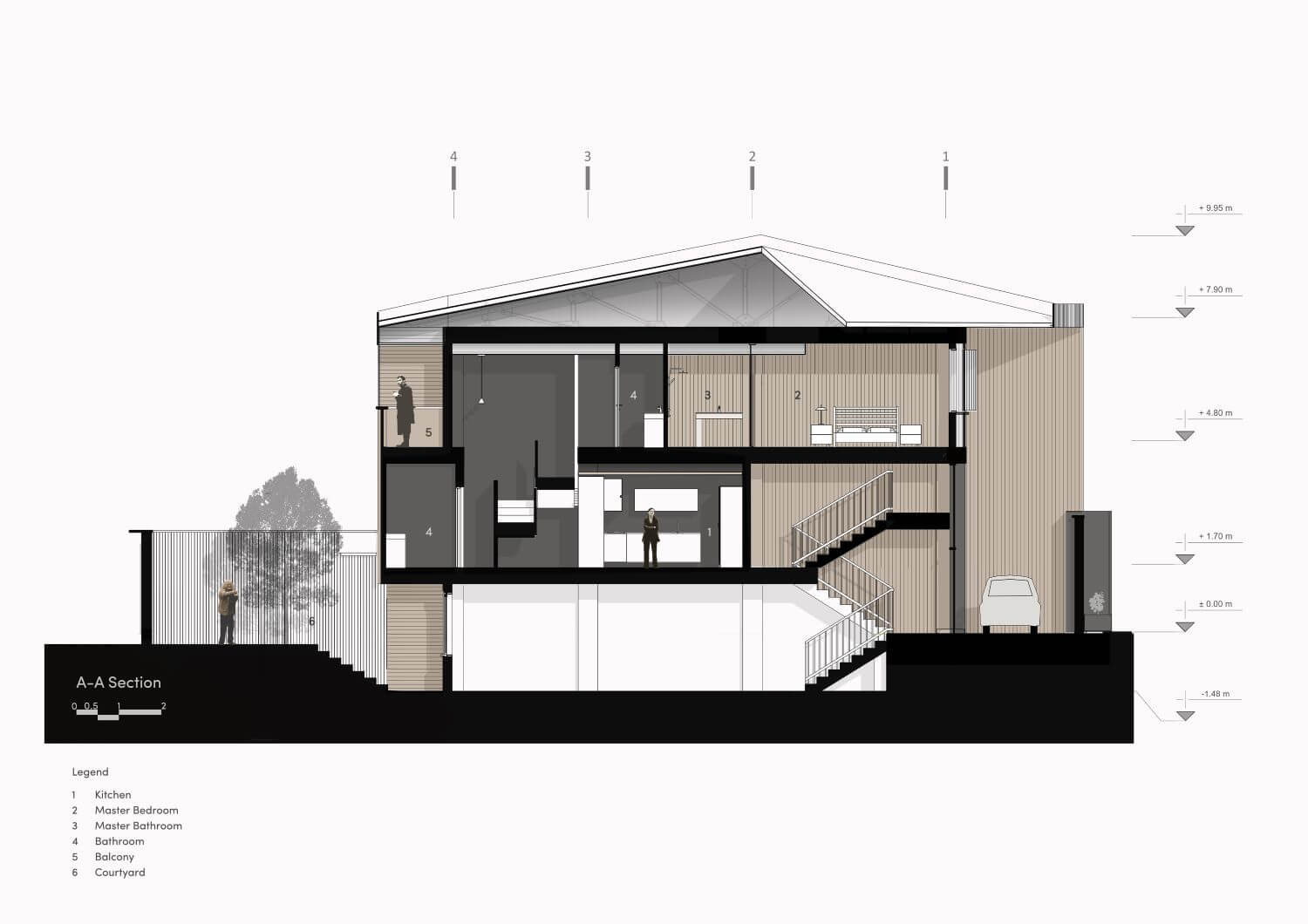
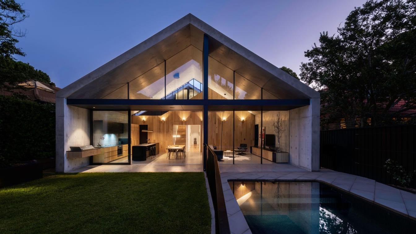
Gera Studio Architects: The project was a request to renovate a duplex house in an area with an urban fabric consisting of three-story (including lower ground floor) houses with courtyards and pitched roofs having north and south facades.
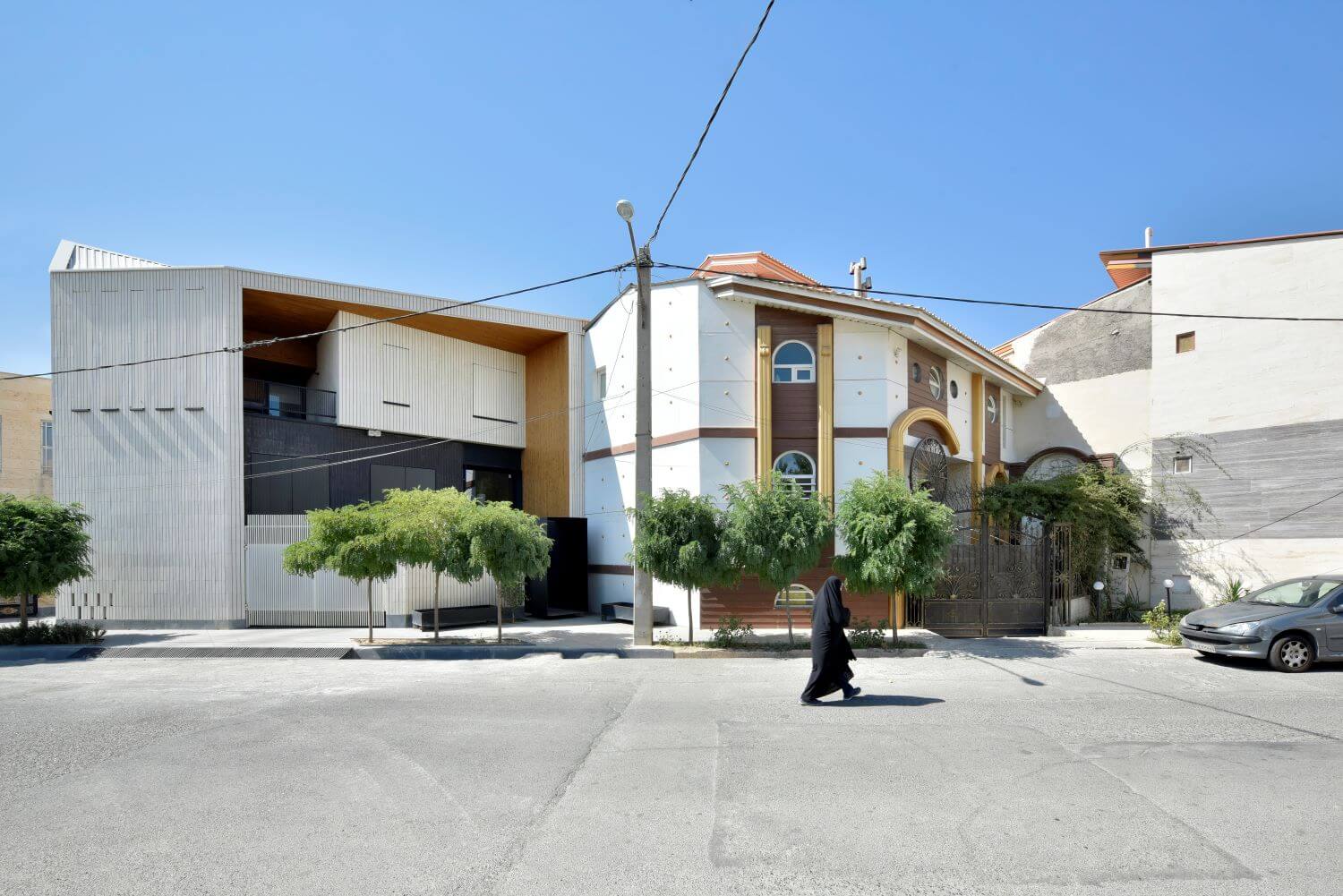
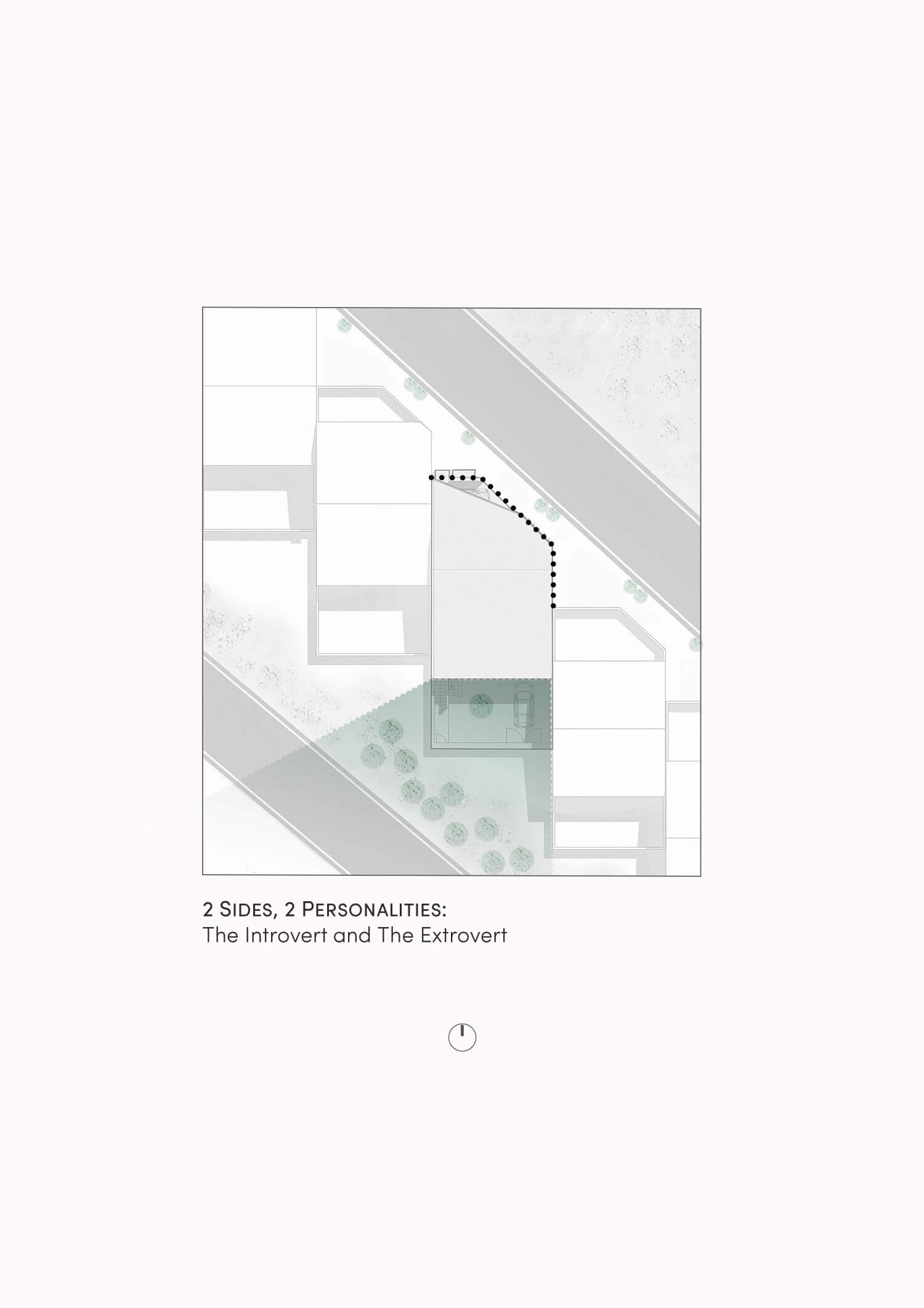
Due to the urban context in the design area, the buildings are stuck together according to the urban planning criteria, but have more connections with the urban body than conventional buildings.
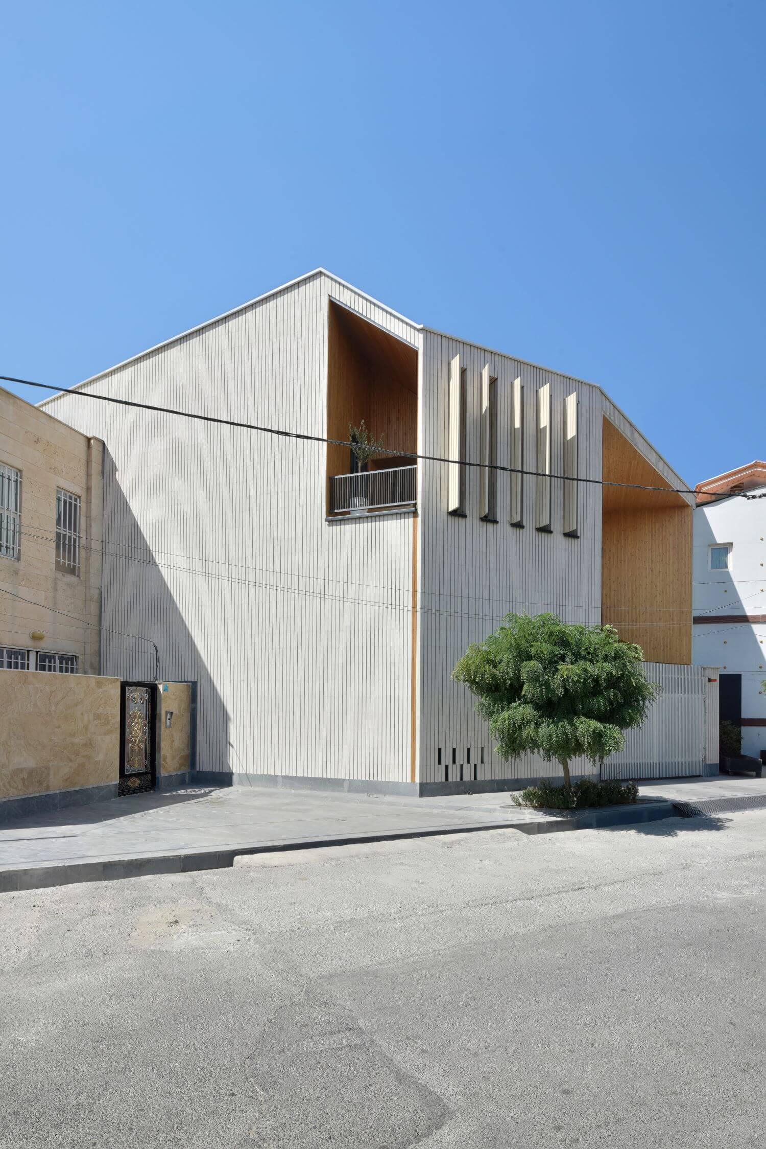
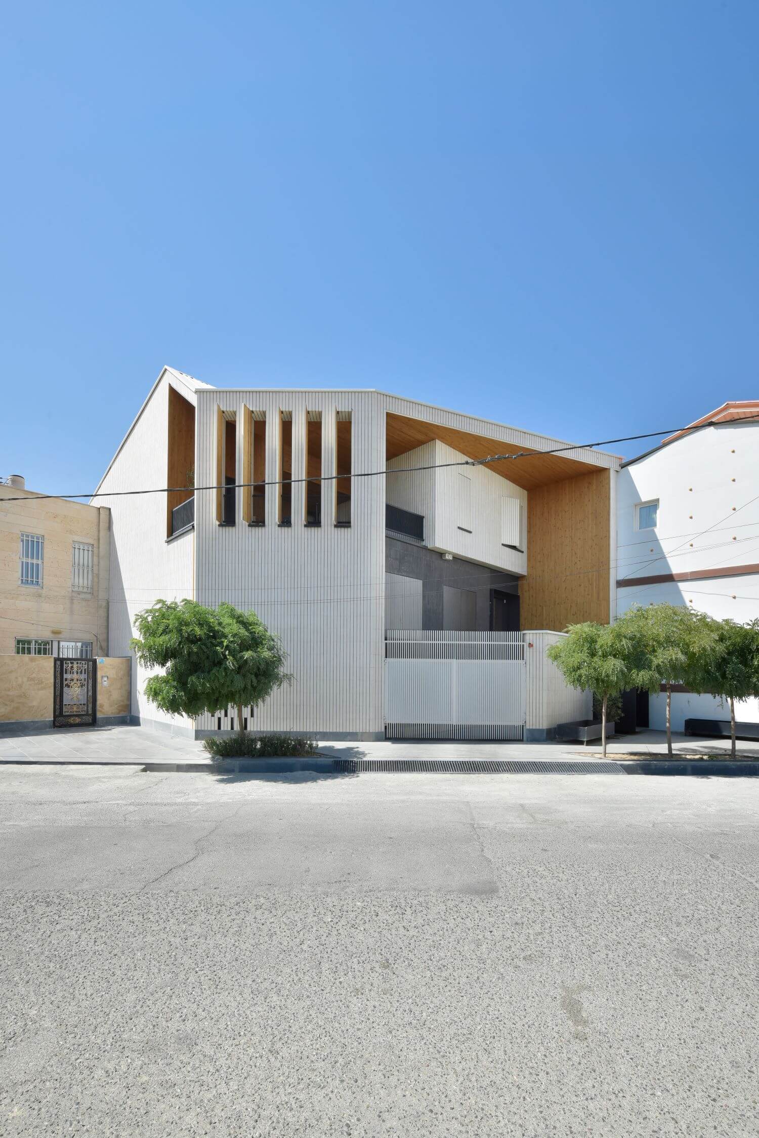
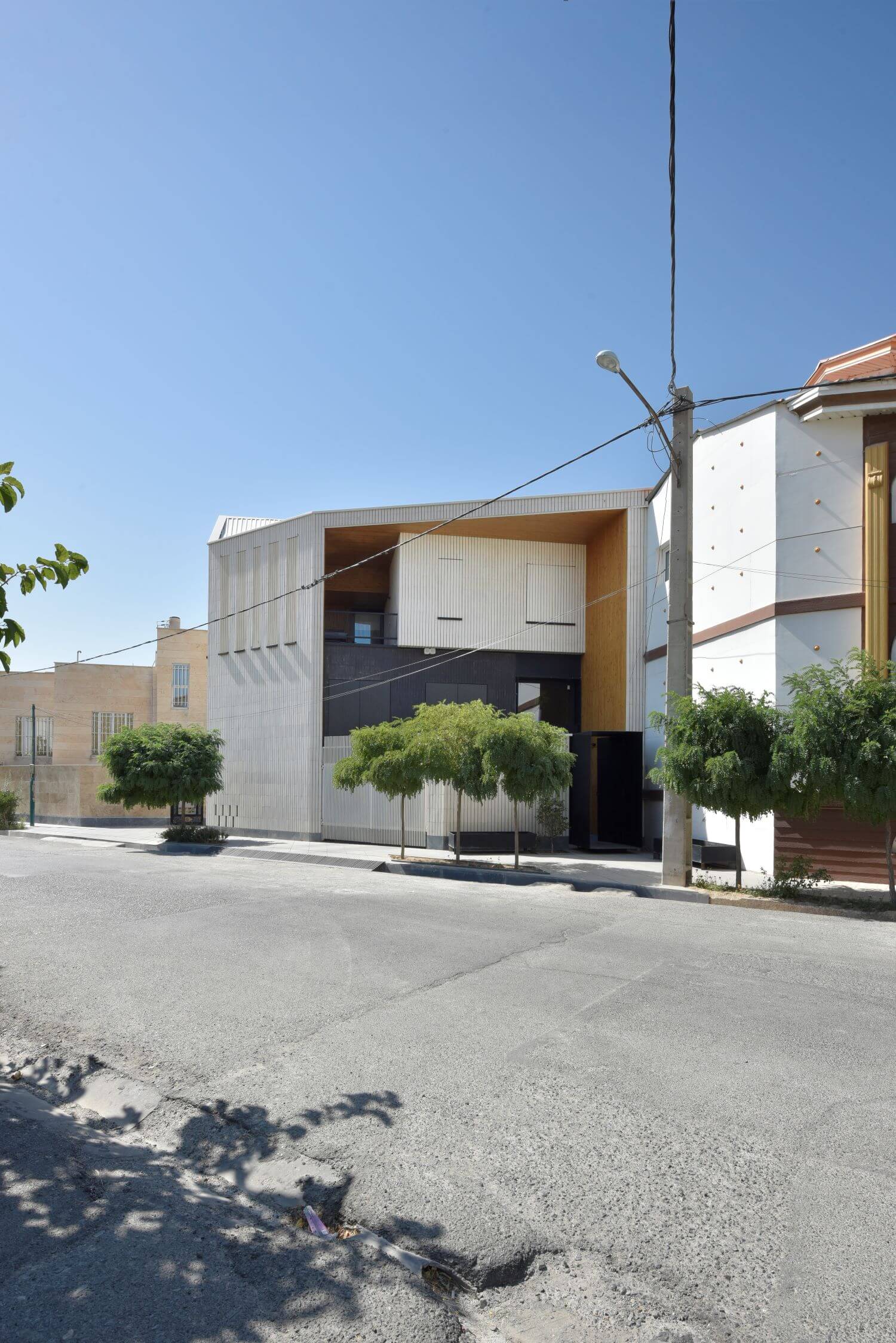
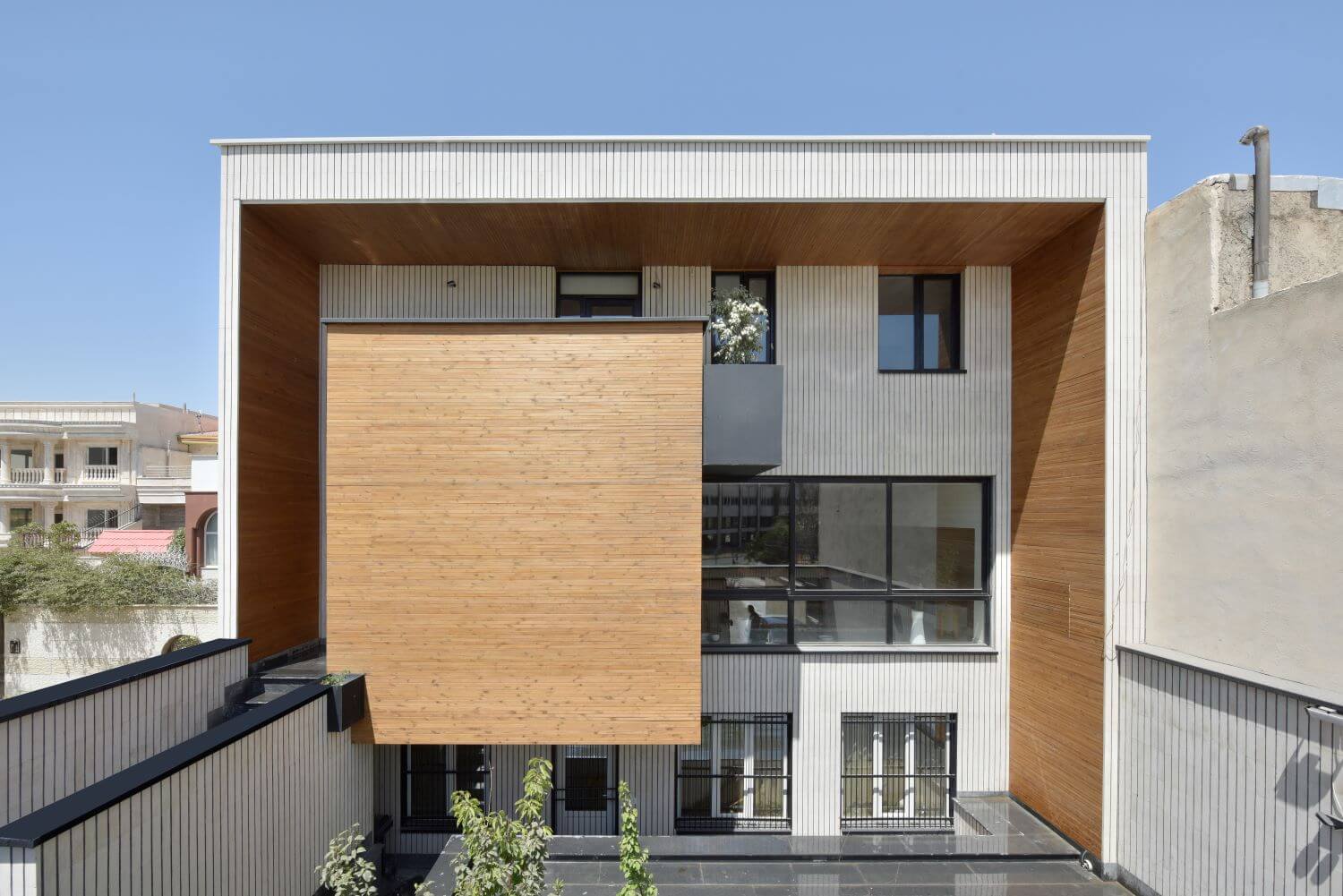
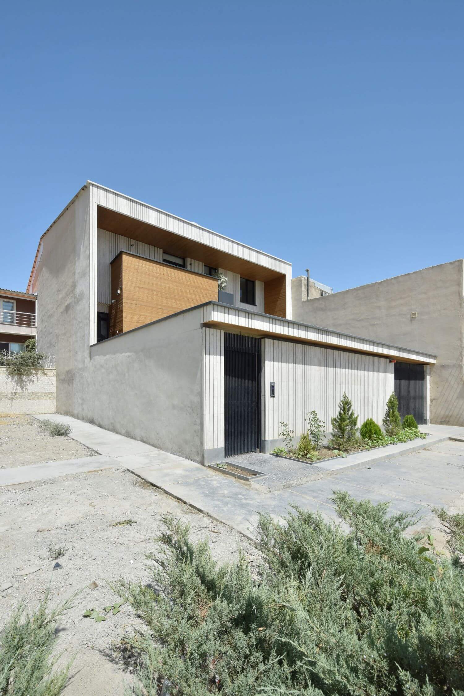
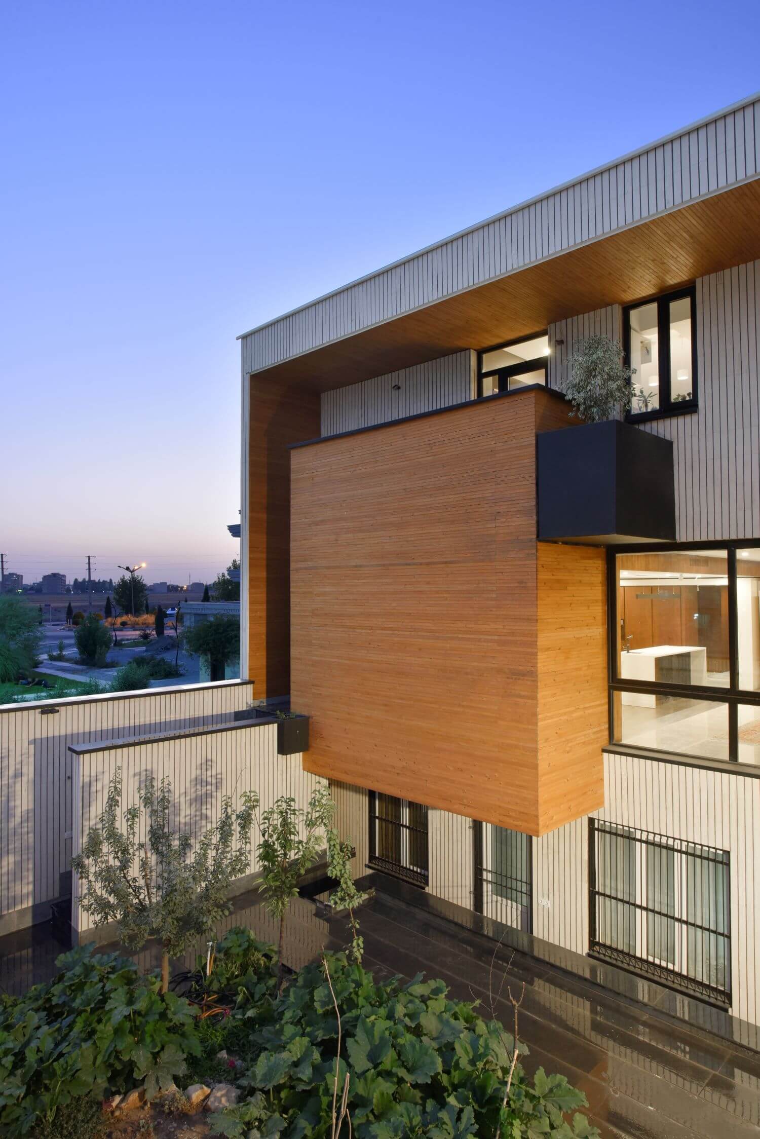
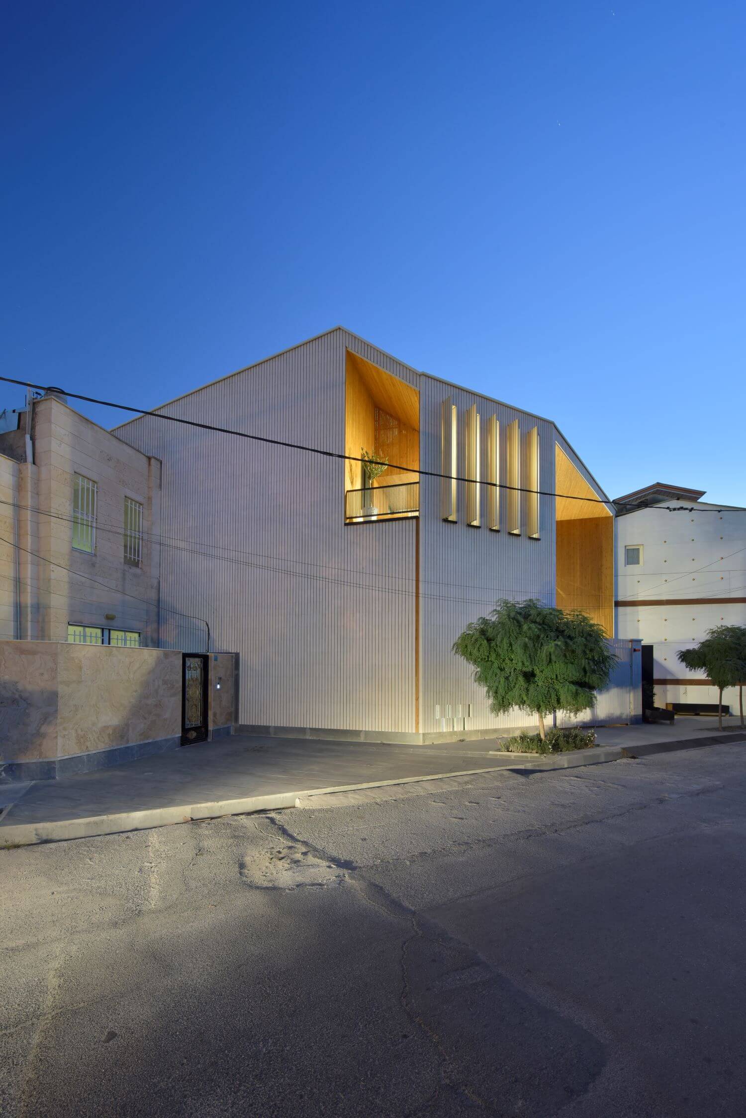
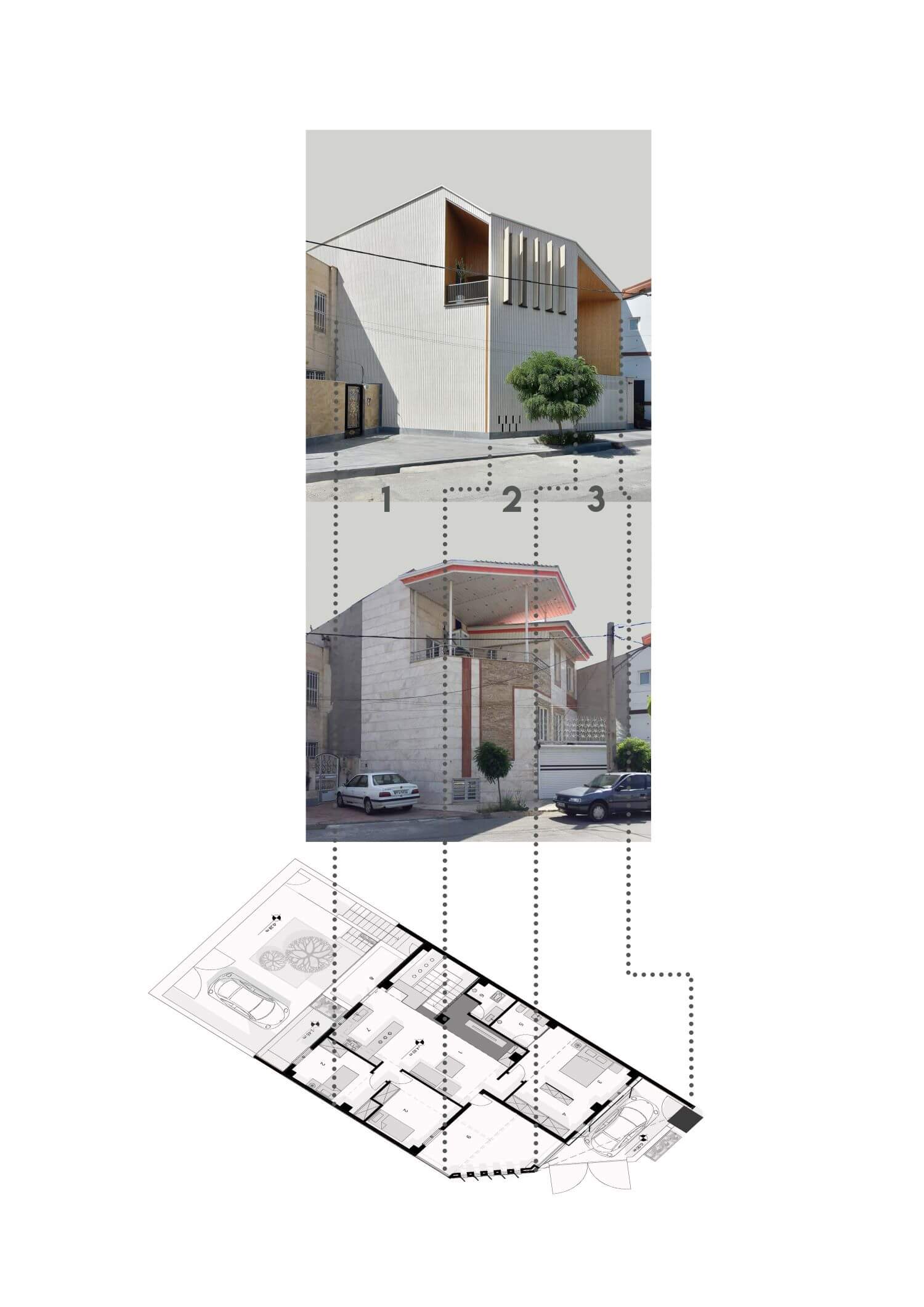
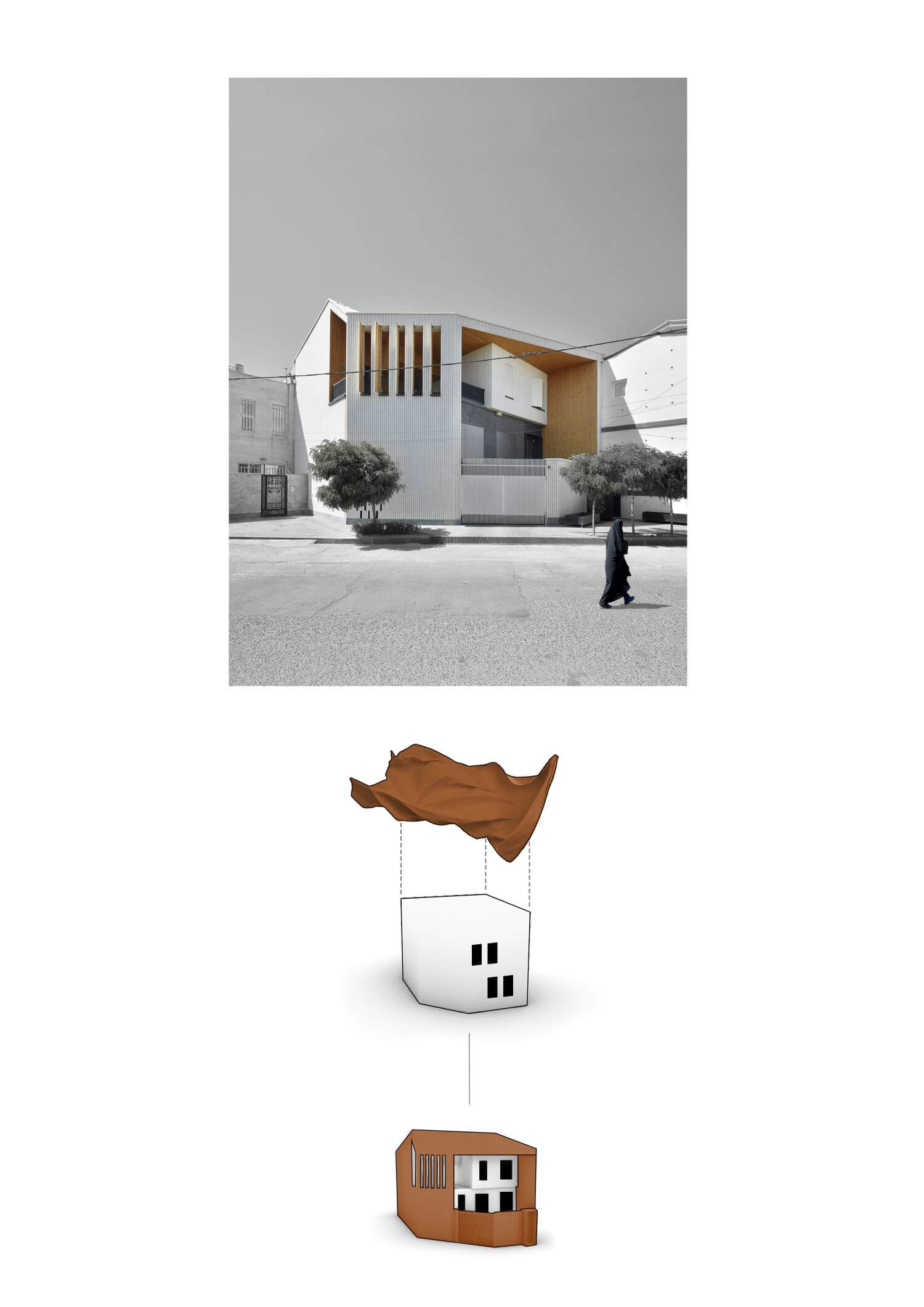
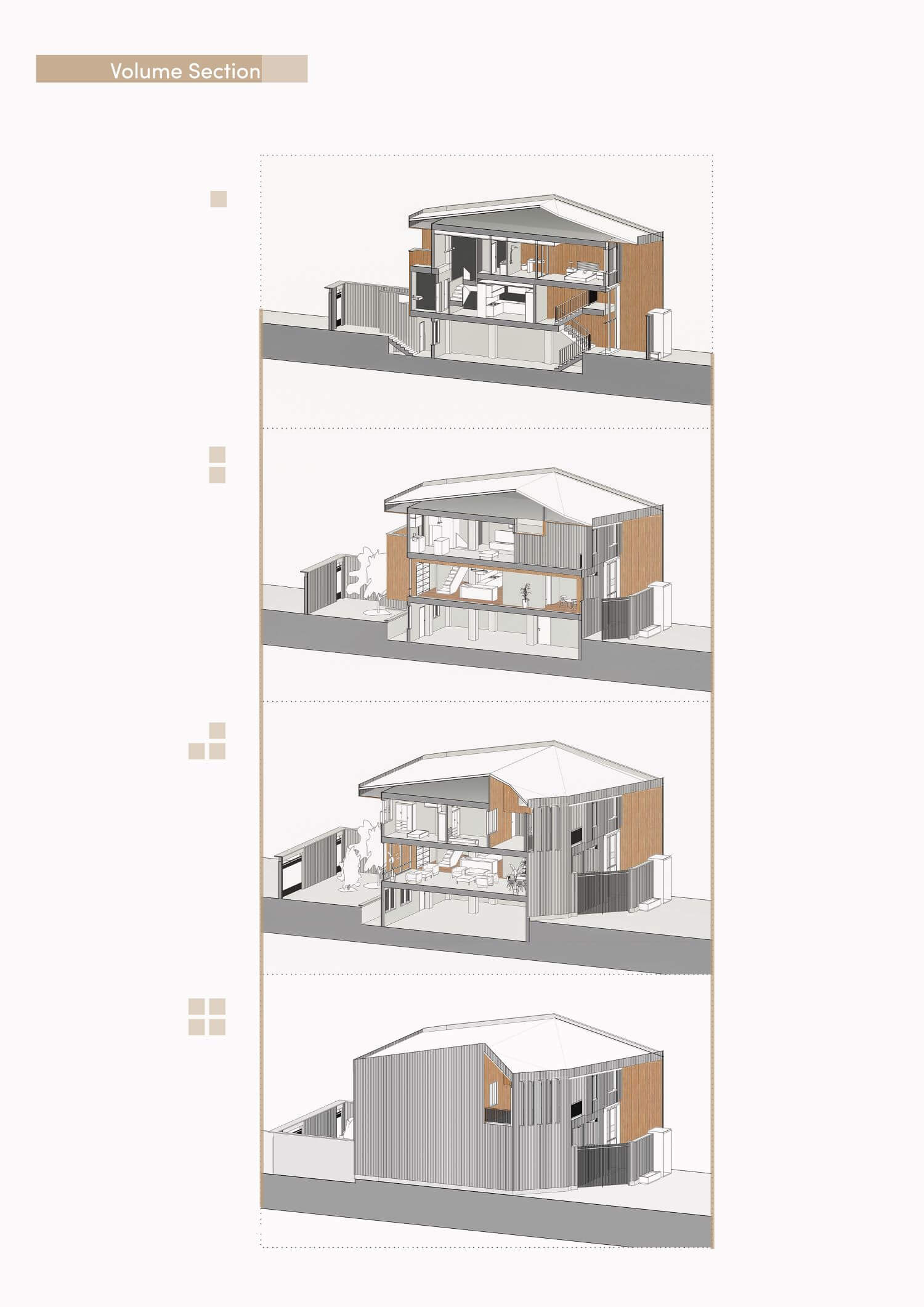
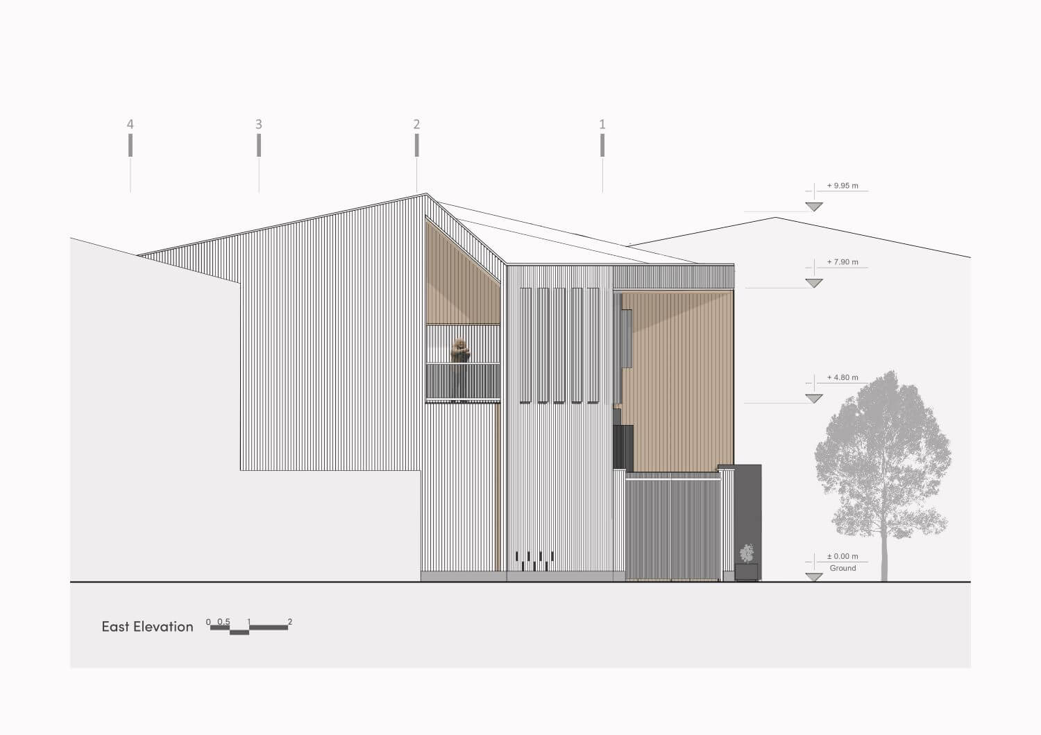
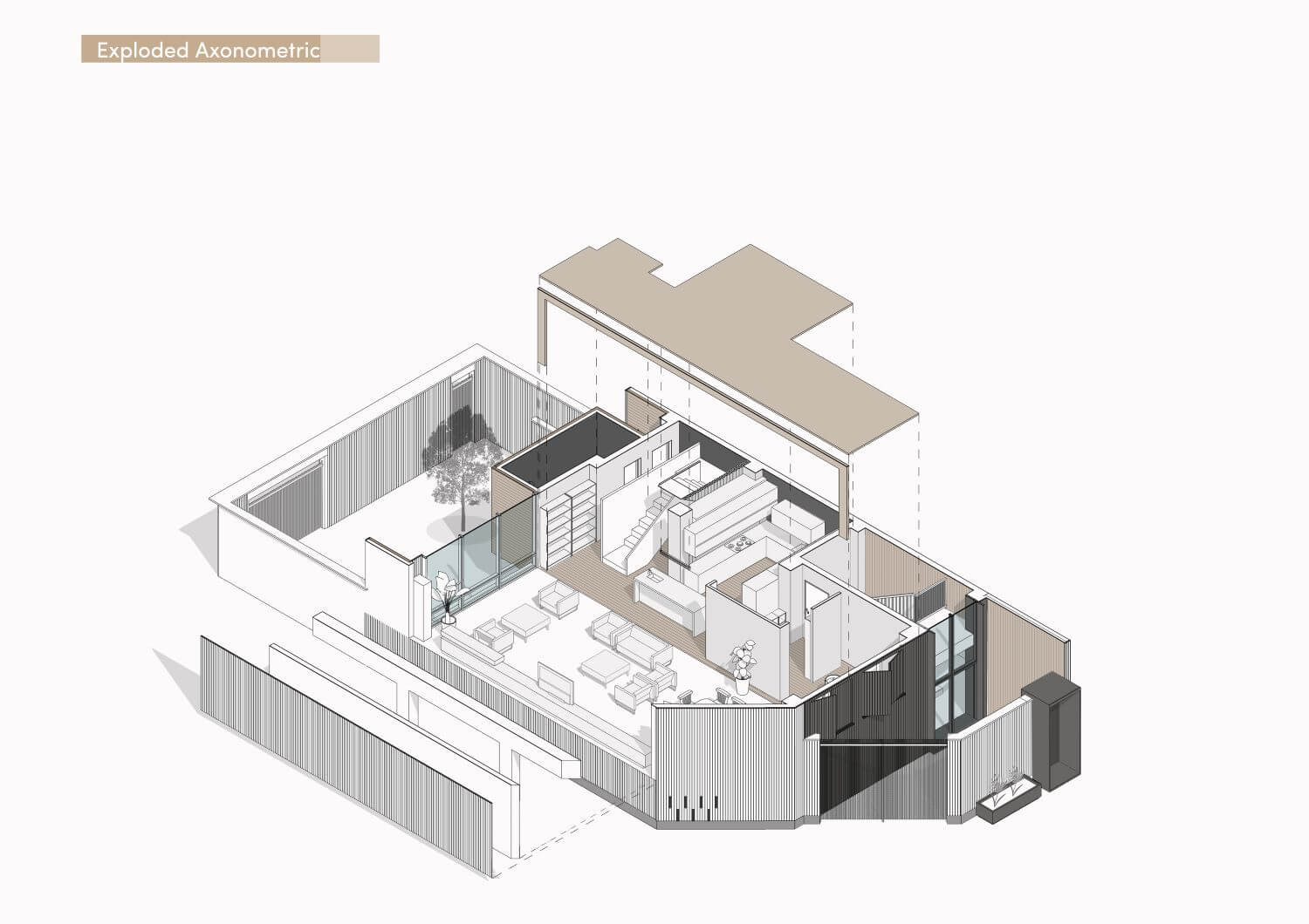
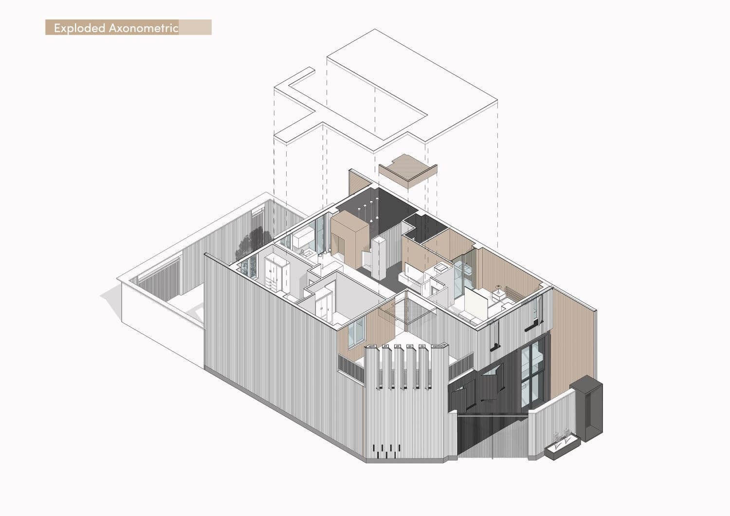
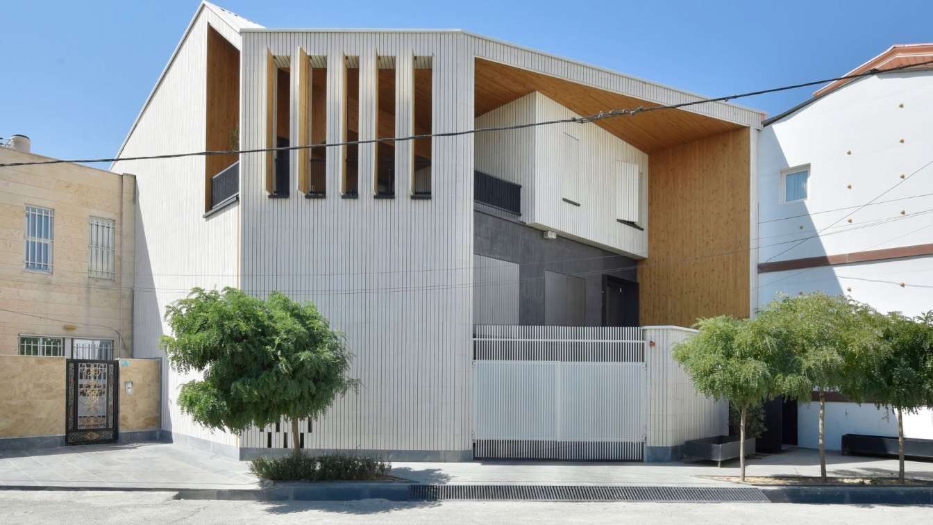
Grea Studio Architects attitude towards designing the facade of the building was such that by creating a comprehensible three-dimensional form instead of a two-dimensional shell, we turned the side views (sides of the building) into the main facade and gained more space to present the building.
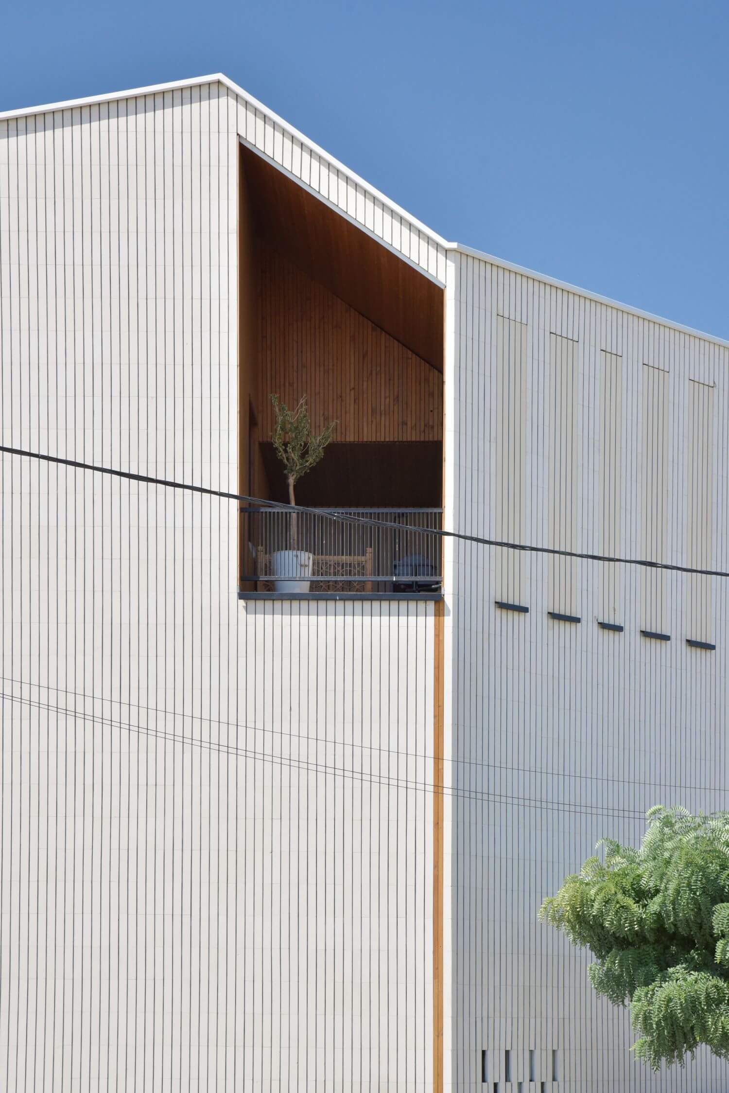
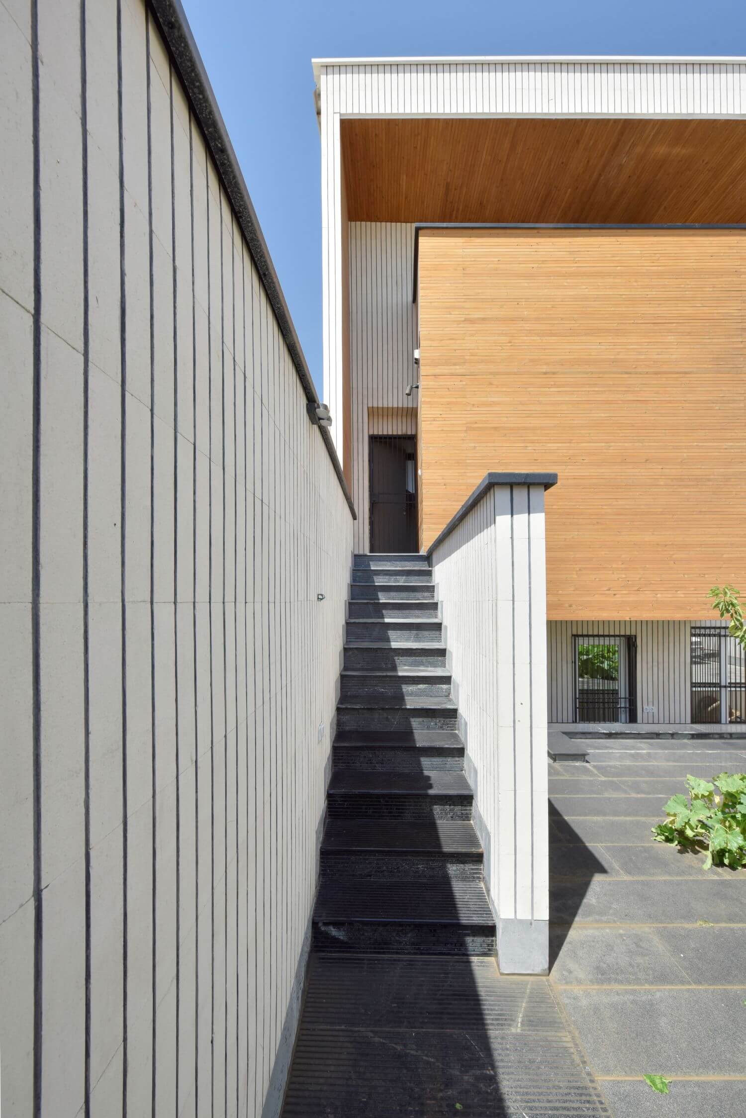
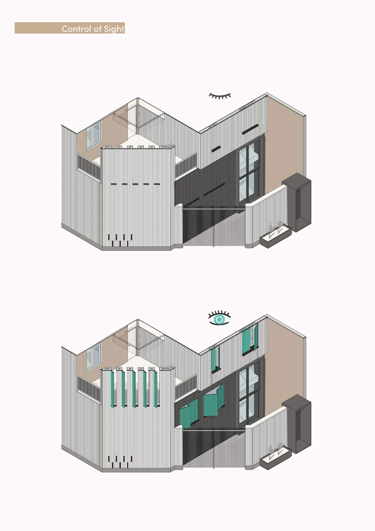
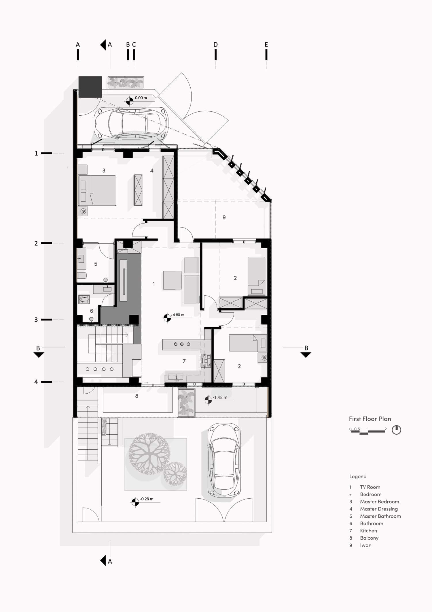
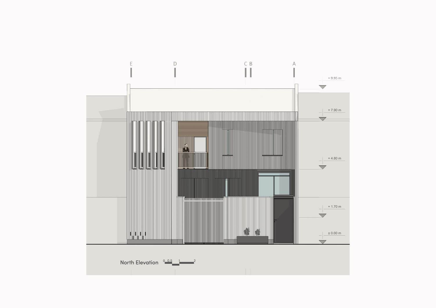
In the northeast of the building, the restoration of the existing terrace character was a special priority for the customer because it had lost its function due to the aristocracy of the neighbors and the proximity to the street and the poor spatial quality. The design response was that we created a semi-enclosed terrace with the ability to adjust the connection and opening with the outside space and generalized this idea to the general form of the north facade of the building. Thus, the building had an outer shell made of white brick and an inner core made of wood.
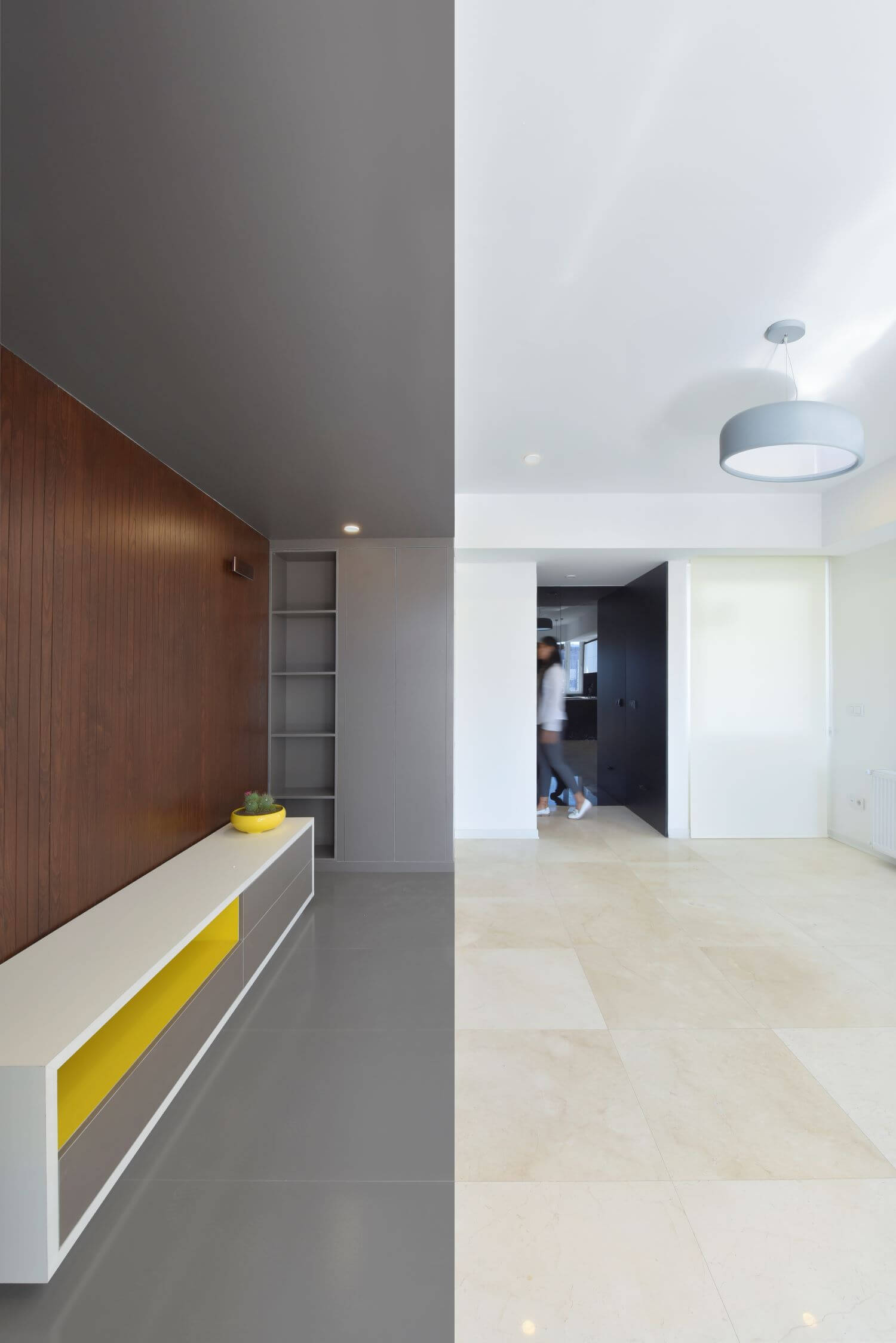
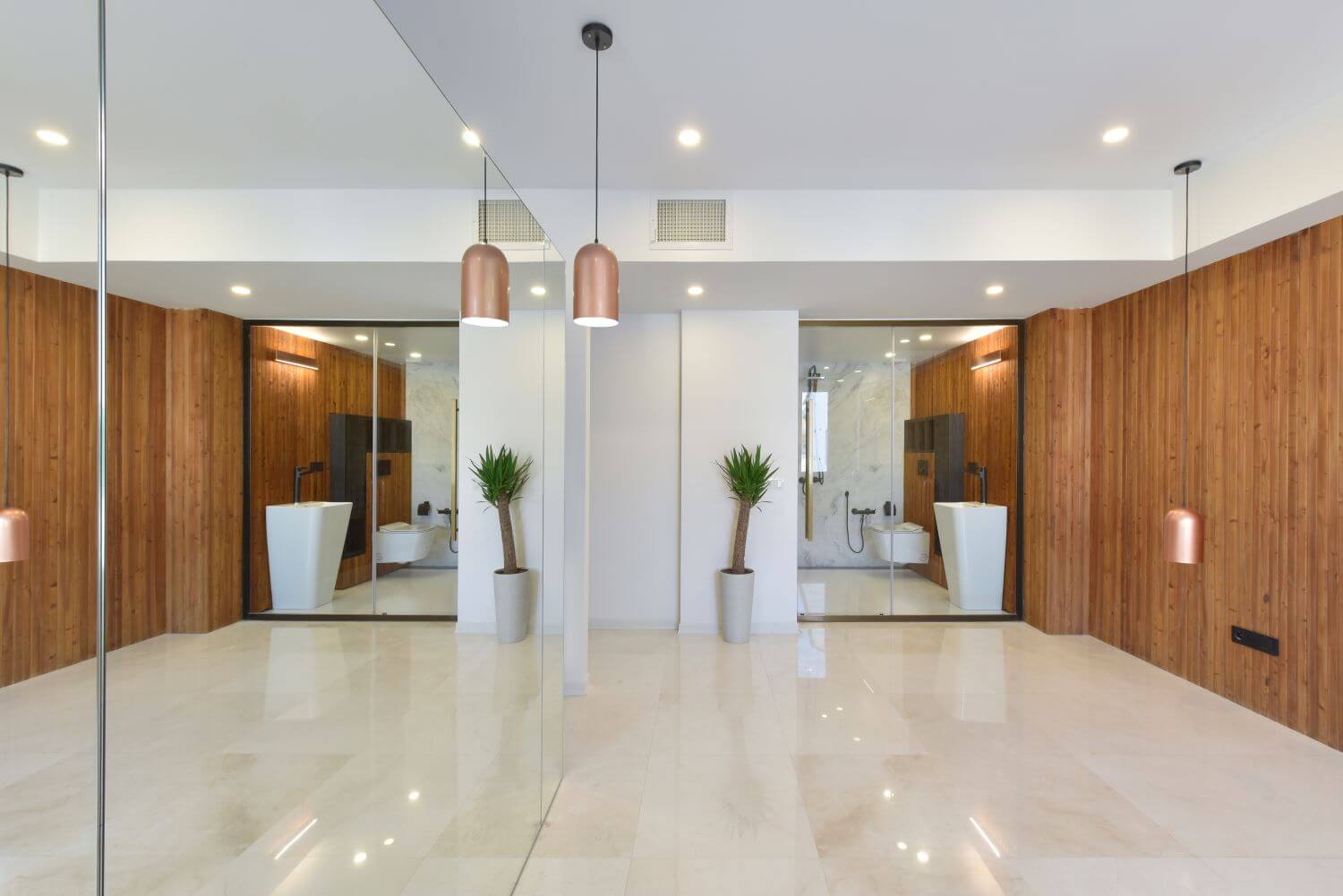
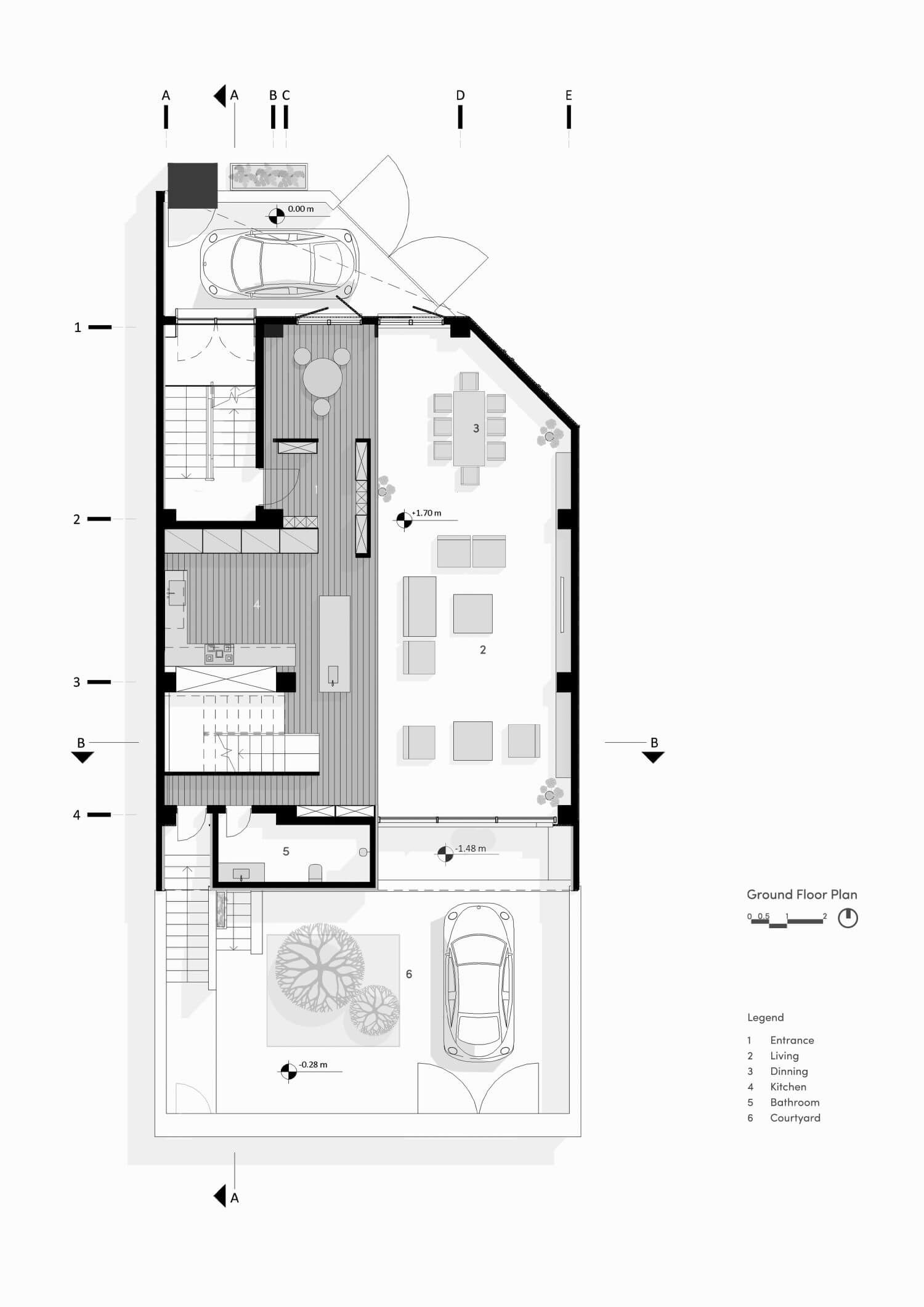
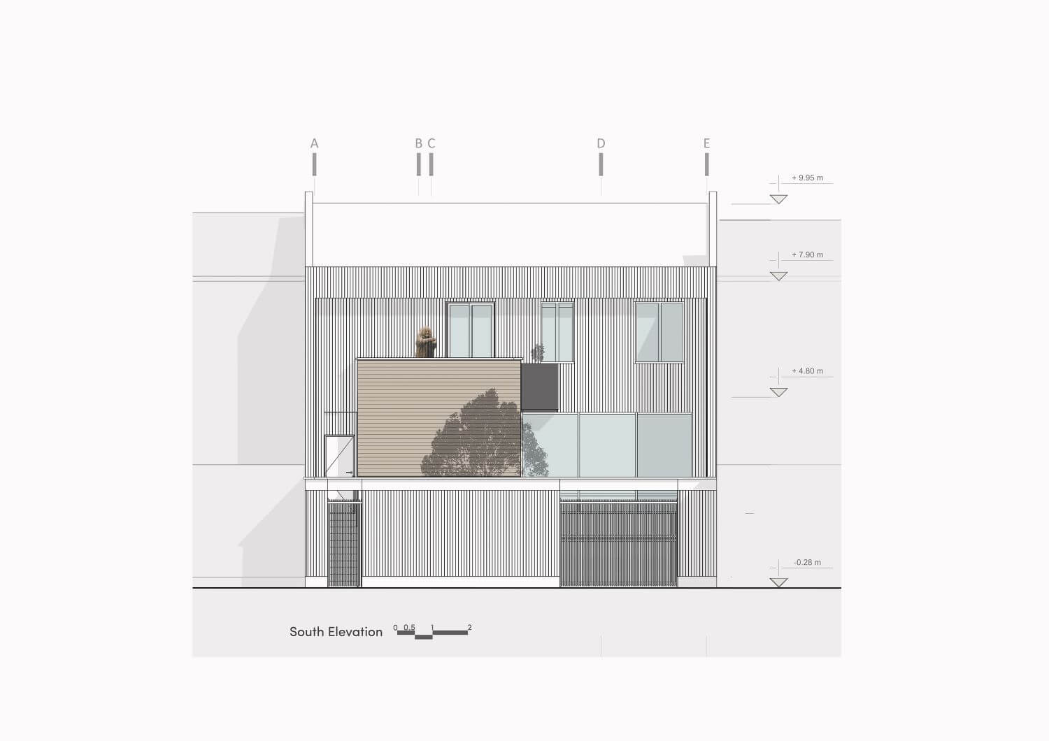
In the southern view, due to the proximity to a park and green space and having a suitable view to it, we created an opening in the view in the area of the living room and increased the area of the southern terrace and the adjacent bathroom and created a more functional connection with the courtyard. The way the building became more introverted in the north and more extroverted in the south.
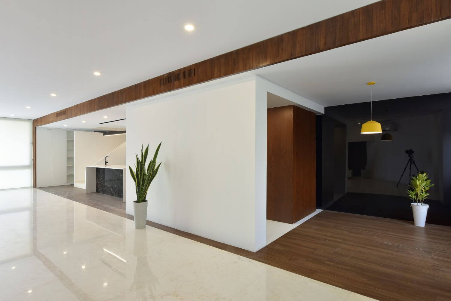
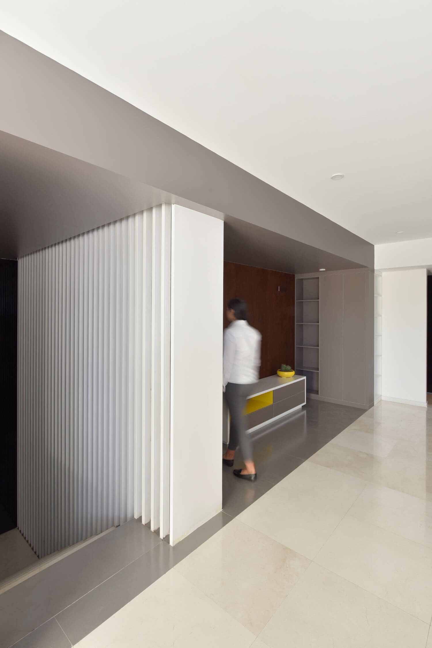
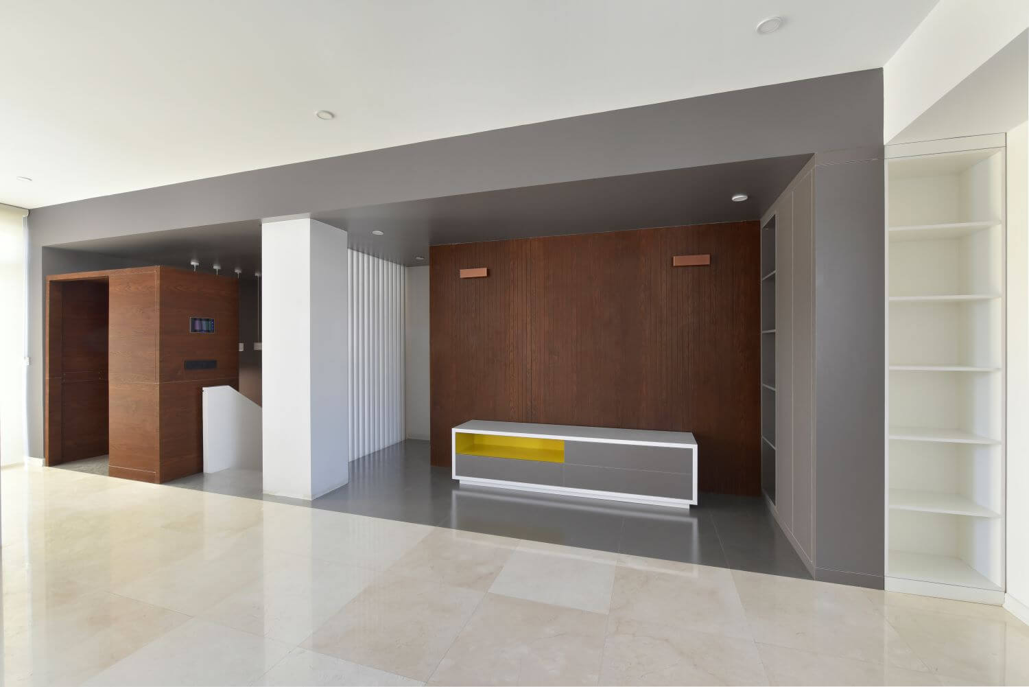
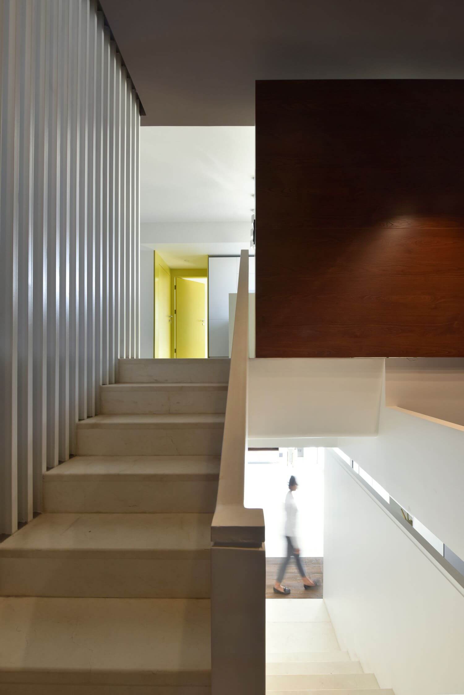
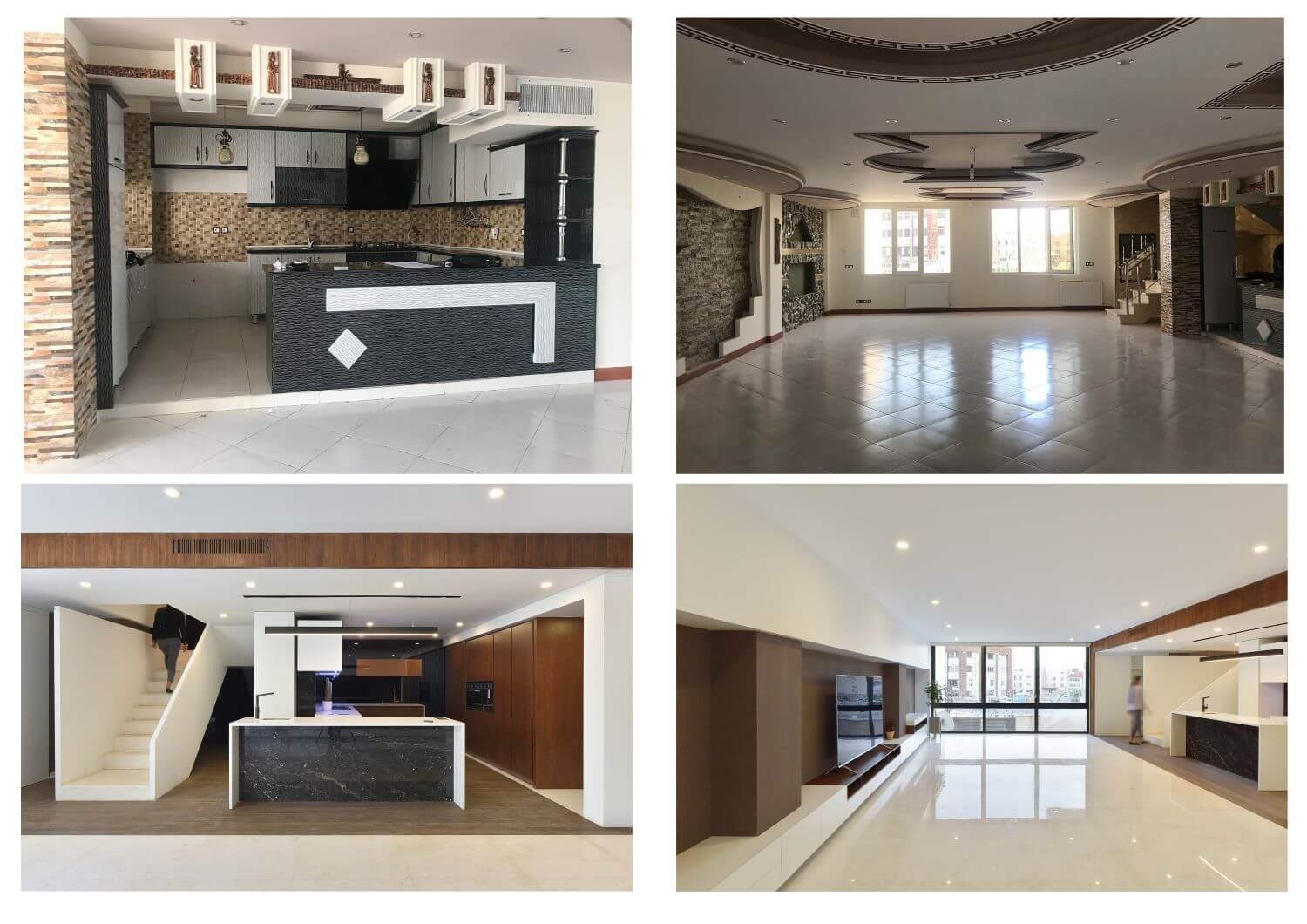
In the interior design of the building, the general structure of the spaces was preserved, but changes were included in the design
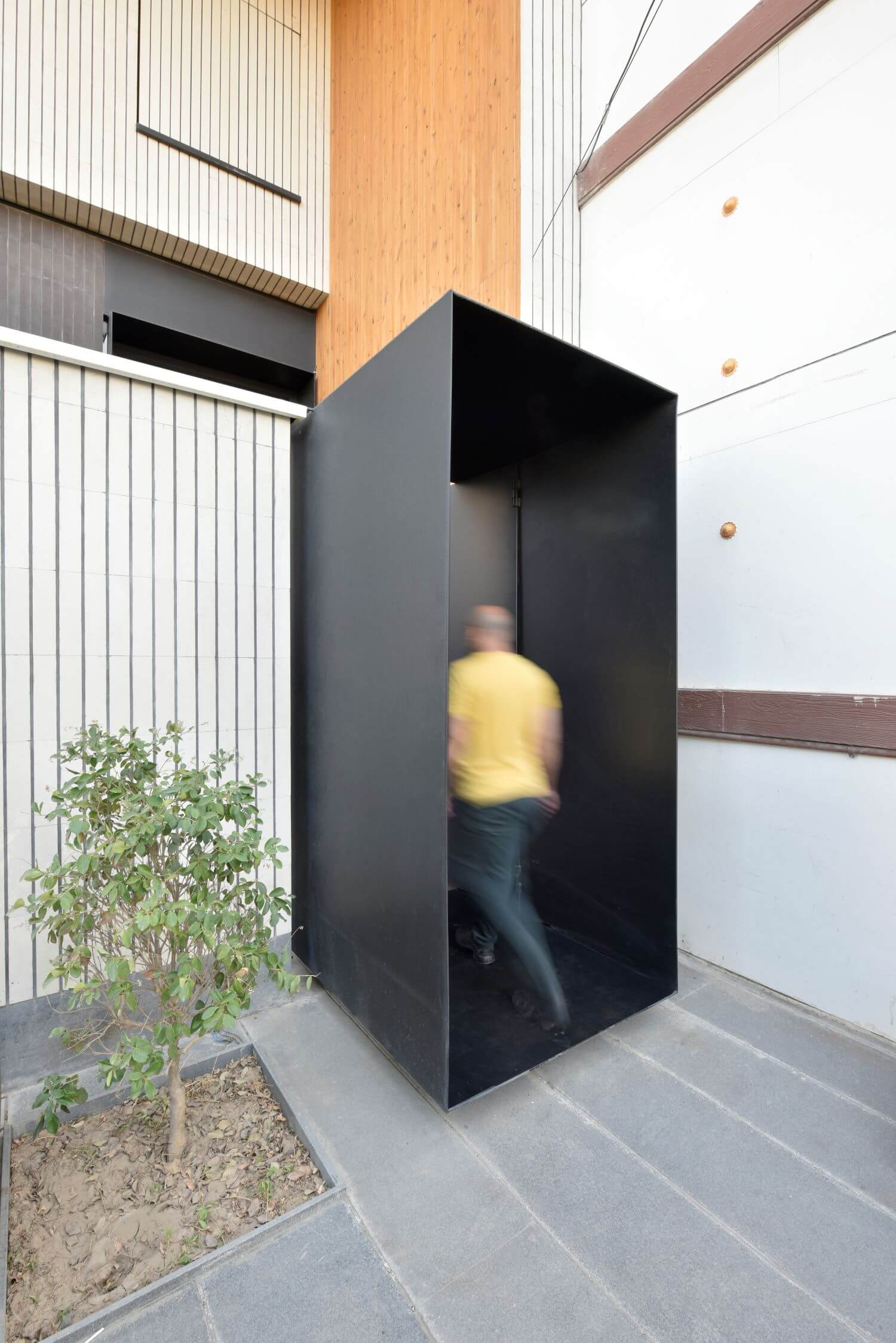
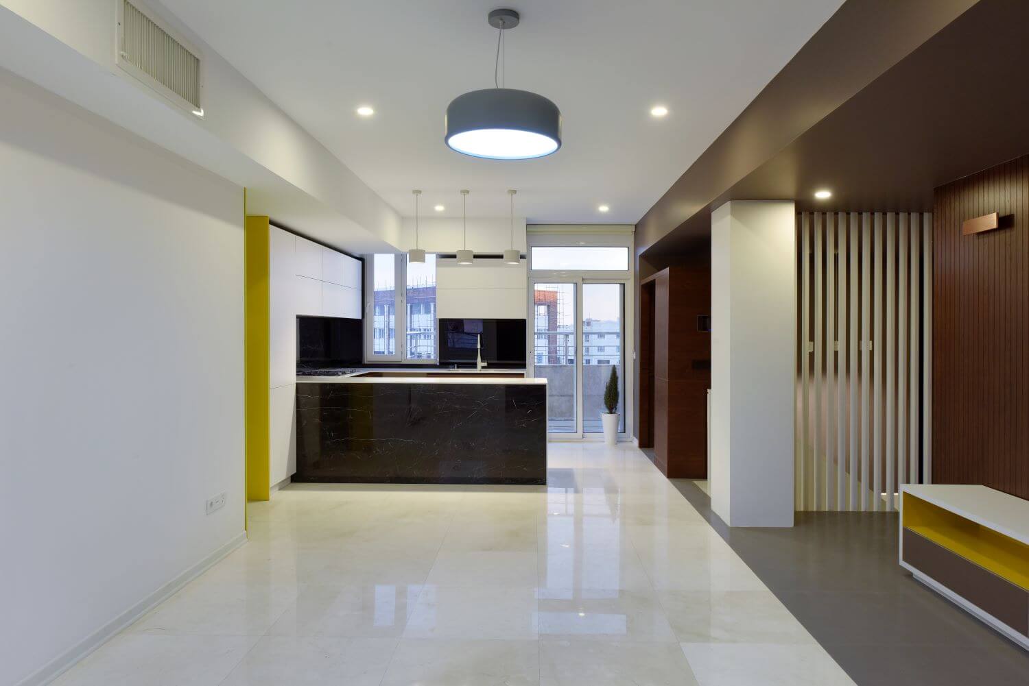
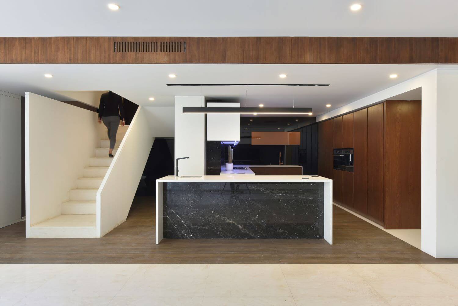
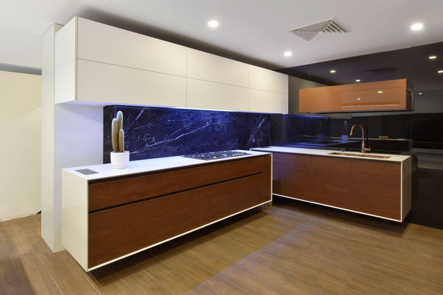
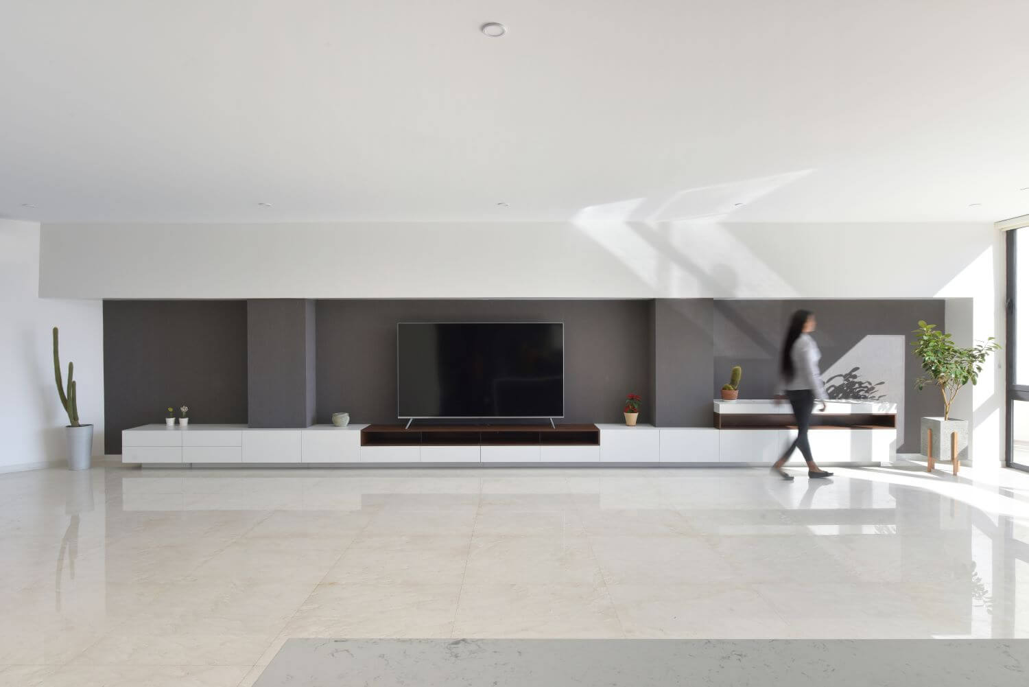
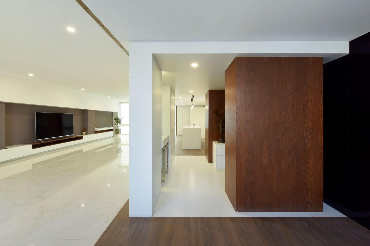
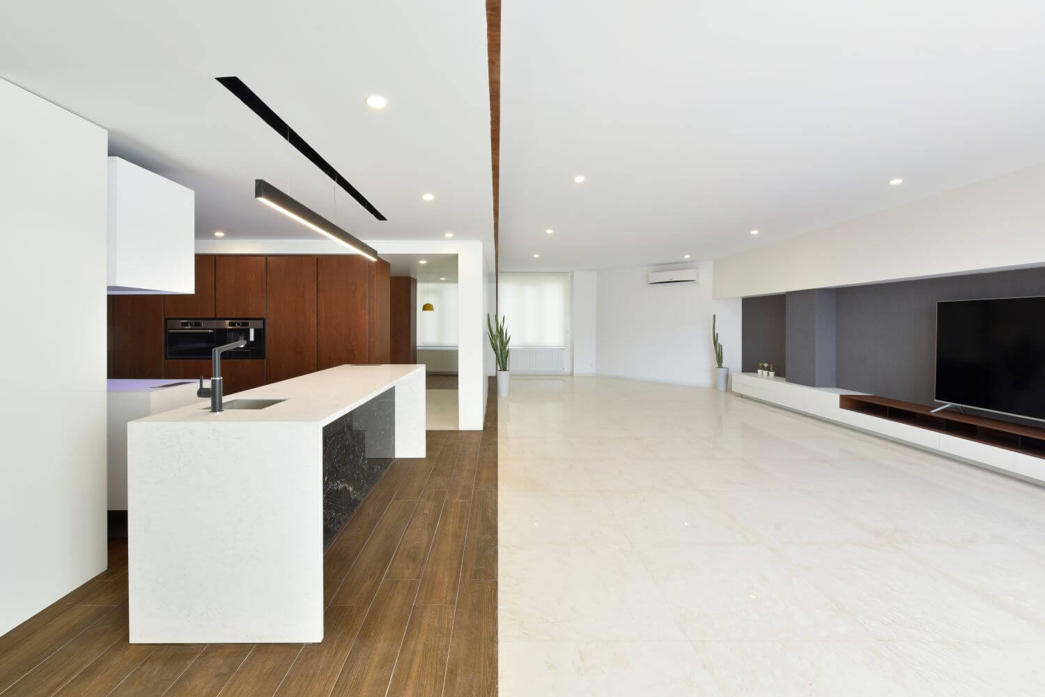
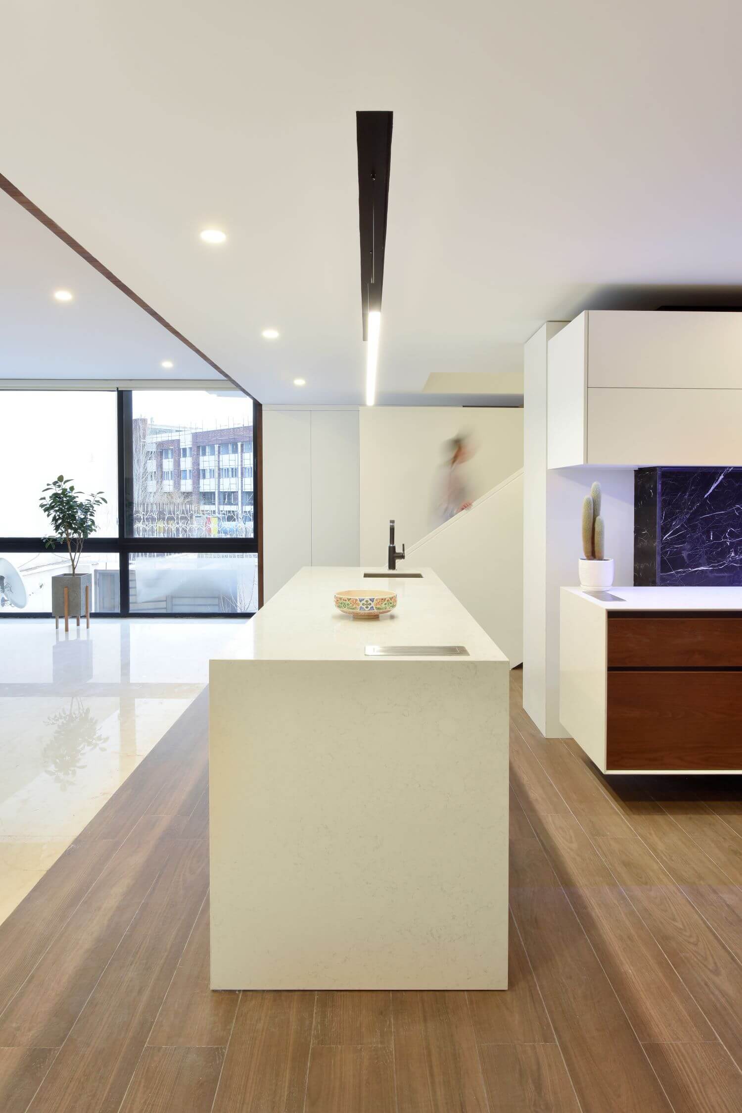
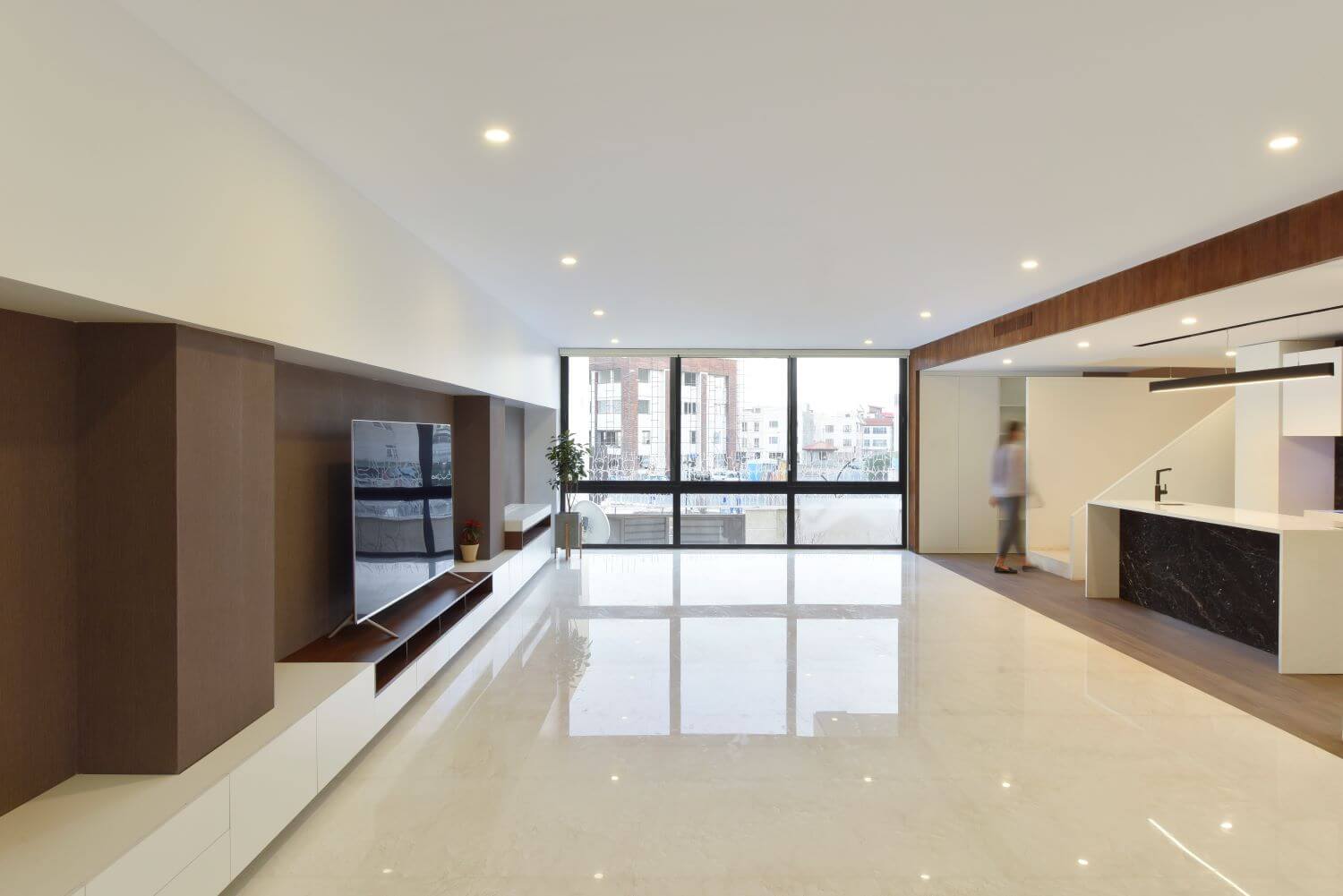
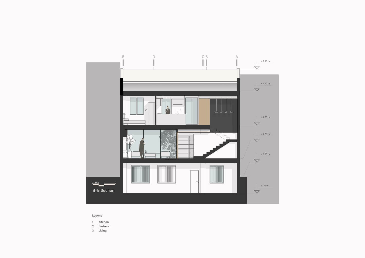
On the ground floor, the entrance was designed according to the placement of the kitchen and the living room and defining the view and access to these spaces, and the living room was formed by creating larger windows to better communicate with the courtyard.
On the first floor, access to the kitchen, rooms and terrace was redefined by removing a number of interior walls.
