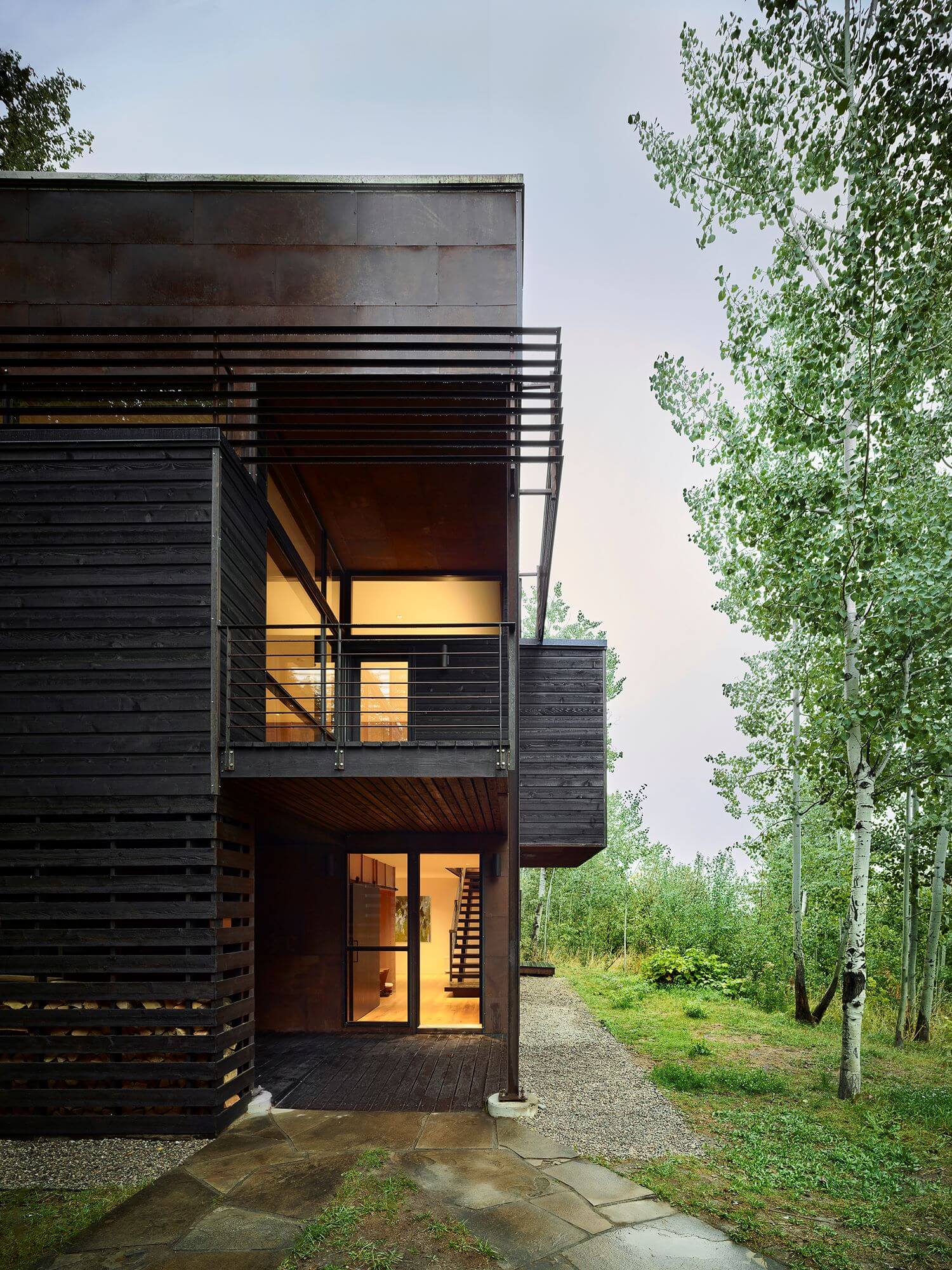
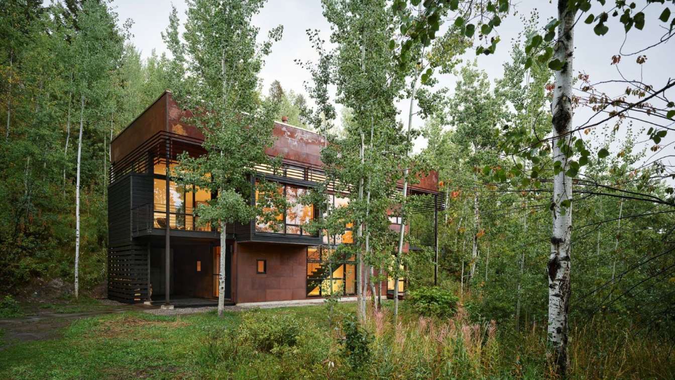
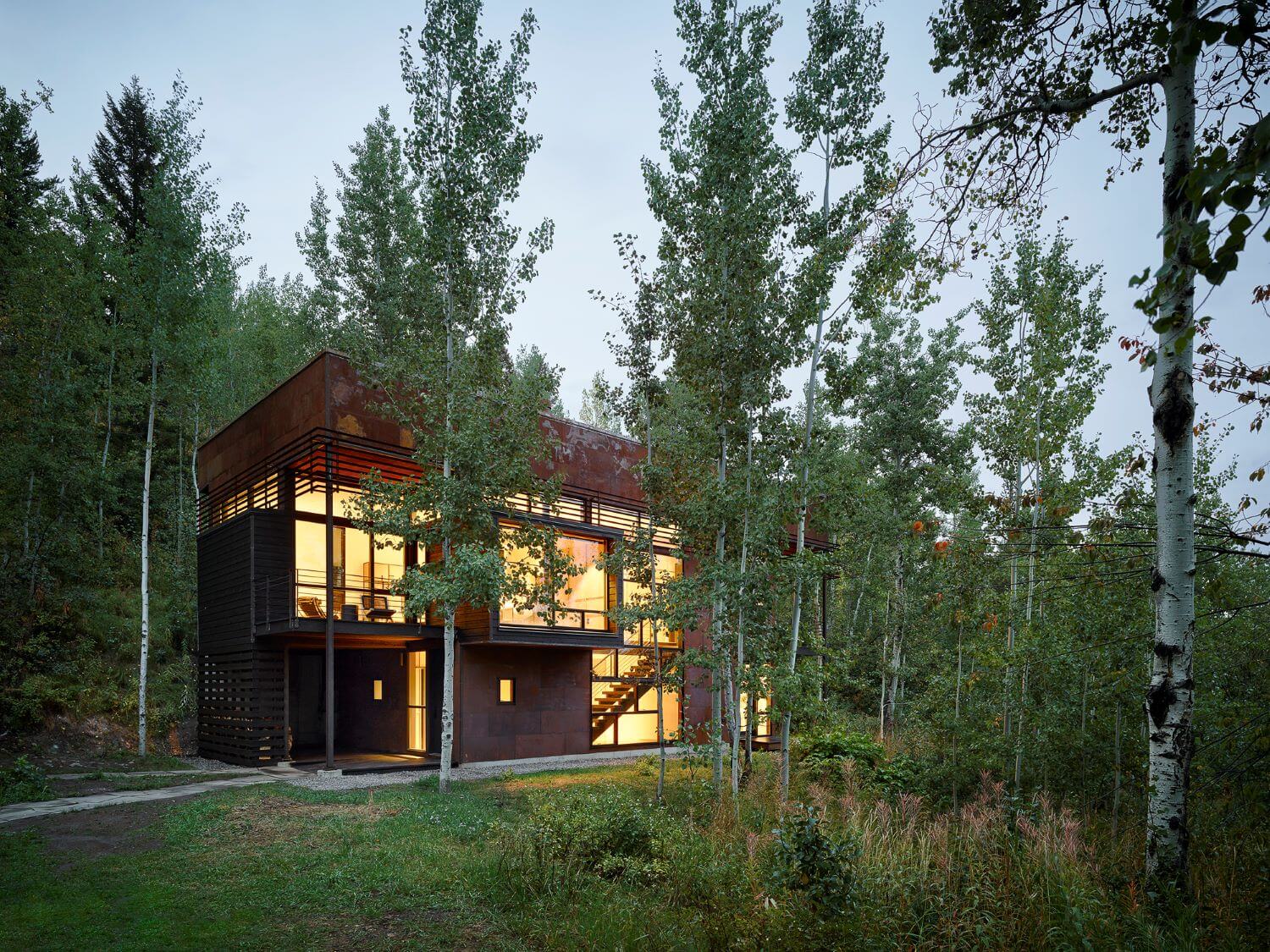
Evolving as deliberately as the forest which surrounds it, the Paintbrush Residence stands as testament to the longevity of thoughtful design. Situated in a dappled Aspen grove outside Jackson, Wyoming, the treehouse-like project reorients the occupant to their place in nature, bringing them into a closer, more intimate cohabitation. Under CLB’s care, the home has been carefully crafted and recrafted over the past two decades in a series of graceful iterations which support the site’s shifting inhabitants.
Initially completed by CLB Architects in 2003, the 2,400 square-foot home straddles both spatial and budgetary constraints on a picturesque site with a small buildable area. The owner wanted a home which would immerse the occupant in nature, calling for a lightness and porosity that was missing from the dark 1970s-era cabin which existed on site. Rearticulating vernacular forms through modular components and machined details, and incorporating slow-weathering materials such as oxidized steel and cedar, CLB sought to render a structure that would sit lightly and change subtly over time – an organic object within the landscape.
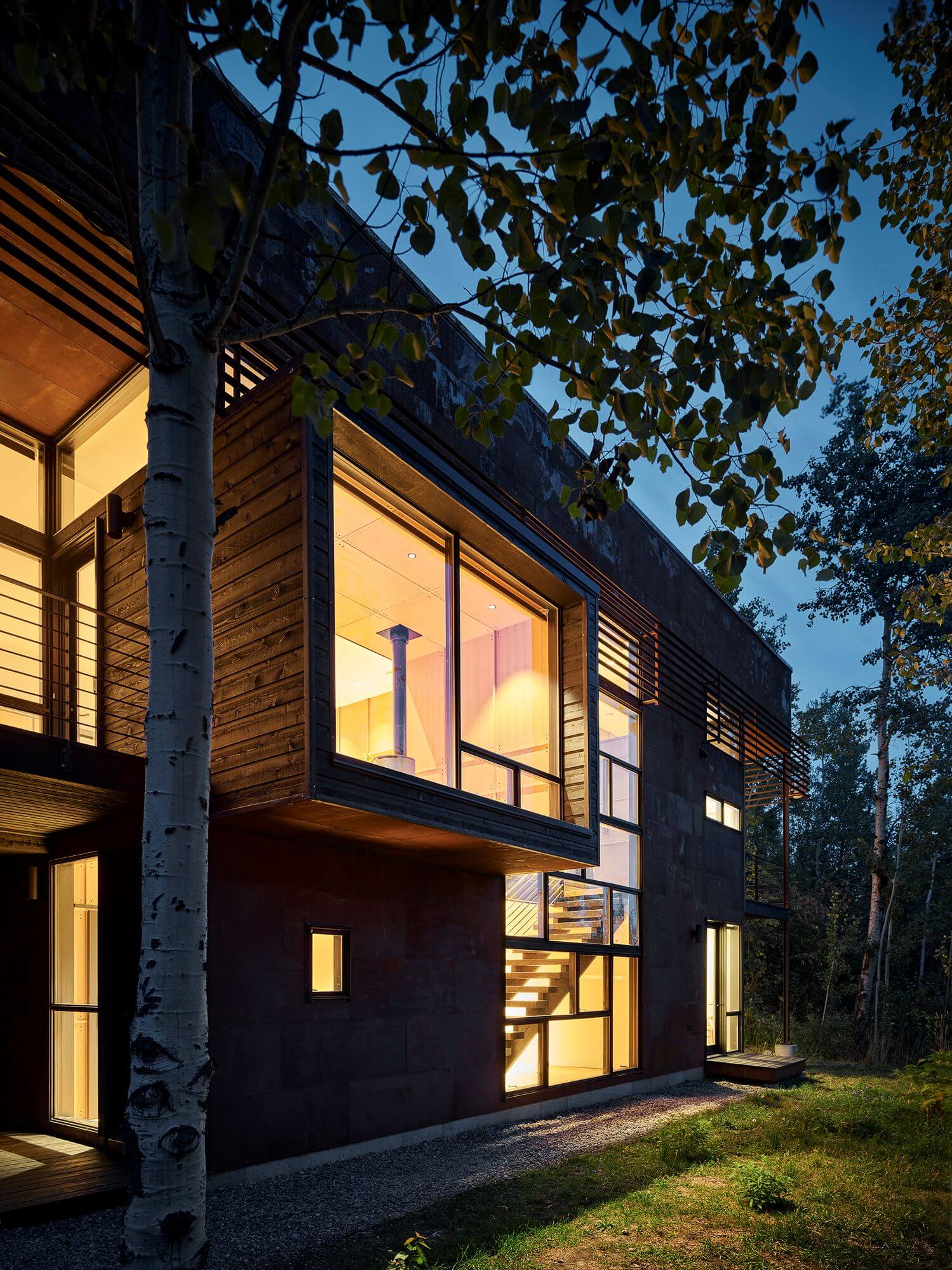
The residence’s design upends the public-to-private relationships of a traditional home, positioning the kitchen, master bedroom, and living room on the upper level nestled within Aspen canopy. The airy and light-filled volume is revealed dramatically at the top of the stairs, when the occupant finally “emerges” into the treetops. A cantilevered, cedar-clad projection from the second level further extends the immersion, allowing daily activities to coexist within expansive views of the outdoors. A continuous band of glazed clerestories demarcate the high ceilings from exterior walls and filter sunlight into the interior. On the lower level, a guest bedroom and entry area sit close to the hillside, flooded with light by the expansive, two-story window which lines the main stairwell.
Twenty years after its original construction, the home’s care was transferred to a new owner who found inspiration in its humble materials, minimalist detailing, and evocative light quality. Seeking to update the home in its existing design language, the new owner wrote a letter to CLB asking them to revisit the project. The new design works within the decisive structural gestures of the original, while refreshing harder-wearing spaces and surfaces with finely-crafted details and warm, tactile, natural finishes.
Updated elements were fabricated and constructed through modular and machined techniques similar to those used in the original iteration. The team worked closely with the client to select an elevated palette of materials, prioritizing durability and a play of textures. In the kitchen, white oak cabinetry modules are framed by powder-coated steel to mimic the home’s structurally expressive exterior, and a reinvented island allows for easy entertaining. The master bathroom reverses the original plan, positioning the bathtub near the window and wrapping the ceiling and walls in tile and warm wood finishes.
The honesty of each material and connection is brought to the surface in an echo of the original, from expressed screw heads to machined cabinet elements. Drawing from the past and opening up new possibilities for the future, the home’s design embraces its process and the specifics of its place.
Quotes
Eric Logan
“ It's almost like a really well crafted piece of furniture, with different iterations over a period of time.”
“She cares about good, authentic design, and that’s something we can really appreciate and relate to. “

“Once you ascend the stairs and are presented with this great big volume with all this natural light – that kind of dappled light of the Aspens – it’s quite a surprise.”
“Very simple, kind of humble materials that get to speak for themselves, and putting it together in a matter-of-fact way so we are seeing screws and embracing all this stuff that comes from the hardware store, but putting it together in a way that is deliberate and specific to this particular site.” (referencing the original design)
“It was also about reorganizing the way their main living level would relate to views and light, so the box presents a kind of upside-down living situation. You begin low, climbing the stairs and then you're on this kind of piano nobile — this thing lifted into the sky, into the canopy of the trees. So it really has a kind of cool treehouse sort of feel about it. It just totally changes the way you feel when you're on the site.”
Sarah Kennedy
“What we ended up doing was creating something that had a little bit more of a crafted feel with the lighting and extrusions and inlaid approach to cabinetry, it’s really beautiful.”
“She was so connected to the way Eric had thought about the house. It was intriguing from that perspective.”

