Springbok Road: SLOW TIME. In many respects, the minimalist approach that interior design studio OKHA took in this Cape Town home on the slopes of Table Mountain has to do with its views over Green Point and Sea Point. From its elevated position, overlooking the bustle of the city, OKHA’s Adam Court discerned a duality at the heart of the home’s character. “You’re overlooking the entire city, but you’re away from it,” he says. “There’s a connectedness but disconnectedness at the same time.”
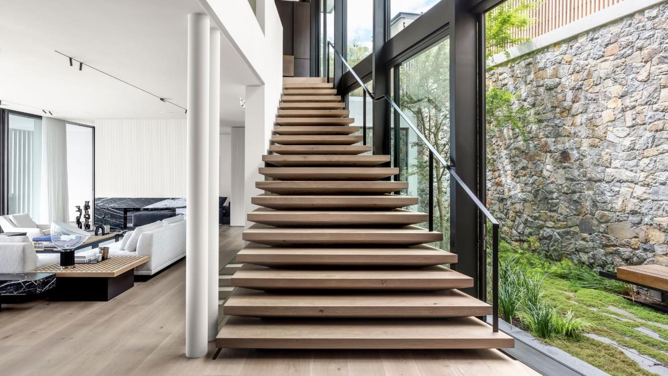
From the street, the house has a discreet, modest presence. Passers-by see little more than a slatted timber fence, which gives no indication of the panoramic vista on the other side of the front door as you enter and descend into the living spaces. Floor-to-ceiling windows and sliding doors embrace the view over the city towards the ocean and let in abundant natural light.

OKHA decided to embrace the contrast and harness this spirit of place. “We wanted to slow time down, press pause and create a sanctuary,” says Court.
That idea of ‘slow time’ is the golden thread that brings together every interior decision in this house. OKHA rigorously pared back the detail and dialled down the colours of the interior to create a refined minimalist setting. “There is so much visual information from the setting and the view,” says Court. “We didn’t want to compete or challenge it, but rather create a space that sits well with it.”
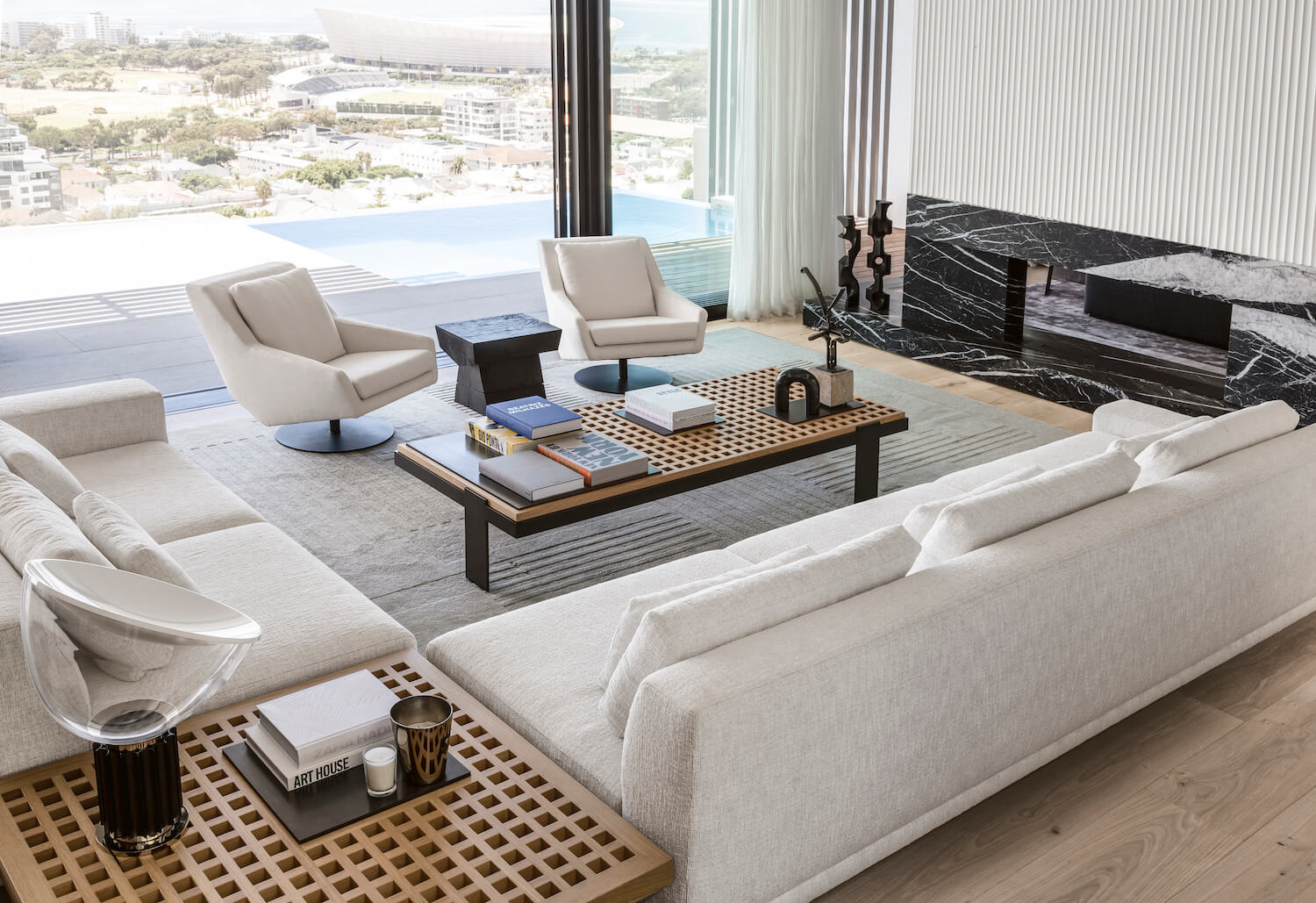
The internal finishes adhere to a restricted range and have been kept consistent throughout the house. The walls are white, and pale oak has been used throughout for the floors, cabinetry and screens. Whatever colour there is comes from the natural materials. Apart from the timber, OKHA’s choice of stone, such as the leathered Spanish Nero Marquina marble around the fireplace or the waxed steel used in some of the furnishings, retains a rawness that expresses their natural materiality.
“Nothing is polished / processed,” says Court. “Everything has a very natural organic filter, we try not to interfere”.

These raw, textured finishes have been chosen because they absorb and soften the abundant natural light, creating a soothing atmosphere. Perhaps the most important animating feature of the house and the element OKHA responded to most profoundly in this project is the natural light that filters into the interiors.
“When the light falls on the internal volumes, you get beautiful modelling and shaping of the internal space,” says Court. With that in mind, OKHA has created strong sculptural forms and clever detailing that catches the light. “The play of light gives form enhanced definition and impact,” says Court. The extensive use of fluted plastering, for example, creates patterns of light and shadow, and the sculpted, geometric forms, around the fireplace allow the light to become an active agent in modelling and expressing shape. “Throughout the day, with the sun moving from one side to the other, the space gets sculpted and re- shaped continuously,” says Court. “We’re allowing the natural light to make and shape the space.”
This movement of light and shadow creates a sense of “slow time” and a sense of calm and serenity. This approach inspired a design language of solid and void in several of the interior architecture details and bespoke furnishings in which, Court explains, “the voids become features in themselves, negative space is form after all”. This is evident in the design of features such as the front door, with its series of protruding and recessed panels, the timber screens and in key items of furniture, such as the Void Barstools.

“The shape of the barstool brings your attention to the empty space, so that the empty space becomes a shape in its own right,” he explains. The design of the chair becomes a frame for the negative space.
“That’s what I love about negative space: your brain picks up on it as much as it picks up on solid volumes,” he says. “So, you’re using negative space as a visual tool.”
In the balance and co-existence of opposites– solid and void, positive and negative, black and white – is something of a Yin and Yang philosophy, which in turn helps to make sense of the Japanese influence in other aspects of the interior design.
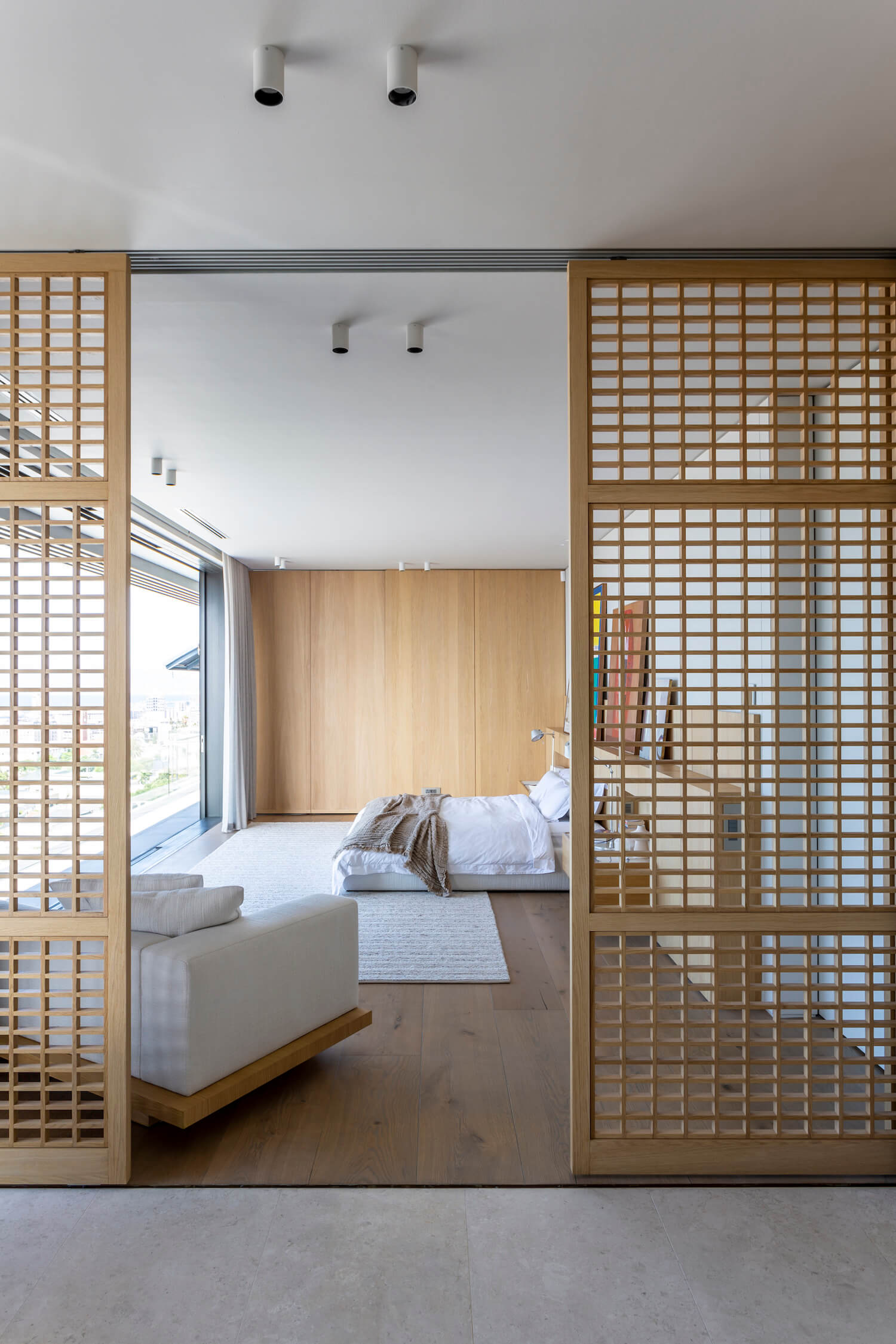
The sliding screens, for example, are clearly stylistically Japanese and add versatility to the open-plan layout, they open up and close down spaces, allowing rooms to expand and contract, becoming expansive or intimate as required. Large timber pocket doors, in the master bedroom for example, can disappear entirely, another instance of the essential duality at the heart of this home’s character. In the same way, the perimeter of the house can open up to an internal courtyard on one side and city and sea scape views on the other.

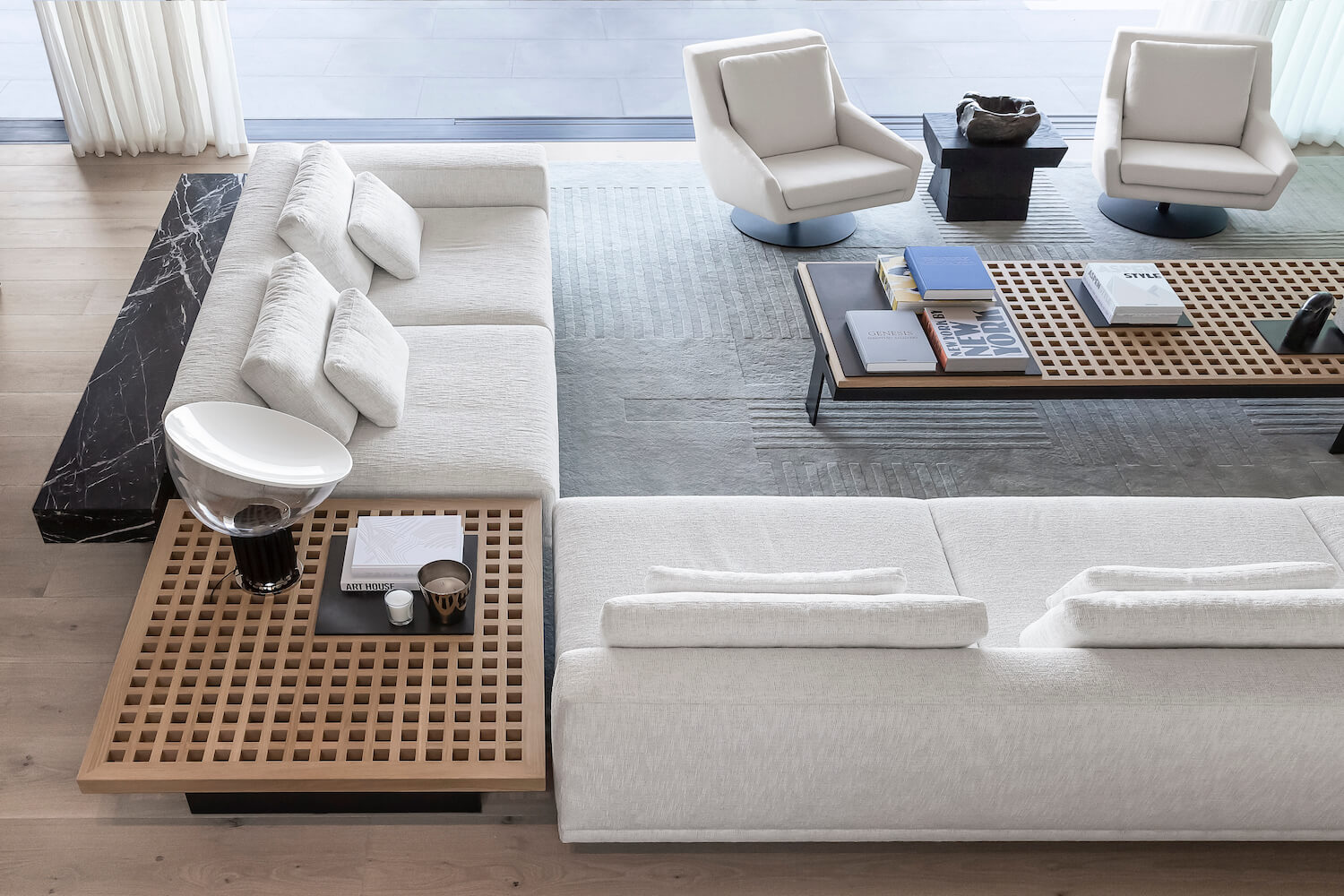
The specially designed rug in the living room is another example of the level of thought and detail sustained in every detail. Like the design of the coffee table, it has a strong linear basis interspersed with randomised elements, expressed not with colour, but only in the different lengths of the carpet pile. This design speaks to the language of light and shadow, solid and void, order and chaos throughout the house, but, importantly, it is also an example of another sense of time encoded in the interior design.
Other freestanding bespoke furniture items are conceptually and aesthetically knitted into the fabric of the design. The coffee table in the main living area is a prime instance. “We took the idea of the trellised timberwork screens and grids and applied it on a horizontal plane,” explains Court. “Then we created islands in the coffee table with recessed metal plates that become practical surfaces for directing the placement of objects, such as books or sculptures.”
By placing the “islands” asymmetrically within the rigorous order of the grid – and the legs off-centre – the disruption creates a play of harmony and discord, which captures a sense of equilibrium and dynamism at once. “The running narrative throughout the space to try and create quiet intrigue with some poetry now and again,” says Court. “When things are a little bit off- centre, it creates a quiet provocation and subtle tension.”

The notion of multifunctionality is included in other bespoke, built-in furnishings. The bed units, particularly in the master bedroom, combine the functions of bed, desk and side table. More than furnishings, however, they are installations that define the whole room. “Furniture and interior architecture become one unified element,” says Court.
These subtle details only reveal themselves over time. It’s what Court calls “slow burn” or “slow-release” design. These “whispering details” do not draw attention to themselves but become discoveries and moments of delight that only become apparent with time and familiarity.
It’s this kind of richness in the design that, despite its apparent restraint and purist approach, creates a sense of luxury, too. The minimalism never becomes dull, and there’s magic in the tranquillity.


