Nick Bell Architects: This weatherboard cottage, typical of the area, had a first floor added in the 80’s and a lean-to structure housing the main living areas towards the rear. The limited site area meant that we had to work with the existing footprint as much as possible. The project therefore consisted on an extensive internal reconfiguration and a replacement of the existing lean-to with a dynamic new addition. The relocation of the stairs brought several new spaces to life with a limited side addition, a fourth bedroom, a study in between floor levels and a new laundry. The family room at first floor was also much improved, with the north east corner becoming usable space from where to enjoy harbour views and the morning sun.
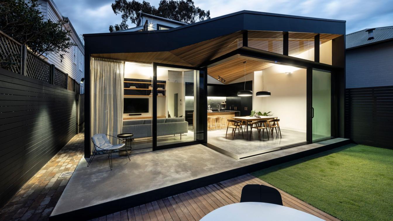
At ground level a new north east facing courtyard brought light into what was a very dark corridor, the new bathroom and kitchen. Towards the rear, the new ‘’lean-to” is a playful re-interpretation of the traditional form. Part of the roof follows convention sloping down from front to back, whilst the other main section of roof slopes up from front to rear, increasing the ceiling height at the rear to 3.6m. Joining these two main roof planes is a third triangular transitional plane. This transitional plane is a large skylight orientated to draw in natural light from the north. The timber ceiling is clad with a routed solid timber that has the profile of custom orb metal roof sheeting. This was chosen as a reference to the custom orb material traditionally used on most Aussie rear lean-tos.
What was your inspiration for the design?
The traditional "Aussie" lean-to additions - we were inspired to design it's modern form.
What was the brief?
The client had lived in the property for a number of years and were frustrated by certain aspects - in particular a cluttered internal configuration and lack of natural light. The brief required reconfiguring the existing living spaces, internal stair and bathrooms to achieve better circulation and open the house up to the views and light. The dwelling needed to accommodate several key furniture pieces of the owners as well as their collection of artwork. A redesign of the rear landscaping and better connection between the indoor and outdoor spaces was also sought by design.

What were the solutions?
1. The stair was relocated by adding a new side addition. This freed up the planning of the existing house as well as providing additional space for a new 4th bedroom and additional laundry
2. The half landing level of the new stair provided an opportunity for a new two person study with an abundance of natural light.
3. The relocated stair also improved the size and shape of upstairs living area and connected it to the north easterly aspect and views
4. To the north a small courtyard was introduced. This provides natural light and air to the shortened entry corridor as well as the new ground floor bathroom and laundry,
5. On the ground floor the existing rear lean to was removed and replaced with a new improved "lean to" addition. This new addition utilises the existing concrete floor slab of the original rear structure and verandah, sitting the new addition on a "plinth". This was then finished with a new polished concrete topping.
6. The roof to the new addition is a playful re-interpretation of the traditional rear lean-to. Part of the roof follows the traditional form sloping down from front to back (albeit raised by about 600mm from the existing) whilst the other main section of roof slopes up from front to rear ), increasing the ceiling height at the rear to 3.6m.
7. Joining these two main roof planes is a third triangular transitional plane. This transitional plane is a large skylight orientated to draw in natural light from the north. This triangular skylight also shifts the geometry of the main roof planes so the "grain" of the roof is not orthogonal to the main structure. There is then a fourth roof plane externally that again is triangular and forms an external eaves and connects the two main roof planes on the outer face of the glazing.
8. Rather than the follow the original rear building line the new addition steps with the western section reducing the rear building line and the eastern section increasing it. Internally this provides an L-shaped space, which furnishes and defines much better the three zones of kitchen, living and dining (which are also defined largely be the 3 different roof planes). This also results in an improved external space where the increased setback section, along with raising the external ground level, allows the addition of an outdoor sitting area.

9. The new rear elevation is entirely glazed to maximise natural light and increase the sense of space in a small area by connecting the internal and external spaces. This is emphasised by the continuation of the concrete base and timber eaves from inside to outside. The large rear sliding doors are Raynaers with minimal framing and the whole system is suspended from steel droppers that hang a steel plate to take the door head. This suspended structure allows an open corner, where the frameless sliding doors junction to a large pivot door that electronically lock together.
10. The timber ceiling is rib clad from cedar sales. It is a routed solid timber that has the profile of custom orb metal roof sheeting. This was chosen as a reference to the custom orb material traditionally used on most Aussie rear lean-tos. Also the strong directional grain of the material emphasises the non-orthogonal pitch directions of the ceiling which come together at interesting angled junctions. This ceiling then extends into the old part of the house and the new half stair, connecting the two together.
What were the key challenges?
a. A deep plan with many internal dark spaces including a dark entry and long dark corridor
b. Stair location took up the best corner location upstairs with north east aspect and view of Harbour Bridge
c. Dark main kitchen/dining/living space to rear had low ceilings pitching down to 2.3m and south/south east aspect (no natural light)
d. Rear outdoor space divided by different levels and an undersized rear verandah, resulting in no space large enough for outdoor entertaining
e. No separate laundry, washing machine in kitchen
f. The property is located in a heritage conservation area and the Council's planning controls required leaving the front of the dwelling and primary roof form intact. As such, replanning of the dwelling focussed on the rear of the house and a new side addition set back from the street.

What are the sustainability features?
1. Age old principles such as cross ventilation and solar orientation are present throughout the project
2. Solar Panels
3. Thermally broken aluminium framed glazing
4. High performance glazing to the skylight
5. Cedar cladding for the ceiling (sustainable softwood timber)
How is the project unique?
a. Much was achieved with only a very small increase to the original footprint
b. Sloping ceilings and large triangulated skylight creates a unique space that makes the most of the natural light and the living areas now enjoy a seamless connection with the outdoors
c. The triangulated planes of the roof form and cantilevering structure required a high level of precision and coordination between the architect, structural engineer and builders


About
Nick Bell Architects are Sydney based Architects founded in 2008.
We are committed to design and architecture that is both innovative and functional. We view each project and all that it encompasses – site, brief and budget – as a unique and individual opportunity to explore the potential of design.
Our architecture is instinctively modern yet aims to provide a softness and warmth that can be lacking in contemporary design. Our work aspires to be environmentally responsible making use of modern technology and design solutions as well as effective age-old principles.
At Nick Bell Architects we believe in combining intelligent use of space and light, beautiful materials and attention to detail; creating environments that enhance and bring happiness to daily life.

