"The vision for the renovation was, on one hand, to preserve the general lines of the original house from the 1970s. The exterior of the building was preserved structurally to avoid major renovations and long licensing processes. However, the interior of the house underwent a complete renovation," explained architect Yehoshua Shashua. He further explained, "An additional request from the client was to choose a light color palette—white, light concrete gray, etc.—and that's what we did."
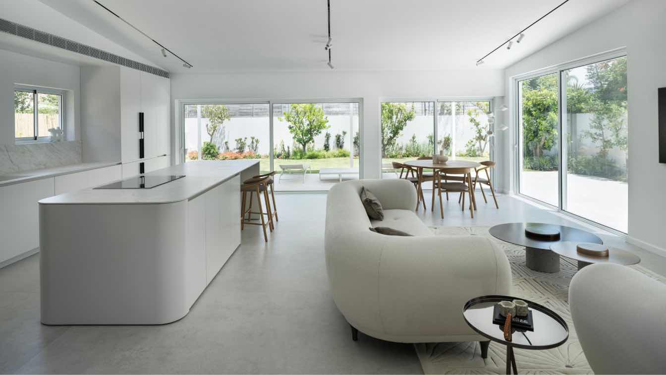
"We broke the wall separating the living room and kitchen to create an open space. We swapped the positions of the kitchen and living room to better utilize the space, the backyard, and the access from the living room to the yard. We retained the high ceiling due to the roof beams but installed magnetic lighting strips and spots within it, allowing for direct light at the right angles. The idea was to create a clean, minimalist gallery-like appearance", Shashua said. The space's floor was covered with large, precisely crafted 120x280 cm porcelain granite tiles in a light concrete tone, and the wall was clad with the same size porcelain granite with a textured grey travertine finish. This wall contrasted with the white and highlighted the furniture—white sofa, off-white island, and wooden accents.
The kitchen, like the rest of the house, is white, creating a dialogue between the sharp, straight lines along the kitchen wall, the merging strip, the ceiling's slanted design, and the rounded corners of the island. The kitchen countertops were chosen with a white model from Laminam, featuring delicate and picturesque veins, which create precision in the kitchen space.
The dining area faces a vitrine that opens to the backyard. Warm-toned furniture was selected for this space, with a light-colored oak table and chairs—Scandinavian style.
The master bedroom is minimalist, and even the facilities follow the clean lines. A white marble countertop, warm lighting, and a glass partition separating the bedroom from the en-suite.
The staircase is one of the key elements in the house, centrally located. The division into half-floors was retained from the previous house's design, meaning: from street level—entry to the house at half-floor and then reaching the living room floor, and then climbing another half-floor to reach the bedroom floor. The old staircase was replaced. Now, the lower half of the staircase is in the form of a "heavy" mass of steps covered with porcelain granite, divided into smaller and larger steps for seating. For the upper part of the staircase, hanging wooden steps are connected on one side directly to the wall and on the other side to a solid iron railing with CNC-cutting. The shapes and positioning of the stairs create a natural light stream into the entranceway.


