I said unto you, I beheld everything
in the first step of the distance.
— Adonis
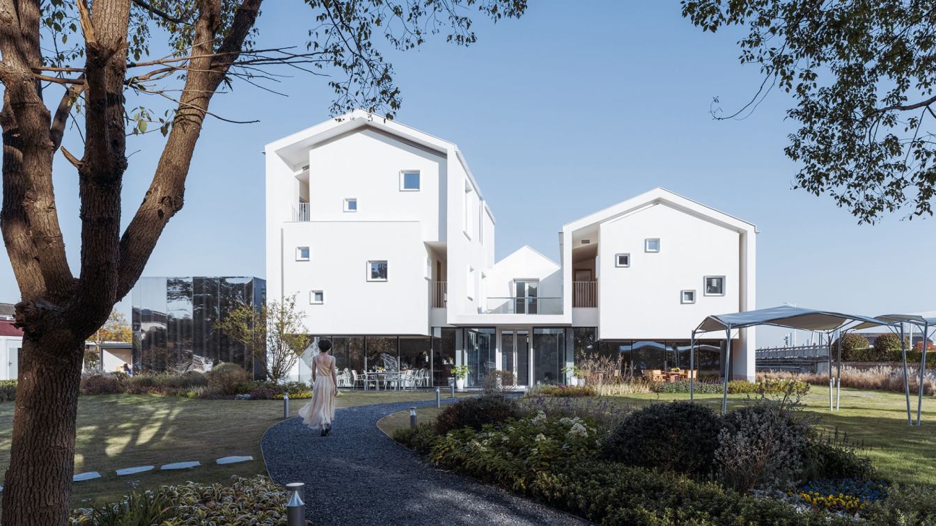
The White Section Homestay designed by Wutopia Lab in Suzhou was opened in October 2021 in West Lindu Village on the shore of Taihu Lake. It is invested by Jingcheng Culture Tourism Development (Suzhou) Co., Ltd, a subsidiary of TONGCHENGTRAVEL, and managed by Taolu Brand homestay. The White Section Homestay is the first prototype building that is a rural revitalization project developed by TONGCHENGTRAVEL and the Hengjing government in Lindu Warm Village.
I Would Like to Relax
The weather was excellent when I visited the site. I was even a little drunk in the golden winter day. The most attractive to me, a middle-aged man, is in a daze in such a peaceful and tidy village to ease the pressure from struggling life! I hope that the Section Homestay could express this relaxed and lazy state, rather than haggle over every ounce with precision.

Cut in Half
The Section Homestay is the redesign and reconstruction of the dilapidated house on the original site. The architect cannot change the footprint of the building. It is interesting that the rural buildings in the suburbs of Suzhou were not courtyards, but an "C" layout. It seems to be half of the courtyard, which inspired me. Half is fine, I decided to design the west facade as a section to expose the internal spatial organization. The Section Homestay seems to be the half of the house left by dividing a complete courtyard into two separate houses. This was the origin of Section Homestay. The visible half house with the invisible half house were the complete Section Homestay, a typical Suzhou courtyard.

Shell
Since it is a section, I decided to treat the outer contour of the building as a continuous shell with thickness. The thickness of the shell from the wall to the roof is controlled at the same 300mm. That's right, this section should be seen clearly on the west facade. In order to maintain this continuous section, I did not use the common blue tiles for the roof in Jiangnan region, but used a white aluminum cover to maintain visual continuity with the white wall. Considering that the sloping roof should fall freely while not destroying the continuity of the section, a white metal cover flashing was specially designed on the cornice to help the rainwater drop away from the wall.
Cavity
Then I regarded the interior of the building as a cavity. Any cavity is unlikely to be filled with various functional spaces like modern buildings. Therefore, I decided to release the first-floor space and blur the boundaries between indoor and outdoor. I defined the first floor as the void in the cavity. It could be used to rest, show or drink. For the guesthouse space on the upper floors, I regarded them as organs in the cavity. I treated each room as an independent volume (organ), instead of treating all rooms including the corridor as a unified volume to be placed in this cavity.

Swing
The homestay has 6 houses, which are 6 volumes. In view of the fact, my few memories of the countryside are the swings in the sun-dried rice field when learning farming. I decided to create the room visually as if a swing is suspended to fill the cavity. They should be suspended above the ground floor of the large space in the section. It is even better if it feels a little wiggly. This created certain difficulties for the structure and equipment. Hu Wenxiao adopted the bottom frame seismic wall masonry structure to economically solve the contradiction between the large space required for public activities and the dislocation of the bottom axis network between the upper-hung room space on the first floor. On the second floor, reinforced concrete cantilever beams with hanging slabs were added. On the third floor, the external load-bearing brick wall is retracted. Finally, the reinforced concrete slab on the roof and the outer load-bearing brick wall are connected by wide flat ring beams to help the architect achieve the effect of suspension and a gap created by the outer shell and the inner cavity on the west section.

The Section is the Facade
Finally, when you enter the building from the west facade, you can have a vague insight into the organizational structure of the building on this seemingly cut section.
A Deliberately Disappeared Pigpen
There used to be an independent square pigpen on the north side of the original building, which is now a private room of the restaurant. I could not visually integrate it with the main building. Then I decided to use reflective stainless-steel panels as the facade to make it disappear by absorbing the surrounding scenery, so as to ensure the integrity and independence of the main building.

East Facade
I maintained a sense of closure on the other three facades and the roof to enhance the visual characteristics of the shell and the volume of the entire building. Especially the east facade, which is the gable.
Long Roll
As the east facade towards the river, I designed a long window with a length of 16.4 meters along the stairs to the second floor. Therefore, the scenery outside the window is slowly opened as the tourists move. The long roll not only crosses the column net in the horizontal direction, but also crosses the floor in the vertical direction. Structural engineers can only use the vertical dimension change of the load-bearing component shear wall and the retraction of the wall below the window roof, so as not to affect the continuity of the window. The main beam of the floor structure at the cross-floor is designed as a vertical folding beam along the top of the window, which satisfies the continuity of the long window across the floor.

Play a Joke
The long window is too controllable on the east facade, even a little blunt. I decided to change the design temporarily. I extended the window cover of the long window, stretched the top slab to the north facade and then folded to the ground, while the south window cover slab directly fell to the ground. The paint between these two parts forms a slight difference in the texture and color with the main wall material. This impureness that is not easy to find is probably a kind of suspicion that, a Jiangnan person like me, has a desire to reject and welcome pure geometry in my heart.
Then Change Other
After continuing to modify the east facade, I redesigned the drain, the window cover of kitchen on the east facade, and of the public rest area on the second floor. While satisfying their functions, they must also strengthen the sense of closure of the east facade.

Give Black Back to the Ground
I use black volcanic rock for the ground on the first floor includes the courtyard uniformly. I explained that the black of the roof was used for the floor. In fact, it is out of avoiding the complete white and the experiment of ink painting tone that I have been trying recently. The black floor also successfully separated the second-floor space, the shell and the ground to enhance the suspension experience.
Gouging for the Light
I regard the yard and windows as holes cut out from the continuous shell of the homestay. You can sit in the shadows and watch the light pouring down from the hole, everything is quiet. The crape myrtle in the small white courtyard to the south brings this quietness to life.

Where is Jiangnan
The renderings of this white house will make people feel a little bit unsuitable in Jiangnan, but from a bird's-eye view after completion, there is no sense of disobedience. In fact, the three percent black and seven percent white Jiangnan vision refined by Wu Guanzhong is far away from us. Not only the shape of house was changed, but even the blue tiles on the roof were abandoned by the local residents. The contemporary Jiangnan is a bit mottled, but Wu Guanzhong's Jiangnan is in memory. My choice of complete white is just to make a subtraction to eliminate the confusion of the mottled Jiangnan. I chose red for the guest room on the third floor, which is another kind of regret. Nowadays, ordinary people in Jiangnan are flooded with Baijiu on their dinner tables. Yuan Mei's favorite rice wine has almost disappeared from the mainstream dinner table of Jiangnan. Although rice wine is made from rice, it uses wheat to make koji, so it has a color of amber. West Lindu Village has a well-known history of winemaking. Therefore, I used the red vinasse to decorate the two rooms on the third floor. It is probably a stubborn expression of some things that are dying.

Everything is Silent Like a Mystery
I did not place a TV in the room because I would like to create a quiet atmosphere, color, light, sense of closure, and restrictive use of the scenery from my own experience. We are so rich of sound and color in our daily lives that we feel uneasy. I hope all the external devices can be put aside temporarily. The sun will warm you slightly, the air will be a little slow, and some insects will sing occasionally. Me or you can do nothing lazily, and then become interested, why is everything silent like a mystery.
Every moment
Ash proves to be the palace of the future.
— Adonis


