The Goudvisch Family, a group of bars spread across Amsterdam, welcomes a new member in West Amsterdam: Moos. As is now traditional, Studio Modijefsky created the name, brand identity, and interior.
Moos is located in Spaarndammmerbuurt, a neighbourhood best known for Het Schip, a housing complex designed in the Amsterdam School style. These buildings display all the hallmarks of this early 20th century architectural movement: ornate brickwork, a multitude of decorative elements, overlaying patterns in a variety of materials, and a love of craftsmanship. As an ode to its rich architectural environment, the interior of Moos features red brickwork tones, tiled surfaces arranged in elaborate patterns, floor finishes and refined details that reflect the values of the Amsterdam school.
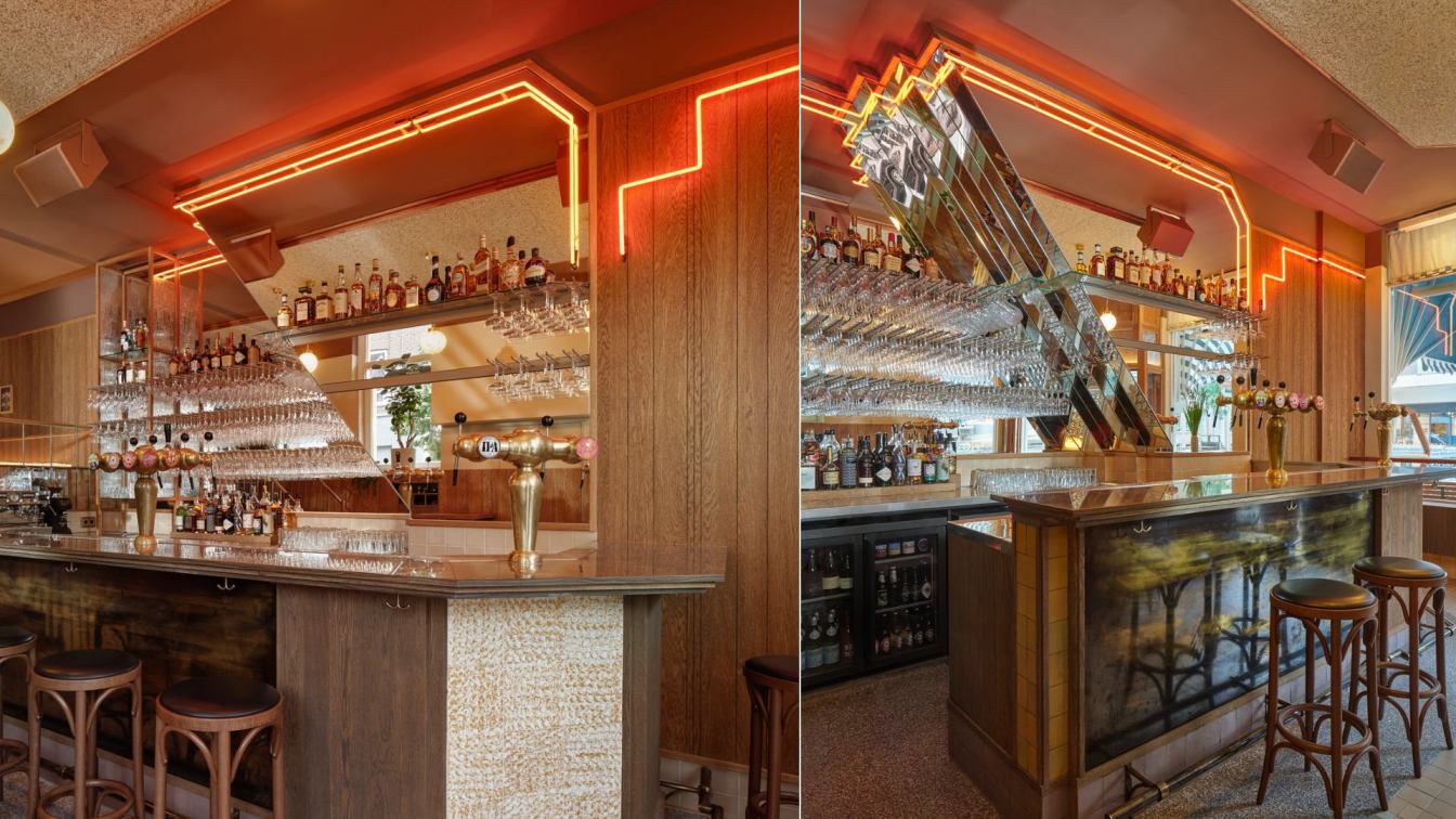
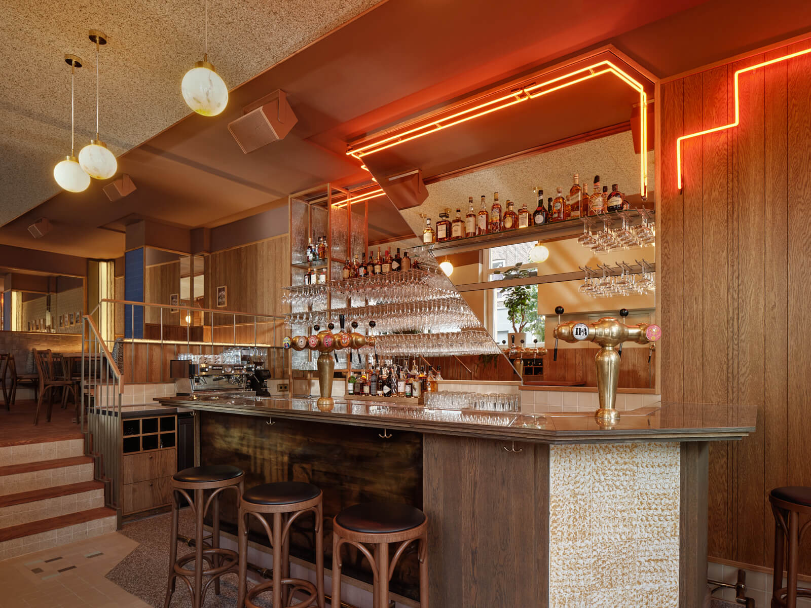
Moos is situated on the ground floor of a corner building that boasts a high ceiling and large windows that flood the space with daylight. Just like its Goudvisch siblings, Moos has the bar as main protagonist; in this case made of marble, combined with brass, wood and pale pink, beige, and bright yellow tiles.
A large mirror behind, split by two zigzagging lines of orange and red neon, creates a stunning backdrop. It’s split into two layers, one reaching forward, the other stretching back, to add another dimension to the mirror’s sheer size. A tiled floor pattern creates the perfect base for this centrepiece, with accents of terrazzo flooring outlining the bar’s shape.
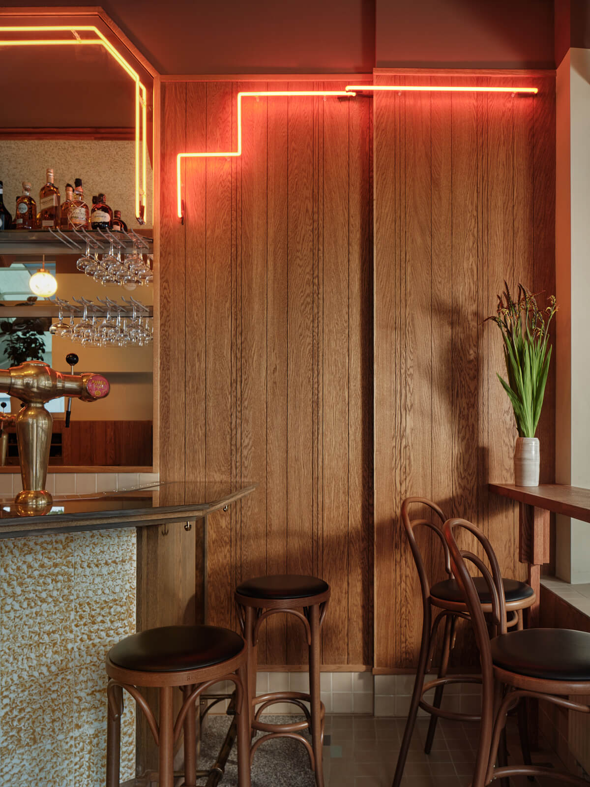
Right above the bar, ceiling lights drop down from acoustic panelling made of rich woven fabric. These hanging lamps trace the length of the interior from the entrance to the very end of the mezzanine level. Illuminated spheres placed on the walls spread a pleasant glow throughout the bar. The warmth of the wooden moulded panelling that traces the entire perimeter is enhanced by the juxtaposition with the darker tone of the ceiling that drops down to define a continuous line around the interior.
At the back of Moos a staircase leads to a mezzanine floor. Detailed railing and wooden steps create a line of sight that invites guests to walk up to this intimate space, where two corner booth seats finished with leather and fabric await. To reflect its position above the main area below, the cosy mezzanine has a distinct character created by a combination of tiles, wood and a custom light element (stepped like the zigzag element behind the bar) used for the wall cladding. By mixing the traditional – vintage chairs, custom wooden tables, a wooden floor with two different laying patterns, tiles in familiar tones of beige, light brown and pale purple – and the modern – a collection of framed modern photography, tiles in a punchy colour palette of mint, blue and yellow – the mezzanine level couples the warmth of nostalgia with a modern edge.
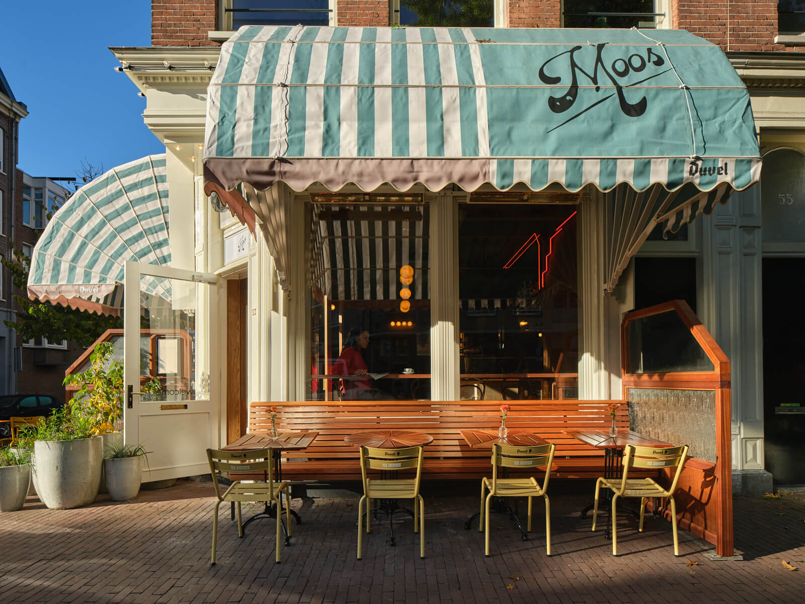
The third and final area (or the first depending on your point of view) is the terrace outside. The interior design concept is translated into outdoor elements in the form of colourful parasols, round awnings and long lines of light bulbs. The perimeter is demarcated by a series of wooden windscreens, with textured glass on the upper part that allows the light through and adds tactility to the screens.
By serving as a bridge between the interior and the neighbourhood, the terrace reinforces Moos’s position as a part of the community. Just like the traditional Amsterdam name the bar was given, Moos is a place rooted in the neighbourhood that embodies the best of the city’s values: a warm welcome and sharp style.




About
Studio Modijefsky is an interior architecture studio founded by Esther Stam in 2009. Its home in the center of Amsterdam hosts an international team of architects and interior designers who provide a total creative service for spatial interventions for clients that range from hotels to boutiques and bars to spas. The nine women that currently form the studio carefully design everything that is seen, passed and touched by a visitor for the duration of their stay whether it’s five seconds or five hours.
Every Modijefsky project is unique thanks to a rigorous creative process that’s rooted in each location. The site – not just the building but also the local environment - is carefully researched and analyzed to reveal and embellish the location’s story. An equal amount of attention is given to the brand or inhabitant of the new space in determining how their attributes, character and heritage can be translated into a relevant, appealing spatial design and experience.
The next step is to consider how the space could and should be used. Height, width, lines of sight, routing, light and sight are explored and optimized in a spatial design in which everything is related to the location and brand’s unique character. Finally, the entire creative process is presented to the client in a book that tells the history of the location and its future design.
The worlds Studio Modijefsky creates need to make sense until the very last detail. Achieving this level of quality requires a large team of professionals - not just designers but painters, electricians, craftsmen, light makers, shop fitters, and contractors – pushing their limits to perform at their best. This level of collaboration is only possible with regular contact, so Studio Modijefsky regularly visits building sites and workshops where the interior and its contents are made to ensure optimum quality.
It’s part of the studio’s ultimate goal to reinvent the way people interact with an interior. By relating design to the location’s context (whether natural or urban) and playing with the composition of texture and materials, light and routing, height and depth, sight and tactility Studio Modijefsky creates spatial experiences that surpass all expectations and create valuable new memories.

