Alexander Tischler: We designed this interior for a couple whose children and grandchildren live in another country and love to come to visit. The clients desired to have a cozy interior with wooden textures and green shades.
We had an important task to design a place where the clients’ family would comfortably spend quality time together. In the initial developer’s project, there were a separate kitchen and a living room. We united these two spaces with a corridor leading from the hallway to a bedroom. It resulted in a large bright 55.5 sq. m space.
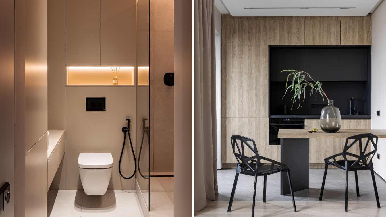
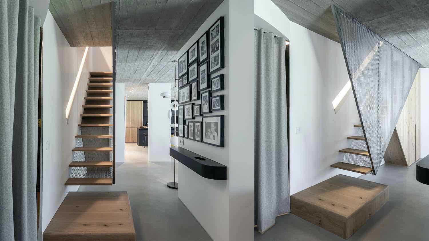
We placed a console with a drawer for little things, a floor-to-ceiling mirror with backlit, and a small pouf in the hallway. We made a wardrobe in the corridor. The hallway is visually highlighted by the porcelain tiles on the floor and walls. One can come in a guest bathroom from the hallway. We enlarged the bathroom at the expense of a small corridor that lead to the kitchen. This allowed us to add a shower in a guest bathroom. In this space, there is a match of porcelain tiles with a wooden texture and dark stone-like Italon porcelain tiles. We placed a tank water heater and a collector unit in the niche, under the wall-hung toilet system.

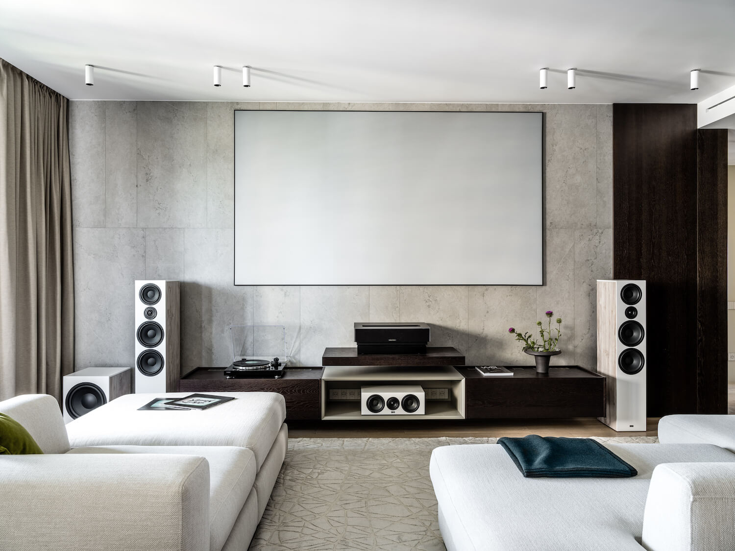
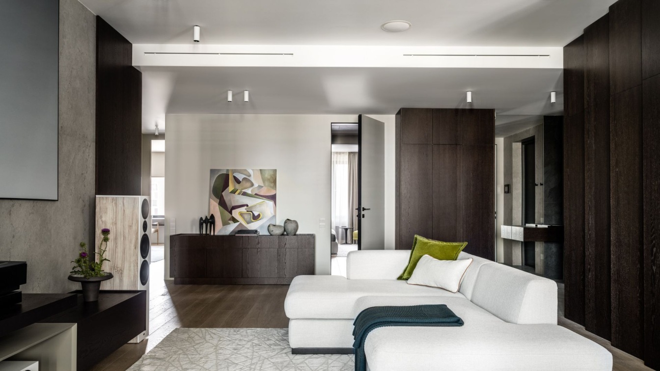
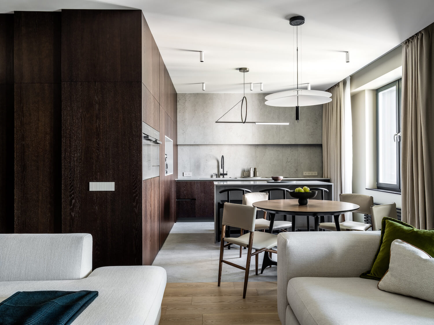
We assembled the graded wall panels continuing in the column cabinets in the space between the hallway and kitchen. Natural light and vertical backlit reveal the texture of oak veneer. In the united kitchen and living room, there are a kitchen island, dining table, and two comfortable sofas. The clients are big music lovers; that’s why we paid much attention to the acoustics in this apartment. In the living room, there is an R9 audio system with built-in ceiling speakers. As the clients asked, we placed a laser-beam projector with a screen instead of a TV.
One more desire of the clients is to have a big corner kitchen made of dark veneer. We designed a special niche with backlit in the column cabinets – it will ease access to the home appliances that are regularly used. We built-in a dish warmer under the microwave. This will keep food warmer for longer. This kitchen does not have upper cabinets. We lined the wall above the bottom units with porcelain tiles that we broke into different-sized fragments. We set the hob with a built-in extractor to keep the wall as a clean panel picture. We opted for Vibia round pendant lamp and a minimalist CVL lamp for lighting the dining area and the kitchen island.
On the kitchen island, there is a top-notch design solution – a niche for feet from the side of the dining table. From the side of the kitchen units, there are drawers and a wine cabinet. We made the kitchen island’s top and sidewalls of quartz stone. We also thought through the placement of electrical outlets – there are in the kitchen island’s top and a sidewall. The wall is continuing in the panels and a hidden oak-veneered door is in the living room. The door leads to a bedroom that the clients made for children when they visit.
We selected a deep green shade for the wall finish in the bedroom. We also picked a bright shade for the armchair upholstery beside the vanity table. We designed and made a large wardrobe with shaded glass facades for this bedroom. It replaces a walk-in closet not only thanks to its size but because of the backlighting of the shelves. This solution makes a wardrobe a standout interior piece. We assembled the wall panels with backlit behind the headboard. The hanging bedside cabinets with built-in wireless chargers are attached to these panels.
The TV zone in this bedroom is characterized by a hanging console shelf and a floor-standing cabinet for bed sheets. We organized a working area closer to the balcony. The working area also serves as a vanity table. On the balcony, we used the same oak-veneered wall panels for the wall finish and window jambs as in the rest of the interior. The guests will use this zone only for leisure time. We placed two armchairs and a Bonaldo metal coffee table here.
In a developer’s planning layout, there was a 10 sq. m bathroom on the right to the guest bedroom. The clients didn’t need such a big bathroom therefore we divided it into a laundry room and a bathroom.The bathroom’s size reached 7.3 sq. m after the replanning. This was enough to place a free-standing bathtub and a shower cabin. We lined the niche for shampoo bottles and showering accessories with black artificial stone.

The laundry room was made out of a part of a former bathroom. We placed a washing machine, a dryer, and a drying cabinet here. Under the hanging cabinet, there is a place for an ironing board. The hanging cabinet has a backlit under and a clothing bar. On the left, there is a place for a clothes basket. A vacuum cleaner and household detergents can be stored in the column cabinet and module units.
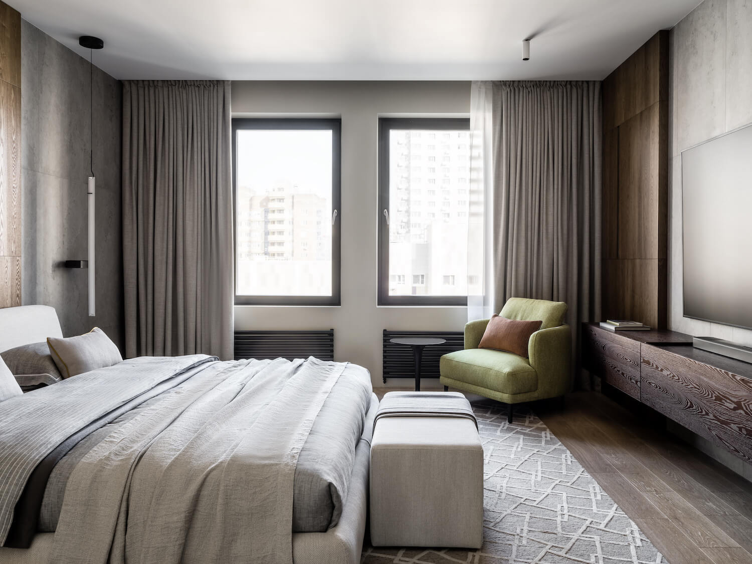
The clients chose a room with two windows to the right of the entrance to the apartment for their bedroom. The bedroom is designed with a calm color palette but with strong textures. We decorated the wall behind the headboard with ash-veneered wall panels. We chose porcelain stoneware with a stone texture to finish the wall behind the TV. Random breakdown of slabs and panels adds casualness to the interior, visually lightening brutal materials.
The armchair with vivid green upholstery reminds of how much the clients like the green color. The armchair is accompanied by a Kartell coffee table. Our communication with the clients started with the idea of making a walk-in closet. They saw a walk-in closet in one of our projects and assured us they want the same. This walk-in closet separates the master bedroom from the rest of the apartment. Here are the open modules with bars and shelves, and units with glass facades and backlit.

We also placed a styler and a hanging vanity table beside a big mirror in the walk-in closet. Each shelf has a backlit – this lighting makes the walk-in closet like a dressing room of a prima ballerina. The wardrobe with shelves for a perfume collection is hidden behind the mirror above the table. A heating collector unit is behind a bottom mirror. This room has two functions: it’s a home office for the clients and a bedroom for their grandchildren when they come.
The Clei transformable sofa becomes two separate beds. We placed a long hanging table with drawers along the window. To the left and right of this, we installed cabinets for the documents and the grandchildren’s clothes when they visit. This is the interior where a big family will gather. This home is always ready to welcome beloved guests yet comfortable for its main inhabitants – our clients.
