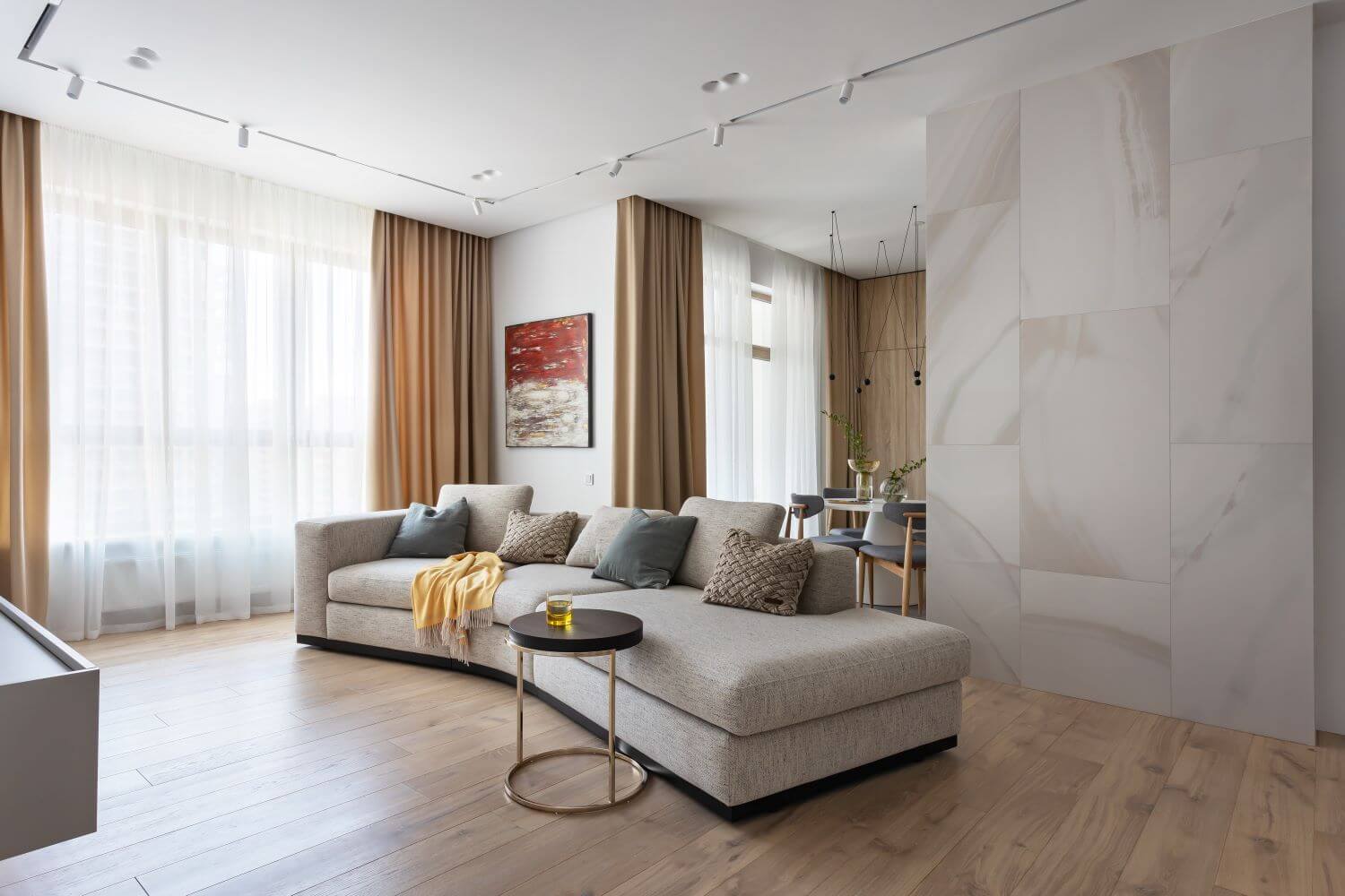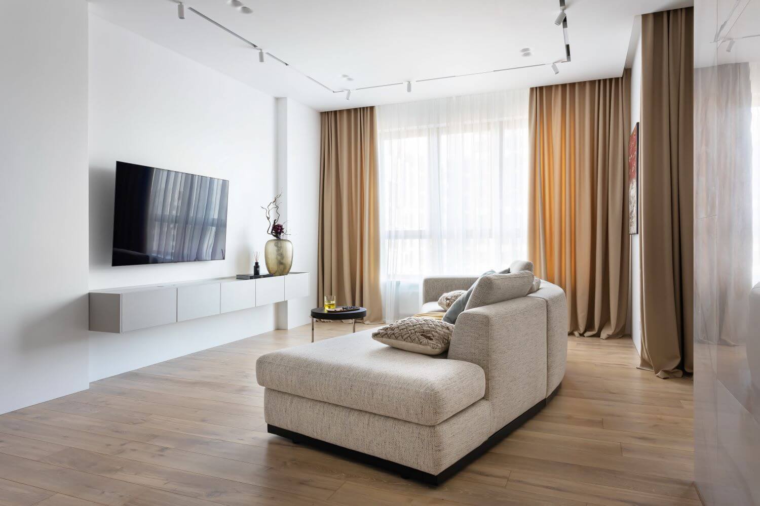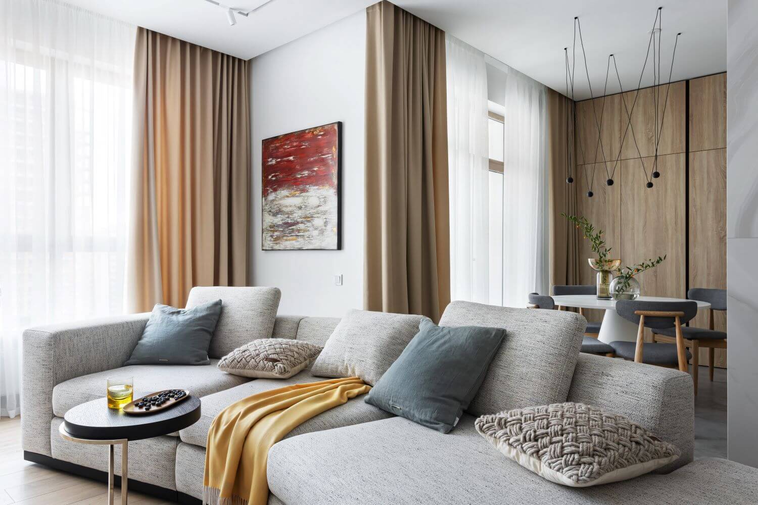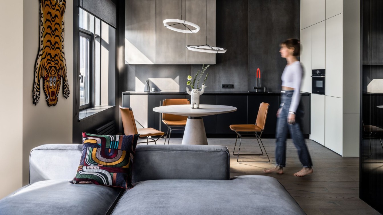
Alexander Tischler: We designed this interior for the family with a teen daughter. The clients wanted their renovated apartment to have a spacious combined kitchen-living room for cozy gatherings and a bedroom leading out to a private dressing room and a master bathroom. Our team created a design project and worked with the interior exactly according to the plan and budget. We also designed and manufactured all the cabinet furniture specifically for this apartment. We removed the partitions between the hallway, kitchen and living room to make a common complex-shaped area. It’s possible to see the laconic kitchen cupboards, the chandelier and the dining table right from the living room. The worktop is hidden behind the supporting pylon decorated with Rex white onyx porcelain stoneware. A curved sofa adds dynamics to the spacious living room.
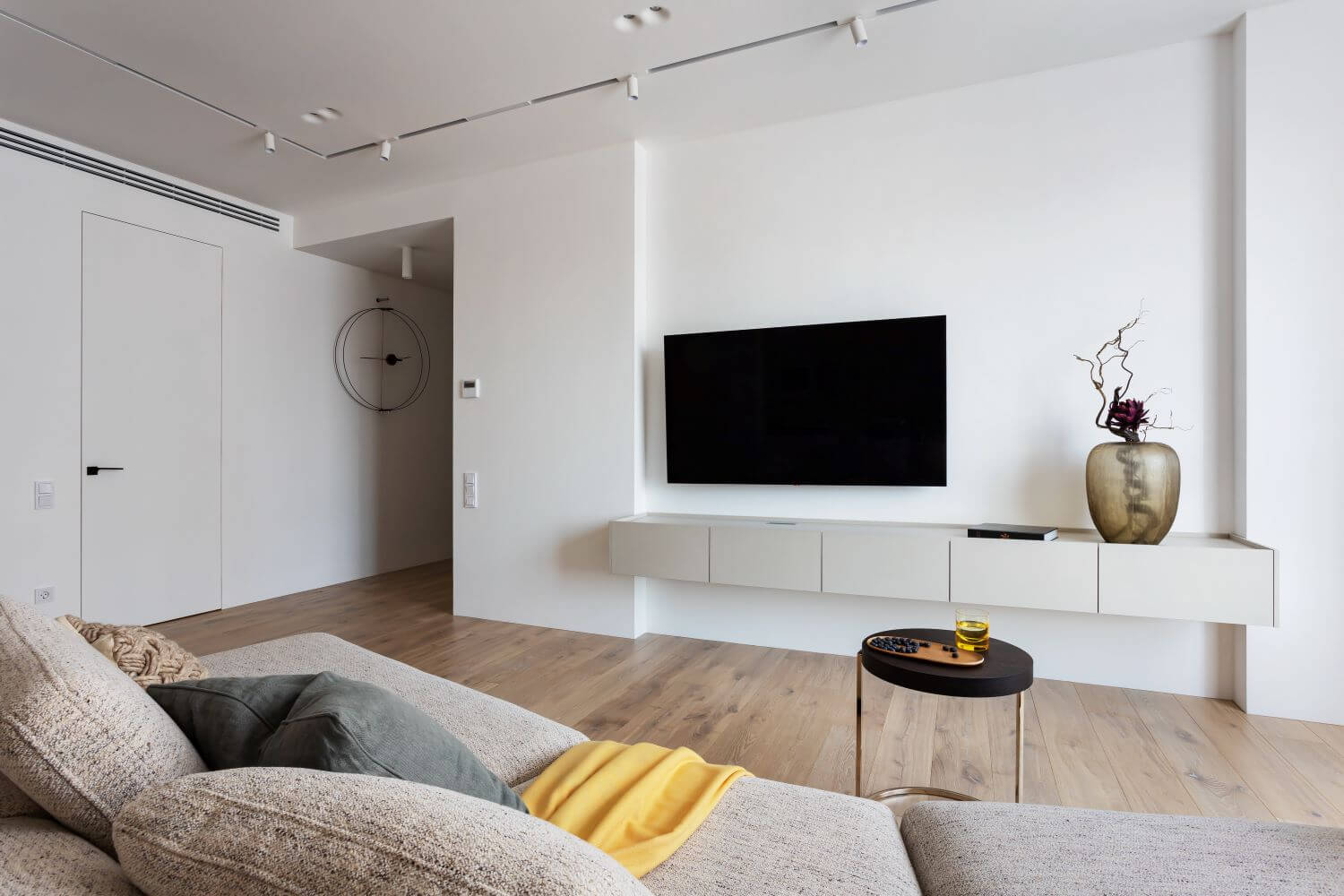
The TV, the sofa and the table are on the same axis. It would be comfortable to watch TV and communicate from anywhere in the kitchen-living room, whether people would be sitting on the sofa, on its back or at the table.We spotlighted the kitchen with several white items: the dining table, the oven, the top set modules, the countertop, and the faucet. The fronts of the column cabinet were chosen to be floor-to-ceiling peninsulas for a great monolithic look. We talked about the installation of the built-in refrigerators without a base in the video. The upper modules are not touching the ceiling, because there is a ducted air conditioner above them. Still, the modules are spacious enough to hide the kitchen hood. In this kitchen, we did not use applied handles to make the whole set look minimalist. The fronts can be opened with the help of built-in profile handles.
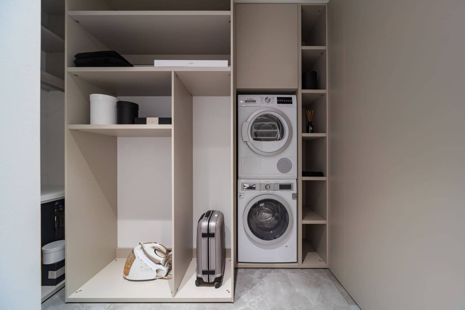
By combining the kitchen and living room, we created a large common space of almost 41 square meters that would easily accommodate both the family and their guests. We decided to not equip the balcony with any heating. Our team produced a cushioned drawer-based seat for it and brightened it with small lights — so it would be nicer to read there on warm evenings. The laundry room was enlarged at the expense of the hallway and the kitchen. Now, the ventilation box is located inside the laundry room. We created open cabinets to store all the household items and appliances, put a column cabinet for the washer and the dryer, and covered the water heater with a facade above them. The laundry room was enlarged from 2.9 to 6.9 square meters. Now it’s possible to store an ironing board there.

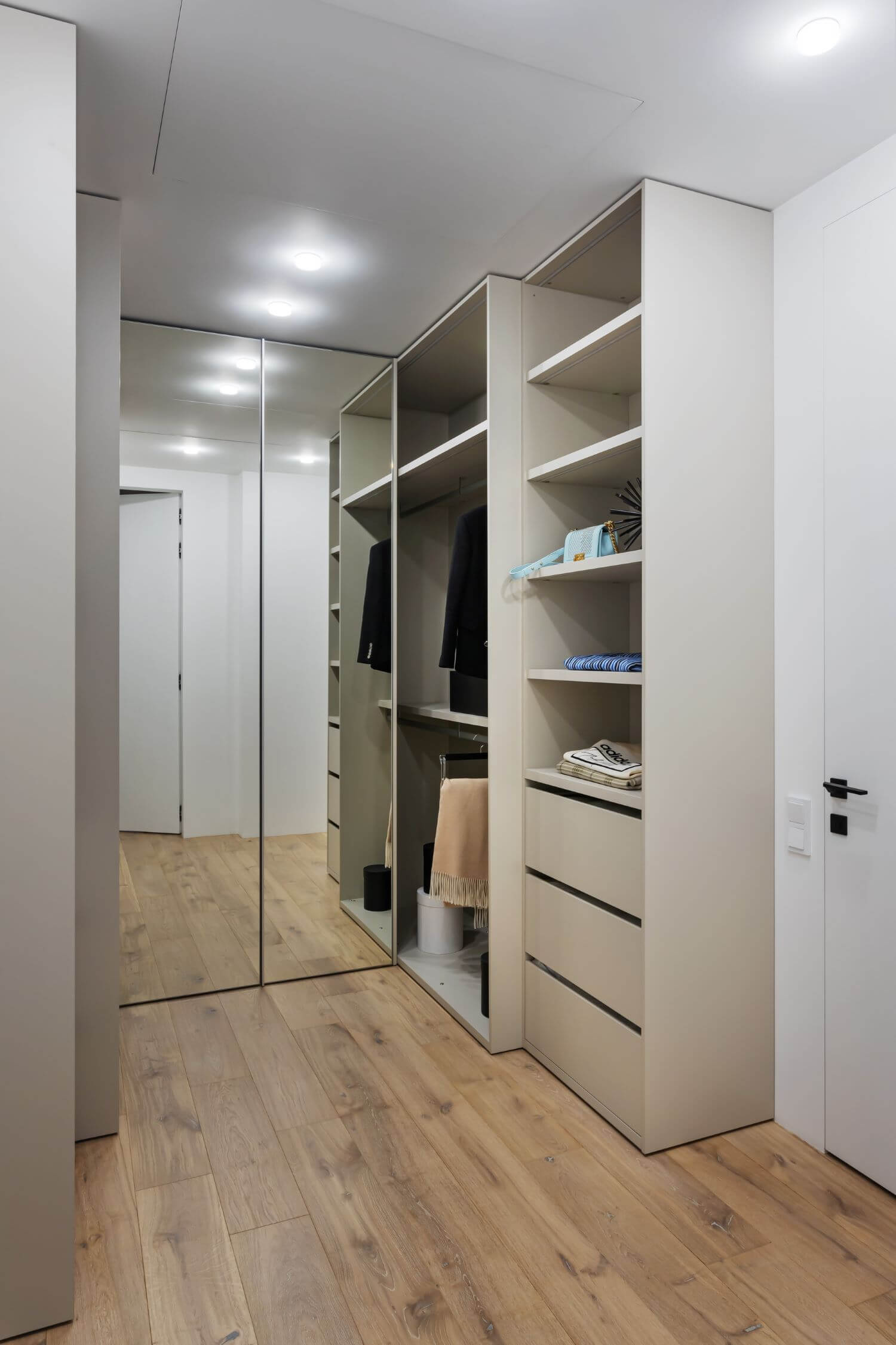
By moving the laundry room door, we also separated the entrance area of the hallway more clearly. The hallway itself is separated from the laundry room by a large coat closet. There is also a small closet for off-season items and suitcases in the hallway. Electrical and low-current shields are hidden behind one of the facades. The hallway is fitted out with a floor-to-ceiling mirror with soft lighting as well. The corridor was made half as much by combining with the living room. It leads to the bedrooms and the bathrooms. The corridor is leading to the master bedroom. There is a walk-through dressing room both with open and closed storage right at the entrance. The closet fronts are floor-to-ceiling mirrors (just as in the hallway). A large shower room located to the left of the dressing room is highlighted with a mirror going up to the ceiling and a countertop with a built-in faux stone sink.
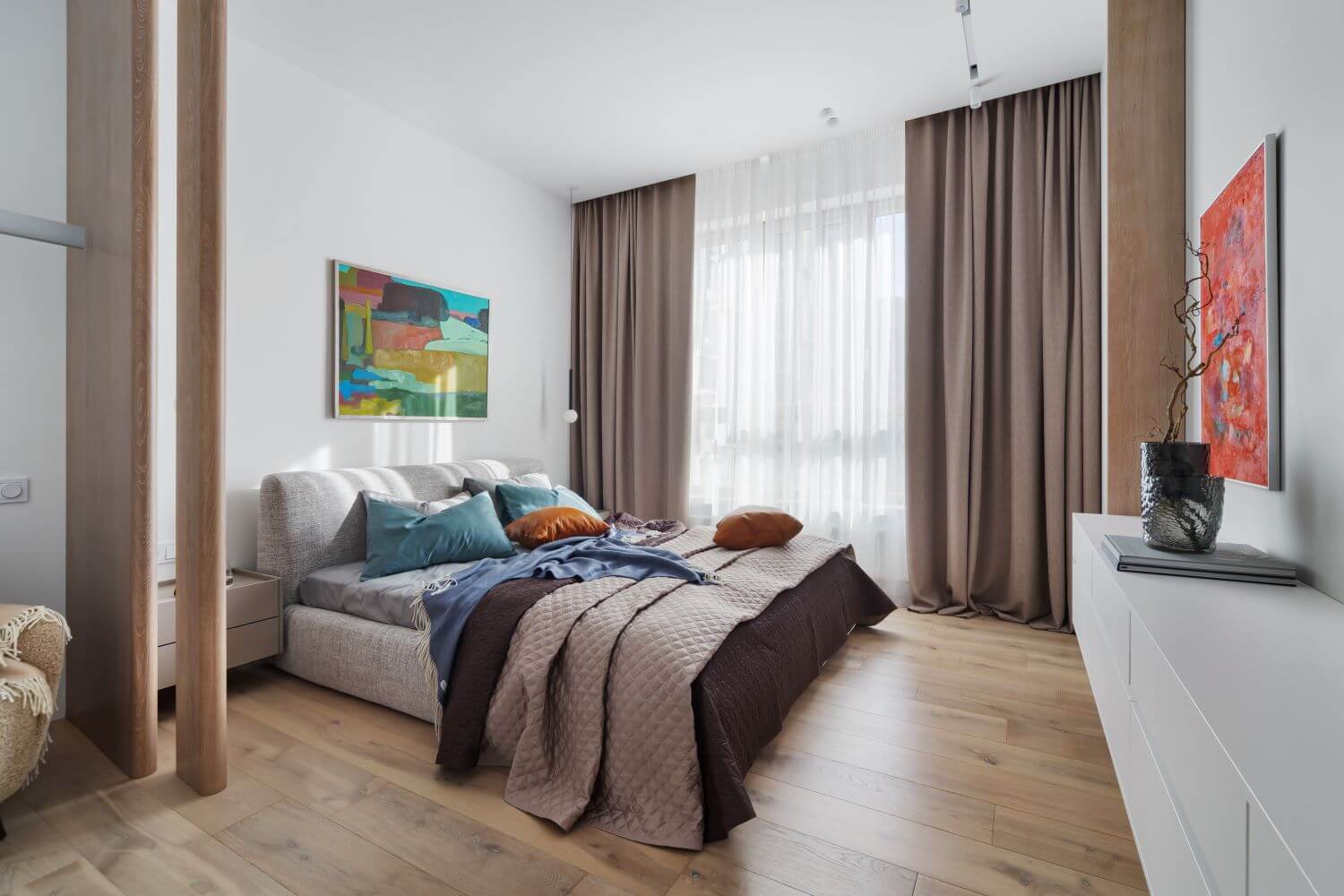
The cabinet above the wall-hung toilet system protrudes slightly from the wall, so there is more storage space inside. The bedroom is divided into two parts: for work and for rest. The first part is located closer to the entrance, and it will accommodate a desk and an armchair. The bed will be separated from the desk with an oak veneer decorative screen. It consists of two parts of different widths positioned at a slight angle, We designed and created hanging bedside tables. There is a laconic lamp above each of them. The wall opposite the bed is uneven. We made a decorative frame with lighting to conceal it. The bed is located in between two supporting pylons. The clients did not want a TV in front of their bed, so we put a big hanging chest of drawers and a mirror there.
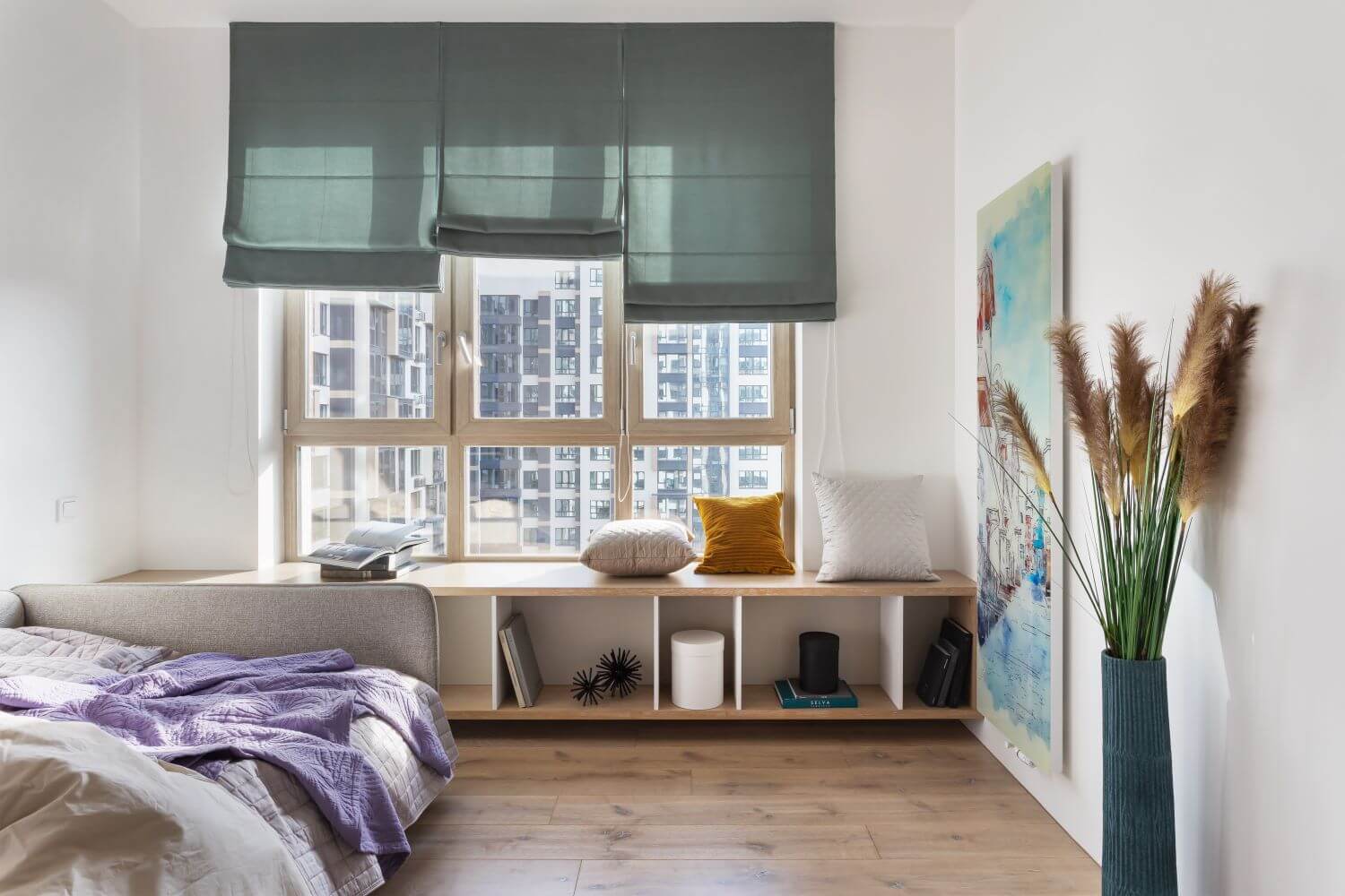
In the children's room, the desk is right at the entrance to the room. It is separated from the bed by a double-sided shelving unit with open and closed storage. There is an additional zone for rest and study, a wide console by the window. The clients asked us to add a watercolor radiator to this room, so we placed a matching one to the right of the window. We chose a distinctive light fixture for the bathroom: it looks like the whole ceiling is shining. The brightness of this glow can be regulated with a switch button.