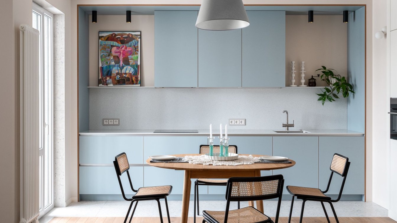
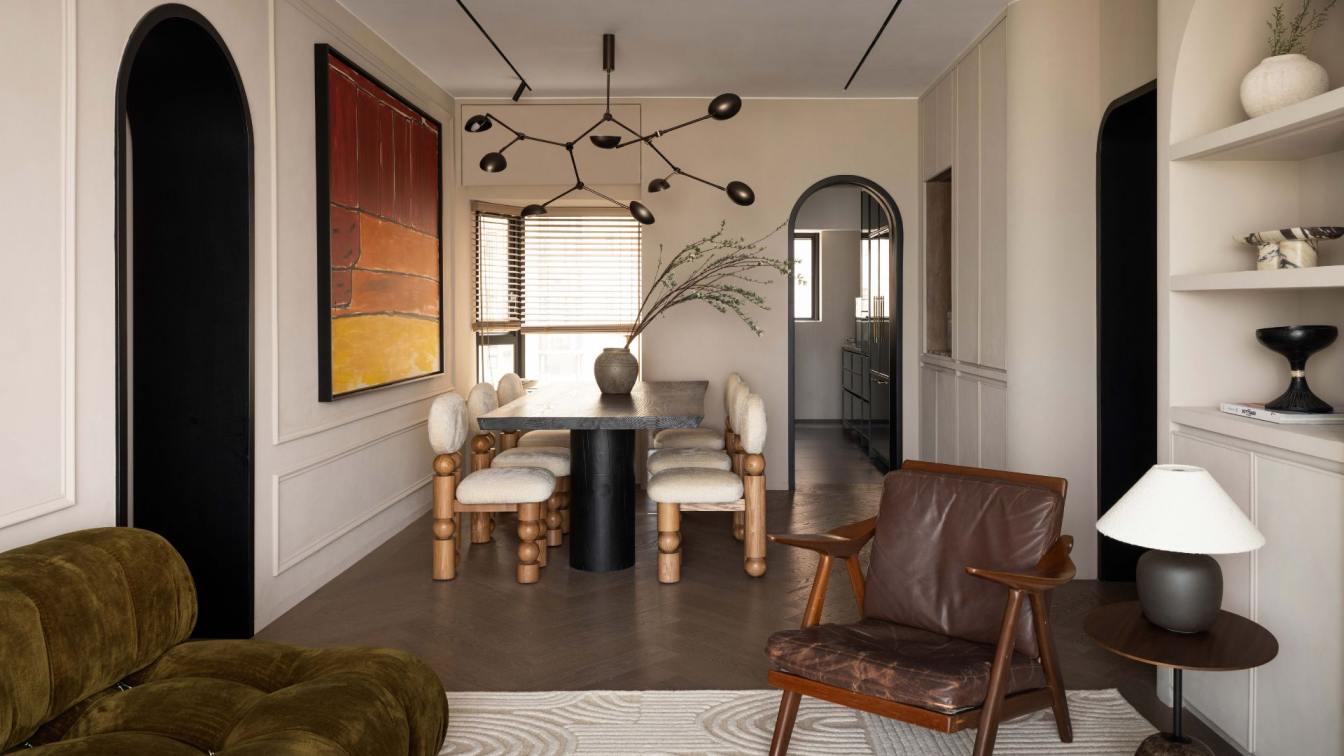
Alexander Tischler: We designed this interior for a young man who is keen on modern culture and music. It was important to create a personalized interior for a homeowner where the art objects would perfectly fit in, as well as to find a place for a home office because the client plans to shoot videos on his Youtube channel. We made a design project and completed the interior. We prepared the estimate and fixed the price for the completion in the stage of designing, therefore the price hadn’t changed during the repair process. We designed the cabinet furniture specially for this apartment. In the apartment, there were practically no dividers. We transformed the space drastically: divided the living room, removed the guest bathroom that was in the operational zone of the hall, and organized an additional bathroom and a home office instead of the corridor.
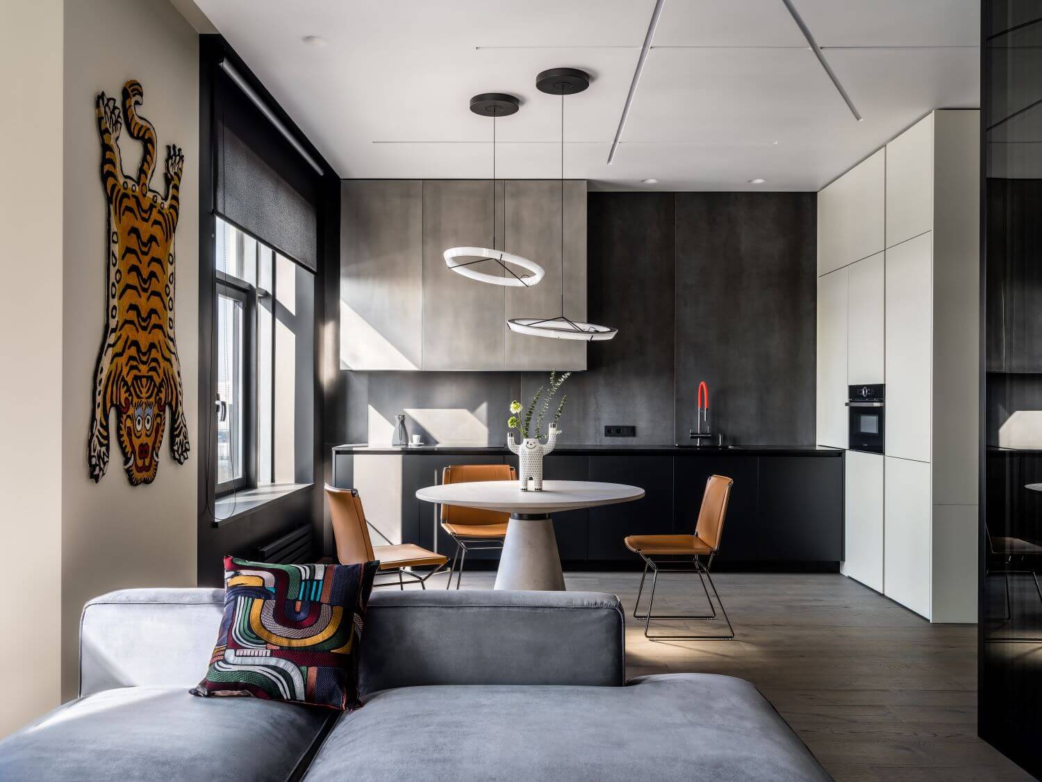
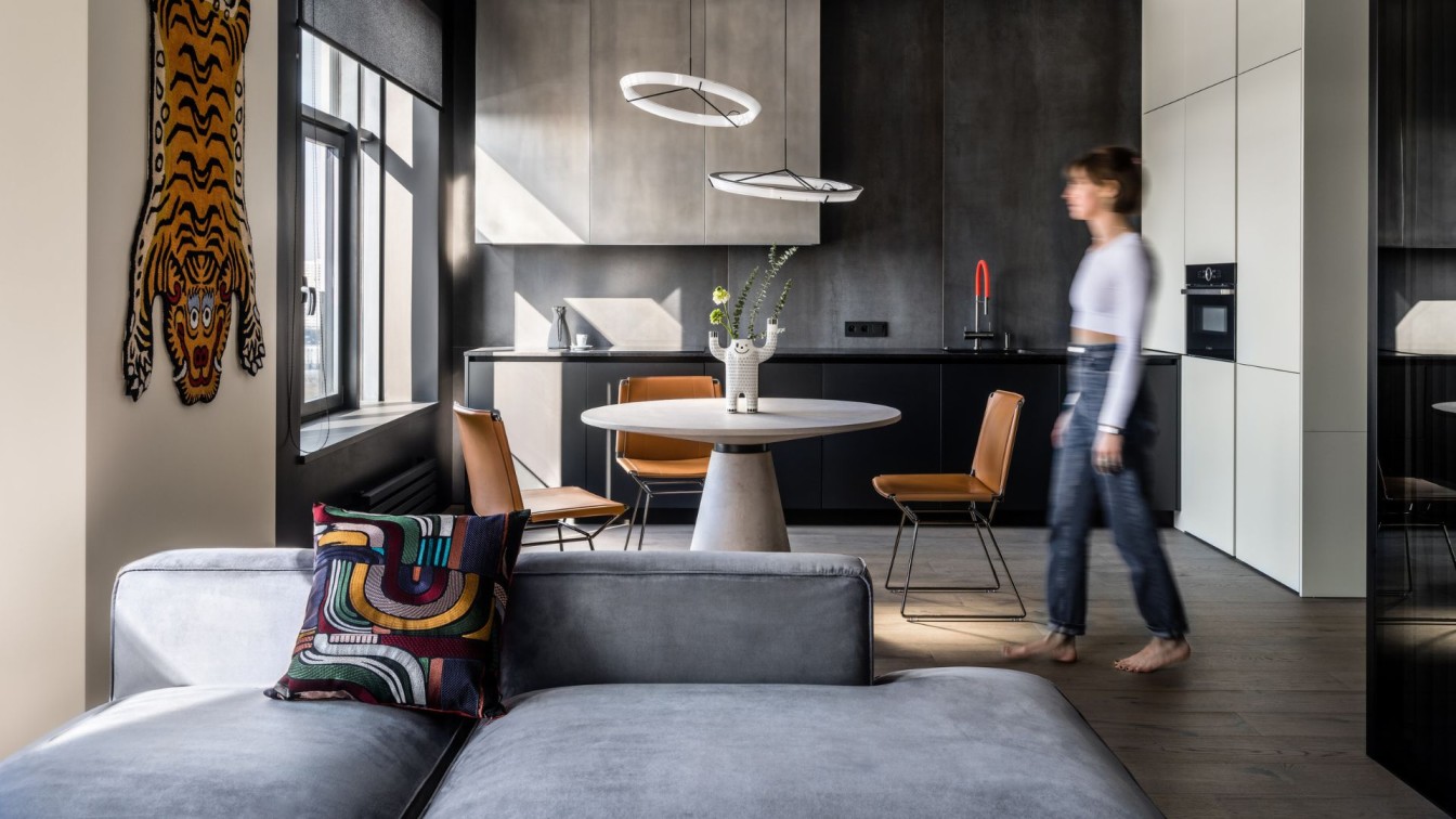
The two main colors in the interior are beige and black. The apartment is divided into “blocks” thanks to the furniture pieces and finishing. At the entrance, there is a bright block formed by the hall’s walls, wardrobe, and kitchen column cabinets. At the entrance, the dark porcelain stoneware continues in the graphite facades of the second wardrobe. We placed two big mirrors and a console with the down backlit in the hall. The cabinets’ bodies are black but we made a backlit that automatically turns on when one opens a cabinet in order to easier find a needed item. This backlit is set not only above the hanging rods but above the deep shelves for shoes. The next dark block is a kitchen. We chose large-format porcelain stoneware for the wall’s finishing.
We found a non-traditional solution for the upper modules’ façade finishing: the facades repeat the metal texture and reflect the light as the metal but they’re made of MDF and covered by special enamel based on metal powder. For the block of upper modules looking monolith, we matched the facades and decorative side parts by a 45° angle. The client is prone to maintain the kitchen tidy that’s why we organized a special place for the teapot storage. We continued the table top behind the facade of a corner module. One can easily open the façade and slide of the body frame. Then one can take the teapot, fill it with water, and turn it on. We placed the sockets inside the module.

Under the oven that is also functioning as a microwave, behind the façade, there is a corner retractable system that withstands up to 17 kilograms of load, easy to open and close. We opted for supporting the brutality of the interior by the dining table with the micro concrete finishing. We complemented it with the bright leather MDF Italia chairs. We placed an original coffee table formed of laconic circles with the backlit in the top one side by side with the grey deep sofa. This coffee table is resonating with the round pendant Vibia lamps that we set over the dining table. We mounted the TV on the paneled wall in the kitchen-living room. Tall enameled panels create additional vertical lines. We placed a mirror that reflects the natural daylight from the window on the right side of the panel.
This apartment has no corridors left after our thoughtful work with the planning layout. We made a home office separated from the rest of the room by the toned glass divider in the place of the corridor designed by the developer. We hung the curtains to create a more intimate atmosphere. We made an additional ventilation system so that the client could work in the home office even with the closed doors. In the niche under the curtains, we made an RGB backlit: since the client is about to become a Youtube blogger, the trendy light will be a good fit. We designed and produced a hanging table for a home office. It’s big and solid but looks weightless like a paper sheet because of the beveled edge. On the left of the table, there are modules for storing documents and books.
Above the table, there is a mobile mini light that is possible to regulate and direct to the needed spot. Also under the low modules, there is a backlit that are turning on with the swipe. We invited the artist who made a wall painting in the interior pallet with adding of a dark red shade. The kitchen-living room interior became more dynamic and acute thanks to this graffiti. We designed a guest bathroom instead of the former corridor. Despite the functional zone exceeding the borders of the bathroom; this solution is legitimate since the zone is separated from the bathroom by a divider. It’s necessary just to place any door or make a doorway for the project’s approval.

In this column cabinet, there is a washing machine with a dryer as well as a place for the iron and ironing board. We produced a round-shaped mirror for this bathroom. We finished the whole bathroom with porcelain stoneware with a concrete texture. Together with the radial mirror, it gives the sensation of the moon landscape. We placed the bed in a way that one could see the park and the city from the window and the sunset sunbeam would come to the bed header. As the client requested, we set the RGB lights and backlit along the ceiling so that it’s possible to regulate its color and intensity with the remote control and a panel. This apartment has no separate walk-in closet. Instead, we placed an accent wardrobe for clothing and accessories in the bedroom.
Behind the glass facades, on the shelves, there is RGB backlit. It’s possible to store the shoes, accessories, and décor pieces behind the transparent facades. Inside, there are places for clothes, backlit, and a mirror on the opposite side of the facade. This cabinet has become a decent replacement for the walk-in closet. Warning: this photo depicts the sex toys. If your audience is not 18+, please, exclude this photo from the publication to avoid any misunderstanding. The bedroom needed one more cabinet; so we placed it in the niche – it practically mimics the wall. The RGB backlit is set behind the built-in profile handle. In the cabinet, there are hidden laundry baskets.
The entrance to the bathroom is moved from the corridor to the bedroom. This allowed us to create a small master bedroom. We chose bright porcelain stoneware for the wall in front of the entrance and glued it on the furniture facades. We made shelves and sockets behind the facades. We placed the same round mirror as in the guest bathroom. We produced a sink made of quartz stone specially for this bathroom. The bathroom looks like a monolith block thanks to the porcelain stoneware finish. The faucet of the bathtub is built-in into its frame.


