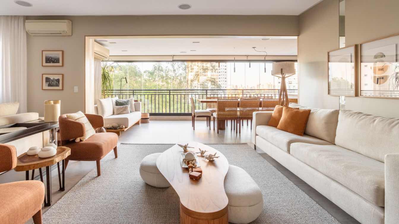
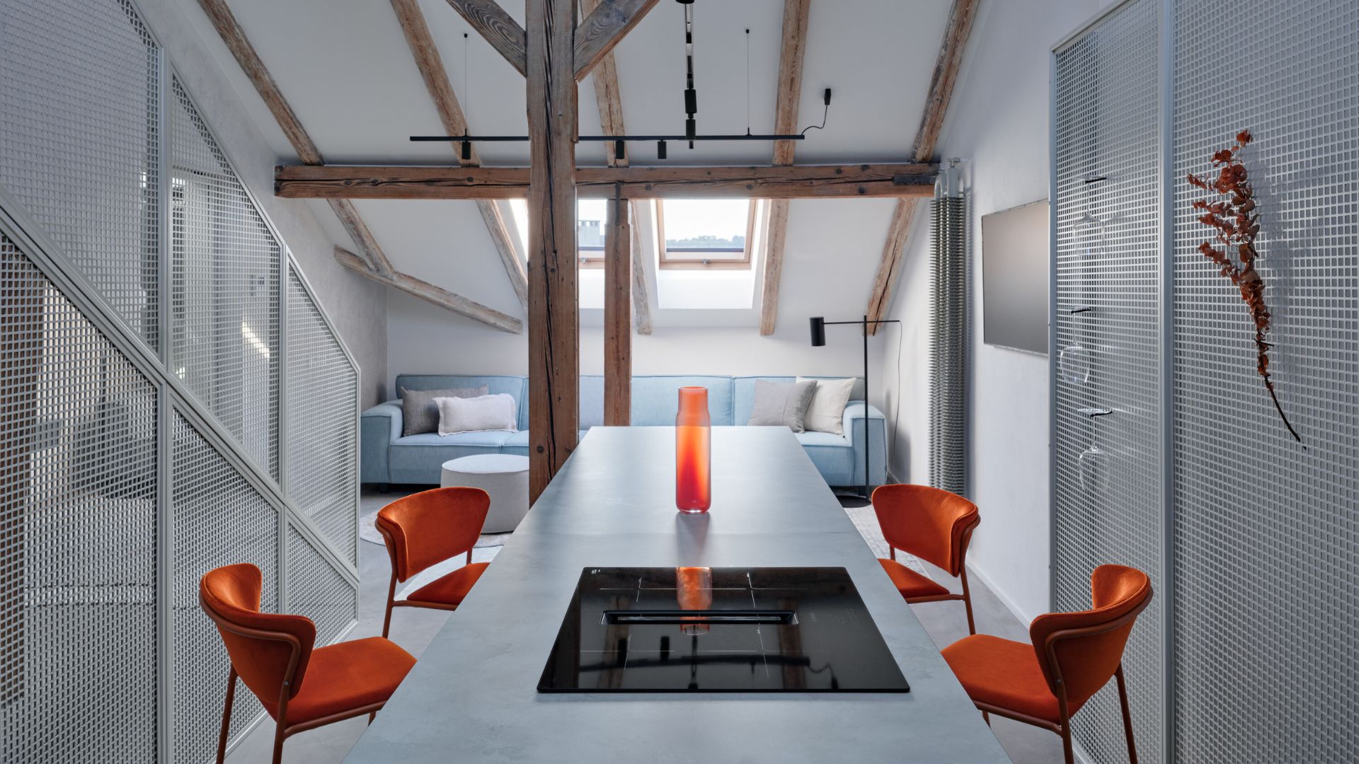
The young couple from Yavne, Israel, sought to upgrade their family and acquired a spacious penthouse apartment with a huge terrace overlooking an open landscape and the Mediterranean Sea. They turned to interior designer Liad Yosef to tailor it to their needs, and as you'll see, he worked wonders, especially in the small details, which precisely crafted the ultra-modern design, free of unnecessary adornments.
When a fashion and aesthetics-loving couple purchases a new apartment, it's reasonable to assume that the result will impress design enthusiasts. This was the case for the couple in their 30s who acquired a luxurious new project apartment in Yavne, offering expansive views reaching the Mediterranean shores. They approached interior designer Liad Yosef to create a modern and sophisticated living space that pays attention to both minute and significant details, incorporating nods to major fashion design houses, carefully integrated throughout. "We initially began the process as a couple with two children, intending to create, alongside the large communal space, a pampering master suite for the parents and two suites for their young children. We even eliminated one of the bedrooms suggested by the contractor in the original plan. But while we were in the thick of it (the walls were up, and the bathrooms were tiled), the family expanded with a third child, so we had to rethink the layout, alter the spatial arrangement again, and create an additional bedroom for the infant who joined the family a few months later."
"We started planning afresh: the large wall closet in the staircase was canceled, as were the original guest facilities, and I designed the new ones using part of the home's storage space, which I minimized. I merged the terrace we gained into a cozy and pleasant room for the youngest daughter."

The apartment is designed with clean, ultra-modern lines devoid of ornamentation, in a monochromatic color scheme of blacks, whites, and deep blues. "The apartment is an extension of the couple, both elegant and fashionable, always impeccably styled, and so is their home," explains the designer. "We sharpened the interior envelope with grooved carpentry lines and verticals that create a three-dimensional experience and emphasize the height dimension. We chose to paint the transition area in a charcoal tone—hidden doors align on a zero line leading to the rooms, and the front in the living room area is tinted platinum."
"The TV wall serves as a power wall. It includes storage spaces and conceals within it an upright unit of the air conditioning system. This allowed us to avoid lowering the ceiling and created an atmosphere akin to that experienced in a villa, not an apartment building."
"The connection between design and fashion is very present in the apartment, drawing inspiration from iconic designs of elegant brands like Yves Saint Laurent and Dior. While the envelope is clean, we integrated small fashion hints into the spaces. For example, the pinstripe fabric in shades of light gray-black used to upholster the armchairs in the living room, with a back wrapped in blue leather."
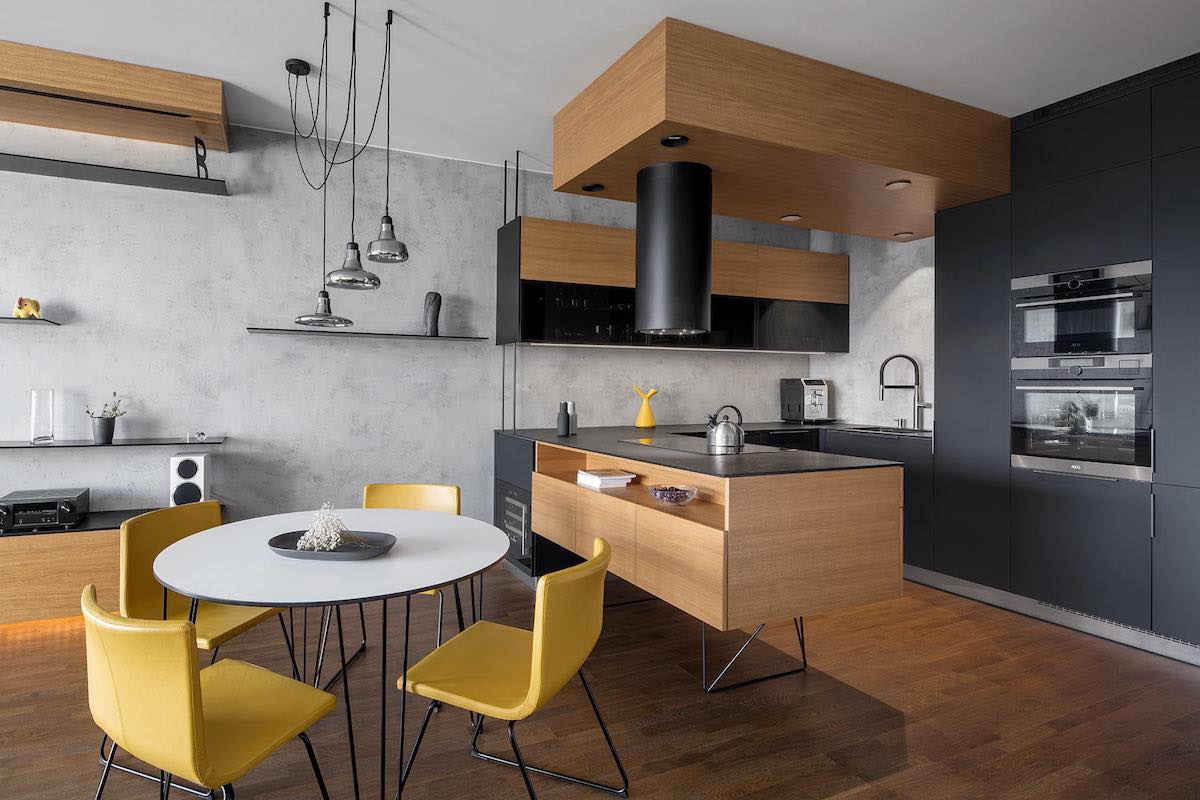
"In general, the blue color recurs in different elements—a nod to the shades of the Mediterranean Sea reflected through the large windows. For example, the parallel kitchen with its dark and luxurious blue-toned facades includes a central island for sitting, working, and a top Dekton surface."

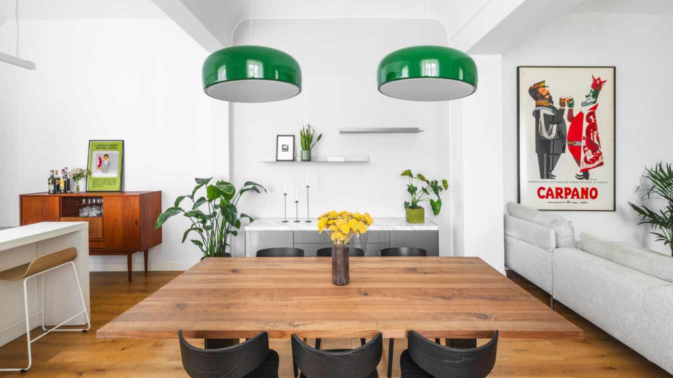
"For the dining area that bridges between the kitchen and the living room, we chose a table with a granite top with blue veins and yellow, gray, and white streaks. This is another piece designed and planned by OKNIN's gallery experts that emphasizes the connections between the neutral envelope and the adorned elements that strengthen the space's appearance. We created connections between wood, fabric, and stone, and incorporated items from luxurious designer brands. Thus, the space remains serene and calm, yet uniquely impressive and stylish. The pendant lighting fixture above the table breaks the straight mass and connects to the maritime view, dominating the space as the only suspended lighting fixture. It creates a subtle sense of freedom in a space filled with a lot of style and chicness."
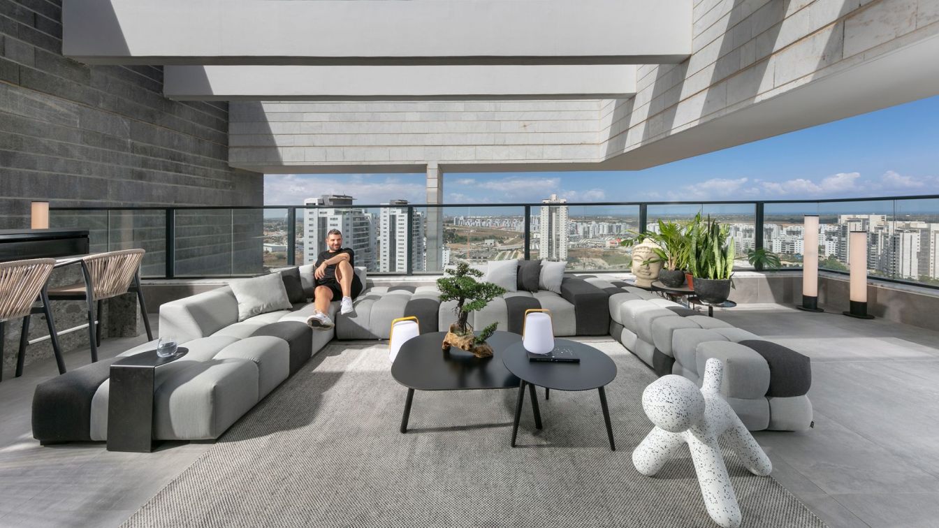
"The terrace surrounding the communal space is undoubtedly one of the highlights of this apartment, comprising a massive seating area (comparable to living room setups in large villas), a dining area, and a fully equipped outdoor kitchen with a sitting bar covered in Tertzo surface. We opted for minimal vegetation on the terrace to give space to the items themselves and the surrounding landscape. We chose superbly crafted furniture and details, such as the lounge area composed of cubes in dark and light gray tones, portable lighting fixtures from a luxurious Dutch brand, and a charming Dalmatian dog from the Tolemans brand."
"The children's bedrooms are minimalist and mature. The room floors are covered with smoked walnut parquet in a herringbone pattern, and the bed heads stretch from one end of the wall to the other. They are frameless and upholstered in luxurious fabric. The wall closets stretch from floor to ceiling, free of handles, and the closet doors connect at a 45° angle."

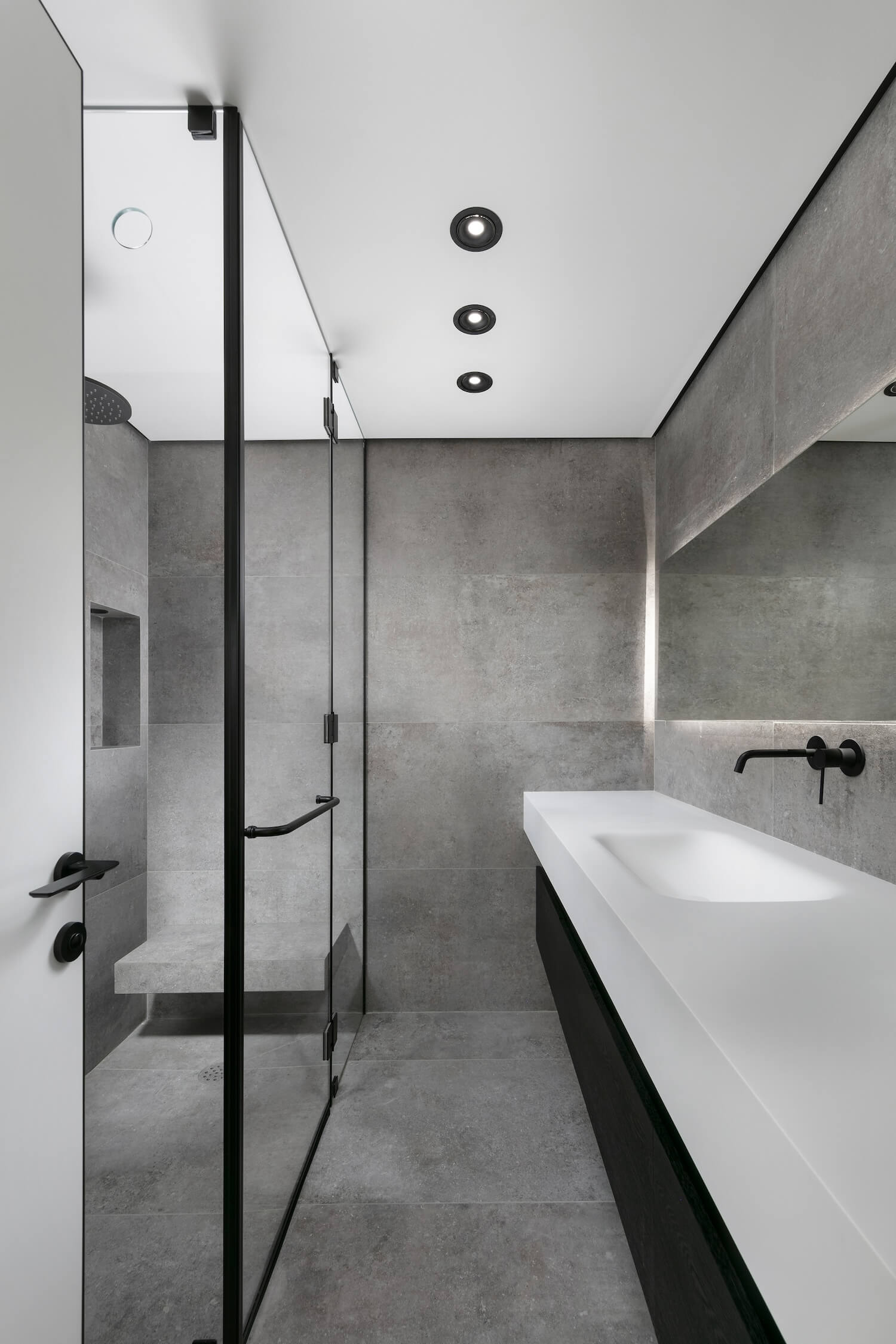
"The bathrooms are a purposeful display of the luxurious ultra-modern line: 'The showers exhibit a cold look, precisely what we sought, an extremely minimalist appearance so that there is nothing to hide behind,' explains Yosef. 'The finishes are extremely precise, and the level of work is particularly high: the glass partitions hang from the ceiling, the showers reach the upper end, culminating in an air vent slot we created using CNC technology, enabling us to be precise to the millimeter, a top-notch seam in every sense. Each bathroom received a slightly different description: the surfaces (floor and ceiling) are made of granite porcelain, and the fronts of the vanity cabinets are made of wood. For the daughter's bathroom, we worked with darkened oak, in the son's room, we used walnut wood strips, and for the parents, vertical strips of darkened oak.'"
"The entrance to the parents' master suite is through the closet room—a giant glass cube inside which everything happens. This space was designed in an 'H' shape—the inside of the closets is made of walnut wood in a cigar tone, where profile lighting was embedded, illuminating the contents through the transparent doors. Another completely sealed side, made of smoked oak, entirely for shoe storage, also housing an air conditioning unit. In the center of the space, a mirrored column exhibits the smoked mirrors where, in the upper part, compartments were designed for belts, accessories, and perfumes."
"Between this area and the sleeping area, two gray glass doors separate. The bed is perfectly symmetrical to the closet room, and the TV is recessed in the ceiling and can be exposed as needed. Between the sleeping area and the bathroom area, we designed a transparent gray glass partition, allowing both functions to forgo as a single panel and, fabric by fabric, enables complete privacy."


