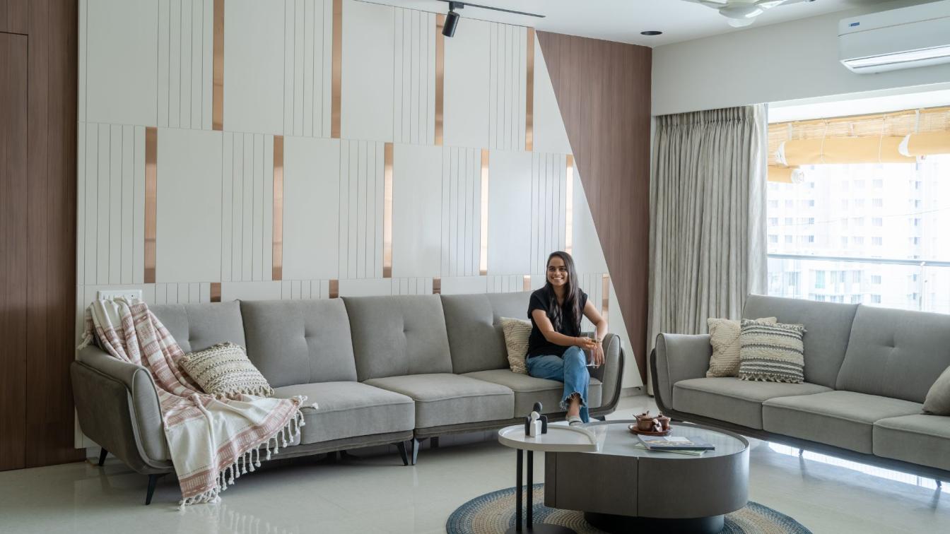
Novu Classic Interior: The apartment of 86 m² is located in the elite housing estate "D3". Our studio created the project for a young family with two children. The main objectives were to place in this area: an entrance hall, 2 bathrooms, a bedroom, a child, a living room and a spacious kitchen. Entering the apartment on the right, we are greeted by a large closet and comfortable seating designed in the form of a semi-circle. On the left, we see a large mirror panel, with which we disguise the doors to the two bathrooms and maximize the narrow space of the hallway.
Let's take a look into the bathroom - its main idea is black: the ceiling, walls, sanitary - everything is black. The accent is the arched mirrors and moldings. Complements the picture golden faucets. And the rhythm is set by the grooved surfaces.
The bathroom is made in gray and white shades with plaster molding in the bath area and milled panels that frame the screen of the bathtub. Another area of sinks deserves special attention - there are two pieces, the material execution of ceramic granite, sinks are connected by one piece of countertop also made of ceramic granite. This composition is complemented by arched mirrors, reversed from top to bottom. In the bathroom, we also placed a dryer and a washing machine with convenient storage for laundry items.
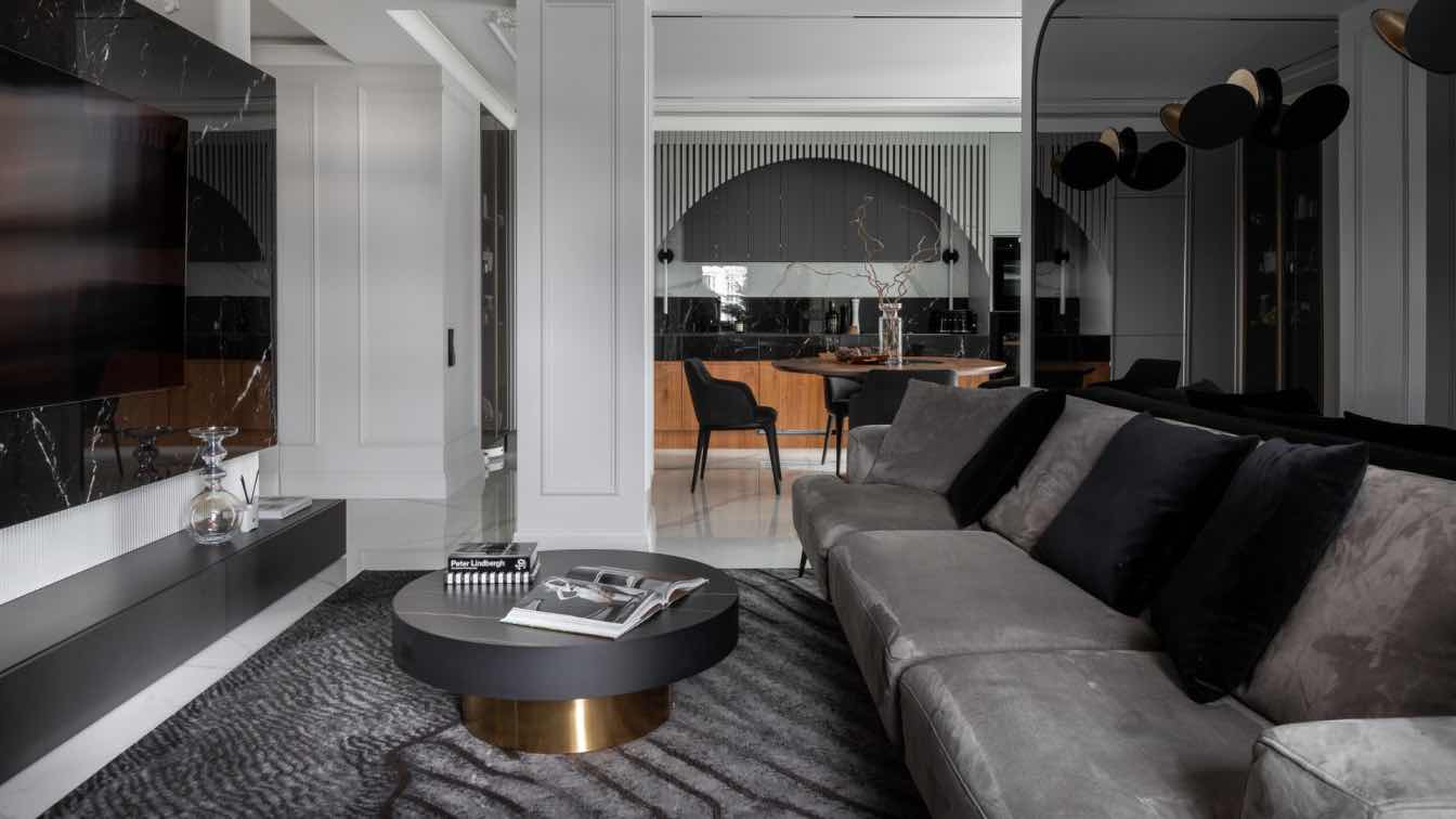
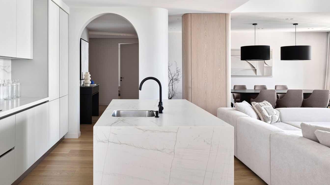
Getting into the main part of the apartment we see two lighting scenarios. These are the backdrop lighting and the track system combined with the plaster stucco, which was custom made in St. Petersburg for our project. The kitchen in the apartment is linear and is quite large. We were able to accommodate everything we needed, as well as make a lot of storage space, adding a beautiful mirrored display case on the side.
The lower fronts of the kitchen are made of a combination of veneer and porcelain stoneware, while the upper fronts are milled mdf. The arch at the top completes the composition and comes into play with the arched forms used throughout the apartment. In the center of the dining area is a round table made of veneer and comfortable soft chairs. The accent object in the living room is a mirrored arched composition of black glass, which was conceived to visually increase the volume of the room. Opposite it is a wall with a combination of three materials: porcelain stoneware, stucco and veneer, which masks the door to the bedroom.
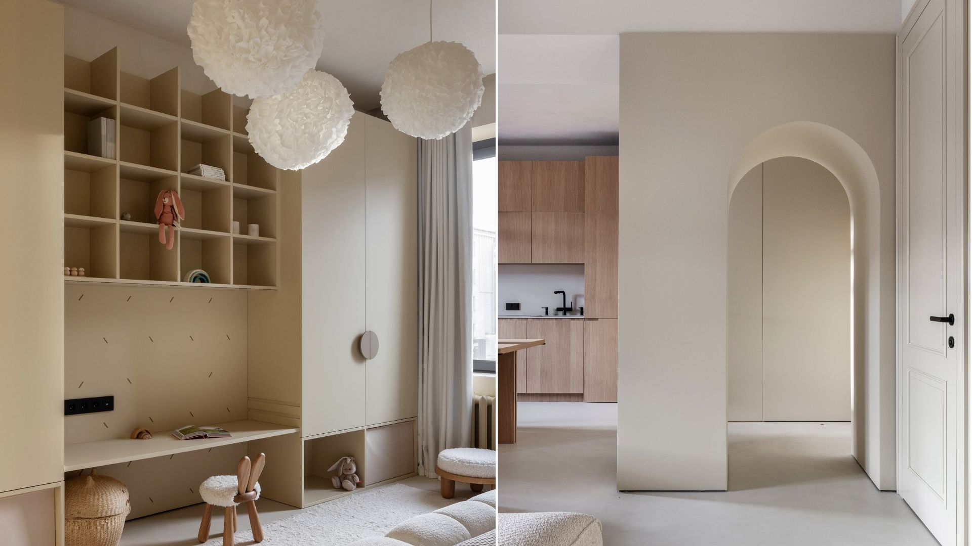
In the small bedroom we placed a large bed in black. The basic theme of "play of textures" can be seen here as well. Black on black: black velvet in the headboard, black bedspread, black linens, black bedside tables. The fronts in the storage area are duplicated by moldings with 3D panels. Beautiful gold fittings complete the picture gathering the interior in a single composition. The most striking room in the gray-white-black apartment is the children's room. A room for two little princesses of almost the same age.
Each girl has her own pink crib, decorative mood lighting, comfortable bedside tables and a marker wall near the bed for creativity. A comfy activity table with a playful leg and a shelving unit with pink inside underscore our intention to create a princess house atmosphere. The arched forms are also used here: mirrors, milled fronts and round handles.
The customers are completely satisfied with the result, and we were happy to realize a project for them that still gives us goosebumps!


