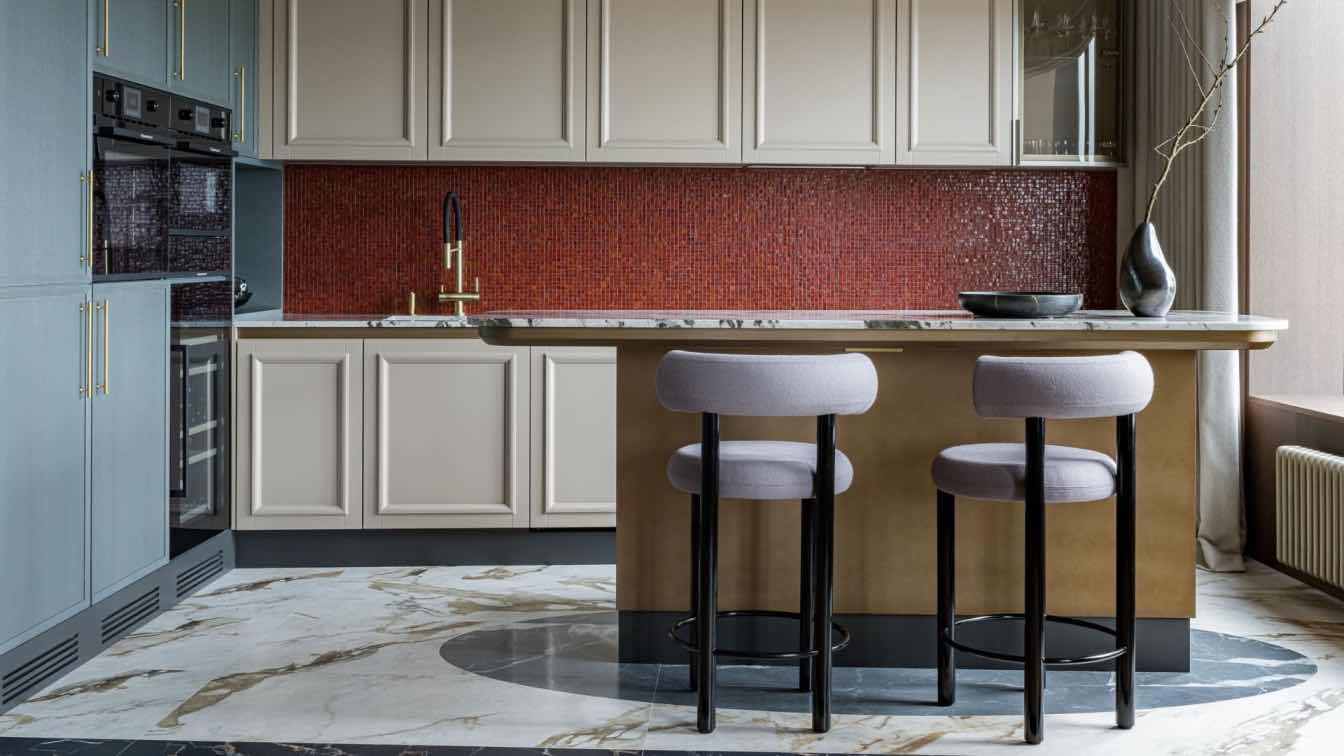
Architects Shira Dromi and Anouk Ron from the "Bazelet Architects" firm transformed a dated four-room apartment in Herzliya, Israel, into a spacious, elegantly designed space with modern lines.
The clients' dream was a pleasant, modern apartment with a luxurious appearance. The process took three months and included a massive overhaul in all parts of the house to suit precisely the family - a couple with two children.
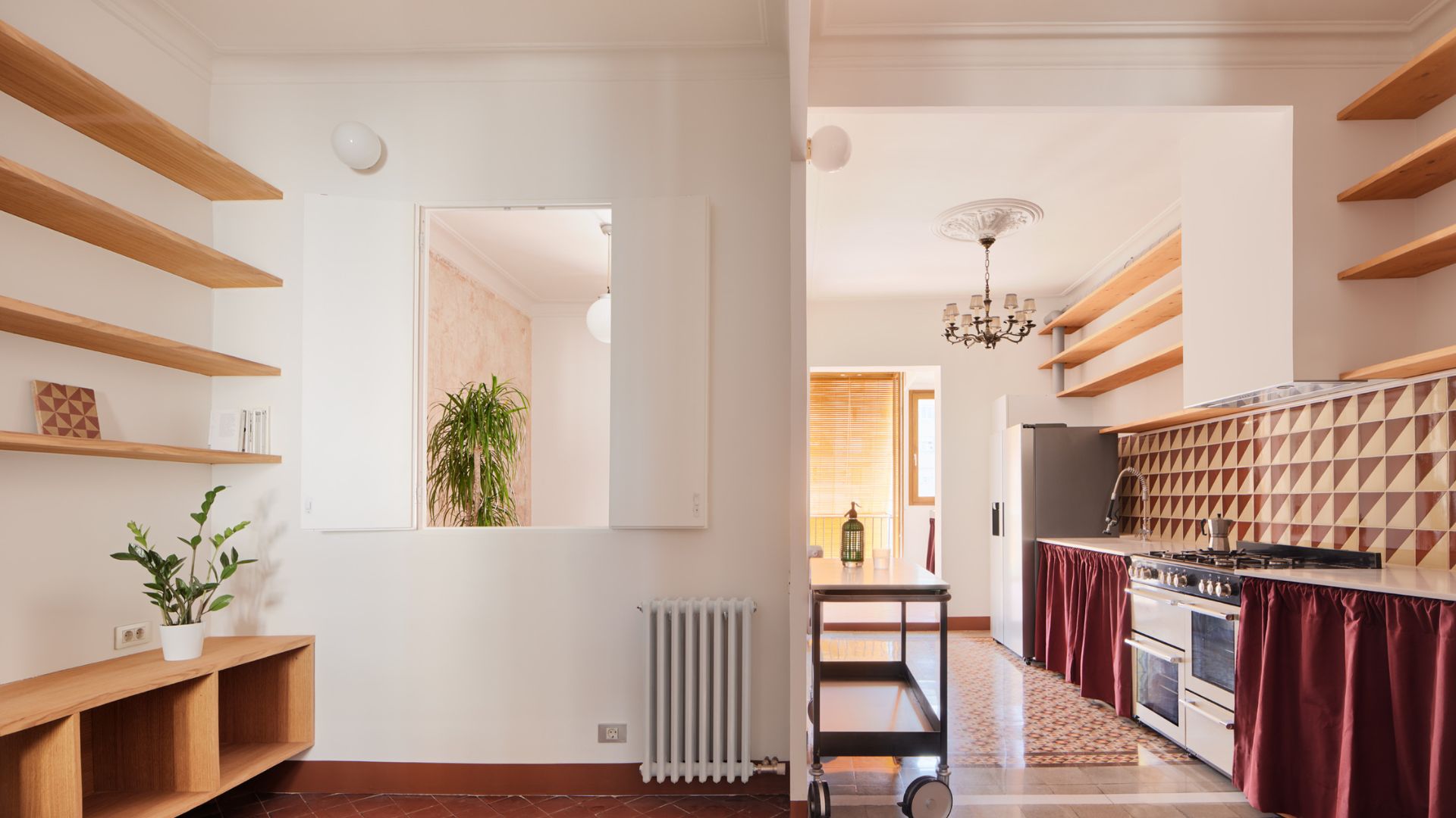
The importance of designing the kitchen was significant as its location was near the house's entrance. Thus, it was essential for the initial view upon entering the house to provide a sense of space. Additionally, the family frequently hosts, so one requirement was to design a spacious and impressive kitchen to accommodate daily entertaining, cooking, and baking, all done frequently. Every detail was taken into account, from general-purpose storage to the carpentry unit connecting to the living room, allowing an engaging visual and spatial connection.
The unique color palette, including shades of gray, wood, and black, blends perfectly with natural granite stone countertops chosen for the kitchen island and other work surfaces. The meticulously designed island allowed comfortable seating and simultaneously provided ample storage and workspace.
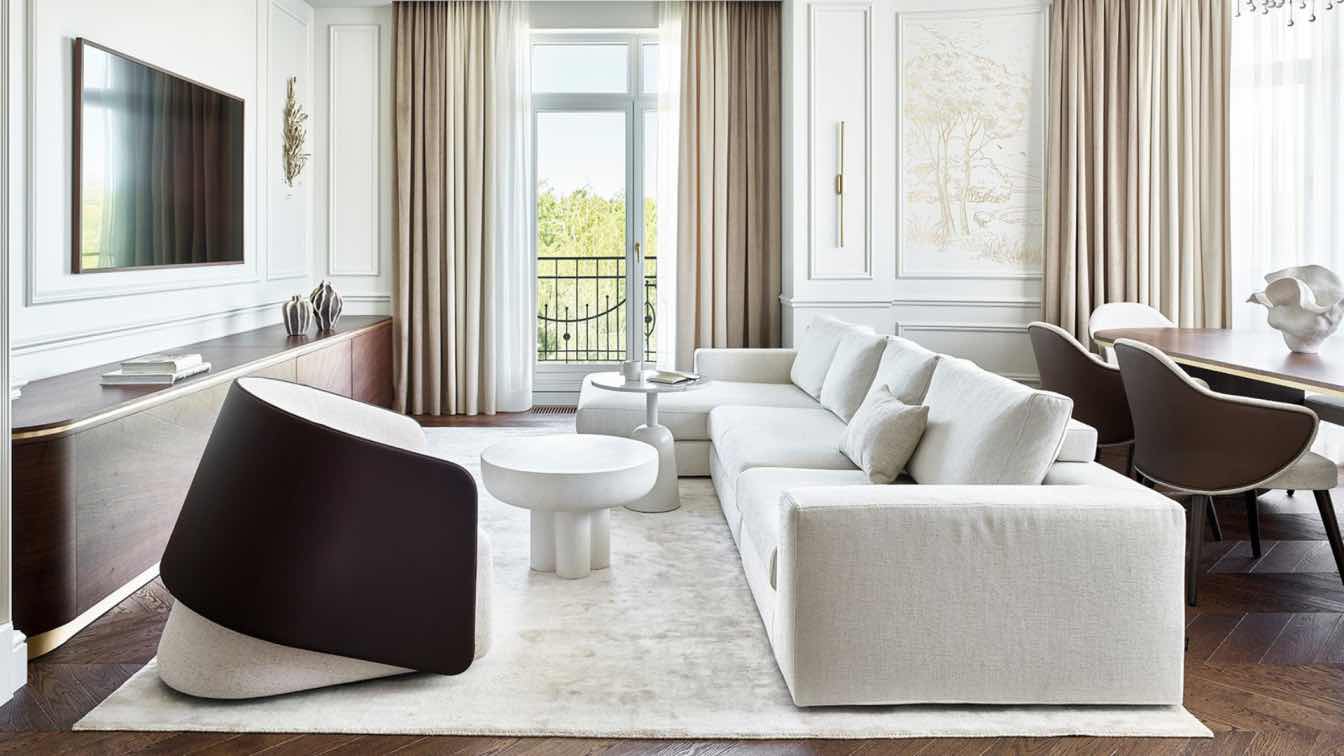
The planning delved into every detail of the house. Similar to the kitchen, a feature wall was designed in the living room that partly opened and partly closed, allowing extensive storage. Additionally, the architects integrated built-in lighting for a pleasant evening atmosphere. The combination of wood in the open unit along with the gray tones enables a visual connection to the kitchen.
The choice of meticulously designed and luxurious furniture aimed to create harmony with the planned carpentry. Accessories, rugs, and equipment were carefully selected to fit the overall color scheme and style.

The dining area adjacent to the balcony creates an expansive and continuous space during hosting, overseeing the three main functions of the home - living room, kitchen, and dining area.
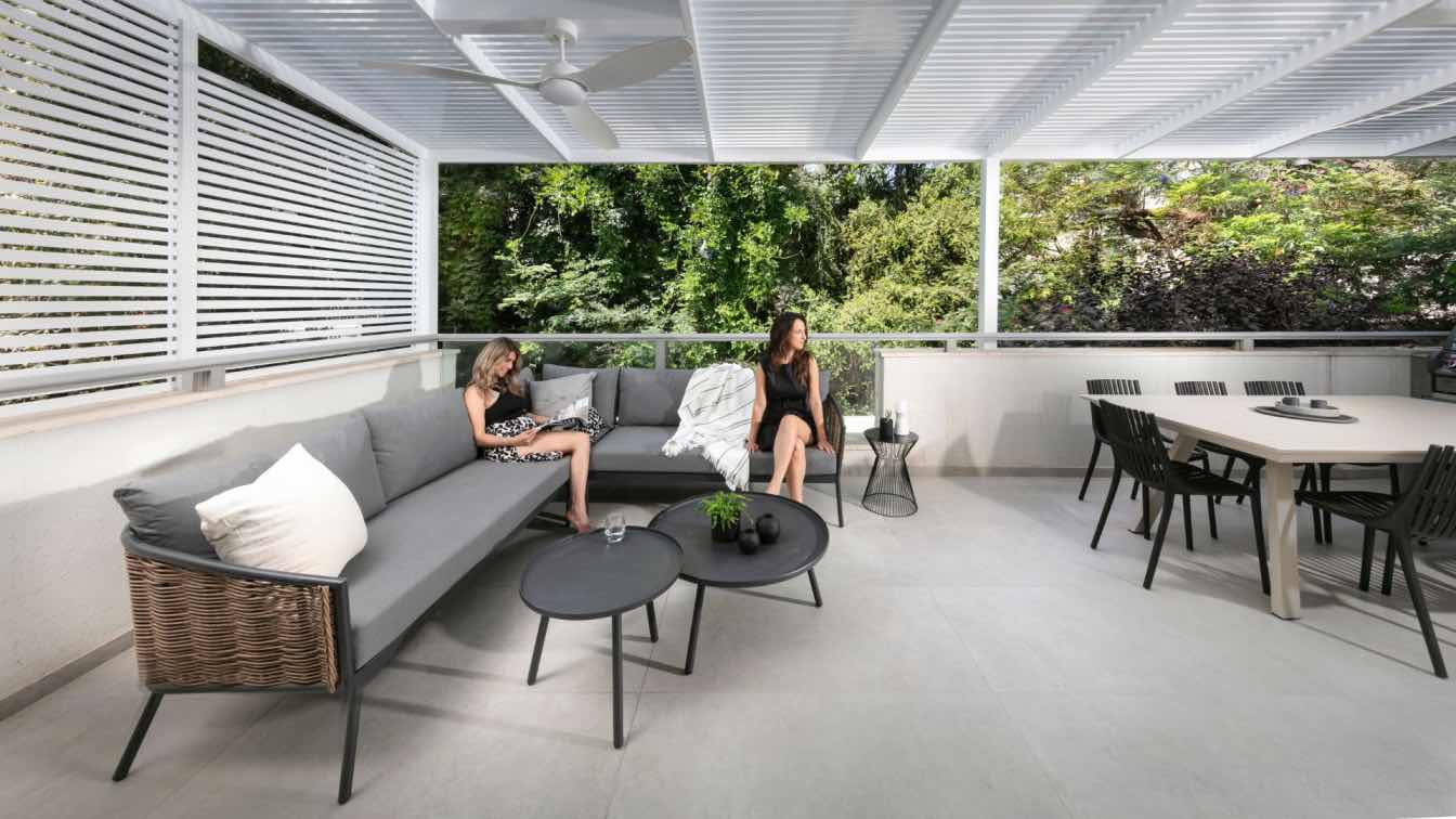
"We found it important to bring the outside in, so we invested thought in planning the entire balcony. The outside deck was replaced with the same tiles used inside the house. A spacious and inviting seating area was positioned facing the exit, allowing an inside view for those seated outside. The choice of an outdoor kitchen and dining area continues the concept that the house is welcoming and inviting, even in its external parts," explain Bazlat Architects.
The master bedroom was designed as a pampering and spacious suite. One request was to integrate a home office that does not encroach on the room's intimate area while allowing for prolonged work when needed. The result is a hidden workspace behind a harmonica door that extends to the makeup area.
The need for separate and spacious closets was addressed by designing two luxurious closets, one for each, purchased and designed by Delkoub Cabinets. This fulfilled the shopping-loving couple's wishes with two separate practical storage areas. Closets play a significant role in the bedroom space. Apart from meeting storage needs, a thoughtful design approach was taken for aesthetics.

The closet fronts were individually designed with a matt glass finish in an interesting asymmetrical division, complementing the luxurious style. The choice of light tones for the external fronts aimed to continue the pleasant feeling of the other light tones in the room, perfectly harmonizing with the wooden floor. The internal division of the closets considered all the clients' needs and desires. A material resembling snake skin was chosen for the inner body of the closets, giving a luxurious and sophisticated appearance, all from Delkoub. Internal mirrors and hidden compartments were incorporated for shoes, accessories, and, of course, clothes. Recognizing the need for ample shoe storage, a double door was designed inside the closet, separating shoes from other garments and preventing odor transfer.
Even in the bathrooms, the luxurious and modern theme of the rest of the house prevails. The couple's bathroom is entirely covered in tiles resembling light onyx stone, contrasted with darker tiles for emphasis and creating a dramatic look. Customized cabinetry for the sink unit in shades matching the tile palette, along with natural stone covering the sink surface, complete the picture, creating a smooth and harmonious line for the bathroom.
The general guest bathroom, used by the children and guests, features dark flooring and concrete-like tiles combined with sanitary ware in bronze tones, connecting with the entire color palette in the room. The grooved carpentry was designed to allow ample storage for laundry machines and cleaning materials while seamlessly blending with the room's overall look.


