About the place
Flora&Fauna Housing Estate is a residential area, eco-district with premium apartments in Novosibirsk.
Few words about the customer
Customer addressed ART-UGOL Design and Architecture Studio with a request to design an apartment for a family with a small child. Her wish was to make the space as stylish as possible but keeping the balance between contrasting materials, in other words – accent enough, but not patchy. One of the main wishes also was to make fully-equipped bathroom with a freestanding bathtub, as this area is very important for the apartment owner.
Project concept and features
Our main goal in ELFLOR project was to balance dark and light shades to make the interior contrasting, deep and interesting to look at. It is important to point out that project implementation was not that easy, because we had to wait for a natural stone from Italy for quite a long time: the stone was required for facing the wall in the hallway, a rather large stone compartment in the bathroom and also for kitchen floor and splashback.
Natural materials used in this project allowed to bring diversity to the design, however, due to well-thought geometry and highly accurate combination of colours, textures and materials interior does not cause visual discord. Honestly speaking, and as we mentioned above, project implementation was not simple. To begin with, we needed to cut this stone and place it in a way we pictured in our mind, plus the installation process of the stone also took a lot of effort. But now, when all the work is in the past we surely can say that all that experience and effort was worth the result we can now observe.

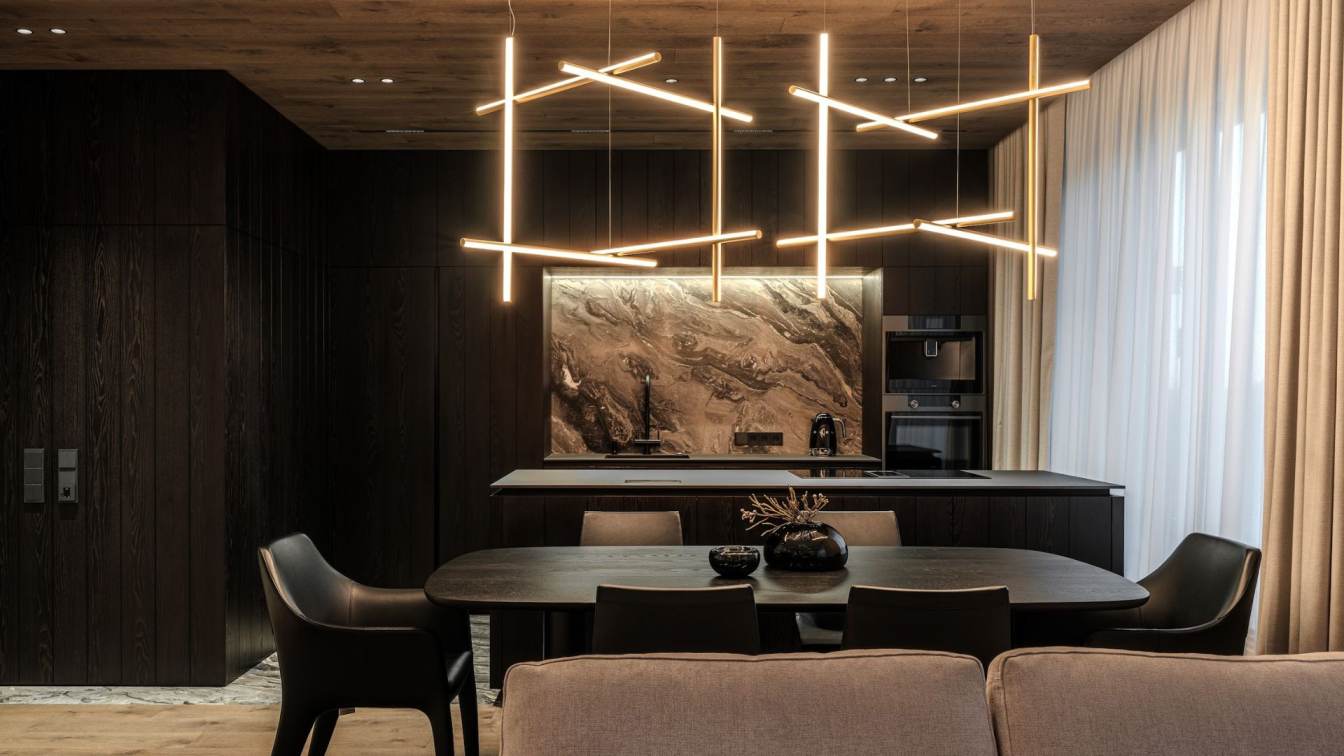
Kitchen and living room
The first thing that catches the eye is a kitchen splashback made of natural stone. We decided that this part of the kitchen should look stylish and advantageous since it faces the living room and can be seen from any corner of the room. That decision provided very expensive and classy look of the interior. And let’s not forget that such material as natural stone should never be hidden.
Kitchen unit is made of dark wood veneer but that color decision does not weight down the space due to the clever balance of light and dark elements as well as materials in general. Dark wood veneer matches perfectly with the bright texture of natural stone. The living room is done in light color scheme. It is composed of My Taos sofa by Saba Italia, Billy Keramik coffee table by Cattelan Italia, grey carpet, and light walls. One also can notice how compositionally we divided the kitchen and living room areas. On the kitchen floor one can see the same natural stone we used for splashback and in the hallway area. To emphasis a kind of division of areas we used natural veneer for the ceiling creating by that some kind of compartment that separate the hallway and kitchen areas from the living room.
Not to weight down this area, we selected two Coordinates Ceiling 1 pendant lamps by Flos that look like brass pipes. They blend perfectly and harmoniously with this interior. It is very often difficult to find suitable painting in stock of galleries and various salons, especially in the right size, when that happens we order paintings from artists. ELFLOR project was not an exception, for this design we specially order a painting from an artist.
The lighting above the painting as well as the painting itself are not randomly chosen. The upper beam light perfectly emphasizes the relief and pattern of the painting. This composition makes the space more cozy and stylish in the evening.

Bedroom
Entering the bedroom one can see a large BEND bed by Ditre Italia and textile wall behind it. Textiles behind the bedhead look like some king of pipes or long cylindrical repeating shapes.
This composition is completed by horizontal decorative insert of brass colour that looks like adjacent straight line. A small lamp of the same material is placed on it. All this complete composition smoothly wraps at the angle, forming a radial curve at the window. By such a minor element space looks a little cozier and free of unnecessary corners.
We also hid lighting in the ceiling and it coolly plays up the space in the evenings by throwing light on the curtains. We also could not help but keep the unified concept and use the same dark veneer that you already saw in the living room. Therefore, on the left side of the bed (entrance to the room) you can see a wall with natural dark veneer, which hides a closet and various places for storing necessary things.
Presence of two big windows allowed us to use quite dark shades and materials in this room.

Child’s room
Room of a child is in some way a whole universe, but at the same time child’s small world where he\she spends a lot of time. Child’s room in ELFLOR project was designed light and airy because it is very important not to clutter the space with unnecessary details and create a cozy and warm atmosphere for the child At first our idea was to place green double-bunk bed and by that add one accent colour to the room. But at the last moment we inclined to make the interior completely monochrome. Customer as well liked the light-coloured version better and so we kept the project monochrome.
This room is for one child, but such sofa below is very convenient because you can always find a use for it. For instance, if a child has a company or his/her friend stay overnight. It is also a great place for book reading. When we design rooms for children, we sometimes add some bright colour to bright up the space. In this case one of the whishes was to add green color, that is why we offered that option.
On the opposite side we created a working space that looks like it levitates. This construction is very firm and were tested many times. Additionally, we have illuminated the whole composition, making it even more airy and weightless. As a result, the interior looks as light as possible. But once child’s toys appear in this room, they will bright it up. That is why child’s room of white colour is quite a common thing in many interior designs.
On the right side there is a horizontally milled closet that has a plenty amount of storage places.

Bathroom
We used our favorite trick and placed the freestanding bathtub and shower in a unified natural stone compartment. The bathroom clearly conveys the interior concept, as it combines all the contrast. Including the white bathtub looks great and stands out against the dark natural stone.
The rest of the items in the interior we made completely white.
The bathroom is composed of a white sink, a composition of round mirrors above it, a toilet and a shower booth.
To make this space look not boring and empty, we made the wall with the sink in decorative plaster the texture of which looks like concrete. We also illuminated this texture with the light coming from the mirror.