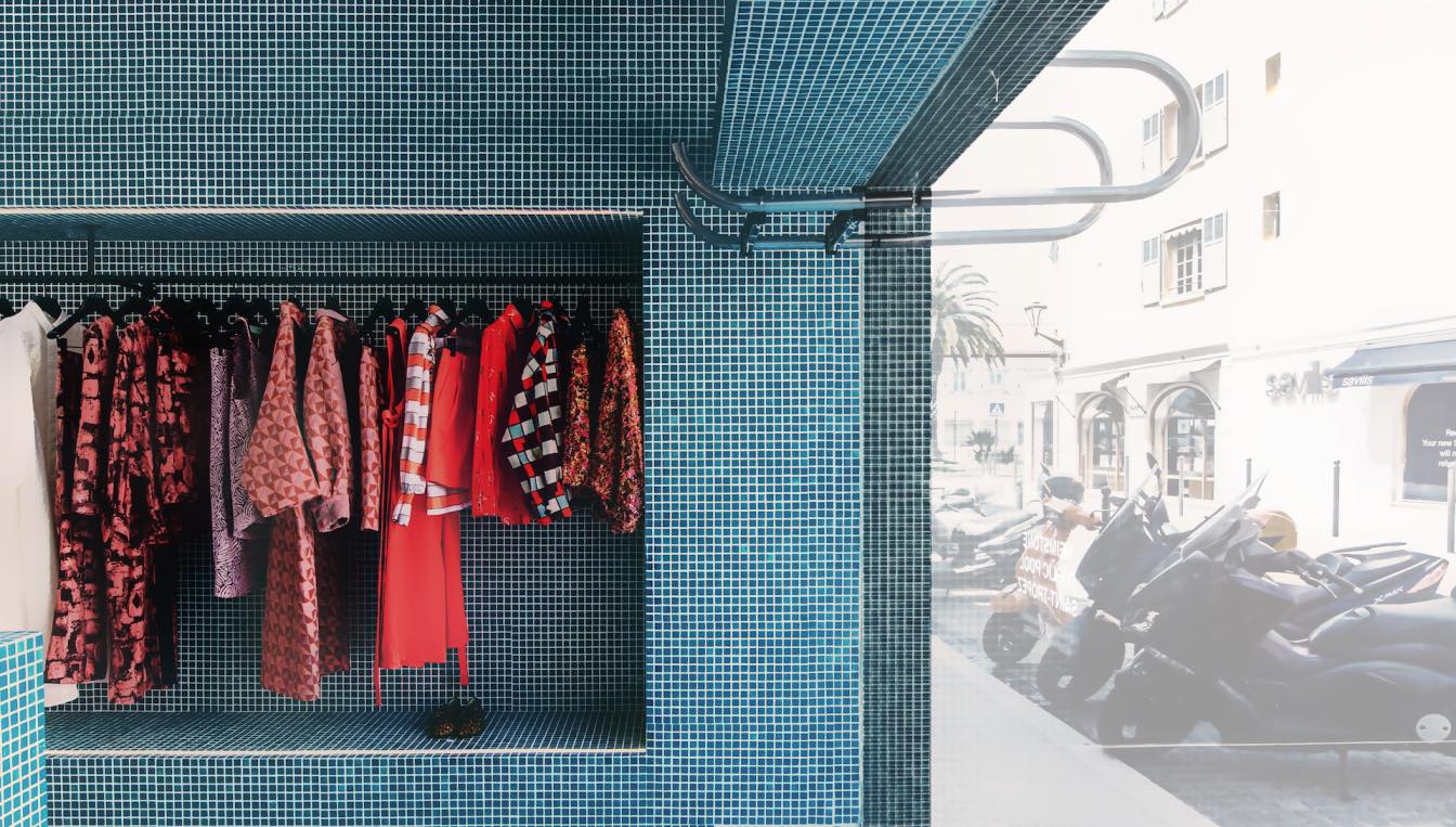
The Refreshment Club, a cutting-edge design agency based in Paris, has unveiled an exciting collaboration with renowned Parisian Fashion Brand Heimstone. The result is an out of the box and immersive retail store located in the heart of Saint Tropez.
Project name
Heimstone 'Public Pool' Saint-Tropez
Architecture firm
The Refreshment Club
Location
Saint-Tropez, France
Principal architect
Onur Keçe
Tools used
Adobe InDesign
Material
Pool tiles 2.5cm
Typology
Commercial › Store
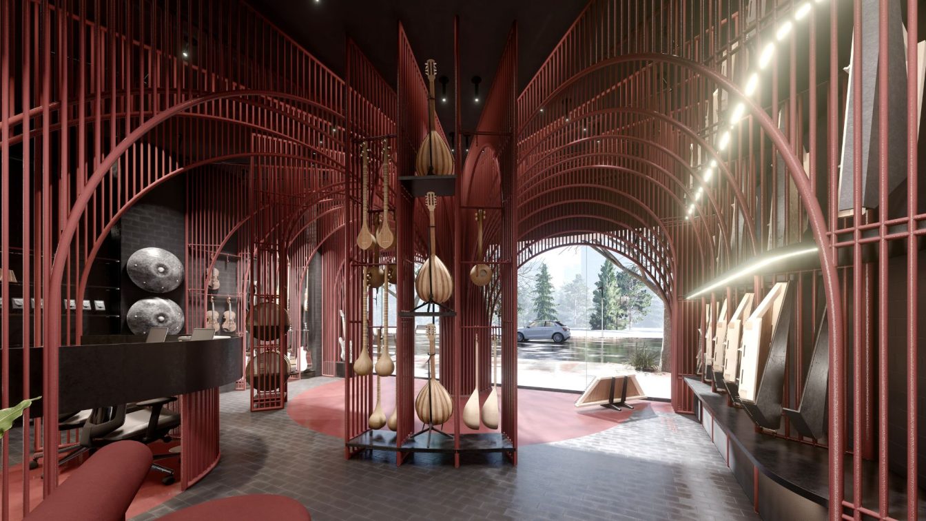
It was supposed to create a space with an artistic spirit in addition to the renovation of a musical instruments store. in fact, the project goal was not just to show the instrument. For this purpose, by making changes such as removing the small balcony of the project, a higher space was available for the design. The back part of the store was also...
Project name
Melodic Frames
Architecture firm
Neda Mirani
Tools used
Sketchup, Lumion, Adobe Photoshop
Principal architect
Neda Mirani
Visualization
Neda Mirani
Typology
Store › Musical Instruments
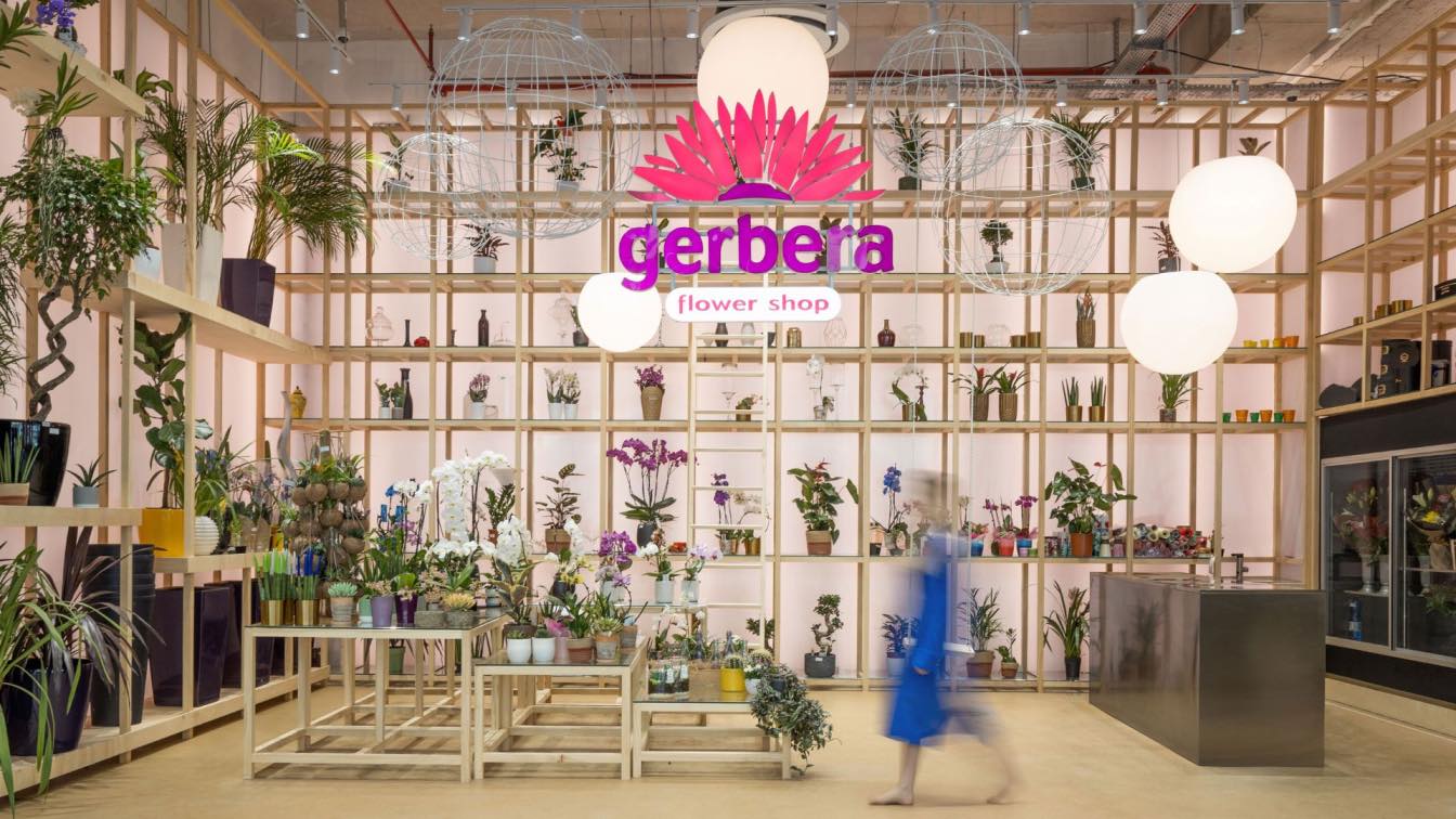
Stepping into Gerbera Flower shop inside Prishtina Mall shopping center and prepare to be transported to another world. The transformation of this space through the use of various plants is truly breathtaking. From lush ferns to delicate orchids, each plant seems to have a personality of its own, inviting you to explore and discover their unique be...
Project name
Gerbera Flower Shop
Architecture firm
Maden Group
Location
Prishtina Mall, Kosovo
Photography
Leonit Ibrahimi
Interior design
Maden Group
Material
Wood, Polycarbon, Gravel – epoxy, stainless steel
Typology
Commercial › Flower Shop
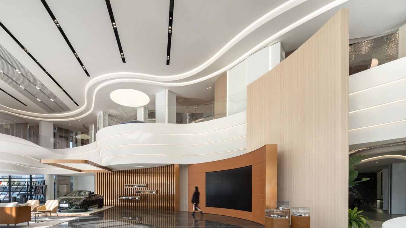
As the forefront of the New Special Economic Zone, Qianhai continues the innovative characteristics of Shenzhen for more than 20 years of reform and opening up, carries the unique Marine culture as the core internal driving power, and demonstrates the innovative and inclusive urban spirit. The customer experience center for BMW is located at the ju...
Project name
Customer Experience Center for BMW in Qianhai
Architecture firm
ARCHIHOPE Ltd.
Location
Qianhai, Shenzhen City, China
Photography
Vincent Wu; Video Shooting Team: Blackstation
Principal architect
Hihope Zhu
Design team
Concept Design Team: Jane Fang, Xu Chang; Deepening Design Team: Tan Chuanli, Zhao Qing, Deng Guanying, He Mengjun,
Interior design
SIAD Design Shenzhen Co. Ltd.
Completion year
December 28th, 2022
Material
Building: Perforated Aluminum Plate, Low-E Hollow Glass, etc; Interior: GRG, Recycled Paper Tubes, Wood Veneers, Water Ripple Stamped Stainless Steel
Client
Sime Darby Group & BMW Group
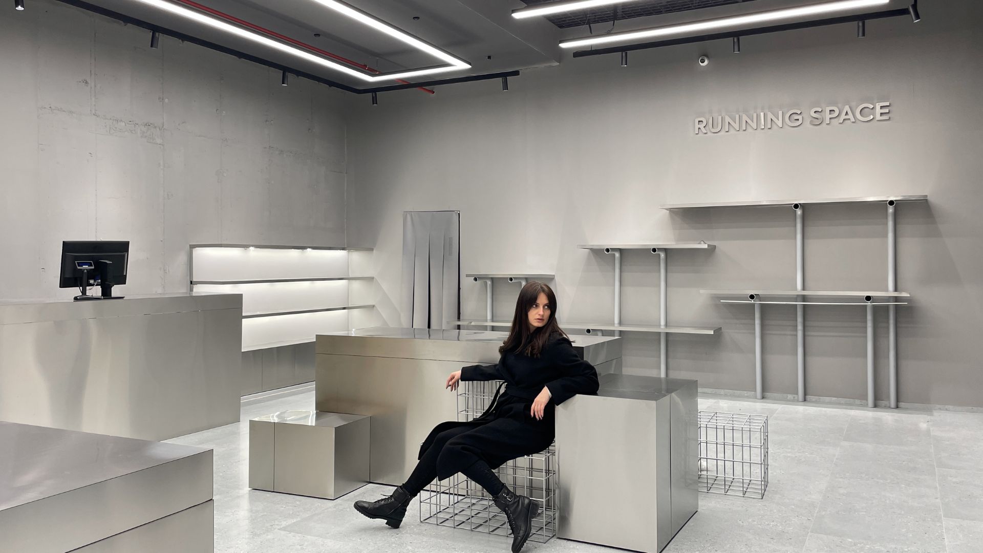
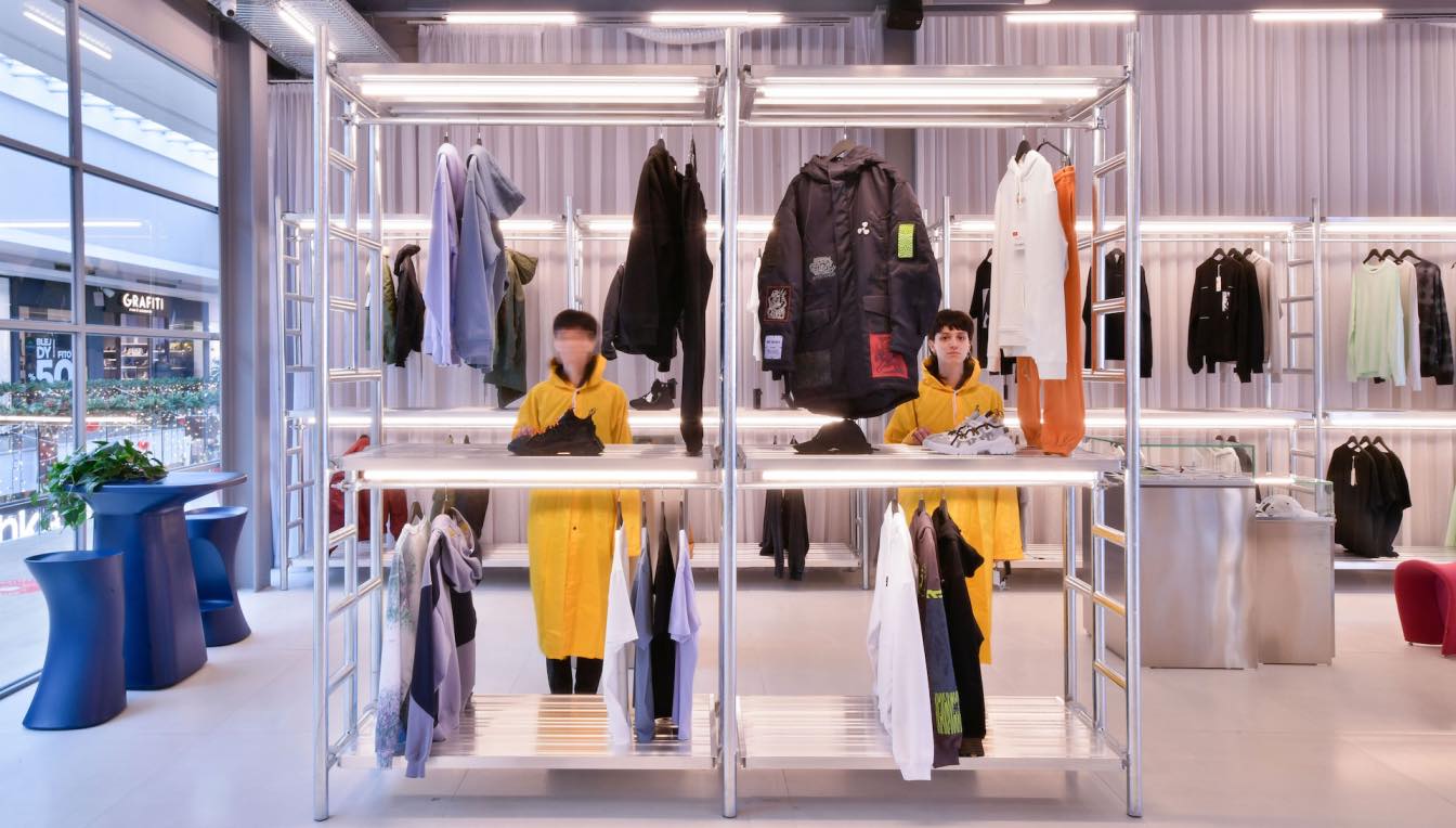
The whole idea is concepted with the principle of creating a monochrome space which was achieved through the use of "industrial" materials with gray tones, to give priority to the textile products that will be exhibited. The design was conceived on the theoretical principle of simplicity, which is manifested by the connection of linear forms and ma...
Architecture firm
AET Group
Location
Prishtina, Kosovo
Photography
Zejnulla Rexhepi
Principal architect
Safete Veliu, Rexhepi and Zejnulla Rexhepi
Design team
Safete Veliu-Rexhepi and Zejnulla Rexhepi
Interior design
AET Group
Tools used
ArchiCAD, Autodesk 3ds Max, Corona Renderer, Adobe Photoshop
Material
Inox, Concrete mesh, Metal water pipes, Construction reinforcements, Stainless steel plates
Typology
Commercial › Store
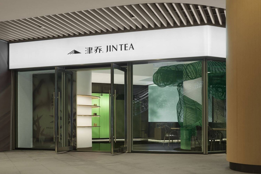
For Jin Tea Space, the designer utilized bamboo, which is a symbol of the spiritual core of traditional Chinese culture as well as tea, to create a modern tea retail store. She realized that the key for a retail space is not only product display, but also the space design and consumers' experiences
Architecture firm
Aurora Design
Photography
INSPACE: Yanyu, Naxin; Video: WM STUDIO
Principal architect
Yang Xuewan
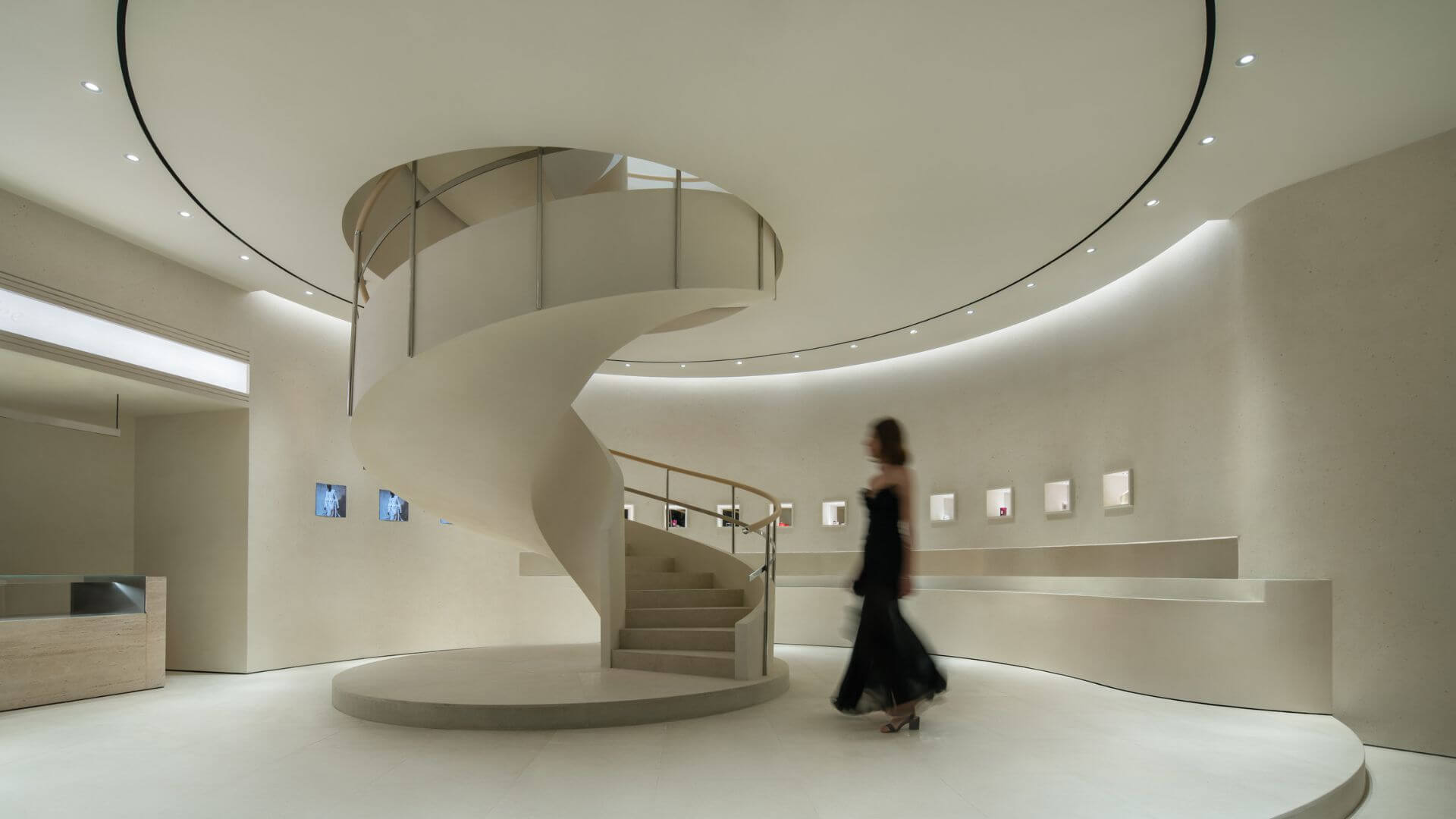
The project is located in the urban lifestyle complex of more than 200,000 square meters in the north section of Tianfu Avenue, Wuhou District, Chengdu. It is adjacent to the giant sculpture designed by Dutch artist Florentijin Hofman and connects the L1-L2 area. Thus, while enjoying the open view of the outdoor atrium, it enjoys the high net worth...
Architecture firm
ATMOSPHERE Architects
Photography
Chuan He from Here Space
Principal architect
Tommy Yu
Design team
Deniel Hwang, April Lo, Chloe Chen, CoCo Lee
Collaborators
Animation Design: ViVi Lee. Prop & Installation: ATM Team. Wall Craft Solution: souls. Floral Installation: JIHEJI Flowers&Inspiration
Interior design
ATMOSPHERE Architects
Construction
Shanghai Qinyin Architectural Decoration Engineering Co., LTD
Typology
Commercial Architecture › Store
Homme is not just a store, but a unique experience of an urban environment within the context of a highly commercial space. Homme is a break from the usual shopping mall experience with a number of distinct aesthetic signs. The height gives the feeling of space and at the same time exposes the structure and ventilation of the space lighting systems...

