Tens Atelier: Vibrant and Colorful Wonderland
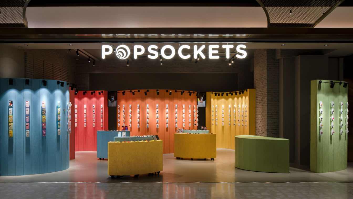
This is POPSOCKETS‘ pop-up store located in Shanghai Taikoo-Li Qiantan. As a temporary space that has only been in operation for six months, the design needed to be highly concise and dry. Through design, a visually recognizable and experiential consumer scene was created within a limited time and space.
In addition to the constraints of the current site conditions and budget, there are relatively few limitations from the client on the design expression of the pop-up store. Therefore, under the premise of meeting a series of established constraints, such as budget, schedule and site conditions, these clear limitations provide designers with a clearer framework and direction. Compared to most ambiguous requirements, clear boundary conditions are more conducive to creative design, and we only need to focus on how to seek breakthroughs and innovations within these constraints.
The original ceiling of the site was not changed due to the owner's request, because once the ceiling is adjusted, it will involve the redesign of fire protection and air-conditioning systems, which will involve the construction period and budget overrun. Therefore, we retained the original ceiling structure, only the ceiling and walls uniformly painted gray paint, the ground paved gray floor rubber. In addition to our new display props, we kept the space in a unified and holistic environment to emphasize the core position of the display itself and make the product display the visual focus.

The curvature of each cluster is carefully designed to fully echo the current situation and spatial logic of the site. We open up the site to maximize its orientation to the public areas of the mall, enhancing the openness and interactivity of the space. The concave-convex relationship between the clusters was also carefully considered: the curved surfaces of the left and right clusters are convex, making them closer to the dynamic line of the mall's public area, and creating a more natural contact with the passing customers, in order to shorten the time for customers to recognize and decide on the products.
The center cluster also adopts a convex design. Considering that the SKU of POPSOCKETS are relatively limited, the depth of the store is reduced through this format, so that the products are visually presented more directly to the customers. At the same time, the back of the central grouping also reserves enough roaming lines for the store staff to ensure efficient and flexible operation. In contrast, the only concave cluster in the store provides a more immersive experience for customers, creating a relatively private atmosphere through the curvature of the wrapping, enabling customers to gain a deeper level of feeling in their interaction with the products. It is hoped that the entire space will form an organic tension between openness and wrapping.
Behind each curved group, we also fully considered the storage function. The operation configuration of the pop-up store consists of 3 staffs. In order to realize an efficient operation flow in a limited space, we reserved a 500mm passageway in the group design. The passageway is located in the gap between groups, which does not destroy the coherence of the overall design and facilitates the flow of staffs.

While the customer is selecting merchandise, one staff is responsible for serving the customer at the front of the room, while the other staff is able to quickly navigate through the reserved moving line behind the grouping without interrupting the customer's experience and go directly around to the storage area behind the grouping to pick up the merchandise. In this way, the staff is able to efficiently deliver the merchandise to the customer.
Regarding the material itself, OSB board is mostly used as a base material, which we transformed into the main element of the surface decoration. Through this transformation of material properties, we can effectively control the budget and at the same time better reflect the environmental protection concept advocated by POPSOCKETS.
In order to achieve the functional division and visual hierarchy of the space, we painted each area with different colors of OSB Board. This color division not only strengthens the sense of hierarchy in the space, but also makes each area visually independent and unified through the echo of color and brand culture. Ultimately, this design not only conveys the concept of environmental protection and minimalist aesthetics, but also maximizes the spatial experience within limited costs through the clever use of materials.


