GE Space Design: This is a simple space, with its pure simplicity overwhelmed with the power of solidity and certainty; this is a complex space, embodying sensitivity, fickleness and calculation, waning and waxing among different people and during different times, and exuding abundant spatial personality charm.
It is a testing ground full of utopian spirits. A whole set of spatial extension and transmutation laws are constructed, stretching from outside to inside and from bottom to top. The connotation of “reset” in space refers not only to the emphasis and implication of "this is the second store of craft brew bar brand MEDISN", but also to the possibility of initiating new spatial connections regardless of the time and space: community, coffee, craft brew, music, vision, TATTOO, exhibition, culture, etc.
01- Constructing overall order at first sight
The second store of Yaochang MEDISN, located at a curved corner of D10 Tianfu Commercial Street in Chengdu’s Jinjiang District and adjacent to Hongji Lane fully covered with paulownia and ginkgoes, is a mix of routine hustle and bustle and urban landscape.
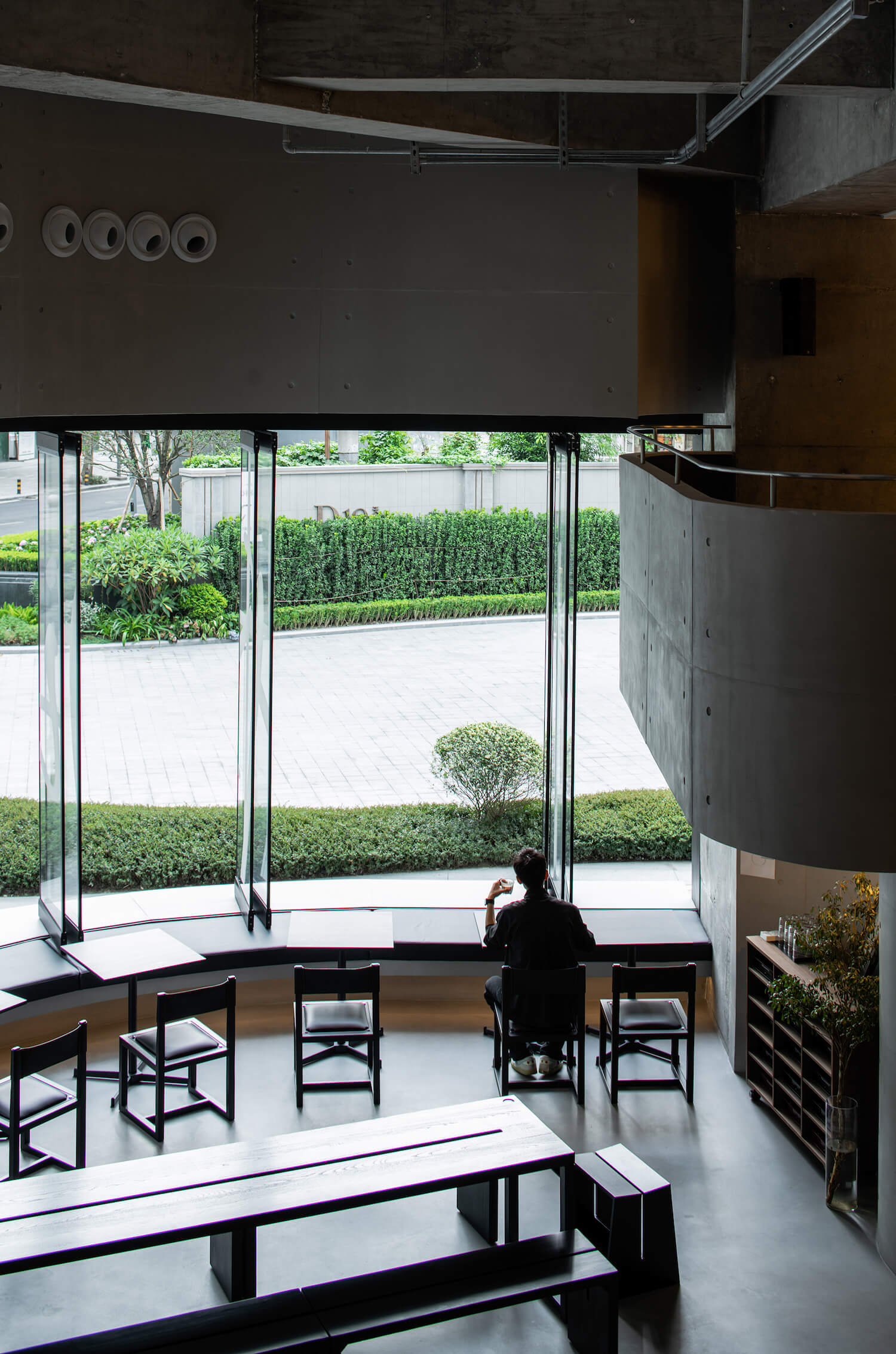
Special attention is paid to the community attributes of the space in the design of the entrance, rendering space closely embedded with the surrounding environment and building up prominent tension between the interior space, the external area and the city street. There is no clear physical separation between the street and the external area, making this space an extension of the urban public domain and a guiding area serving as the transition from community street to space. Such transition is especially intimate and natural in the summer when all the six foldable glass doors are open.

The process of extending from the intimate and casual exterior area to the slightly high-profile interior space is also a natural process of transitioning from coffee to wine. Although the interior space remains semi-open, the uniqueness of the place is in the first place manifested in the six-meter-high original building, where the vertical spatial tension interacts with the horizontal boundary permeability, establishing a concrete and intense presence.
Substantial natural light pours into the space during daytime through the continuous glass doors that occupy the entire arc facade, taking on a delicate grayness under light reflection and diffuse reflection. As a static language, the spatial block, silent and solid, extends across the internal boundary of the space, bringing about a spiritual feeling that reconciles the rigor and straightforwardness of the pre-industrial era and truly correlates with the human and material world.
There lies a hidden and imperceptible commitment to simplification as a result of artistic metamorphosis. However, upon entering a space one can clearly sense the replacement of visual perception by a sense of touch that evokes more perceptual power. The sequence, layers, texture and quality of space become the so-called objects of “The Eyes of the Skin ", where matter and consciousness move from opposition to unity.
02- Exploring the sequence of Dionysian spirit
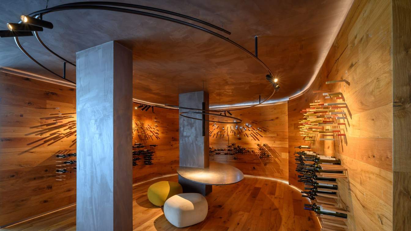
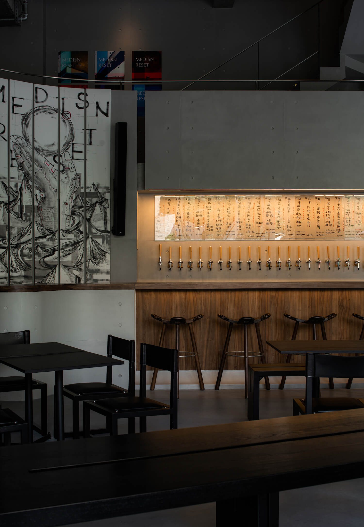
The scale relation is magnified from general experience in the space with high ceilings and a strong sense of sculpture. To reinforce the dramatic large-scale experience, the advantages of vertical height are used in the design. A three-dimensional six-meter-high matrix-structured glass wine room is formed by displacing wines in the visually open interior area. A measurement of spatial scale and alcohol intensity is emanated when people are in the glass wine room.
In addition to intentional amplification, the effect of scale on human experience in space is usually inadvertently reflected in drastic contraction or depression. The tension and elasticity of space can be more accurately transmitted after undergoing a certain degree of sensory depression, which endows spatial perception with change. The change constitutes the folds of space and becomes a critical component of spatial function.
The intrinsic limited spatial experiences, such as the staircase on the inner side of the space that rises along the crevice and making it to the mezzanine by climbing the staircase and crossing the glass wine room, provide the space with diverse scenarios, enrich the layering of space, and accentuating the spatial scale once again.

By exploring upward, all the spatial details slowly unfold outward under close physical experience: the walls are decorated with finely textured concrete panels; the circular hole elements begin to continuously hop into the view; the curved concrete railing on the outside of the mezzanine balances the toughness of the space; the exposed concrete beam structure and metal pipes on the top surface give away an existing reality; and the enormous circular skylight on the ceiling becomes an important visual node, disclosing some purely abstract pictures.
Therefore, the space unifies the complexity of the top, beams, facade and staircase into a spatial sequence in a series of coherent images and perceptual systems, achieving a multi-dimensional layering of space and richness between the layers.
03- Summoning paranoid and independent art scene
The energy of composite space is enormous. MEDISN has been committed to integrating alcoholic experience and visual art experience into the emotional atmosphere. The directors have even half-jokingly attributed the fusion of coffee, alcohol and TATTOO to certain common "addiction" syndrome. This has greatly expanded the boundary of MEDISN and increased the independence of the space and the brand effect. As the upper space of the bar, the art gallery and the on-site area thus become a promised land and a real and deserved presence.

Like the first floor, the upper art space is not confined to height and is thus ideal for high-quality niche exhibitions. At the same time, to increase the layering of space, a relatively low mezzanine has been created in the corner and is used as a separate and secluded studio for FORESEER. In fact, a lot of the visual art employed in the interior of MEDISN comes from FORESEER studio, which focuses on the art of tattooing and is therefore regarded as the soul of MEDISN.
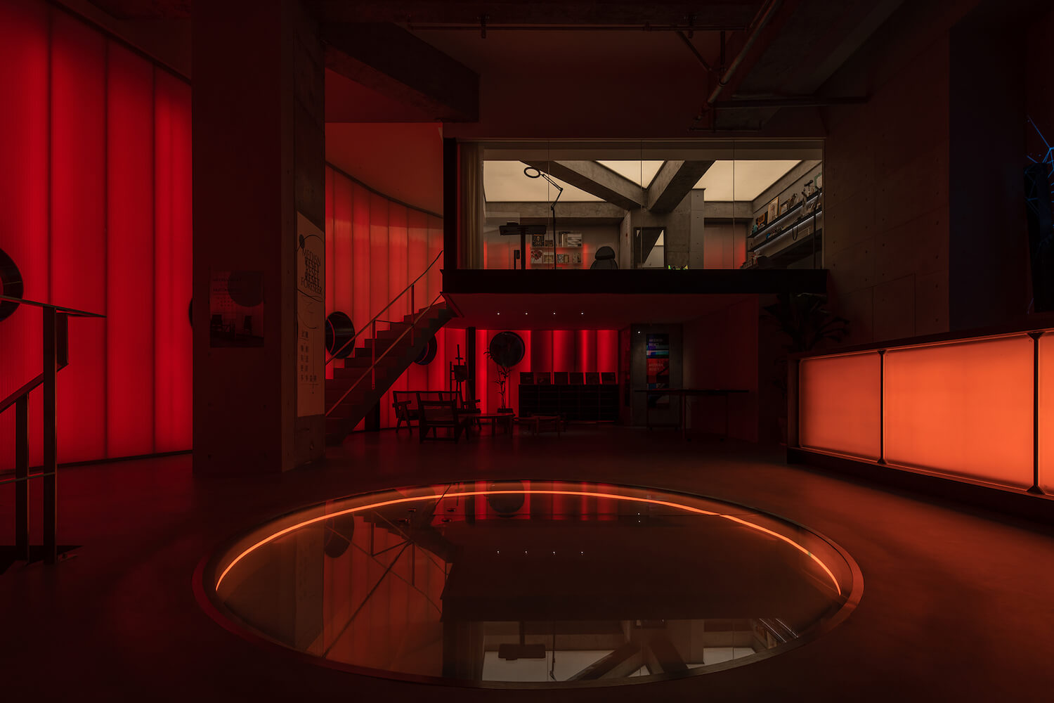
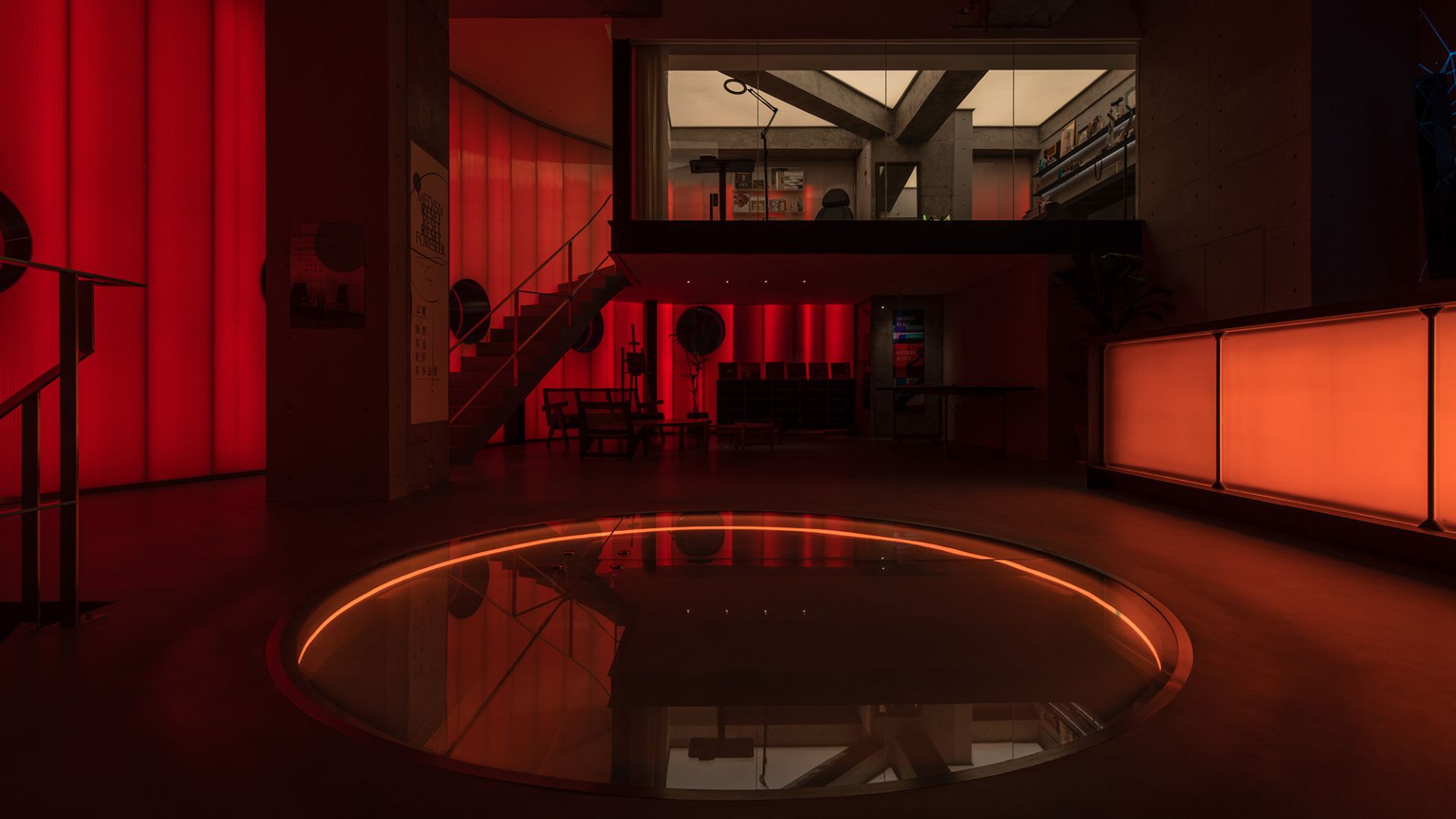
Viewing on the second floor the circular skylight on the top of the first floor brings a different experience. The entire huge open circle encompasses the main business space on the first floor, links the interactive imagery between the first and second floors, and forms a visual focal point. The two-layer lighting system between the beams and the circular holes makes the huge circular holes stand out by covering the exposed concrete cross beams.
The beauty of art lies in the stripping of self and the embedding of pain. This giant glass hole embedded between the concrete beams and columns acts as not only a path for spatial vision penetration in the upper and lower relationship but also a symbol of the stripping and pain between alcohol and tattoo.

04- Indulging in tidal circadian rhythm
Drinking during the daytime with the company of sunshine, routine hustle and bustle, shade and light-hearted music brings sobering carefreeness. The space thus appears fairly bright, hard and clear, as if the space is more supportive of a lonely melancholic temperament in the midst of a crowd under the disguise of warm and affable social attributes.
When night falls, the daytime rigid seriousist style is smashed by light and music and gives way to simmering emotions and an industrial utopia for addicts. The silent temperament of daytime disappears as the clean, restrained gray cement walls become the ubiquitous carrier of visual art in the space, playing the role of spatial integrity and adaptability for the expression of artistic atmosphere and acting as both canvas and container.
Consequently, the whole space is given the possibility to be more compromising than the daytime status. The entire internal space but the boundary is handed over, with the physical boundary inevitably replaced by the darkness that serves as a visual boundary. Diffusing light makes the rounds across the surface of the material space and disappears into the darkness.
The continuous concrete surface and simplistic and rhythmic openings seem to make the space afloat, bringing the possibility of entering the future or the infinite universe. Thanks to the splitting of different time periods, the space, like living creatures with circadian rhythms, achieves an alternating static and dynamic state, growing at night and staying static during the day. Matter and consciousness find their rhythms in two opposite directions, extend unfetteredly and eventually diffuse into a spiritual community, which is catalyzed, perceived and indulged by human participation.
When night falls and the sleeping Dionysian spirit is awakened under the sequence of space, space ceases to be a space with material entities and turns into a field and a black hole of perception. At this point, the greatest contribution of space is the consolidation of order. And in the main business area on the first floor, wavering light exudes emotions with maximum brightness and alcohol and music waves throughout the whole space, infiltrating every lonely and interesting soul.
All external forms of coquetry are rejected here. There is no flat vision, cheap textures, or eagerness for quick success and instant benefit, but experience and the accompanying intoxication. Steering away from aesthetic speculation and restoring true nature is the meaning of construction.


