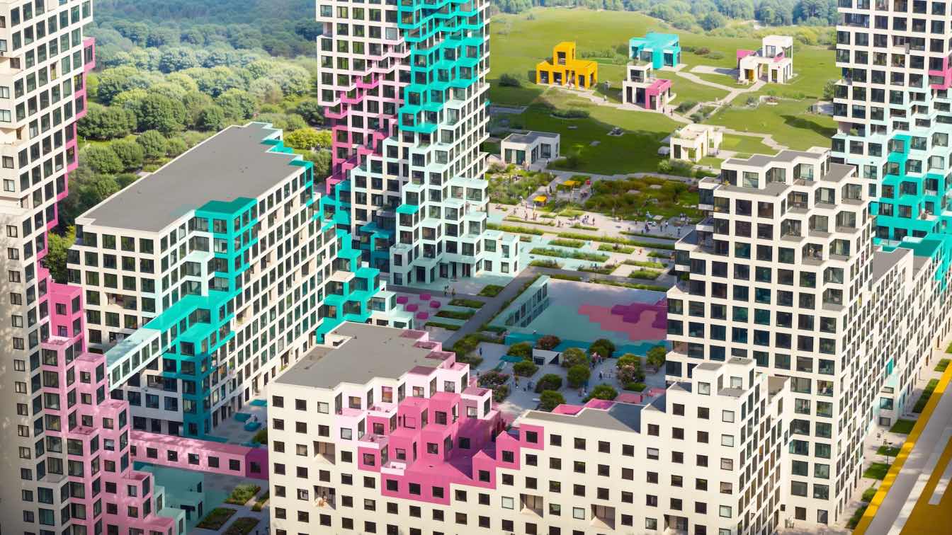
Attractive views of the city panorama are one of the main reasons why clients bought this particular apartment in Highvill Gold Ishim Residential Complex. A space that offers an impressive view of the river, the Presidential Park, iconic architecture, and the cityscape.
The young couple gave carte blanche to the designers of Kvadrat Architects studio to realize any ideas. The powerful trust factor was explained by the backstory: when the girl was a teenager, they designed her parents' house and her room. The unconditional trust was reinforced by a conversation: Sergey Bekmukhanbetov and Rustam Minnehanov found out the habits, hobbies, tastes and lifestyle of the couple.
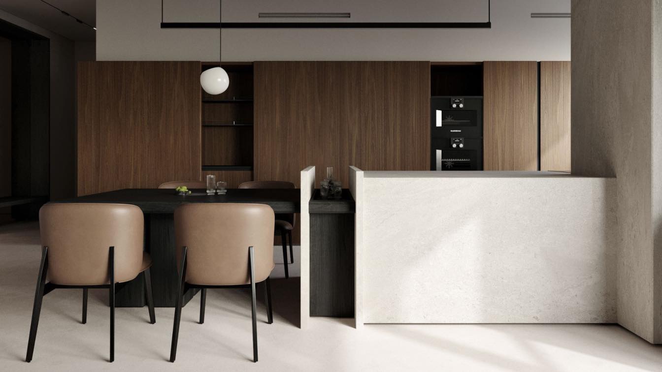
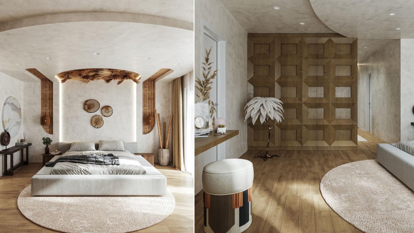
Clean but cozy minimalism is the result of interaction with the space and its owners. A combination of warm texture of eucalyptus veneer wood and concrete panels, natural décor and masterful lighting scenarios. A place where you relax from everyday life physically and mentally.
Technically, the project turned out to be extremely challenging and interesting: the designers left almost nothing from the original layout. Although the developer thought out a lot of details, but it was not enough for them. The room was divided into three zones: kitchen-living room, private (two children's rooms, master bedroom) and technical – the second kitchen for professional cooking and storage. One section of the range serves as a door leading into the chef-kitchen, where the culinary magic happens.
Opposite the technical kitchen behind the TV zone is a spacious room with extensive storage for appliances, tools and ironing system. Additional comfort is provided by large walk-in closets in the master bedroom and at the entrance, a separate technical block. Functionality is colored by incredible aesthetics and light scenarios. The decision not to interfere with the light flow from the stained-glass windows is well-calibrated. It freely enters the apartment and spills over the entire living room....

The enveloping effect
In this space, light pours in without obstacles. The atmosphere of spaciousness and airiness is created by the unity of pastel colors of the ceiling, walls, floor and kitchen furniture. In contrast to the warm texture and complex pattern of eucalyptus, the lightness is felt even more.
"White sand" - a shade that is not without nuance, connects the walls, floor, ceiling, kitchen island into a single space. In different lighting, it reads as white, light beige or light gray. The color is one, the texture is different.
In such a minimalist, monochromatic interior, special demands are made on the quality of the finish. Wood has a different character, it is responsible for coziness and serves as a decoration. The play of opposites is supported by eucalyptus veneer with a Frize effect. We chose this particular type of veneer instead of the usual oak, pine and walnut.
Thanks to the complex pattern, the surface shimmers with a pearlescent luster when exposed to light. This is the natural texture of eucalyptus, created under the influence of wind and sun. Like a chameleon, the veneer is different at different angles of view, with strong visual decorative properties.
The eucalyptus finish runs a line through the entire interior. The panels on the walls flows into the fronts of the built-in furniture, continue in the doors of the technical kitchen, in the hallway. But to maintain the enveloping effect, they do not reach the ceiling.
The plasticity of light: drama and melancholy
The light design of an apartment is built around the presence and absence of light, on its depth and contrast.
Lighting, natural or artificial, is subject to the same parameters as the other elements in the interior. To be visually clean and minimalist, but at the same time sufficient. On the windows used roller blinds and wooden shutters. Roller blinds, like overcast weather, fill the space with diffused, reflected light, without sharp shadows and transitions.
Blinds, on the contrary, on sunny days help to bring some drama into the apartment. If you direct them on the floor, ceiling, walls, clear shadows are formed, glare plays.
With the help of light, the designers leveled the architecture of the interior. When they chose the types of lighting fixtures, they took into account their ability to influence the perception of space. To transform it and the feeling of the environment.
Architectural light is represented by track systems and concealed spotlights that do not add volume. They leave a clean space. Contour ceiling perimeter lighting provides uniform illumination.
The decorative light of the Vibia pendant light zoned the space and illuminates the environment above the kitchen island and dining table. Spot lighting picturesquely transforms the details of the composition. For example, illumination of a painting makes it three-dimensional, shadows and reliefs appear – a new pattern is outlined.


