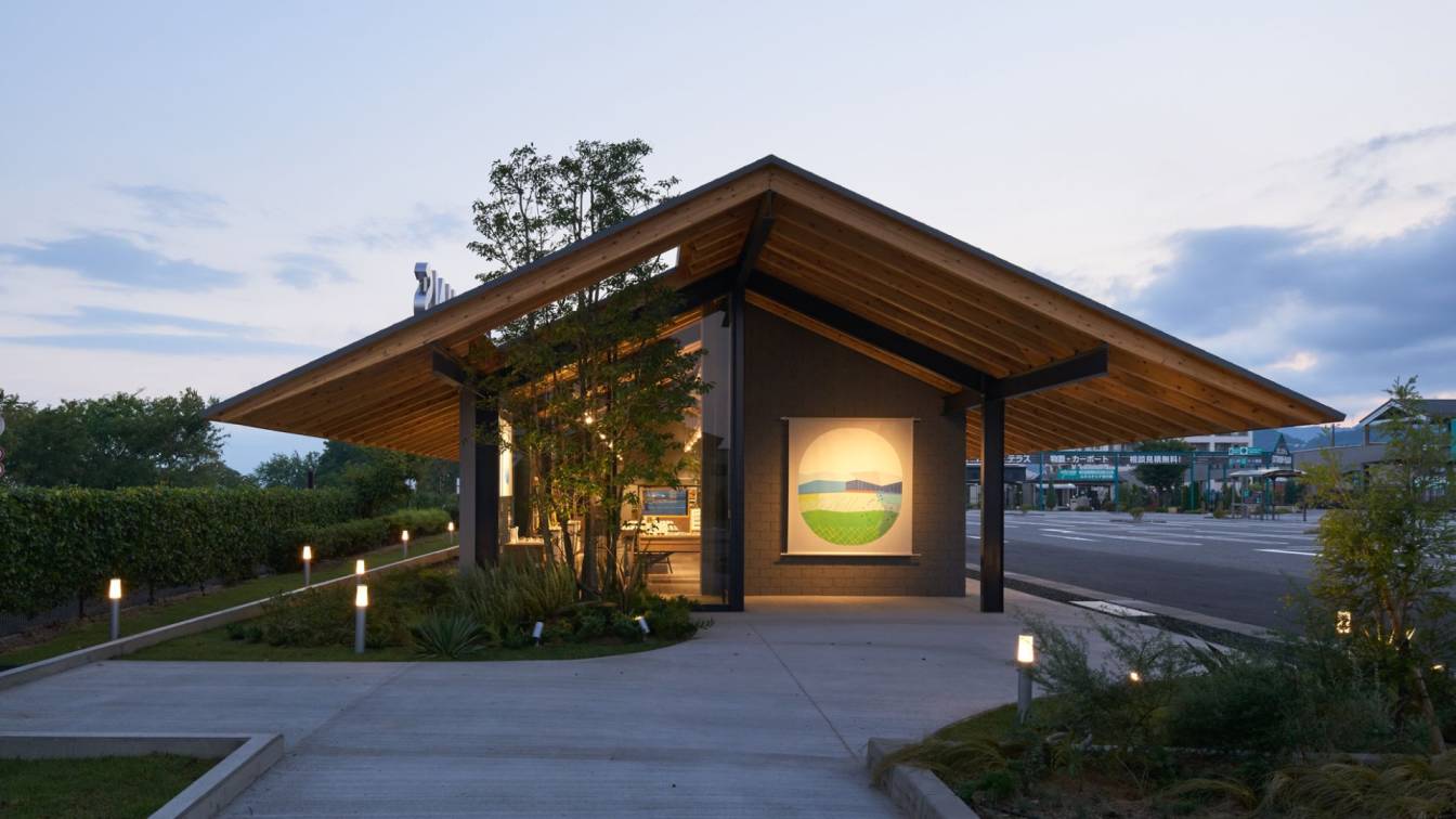
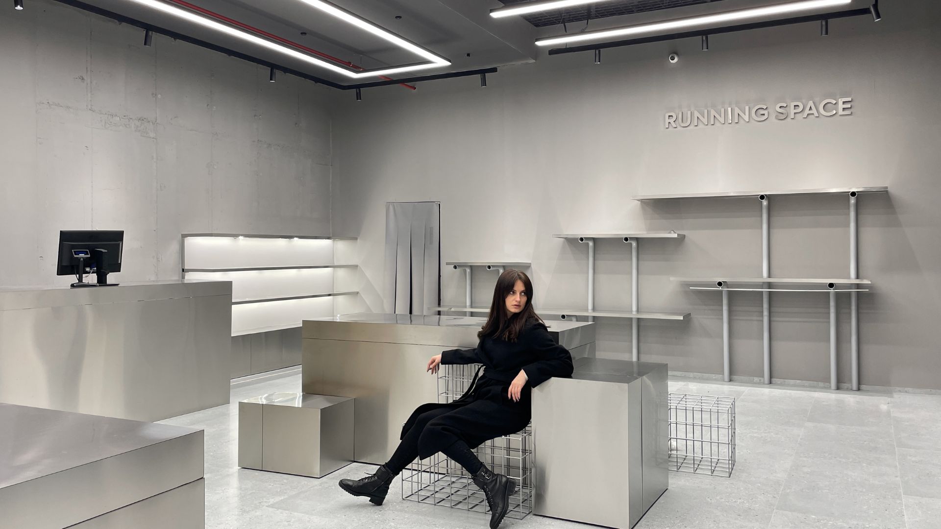
Migliore+Servetto designs a new format store for Electa bookshops, by creating new spaces for culture and encounter in Rome, within four extraordinary locations of the Colosseum Archaeological Park (Colosseum First Gallery, Second Gallery, San Gregorio al Palatino and Clivo Palatino), and in Venice, in the spaces of the Biennale.
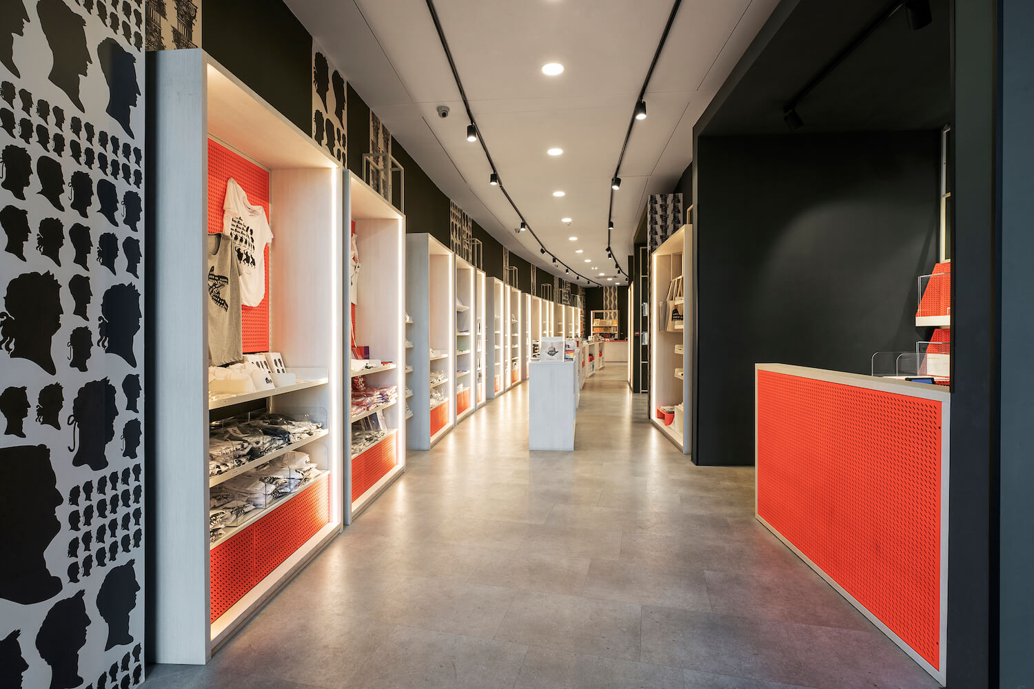
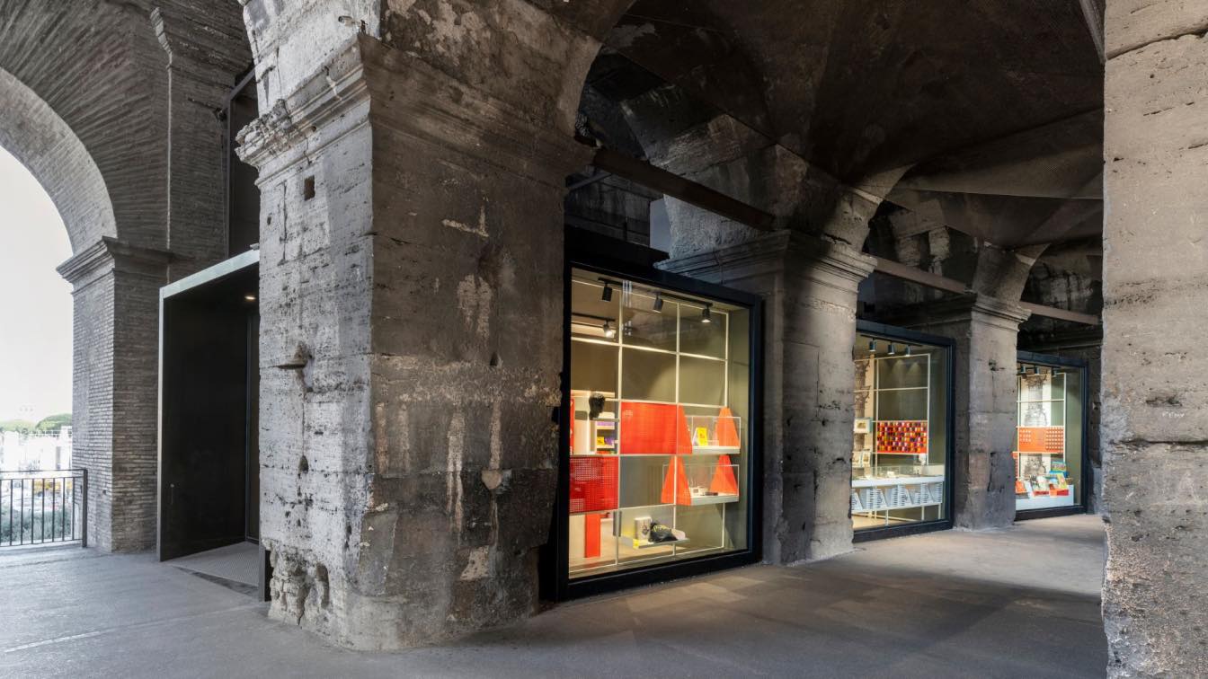
Features common to the various interventions include an extremely light furniture system in the design, which stands out for the choice of light hues and the transparency of the micro-perforated metal sheeting - on design -, but at the same time is strongly characterized by precise color variations different for each store, in the desire to return a unique identity to each space. Thus, to the light shades are added the chromatic elements in perforated sheet, which buffer or act as a backdrop, different presence for each of the stores: the sulphurous yellow for Colosseum First Gallery, the scarlet red for Colosseum Second Gallery, the green celadon for San Gregorio al Palatino and yellow cadmium for Clivo Palatino.
Within each space, to connect and at the same time emphasize the different parts of the store, the format provides full-height graphic fields, such as backdrops of the furniture, to emphasize the identity and uniqueness of the places. Graphic spaces interpreted, between memory and irony, by Studio Sonnoli who has thus chosen to alternate the shelves a narration for quotes and ad hoc references.

The Clivo Palatino store, the last of the 4 newly opened stores, is located inside a newly constructed lower volume, and is characterized by the presence of a large ribbon window overlooking the Archaeological Park. For this store, Migliore+Servetto has designed a series of ad hoc bases placed under the windows. To overcome this furniture some mobile towers allow you to set up the showcase in a versatile and light way, in a continuous addition of perspectives, ensuring the visitors an optimal fruition of the suggestive landscape.
The new bookshops conceived by Migliore+Servetto propose a system integrated in the exhibition that enhances the richness of the contents through the lightness of the furniture and puts the visitor in dialogue with the imposing and monumental context in which each bookstore is inserted. The set-up has in fact its strength in being a flexible, adaptable and interchangeable system in the context of the different needs and sizes of the environments and to offer diversified levels of interpretation.
The exhibition space is substantially structured on the basis of five main elements: wall display elements to accommodate the different product categories; wall focus elements, for the targeted presentation of individual products or themes; double-sided central elements with function of definition of paths and flows; thematic islands, for an exposition of individual themes; checkout element, for customer support and assistance.
The sign that characterizes both the murals and the islands is "the frame", with its ability to symbolically and functionally circumscribe the merchandising displayed. In fact, the frame element works synergistically with the product offer, making itself repeated sign, added, juxtaposed according to the needs, acting as a background as well as a support to the products themselves.

The new spaces, conceived by M+S, focusing on the visitor and thinking about his movements in space, were conceived as paths within a sort of contemporary Wunderkammer, where the visitor is surrounded by the refined selection of texts and objects proposed by Electa, in which you can get lost. Beyond its function as a sales space, the bookshop thus becomes a narrative landscape, a place of discovery that turns in memory, stimulating cultural growth, through a valorization of the wise offer of contents and a constant dialogue with the extraordinary architectural context that contains them.
The project to redesign the Electa bookshop in Rome follows a series of timely interventions to renew and upgrade the Electa bookshop in the spaces of the Venice Biennale (Cà Giustinian and Corderie), inaugurated on the occasion of the 59th International Art Exhibition, and at the Lido for the temporary store for the 79th edition of the International Film Festival.
Founded in 1997 by Ico Migliore and Mara Servetto, Migliore+Servetto is an Italian design studio based in Milan that has carried out over 800 projects in 21 countries. It has won numerous prestigious international awards, including three Compassi d’Oro. The firm specialises in the creation of branding projects and narrative spaces - public areas, museums, exhibitions, installations, projects for retail, hospitality and entertainment - engaging at every level, from interior design to graphics, from video to multimedia. Ico Migliore is Professor at the Politecnico di Milano and Chair Professor at Dongseo University in Busan, while Mara Servetto is Visiting Professor at Joshibi University in Tokyo. Over 150 companies and institutions have entrusted the firm with their projects over the years, such as Max Mara, Tod's, Adidas, Lexus, Alcantara, Boffi, Samsung, Bombardier, the New York Times and Wallpaper*. Migliore+Servetto are behind several major cultural destinations in Italy and Europe, such as the Egyptian Museum in Turin, the Miramare Museum in Trieste, the Chopin Museum in Warsaw and the ADI Design Museum in Milan. In the field of urban design, Migliore+Servetto realized the Line Park a Busan, South Korea, winner of the City_Brand&Tourism Landscape Award 2021, and the Waterfront Door / Into the Ocean, also realized in Busan in collaboration with 40 local artists. The Studio also curated the Interior, Exhibition, Multimedia & Graphic Design of the Procuratie Vecchie in Piazza San Marco in Venice, conceptualising the spaces of the new headquarters of the Generali Group’s social foundation, The Human Safety Net.


