STILL YOUNG: ARC'TERYX boasts a global presence, with stores strategically located in premier urban business districts worldwide, ensuring a high-spec, immersive experience that aligns with consumer expectations. As the industry's foremost leader, infused with the essence of Vancouver's forested and mountainous landscapes and contemporary aesthetics, the brand is poised to make its mark in Beijing’s iconic Sanlitun business district. This move, which targets the high-end consumer market, will spark a resurgence in outdoor sports.
The design narrative draws inspiration from adventures amid mountains and forests and pays homage to Vancouver's cultural context. Through a continuous dialogue with nature, the store guides consumers through diversified themed spaces, offering an unprecedented experience for both outdoor enthusiasts and the brand's veteran fans.
1. Artistic recreation: tracing back to Vancouver's cultural roots
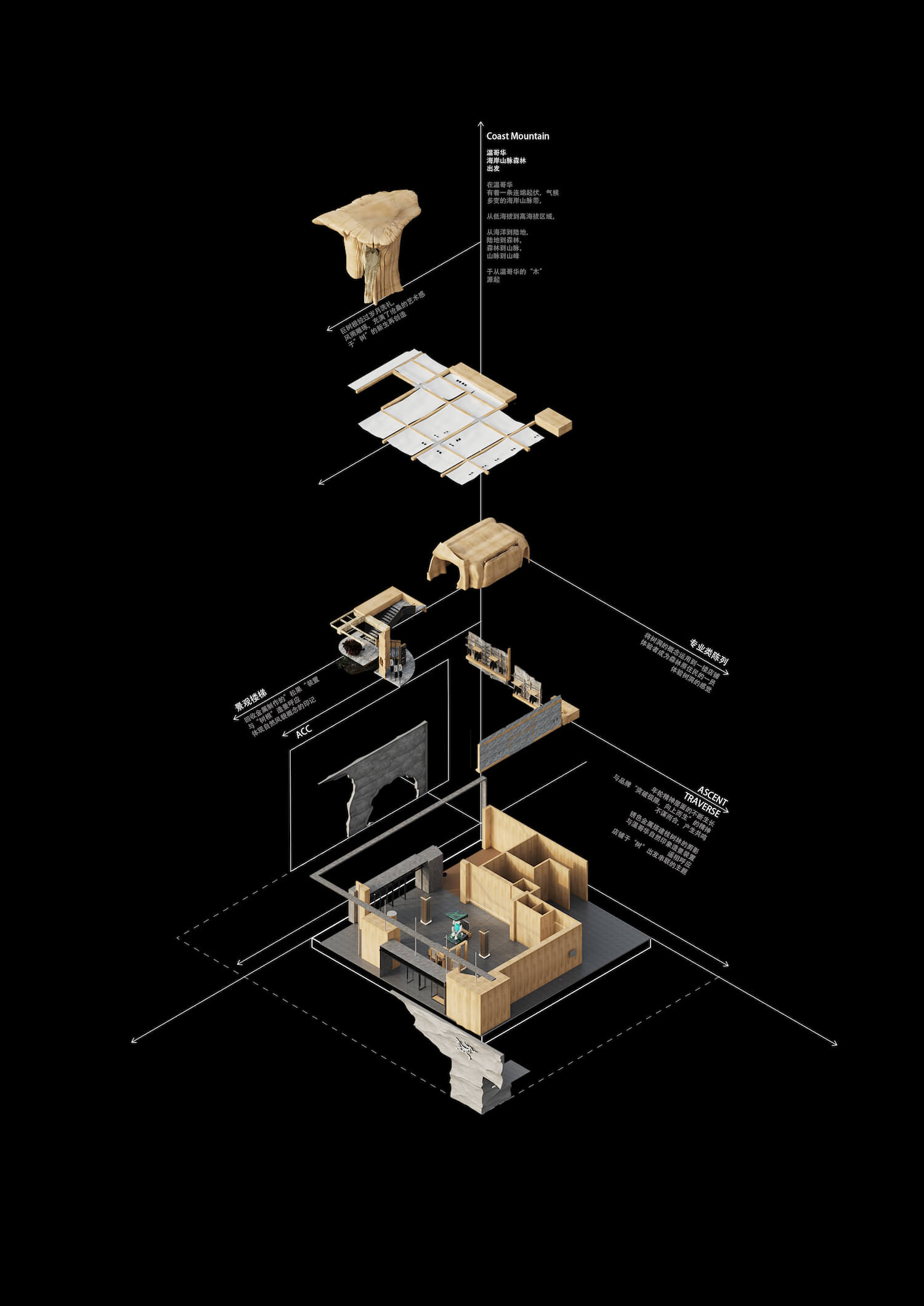
In the initial stage of schematic design, the design team delved deep into Vancouver, finding inspiration from local artists' reimagining of "trees". This re-creation became the primary muse for the design, which seamlessly weaves the urban outdoor cultural artwork into the store.
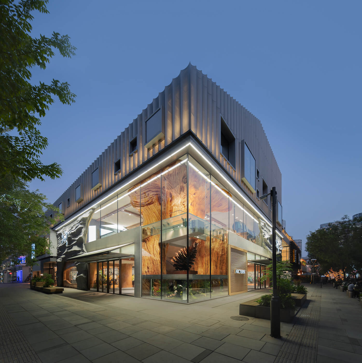
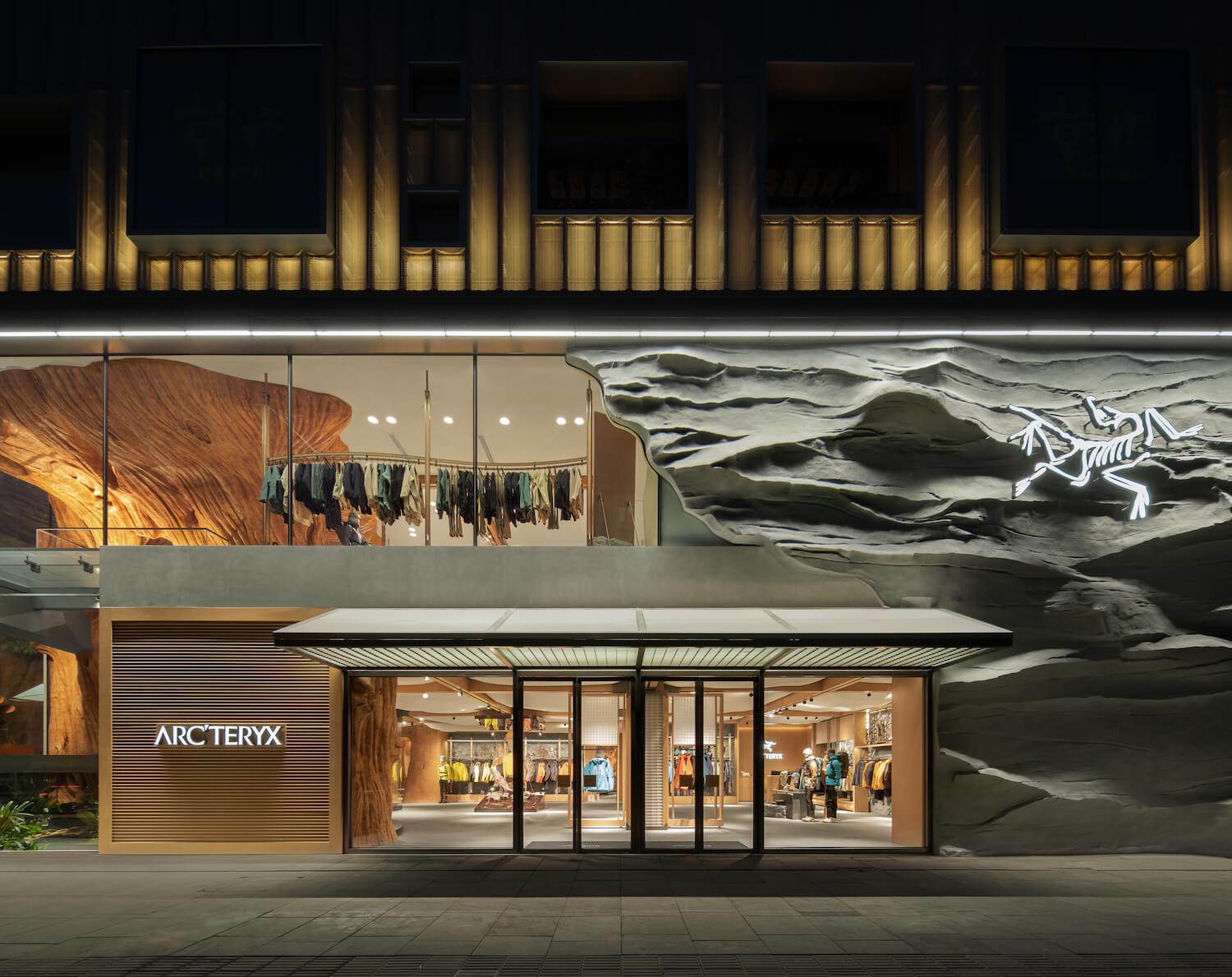
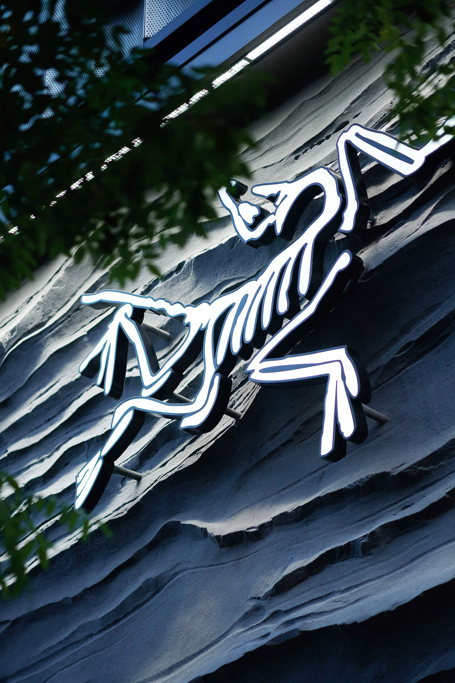
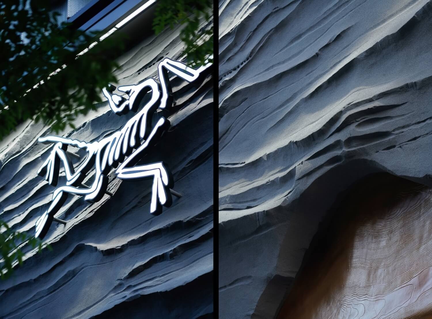
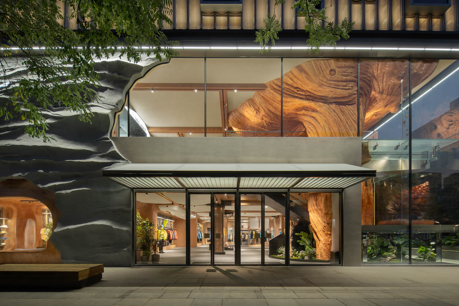
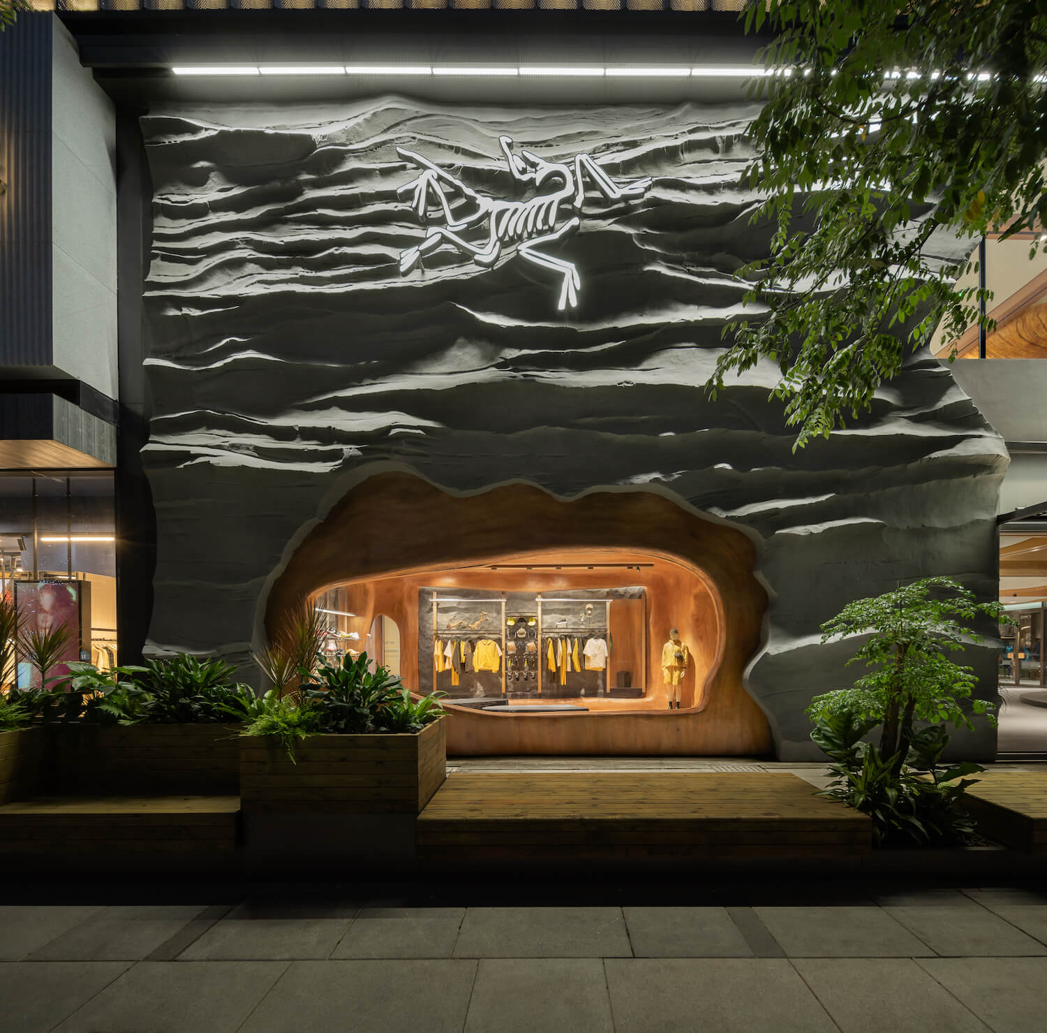
Situated on an L-shaped site, the store features a facade crafted from gray rocks embedded with glass. Employing bold design techniques, this composition not only creates a striking visual effect but also demonstrates the brand's distinctive and memorable identity. The design captures the essence of a natural mountain. A luminous installation in the shape of the brand's skeleton logo is placed on the rugged surface, forming a unique brand atmosphere in the external environment to invite customers into a setting that encapsulates the spirit of Vancouver's mountains and forests. At the entrance, a grilled lightweight acrylic canopy is set up with an extended lounge area reaching out towards the street to engage with consumers.
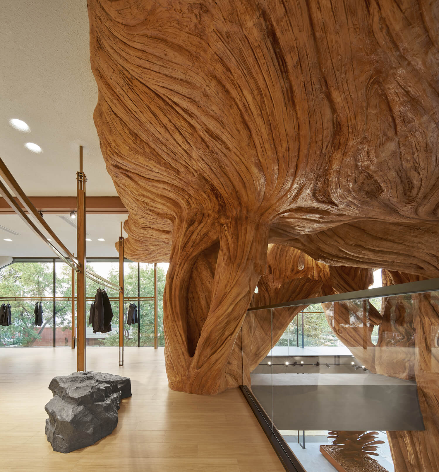
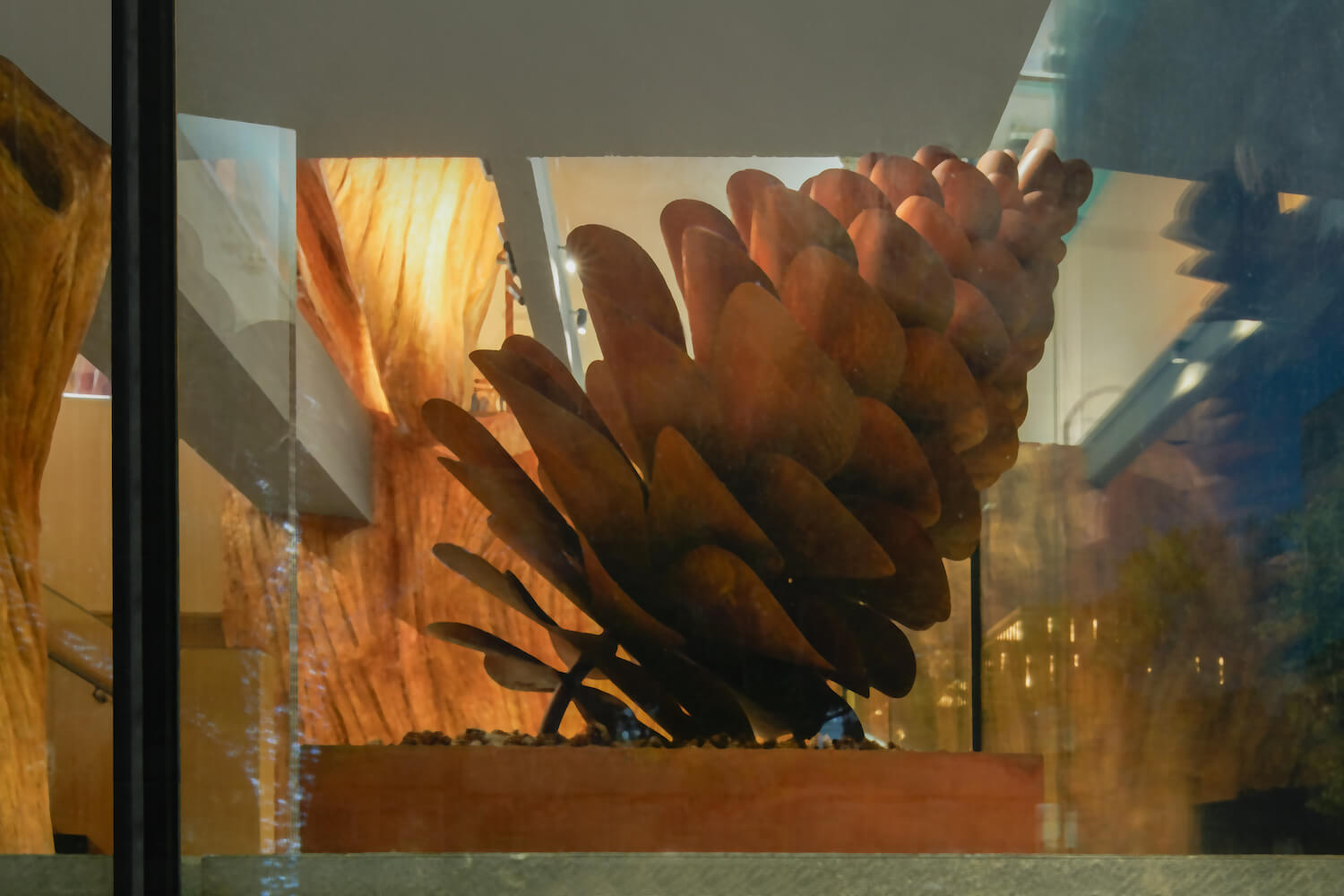
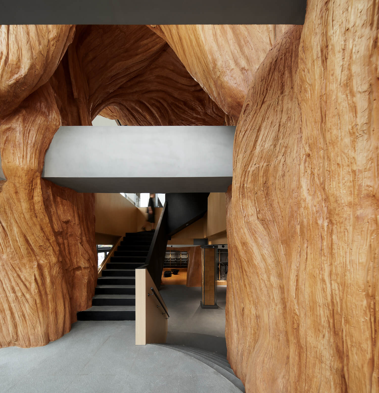
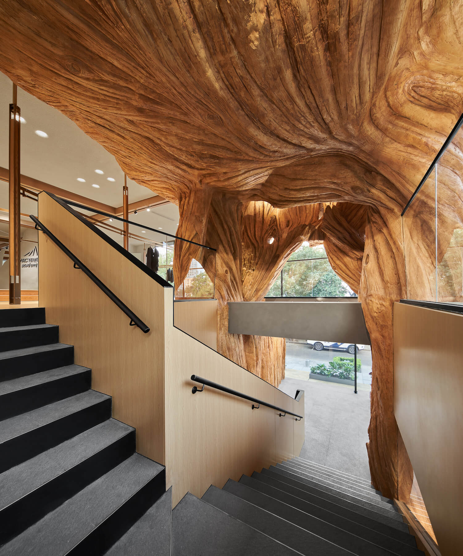
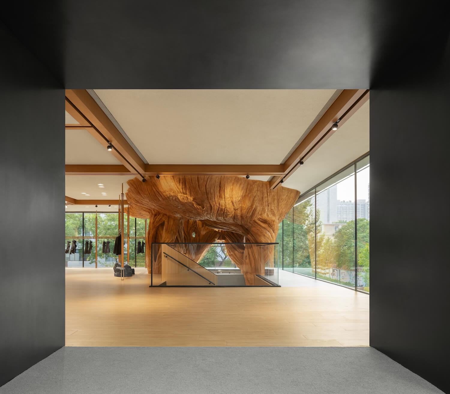
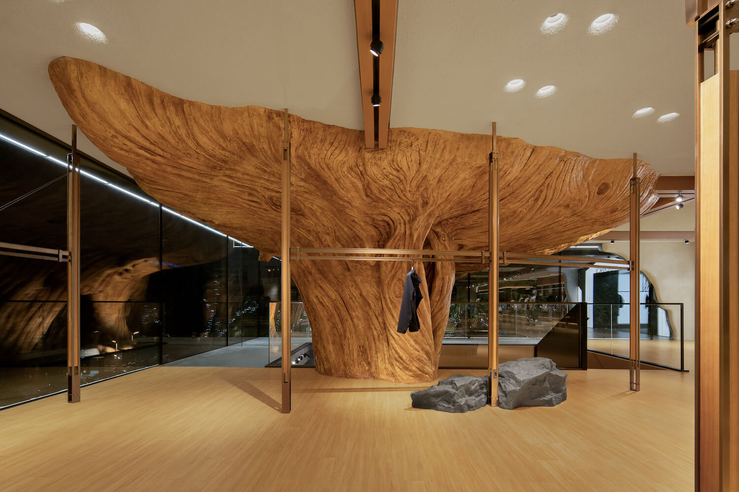
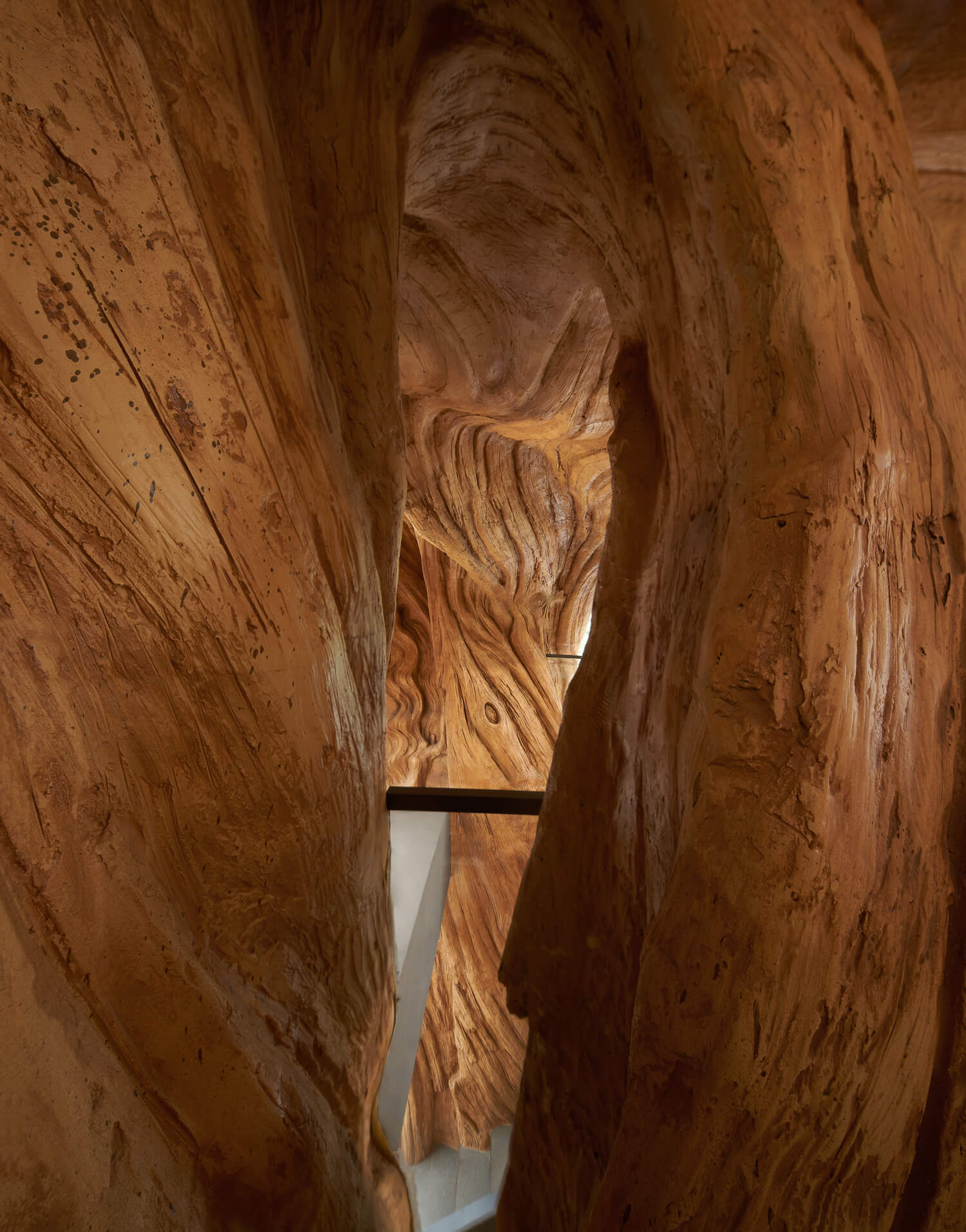
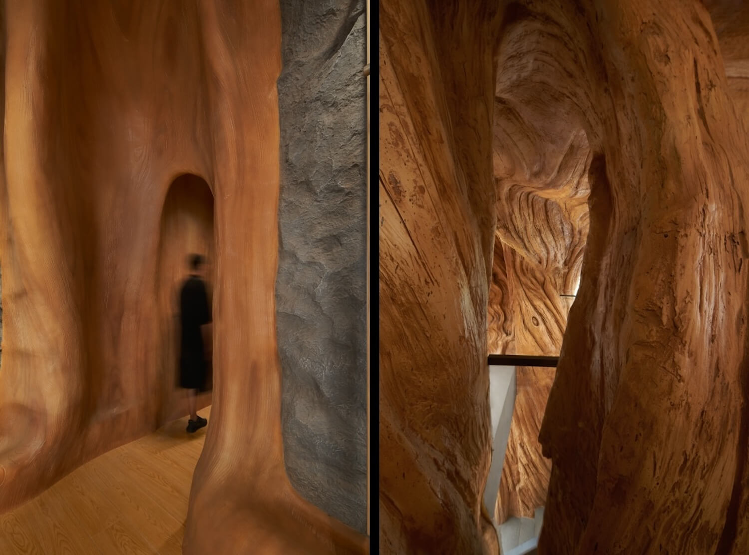
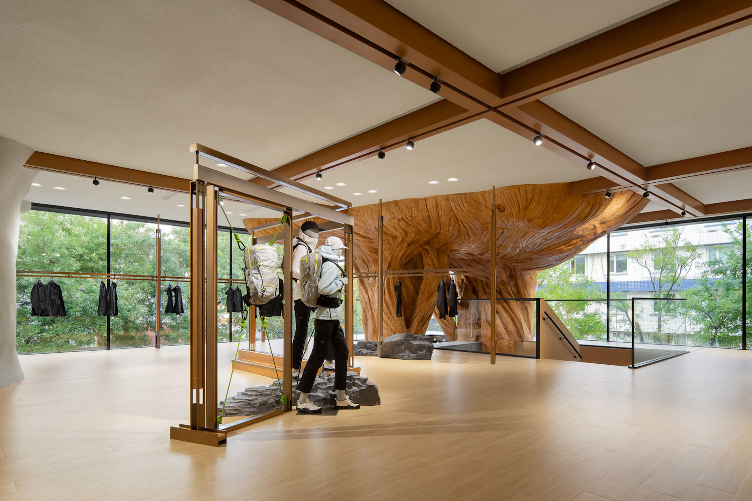
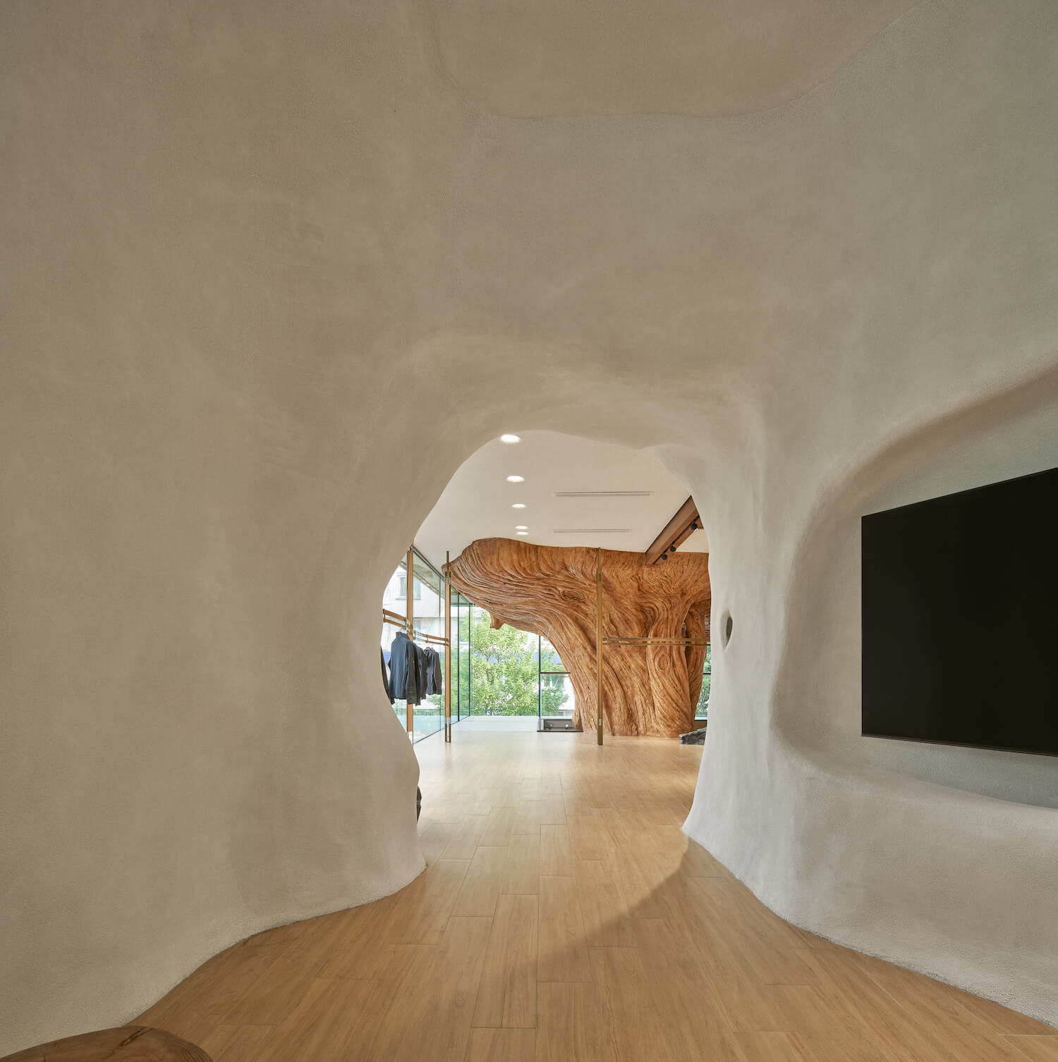
The space strives to foster a harmonious connection between humanity and nature and interpret the spirit of the outdoors through innovative artistic expression. Positioned in an elevated corner of the store, a colossal dead tree's root extends vertically along a transparent glass facade, seamlessly blending into the store's setting. The project emphasizes the sustainability of materials. On a suspended staircase platform, the design team introduced a 2-meter-high pinecone art installation crafted from rust boards recycled from factory waste. This installation harmonizes with the upward-reaching large tree root, cultivating a profound artistic ambiance.
2. Wood and rock elements: inspired by mountains and blended into nature
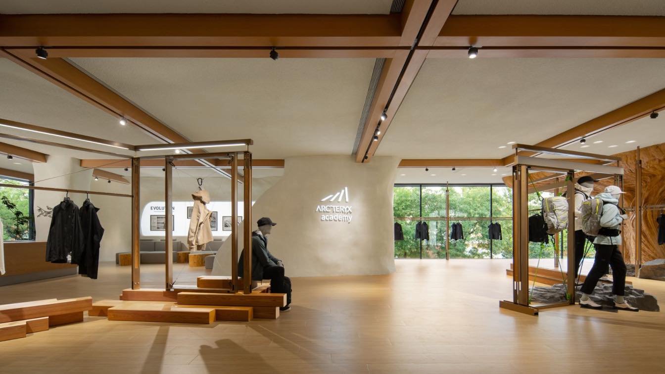
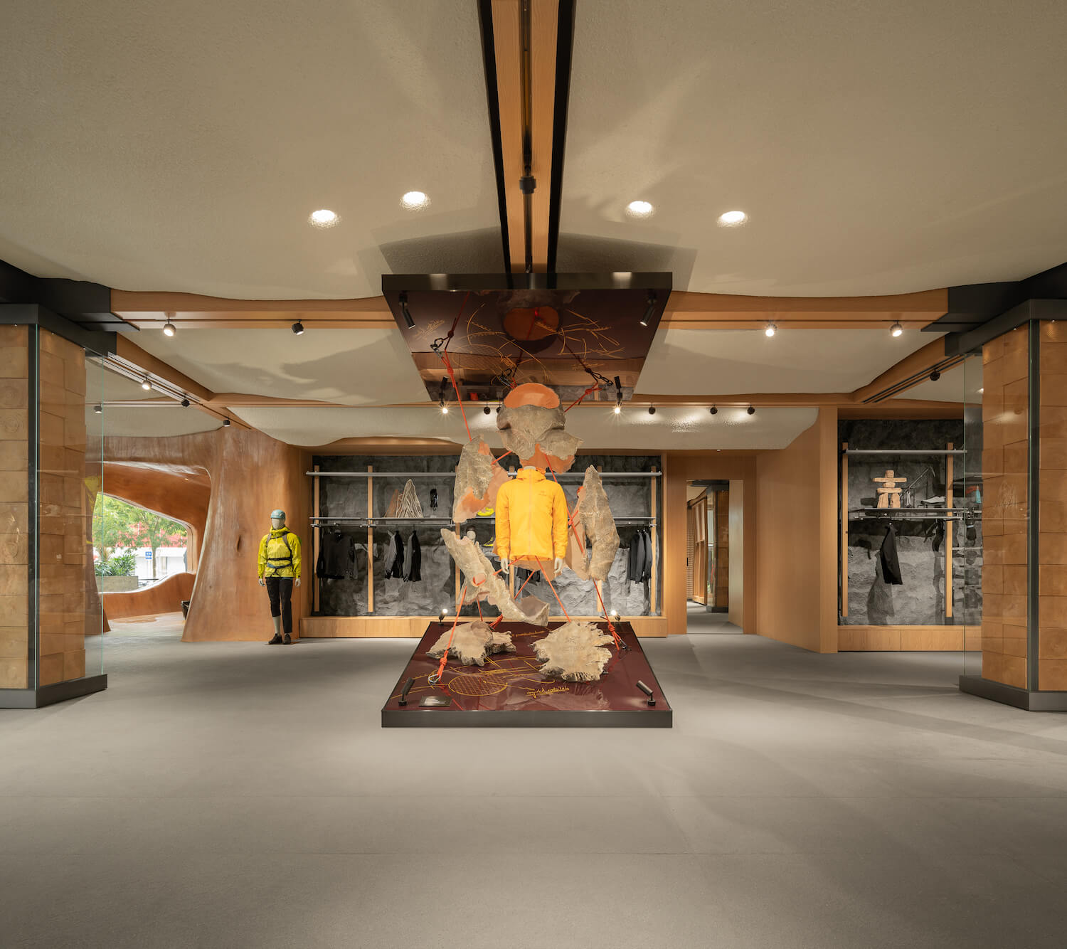
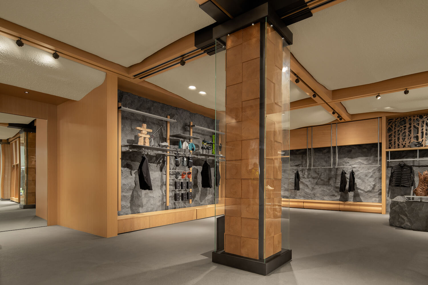
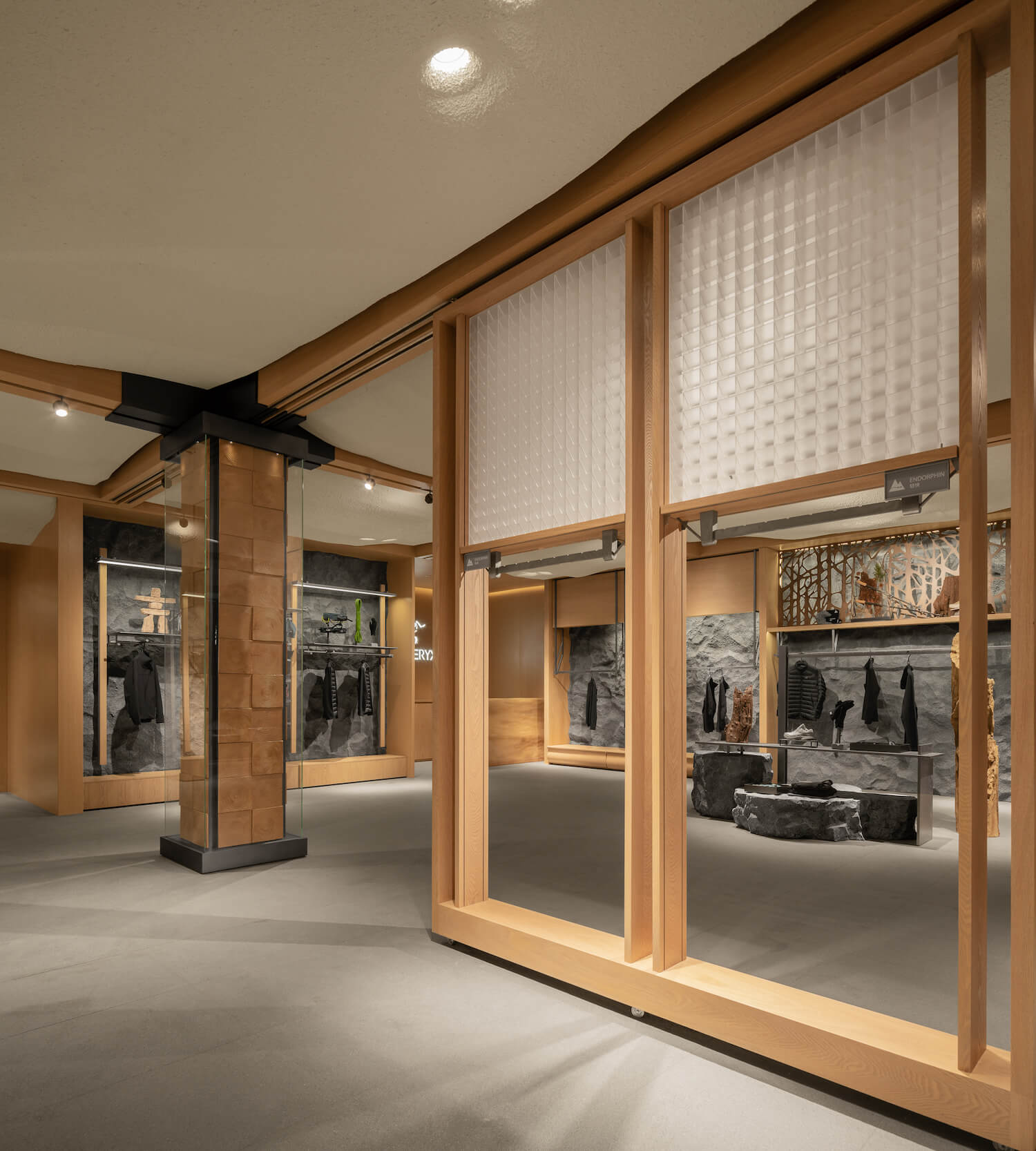
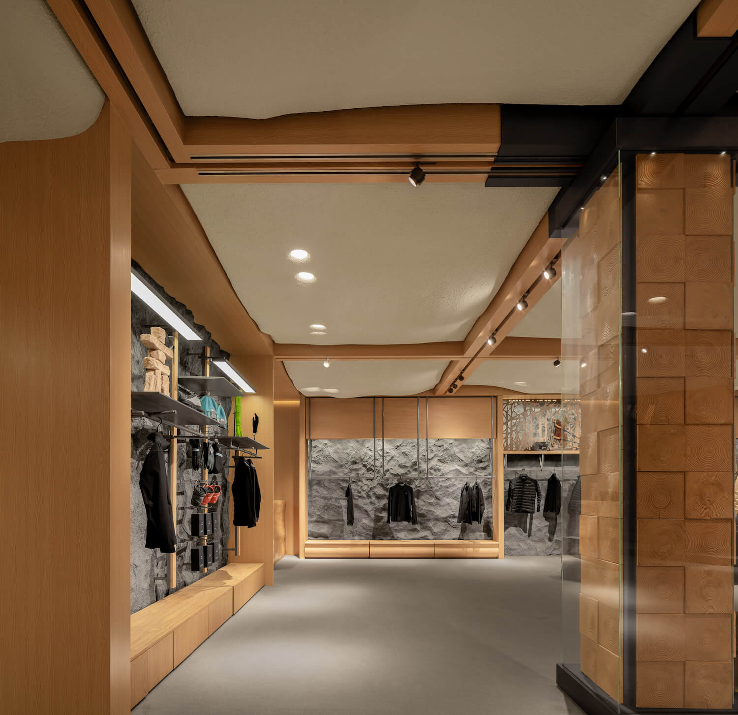
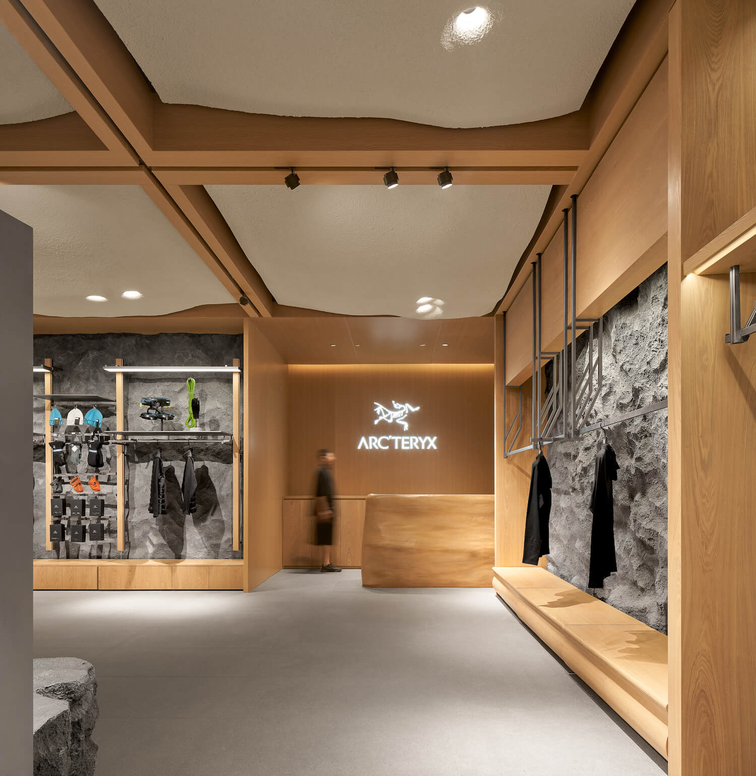
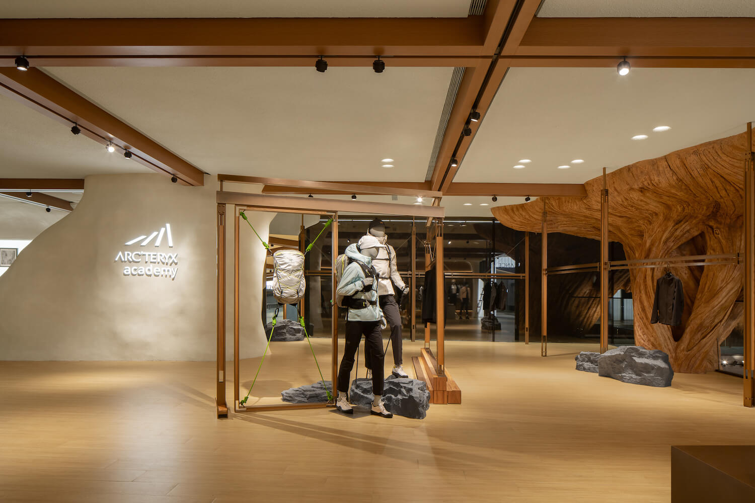
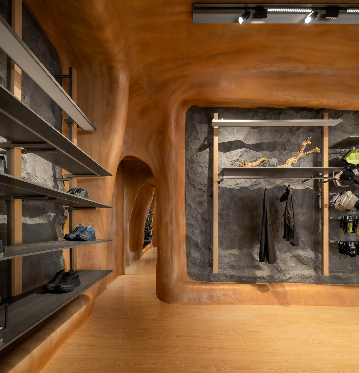
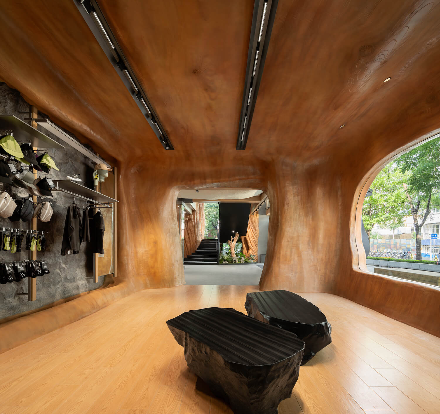
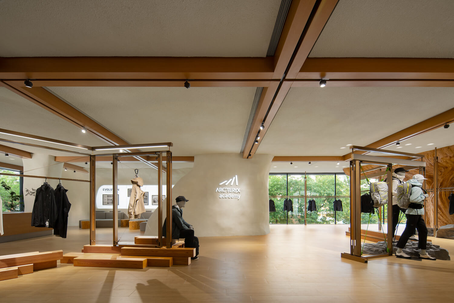
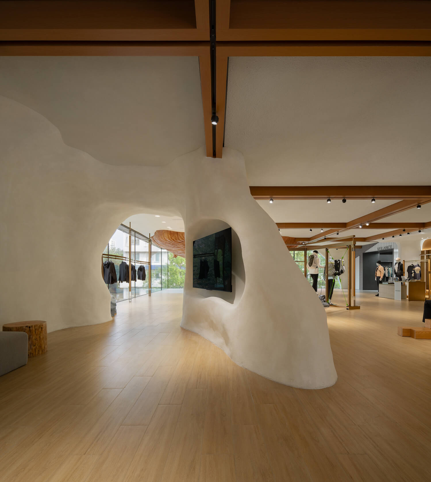
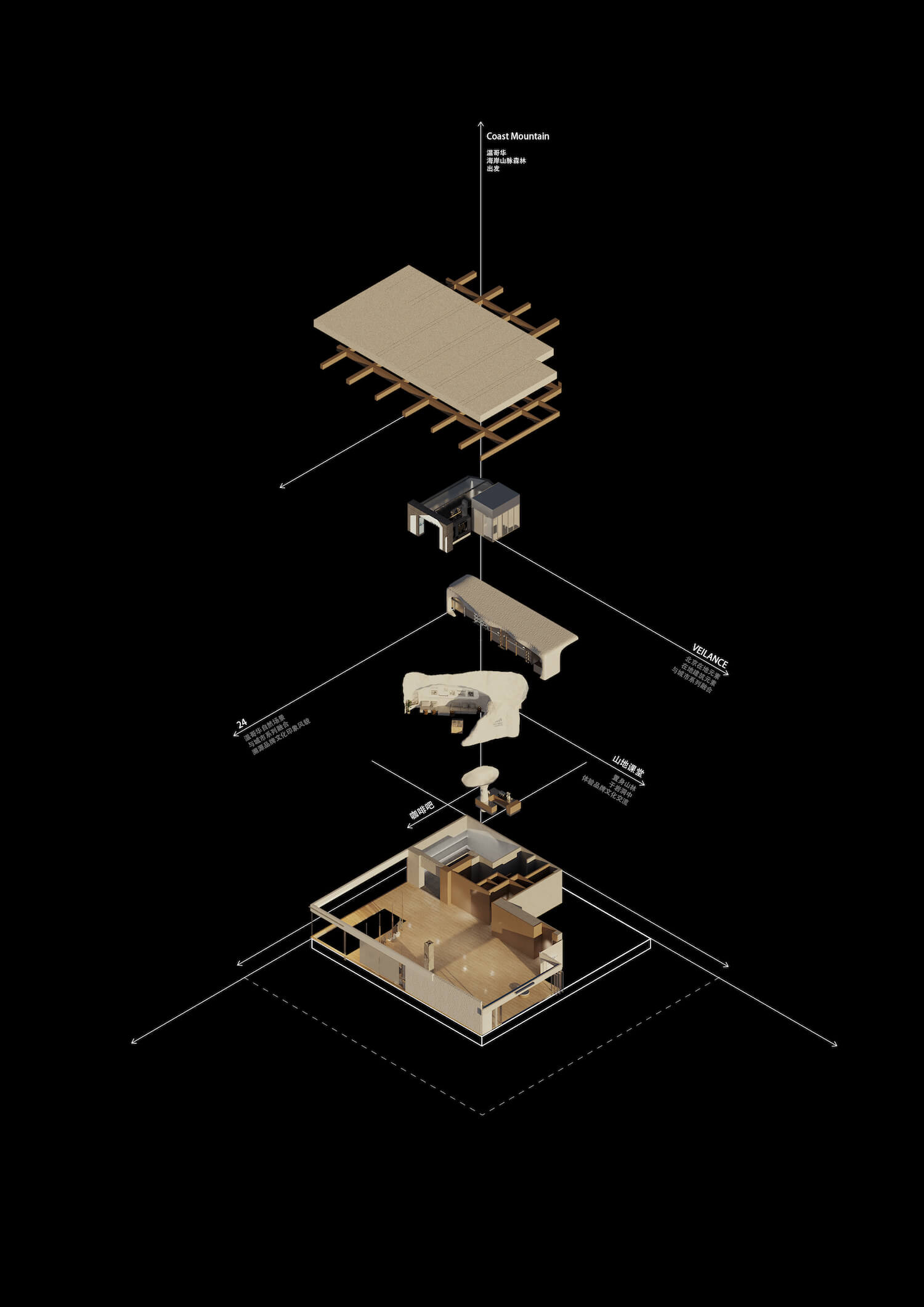
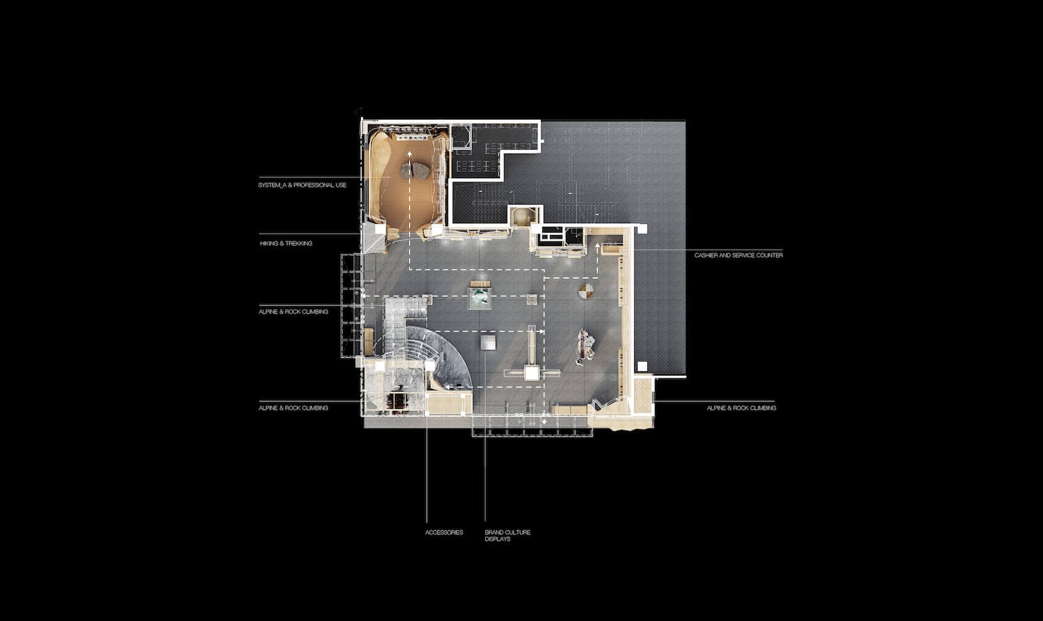
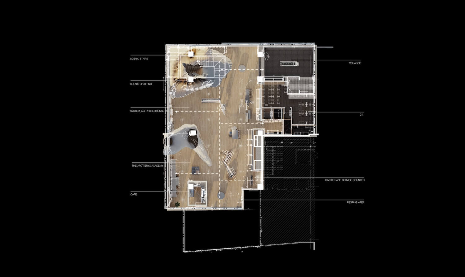
In this two-story store, the first floor is designed as a dedicated space for the professional rock climbing and hiking series – an area suited for mountain and forest-themed scenarios. Meanwhile, the second floor is curated as an urban life product area for the 24 Collection, the VEILANCE Series, and in-store sharing sessions on mountain skills. Throughout the entire space, elements of rocks, trees and wood grain are incorporated into the mountainous backdrop to express the brand DNA of ARC'TERYX. A combination of ambient lighting and localized lighting for products contributes to the creation of distinct atmospheres in different areas through the interplay of warm and cold tones.
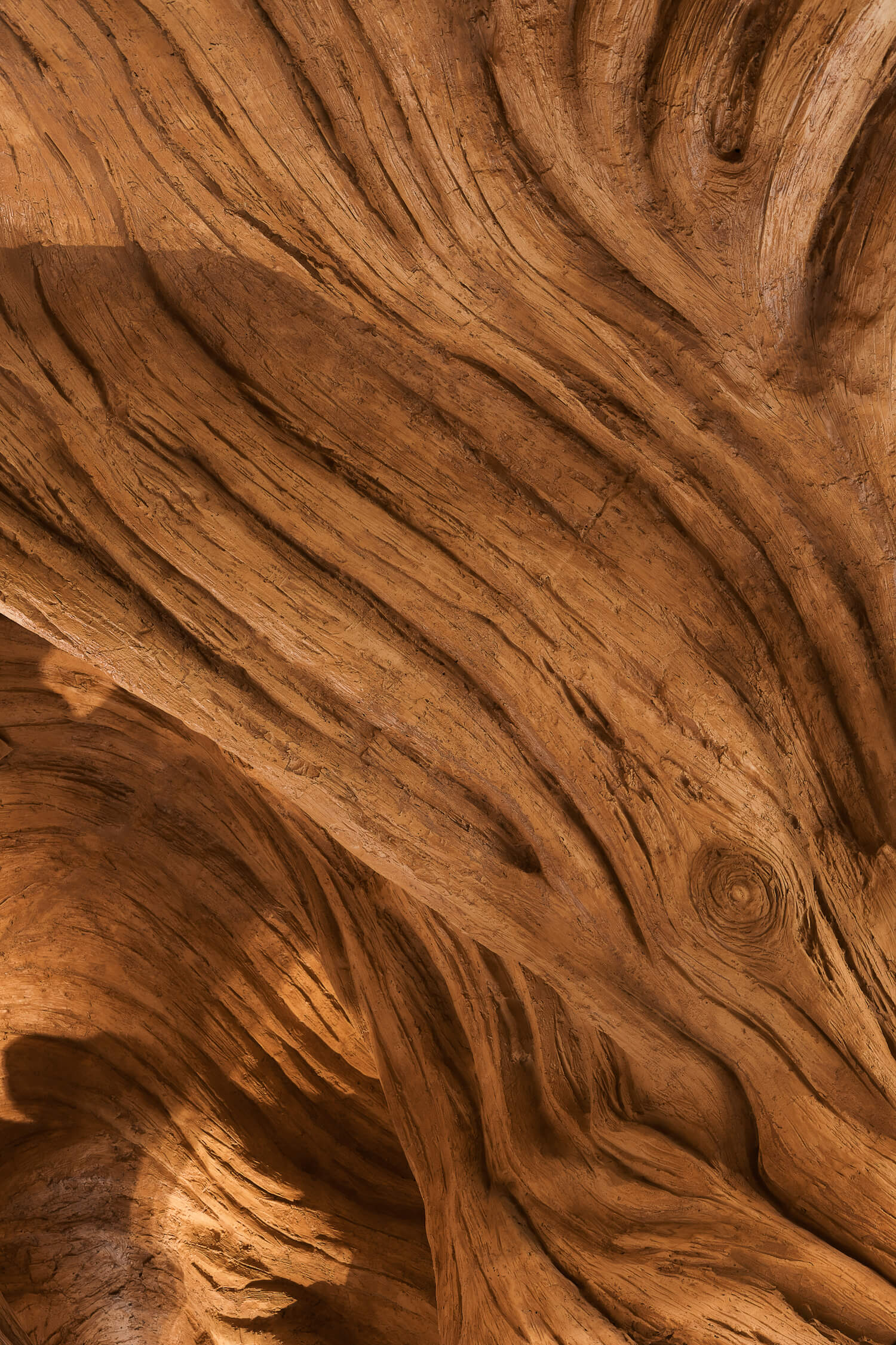
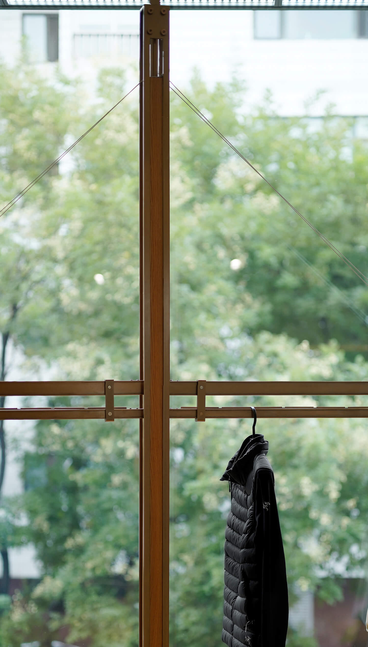
The design team hunted for fallen dead trees in the forest and transformed them into decorative columns by slicing and encasing them in glass. The tree rings on these columns serve as a visual testament to the trials and tribulations endured by the trees during their growth in nature – a perseverance that resonates with the spirit of ARC'TERYX, which aims to break through limits and keep reaching upwards.
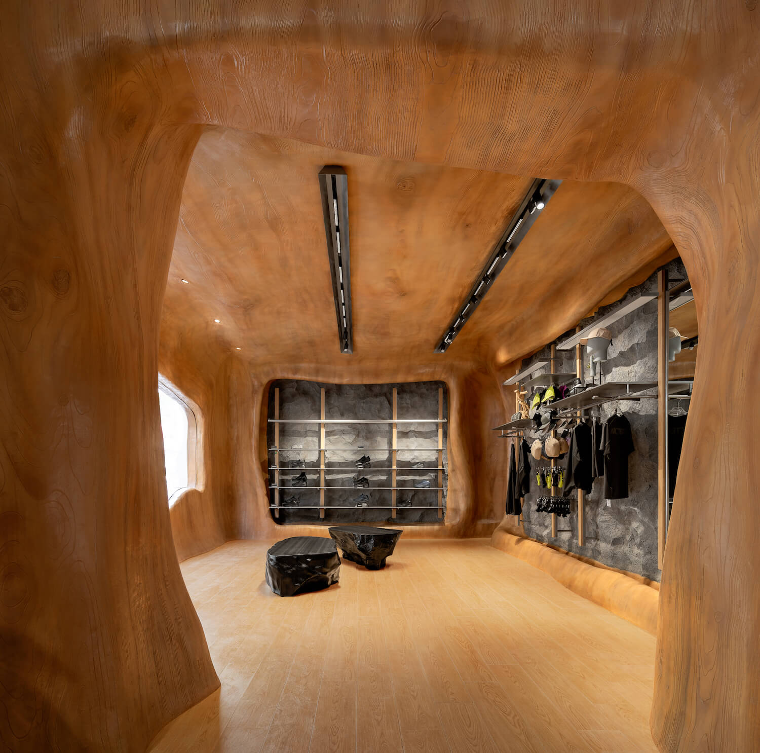
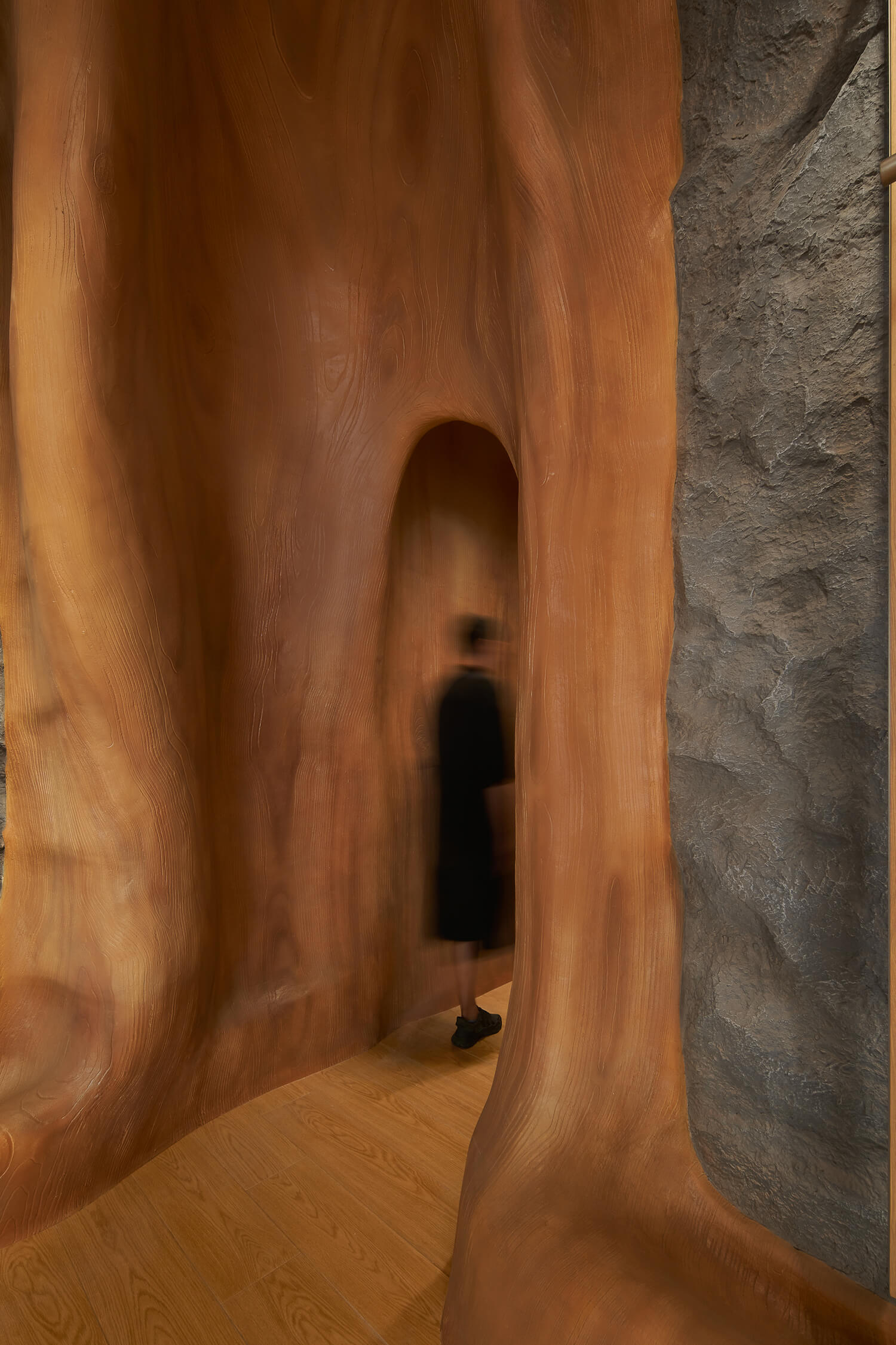
A customized irregularly shaped rock platform erects in the display area, complemented by a rust-colored metal wall featuring tree branch silhouettes, echoing the overarching theme of "trees" in the store. The concept of tree holes is also applied to the first floor, where each scene draws inspiration from nature, catering to the desires of outdoor enthusiasts. This space is primarily dedicated to the outdoor product line for young people, which is also available for the release of special merchandise in the future.
3. Urban fabric: a fusion of culture and technology
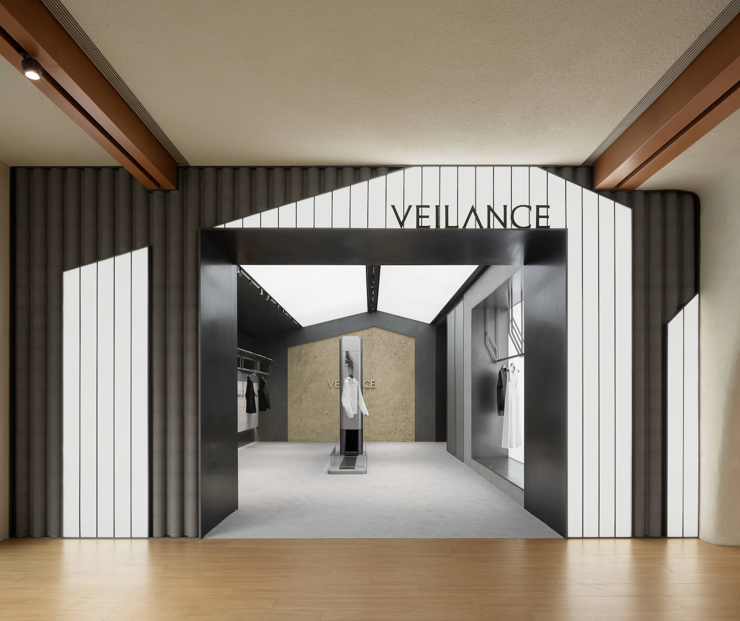
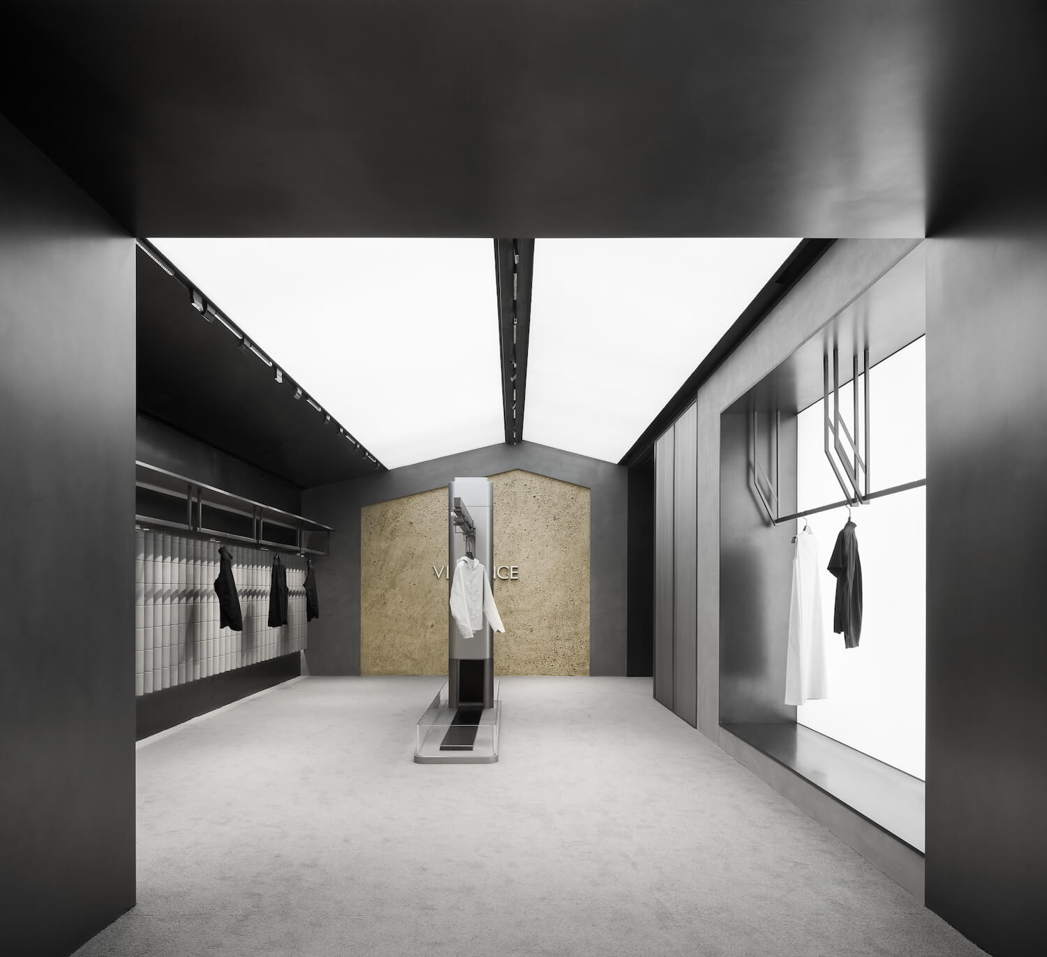
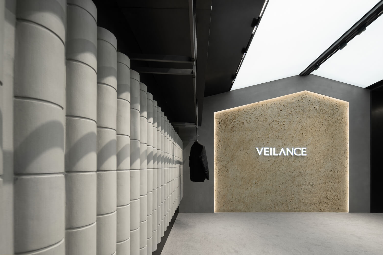
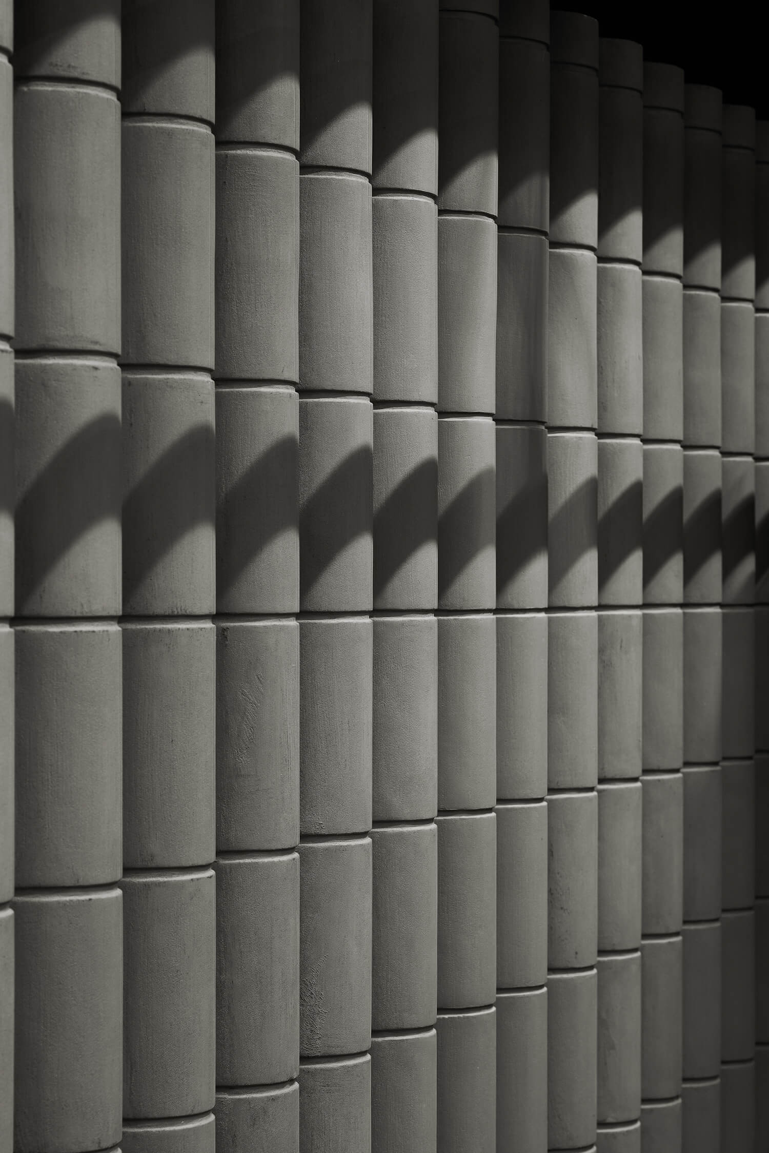
Beijing boasts a skyline where ancient buildings majestically merge with the sky. Drawing inspiration from this cityscape, the project incorporates the element of eaves tiles into the facade of the VEILANCE Series area. This design aims to evoke the aesthetics of ancient Chinese architecture and showcase the brand’s cultural richness and inclusivity. The use of gray metal and cement contributes to a spatial ambiance infused with a solid feel, complementing the temperament of outdoor products within an urban environment.
The overall space emphasizes the harmonious blend of an outdoor feeling and a sense of technology. Display installations are crafted with acrylic and metal materials and mirror the forms of production line equipment. This choice seeks to spotlight the brand’s dedication to research and development and its modification techniques, while paying homage to its outdoor spirits.
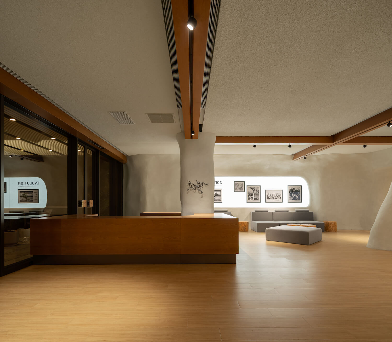
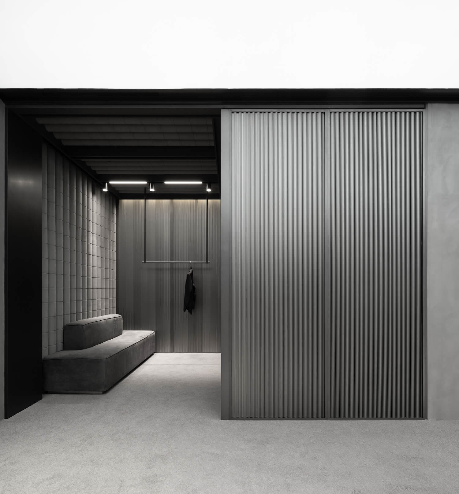
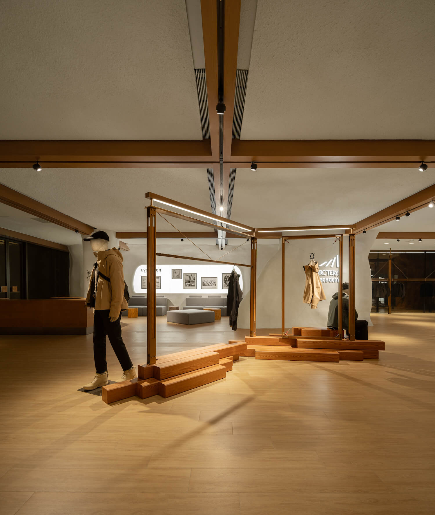
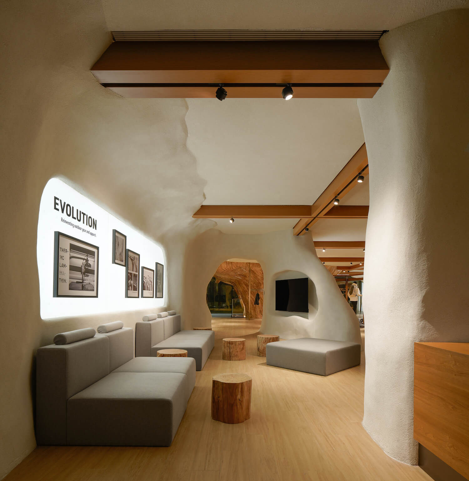
Within the 24 Collection product display area, wooden frame structures are adopted. Meanwhile, an irregular mountain-shaped display platform creates an outdoor vibe through details on its base. A cavern-shaped installation takes center stage in the area for sharing sessions on the second floor. Low tables made of timber piles, fabric sofas, and decorative floor stoves collectively craft a cozy setting infused with a woodland feel. This environment allows consumers to enjoy coffee while listening to stories shared by rock climbing experts, thereby bringing consumers closer to the brand through brand promotion.
Diving back to mountains and the greater wilderness, being prepared for exploration, and experiencing the world through our bodies marks the initiation of our connection with the vast expanse. ARC'TERYX stands as a premier brand championed by numerous outdoor enthusiasts and extreme sports experts. The opening of its landmark flagship store in Beijing represents an innovative fusion of nature, outdoor sports and art, and a fresh interpretation of a sustainable outdoor lifestyle.



About
Founded in 2007, STILL YOUNG is headquartered in Shanghai, and has offices in Guangzhou and Wuhan. The design practice is dedicated to delivering high-standard, customized spatial solutions to far-sighted leading commercial brands. Based on a holistic and systematic approach, STILL YOUNG works on full lifecycle design for commercial spaces. As consumption modes keep upgrading, the company's subdivided multi-disciplinary team guarantees the effective execution of creative ideas in all dimensions, to empower brand spaces to create everlasting commercial value adaptively.
Having been working in multiple sectors including catering, fashion, new retail and interactive entertainment and delving into lifestyles and business modes for 15 years, STILL YOUNG has established an international vision and gained rich practical experience. As a desirable design solution provider for Fortune Global 500 companies and emerging domestic brands, STILL YOUNG has been continuously engaging in business innovation in China. The practice is equipped with an experienced professional team, with a clear division of work in varied aspects including design, material techniques, VI, site survey, MEP, and HVAC, etc. STILL YOUNG approaches commercial design through logical thinking, and manages to create differentiated, innovative spatial scenes, hoping to convey the value of design to clients and end users.
The innovation of commercial design is relevant to the future of cities and public life. As the development of economy, technology and culture in China has been breeding infinite possibilities for commercial space, STILL YOUNG established a LAB team dedicated to chain brands, to deliver differentiated designs for each project. The LAB team adopts a work approach that effectively combines standardized practice with experimental original design.
STILL YOUNG strives to develop into a leading original design platform that gathers emerging design talents based on a philosophy of inclusiveness and diversity, to build a Chinese design community with strong global presence, and to seek mutual growth with the staff and the clients.

