The project is located in Chancheng District, Foshan with a total site area of 7,865 square metres. From the general layout, these are two parcels of land. The design goal is to build two new buildings with different functional requirements, that is a BMW Green Star BEACON project and LEED BD+C gold certification, human-centred multifunctional showroom with its internal space integrating social contact and office. A corridor runs through the two buildings to form a single building volume from the appearance.
#01. Exploration of Green Sustainable Buildings
The southern climate, represented by Lingnan, is particularly in need of shade and protection from the heat. From the very beginning of the scheme design, ARCHIHOPE have been thinking about sustainable architecture as the core of the design. Inspired by the Qilou, a unique architectural style in Lingnan, local buildings' adaptation to climate, solution to shading, ventilation, and heat dissipation in particular, was taken into full consideration to deal with high temperature weather and urban heat island effect.
Therefore, ventilation and heat dissipation measures such as skywells, cooling alley, open floor, secluded alley and breathing wall, are made full use of inside and outside the whole building to strengthen the convection of natural wind. A corridor is used to connect the horizontal traffic moving line between two buildings and overhangs the curtain wall, forming a multifunctional building form integrating elevated corridor, showcase and sunshade shed. And the corridor in the traditional form of sunshade has also evolved into a new facade system for the building.
In addition to emphasizing the efficiency of shading, it is also exploring an architectural form with the integration of shading and architecture to respond to the subtropical climate. And to design an inseparable volume made of surrounding corridor and buildings on two parcels of land is also based on this consideration. Therefore, the main facade of the building is formed by the interpenetration and occlusion of the massing, like two C-shaped structures fastened together, to integrate several different functional areas together.

The arcade building with cantilever structure produced by setting back of the curtain wall on the first floor, provides a curtain wall environment with fluent wind field, excellent shading effect to minimize glare, so as to avoid the interior space from overheating and provide interactive space away from sunshine, heat, wind and rain for the operator and pedestrians, with shade and protection within the curtain wall.
For the cantilevered area above the "arcade", its external facade is inspired by spider webs in nature, merging lattice screen and metal mesh having a good effect of shading but not completely hindering the daylight into the interior. It has also formed a large grey space of terrace on the second floor, providing guests with larger outdoor activity space and ensuring good lighting and ventilation.
The facade of the "arcade" in the southeast vehicle reception area is designed with perforated aluminum plates to minimize the heat gain effect caused by sunlight on the facade, achieving the goal of self-shading and creating an excellent customer experience.
For the sake of sustainable design, a series of sustainable design strategies have also been adopted, with every detail of scoring item including the thermal performance of the enclosure structure, building's self-shading systems, bicycle and changing and shower facilities, fresh air monitoring systems, efficient cooling and heating source systems, building energy metering for building lighting and indoor intelligent lighting control, efficient landscape water-saving irrigation, construction pollution prevention and control. In addition, detachable partitions and modular workstations have been adopted in most of the indoor exhibition areas and office areas, which greatly reduces energy consumption and enhances the sustainability of the building.

#02. Moving Line and Functional Blocks
Achieving the unity of people and vehicles is the design core of moving line in the entire building, encouraging more possibilities for activities and functions and allowing both people and vehicles to shuttle freely and interestingly. People can drive a car to every floor, interior and exterior space, and even the top floor of the building.
There are entrances and exits on each side of the building. From a macro perspective, exhibition areas, offices, and parking lots are arranged on three floors in total on the south with the workshops on the north. The exhibition areas on the south include car showrooms on the first floor, as well as a part of customer negotiation areas and offices. On the second floor, is the integration of customer rest areas, interactive areas, restaurants, tea rooms, cafes, book bars, children's playground and offices while on the third floor is mainly office and parking areas. With the corridor running through buildings between north and south, there are maintenance workshops on all the three floors on the north. There is also a runway behind the workshop through which cars can directly drive up to the roof.

#03. Art Exhibition Hall
It is hoped to create a bright and warm atmosphere in the interior design and a spatial layout with a sense of more relaxation throughout the space. So, the purpose of ARCHIHOPE's design for experience sense is to build an open space like an art exhibition hall with a clear and free visual experience making visitors more relaxing.
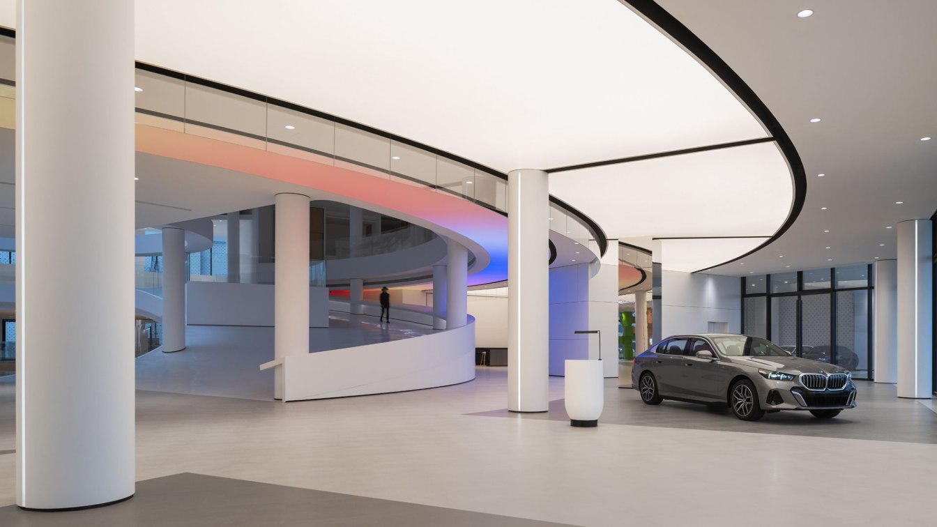
The design concept of the exhibition areas on the first floor is pixel modularity. Enlarged pixels are stacked into different shapes, mixing and matching with the exhibition vehicles and contrasting with dynamic annular coloured light film in large span on the ceiling, expressing a youthful and entertaining life inspiration with the coordination and conflict of model and color.
The atrium is designed into a sunken coffee area, a circular hollow space which is also the central part of the entire building. Sunlight pouring down through the light well on the top, how comfortable it is to enjoy coffee with a few friends here. Besides, the design of the coffee service counter is also based on the concept of pixel modularity, appearing more youthful and colorful. With the circular lane in the atrium slowly around from the first floor to the second floor, the design not only increases natural lighting, but also creates a circulation of wind from outside to inside of the building, promoting indoor air convection and cooling, which can effectively improve the microclimate in building environment.
The indoor and outdoor forestation adopts the landscape design techniques of golf concept, and the building outfield is surrounded by micro-topography with paths curved round in it. Seedling selected for curtain walls and windowsills plants are mostly under soil culture in flower boxes. The initial intention of ARCHIHOPE's design is to provide a happy working environment and relaxing living conditions for those living in the building so as to improve their life quality.


