Bitte Design Studio: A kitchen and a garage shop is not usually what comes to mind when you think about a commercial space. But that’s what eventually appeared on the brief when Bitte was approached by Convoi & Garrison for the establishment of Convoi & Garrison Motorforge at Bintaro. Convoi is known to be an F&B establishment, serving Asian and Western dishes and highlighting the concept of communal dining experience. Hence the name ‘convoi’, which in Indonesian sometimes translates to ‘konvoi’ - an occasion where people ride together in vehicles to a gathering. While Garrison is well known as a one-stop garage shop and a lifestyle hub for riders in Jakarta.
The idea of this establishment is to combine the best of both brands by creating a gathering spot for riders to relax, shop and dine with fellow riders. Convoi & Garrison Motoforge sets its location in the greater Bintaro area by taking into consideration of the popular route that Jakarta’s riders community would take for their weekend ride, making the place an oasis for riders.
One of its kind, the 1500 sqm building is sprawled across two levels encompassing a premium Harley Davidson showroom, merchandise store, maintenance shop, kitchen and a lounge. “This project has two different functions. What’s interesting is that it has to belong within one location and cohesive to one another,” said Chrisye Octaviani. The project leader further elaborates, “Arranging the visually tangible parts is not so difficult compared to organizing the back end functions, which involves intense discussion with the client.”

Since Garrison serves as a garage shop and Convoi focuses on its F&B operation, the combination created a direct impact toward the structure of the space, where careful and deliberate planning is needed. The best strategy to achieve such a result is to focus on the function and connectivity between the two and how visitors would experience it. The visibility of Convoi and Garrison from the visitor’s point of view was also considered: How will the visitor see Garrison when they’re in Convoi and vice versa? All of this is to ensure that both brands get the most visibility while integrating both presence cohesively.
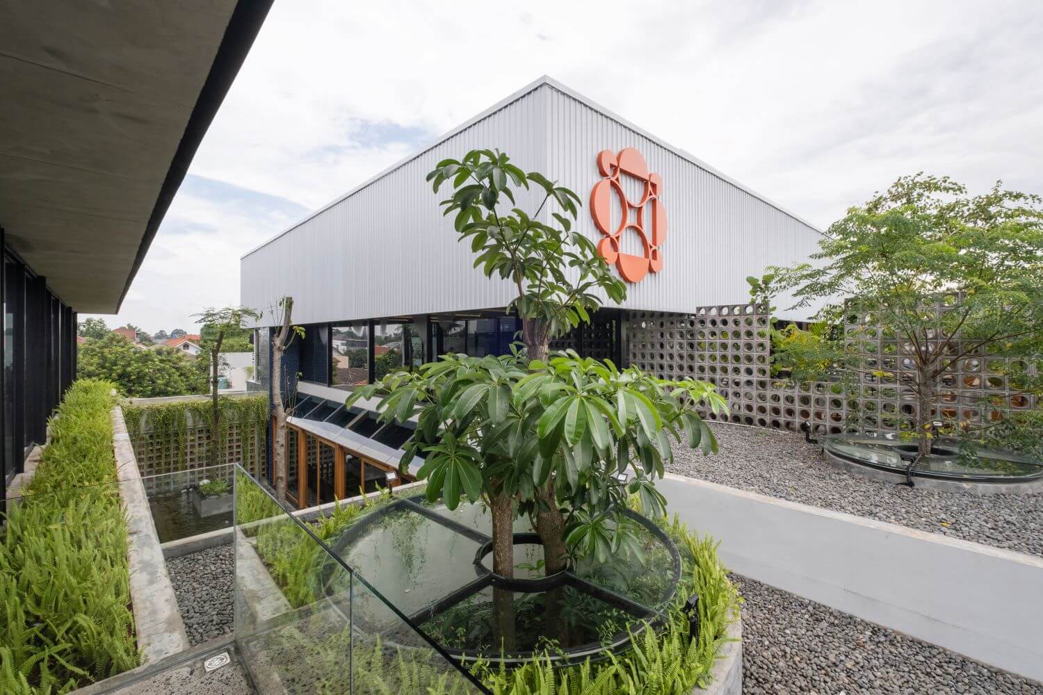
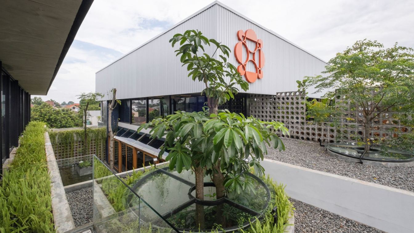
“We transformed Convoi as a casual social place, which visitors can enjoy from morning till night. We also try to experiment with the experience of space and material,” explained Chrisye. The team experimented around alternating between indoor and outdoor layouting, morphing the indoor area so that it appeared to be a part of the outdoors. A combination of materials, such as steel, wood and exposed concrete, was arranged to bring out the urban mood of the retail space. A brooding color tone engulfes the whole structure with a woody undertone, bringing a masculine outlook that is coherent with Garrison’s brand.
The team retained the masculineaspect of Garrison, all the while making sure that the design is still classy and marries well with Convoi’s own branding. Another signature design of Convoi & Garrison Motorfroge is the layout of the space. From the entrance, the access to where the vehicles are displayed informs visitors of the area’s division. was also installed as a divider and to create a micro climate into the environment.

Since layout plays a crucial part in defining the areas in Convoi & Garrison, the discussion of the space programming was the first priority with the client. All space functions have been pre-determined beforehand, making it easier for Convoi & Garrison to grow in its design while retaining its purpose. As the project progressed, further adjustments were made on the structure’s access and the finishing material. “Something rare happened within this project, which we don’t usually see in other projects, is how the client was actually the one who wished to upgrade the design and finishing materials to a better one.
The challenging part is making sure that each material is well integrated and does not dominate the other too much,” recalled Chrisye. From the outside, the massive blocks made out of container created an illusion of a stacked structure. A perforated concrete wall creates privacy for the inner outdoor area without adding density to the whole building. Glass doors and windows further showcase the motorbikes on the first floor and the retail space on the second.
Furthermore, the lower ground area merges an open-space garage with fluorescent lighting and glass doors to an outdoor parking space laid with white gravel. Overall, Convoi and Garrison Motorfage creates an immersive experience for visitors, especially for the dynamic riders of the city, in which the space allows them to kickback and relax with good food in the company of handsome cars and fellow community of riders.


