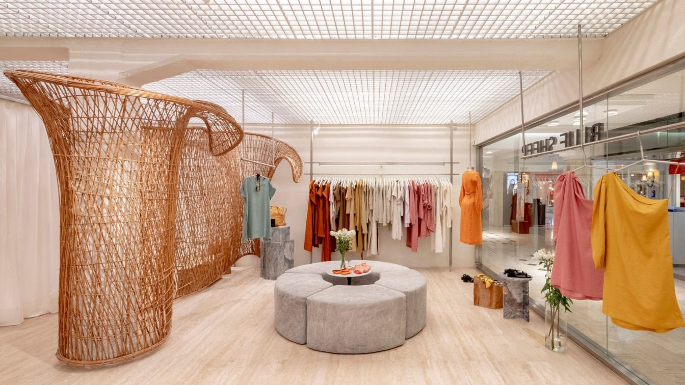
Vang Studios: Dedicated to the design of women's apparel, Blue Sheep presents itself as an honest, national, and inclusive brand. Its products stand out for their elemental design, crafted with a minimalist approach. This same focus is translated into the interior of the store—a structure of clean lines that expresses the essence of the project. It features an orthogonal enclosure of white planes that synthesize and elevate the spatial expression of its elements.
The project is conceived as an exhibition space for works of art. Under this premise, each garment becomes the protagonist. The fabrics, textures, and colors of the pieces are enhanced by the neutral and modern environment created to elevate their presence. The lighting, conceived as a gallery, unfolds in a continuous plane on the ceiling, materialized through an aluminum grid that covers the entire space.
The concept of the shop window is dismantled, generating a diffuse boundary with minimal elements, allowing the entire store space to fulfill that role. Following the same premise, the cash register is located in the storage area, hidden away, dedicating the entirety of the space to the user experience.
Spatial balance is achieved through a continuous dialogue between two opposites. The juxtaposition between perfection and imperfection becomes evident when organic and sensitive bodies are introduced into the neutral space. This back and forth is a constant; the smooth and pristine travertine marble flooring together with the artisanal wooden furniture, as well as the display table covered in plush fabric, converse with the stainless steel profiles that serve as display supports.

"Tejer en el aire", the artwork by Edgardo Madanes, speaks of constructing in the void. It creates transparent planes, a concept initially conceivable only rhetorically, but becomes tangible through his wicker piece. This site-specific work functions as a conceptual piece that transcends mere decoration and represents the brand's values. Madanes' weaving serves as a "macro" scale reproduction of the textiles that compose Blue Sheep's clothing. This sculpture not only manifests the essence of the product but also demonstrates how various specialties can be built with a contemporary approach using traditional resources. The result is an environment that merges tradition and innovation, creating a unique experience for users and encapsulating the essence of Blue Sheep.
What was the brief?
The project is commissioned by an Argentine clothing brand called Blue Sheep. It is the brand's first store in a shopping mall, as their other stores are located in smaller, more private settings. One of the key premises of the project was to rethink the brand's image in terms of interior design and store architecture to adapt to this new environment.
What were the key challenges?
Including a large-scale art piece with a central function in the project was one of the objectives. Its creation in an external workshop raised many questions about how this artwork would be ultimately incorporated into the store. Since the artwork had an organic morphology that the artist worked on and defined in their workshop, with dimensions different from those of the store, it was challenging to imagine how the sculpture would look in its final form in the projected site and how it would interact with the other pieces around it.
What were the solutions?
A meticulous survey of the space was conducted. Additionally, a 1:1 scale model of the existing column in the store was constructed in the artist's workshop to assess how it would interact with the artwork. Finally, trust was placed in the expertise of the hired artist to successfully resolve the task.

How is the project unique?
In addition to the site-specific artwork that takes center stage in the project, the user experience was designed in a particular way. The concept of the storefront was deconstructed, leaving it stripped down to allow the entire space of the store to fulfill that role. Following the same premise, the cashier is positioned in the store's storage area, hidden from view, thus dedicating the entirety of the space to the user experience.
Key products used:
The project is composed of contrasting materials that coexist in the space. The flooring is made of elegant and traditional travertine marble. On the other hand, the ceiling is designed as an aluminum grid, and the facade and display areas are made of stainless steel, giving a modern touch to the project. Other smaller-scale elements are characterized by their artisanal imprint, such as the carved and burnt wooden totems or the counter upholstered in textiles dyed by the brand owner herself.
Who are the clients and what's interesting about them?
In addition to being involved in fashion design, the client is also an art collector. Therefore, it was fascinating to explore how we could integrate these two worlds in the project, as she requested. Furthermore, her contemporary perspective on production and creative processes is evident in her brand, with a deep interest in incorporating artisanal and natural elements into her products.


