Pizza-restaurant GINO: a gastronomic laboratory with vinyl aesthetic
«Не (с)только про еду» (“Not only about food/Less about food”) – such code name was assigned by a MODGI team to the pizza restaurant on the territory of an apart-hotel VALO in Saint Petersburg. We were directed to a concept of the above public place by the owner’s preferences. Aesthetics of a vintage pizza restaurant or a café somewhere in an Italian suburb, an atmosphere of modern interiors with artifacts of the past and suave melodies played from vinyl discs – all those elements we brought together in an interior composition of the GINO food space.
About stylistics
Being inspired by the mood, which usually prevails in Italian cafes, and an expressive character of local citizens, we determined a concept of that interior. It is based upon a philosophy of freedom, where there is no place to overwork and abundance of décor. As a hint to heritage of a vintage Italy, we used a mix of retro-accents.
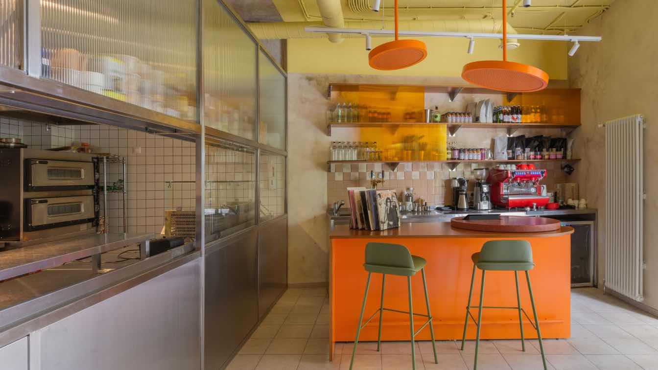
An optimistic and freedom-loving aesthetics of the past epoch we expressed utilizing a heart-warming palette. Bright orange and lemon-coloured, mustard and terracotta, heavy burgundy and olive shades we introduced into the interior in order to boost its neutral base of light tile, semi-antique stucco and metal.
Staying a key technique to decorate, those colour accents allowed to perceive such materials, as wood and metal, in the interior otherwise. Usually we imagine them in a traditional chord from chocolate and coffee-coloured shades to silver, gold and brass. There ceiling pipes, lamps and a portion of chairs look “audacious” and forward thanks to the colour per se.
Another style-forming keynote at the pizza-restaurant became furniture, lamps and wall luminaries. Their form is hinting to their link with a vintage past. Circular and ball-shaped ceiling lamps, conical elements of the table supports near a bar table and «slightly spread» legs of the chairs – all that is inherent to a retro-style and relevant in realities of a cultural capital.

Planning characteristics and seating
As a floor space for a would-be seating was compact, we based our planning upon an open-space idea. In order not to reduce a volume of the premises and deprive it of air, we dropped blank walls in favour of partitions and thematic seating. We made a kitchen a part of the main space, slightly hiding it behind a framework of embossed glass and stainless metal – artificial steel. Looking from outside like a research laboratory, it carried the fancy to industrial shops of larger enterprises.
. However, this imaginative association is not the only advantage of the kitchen. Watching the chief preparing the dough and ingredients for pizza, every visitor could feel therein a participant of the cooking process. That show stimulates taste sensors and appetite stronger than ever. That kitchen space from one side slides into a bar zone, where there are a coffee-machine, table ware, various syrups, sauces and species. Over there is located the first seating zone as a bar counter and bright orange lamps suspending over it like LED lamps-headlights.
. Headway against the bar is stipulated a soft sofa seating with smaller tables and fold-out chairs opposite, while various forms of the tables create a sensation of slight carelessness and enervation, as if the visitor has organized that place himself/herself. Adjacent to the entrance zone there are vacant tables for two and half-bar zone, where one could accommodate himself/herself with a notebook for work.
Style-forming details
Would the interior with a perceptible retro-veil be finished, if not for the décor? Certainly, no. A vinyl-zone with a player over there is a key vintage location. And it is a functional one. Every visitor may take an atmosphere photo there for social networks, to look through a collection of vinyl discs and choose a background music during one’s stay in the pizza restaurant. Wall pictures and colourful vinyl disc envelopes were used in the premises as art objects. Illustrations on the envelopes vaguely resemble pop-art or show portraits of musical singers of the past.
Besides that, in the interior is traced a clear pattern as geometrical forms of various sizes. As well, perforation at the ends of cabinet-work furniture and walls shows aspiration to open space. The tablets with a menu and sign’s style at the entrance became a reminder of a graphical design, which was popular in the past.


