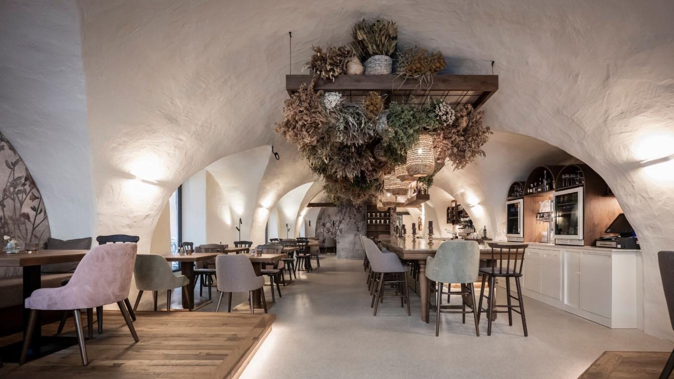
Restaurant Hermanos Renovation and New Layout
OHIO Estudio: Our renovation of Restaurant Hermanos is centered around how we consume, connect, and experience gastronomy. This concept guides our redesign of the existing layout, redefining both the workspace and the dining area.
Following the pandemic, we've witnessed a heightened interest in cooking, reflected in the resurgence of open kitchens and dining bars. People have gravitated towards cooking out of necessity or the perception of having more available time. Nowadays, diners seek to learn and appreciate the entire process, emphasizing the traceability of ingredients from their origin to the final dish.
"COLOR TO PERCEIVE, FLEXIBILITY TO CREATE, FUNCTIONALITY TO RESOLVE, EXISTENCE TO LEARN."
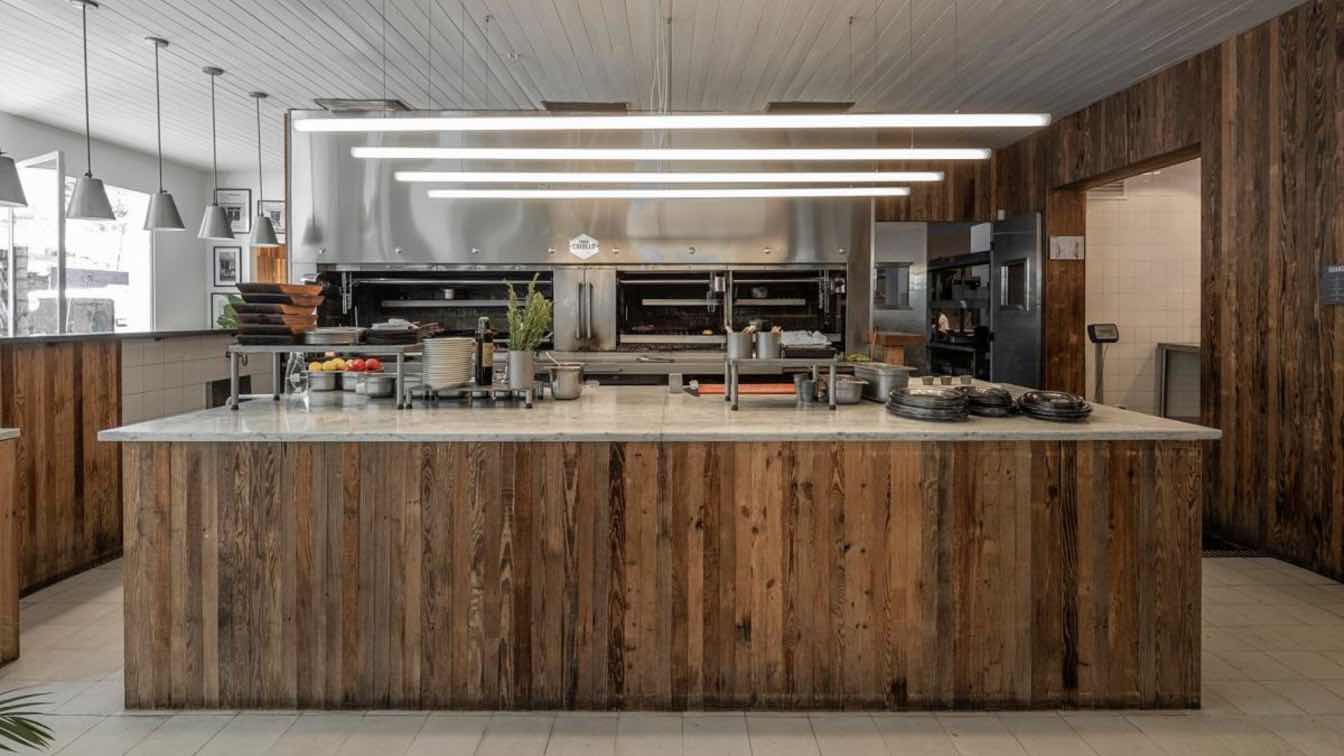
In our intervention, we've transformed the bar into a threshold that acts as a focal point, facilitating a quick understanding of the space while encouraging interaction between staff and guests. This bar has become a space for shared stories, enjoyment, and learning.
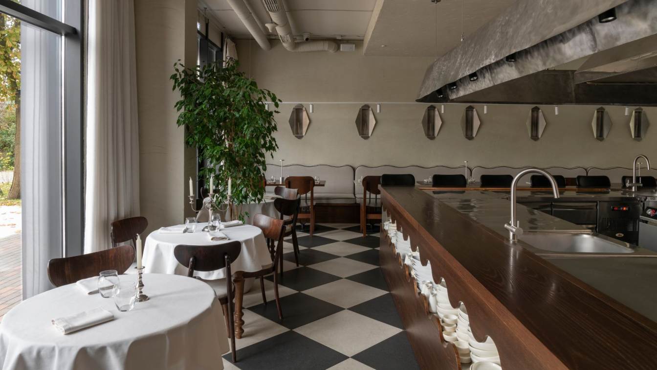
The choice of steel material for the bar and its dimensions provide lightness to the space without compromising the restaurant's original essence. A metal ribbon embraces the existing columns, organizing the dining area through its functionality. This operation has rendered the dining hall flexible, allowing for various seating arrangements. Additionally, the bar area doubles as a platform for classes, with the kitchen centered within the bar, providing an immersive experience for onlookers.
We've utilized the existing color palette but enhanced it with brighter finishes, such as tiled columns, to reinforce the concept of operational core. Furthermore, we've repurposed existing wooden bars into two elongated counters of lower height, creating communal spaces. These wooden surfaces are supported by curved pinotea legs, accentuating their length.
In this way, the restaurant offers a fresh way to savor gastronomy while preserving its essential character.


