SET Ideas: Famiglia is much more than an ice cream store, it is a meeting point that makes people talk, firstly because of the richness of the ice cream and secondly because of everything that the brand generates.
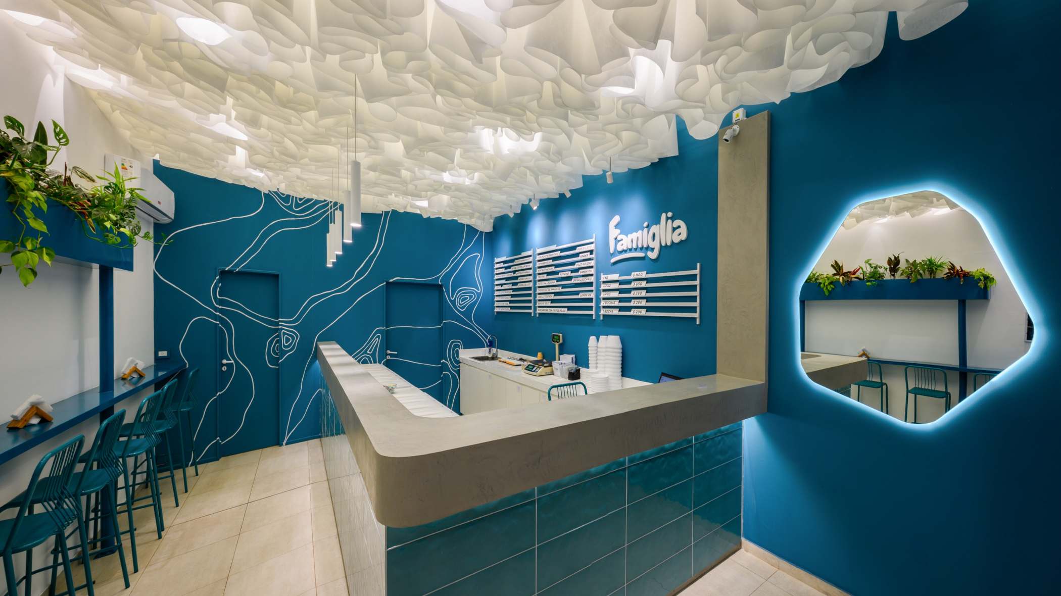
Based on these premises, we sought to innovate the way in which the space was conceived, inspired firstly by the creaminess of the ice cream and secondly by the corporate elements that the brand as such had.
In the branches, the item and the tools were the same, but each design was adapted to the particularity of each location. The study designed, built and managed the work in its entirety, including the tests and experimentations that the ceiling carried.
The material exploration was the main challenge, to achieve from the material a unique, memorable sensation, like eating an ice cream here. To achieve this result, we work with various materials until we find a mesh fabric supported on a net and translucent, with a very cautious art direction, we seek to form curves, waves, spirals and organic movements.

The distribution in the premises seeks to make the most of its uses in a clear and transparent manner. For this, the study takes advantage of the existing conditions of the premises, achieving a concise communication between the interior and the exterior, accompanying the gesture with continuous furniture, the incorporation of the interior landscape and the present colorimetry.
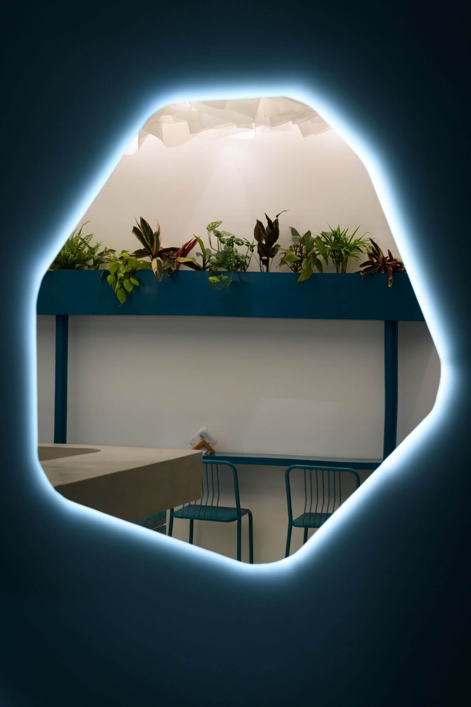
The equipment of both ice cream parlors was specially designed according to the needs of each one. For example, the tables proposed for the use of the public of ice cream parlors seek to adapt to the distribution of each branch and the morphology of each local. As well as the design of the curved lines that complement and link between the artistic finish on the wall, the mirrors, the ceiling and the incorporation of vegetation to contribute to a harmonious environment.


