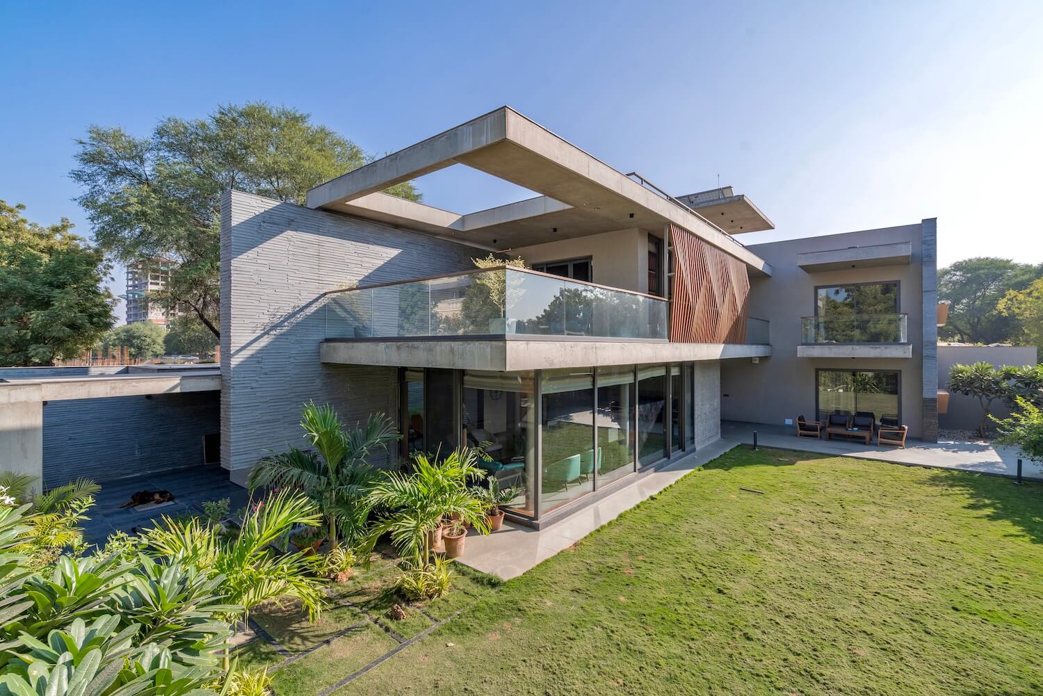
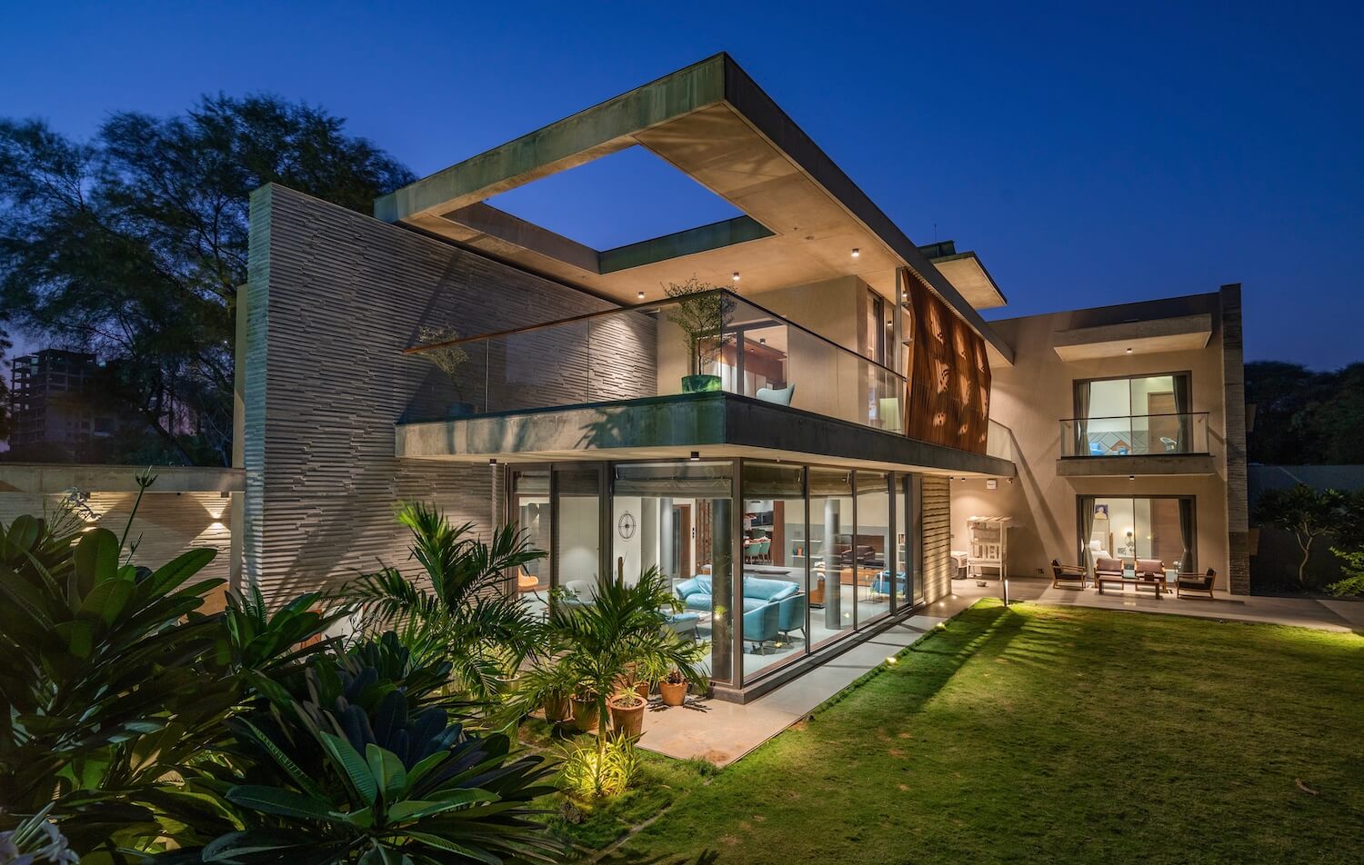
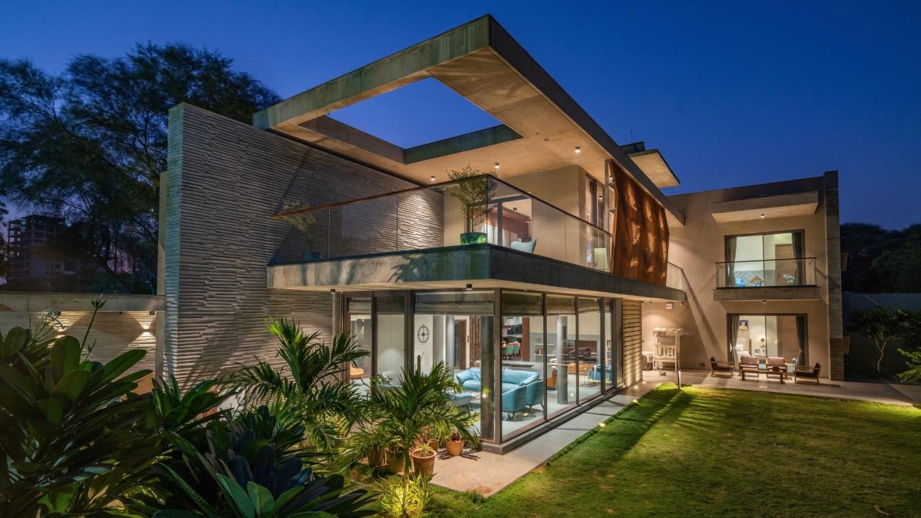
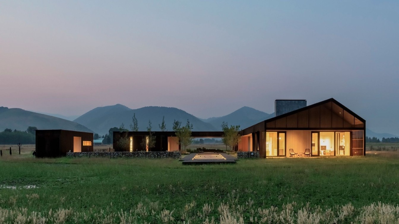
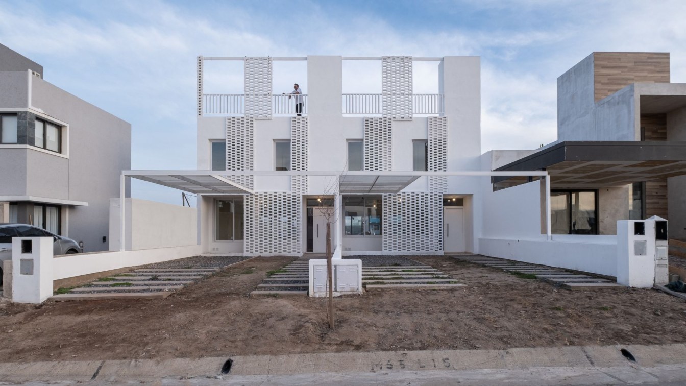
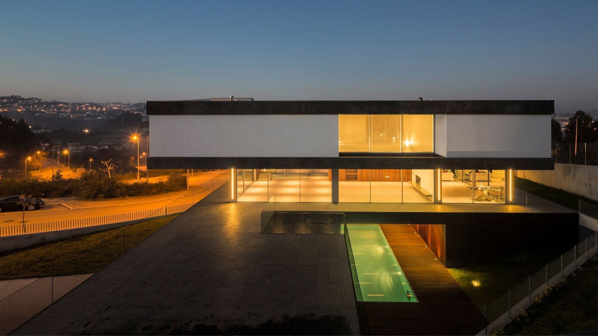
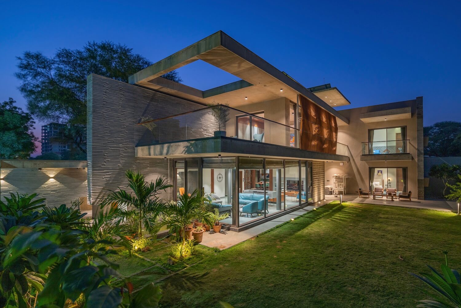
VPA Architects: The Hover House sits in a newly developing area of Ahmedabad in a plot size of about 7600 sft. The plot is North facing and rectangular in shape. Having a private bungalow on it's eastern side and an open plot on it's western side, the plot is sandwiched in between. This placement of spaces lead us to plan a house that opens up to a garden on its north-west side.
The client's small family of 4 required a 4 bedroom house with common spaces such as living room, drawing room, dining space for 6 people, kitchen and a hometheater along with other ancillary structures in the form of an outdoor kitchen and a servant quarter. The built up turned out to be about 6700 sft divided in 2 floors.
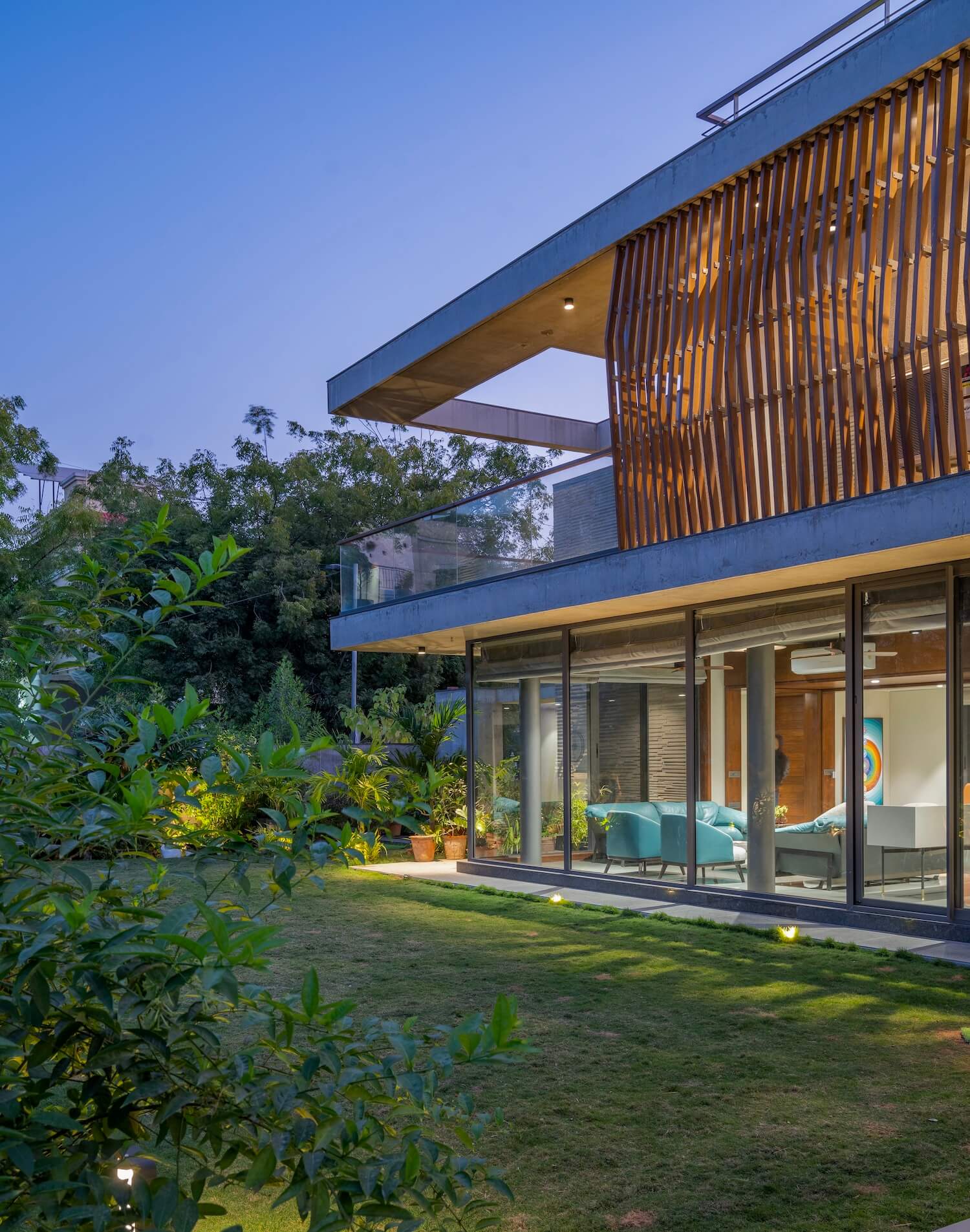
The house entry is defined by a unique water body, which falls from the floating wall making it a unique feature. This floating wall stands tall and vertical in the defining elevation, made out of chipped stone. As you enter the house door, you are welcomed into the drawing room and living room, divided by a console unit. This was a specific requirement from the client; he wanted these spaces to be worked out such that he can move around the furniture and make it into a single gathering room as and when required. This space is enclosed in glass, making a great connection to the outdoor garden.
Walking further in, you are taken to the open kitchen and dining space. The dining is placed such that the morning sun hits the spot beautifully every morning, making it a perfect place for breakfast. A sculptural spiral staircase from the dining space takes you to the first floor. This staircase is an art piece in itself, cladded in solid wood and flowing freely.
One of the most interesting and unique feather of the house is the aviary we have created for the client's exotic birds. This aviary is created in the margin area on the east end of the house. This gives the birds a free space to move around throughout the length of the house.
The ground floor has 2 bedrooms in the southern part of the house; one being a guest bedroom and another for the client's mother. While the guest bedroom opens in the gravel court, the mothers bedroom extends into a deck that connects to the garden.
The house follows the same L-shape plan on the first floor. While the children's bedroom sits right above mother's bedroom, a hometheater takes up the space above the guest bedroom. The master ensuite that has an extended front facing terrace sits above the mass of the drawing and living space.
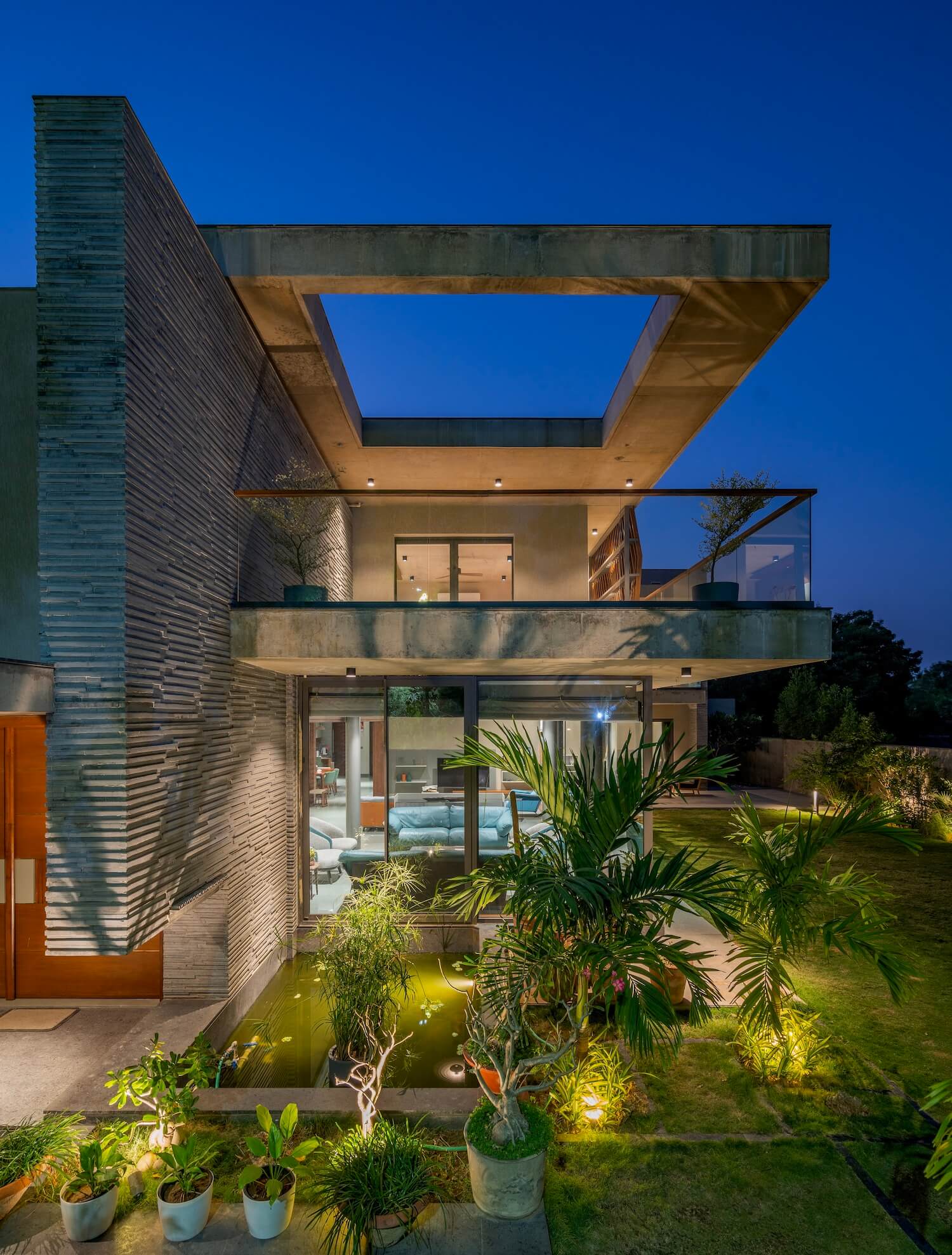
The massing of the house is kept as simple and straight line as its planning. Exposed concrete cantilever slabs and vertical walls make up for the elevation. Slab cut-outs and screens are given for aesthetic purpose. One thing that stands out in the house is the vertical stone-chipped wall, which acts like a backdrop of the entire house when seen from the western side.
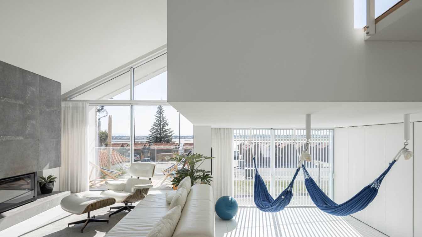
Interiors play a very important part in getting a place together and making it a home. Furniture imported from Italy makes up for the modern interior. Minimum POP ceiling, while utilizing the exposed concrete slabs as an ornament works perfectly with the modern approach. Locally procured Kotah stone in the flooring goes well with the colour story of greys and neutrals in the house. Adding solid wood in wall panelling, bedroom furniture and ceilings as and when required balances out the use of grey.
The decorative lights follow the same material palette of concrete and wood. These were specifically customized for this project, by a light designer. Similarly customized and carefully procured art pieces sit in different corners of the house, enriching the interiors.
The bedding fabrics and curtains were designed by a textile designer, fulfilling the client's specific requirements while keeping the modern interior language intact. Adding subtle colour tones and balancing those out with neutrals makes for the fabric palette. All these factors amalgamates into a minimalistic interior.


