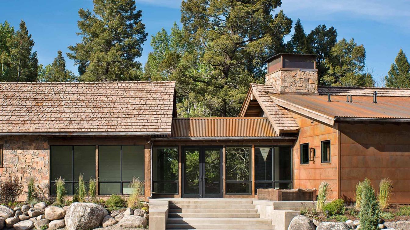
Cibrian Arquitectos: Architect Fernando Cibrian ́s recently finished home is a project centered on the expressiveness of form and design. His work incorporates innovative and creative details, that create harmony between structure and nature, which are meant to be noticed and appreciated. The aesthetic sense is very much emphasized in the eccentric and elegant design of the different volumes and structures. Vista Clara counts with a wide range of exotic material combinations that bring out contrast or uniformity within the different asymmetrical spaces.
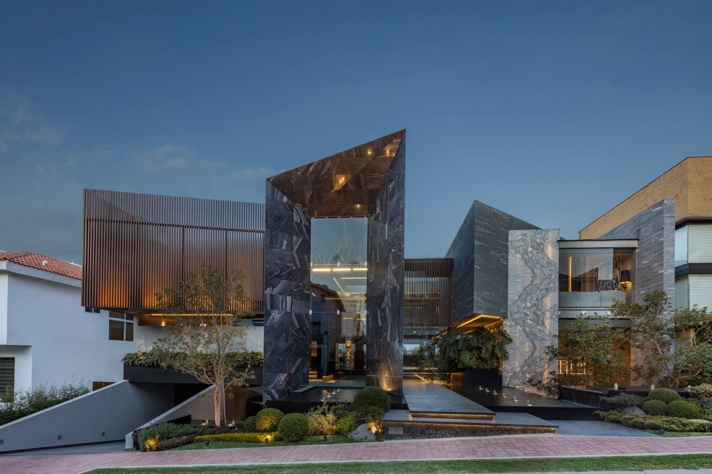
Architect's statement: Vista Clara is a project set on the surface of a rectangular plot with a negative slope towards the golf course. The main challenge was to play with the foundations and levels of the house to respect the heights allowed in the subdivision and achieve the best views in the social and private areas of the project. The configuration of the house required to achieve double heights and large overhangs, having great complexity in the structure because the design was conceived as clean and spacious in the interior spaces. In the exterior volumetry, simple geometries are played that are intercepted, achieving a game of heights, angles but detonating the main spaces of the house.

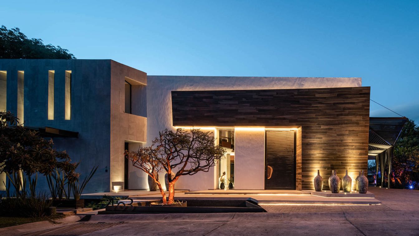
The wood coatings seek to give warmth to the facades in their different configurations, breaking with the homogeneity. The contrast of natural stones generates sobriety with light textures respecting a range of gray and black colors, however each element detonates its coating without competing in an elegant harmony. The green colors implemented in nature and landscaping seek to stand out and highlight giving vitality to the project on the outside.
The main natural element is water, which rises from the main exterior access and enters the interior of the house, a water spring being the central heart of the house and from which it determines the main views from the interior to the exterior. The central water core vestibulates the social spaces and main corridors perimeter to it. The core creates a void inside creating translucent double heights towards the central axis of the project, completely bathing the interior of the project with light.

The waterfalls generated in the path of the water mirrors create subtle movement and direct the water towards strategic points destined for intimate spaces, taking its channel over weeping walls towards the basements and lower levels with respect to the street level such as the studio and spa. On the rear facade, the last space with water is generated, ending the great route from the main access to the end of the house on a large floating water mirror received by a spectacular work of art. Natural elements such as stone, wood and water are the protagonists that dress the monumental volumetry.

Light is the essence of the project, transforming the interior into two totally different spaces, day and night. The spacious, clean and double-height openings capture natural light during the day, managing to ventilate and illuminate each space with a range of dark colors. At night the spaces become a play of indirect and specific lights on decorative elements that enhance their beauty. The openings now become large screens towards the outside, managing to contemplate the vitality of the interior creating comfortable environments with the play of warm lights inviting to discover the design in each space. The exterior lighting design seeks to bathe the main volumes of the project with light, highlighting the natural textures of the coatings, however inside the indirect light directs the different routes over the corridors towards the spaces of the house creating cozy and warm environments in contrast to the coldness of the gray and dark colors of the materials. The bright colors will stand out on the sobriety in decorative elements such as works of art, fabrics or decoration thought and designed for each space.

The selection of materials in the interior were designed to create a fusion of brightness and reflections on each surface, mostly dark but highlighting and differentiating each one of the materials over the rustic, rough and raw elements to highlight their essence and beauty.
Conceptually Vista Clara arises from a shower of geometries represented in governed needs and distributed on a central axis generated an atmosphere impregnated with tones of elegance and tranquility which are mixed to create spaces in complete harmony and that frame the activities of each area but creating through art and design a space for reflection and introspection that allow the user to live a unique experience both inside and outside.

Every detail within each area was thought of thoroughly, guided by the elegance and sleekness that are found everywhere. It was no simple task to create the perfect visual frames filled with masterpieces of renowned artists, that accent not only every space but also the transition between them. It was essential for the design to produce two different reads and for this, details such as the lighting design, found in the facades and the overall interiors, were fundamental for the creation of diverse ambiances, given by exposure of light, that of day and night.
Beauty is not only found in art, but also in nature. Vista Clara’s main natural attribute is the element of water. It emerges from the main façade and carries out throughout the residence. Just as water flows and creates pathways, the water mirrors are fashioned to mimic this natural phenomenon all to create a node from where the entire pro- gram unfolds. Water was specifically chosen as the main element because it is a symbol of contem- plation and unity, which helps tie the geometries together and reflect the genius loci of every space.

It took Fernando a few months to decide the final layout of the house. He essentially wanted to make a connection between a structure composed of interesting volumes with nature, mainly water because of its ability to refresh the building and the natural lighting from the sun ray’s reflection. Fernando ́s spectacular home also serves as a showroom which is why the house has so many lavish finishes inside and out.
The Vista Country Club has a strict design code that specifies the following:
The home is situated at the edge of the green 30 meters away from the 18th hole giving it one of the greenest views within the gated community.
The design must comply with the maximum height authorized. No construction is allowed within the shaded area, except for pathways.
At least 70% of the roof slabs must have a slope of 30%. Architect Fernando ́s design is already an icon within the gated community. Its daring takes on exotic finishes breaks the context it is surrounded by.
The typical home here is painted in beige tones, with their sloped rooftops covered in Italian roof tiles.

A volume set can be seen on the facade, which gives a hierarchy to certain areas of the project, while allowing a set of lights and shadows to exist. The 18 main element in this facade is the path that the water mirrors provide to access the residence.
The space gives a grandeur effect to the main entry, allowing the distinct areas this lobby has, provides elegance. The water mirrors, the natural and artificial of the house to be seen, while dividing them as well. Each element that lighting, the sculpture and the materials.
Its height grants a sensation of greater extent to the space. The variety of colors in its materials creates a warm environment. The floor-to-ceiling window provides abundant natural lighting and a spectacular view of the golf course. Plus, it allows direct access to the garden and terraces.

The project frames different views of the golf course, allowing each view to be enjoyed outside or in enclosed spaces. The geometry allows that distinct terraces form and the balcony located on the second level shows a grand hierarchy due to its materiality and dimension, since its volume has one of the main views on the level.
The double height magnifies the space. Its materiality, height, and lighting give it elegance and warmth, creating a comfortable environment. The materials utilized in this space emanates warm golf course, and also has access to the balcony.
The dimension and height in this space enhances the amplitude in the studio. The bookshelf is an important element that frames the grandness of the space. It has a small garden, which is separated by a floor-to-ceiling window, creating a soothing environment.
The master bedroom has a panoramic view of the golf course. The materiality and finishes form a sensation of a welcoming and tranquil space.

The first level may seem like its being divided by the parking spaces and service rooms, but it was disguised and covered by interesting bespoken millwork because it is meant to house large parties and can connect with the bar and terrace whenever Fernando has an event. On the weekdays Fernando can make use of the full-size gym and after- wards can hit the spa before heading to work. There is also a spectacular theatre with a small pantry for snacks when he has family come over to watch sports or movies and a private double height study to attend clients.

When you enter the ground floor through the main entrance you are greeted by a display of art- work and a stunning view of the water mirrors through huge walls of tempered glass that also let you get a glimpse of the living room with terrace on one side and the dining room with a terrace on the other side. Away from view there is a small tv room with a small dining set for family use and a guest lavatory. There is also an entrance to the top floor of the private study.
The third floor is the private level where you will find the master bed with a walk-in closet along with two other ensuites and a small linen space.


CIBRIAN Architects is a Mexican firm, led by the architect Fernando Cibrian Castro, with experience in design, construction and interiorism. The firm develops residential projects to commercial and high-rise towers mainly in Mexico, focused on contemporary vanguard designs.

