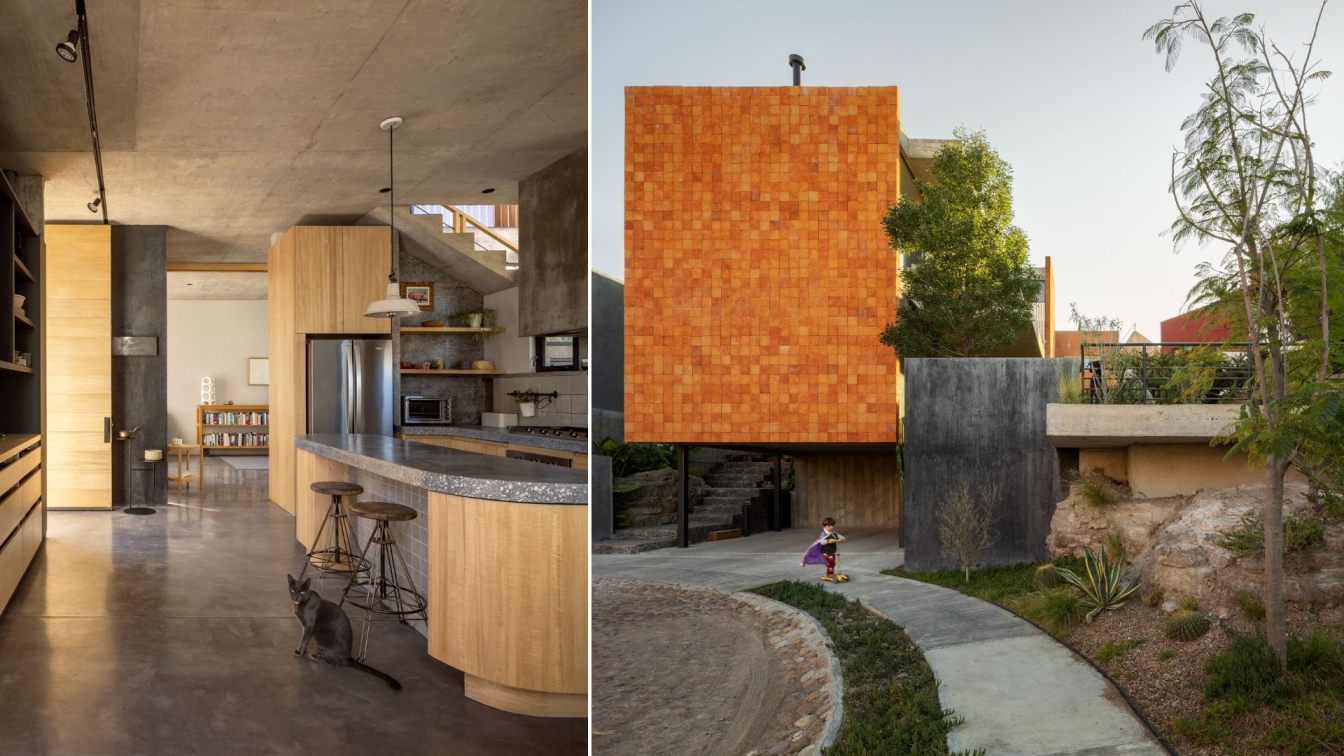
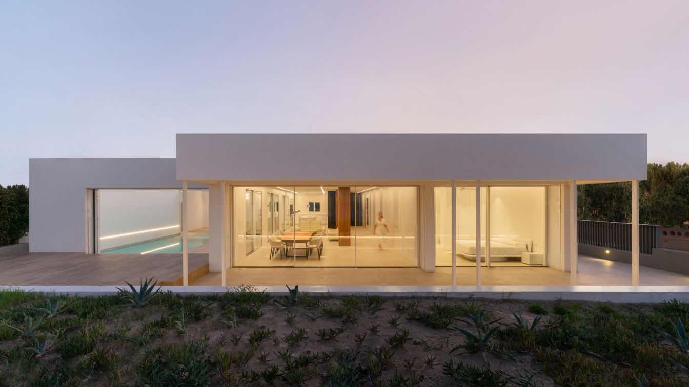
Mauricio Alonso. m aquitecturA: The house proposes a way of living that starts from a continuous dialogue with the landscape in which it is located. An irregular terrain at the end of a closed street, merging in some portion, to the semicircle of the roundabout that completes the residential area where TOMM House stars with its powerful personality of right angles. It is a Volume contiguous to a green area that belongs to the city. This green area is the trigger that determines the orientation. The street front is totally blind and leaves its main opening to the northeast. The order is for a family of 3 inhabitants with a priority; establish a permanent conversation with the vegetation that is what guarantees the outdoors, this, without neglecting privacy. The highest percentage of garden area that the polygon of the land allowed us was achieved, being the juncture between the habitacle and the area donated for a park, attesting to this constant relationship of views to the horizon.
The terrain by nature rises almost 3 meters from the sidewalk so the access is ascending, covered with local flagstone caressing traces of the terrain that was left uncovered intentionally showing, in 2 points, the original rocky substratum. Two rooms on the top floor, an open space on the first level form the parallelepiped closed to the street with a facade covered in rustic clay giving character a powerful personality. The program is held floating by 4 steel columns superimposing the project on the ground barely caressing leaving the car below.The materiality is honest and reveals almost all the exposed materials, apparent concrete and black stucco combined with wood, a white mahogany of impeccable beauty called congona.
The project is distinguished by the use of these 3 base materials, as we already said concrete, wood and steel, these three combined create a more welcoming, honest and versatile environment. They provide a particular style to the house and express purity in a very warm way, which adapts perfectly to the conditions of the land; With an austere style, architectural and formal elements typical of its context and structural solutions typical of contemporary architecture are used.

For the description of the project we will start talking about the access, it is by means of a local flagstone staircase with cambers and a rajuela side of it, recreating the solidity of a base from where the overhang to the garage is perceived. At the end of these 9 steps we come to rest in an entrance square towards the main access, a landing that allows you to access or continue, if you do, it leads to a service corridor and on the other side a laundry/warehouse where we maintain the gas installation.
In the search for the staircase, which is an important articulation of the project, you will find the study / bedroom for visitors that, with a sliding "pocket door", makes the space versatile as required, as well as a bathroom that is reminiscent of the clay that we see in the facade; On the stairs, After the first ramp, it was possible to raise a large rest platform in the middle of the stairs that represents the buffer between the two levels. The dimensions of the landing achieve a broader spatial perception than this project has and it is a quite effective sensory success, having a view of the garden on the north side.
In the main bedroom, passing through the work space or hall, you can see the double-height wall of the room that is closed with an automated blind that protects the climate from the large windows, the right space for rest, it is visually expanded to the terrace, which is an internal garden full of pots, and the gray quarry board that was configured on site, achieved a micro-environment, giving privacy and protecting from the south west that affects less but hits and generates an interesting texture of this material.


