K.N. Associates: A Mid-century Modern & Charismatic Space Carved in Concrete.
The nascent charm of textured concrete walls gives a sleek, modern, and chic look to Royal Acres.
This family home is an ensemble of luxurious appeal and pleasing comfortable space. The vision of the designer complements the intrinsically contemporary design which surprisingly gives a modern yet elegant vibe to this project. The concept was optimizing the space specifically to entice the eye at the same time efficiently utilizing it.
The house’s decor is calm and restful, with shades of bluish-green and grey. You can also notice bold statements with RCC exposed ceilings contrasting with modern furniture. The furniture, decorations, and artworks are all carefully selected to give a bold visual impression.
Exteriors
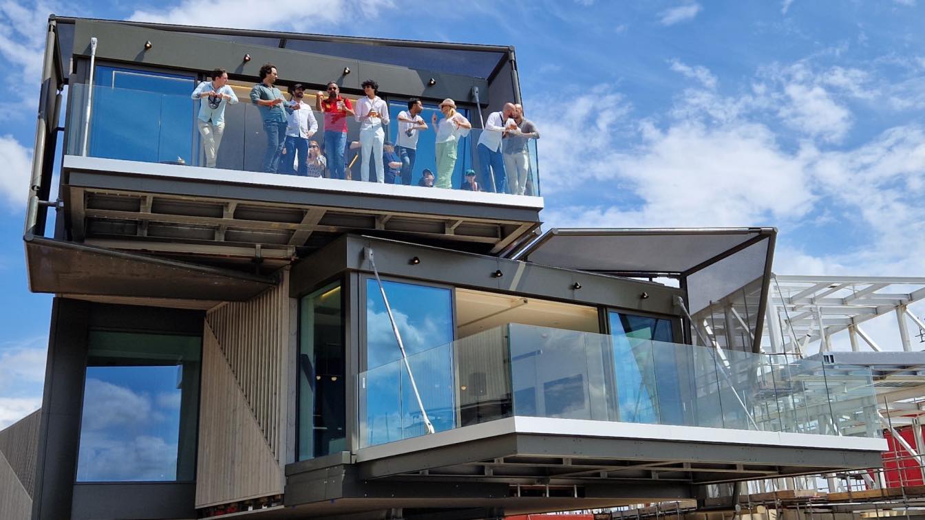
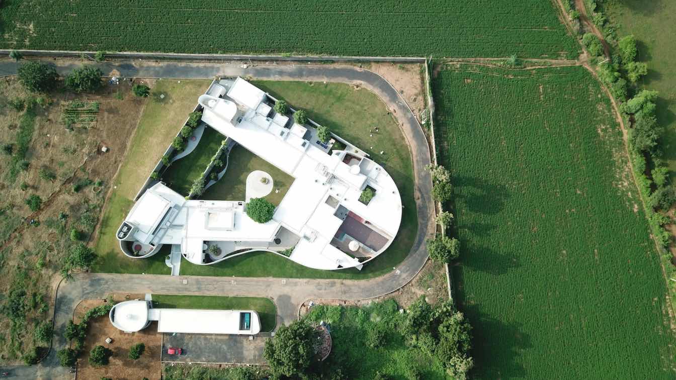
The use of exposed RCC slabs and Gwalior mint stone cladding on walls adds texture to the home and expresses the structural elements that support the framing and volumes. Together with the use of hardwood timber, a natural focus is carried through the floors, walls, ceilings, doors, and select joinery. Capped in metallic sheeting, the circular-cut-out roof at various levels enables multiple access points for natural light to enter and fill the home.

Foyer and Living Area
The moment someone enters your tranquil home, the first thing they notice is the entryway or the foyer area. Without expensive wall treatments and fancy artwork, the entryway sure does make a statement. The living room adjoining the foyer has an interior palette of muted greys, timber wood, and natural tones that match the green surroundings, carrying a sense of calm into the home.
Family Seating
The family living room is the heart of the home, so creating a living room that is a perfect space for every family member is the key. The living room overlooking the garden has a luxurious and cozy vibe. The use of muted grey and bright timber wood couches with a unique TV unit brings out the uniqueness and opulence in a very subtle way. The low-height paneling with a wooden frame on the wall enhances aesthetics and adds to the architectural design of Royal Acres.
Dining Area
The living and dining areas, being so close to one another, create a contrast of ingenious design. The dining area has an extremely chic yet classy look. The pattern etched in yellow Kota stone on the floor replicates the exact pattern on the RCC ceiling above. A huge planter adorns the backdrop which particularly makes the place stand out.
The black and teakwood color scheme and the feel have been designed in such a way that they spruce up the taste buds. The dining area of this home is furnished with an elegant and comfortable dining table that gives a lot of space for free movement. The chairs used in the dining area are sleek rather than bulky, which makes the room look airy and spacious. The pendant lights and wall art used near the dining area symbolize peace, calm, and positivity.
Kitchen
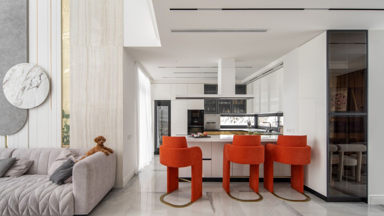
The kitchen cabinetry in light grey camouflages with the white walls making it look subtly artistic. This is intended to make the kitchen look more spacious. The kitchen comes along with a granite island at the side. This is very useful for serving food and lets one contently enjoy every bit of their meal.

Stairway
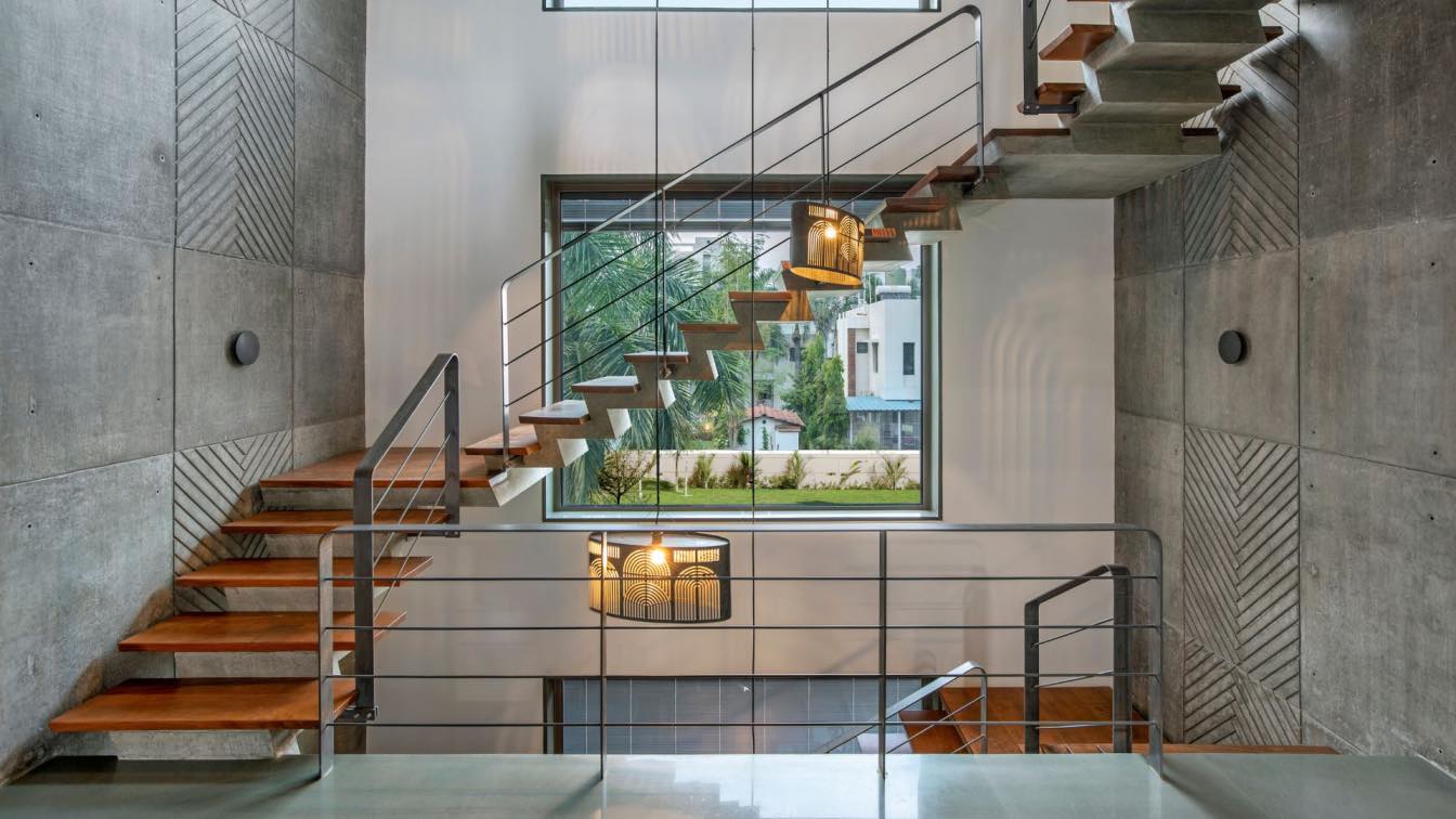
A stairway emerges from the dining area to become the central spine between two levels. Just like the RCC ceiling the staircase wall features exposed RCC with a Herringbone pattern and seems almost like an extension of the ceiling. The wooden treads of the staircase, customized metal hanging lamp and the metal railing further enhance the overall appeal of the stairway.
Pooja Area
Temples are not always simple, enclosed spaces with a few images and statues. The Mandir is definitely the center of attraction of this beautiful home. The green and yellow Kota pattern on the floor with brass inlay adds class to this prayer room.
While the warmth of wood and the mantra inscribed in the veneer finish circle on the wall creates a tranquil space for prayer. A calm and serene space adorned by a brass Ganesha Idol, this Pooja room overlooks the garden and is hence a perfect place to meditate and connect with oneself.
Parents’ Bedroom
The bedroom has a concept of contrast between modern and ethnic elements. The lounge chair is used to portray an authentic look alongside modern furniture and can also be a relaxation spot. The simple layout with minimal wall art makes the room look more spacious and cozier.
First Floor Passage
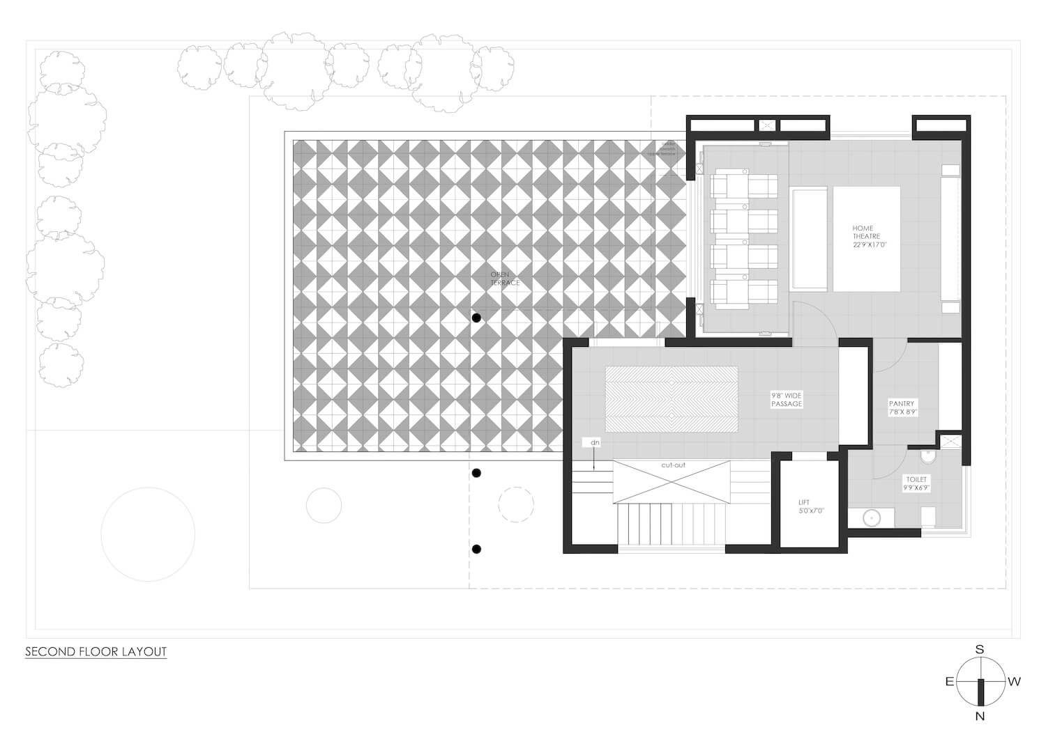
The passage area on the first floor features a Herringbone pattern in Yellow Kota stone on the floor replicating the exposed RCC ceiling pattern. The unique white clay mask mural displayed right above a customized veneer finish console unit is the highlight of this space. On the other side, pictures by Narendra Joshi are displayed in an art gallery fashion.

Master Bedroom
The master bedroom is an ethnic space with minimal furniture, embedded in warm and welcoming colors. You can also notice bold statements with bright handmade blue titles, brass framing and brass planter over the bed contrasting to modern and minimal furniture of the room. Use of green Kota as the flooring immediately lights up the space.
The vanity area exudes class and luxury with the Herringbone pattern in tiles, the stylish brass framing, and the mirror set in a grooving pattern in veneer
Son’s Bedroom
This bedroom opens up to a huge balcony and an outdoor sit-out that adds up to the ease of spending quality time with friends and loved ones. The bed back with veneer paneling and sandblasting pattern in yellow Kota catches the attention of this room’s design.
Daughter’s Bedroom
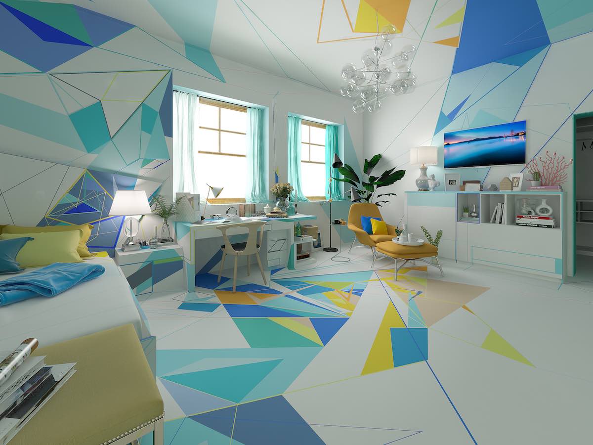
All the bedrooms in this beautiful home are designed individualistically - the master bedroom was very classy and eclectic, the son’s bedroom functional, and the daughter’s bedroom fun and cheerful. Sporting fresh and young colors, the elaborate design makes the daughter’s room playful and stylish.
The hand-painted art by Avinash Gondaliya along with the wooden frame as the bed-back is the main highlight of this room. The furniture in this room is both comfortable and functional, making it a pleasant place to be.
Second Floor - Home Theater
A perfect spot to create an interesting atmosphere for all cinephiles – this theatre room features open wiring in the ceiling and wooden flooring. To create that black-out movie theater feels, this theater room is coated in shades of deep charcoal. Adding oomph is a customized artwork by Avinash Gondaliya on either side of the recliner, featuring the client’s family portraits.
For a fun touch, the room is adorned with bright blue and pink lounge deep seats. With an acoustic panel on the wall, movie poster-like pictures to cinema-like lighting, it’s the perfect spot to create a unique atmosphere for family and friends.
Project Summary
From the foyer to the bedroom, every corner of Royal Acres makes a statement with its contemporary style and interesting pieces of furniture. Every corner of the house has a different story to tell. Practicality was also considered in designing these interiors, which are seen throughout all of its rooms.
The use of varying textures and an active engagement with light throughout ensures the experience of the house is distinct, and warm and celebrates the natural surroundings. The goal was to combine the austerity, grace of minimalism, and elegance of monastic simplicity with a warm and welcoming home.


