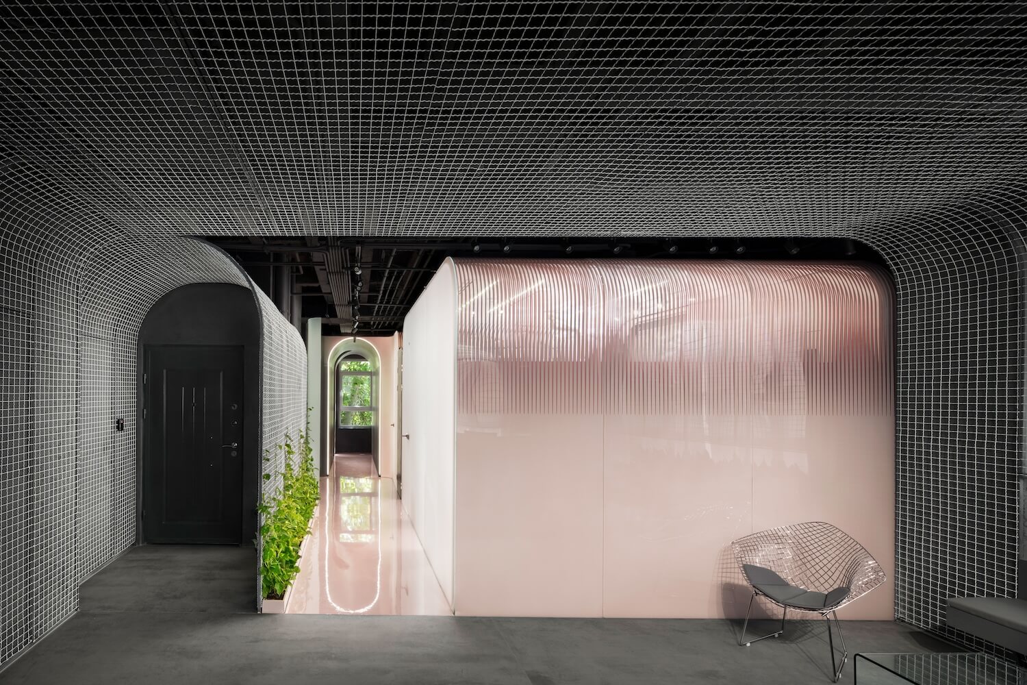
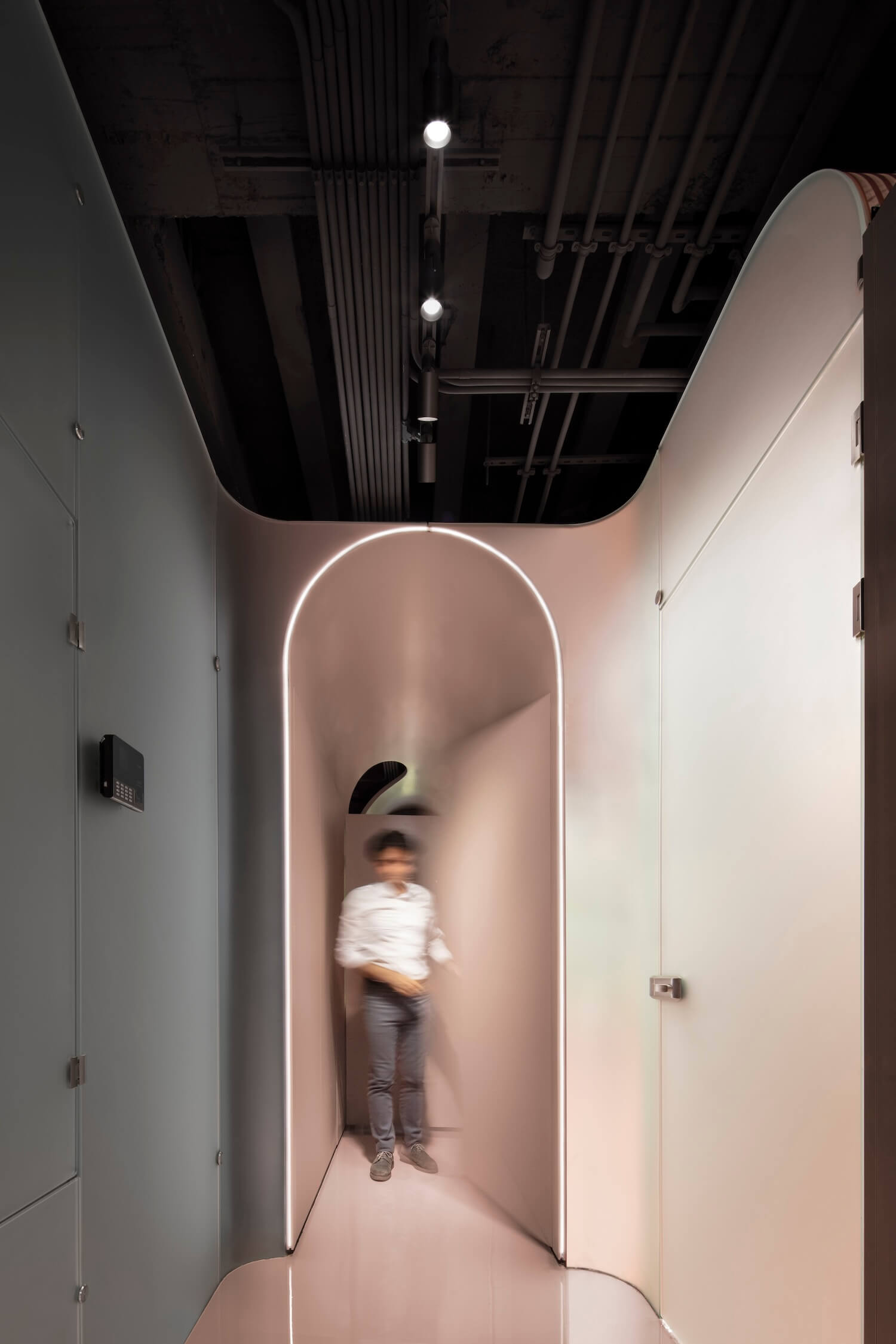
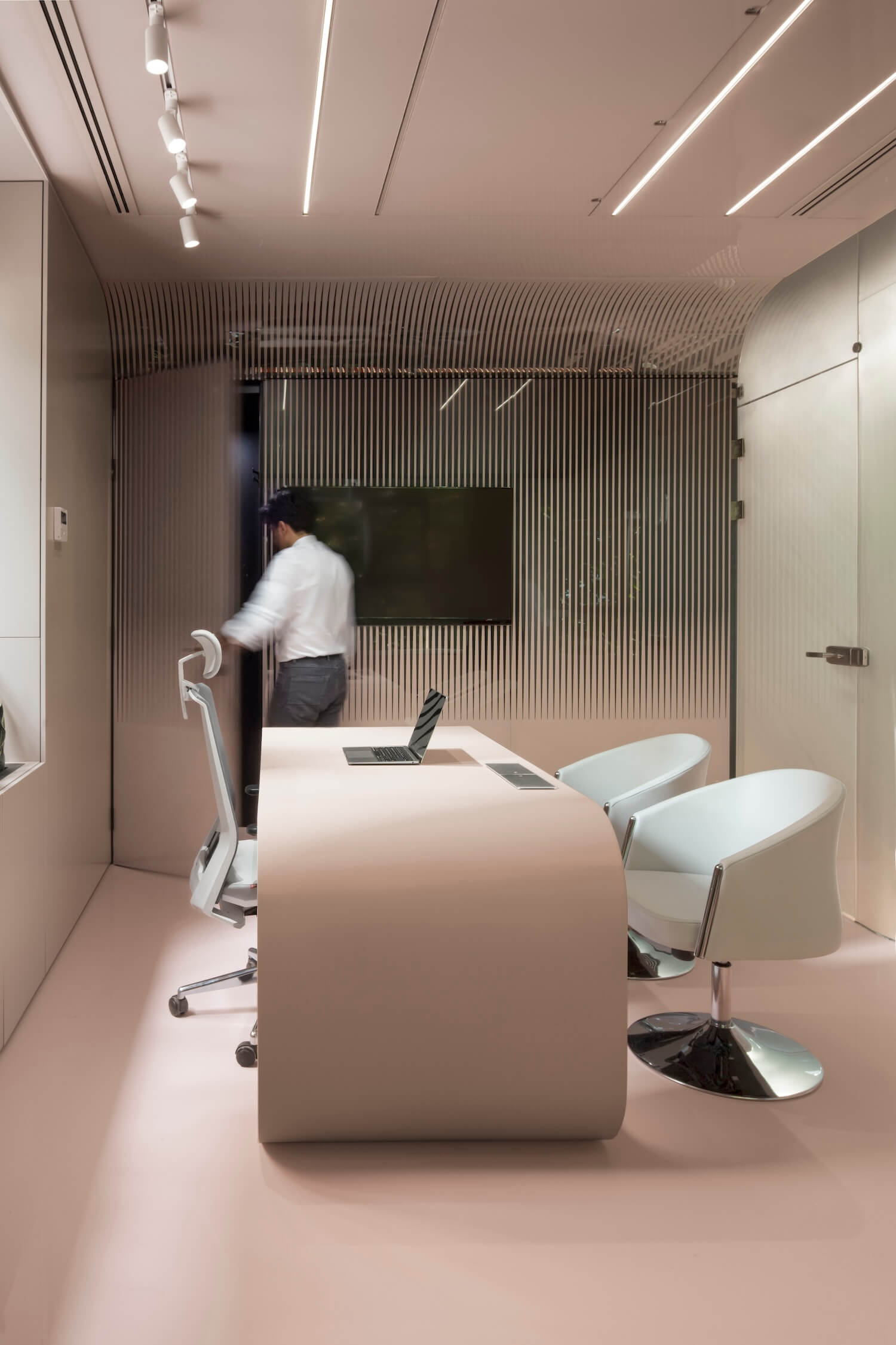
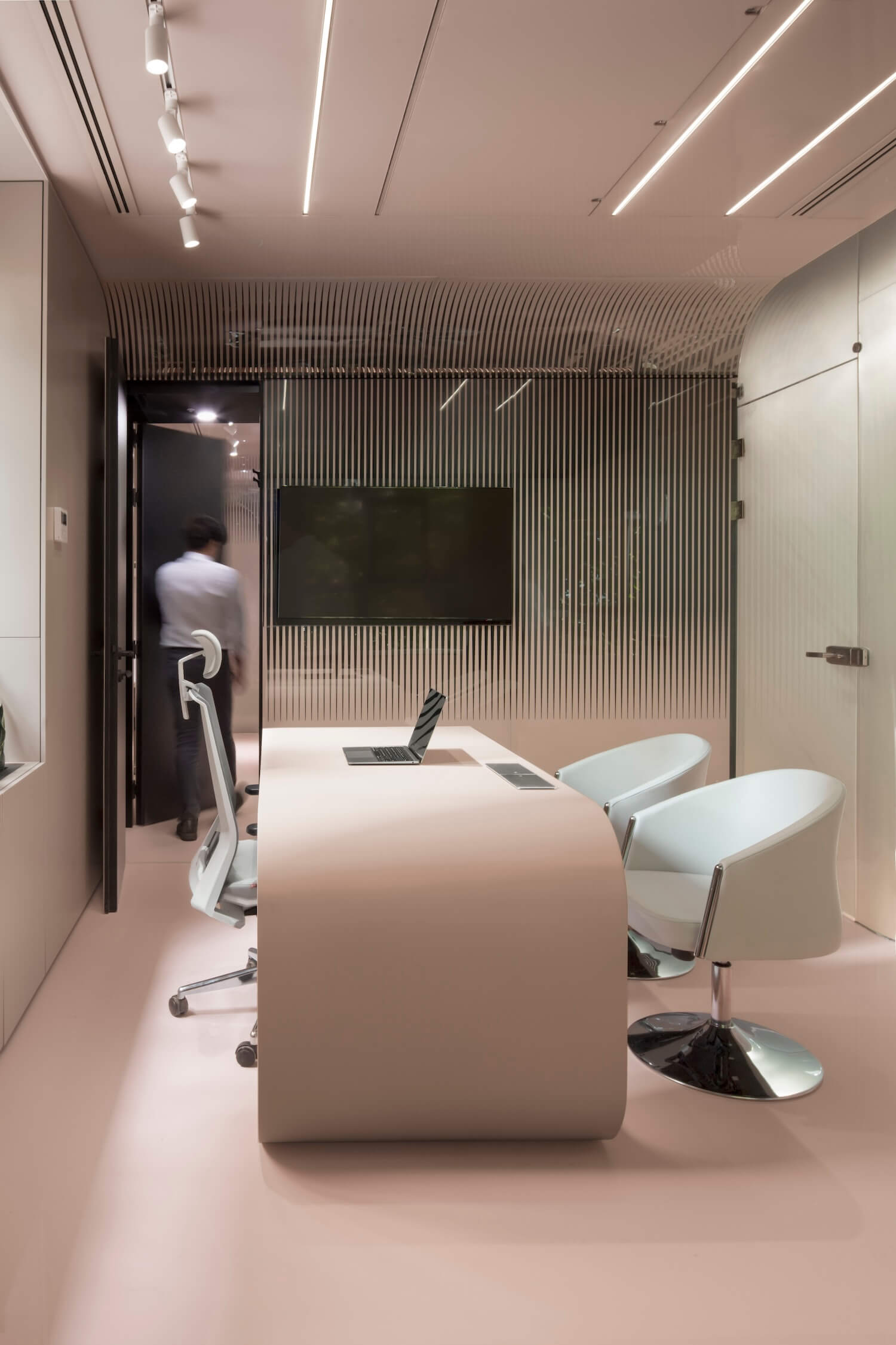
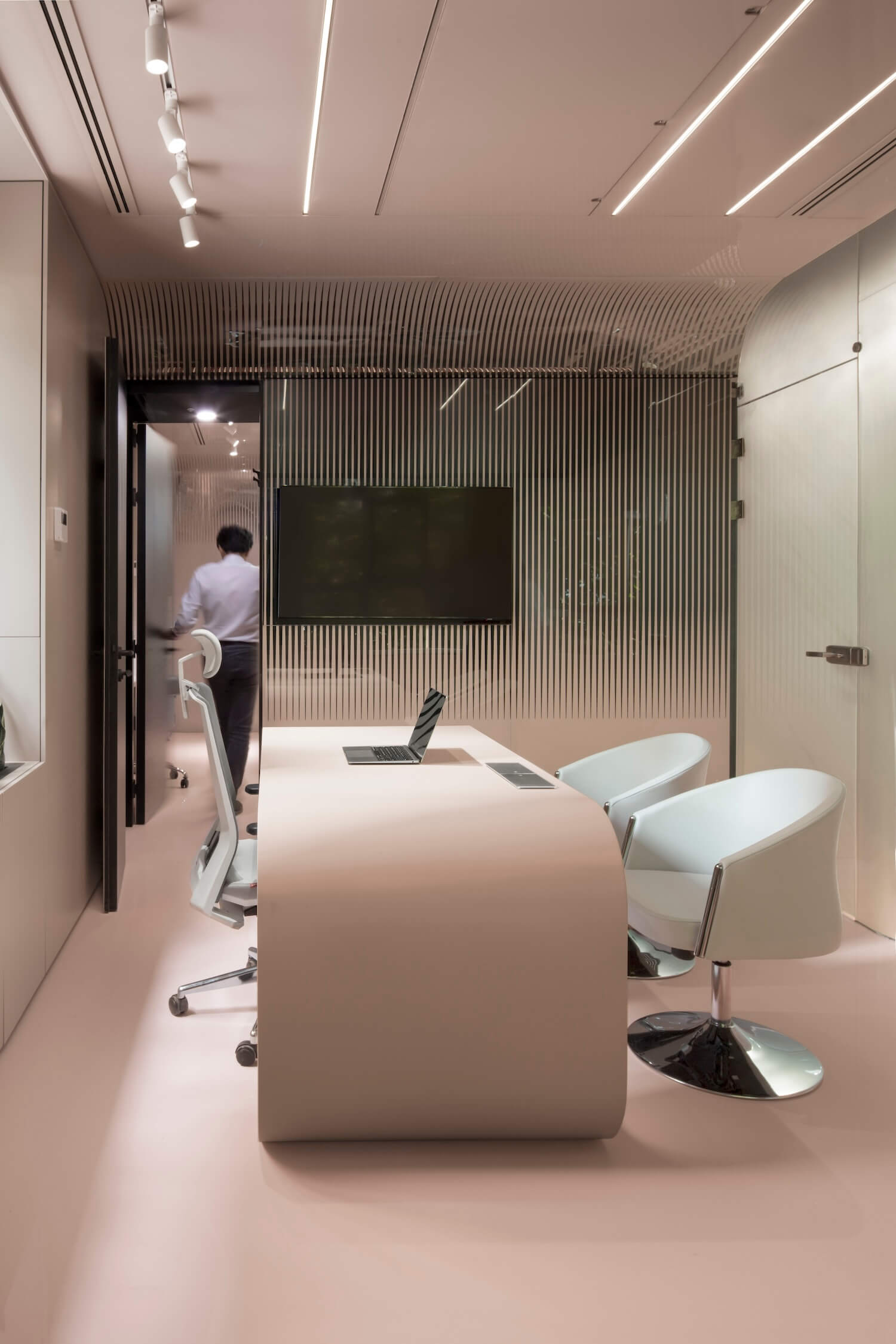
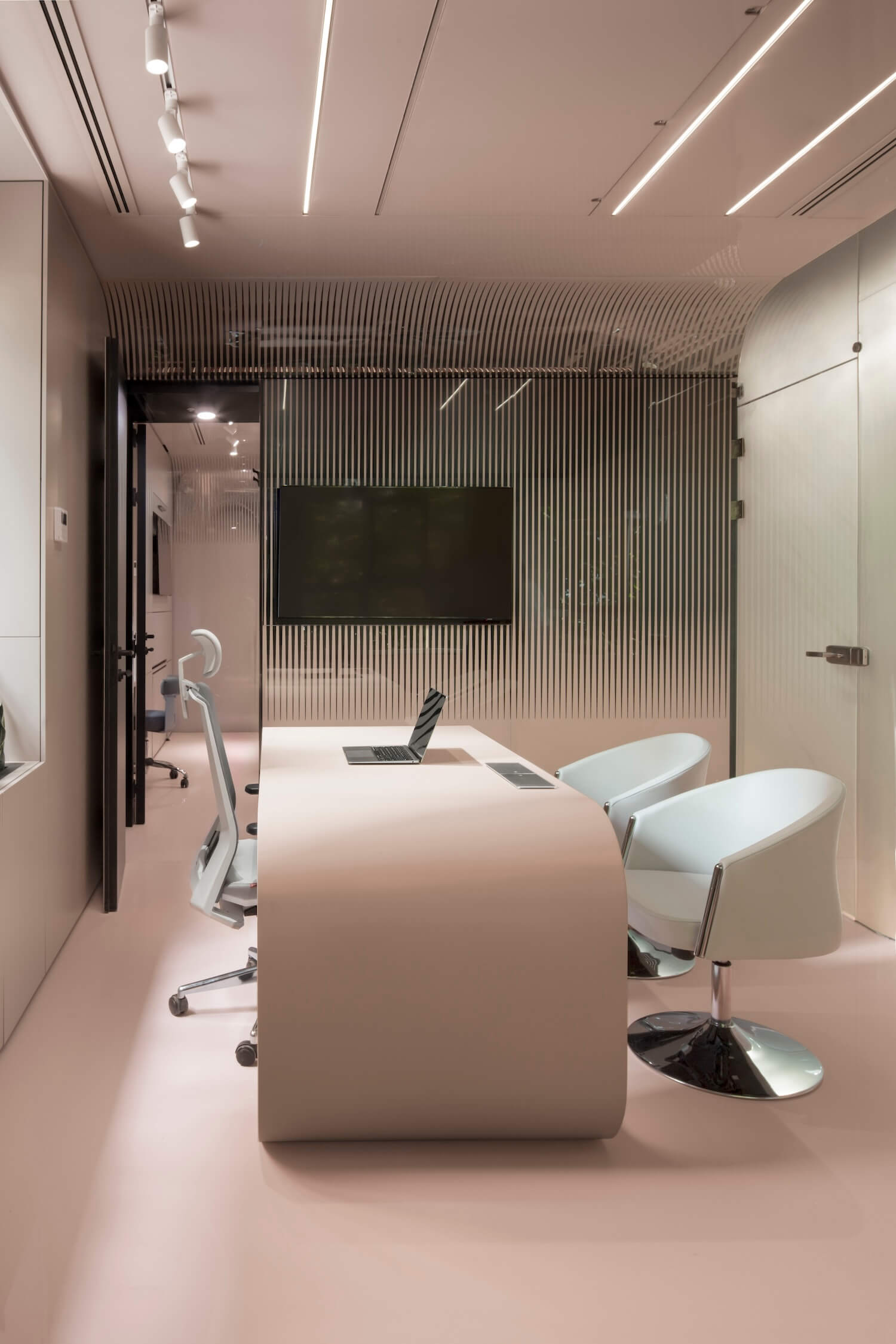
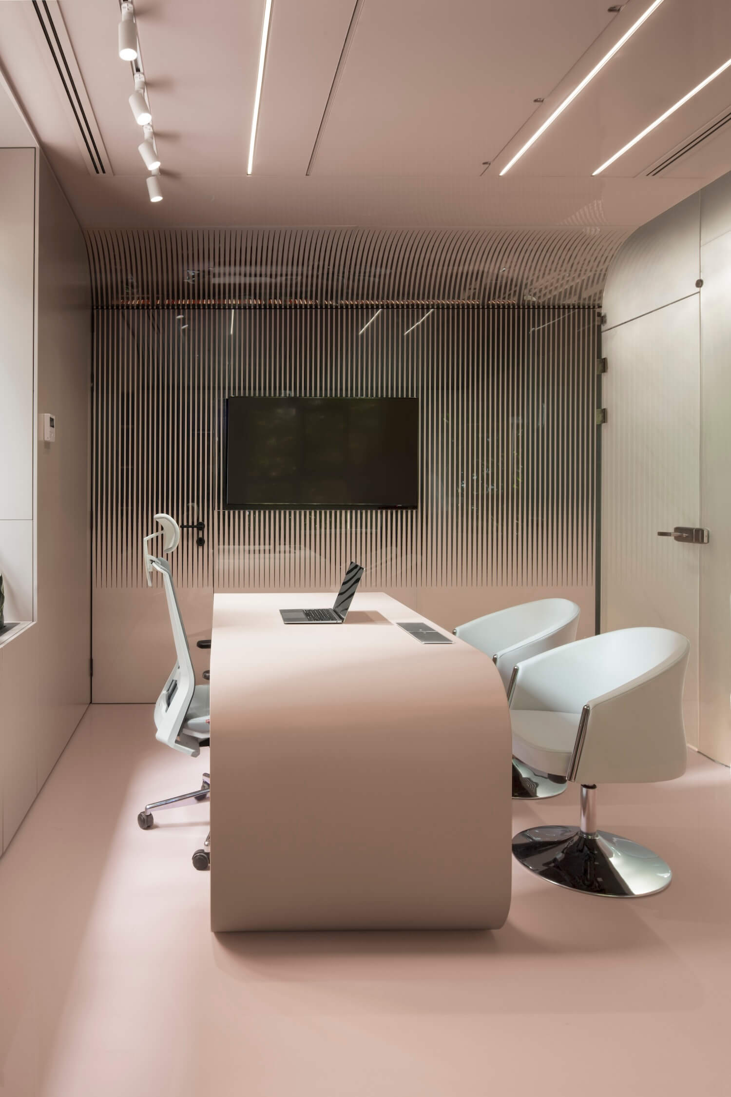
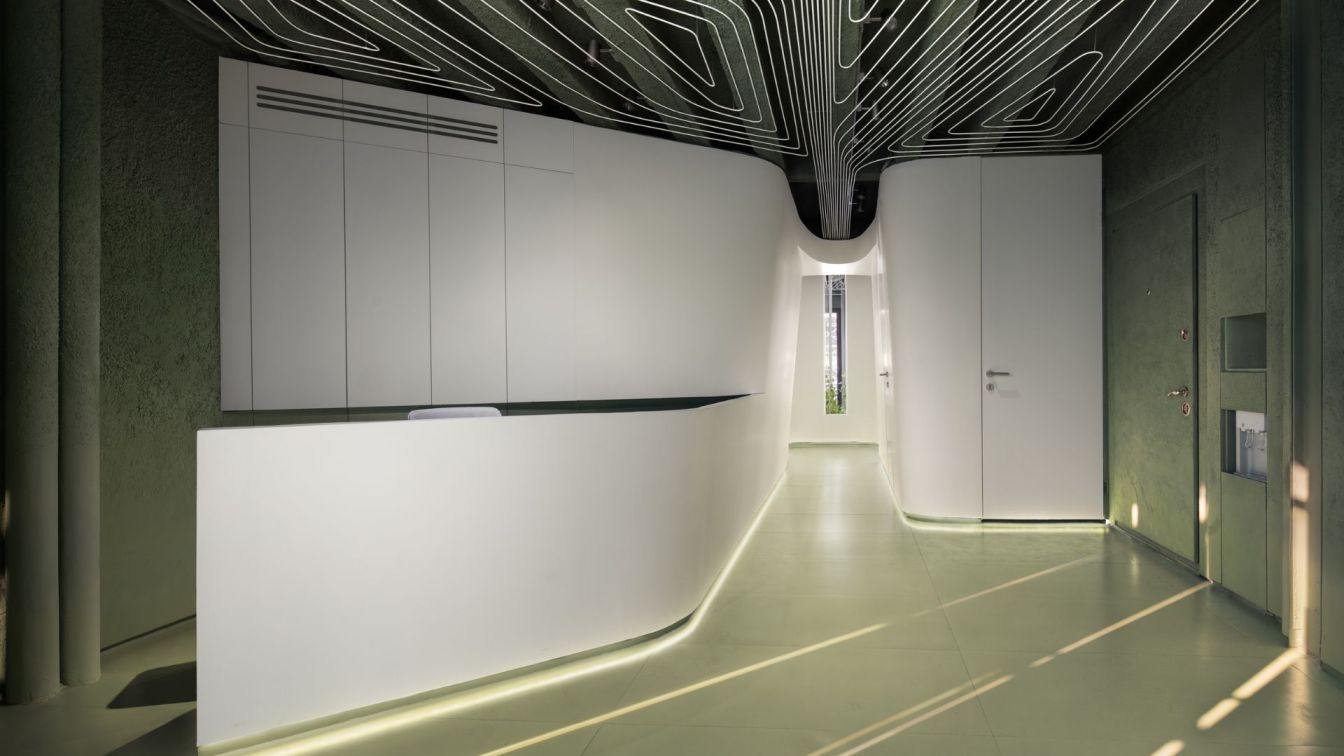
AsNow Design & Construct: The idea for interior design of the Bafter, a dermatology Clinic, was formed by an effort to embody the concepts related to the treatment process and the oblique reference to the mastery of the doctor. Contemplating the Vocabulary related to this field brings to mind features such as texture, layers, purification, elegance, sensitivity and flexibility. To materialize these words, physical similarities and sometimes thought-out contrasts were used in an attempt to engage the audience’s sense in this limited and small spatial box.
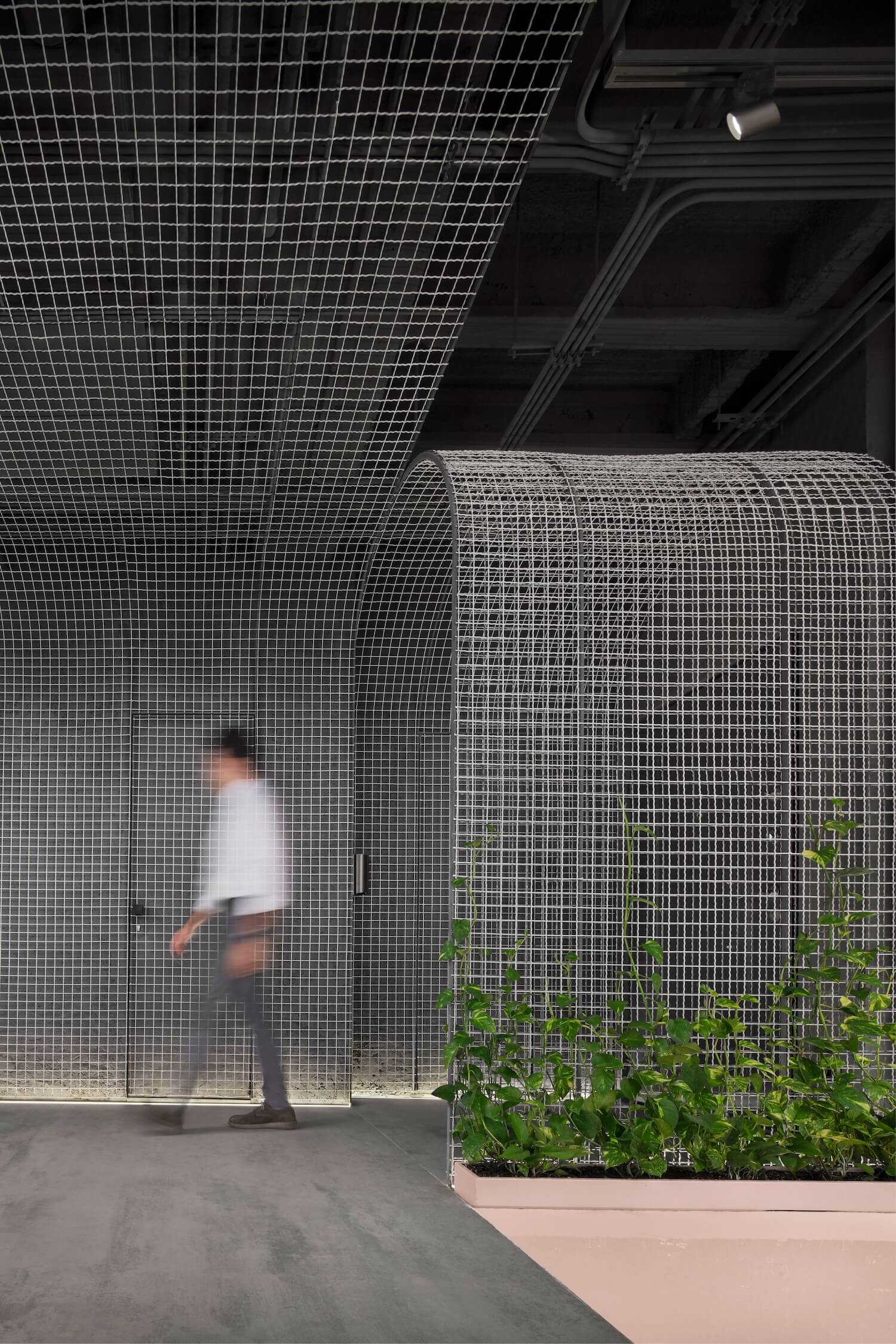
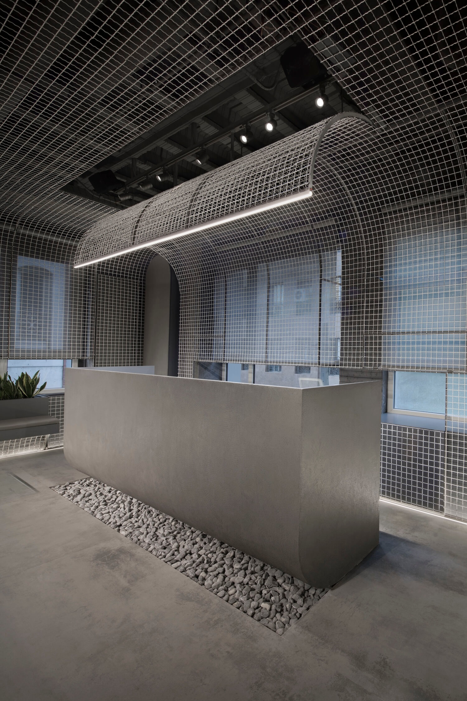
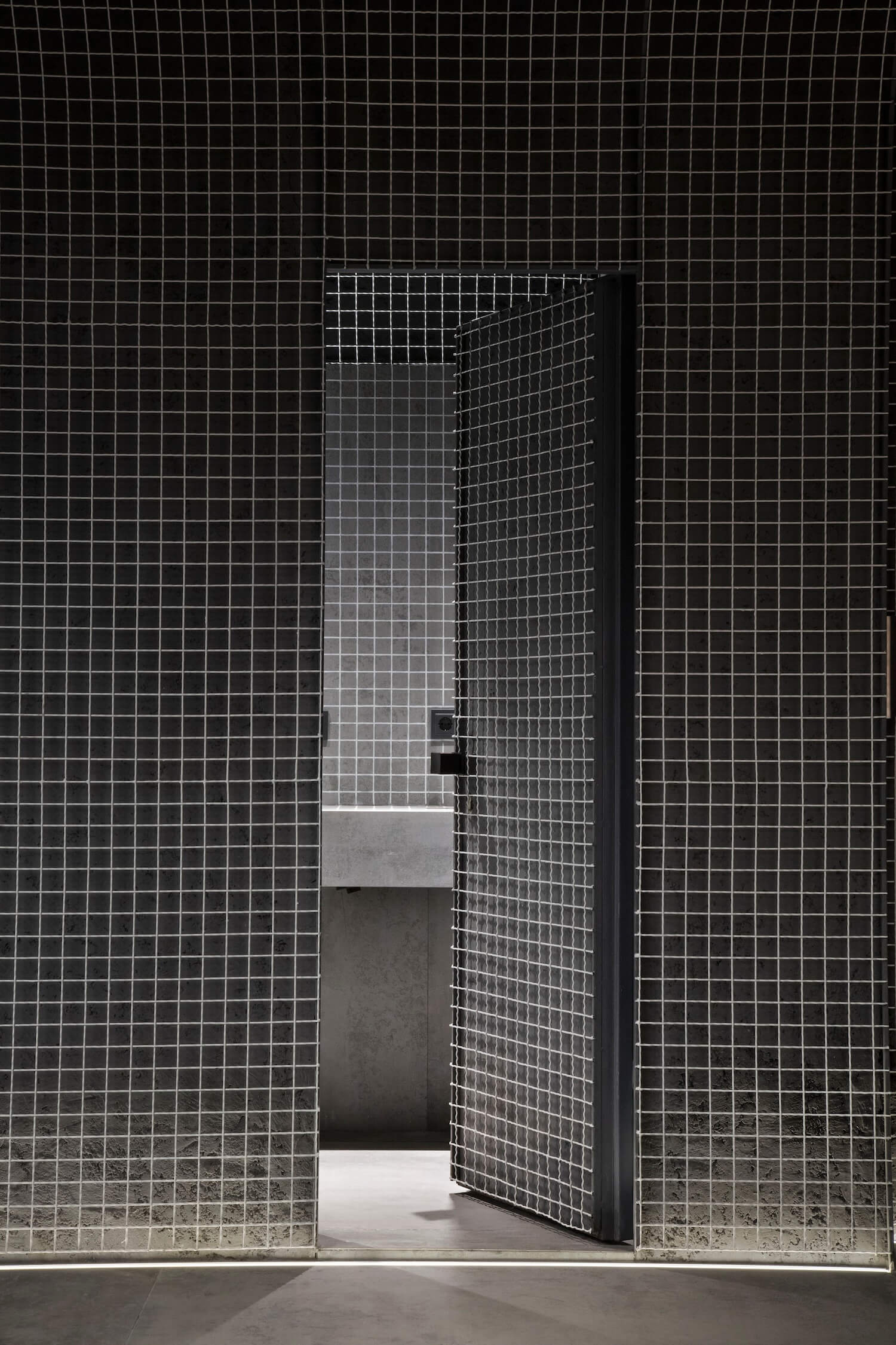
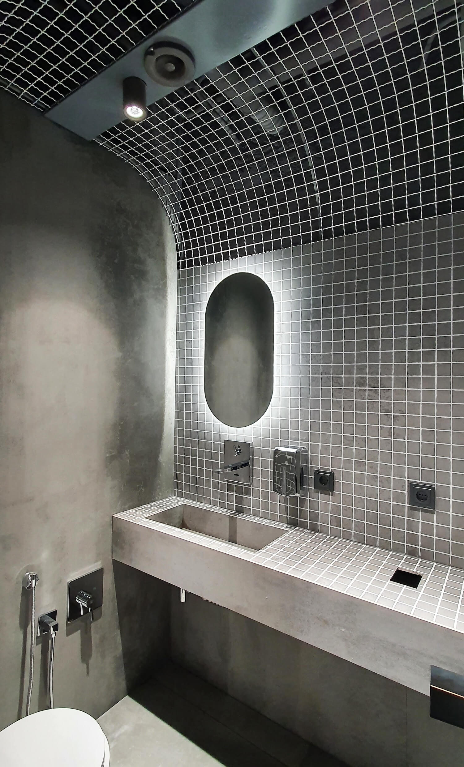
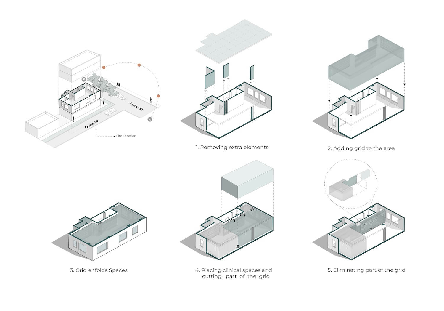
The design process commenced like the work of a doctor by peeling off the additions and removing the excess elements not only the walls that interfere in performance but also the ceiling and walls, covering the utility pipes. The purpose was to display all the structural elements of the space, both in terms of structure (removing the monoliths under the suspended ceiling to expose the slab network of the roof) and in terms of facilities (revealing the main network and carefully implementing the new mechanical and electrical system) to provide an opportunity to form a flexible shell.
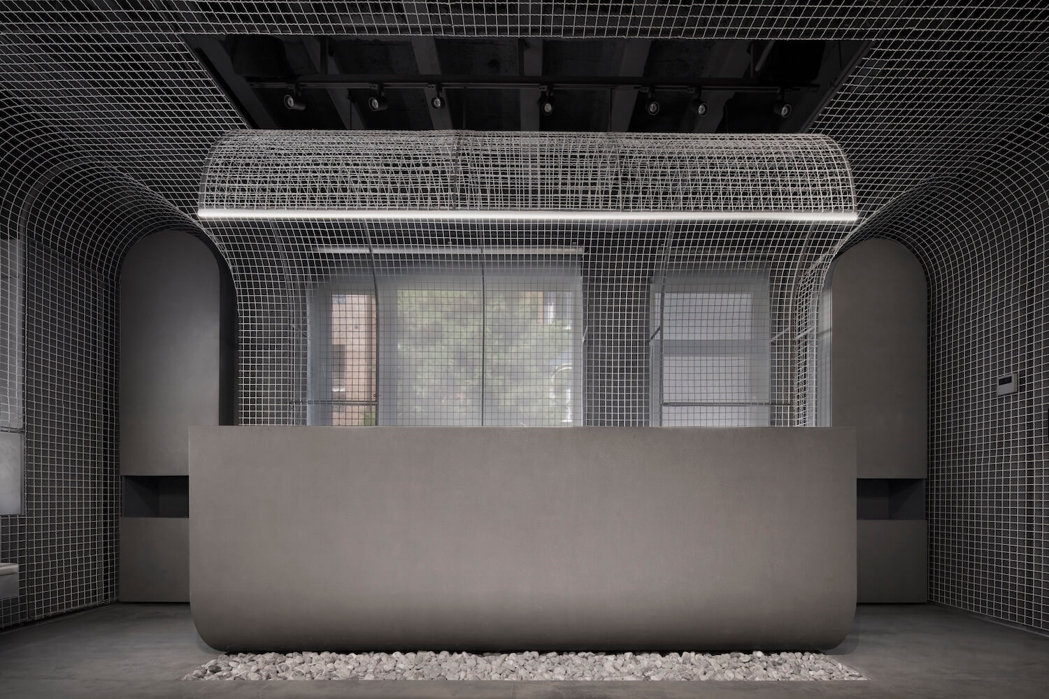
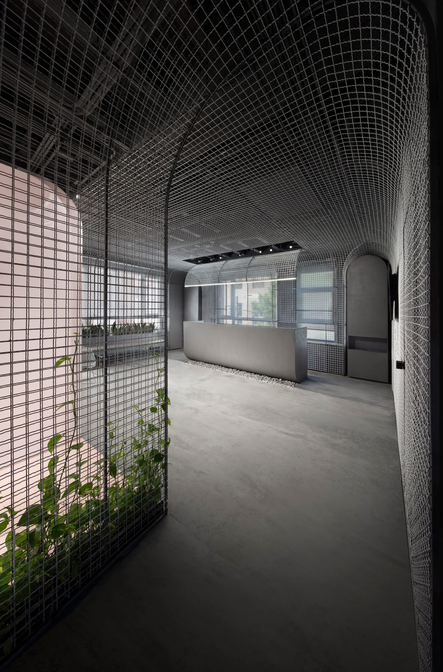
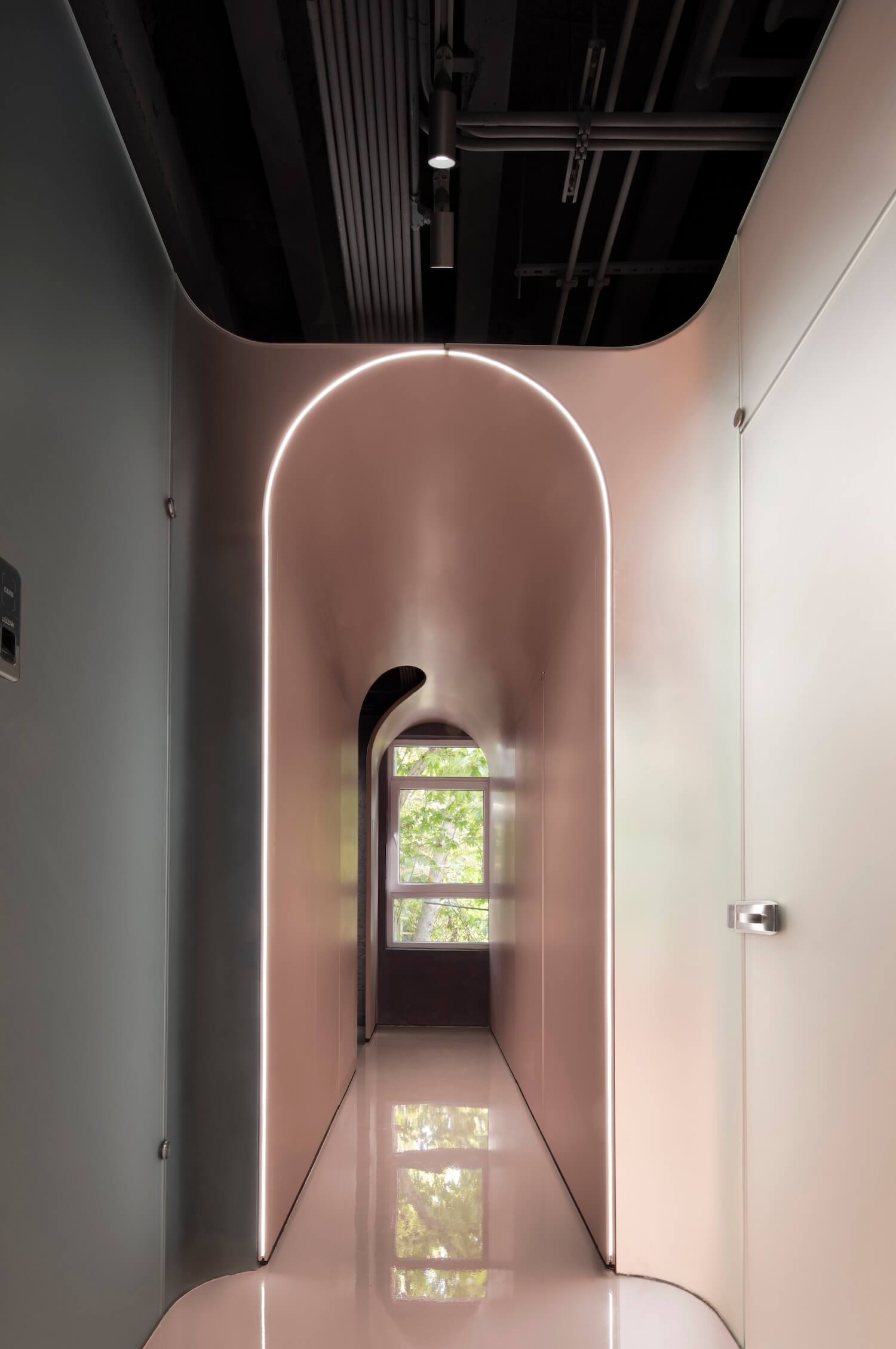
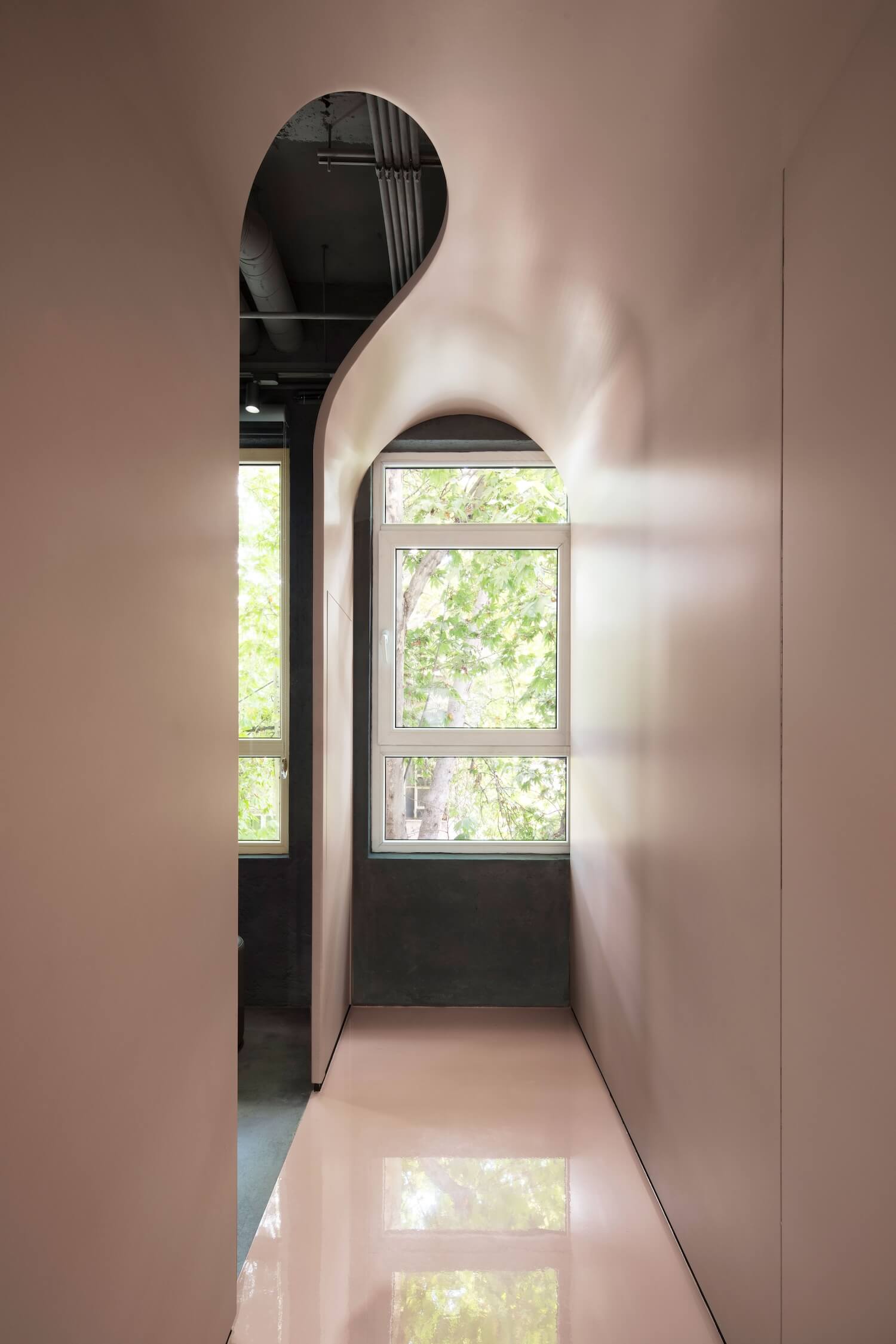
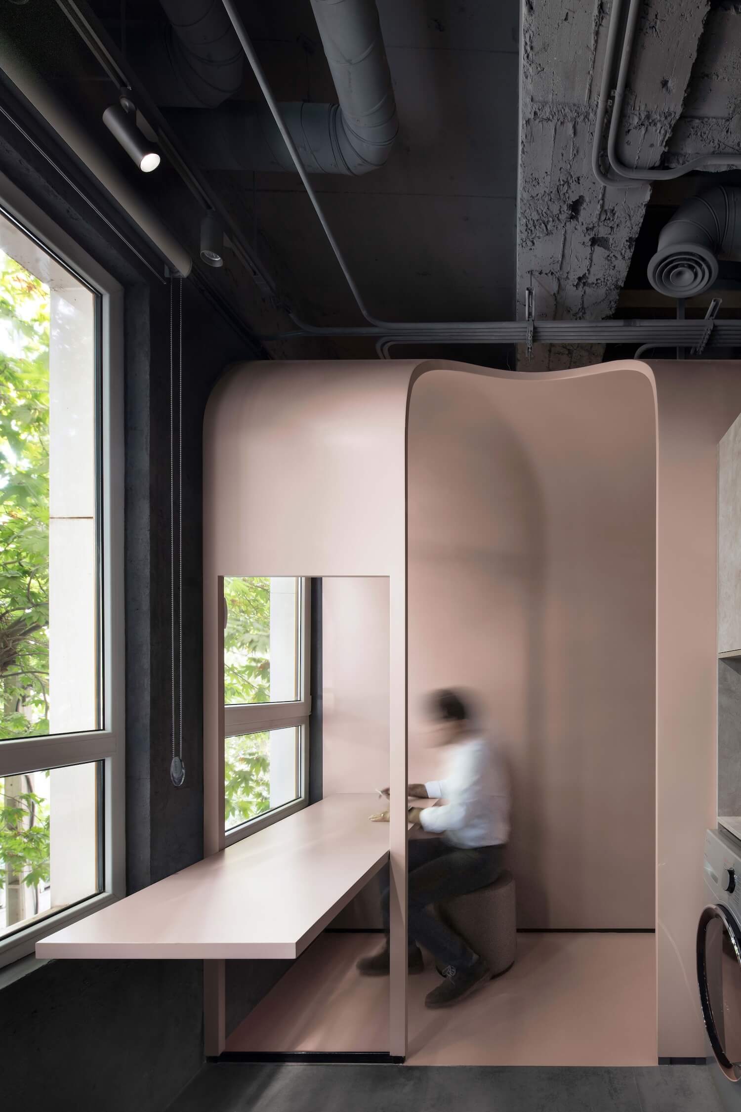
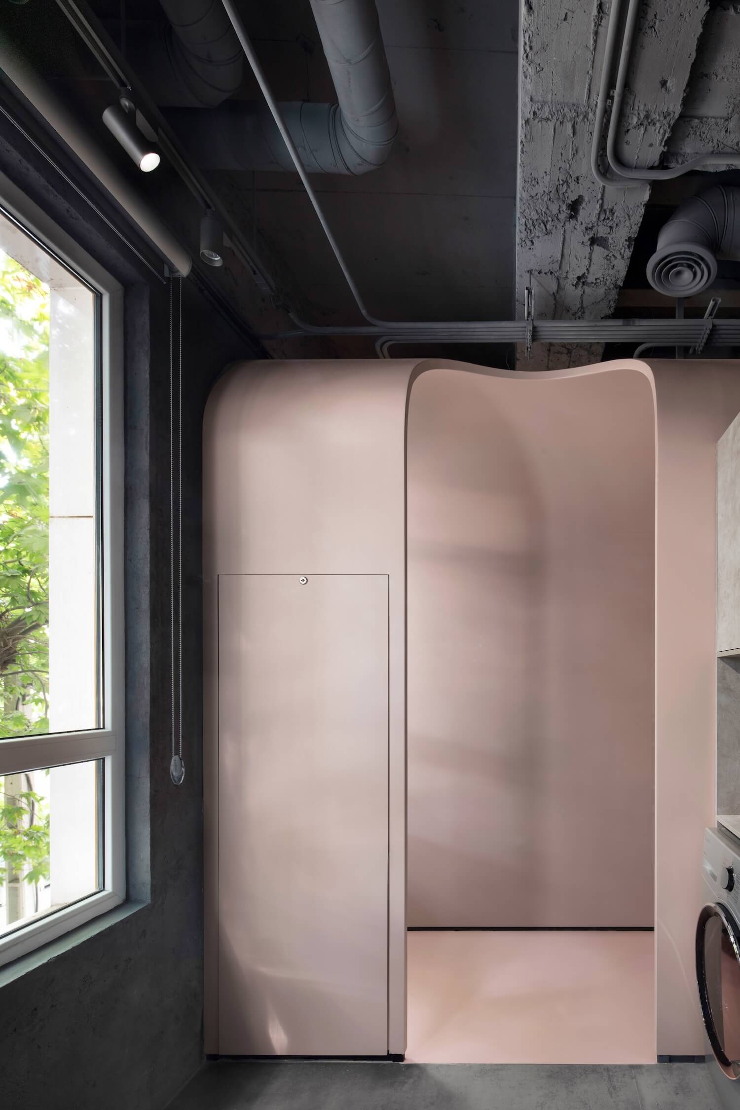
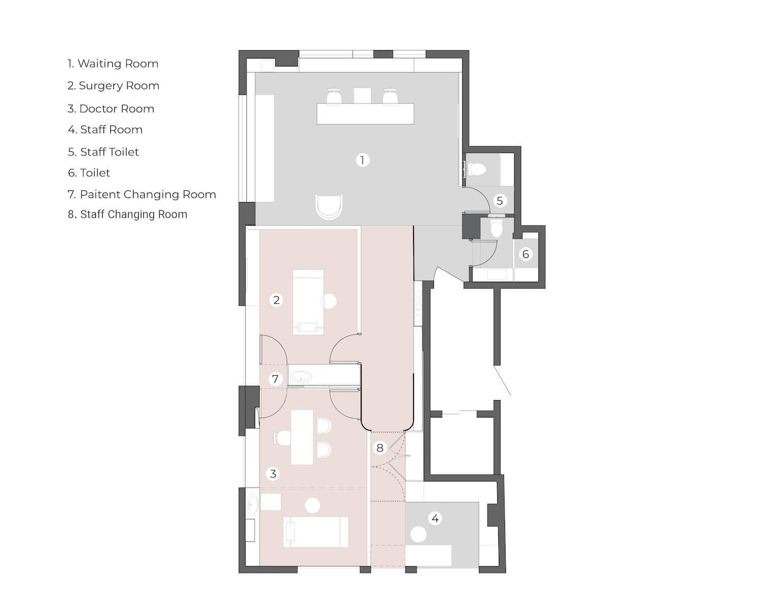
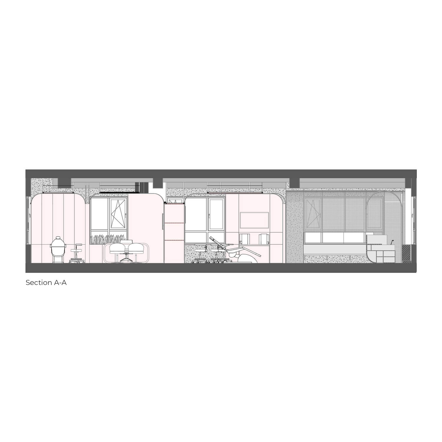
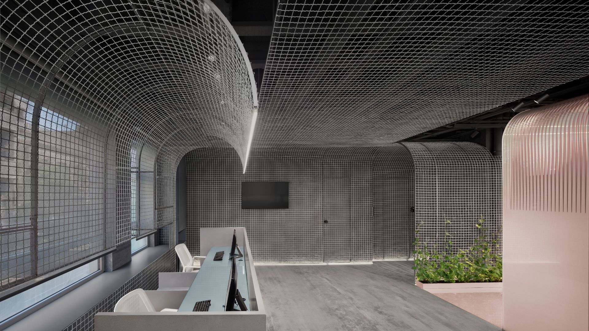
The totality of space got a coherent shape with the help of this mesh layer, and in the next step, when the treatment box was placed in the space, some cuts appeared on the mesh. The challenge that the plan provided for the design was a disproportionate corner with a beautiful view of the sycamore trees of the alley and a long access path that connected the treatment rooms to this cozy corner (private space for the doctor and staff)..
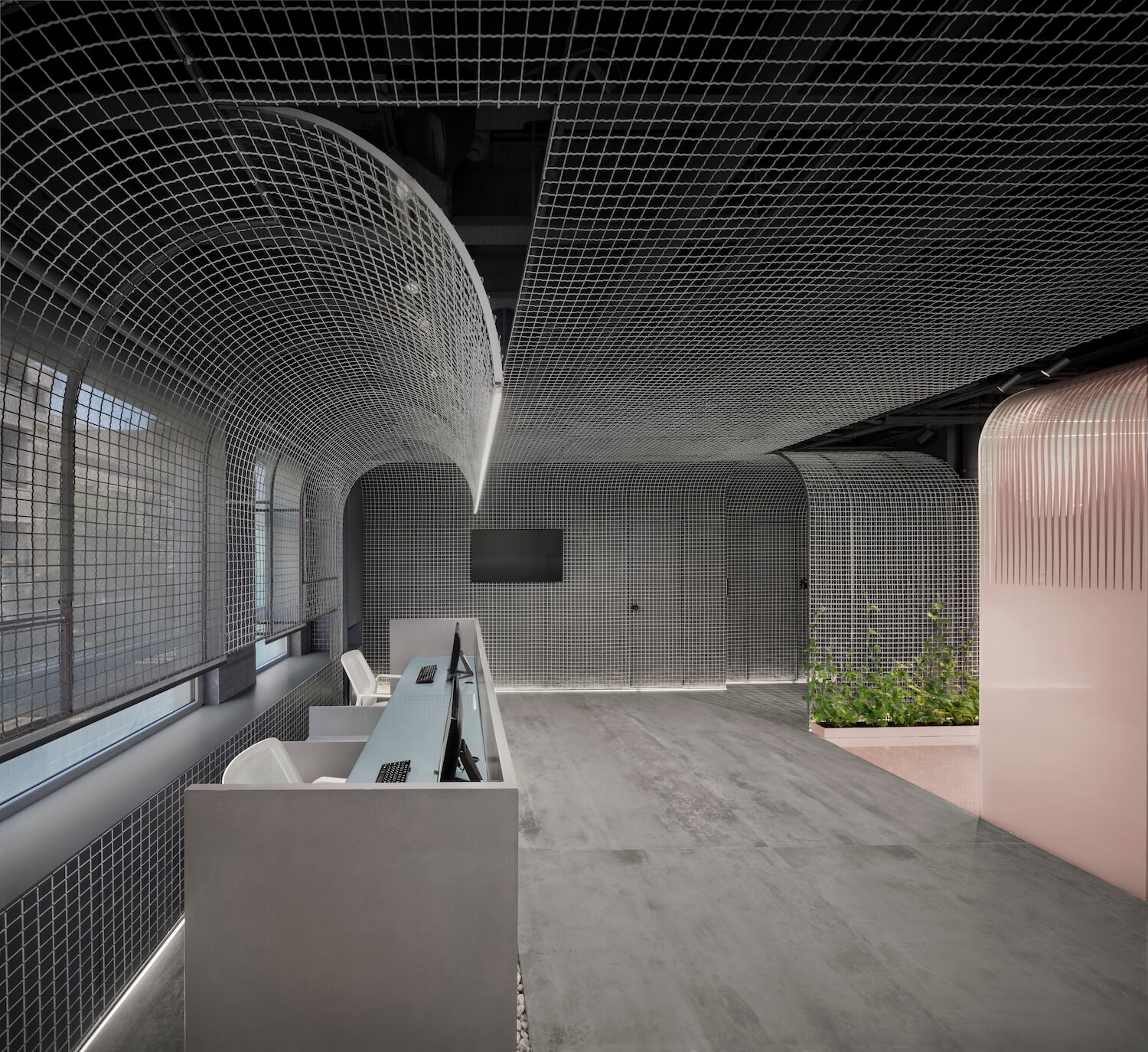
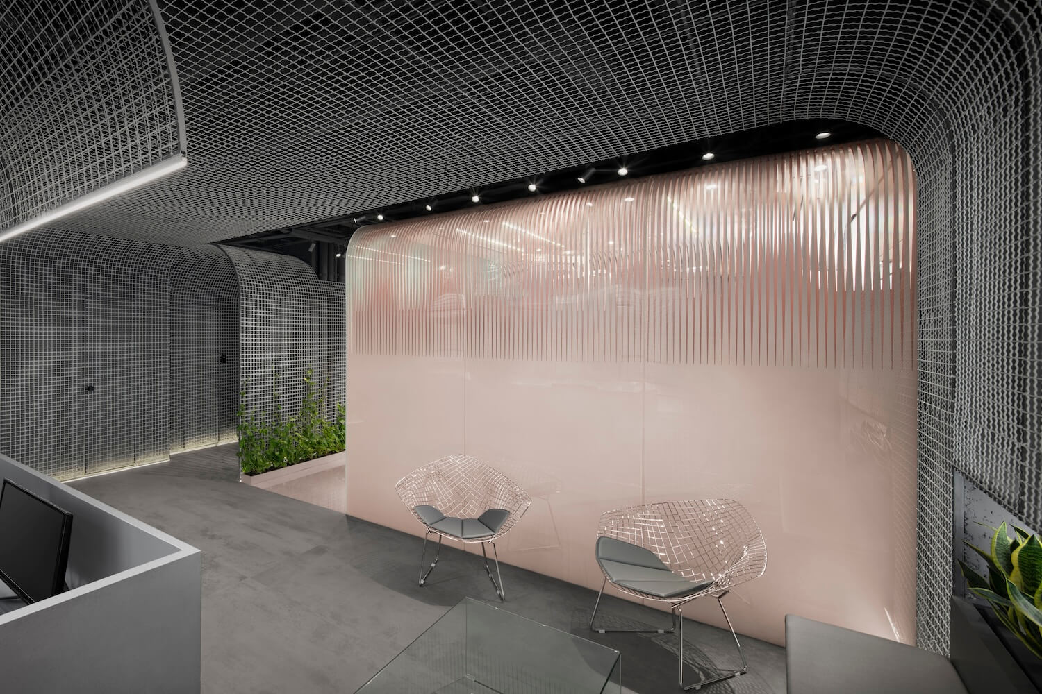
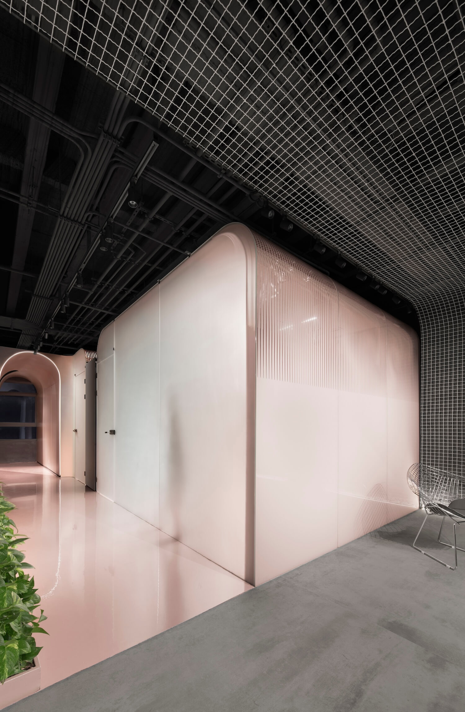
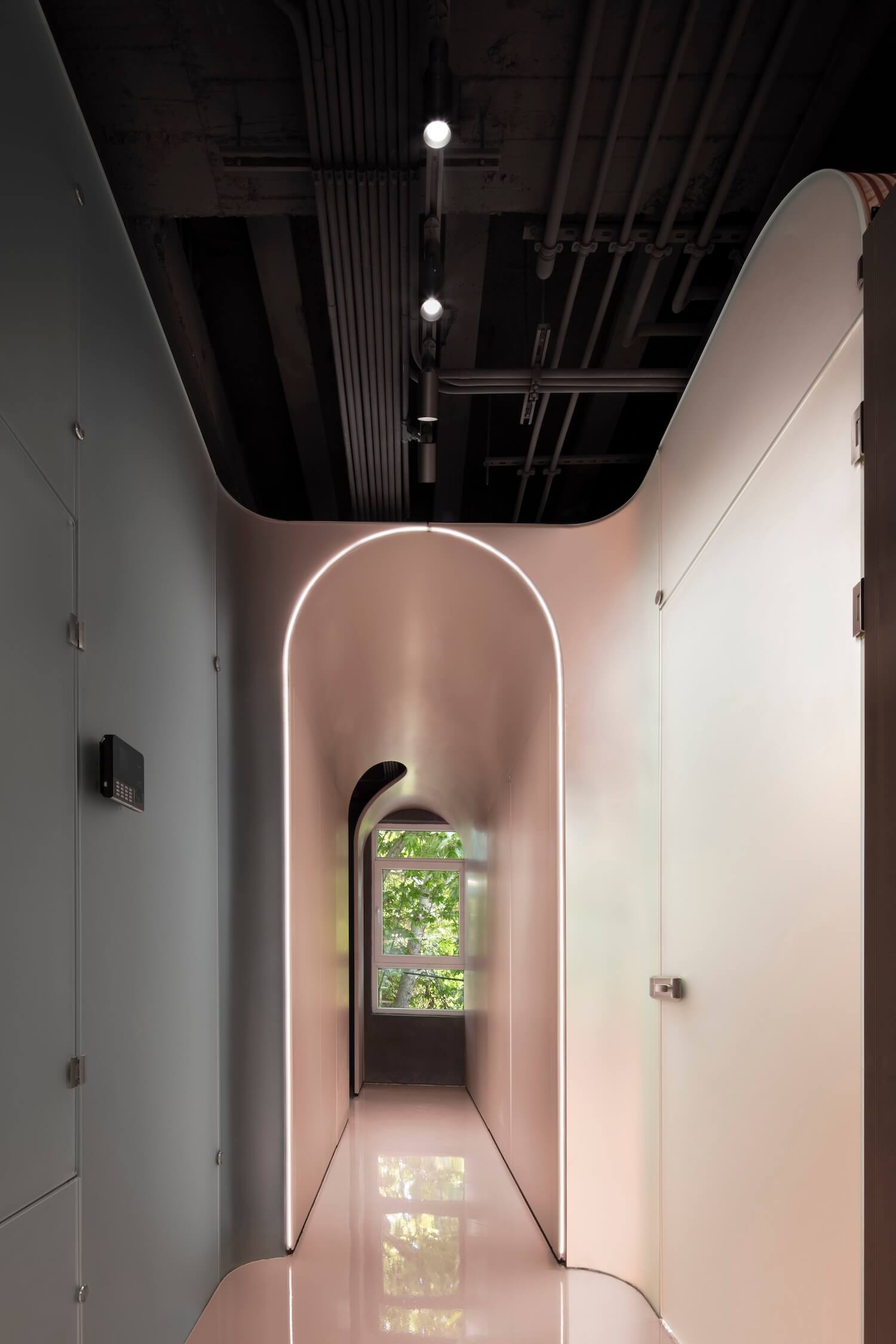
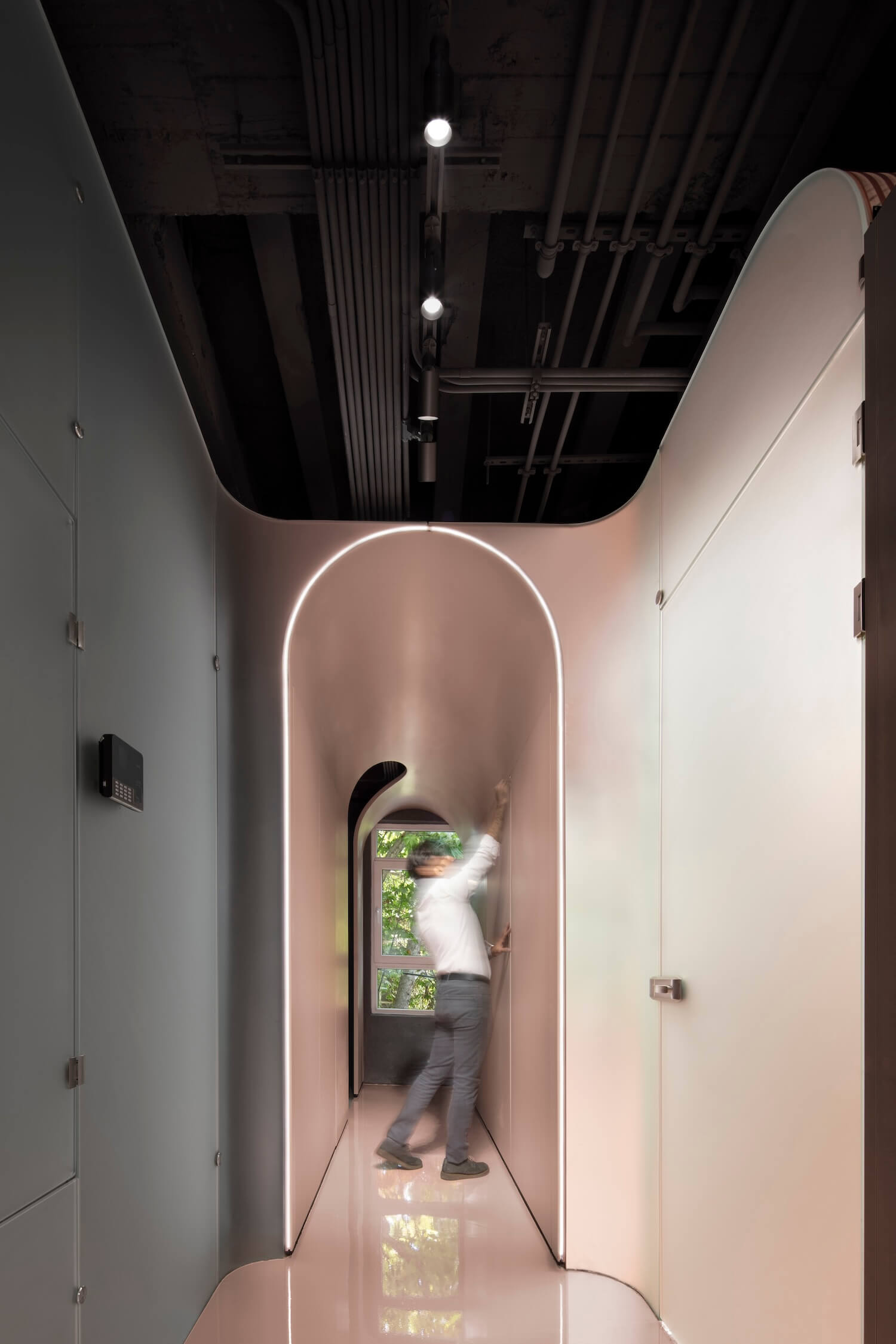
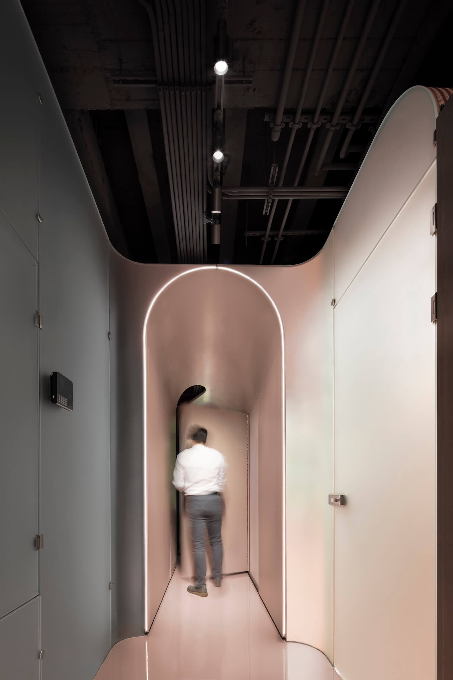
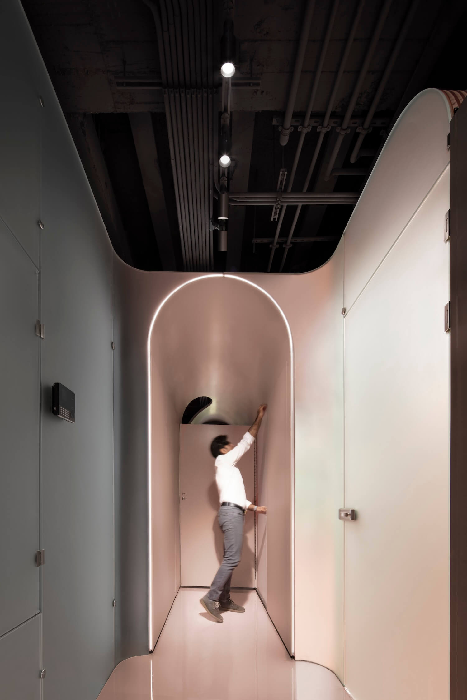
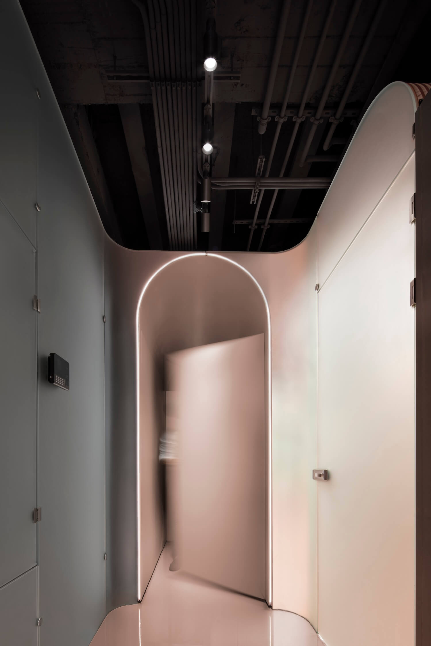
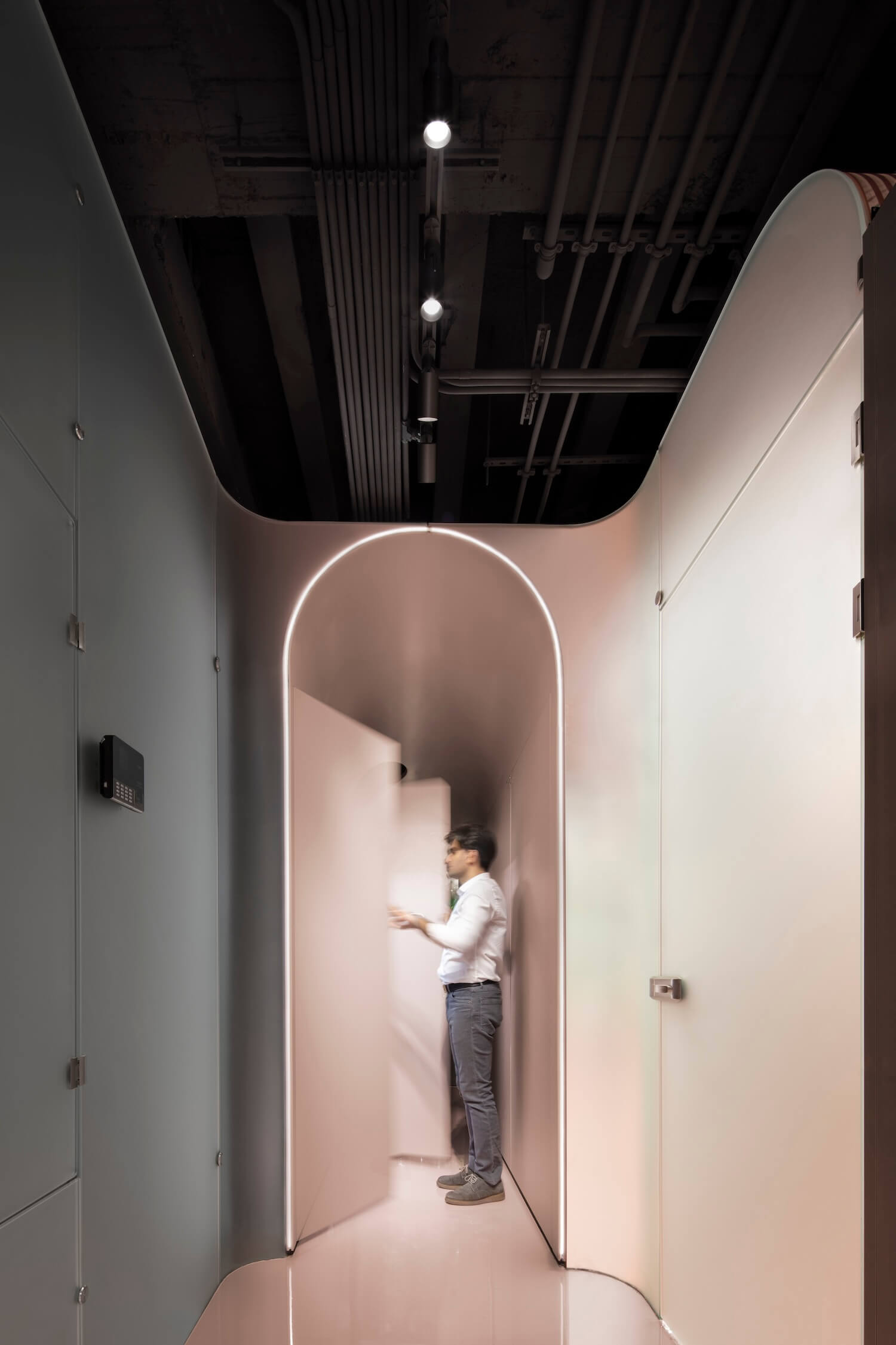
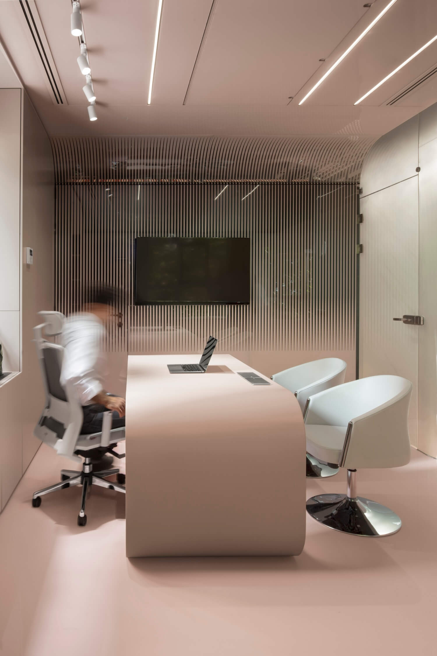
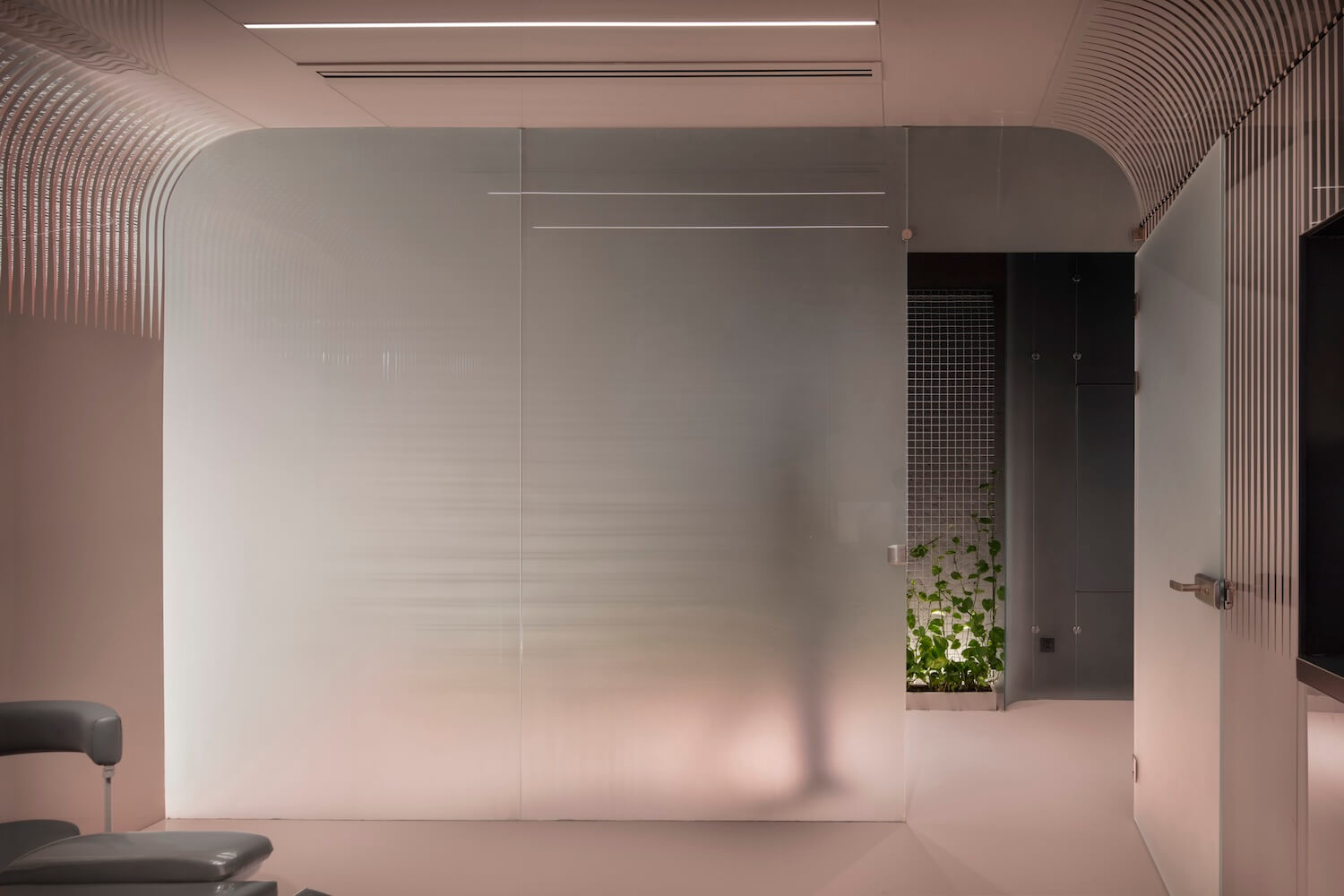
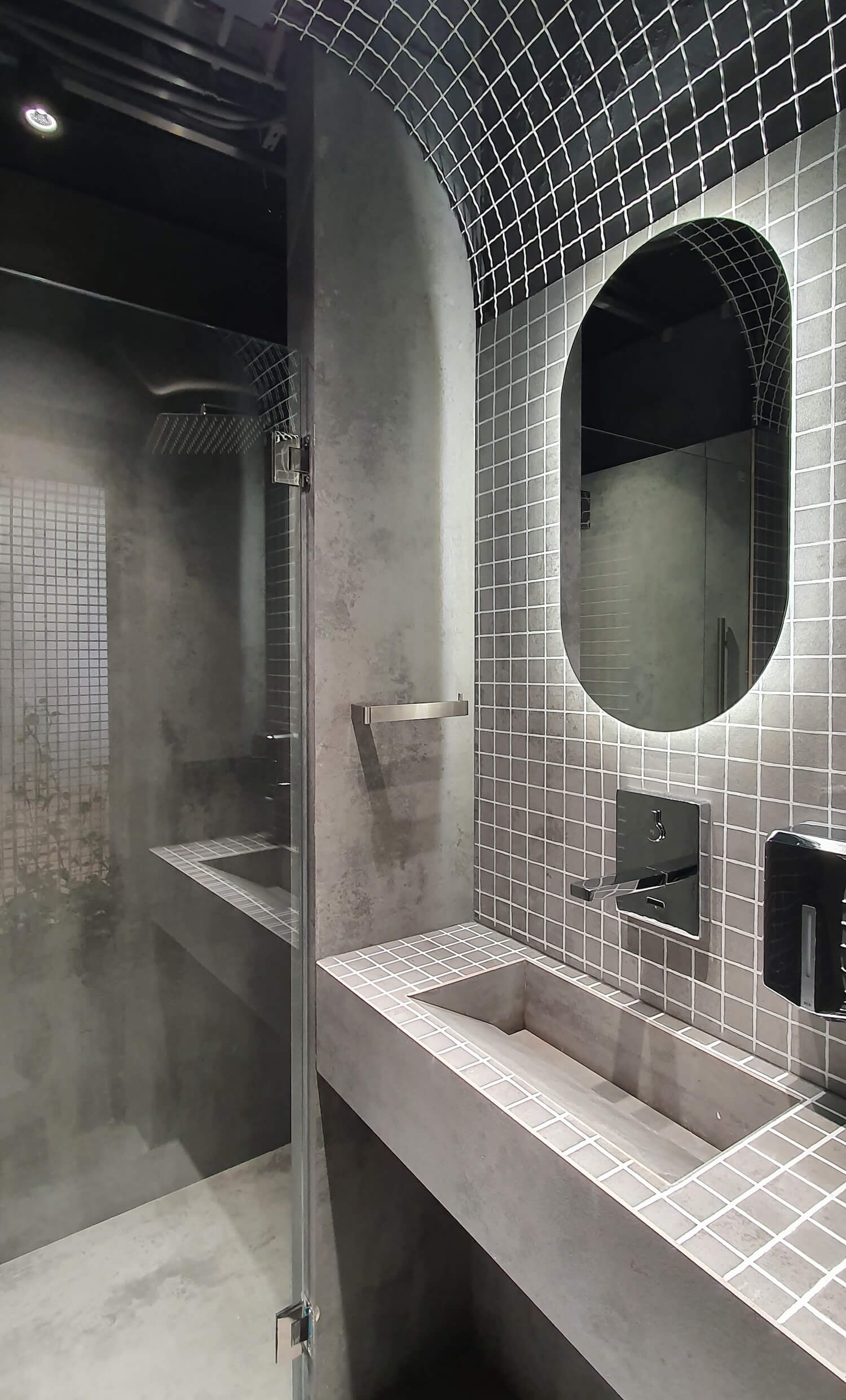
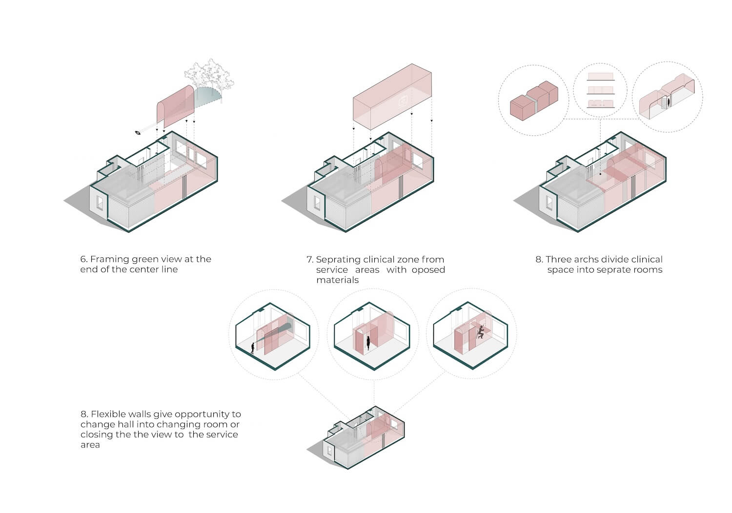
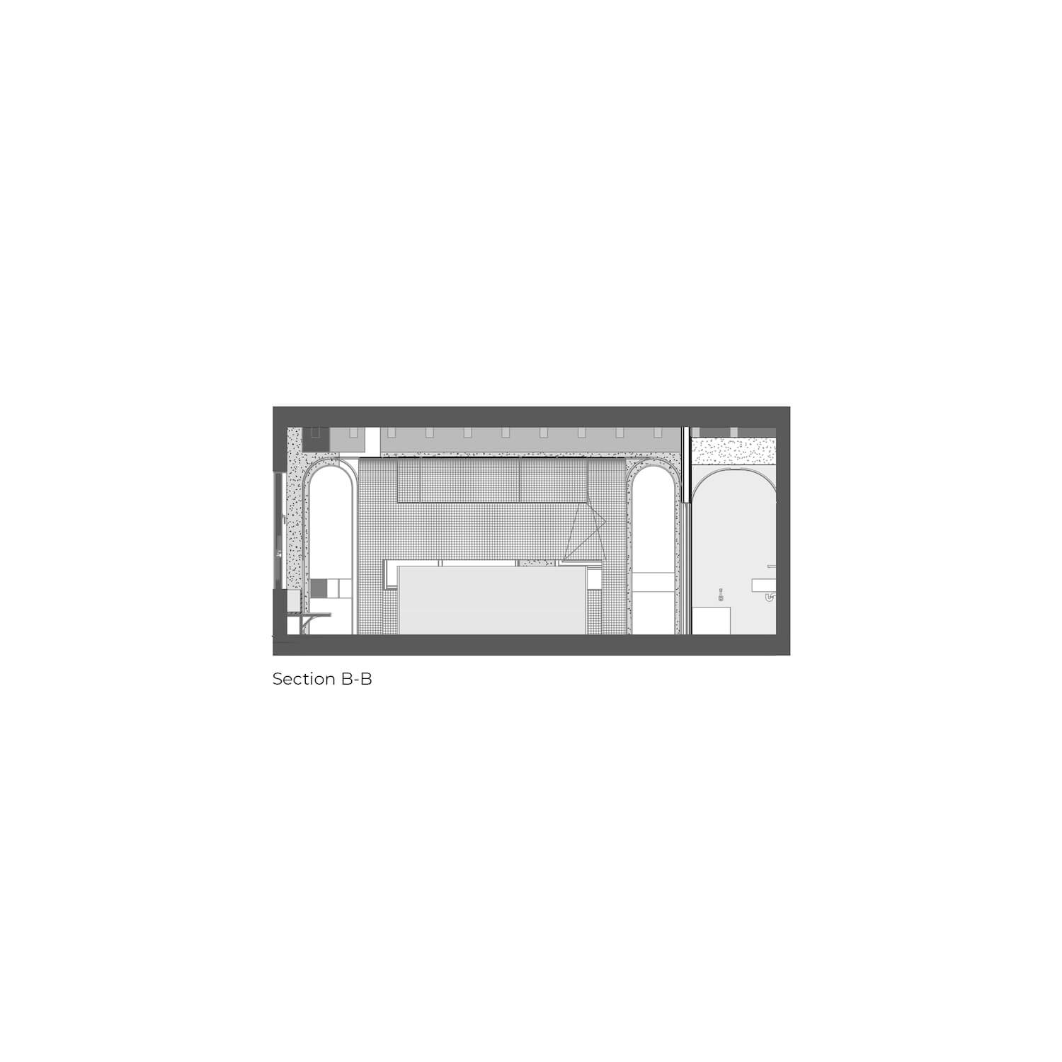
This long corridor, with the potential of the trees at the end of its axis, presented an opportunity for the formation of a green frame that would increase in the spatial quality. A vaulted space, in addition to visual beauty, meets the functional needs of a small medical office space. The staff dressing room can be enclosed with two doors built into the wall of the arch and when necessary, it blocks the visitor's view of the private rest area.The delicate and sensitive treatment box, which is a semi-transparent glass box, has a noticeable contrast with the rough texture of the mesh.
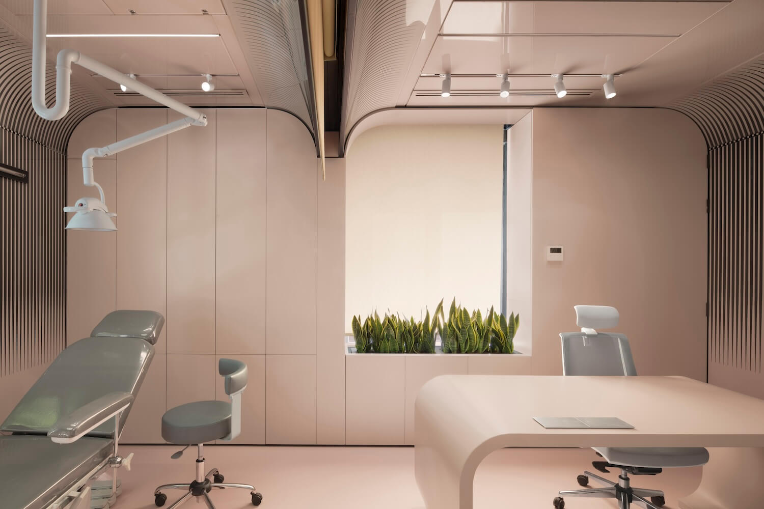
The visitors, sitting in the waiting area (contrary to the usual routine), see the semi-transparent glass box, which arouse their curiosity for the treatment area. This shiny space, which complies with the hygiene standards of the examination and surgery room, has a curved shape in accordance with the nature of the whole space and incorporates the physical plan of the design with cut arches.
