An Emotional Balance of Material and Contemporary.
The "BEN MOO Brand Exhibition Hall", located on the fifth floor of Fusen-Noble House in Nanmen, is one of the latest works carefully planned and designed by Rene Liu and Jiajun Tang, the design directors of HDC Design.
This exhibition hall is a brand-new design work created by the designers after carefully reading the series composition and development concept of BEN MOO products, together with the brand, using a restrained and spiritual design aesthetic. Therefore, in terms of functionality, aesthetic significance, and the sense of "communication" in contemporary commercial space, it has reached a high degree of fit.
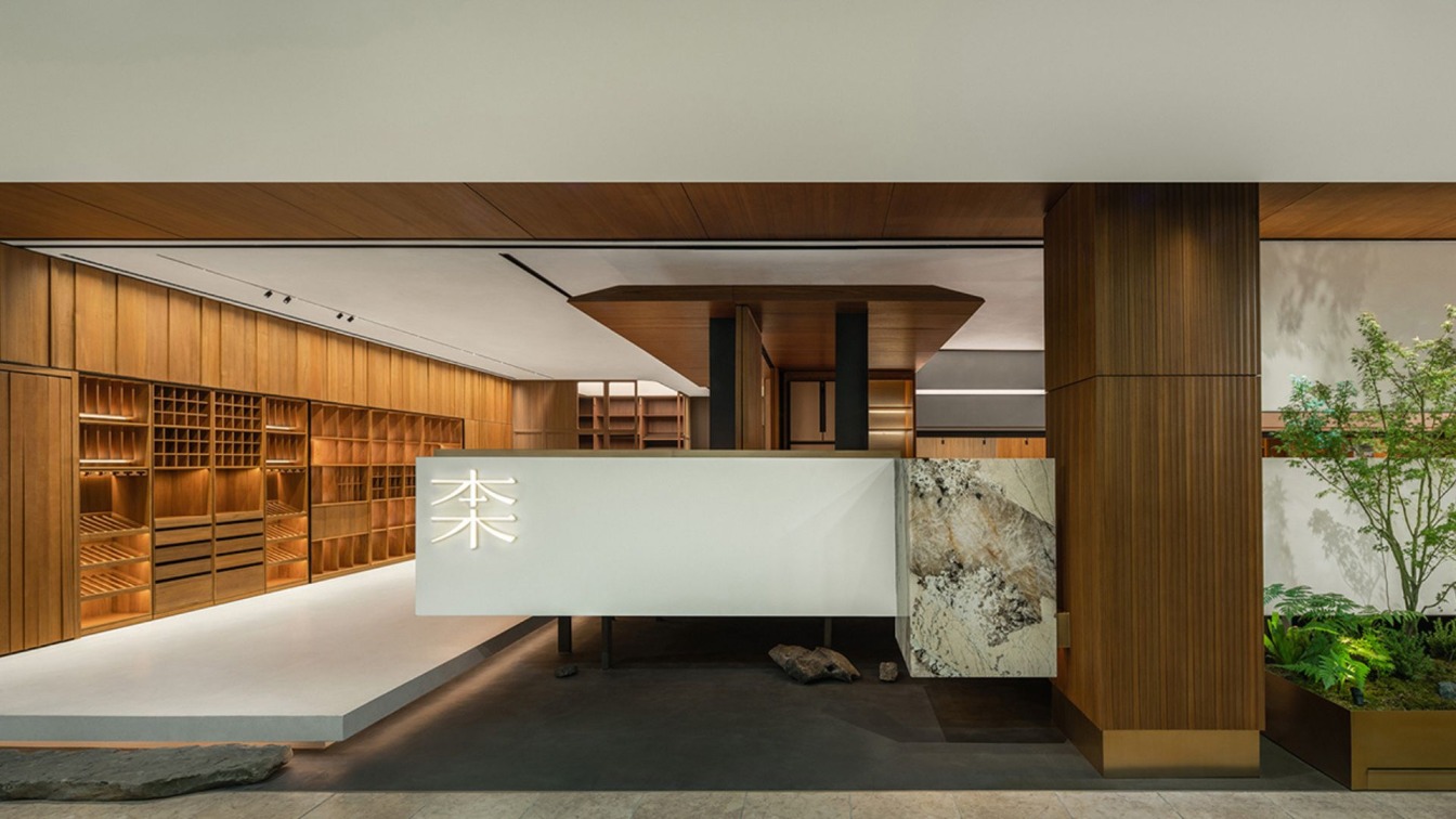
The space unfolds a narrative horizontally on a base site of just over 200 square meters. It integrates contemporary, traditional and oriental sense with exquisite structure, formed a place that is comfortable, stretched and full of humanistic temperament. At the entrance, the designer used natural stone as steps, milky white artificial stone, white hollow logo wall and stone with patterns to make the entry passage carries a sense of float.
From a distance, the whole space looks like a baby being nurtured in the mother's womb. After being embellished by natural stones, plants softly define the boundary of the space, reflecting a tranquil, quiet and warm mood.
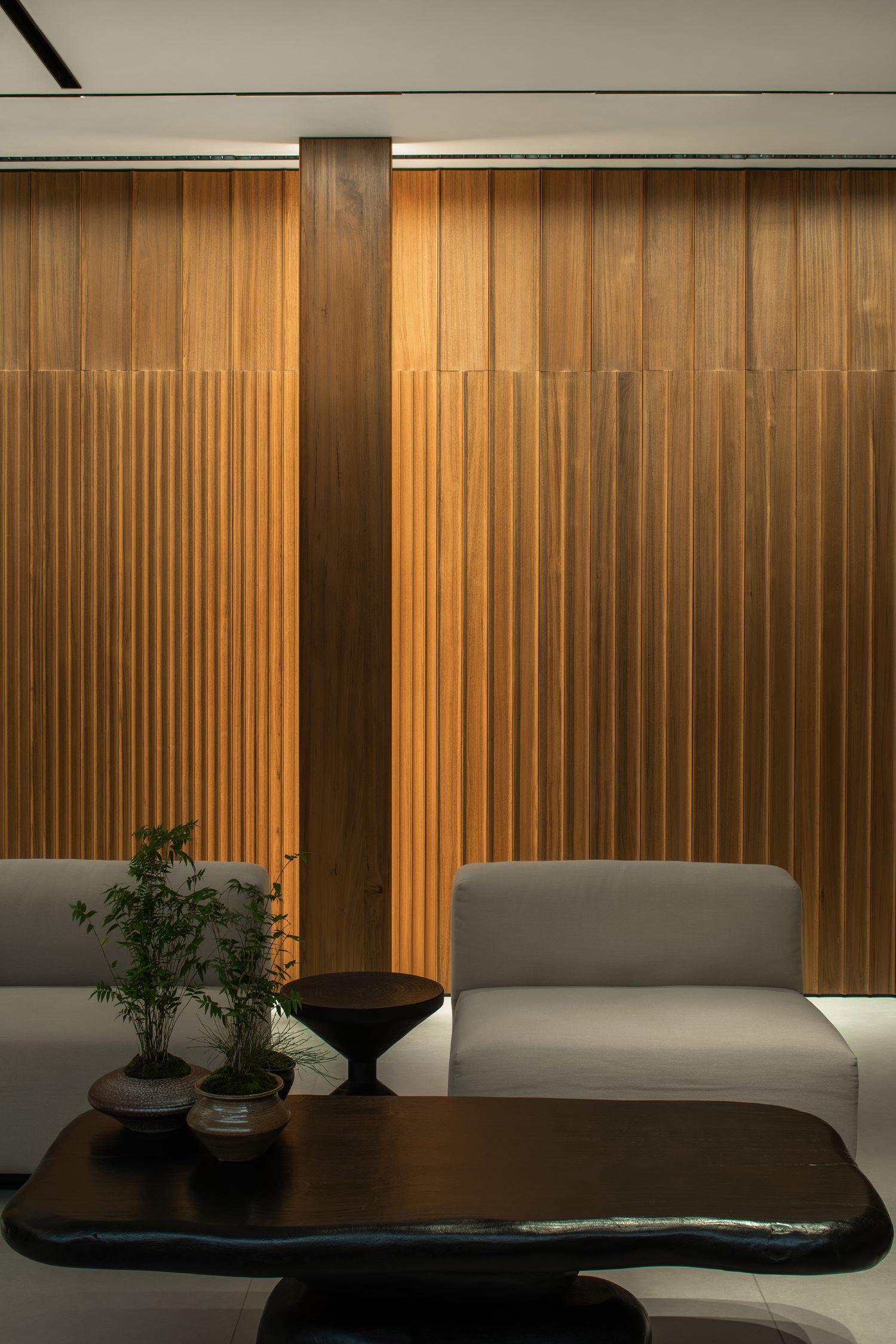
After entering the space, cloakroom-like grids are set to stand along the wall. The structured wooden panels use different forms such as tenon, supports, columns to make the texture of the space rich and full, radiate a sense of home in silence. It does not only show the space planning ability of "BEN MOO", but also the craftsmanship of the brand. The designers created a scene that combines the density of texture and space division, formed an overall image spirit and charm, which is an understanding of "fineness", it implies the order of life, the combination of elegance and fashion, and is full of spirituality.
In the design of BEN MOO brand exhibition space, the designers used the psychological factors in mass communication as the background, kept an eye on the theme of "communication," thus, formed a logical relationship among the three areas of cognition, communication and problem solving.

Initial contact with "BEN MOO" starts from the cabinet display at the entrance, you can preliminarily understand the tonality and craftsmanship of "BEN MOO" products. Through an appropriate personal thinking process, designers and owners who use "BEN MOO" products can get a conceptual judgment on whether they meet the ideal woodwork in their minds, laying a foundation for further decision-making. Here, customers can use "touch" and "vision" to "have a conversation" closely with the products. On the premise of being satisfied with the "vision" and "touch" of the product, customers can begin to communicate with the personnel of "BEN MOO" in depth. At this time, business contacts begin officially.
All product goes from "physical property" to "human nature", and it is people who finally endows products with soul. Space design gives "products" with temperature, which is the meaning of communication.
In the area of communication with people, designers made the most effort. If they didn't pay full attention, the space rhythm would become confusing. After careful consideration, space matching and full communication with the brand, the designers use the transparent cabinet structure as the bridge of the space at the end of the product display area. In this way, the partitions become flexible and can be interspersed with each other, and are shaped with light of different illuminance, so that further communication becomes natural.
The most striking thing is that in terms of regional division, the designers allow spaces with different attributes to converge at the top, rather than the conventional ground lifting. The designers make the lighting area sudden changes here, the lines are flexible, simple and elegant, and the texture is exquisite.
In order to enable the scheme discussion to be carried out in the exhibition space, the designers implanted a white box in the space, which is transversely connected and penetrates the internal and external vision. Its bottom layer is built-on stilts, making it more exquisite and lighter.

Here, the designers appropriately introduce the elements of the interior garden. The hard rocks embellished at the edge of the built-on stilts layer and the plant branches become the elements that define the edge of the space, which are lively and happy. The height of the long window across the middle and upper part of the box was carefully designed, which becomes the focus of vision shielding and opening. In this way, reception and scheme discussion are shared and naturally partitioned, and they are interchangeable landscapes.
The visual design of the space is very sophisticated. Designers use wooden nets to form exquisite wooden screen as rhythmic paragraphs to control the fuzziness and profundity of vision, so that the vision can penetrate and focus in the space just from time to time. All of these inadvertently make people pay attention to the dedication of "BEN MOO" to its products. As a space design firm, HDC Design pays full attention to the creation of atmosphere when designing, in general, the transformation reflects integrity and simplicity.
All this is just like what Colin Rowe discussed in 《Transparency》: "parallel perspective, compressing depth of field, shrinking space, clarifying light source, pouring objects, controlling color, oblique lines and linear grids, and the tendency to develop towards the periphery... This layered structure of space, the mechanism by which space is organized, shaped, and expressed clearly, is the essence of phenomenon transparency." Everything is as accurate as a clock.
BEN MOO Brand Exhibition Hall is like a piece of music that always swims in "minor." It has no mass contradiction, but it is very rich. Here, the movement of fashion, elegant refinement, contemporary accuracy and classical meaning are combined without any conflict, giving people a space for aftertaste. Everything is smooth, like a brook swimming forward happily.




Chengdu HDC Design Consultant
Since it was founded, Chengdu HDC Design Consultant has always adhered to a diverse, open-minded, creative and refined design way, we keep the strategy of “exploring the essence of commercial space” to actively carry out space design, so as to create complete high-quality projects for Chinese catering industry. The work we have designed speaks clearer than words, and we never make profit by any sharp practice.We have been exploring and discovering cutting-edge boundaries in the dialogue between commerce and design, creating leading design ideas for different type of projects to help clients enhance their brand value and industry barriers, and actively promote the expansion and output of China’s design.

