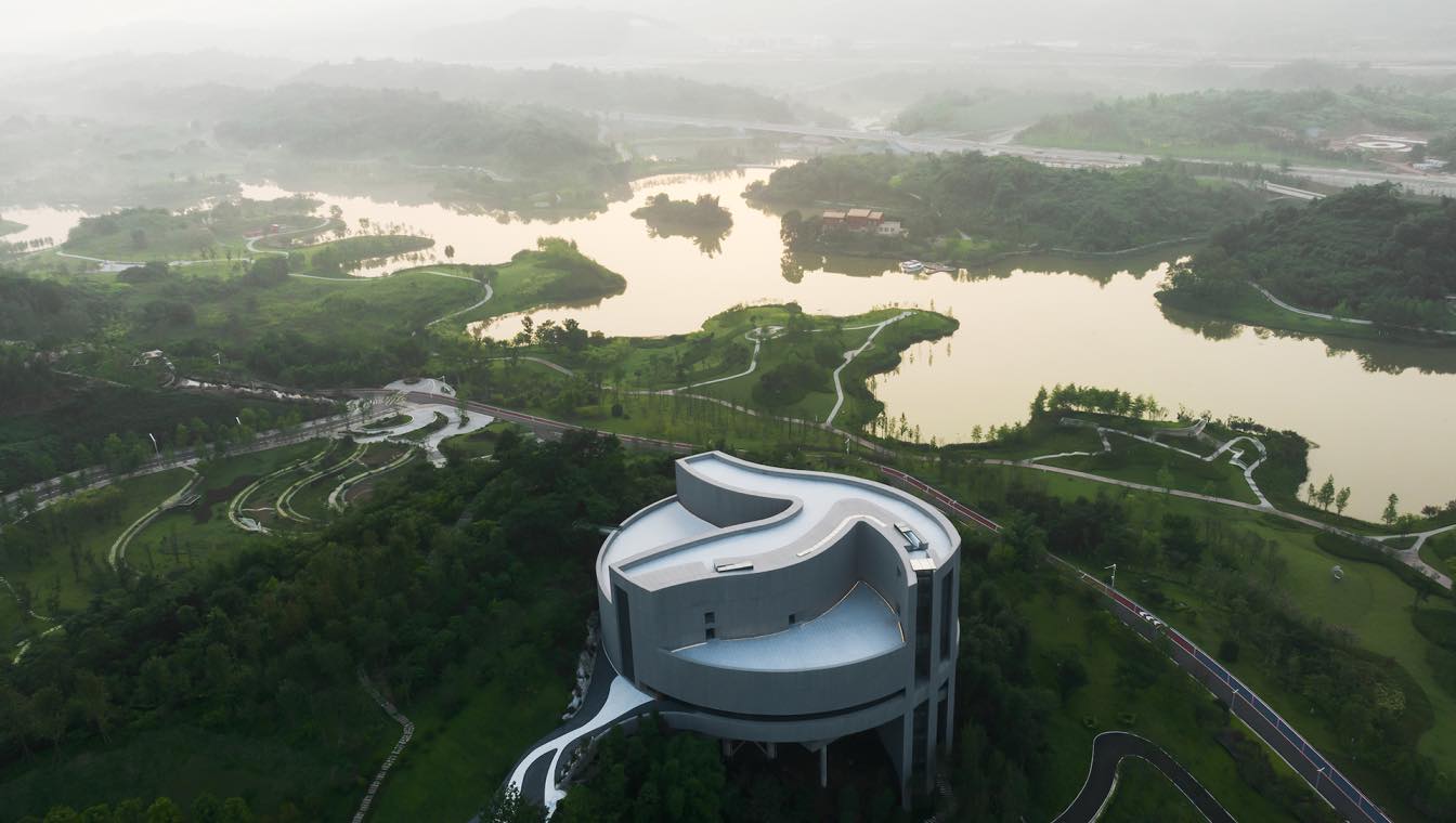
Tanghua Architects: The Planning Exhibition Center of Liangjiang Collaborative Innovation Zone is located in the south of the Innovation Zone and to the west of Huanhu Road. It is designed to cover an area of around 16,670 square meters. The plot is a hillock, which is at a high point of the Innovation Zone's 6.8-square kilometer core area. To the east of the site is a cliff, below which there lies Mingyue Lake and its surrounding ecological belt. Enveloped in a natural environment, the site is not close to municipal roads. Looking into the distance from the top of the hill, visitors will capture a faint view of Longxing Ancient Town.
The Circular Hall
The planning exhibition center has a gross floor area of 5,190 square meters. It serves the functions of reception, exhibition, communication and office as the "living room" of the Innovation Zone. Its functional boundaries are flexible, and it enjoys a rich natural setting. From the early phase of the project, the architects carefully worked to avoid creating an overwhelmingly huge structure on top of the small hillock. The team adopted an approach that disperses the functions specified in the Design Brief across the landscape. The visiting circulation starts from a bamboo forest at Yuanqu Road. As nature gradually gives way to manmade landscape, more scenery is unveiled along the circulation. The first floor of the main building involves nothing else but an exhibition hall that showcases the master plan models of the Innovation Zone. The building is presented as a perfect circle in plan, whilst its varying roof heights indicate internal programmatic divisions.
The building is a formal representation of Jialing River and Yangtze River, perched on one side of the hillock and adopting the form of a stilted structure that is local to the Chongqing region. Adjacent to a cliff, the office area, meeting room and café are located below the round hall, offering stunning views of an open lake. To avoid abrupt transitions between these areas and the main exhibition hall, the design encourages visitors to explore the surrounding scenery as they move between indoor spaces. Additionally, a vertical cylindrical structure provides vital support for efficient access and service circulation throughout the building.
The architects leveraged a sectional design approach to create a building in the shape of a vertical garden. By refining the functions of the building, the team not only fully integrated the building with the surrounding landscape but also established a deeper relationship between the main exhibition hall and the intricacies of the architectural form, thus to avoid the fate of being a monotonous envelope architecture.

Liangjiang/Twin Rivers (Jialing River and Yangtze River)
The intersection of Jialing River and Yangtze River has created a unique culture of Chongqing, as well as being the city's most recognizable icon. The architects incorporated the shape of confluence into the building's design as the guiding formal structure. This form overlaps with the circular plan of the main hall with varying roof heights signifying three distinct internal zones: a high-ceilinged exhibition area, a mountain-shaped exhibition platform, and an exhibition wall area.
The exhibition hall can also serve as a venue to host events for special occasions such as holiday, celebration or press conference. Rather than a conventional dedicated area for the scaled urban development model on the floor, the design team conceived a 17-meter-high exhibition wall to showcase the master plan of Liangjiang New Area vertically. Through the long, narrow window of the exhibition hall, visitors can observe the undulating mountains of the New Area. The high-ceiling space creates an exceptional experience, where visitors can immerse themselves in a world where reality and the future converge, poetry and dreams intertwine. As entering the exhibition hall, they will follow the "flow" of the rivers and get closer to the city's future featured on the map of Liangjiang New Area.
The visual language of the "flowing rivers" defines the spatial expression of the main exhibition hall and the vertical structure of the entire building. The vertical traffic is placed at the ends of the "riverways". Each floor is provided with a cantilevering platform, with the largest one protruding outwards for approximately 12 meters. 1.5-meter steel trusses are utilized to ensure the vertical rigidity of the large overhangs and the comfort of human experience. For some cantilevers, beams are attached to the upper and lower chords to maintain the stability of the truss. Standing at the center of the exhibition hall, visitors can clearly perceive the iconic shape of the Yuzhong peninsula.

The Sculptural Form
The facade design is generated by the form of the two-river-confluence. The building blends into the natural surroundings like a quiet sculpture, without excessive expression other that of the form itself. Fair-faced concrete panels are used as the primary material for the facades, creating a consistent architectural image with a rustic texture. To reduce the visual effect of surface panelization, the architects added vertical grooves and rough textures to the surface of the panels, in order to integrate the vertical gaps. The horizontal gaps are set at 30 millimeters wide, which enhances the visual expression of the facade. The facade panels follow a standard module of 4.3 meters, which reduces the number of molds required and improves construction efficiency. This also helps to control the placement and size of the openings on the facade, creating a simple and unified texture that accentuates the changes in the architectural form.
After experimenting with several designs regarding the width and depth of the panels' textures, as well as the consistency of the textures' angels, the architects conducted sampling and comparisons to determine the final approach. The team ultimately decided to adopt a vertical groove pattern with 50-millimeter-wide intervals presenting a rough and even textures, expressing the architectural form with more clarity. During the final stages of construction, the design team utilized concrete sealers to adjust and control the overall color of the building, thereby providing more tolerance to color discrepancies between the panels due to supply-side and construction-side causes.

The Trail
The visitors’ circulation creates spatial rhythms in the context of a rich and marvelous landscape. Visitors experience a sense of compression as they traverse a narrow path through the towering bamboo forest before entering the planning exhibition center. This experience acts as the prelude to the expansive view of Mingyue Lake. Upon reaching the entrance of the exhibition center via a leading bridge, visitors pass through a small private gate with a height of only 2.1 meters before they're greeted by a 19-meter-high exhibition hall. After visiting the main exhibition hall, visitors continue through a 4-meter-wide winding exhibition hall along the stairway, leading to an open rooftop terrace. The alternating sense of compression and expansion, looseness and density, creates distinct layers of view and enrich the visitors' experience in an otherwise small and confined site.
Perched on the southern hilltop, the building takes on the form of a traditional stilted structure, leaning against the hill, forming interior spaces and viewing platforms at different altitudes. The shape of the hill is also integrated into the building's design, resulting in a multi-leveled space. The rooftop terrace, which offers stunning views, is connected to a walking trail on the hilltop, making it part of a larger landscape system. The walking trail system is linked to the entrance terrace and the viewing terrace, making the building a public platform and a hub for the larger landscape system.

Conclusion
It has been over a year since the exhibition center was in operation. As the vegetation at the site grow lusher, the design team's initial vision of the building-nature relationship has been realized. In the picturesque landscape with mountain and lake views, the light-grey exhibition center sits on the hilltop in an elegant, simple and restrained yet eye-catching manner. It stands as a companion and witness to the city of innovation, a land where technology, culture and nature intertwine.


