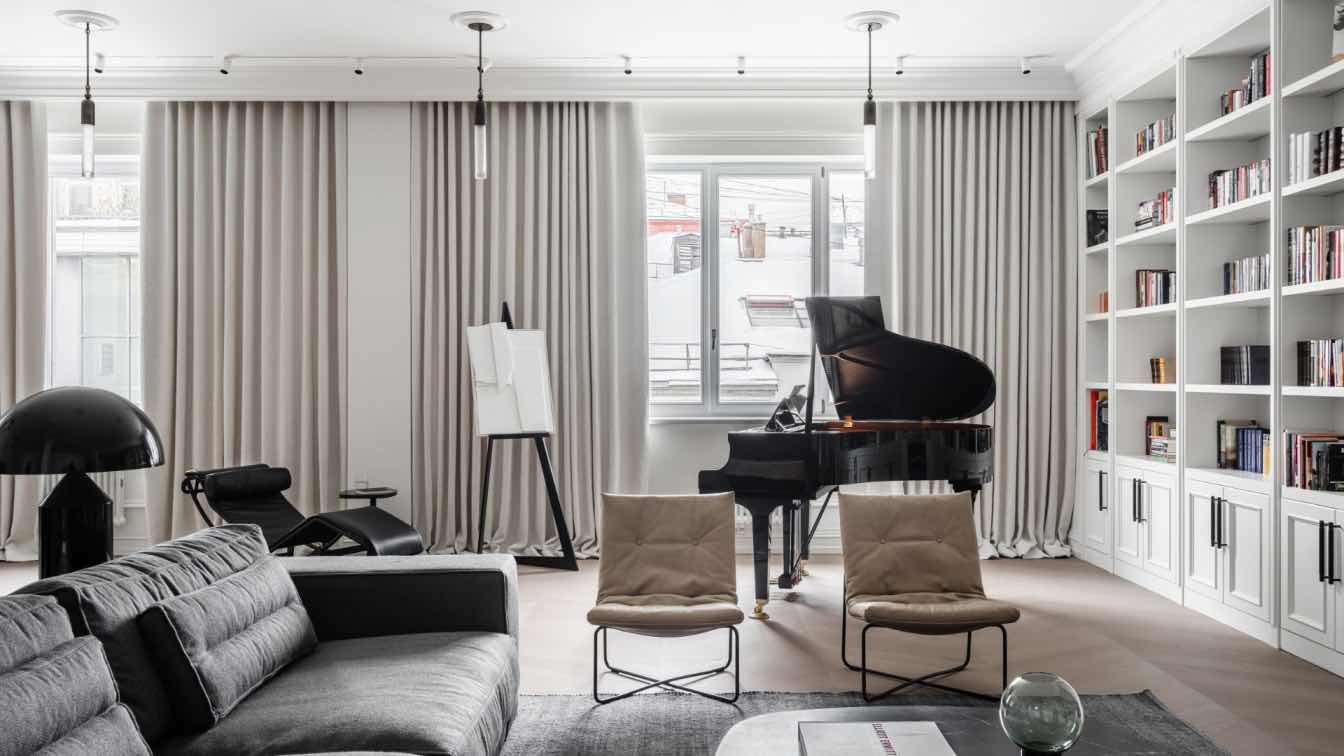
Babayants Architects: We are very much impressed with the location of this interior. VTB Arena is a whole block of modern high-quality architecture. It has a recognizable design code and its own character.
When we first came here, we understood that the interior will continue the architecture. Its clear geometry and curves. When we got to know the clients' wishes better, the main motive of the project was fully formed: these are smooth lines, visual lightness, relaxation and subtle flair of Asia.
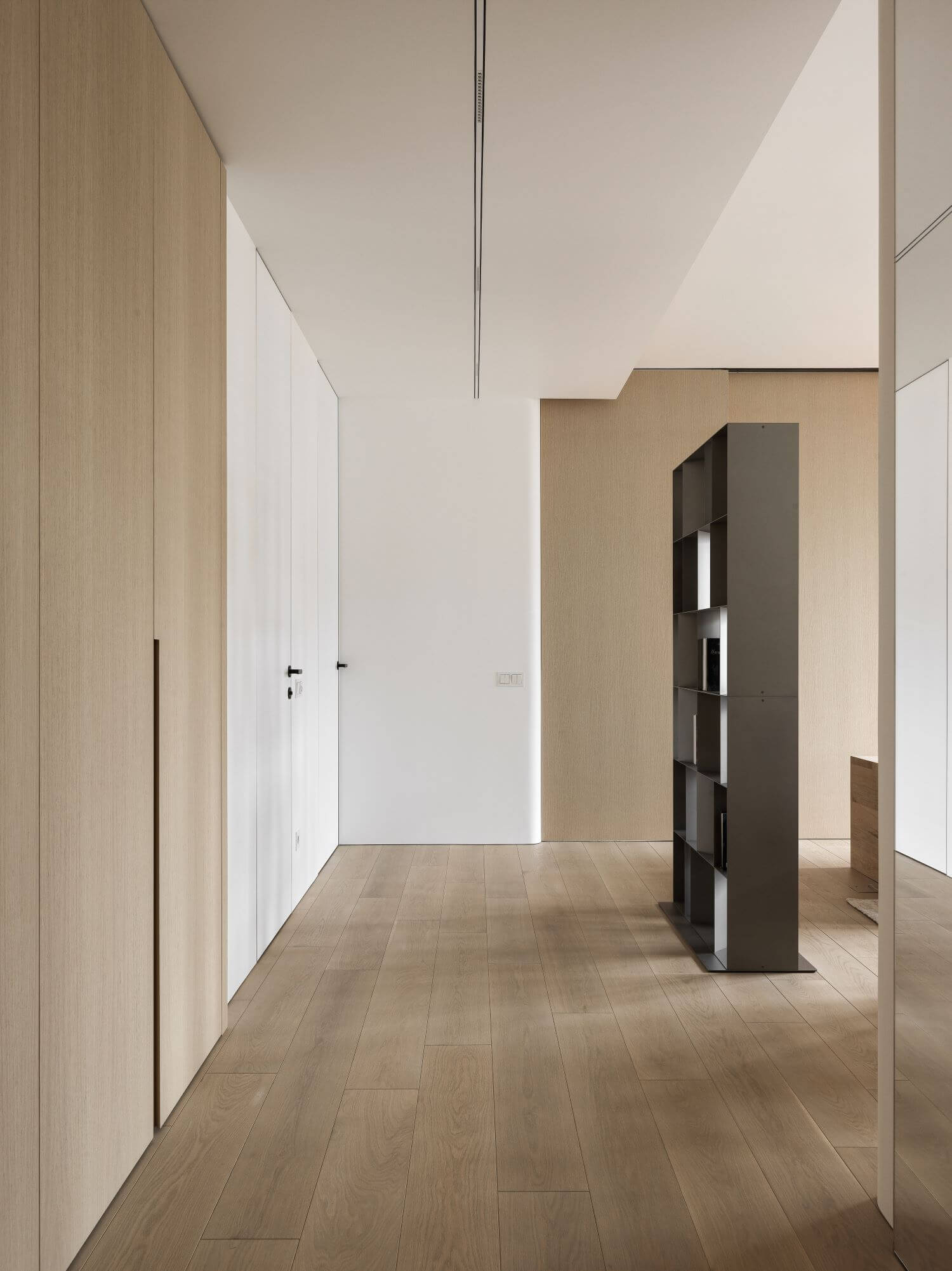
When you enter the apartment the first thing that catches your eye is the soaring wooden volume, a cabinet suspended between two walls. Behind it you can immediately see the general area of the apartment. This solution, like many in this interior, is both aesthetic and functional. In terms of design, we project emotion - curiosity and desire to peek or walk and examine in detail the interior. In terms of function - we launch natural light into the hallway area. Aesthetically - we make an airy composition that sets the whole interior.
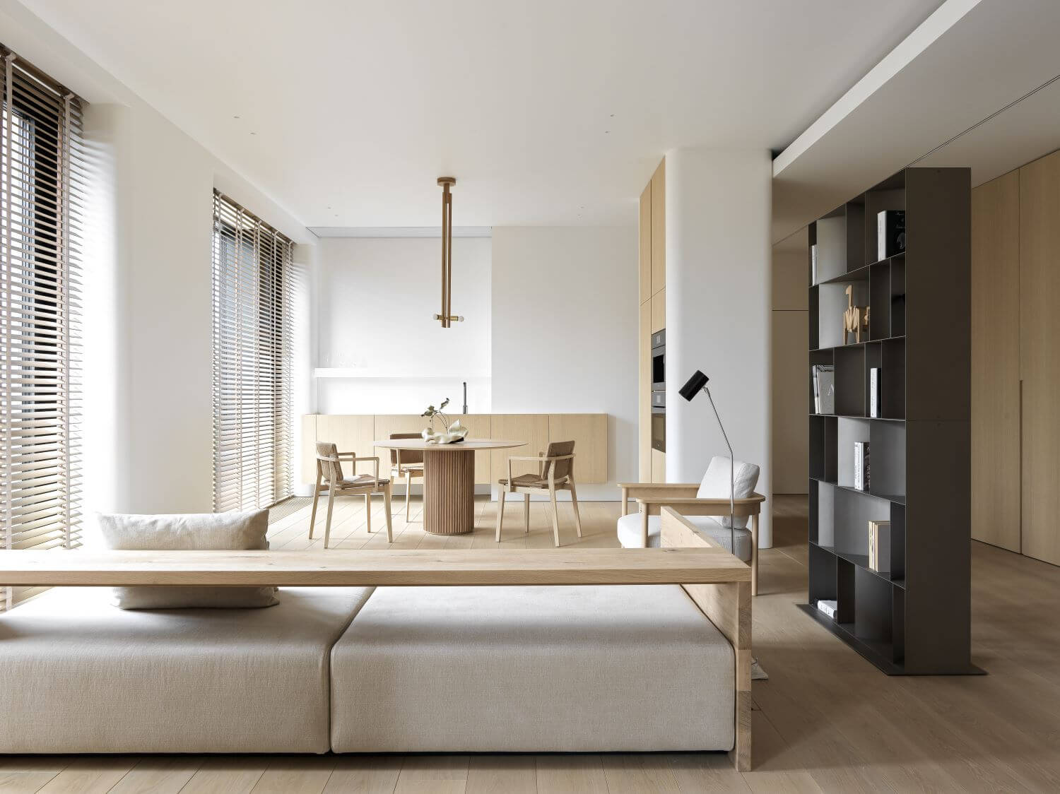
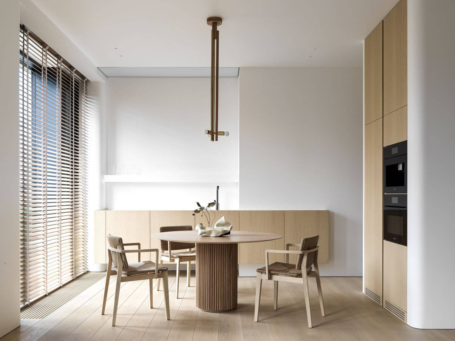
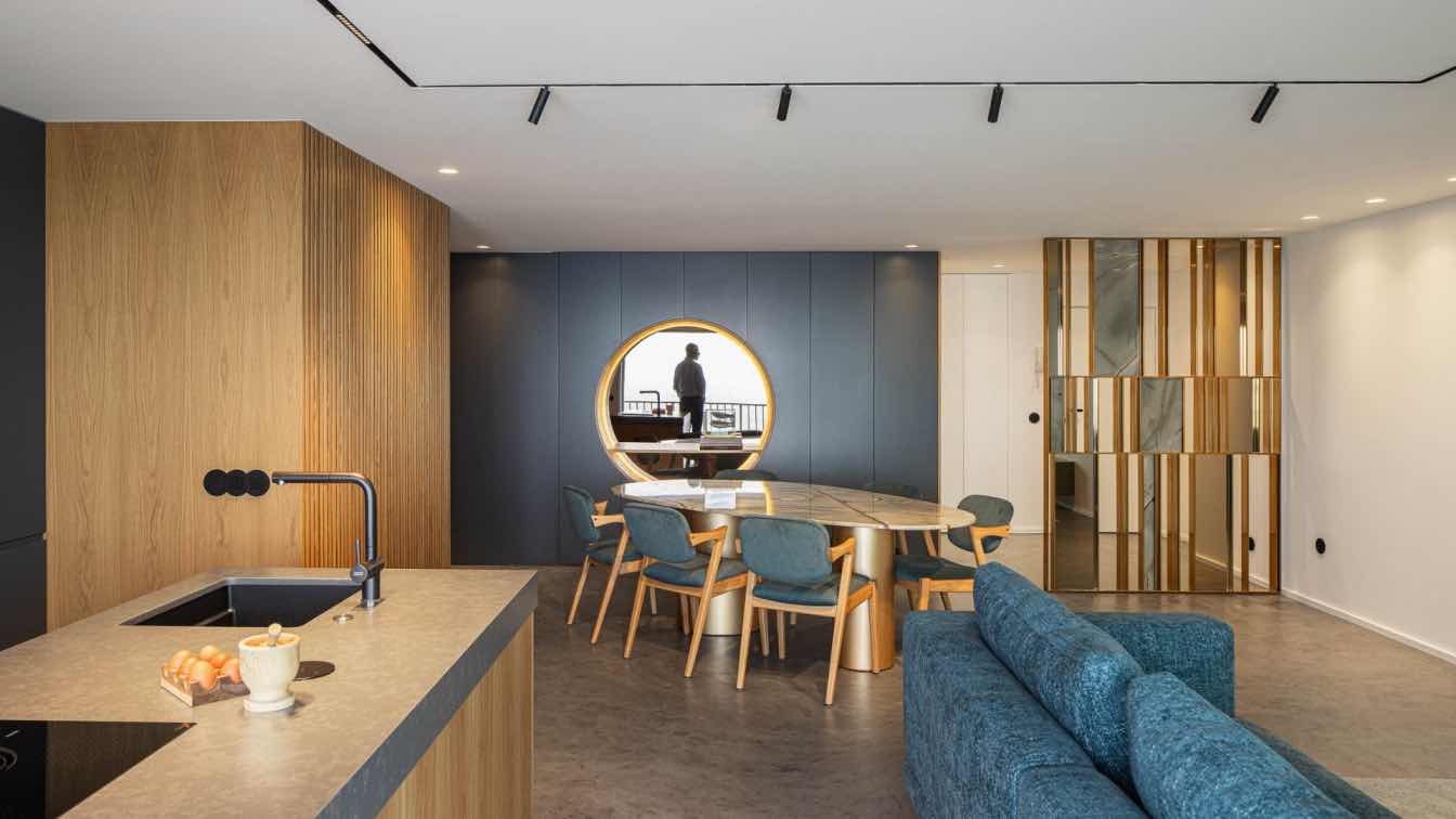
Next we get into the general area. Here the kitchen, dining group and seating area are compactly arranged, but calibrated and responsive to the request of the owners. What we see is not at all associated with the classic understanding of the kitchen set. We have divided the kitchen into two elements built into the interior architecture. This is a soaring horizontal ribbon of wood and two vertical columns that hug a rounded wall. All the necessary appliances are built in here. The central axis is given to a composition of a round table, wicker chairs and a lamp. The upholstered furniture is extremely laconic.
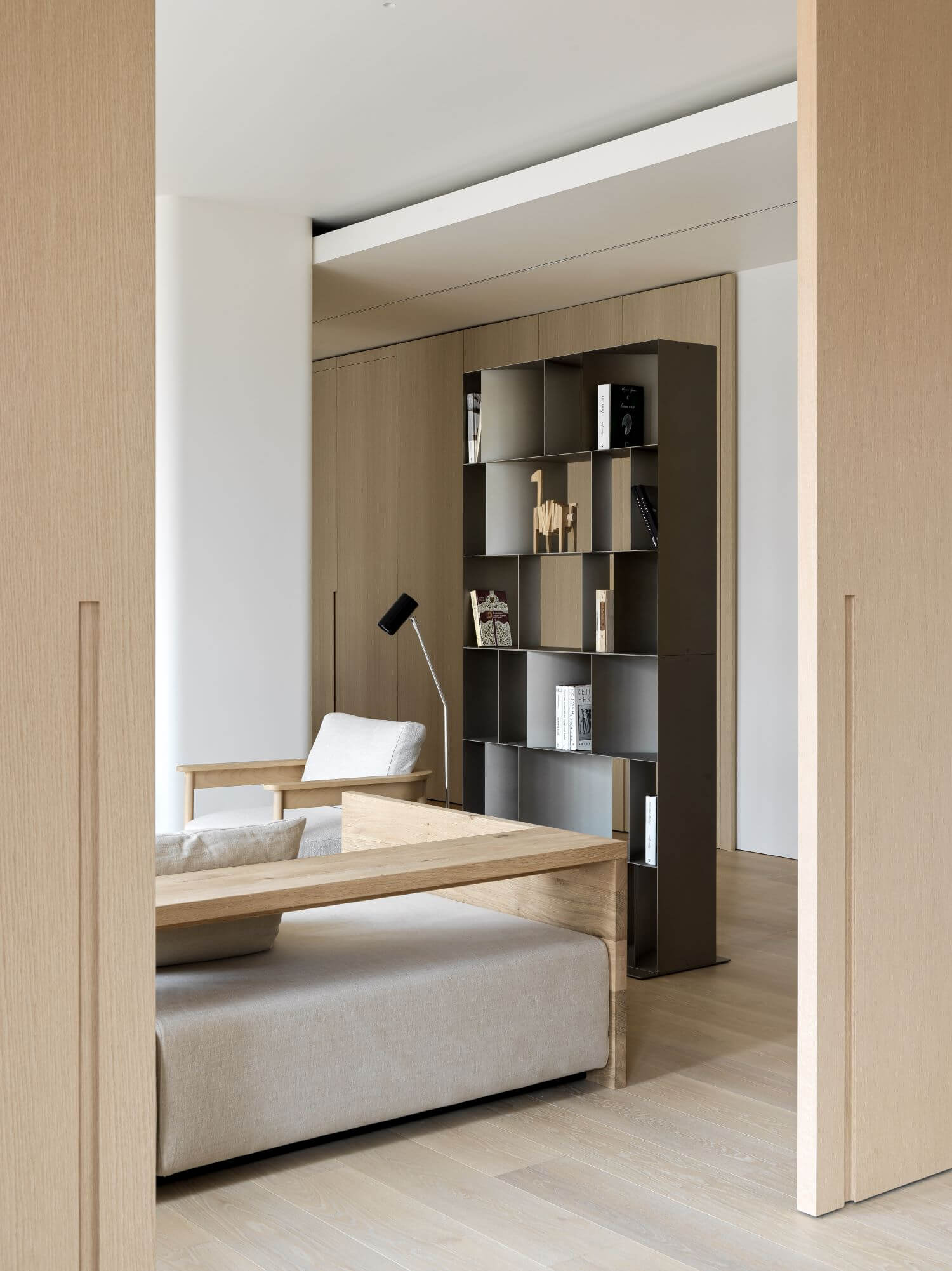
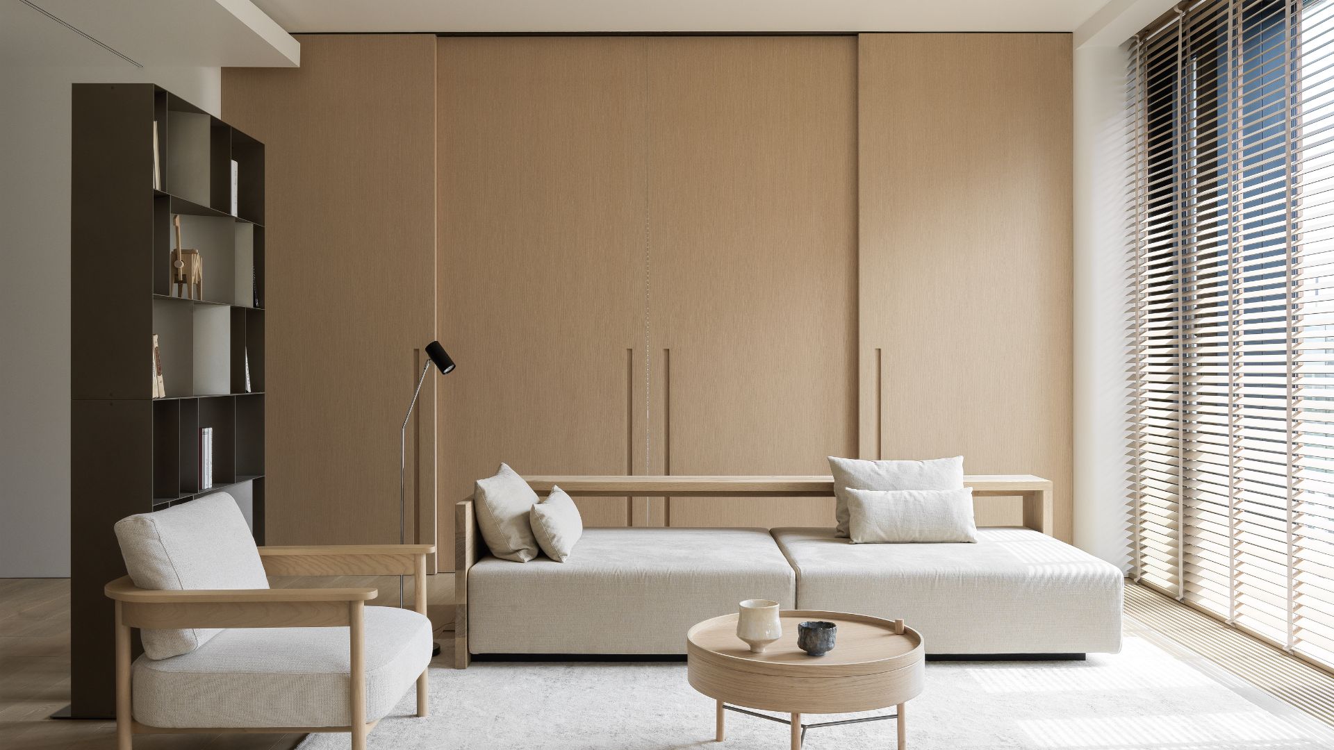
The highlight of the project is the large sliding wooden partitions that lead into the studio. Their aesthetics largely determined the mood of the project. The factory specially made them for us to order in this finish. The studio is a working space. When closed, it is a complete separate room. But the partitions can be opened up to create an even larger common area. The four options for the arrangement of the partitions give a variety of impressions of the space.
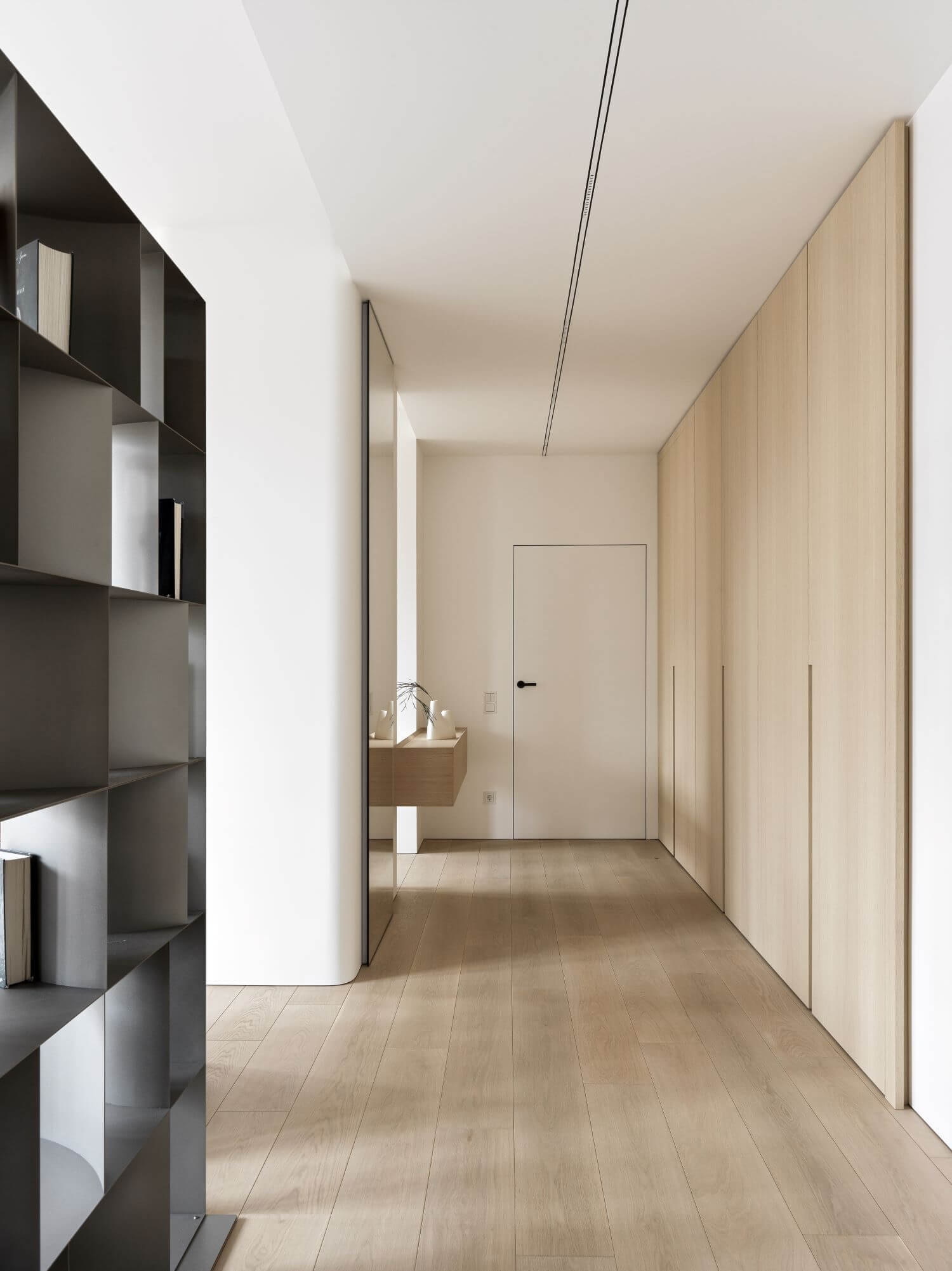
In the studio there are closed cabinets, which are very successfully disguised by rounded walls, a light shelving unit, a work desk for filming and another workspace nestled in the corner opposite the large panoramic windows.
The bedroom and bathroom continue the motifs of flowing lines and floating. The bed looks completely weightless.
A special element that creates the atmosphere of the interior is the long wooden blinds. This is a great solution that allows you to feel comfortable with so many windows. When they are closed they create a blackout effect. In fact, blinds cope with all the functions of drapes and tulle. Only in addition we get such magic, as drawing shadows in the sunny weather and the pleasant aesthetics of wood.
This project is the embodiment of our approach to working with lines. As we call it an "ode to lines." You can see in the details an extreme perfectionism and idyll of geometry: architecture, volumes, adjacencies, technical solutions, furniture, everything. Usually, the viewer does not look at the millimeters, but simply feels the harmony and correct proportions. This is what we aim for.
The interior is exquisitely delicate. It's as if it gently embraces you and soothes you. In every line there is a sense of precision and harmony. But what is particularly pleasant for us is that the space is surprisingly responsive to our clients. I would even say it looks like them.


